文章目录
- matplotlib 使用指南
- 1 matplotlib安装与基本介绍
- 1.1 %matplotlib inline
- 1.2 认识matplotlib图表
- 2 matplotlib基本使用
- 2.1 参数
- 2.2格式配置
- 2.3设置x与y轴
- 2.4 字体设置
- 2.5 title/图例设置
- 2.6 子图
- 2.7 创建画布
- 2.8 设置坐标轴
- 3 matplotlib常用的图表
- 3.1 折线图
- 3.1 散点图
- 3.3 柱状图/条形图
- 3.4 饼状图
- 3.5 直方图
- 3.6 箱形图
matplotlib 使用指南
1 matplotlib安装与基本介绍
-
基本介绍
Matplotlib是Python的绘图模块,他与Numpy,Pandas等配合使用,类似于MATLAB 的绘图工具;
- Matplotlib是一个基础工具,后面所介绍的seanborn等都是基于这个模块实现;
- Matplotlib可以在Jupyter中直接显示,是Python进行数据分析的必备模块之一;
- 官网:https://matplotlib.org/index.html (https://matplotlib.org/index.html)
- 案例:https://matplotlib.org/gallery/index.html (https://matplotlib.org/gallery/index.html)
-
安装
pip install matplotlib无需anaconda环境,可直接使用
#导入matplotlib
import matplotlib.pyplot as plt
import numpy as np
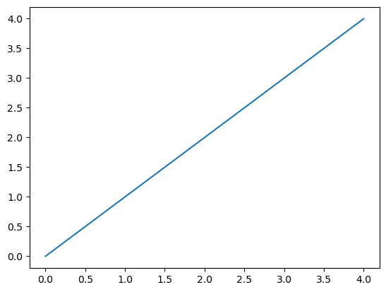
#创建图表
plt.plot(np.arange(5), np.arange(5))
#显示
plt.show()
1.1 %matplotlib inline
%matplotlib inline作用:iPython 中定义的魔法函数(Magic Function),将matplotlib绘制的图显示在页面里中;
如果不加这句话需要调用:plt.show()
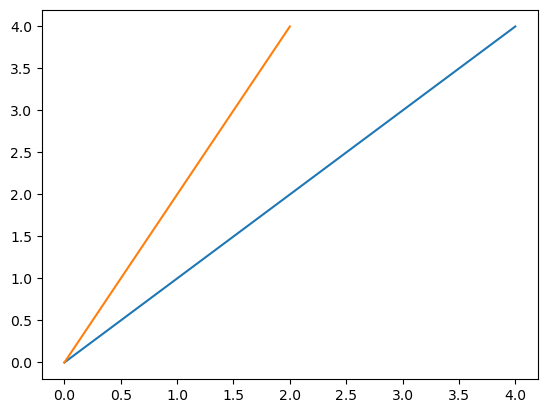
import matplotlib.pyplot as plt
import numpy as np
%matplotlib inline
plt.plot(np.arange(5), np.arange(5))
plt.plot(np.arange(3), [0,2,4])
#plt.show()
[<matplotlib.lines.Line2D at 0x22a9bcd6950>]
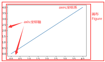
1.2 认识matplotlib图表
认识画布,axis,axes 画布:图表大小,进行图表绘制
axes:坐标系,一个画布中可以指定多个坐标系
axis:坐标轴,每个坐标系都有一个坐标轴
2 matplotlib基本使用
主要内容:
- 绘制基本图表;
- 图表格式设置;
- 多图与子图;
2.1 参数
plt.plot?
[1;31mSignature:[0m
[0mplt[0m[1;33m.[0m[0mplot[0m[1;33m([0m[1;33m
[0m    [1;33m*[0m[0margs[0m[1;33m:[0m [1;34m'float | ArrayLike | str'[0m[1;33m,[0m[1;33m
[0m    [0mscalex[0m[1;33m:[0m [1;34m'bool'[0m [1;33m=[0m [1;32mTrue[0m[1;33m,[0m[1;33m
[0m    [0mscaley[0m[1;33m:[0m [1;34m'bool'[0m [1;33m=[0m [1;32mTrue[0m[1;33m,[0m[1;33m
[0m    [0mdata[0m[1;33m=[0m[1;32mNone[0m[1;33m,[0m[1;33m
[0m    [1;33m**[0m[0mkwargs[0m[1;33m,[0m[1;33m
[0m[1;33m)[0m [1;33m->[0m [1;34m'list[Line2D]'[0m[1;33m[0m[1;33m[0m[0m
[1;31mDocstring:[0m
Plot y versus x as lines and/or markers.

Call signatures::

    plot([x], y, [fmt], *, data=None, **kwargs)
    plot([x], y, [fmt], [x2], y2, [fmt2], ..., **kwargs)

The coordinates of the points or line nodes are given by *x*, *y*.

The optional parameter *fmt* is a convenient way for defining basic
formatting like color, marker and linestyle. It's a shortcut string
notation described in the *Notes* section below.

>>> plot(x, y)        # plot x and y using default line style and color
>>> plot(x, y, 'bo')  # plot x and y using blue circle markers
>>> plot(y)           # plot y using x as index array 0..N-1
>>> plot(y, 'r+')     # ditto, but with red plusses

You can use `.Line2D` properties as keyword arguments for more
control on the appearance. Line properties and *fmt* can be mixed.
The following two calls yield identical results:

>>> plot(x, y, 'go--', linewidth=2, markersize=12)
>>> plot(x, y, color='green', marker='o', linestyle='dashed',
...      linewidth=2, markersize=12)

When conflicting with *fmt*, keyword arguments take precedence.
Plotting labelled data
There's a convenient way for plotting objects with labelled data (i.e.
data that can be accessed by index ``obj['y']``). Instead of giving
the data in *x* and *y*, you can provide the object in the *data*
parameter and just give the labels for *x* and *y*::

>>> plot('xlabel', 'ylabel', data=obj)

All indexable objects are supported. This could e.g. be a `dict`, a
`pandas.DataFrame` or a structured numpy array.
Plotting multiple sets of data
There are various ways to plot multiple sets of data.

- The most straight forward way is just to call `plot` multiple times.
  Example:

  >>> plot(x1, y1, 'bo')
  >>> plot(x2, y2, 'go')

- If *x* and/or *y* are 2D arrays a separate data set will be drawn
  for every column. If both *x* and *y* are 2D, they must have the
  same shape. If only one of them is 2D with shape (N, m) the other
  must have length N and will be used for every data set m.

  Example:

  >>> x = [1, 2, 3]
  >>> y = np.array([[1, 2], [3, 4], [5, 6]])
  >>> plot(x, y)

  is equivalent to:

  >>> for col in range(y.shape[1]):
  ...     plot(x, y[:, col])

- The third way is to specify multiple sets of *[x]*, *y*, *[fmt]*
  groups::

  >>> plot(x1, y1, 'g^', x2, y2, 'g-')

  In this case, any additional keyword argument applies to all
  datasets. Also, this syntax cannot be combined with the *data*
  parameter.

By default, each line is assigned a different style specified by a
'style cycle'. The *fmt* and line property parameters are only
necessary if you want explicit deviations from these defaults.
Alternatively, you can also change the style cycle using
:rc:`axes.prop_cycle`.
Parameters
----------
x, y : array-like or scalar
The horizontal / vertical coordinates of the data points.
x values are optional and default to range(len(y)).
    Commonly, these parameters are 1D arrays.

    They can also be scalars, or two-dimensional (in that case, the
    columns represent separate data sets).

    These arguments cannot be passed as keywords.

fmt : str, optional
    A format string, e.g. 'ro' for red circles. See the *Notes*
    section for a full description of the format strings.

    Format strings are just an abbreviation for quickly setting
    basic line properties. All of these and more can also be
    controlled by keyword arguments.

    This argument cannot be passed as keyword.

data : indexable object, optional
    An object with labelled data. If given, provide the label names to
    plot in *x* and *y*.

    .. note::
        Technically there's a slight ambiguity in calls where the
        second label is a valid *fmt*. ``plot('n', 'o', data=obj)``
        could be ``plt(x, y)`` or ``plt(y, fmt)``. In such cases,
        the former interpretation is chosen, but a warning is issued.
        You may suppress the warning by adding an empty format string
        ``plot('n', 'o', '', data=obj)``.

Returns
-------
list of `.Line2D`
    A list of lines representing the plotted data.

Other Parameters
----------------
scalex, scaley : bool, default: True
    These parameters determine if the view limits are adapted to the
    data limits. The values are passed on to
    `~.axes.Axes.autoscale_view`.

**kwargs : `~matplotlib.lines.Line2D` properties, optional
    *kwargs* are used to specify properties like a line label (for
    auto legends), linewidth, antialiasing, marker face color.
    Example::

    >>> plot([1, 2, 3], [1, 2, 3], 'go-', label='line 1', linewidth=2)
    >>> plot([1, 2, 3], [1, 4, 9], 'rs', label='line 2')

    If you specify multiple lines with one plot call, the kwargs apply
    to all those lines. In case the label object is iterable, each
    element is used as labels for each set of data.

    Here is a list of available `.Line2D` properties:

    Properties:
    agg_filter: a filter function, which takes a (m, n, 3) float array and a dpi value, and returns a (m, n, 3) array and two offsets from the bottom left corner of the image
    alpha: scalar or None
    animated: bool
    antialiased or aa: bool
    clip_box: `~matplotlib.transforms.BboxBase` or None
    clip_on: bool
    clip_path: Patch or (Path, Transform) or None
    color or c: color
    dash_capstyle: `.CapStyle` or {'butt', 'projecting', 'round'}
    dash_joinstyle: `.JoinStyle` or {'miter', 'round', 'bevel'}
    dashes: sequence of floats (on/off ink in points) or (None, None)
    data: (2, N) array or two 1D arrays
    drawstyle or ds: {'default', 'steps', 'steps-pre', 'steps-mid', 'steps-post'}, default: 'default'
    figure: `~matplotlib.figure.Figure`
    fillstyle: {'full', 'left', 'right', 'bottom', 'top', 'none'}
    gapcolor: color or None
    gid: str
    in_layout: bool
    label: object
    linestyle or ls: {'-', '--', '-.', ':', '', (offset, on-off-seq), ...}
    linewidth or lw: float
    marker: marker style string, `~.path.Path` or `~.markers.MarkerStyle`
    markeredgecolor or mec: color
    markeredgewidth or mew: float
    markerfacecolor or mfc: color
    markerfacecoloralt or mfcalt: color
    markersize or ms: float
    markevery: None or int or (int, int) or slice or list[int] or float or (float, float) or list[bool]
    mouseover: bool
    path_effects: list of `.AbstractPathEffect`
    picker: float or callable[[Artist, Event], tuple[bool, dict]]
    pickradius: float
    rasterized: bool
    sketch_params: (scale: float, length: float, randomness: float)
    snap: bool or None
    solid_capstyle: `.CapStyle` or {'butt', 'projecting', 'round'}
    solid_joinstyle: `.JoinStyle` or {'miter', 'round', 'bevel'}
    transform: unknown
    url: str
    visible: bool
    xdata: 1D array
    ydata: 1D array
    zorder: float

See Also
--------
scatter : XY scatter plot with markers of varying size and/or color (
    sometimes also called bubble chart).

Notes
-----
**Format Strings**

A format string consists of a part for color, marker and line::

    fmt = '[marker][line][color]'

Each of them is optional. If not provided, the value from the style
cycle is used. Exception: If ``line`` is given, but no ``marker``,
the data will be a line without markers.

Other combinations such as ``[color][marker][line]`` are also
supported, but note that their parsing may be ambiguous.

**Markers**

=============   ===============================
character       description
=============   ===============================
``'.'``         point marker
``','``         pixel marker
``'o'``         circle marker
``'v'``         triangle_down marker
``'^'``         triangle_up marker
``'<'``         triangle_left marker
``'>'``         triangle_right marker
``'1'``         tri_down marker
``'2'``         tri_up marker
``'3'``         tri_left marker
``'4'``         tri_right marker
``'8'``         octagon marker
``'s'``         square marker
``'p'``         pentagon marker
``'P'``         plus (filled) marker
``'*'``         star marker
``'h'``         hexagon1 marker
``'H'``         hexagon2 marker
``'+'``         plus marker
``'x'``         x marker
``'X'``         x (filled) marker
``'D'``         diamond marker
``'d'``         thin_diamond marker
``'|'``         vline marker
``'_'``         hline marker
=============   ===============================

**Line Styles**

=============    ===============================
character        description
=============    ===============================
``'-'``          solid line style
``'--'``         dashed line style
``'-.'``         dash-dot line style
``':'``          dotted line style
=============    ===============================

Example format strings::

    'b'    # blue markers with default shape
    'or'   # red circles
    '-g'   # green solid line
    '--'   # dashed line with default color
    '^k:'  # black triangle_up markers connected by a dotted line

**Colors**

The supported color abbreviations are the single letter codes

=============    ===============================
character        color
=============    ===============================
``'b'``          blue
``'g'``          green
``'r'``          red
``'c'``          cyan
``'m'``          magenta
``'y'``          yellow
``'k'``          black
``'w'``          white
=============    ===============================

and the ``'CN'`` colors that index into the default property cycle.

If the color is the only part of the format string, you can
additionally use any  `matplotlib.colors` spec, e.g. full names
(``'green'``) or hex strings (``'#008000'``).
[1;31mFile:[0m      d:\software\anaconda\lib\site-packages\matplotlib\pyplot.py
[1;31mType:[0m      function
2.2格式配置
文档:https://matplotlib.org/stable/api/index.html
| 方法 | 说明 |
|---|---|
plt.plot(fmt, data, **kwargs) | 绘制线状图,fmt 是字符串,表示线与点的属性。data 是数据。kwargs 是关键字参数。 |
-
设置线型
fmt格式:‘-or’,分别代表:线型,点形状,颜色,顺序可以颠倒
符号 说明 '-'实线样式 '--'虚线样式 '-.'点划线样式 ':'点线样式 -
设置点
符号 说明 '.'点标记 ','像素标记 'o'圆形标记 'v'朝下的三角形标记 '^'朝上的三角形标记 '<'朝左的三角形标记 '>'朝右的三角形标记
y = range(1,4)
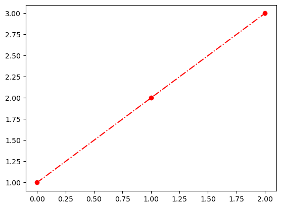
plt.plot(y,'-.or')
[<matplotlib.lines.Line2D at 0x22a9c913c50>]
- 设置颜色
符号 说明 'b'蓝色 'g'绿色 'r'红色 'c'青色 'm'洋红色 'y'黄色 'k'黑色 'w'白色
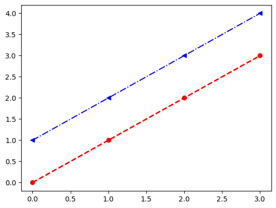
#fmt:--:虚线,o:点形状为圆,r:红色,, linewidth:设置线宽度
plt.plot(range(4), '--or', linewidth=2)
#fmt:-.:虚线,<:点形状为三角,r:蓝色
plt.plot(range(1,5), '-.<b')
[<matplotlib.lines.Line2D at 0x22a9da02c10>]
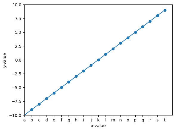
#设置xy轴范围(-10, 10)
import matplotlib.pyplot as plt
plt.xlim(-10,10)
plt.ylim(-10,10)
#折线图
plt.plot(range(-10,10),range(-10,10), '-o')
#设置x-ylabel
plt.xlabel('x-value')
plt.ylabel('y-value')
#设置x轴显示坐标值(x轴值与显示值要对应,例如:-10:a, -9:b...10:t)
xticks = [chr(v) for v in range(ord('a'), ord('a')+20)]
_ = plt.xticks(range(-10,10),xticks)

2.3设置x与y轴
坐标轴设置包括:
坐标轴值,坐标轴显示值,坐标轴标签
| 操作 | 说明 |
|---|---|
| 设置 x 轴标签 | plt.xlabel(s, *args, **kwargs) |
| 设置 y 轴标签 | plt.ylabel(s, *args, **kwargs) |
| 设置 x 轴刻度 | plt.xticks(*args, **kwargs) |
| 设置 y 轴刻度 | plt.yticks(*args, **kwargs) |
| 设置 x 轴范围 | plt.xlim(*args, **kwargs) |
| 设置 y 轴范围 | plt.ylim(*args, **kwargs) |
#设置xy轴范围(-10, 10)
import matplotlib.pyplot as plt
plt.xlim(-10,10)
plt.ylim(-10,10)
#折线图
plt.plot(range(-10,10),range(-10,10), '-o')
#设置x-ylabel
plt.xlabel('x-value')
plt.ylabel('y-value')
#设置x轴显示坐标值(x轴值与显示值要对应,例如:-10:a, -9:b...10:t)
xticks = [chr(v) for v in range(ord('a'), ord('a')+20)]
_ = plt.xticks(range(-10,10),xticks)
2.4 字体设置
字体设置包括大小,字体,颜色,旋转角度等
参考链接:https://matplotlib.org/api/text_api.html (https://matplotlib.org/api/text_api.html)
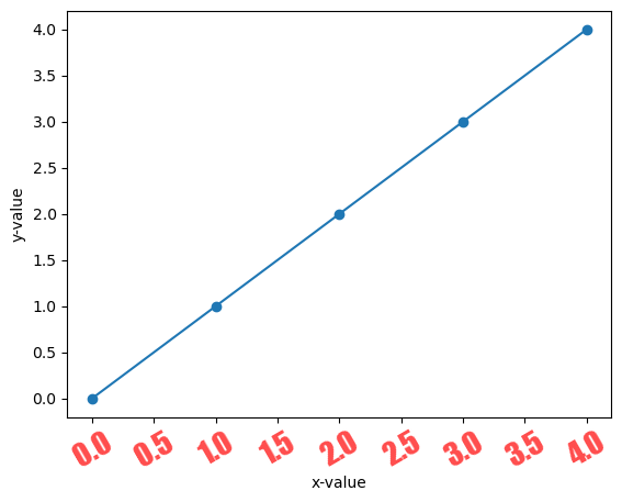
#设置xy轴范围(-10, 10)
import matplotlib.pyplot as plt
#折线图
plt.plot(range(5), '-o')
#设置x-ylabel
_ = plt.xlabel('x-value')
_ = plt.ylabel('y-value')
_ = plt.xticks(rotation=30, fontfamily = 'fantasy', size=20,alpha=0.7,visible=True,c='r')
2.5 title/图例设置
plt.title(label, fontdict=None, loc='center', pad=None, **kwargs):设置标题;
plt.legend(*args, **kwargs):设置图例,例如一个图表中可以绘制多个折现,每个折现代表说明可以使用legend标识;档;
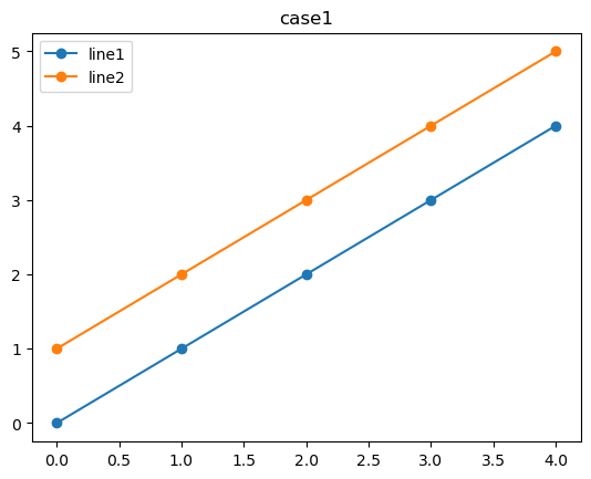
import matplotlib.pyplot as plt
#折线图
plt.plot(range(5), '-o', label="line1")
plt.plot(range(1,6), '-o', label="line2")
#设置x-ylabel
plt.legend()
plt.title("case1")
Text(0.5, 1.0, 'case1')
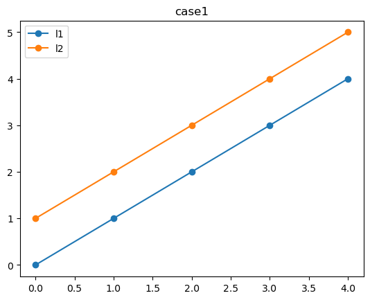
import matplotlib.pyplot as plt
#折线图
line1 = plt.plot(range(5), '-o')
line2 = plt.plot(range(1,6), '-o')
#设置x-ylabel
plt.legend(('l1', 'l2'))
plt.title("case1")
Text(0.5, 1.0, 'case1')
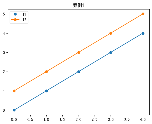
plt.rcParams['font.family'] = ['sans-serif']
plt.rcParams['font.sans-serif'] = ['SimHei']
import matplotlib.pyplot as plt
#折线图
line1 = plt.plot(range(5), '-o')
line2 = plt.plot(range(1,6), '-o')
#设置x-ylabel
plt.legend(('l1', 'l2'))
plt.title("案例1")
Text(0.5, 1.0, '案例1')
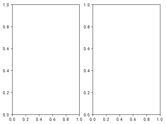
2.6 子图
添加多个图表方式可以使用子图及多图
plt.subplot(*args, **kwargs):返回axes
plt.subplot(1,2,1) #同:plt.subplot(121)
plt.subplot(1,2,2) #同:plt.subplot(122)
<Axes: >
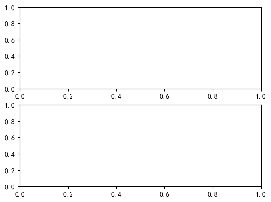
plt.subplot(2,1,1)# 同plt.subplot(211)
plt.subplot(2,1,2)# 同plt.subplot(212)
<Axes: >
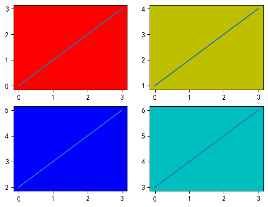
#axes1
axes1 = plt.subplot(221)
axes1.plot(range(4))
axes1.set_facecolor('r')
#axes2
axes2 = plt.subplot(222)
axes2.plot(range(1,5))
axes2.set_facecolor('y')
#axes3
axes3 = plt.subplot(223)
axes3.plot(range(2,6))
axes3.set_facecolor('b')
#axes4
axes4 =plt.subplot(224)
axes4.plot(range(3,7))
axes4.set_facecolor('c')
2.7 创建画布
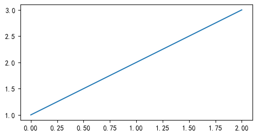
#创建画布1
plt.figure(1,figsize=(6, 3))
plt.plot([1,2,3])
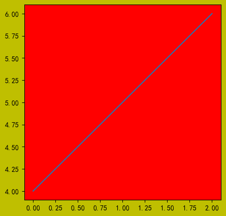
#创建画布2
plt.figure(2,figsize=(5, 5), facecolor='y')
plt.plot([4,5,6])
#获取当前坐标系
ax = plt.gca()
#设置颜色为ax
ax.set_facecolor('r')
2.8 设置坐标轴
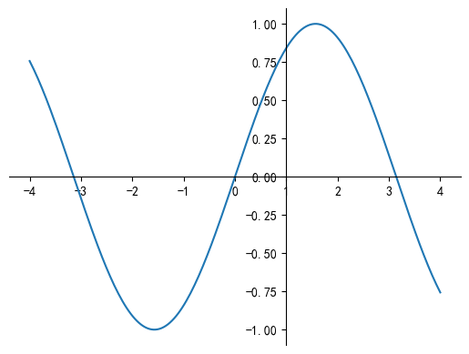
默认坐标系为00,有时候我们希望坐标轴中心点在其他位置,且只希望显示x,y两个轴,实现如下
import matplotlib.pyplot as plt
%matplotlib inline
import numpy as np
#支持中文
plt.rcParams['font.family'] = ['sans-serif']
plt.rcParams['font.sans-serif'] = ['SimHei']
#结局负数乱码
plt.rcParams['axes.unicode_minus']=False
x = np.linspace(-4, 4, 200)
y = np.sin(x)
plt.figure()
#获取当前axes
ax = plt.gca()
#坐标系中right,top不显示
ax.spines['right'].set_color('none')
ax.spines['top'].set_color('none')
#设置ticks显示位置
ax.xaxis.set_ticks_position('bottom')
ax.yaxis.set_ticks_position('left')
#移动坐标轴位置:中心位置为(1,0)
ax.spines['left'].set_position(('data', 1))
ax.spines['bottom'].set_position(('data', 0))
plt.plot(x, y)
[<matplotlib.lines.Line2D at 0x22a9defb490>]
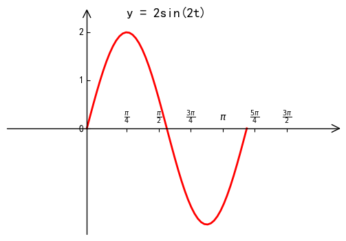
import numpy as np
import matplotlib.pyplot as plt
import mpl_toolkits.axisartist as axisartist
fig = plt.figure('Sine Wave', (6,4))
#创建axisartist对象
ax = axisartist.Subplot(fig, 1,1,1)
#增加坐标系
fig.add_axes(ax)
#坐标设置不显示
ax.axis[:].set_visible(False)
#指定坐标系位置
ax.axis["x"] = ax.new_floating_axis(0, 0)
ax.axis["y"] = ax.new_floating_axis(1, 0)
ax.axis["x"].set_axis_direction('top')
ax.axis["y"].set_axis_direction('left')
#设置坐标轴格式
ax.axis["x"].set_axisline_style("->", size = 2.0)
ax.axis["y"].set_axisline_style("->", size = 2.0)
t = np.linspace(0, 1*np.pi)
y = 2*np.sin(2*t)
ax.plot(t, y, color = 'red', linewidth = 2)
plt.title('y = 2sin(2t)',fontsize = 14)
#设置x轴刻度
ax.set_xticks(np.linspace(0.25,1.25,6)*np.pi)
ax.set_xticklabels(['$\\frac{\pi}{4}$','$\\frac{\pi}{2}$', '$\\frac{3\pi}{4}$', '$\pi$', '$\\frac{5\pi}{4}$', '$\\frac{3\pi}{2}$'])
ax.set_yticks([0, 1, 2])
#设置xy周范围
ax.set_xlim(-0.5*np.pi,1.5*np.pi)
ax.set_ylim(-2.2, 2.2)
(-2.2, 2.2)
3 matplotlib常用的图表
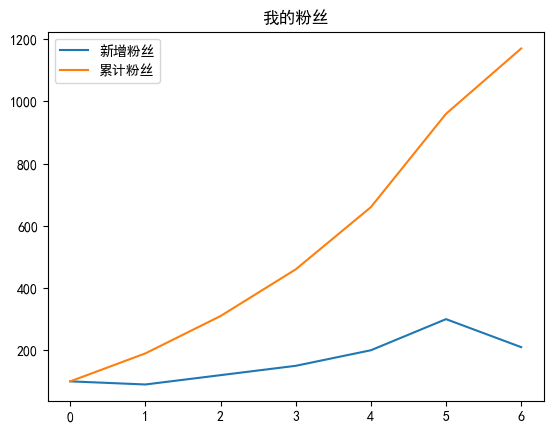
3.1 折线图
- 折线图:趋势变化关系,场合时间等结合起来使用;
- 例如:新增用户,累计用户,股票数据等;
#案例:近一周某用户粉丝每天增长量与累积粉丝数:
import matplotlib.pyplot as plt
import numpy as np
ydata = [100, 90, 120, 150, 200, 300, 210]
sumydata = np.cumsum(ydata)
plt.plot(ydata)
plt.plot(sumydata)
plt.legend(['新增粉丝', '累计粉丝'])
plt.title("我的粉丝")
Text(0.5, 1.0, '我的粉丝')
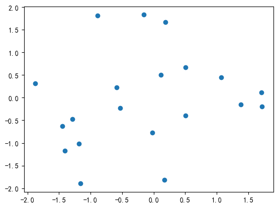
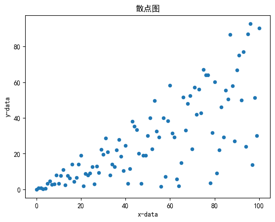
3.1 散点图
- 显示若干数据系列中各数值之间的关系,一定程度反映数据分布关系;
- 适用于维度较少数据
- 方法:plt.scatter(x, y, s=None, c=None,marker=None,…,alpha=None,**kwargs)
import matplotlib.pyplot as plt
import numpy as np
plt.rcParams['font.family'] = ['sans-serif']
plt.rcParams['font.sans-serif'] = ['SimHei']
%matplotlib inline
xValue = list(range(0, 101))
yValue = [x * np.random.rand() for x in xValue]
plt.title(u'散点图')
plt.xlabel('x-data')
plt.ylabel('y-data')
plt.scatter(xValue, yValue, s=20, marker='o')
<matplotlib.collections.PathCollection at 0x22a9f1f5190>
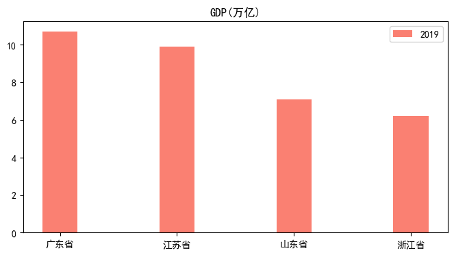
3.3 柱状图/条形图
显示一段时间内的数据变化或显示各项之间的比较情况
例如:数据对比
import matplotlib.pyplot as plt43v发v
plt.rcParams['font.family'] = ['sans-serif']
plt.rcParams['font.sans-serif'] = ['SimHei']
import numpy as np
plt.figure(figsize=(8,4))
x=np.arange(4)
gdp_2019 = [10.7, 9.9,7.1,6.2]
#设置柱状图的宽度
bar_width=0.3
tick_label=['广东省','江苏省','山东省','浙江省']
#绘制并列柱状图
plt.bar(x,gdp_2019,bar_width,color='salmon',label='2019')
plt.title('GDP(万亿)')
plt.legend()
_ = plt.xticks(x,tick_label)
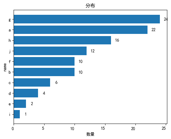
import matplotlib.pyplot as plt
dic = {'a': 22, 'b': 10, 'c': 6, 'd': 4, 'e': 2, 'f': 10, 'g': 24, 'h': 16, 'i': 1, 'j': 12}
s = sorted(dic.items(), key=lambda x: x[1], reverse=False) # 对dict 按照value排序 True表示翻转 ,转为了列表形式
x_x = []
y_y = []
for i in s:
 x_x.append(i[0])
 y_y.append(i[1])
x = x_x
y = y_y
fig, ax = plt.subplots()
ax.barh(x, y)
labels = ax.get_xticklabels()
plt.setp(labels, rotation=0, horizontalalignment='right')
for a, b in zip(x, y):
 plt.text(b+1, a, b, ha='center', va='center')
plt.ylabel('name')
plt.xlabel('数量')
plt.title("分布")
Text(0.5, 1.0, '分布')
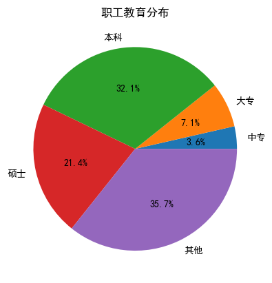
3.4 饼状图
总体数据中,各项与总和的比例;
各个数据对比,例如:不同地区销售额占比;
plt.pie(x, explode=None, labels=None…)
import matplotlib.pyplot as plt
# 构造数据
edu = [100,200,900, 600, 1000]
labels = ['中专','大专','本科','硕士','其他']
plt.pie(x = edu, labels=labels, autopct='%.1f%%')
plt.title('职工教育分布')
plt.show()
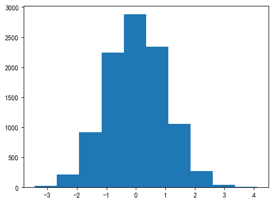
3.5 直方图
数据分布情况
plt.hist(x, bins=None, range=None,…).
import matplotlib.pyplot as plt
import numpy as np
# 构造数据
data = np.random.randn(10000)
plt.hist(data)
plt.show()
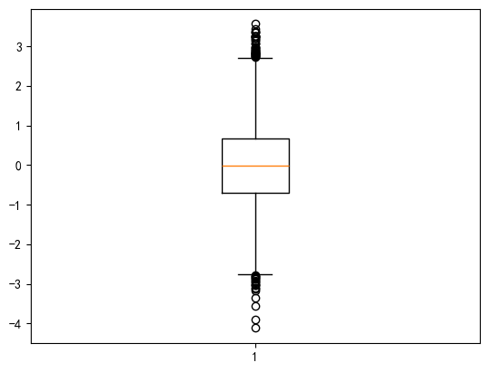
3.6 箱形图
箱形图可以很直观的描述数据的最大值、最小值、中位数、上四分位数、下四分位数、异常值,
plt.boxplot(x, notch=None, sym=None, vert=None, whis=None)
import matplotlib.pyplot as plt
import numpy as np
# 构造数据
data = np.random.randn(10000)
plt.boxplot(data)
plt.show()
练习:
'''
在Python中: x = np.random.randn(20) y = np.random.randn(20) 使用matplolit绘制散点图
'''
import matplotlib.pyplot as plt
import numpy as np
x = np.random.randn(20) # 生成20个随机数作为x轴数据
y = np.random.randn(20) # 生成20个随机数作为y轴数据
plt.scatter(x, y) # 绘制散点图
plt.show() # 显示图形