FlexboxLayout 布局
- 一、简介
- 二、使用
- 三、功能详解
- FlexboxLayout属性
- flexWrap
- flexDirection
- alignItems
- justifyContent
- alignContent
- dividerDrawableHorizontal、showDividerHorizontal
- dividerDrawableVertical、showDividerVertical
- dividerDrawable、showDivider
- maxLine
- FlexboxLayout子控件属性
- layout_order
- layout_flexGrow
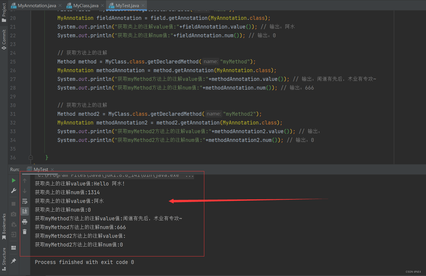
- layout_flexShrink
- layout_flexBasisPercent
- layout_wrapBefore
- layout_minWidth、layout_maxWidth、layout_minHeight、layout_maxHeight
- layout_alignSelf
- FlexboxLayout在RecyclerView应用(FlexboxLayoutManager)
一、简介
FlexboxLayout 是2016年 Google I/O 上开源的一个布局控件,FlexBoxLayout是为Android带来了与 CSS Flexible Box Layout Module (CSS 弹性盒子)相似功能的开源布局控件。
FlexboxLayout 官方开源项目地址:https://github.com/google/flexbox-layout
二、使用
在项目的build.gradle引入flexbox:
implementation 'com.google.android.flexbox:flexbox:3.0.0'
从1.1.0开始,该库预计将与AndroidX一起使用。如果还没有迁移到AndroidX,需使用1.0.0版本,如果使用1.1.0或更高版本,需迁移到AndroidX;
从2.0.0开始,FlexboxLayout的alignItems和alignContext的默认值已从stretch更改为flex_start;
从3.0.0开始,groupId更改为com.google.android.flexbox,且上传至google-maven。旧版本的groupId(com.google.android),可以从jcenter中引用,建议迁移至3.0.0;
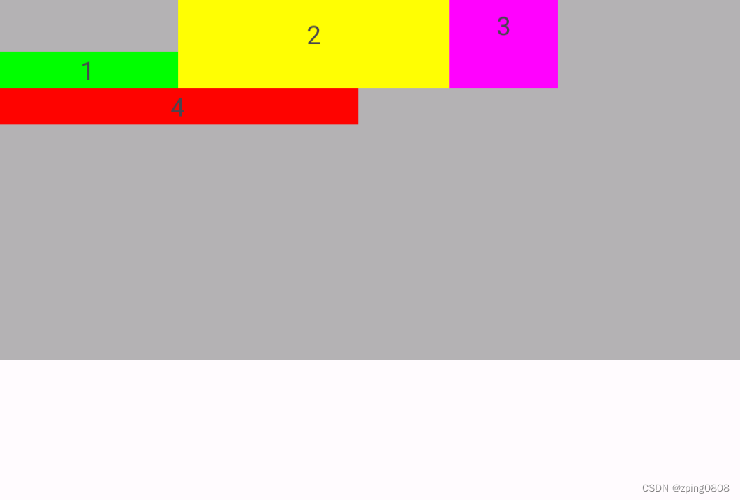
在布局文件中添加flexbox:
<com.google.android.flexbox.FlexboxLayout xmlns:android="http://schemas.android.com/apk/res/android"
    xmlns:app="http://schemas.android.com/apk/res-auto"
    android:layout_width="match_parent"
    android:layout_height="match_parent"
    app:flexWrap="wrap">

    <TextView
        android:layout_width="100dp"
        android:layout_height="20dp"
        android:background="#00FF00"
        android:gravity="center"
        android:text="1" />

    <TextView
        android:layout_width="150dp"
        android:layout_height="20dp"
        android:background="#FFFF00"
        android:gravity="center"
        android:text="2" />

    <TextView
        android:layout_width="60dip"
        android:layout_height="20dp"
        android:background="#FF00FF"
        android:gravity="center"
        android:text="3" />

    <TextView
        android:layout_width="200dip"
        android:layout_height="20dp"
        android:background="#FF0000"
        android:gravity="center"
        android:text="4" />

</com.google.android.flexbox.FlexboxLayout>
显示效果如下:

三、功能详解
FlexboxLayout属性
flexWrap
控制是否换行和换行的方向
属性值:
  <attr name="flexWrap">
            <enum name="nowrap" value="0"/>
            <enum name="wrap" value="1"/>
            <enum name="wrap_reverse" value="2"/>
  </attr>
示例代码:
<com.google.android.flexbox.FlexboxLayout xmlns:android="http://schemas.android.com/apk/res/android"
    xmlns:app="http://schemas.android.com/apk/res-auto"
    android:layout_width="match_parent"
    android:layout_height="200dip"
    android:background="#4A000000"
    app:flexWrap="nowrap">
    <!--    flexWrap属性控制是否换行和换行的方向-->
    <!--    app:flexWrap="nowrap"//默认 单行显示-->
    <!--    app:flexWrap="wrap"//超过当前行,自动换行显示-->
    <!--    app:flexWrap="wrap_reverse"//反向换行,当内容超过当前行,自动在换行到当前行上方显示-->
    <TextView
        android:layout_width="100dp"
        android:layout_height="20dp"
        android:background="#00FF00"
        android:gravity="center"
        android:text="1" />

    <TextView
        android:layout_width="150dp"
        android:layout_height="20dp"
        android:background="#FFFF00"
        android:gravity="center"
        android:text="2" />

    <TextView
        android:layout_width="60dip"
        android:layout_height="20dp"
        android:background="#FF00FF"
        android:gravity="center"
        android:text="3" />

    <TextView
        android:layout_width="200dip"
        android:layout_height="20dp"
        android:background="#FF0000"
        android:gravity="center"
        android:text="4" />

</com.google.android.flexbox.FlexboxLayout>
-
app:flexWrap="nowrap"
默认,单行显示

-
app:flexWrap="wrap"
超过当前行,自动换行显示

-
app:flexWrap="wrap_reverse"
反向换行,当内容超过当前行,自动在换行到当前行上方显示

flexDirection
控制主轴的方向,子元素的排列按照轴线方向依次添加
属性值:
 <attr name="flexDirection">
     <enum name="row" value="0"/>
     <enum name="row_reverse" value="1"/>
     <enum name="column" value="2"/>
     <enum name="column_reverse" value="3"/>
</attr>
示例代码:
<com.google.android.flexbox.FlexboxLayout xmlns:android="http://schemas.android.com/apk/res/android"
    xmlns:app="http://schemas.android.com/apk/res-auto"
    android:layout_width="match_parent"
    android:layout_height="200dip"
    android:background="#4A000000"
    app:flexDirection="row"
    app:flexWrap="wrap">
<!--  flexDirection属性控制主轴的方向,子元素的排列按照轴线方向依次添加-->
<!--  flexDirection="row"默认,主轴方向按水平方向排版(行排版),从左到右-->
<!--  flexDirection="row_reverse"主轴方向按水平方向反向排版(行反向排版),从右到左-->
<!--  flexDirection="column"主轴方向按竖直方向排版(列排版),从上到下-->
<!--  flexDirection="column_reverse"主轴方向按竖直方向反向排版(列反向排版),从下到上-->
  <TextView
      android:layout_width="100dp"
      android:layout_height="20dp"
      android:background="#00FF00"
      android:gravity="center"
      android:text="1" />

  <TextView
      android:layout_width="150dp"
      android:layout_height="20dp"
      android:background="#FFFF00"
      android:gravity="center"
      android:text="2" />

  <TextView
      android:layout_width="60dip"
      android:layout_height="20dp"
      android:background="#FF00FF"
      android:gravity="center"
      android:text="3" />

  <TextView
      android:layout_width="200dip"
      android:layout_height="20dp"
      android:background="#FF0000"
      android:gravity="center"
      android:text="4" />

</com.google.android.flexbox.FlexboxLayout>
-
app:flexDirection="row"
默认,主轴方向按水平方向排版(行排版),从左到右

-
app:flexDirection="row_reverse"
主轴方向按水平方向反向排版(行反向排版),从右到左

-
app:flexDirection="column"
主轴方向按竖直方向排版(列排版),从上到下

-
app:flexDirection="column_reverse"
主轴方向按竖直方向反向排版(列反向排版),从下到上

alignItems
控制每行轴线上对齐方式
属性值:
<attr name="alignItems">
    <enum name="flex_start" value="0"/>
    <enum name="flex_end" value="1"/>
    <enum name="center" value="2"/>
    <enum name="baseline" value="3"/>
    <enum name="stretch" value="4"/>
</attr>
示例代码:
<com.google.android.flexbox.FlexboxLayout xmlns:android="http://schemas.android.com/apk/res/android"
    xmlns:app="http://schemas.android.com/apk/res-auto"
    android:layout_width="match_parent"
    android:layout_height="200dip"
    android:background="#4A000000"
    app:flexDirection="row"
    app:flexWrap="wrap"
    app:justifyContent="flex_start"
    app:alignContent="flex_start"
    app:alignItems="flex_start">
<!--    app:alignItems:控制每行轴线上对齐方式-->
<!--    app:alignItems="flex_start"//默认,每行子控件上下顶部对齐-->
<!--    app:alignItems="flex_end"//每行子控件上下底部对齐-->
<!--    app:alignItems="center"//每行子控件上下居中对齐-->
<!--    app:alignItems="baseline"//每行子控件中内容对齐-->
<!--    app:alignItems="stretch"//每行子控件以该行最大高度将每个子控件填充完成-->
    <TextView
        android:layout_width="100dp"
        android:layout_height="20dp"
        android:background="#00FF00"
        android:gravity="center"
        android:text="1" />

    <TextView
        android:layout_width="150dp"
        android:layout_height="wrap_content"
        android:paddingTop="10dip"
        android:paddingBottom="20dip"
        android:background="#FFFF00"
        android:gravity="center"
        android:text="2" />

    <TextView
        android:layout_width="60dip"
        android:layout_height="wrap_content"
        android:paddingBottom="20dip"
        android:background="#FF00FF"
        android:gravity="center"
        android:text="3" />

    <TextView
        android:layout_width="200dip"
        android:layout_height="20dp"
        android:background="#FF0000"
        android:gravity="center"
        android:text="4" />

</com.google.android.flexbox.FlexboxLayout>
类似于
[外链图片转存失败,源站可能有防盗链机制,建议将图片保存下来直接上传(img-pqekIpWl-1683346777203)(null)]
-
app:alignItems="flex_start"
默认,每行子控件上下顶部对齐

-
app:alignItems="flex_end"
每行子控件上下底部对齐

-
app:alignItems="center"
每行子控件上下居中对齐

-
app:alignItems="baseline"
每行子控件中内容对齐

-
app:alignItems="stretch"
每行子控件以该行最大高度将每个子控件填充完成

类似于 CSS Flexible Box Layout Module 中align-items:
图片来源

justifyContent
控制元素在主轴上的对齐方式,需要配合flexDirection或flexWrap属性来使用
属性值:
<attr name="justifyContent">
     <enum name="flex_start" value="0"/>
     <enum name="flex_end" value="1"/>
     <enum name="center" value="2"/>
     <enum name="space_between" value="3"/>
     <enum name="space_around" value="4"/>
     <enum name="space_evenly" value="5"/>
</attr>
示例代码:
<com.google.android.flexbox.FlexboxLayout xmlns:android="http://schemas.android.com/apk/res/android"
    xmlns:app="http://schemas.android.com/apk/res-auto"
    android:layout_width="match_parent"
    android:layout_height="200dip"
    android:background="#4A000000"
    app:flexDirection="row"
    app:flexWrap="wrap"
    app:justifyContent="flex_start">
    <!--app:justifyContent 控制元素在主轴上的对齐方式,需要配合flexDirection或flexWrap属性来使用-->
    <!--app:justifyContent="flex_start"//默认,每行左对齐-->
    <!--app:justifyContent="flex_end"//每行右对齐-->
    <!--app:justifyContent="center"//每行居中对齐-->
    <!--app:justifyContent="space_between"//两端对齐-->
    <!--app:justifyContent="space_around"//每行分散对齐,每个控件左右间隔均相等,控件之间的间隔比控件与边框的间隔大一倍,因为每个控件均存在左右间隔-->
    <!--app:justifyContent="space_evenly"//每行均匀对齐,每行所有间隔均相等-->
    <TextView
        android:layout_width="100dp"
        android:layout_height="20dp"
        android:background="#00FF00"
        android:gravity="center"
        android:text="1" />

    <TextView
        android:layout_width="150dp"
        android:layout_height="20dip"
        android:background="#FFFF00"
        android:gravity="center"
        android:text="2" />

    <TextView
        android:layout_width="60dip"
        android:layout_height="20dp"
        android:background="#FF00FF"
        android:gravity="center"
        android:text="3" />

    <TextView
        android:layout_width="200dip"
        android:layout_height="20dp"
        android:background="#FF0000"
        android:gravity="center"
        android:text="4" />

</com.google.android.flexbox.FlexboxLayout>
-
app:justifyContent="flex_start"
默认,每行左对齐

-
app:justifyContent="flex_end"
每行右对齐

-
app:justifyContent="center"
每行居中对齐

-
app:justifyContent="space_between"
两端对齐

-
app:justifyContent="space_around"
每行分散对齐,每个控件左右间隔均相等,控件之间的间隔比控件与边框的间隔大一倍,因为每个控件均存在左右间隔

-
app:justifyContent="space_evenly"
每行均匀对齐,每行所有间隔均相等

alignContent
控制主轴对齐方式(纵向对齐),与justifyContent(横向对齐)对应
属性值:
<attr name="alignContent">
    <enum name="flex_start" value="0"/>
    <enum name="flex_end" value="1"/>
    <enum name="center" value="2"/>
    <enum name="space_between" value="3"/>
    <enum name="space_around" value="4"/>
    <enum name="stretch" value="5"/>
</attr>
示例代码:
<com.google.android.flexbox.FlexboxLayout xmlns:android="http://schemas.android.com/apk/res/android"
    xmlns:app="http://schemas.android.com/apk/res-auto"
    android:layout_width="match_parent"
    android:layout_height="200dip"
    android:background="#4A000000"
    app:alignContent="flex_start"
    app:flexDirection="row"
    app:flexWrap="wrap"
    app:justifyContent="flex_start">
    <!--app:alignContent 控制主轴对齐方式(纵向对齐),与justifyContent(横向对齐)对应-->
    <!--    app:alignContent="flex_start"//默认,顶部对齐-->
    <!--    app:alignContent="flex_end"//底部对齐-->
    <!--    app:alignContent="center"//上下居中对齐-->
    <!--    app:alignContent="space_between"//上下两端对齐-->
    <!--    app:alignContent="space_around"//上下分散对齐,每行上下间隔均相等,每行之间的间隔比首行/尾行与边框的间隔大一倍,因为每行均存在上下间隔-->
    <!--    app:alignContent="stretch"//每行上下均分整个FlexboxLayout,需要app:alignItems="stretch"才有效,没有设置alignItems时,除首行紧贴边框,其他间隔相等-->
    <TextView
        android:layout_width="100dp"
        android:layout_height="20dp"
        android:background="#00FF00"
        android:gravity="center"
        android:text="1" />

    <TextView
        android:layout_width="150dp"
        android:layout_height="20dp"
        android:background="#FFFF00"
        android:gravity="center"
        android:text="2" />

    <TextView
        android:layout_width="60dip"
        android:layout_height="20dp"
        android:background="#FF00FF"
        android:gravity="center"
        android:text="3" />

    <TextView
        android:layout_width="200dip"
        android:layout_height="20dp"
        android:background="#FF0000"
        android:gravity="center"
        android:text="4" />

</com.google.android.flexbox.FlexboxLayout>
-
app:alignContent="flex_start"
默认,顶部对齐

-
app:alignContent="flex_end"
底部对齐

-
app:alignContent="center"
上下居中对齐

-
app:alignContent="space_between"
上下两端对齐

-
app:alignContent="space_around"
上下分散对齐,每行上下间隔均相等,每行之间的间隔比首行/尾行与边框的间隔大一倍,因为每行均存在上下间隔

-
app:alignContent="stretch"
每行上下均分整个FlexboxLayout,需要app:alignItems="stretch"才有效,没有设置alignItems时,除首行紧贴边框,其他间隔相等-
没有设置alignItems时:

-
设置
app:alignItems="stretch"时:

-
dividerDrawableHorizontal、showDividerHorizontal
dividerDrawableHorizontal:设置水平分隔线资源,配合showDividerHorizontal使用;showDividerHorizontal:设置水平分隔线显示方式
showDividerHorizontal属性值:
<attr name="showDividerHorizontal">
    <flag name="none" value="0"/>
    <flag name="beginning" value="1"/>
    <flag name="middle" value="2"/>
    <flag name="end" value="4"/>
</attr>
实例代码:
<com.google.android.flexbox.FlexboxLayout xmlns:android="http://schemas.android.com/apk/res/android"
    xmlns:app="http://schemas.android.com/apk/res-auto"
    android:layout_width="match_parent"
    android:background="#4A000000"
    android:layout_height="200dip"
    app:dividerDrawableHorizontal="@drawable/divider"
    app:flexWrap="wrap"
    app:showDividerHorizontal="none">
    <!--    app:dividerDrawableHorizontal:设置水平分隔线资源-->
    <!--    app:showDividerHorizontal:设置水平分隔线显示方式-->
    <!--    app:showDividerHorizontal="none"//默认,设置水平分隔线不显示-->
    <!--    app:showDividerHorizontal="beginning"//设置水平分隔线开始显示-->
    <!--    app:showDividerHorizontal="middle"//设置水平分隔线中间显示-->
    <!--    app:showDividerHorizontal="end"//设置水平分隔线结束显示-->

    <TextView
        android:layout_width="100dp"
        android:layout_height="20dp"
        android:background="#00FF00"
        android:gravity="center"
        android:text="1" />

    <TextView
        android:layout_width="150dp"
        android:layout_height="20dp"
        android:background="#FFFF00"
        android:gravity="center"
        android:text="2" />

    <TextView
        android:layout_width="60dip"
        android:layout_height="20dip"
        android:background="#FF00FF"
        android:gravity="center"
        android:text="3" />

    <TextView
        android:layout_width="200dip"
        android:layout_height="20dp"
        android:background="#FF0000"
        android:gravity="center"
        android:text="4" />


</com.google.android.flexbox.FlexboxLayout>
分隔线资源divider.xml:
<?xml version="1.0" encoding="utf-8"?>
<shape xmlns:android="http://schemas.android.com/apk/res/android">
    <size
        android:width="10dip"
        android:height="10dip" />
    <solid android:color="#D1D1D1" />
</shape>
-
app:showDividerHorizontal="none"
默认,设置水平分隔线不显示

-
app:showDividerHorizontal="beginning"
设置水平分隔线开始显示

-
app:showDividerHorizontal="middle"
设置水平分隔线中间显示

-
app:showDividerHorizontal="end"
设置水平分隔线结束显示

-
也可以组合使用,例如设置水平分隔线中间、结束显示:
app:showDividerHorizontal="middle|end"

dividerDrawableVertical、showDividerVertical
dividerDrawableVertical:设置垂直分隔线资源,配合showDividerVertical使用;showDividerVertical:设置垂直分隔线显示方式
showDividerVertical属性值:
<attr name="showDividerVertical">
    <flag name="none" value="0"/>
    <flag name="beginning" value="1"/>
    <flag name="middle" value="2"/>
    <flag name="end" value="4"/>
</attr>
实例代码:
<com.google.android.flexbox.FlexboxLayout xmlns:android="http://schemas.android.com/apk/res/android"
    xmlns:app="http://schemas.android.com/apk/res-auto"
    android:layout_width="match_parent"
    android:layout_height="200dip"
    android:background="#4A000000"
    app:flexWrap="wrap"
    app:dividerDrawableVertical="@drawable/divider"
    app:showDividerVertical="none">

    <!--    app:dividerDrawableVertical:设置垂直分隔线资源-->
    <!--    app:showDividerVertical :设置垂直分隔线显示方式-->
    <!--    app:showDividerVertical="none"//默认,设置垂直分隔线不显示-->
    <!--    app:showDividerVertical="beginning"//设置垂直分隔线开始显示-->
    <!--    app:showDividerVertical="middle"//设置垂直分隔线中间显示-->
    <!--    app:showDividerVertical="end"//设置垂直分隔线结束显示-->


    <TextView
        android:layout_width="100dp"
        android:layout_height="20dp"
        android:background="#00FF00"
        android:gravity="center"
        android:text="1" />

    <TextView
        android:layout_width="150dp"
        android:layout_height="20dp"
        android:background="#FFFF00"
        android:gravity="center"
        android:text="2" />

    <TextView
        android:layout_width="60dip"
        android:layout_height="20dip"
        android:background="#FF00FF"
        android:gravity="center"
        android:text="3" />

    <TextView
        android:layout_width="200dip"
        android:layout_height="20dp"
        android:background="#FF0000"
        android:gravity="center"
        android:text="4" />


</com.google.android.flexbox.FlexboxLayout>
分隔线资源同上divider.xml:
-
app:showDividerVertical="none"
默认,设置垂直分隔线不显示
-
app:showDividerVertical="beginning"
设置垂直分隔线开始显示

-
app:showDividerVertical="middle"
设置垂直分隔线中间显示

-
app:showDividerVertical="end"
设置垂直分隔线结束显示

-
也可以组合使用,例如设置垂直分隔线中间、结束显示:
app:showDividerVertical="middle|end"

dividerDrawable、showDivider
dividerDrawable:设置水平和垂直分隔线资源,配合showDivider使用;showDivider:设置水平和垂直分隔线显示方式
showDivider属性值:
<attr name="showDivider">
    <flag name="none" value="0"/>
    <flag name="beginning" value="1"/>
    <flag name="middle" value="2"/>
    <flag name="end" value="4"/>
</attr>
实例代码:
<com.google.android.flexbox.FlexboxLayout xmlns:android="http://schemas.android.com/apk/res/android"
    xmlns:app="http://schemas.android.com/apk/res-auto"
    android:layout_width="match_parent"
    android:layout_height="200dip"
    android:background="#4A000000"
    app:flexWrap="wrap"
    app:dividerDrawable="@drawable/divider"
    app:showDivider="none">
    <!--    app:dividerDrawable:设置水平和垂直分隔线资源-->
    <!--    app:showDivider:设置水平和垂直分隔线显示方式-->
    <!--    app:showDivider="none"//设置水平和垂直分隔线不显示-->
    <!--    app:showDivider="beginning"//设置水平和垂直分隔线开始显示-->
    <!--    app:showDivider="middle"//设置水平和垂直分隔线中间显示-->
    <!--    app:showDivider="end"//设置水平和垂直分隔线结束显示-->
    <TextView
        android:layout_width="100dp"
        android:layout_height="20dp"
        android:background="#00FF00"
        android:gravity="center"
        android:text="1" />

    <TextView
        android:layout_width="150dp"
        android:layout_height="20dp"
        android:background="#FFFF00"
        android:gravity="center"
        android:text="2" />

    <TextView
        android:layout_width="60dip"
        android:layout_height="20dip"
        android:background="#FF00FF"
        android:gravity="center"
        android:text="3" />

    <TextView
        android:layout_width="200dip"
        android:layout_height="20dp"
        android:background="#FF0000"
        android:gravity="center"
        android:text="4" />


</com.google.android.flexbox.FlexboxLayout>
分隔线资源同上divider.xml:
-
app:showDivider="none"
默认,设置水平和垂直分隔线不显示
-
app:showDivider="beginning"
设置水平和垂直分隔线开始显示

-
app:showDivider="middle"
设置水平和垂直分隔线中间显示

-
app:showDivider="end"
设置水平和垂直分隔线结束显示

-
也可以组合使用,例如设置水平和垂直分隔线中间、结束显示:
app:showDivider="middle|end"

maxLine
设置最大行数,只有flexWrap设置为wrap或wrap_reverse时,此属性才生效
示例代码:
<com.google.android.flexbox.FlexboxLayout xmlns:android="http://schemas.android.com/apk/res/android"
    xmlns:app="http://schemas.android.com/apk/res-auto"
    android:layout_width="match_parent"
    android:background="#4A000000"
    android:layout_height="200dip"
    app:flexWrap="wrap"
    app:maxLine="1">
    <!--    maxLine:设置最大行数,只有flexWrap设置为wrap或wrap_reverse时,此属性才生效-->
    <!--    app:maxLine="1":设置最大行数为1行-->
    <TextView
        android:layout_width="100dp"
        android:layout_height="20dp"
        android:background="#00FF00"
        android:gravity="center"
        android:text="1" />

    <TextView
        android:layout_width="150dp"
        android:layout_height="20dp"
        android:background="#FFFF00"
        android:gravity="center"
        android:text="2" />

    <TextView
        android:layout_width="60dip"
        android:layout_height="20dip"
        android:background="#FF00FF"
        android:gravity="center"
        android:text="3" />

    <TextView
        android:layout_width="200dip"
        android:layout_height="20dp"
        android:background="#FF0000"
        android:gravity="center"
        android:text="4" />


</com.google.android.flexbox.FlexboxLayout>
app:maxLine="1"
设置最大行数为1行,只有flexWrap设置为wrap或wrap_reverse时,此属性才生效
FlexboxLayout子控件属性
layout_order
指定子元素排序优先级,值越小越排在前面,默认值为1,类型为int
例如“1” 原本在第一位,layout_order设置为2,则会在整个控件最后:
<com.google.android.flexbox.FlexboxLayout xmlns:android="http://schemas.android.com/apk/res/android"
    xmlns:app="http://schemas.android.com/apk/res-auto"
    android:layout_width="match_parent"
    android:background="#4A000000"
    android:layout_height="200dip"
    app:flexWrap="nowrap">
    <TextView
        android:layout_width="100dp"
        android:layout_height="20dp"
        android:background="#00FF00"
        android:gravity="center"
        app:layout_order="2"
        android:text="1" />
    <!--    app:layout_order="2"-->
    <!--    app:layout_order:指定子元素排序优先级,值越小越排在前面,默认值为1,类型为int-->
    <!--    例如“1” 原本在第一位,layout_order设置为2,则会在整个控件最后-->
    <TextView
        android:layout_width="150dp"
        android:layout_height="20dp"
        android:background="#FFFF00"
        android:gravity="center"
        android:text="2" />
    <TextView
        android:layout_width="60dip"
        android:layout_height="20dip"
        android:background="#FF00FF"
        android:gravity="center"
        android:text="3"/>
    <TextView
        android:layout_width="200dip"
        android:layout_height="20dp"
        android:background="#FF0000"
        android:gravity="center"
        android:text="4" />
</com.google.android.flexbox.FlexboxLayout>
效果如下:

没有设置时:

layout_flexGrow
设置同一轴线剩余控件所占权重,类型为float
例如将“2”权重值layout_flexGrow设置为1,则会占满该行剩余空间:
<com.google.android.flexbox.FlexboxLayout xmlns:android="http://schemas.android.com/apk/res/android"
    xmlns:app="http://schemas.android.com/apk/res-auto"
    android:layout_width="match_parent"
    android:background="#4A000000"
    android:layout_height="200dip"
    app:flexWrap="nowrap">

    <TextView
        android:layout_width="100dp"
        android:layout_height="20dp"
        android:background="#00FF00"
        android:gravity="center"
        android:text="1" />

    <TextView
        android:layout_width="150dp"
        android:layout_height="20dp"
        android:background="#FFFF00"
        android:gravity="center"
        app:layout_flexGrow="1"
        android:text="2" />
    <!--    app:layout_flexGrow="1"-->
    <!--    app:layout_flexGrow:设置同一轴线剩余控件所占权重,类型为float-->
    <!--    例如将“2”权重值layout_flexGrow设置为1,则会占满该行剩余空间-->
    <TextView
        android:layout_width="60dip"
        android:layout_height="20dip"
        android:background="#FF00FF"
        android:gravity="center"
        android:text="3"/>
    <TextView
        android:layout_width="20dip"
        android:layout_height="20dp"
        android:background="#FF0000"
        android:gravity="center"
        android:text="4" />


</com.google.android.flexbox.FlexboxLayout>
效果如下:

没有设置时:

layout_flexShrink
单个控件缩放比例,值越大缩放比例越大,如果设置了换行(flexWrap=“wrap或wrap_reverse”)则该属性无效,类型为float
例如将"2"缩放比例layout_flexShrink设置为2,则缩放更明显(双倍缩放):
<com.google.android.flexbox.FlexboxLayout xmlns:android="http://schemas.android.com/apk/res/android"
    xmlns:app="http://schemas.android.com/apk/res-auto"
    android:layout_width="match_parent"
    android:background="#4A000000"
    android:layout_height="200dip"
    app:flexWrap="nowrap">

    <TextView
        android:layout_width="100dp"
        android:layout_height="20dp"
        android:background="#00FF00"
        android:gravity="center"
        android:text="1" />
    <TextView
        android:layout_width="150dp"
        android:layout_height="20dp"
        android:background="#FFFF00"
        android:gravity="center"
        android:text="2" />
    <TextView
        android:layout_width="60dip"
        android:layout_height="20dip"
        android:background="#FF00FF"
        android:gravity="center"
        android:text="3"
        app:layout_flexShrink="2" />
    <!--    app:layout_flexShrink="2"-->
    <!--    app:layout_flexShrink:单个控件缩放比例,值越大缩放比例越大,如果设置了换行(flexWrap=“wrap或wrap_reverse”)则该属性无效,类型为float-->
    <!--    例如将"2"缩放比例layout_flexShrink设置为2,则缩放更明显(双倍缩放)-->
    <TextView
        android:layout_width="200dip"
        android:layout_height="20dp"
        android:background="#FF0000"
        android:gravity="center"
        android:text="4" />


</com.google.android.flexbox.FlexboxLayout>
效果如下:

没有设置时:

layout_flexBasisPercent
设置控件宽度占用父控件宽度的百分比,设置后,该控件原有宽度失效,父控件需明确宽度,此设置才生效
例如 将“1” layout_flexBasisPercent设置为50%,则宽度正好是父控件一半:
<com.google.android.flexbox.FlexboxLayout xmlns:android="http://schemas.android.com/apk/res/android"
    xmlns:app="http://schemas.android.com/apk/res-auto"
    android:layout_width="match_parent"
    android:background="#4A000000"
    android:layout_height="200dip"
    app:flexWrap="wrap">
    <TextView
        android:layout_width="100dp"
        android:layout_height="20dp"
        android:background="#00FF00"
        android:gravity="center"
        app:layout_flexBasisPercent="50%"
        android:text="1" />
<!--    app:layout_flexBasisPercent="50%"-->
<!--    app:layout_flexBasisPercent:设置控件宽度占用父控件宽度的百分比,设置后,该控件原有宽度失效,父控件需明确宽度,此设置才生效-->
<!--    例如 将“1” layout_flexBasisPercent设置为50%,则宽度正好是父控件一半-->
    <TextView
        android:layout_width="150dp"
        android:layout_height="20dp"
        android:background="#FFFF00"
        android:gravity="center"
        android:text="2" />
    <TextView
        android:layout_width="60dip"
        android:layout_height="20dip"
        android:background="#FF00FF"
        android:gravity="center"
        android:text="3" />
    <TextView
        android:layout_width="200dip"
        android:layout_height="20dp"
        android:background="#FF0000"
        android:gravity="center"
        android:text="4" />
</com.google.android.flexbox.FlexboxLayout>
效果如下:

layout_wrapBefore
设置控件是否强制换行,默认false,如果设置为true,则该控件强制换行展示
例如将"2",“4” layout_wrapBefore 设置为true,则该控件强制换行:
<com.google.android.flexbox.FlexboxLayout xmlns:android="http://schemas.android.com/apk/res/android"
    xmlns:app="http://schemas.android.com/apk/res-auto"
    android:layout_width="match_parent"
    android:background="#4A000000"
    android:layout_height="200dip"
    app:flexWrap="wrap">
    <TextView
        android:layout_width="100dp"
        android:layout_height="20dp"
        android:background="#00FF00"
        android:gravity="center"
        android:text="1" />
    <TextView
        android:layout_width="150dp"
        android:layout_height="20dp"
        android:background="#FFFF00"
        android:gravity="center"
        app:layout_wrapBefore="true"
        android:text="2" />
    <!--    app:layout_wrapBefore="true"-->
    <!--    app:layout_wrapBefore:设置控件是否强制换行,默认false,如果设置为true,则该控件强制换行展示-->
    <!--    例如将"2","4" layout_wrapBefore 设置为true,则该控件强制换行-->
    <TextView
        android:layout_width="60dip"
        android:layout_height="20dip"
        android:background="#FF00FF"
        android:gravity="center"
        android:text="3" />
    <TextView
        android:layout_width="200dip"
        android:layout_height="20dp"
        android:background="#FF0000"
        android:gravity="center"
        app:layout_wrapBefore="true"
        android:text="4" />
</com.google.android.flexbox.FlexboxLayout>
效果如下:

layout_minWidth、layout_maxWidth、layout_minHeight、layout_maxHeight
layout_minWidth:设置该控件最小宽度,layout_maxWidth:设置该控件最大宽度
layout_minHeight:设置该控件最小高度,layout_maxHeight:设置该控件最大高度
例如,设置"3"的最大、最小宽度和高度都为90dip:
<com.google.android.flexbox.FlexboxLayout xmlns:android="http://schemas.android.com/apk/res/android"
    xmlns:app="http://schemas.android.com/apk/res-auto"
    android:layout_width="match_parent"
    android:background="#4A000000"
    android:layout_height="200dip"
    app:flexWrap="wrap">

    <TextView
        android:layout_width="100dp"
        android:layout_height="20dp"
        android:background="#00FF00"
        android:gravity="center"
        android:text="1" />
    <TextView
        android:layout_width="150dp"
        android:layout_height="20dp"
        android:background="#FFFF00"
        android:gravity="center"
        android:text="2" />

    <TextView
        android:layout_width="60dip"
        android:layout_height="20dip"
        android:background="#FF00FF"
        android:gravity="center"
        app:layout_minWidth="90dip"
        app:layout_maxWidth="90dip"
        app:layout_minHeight="90dip"
        app:layout_maxHeight="90dip"
        android:text="3" />
    <!--    app:layout_minWidth:设置该控件最小宽度-->
    <!--    app:layout_maxWidth:设置该控件最大宽度-->
    <!--    app:layout_minHeight:设置该控件最小高度-->
    <!--    app:layout_maxHeight:设置该控件最大高度-->


    <TextView
        android:layout_width="200dip"
        android:layout_height="20dp"
        android:background="#FF0000"
        android:gravity="center"
        android:text="4" />

</com.google.android.flexbox.FlexboxLayout>
效果如下:

未设置时效果:

layout_alignSelf
设置单个控件的对齐方式,不同于app:alignItems是设置每行轴线上对齐方式
属性值:
<attr name="layout_alignSelf">
	<enum name="auto" value="-1"/>
	<enum name="flex_start" value="0"/>
	<enum name="flex_end" value="1"/>
	<enum name="center" value="2"/>
	<enum name="baseline" value="3"/>
	<enum name="stretch" value="4"/>
</attr>
示例代码:
<com.google.android.flexbox.FlexboxLayout xmlns:android="http://schemas.android.com/apk/res/android"
    xmlns:app="http://schemas.android.com/apk/res-auto"
    android:layout_width="match_parent"
    android:background="#4A000000"
    android:layout_height="200dip"
    app:alignItems="flex_end"
    app:flexWrap="wrap">

    <TextView
        android:layout_width="100dp"
        android:layout_height="20dp"
        android:background="#00FF00"
        android:gravity="center"
        android:text="1" />

    <TextView
        android:layout_width="150dp"
        android:layout_height="wrap_content"
        android:paddingTop="10dip"
        android:paddingBottom="20dip"
        android:background="#FFFF00"
        android:gravity="center"
        android:text="2" />

    <TextView
        android:layout_width="60dip"
        android:layout_height="wrap_content"
        android:paddingBottom="20dip"
        android:background="#FF00FF"
        app:layout_alignSelf="auto"
        android:gravity="center"
        android:text="3" />

<!--    app:layout_alignSelf:设置单个控件的对齐方式,不同于app:alignItems是设置每行轴线上对齐方式-->
<!--    app:layout_alignSelf="auto"//默认,继承父元素的alignItems属性-->
<!--    app:layout_alignSelf="flex_start"//该控件顶部对齐-->
<!--    app:layout_alignSelf="flex_end"//该控件底部对齐-->
<!--    app:layout_alignSelf="center"//该控件居中对齐-->
<!--    app:layout_alignSelf="baseline"//该控件内容对齐-->
<!--    app:layout_alignSelf="stretch"//该控件控件以该行最大高度将控件填充完成-->

    <TextView
        android:layout_width="200dip"
        android:layout_height="20dp"
        android:background="#FF0000"
        android:gravity="center"
        app:layout_wrapBefore="true"
        android:text="4" />
</com.google.android.flexbox.FlexboxLayout>
实例代码效果如下:

-
app:layout_alignSelf="auto"
默认,继承父元素的alignItems属性
-
app:layout_alignSelf="flex_start"
该控件顶部对齐

-
app:layout_alignSelf="flex_end"
该控件底部对齐
-
app:layout_alignSelf="center"
该控件居中对齐

-
app:layout_alignSelf="baseline"
该控件内容对齐

-
app:layout_alignSelf="stretch"
该控件控件以该行最大高度将控件填充完成
FlexboxLayout在RecyclerView应用(FlexboxLayoutManager)
代码中设置RecyclerView的setLayoutManager为FlexboxLayoutManager,配置属性通过FlexboxLayoutManager设置即可:
RecyclerView recyclerView = (RecyclerView) context.findViewById(R.id.recyclerview);
FlexboxLayoutManager layoutManager = new FlexboxLayoutManager(context);
layoutManager.setFlexDirection(FlexDirection.COLUMN);
layoutManager.setJustifyContent(JustifyContent.FLEX_END);
recyclerView.setLayoutManager(layoutManager);
对于FlexboxLayout子控件属性设置方式如下:
mImageView.setImageDrawable(drawable);
ViewGroup.LayoutParams lp = mImageView.getLayoutParams();
if (lp instanceof FlexboxLayoutManager.LayoutParams) {
    FlexboxLayoutManager.LayoutParams flexboxLp = (FlexboxLayoutManager.LayoutParams) lp;
    flexboxLp.setFlexGrow(1.0f);
    flexboxLp.setAlignSelf(AlignSelf.FLEX_END);
}
使用FlexboxLayoutManager优势是:RecyclerView有屏幕外部控件回收复用机制,相对于直接使用FlexboxLayout(大量的子控件时)减少内存消耗。
官方提供了一个在RecyclerView使用FlexboxLayout(FlexboxLayoutManager)可设置的属性对照表如下:
| Attribute / Feature | FlexboxLayout | FlexboxLayoutManager (RecyclerView) |
|---|---|---|
| flexDirection | ✓ | ✓ |
| flexWrap | ✓ | ✓ (except wrap_reverse) |
| justifyContent | ✓ | ✓ |
| alignItems | ✓ | ✓ |
| alignContent | ✓ | - |
| layout_order | ✓ | - |
| layout_flexGrow | ✓ | ✓ |
| layout_flexShrink | ✓ | ✓ |
| layout_alignSelf | ✓ | ✓ |
| layout_flexBasisPercent | ✓ | ✓ |
| layout_(min/max)Width | ✓ | ✓ |
| layout_(min/max)Height | ✓ | ✓ |
| layout_wrapBefore | ✓ | ✓ |
| Divider | ✓ | ✓ |
| View recycling | - | ✓ |
| Scrolling | *1 | ✓ |
*1 Partially possible by wrapping it with ScrollView. But it isn’t likely to work with a large set of views inside the layout. Because it doesn’t consider view recycling.