使用Jetpack Compose和Motion Layout创建交互式UI
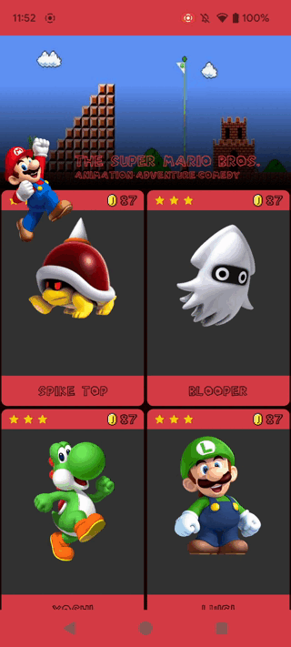
通过阅读本博客,您将学会使用Motion Layout实现这种精致的动画效果:
让我们从简单的介绍开始。
介绍
作为Android开发者,您可能会遇到需要布局动画的情况,有时甚至需要变形样式的布局动画。这就是Motion Layout的用武之地。
它填补了布局转换和复杂动作处理之间的空白,提供了一系列位于属性动画框架功能之间的功能。
虽然Motion Layout在XML视图中已经存在了一段时间,但在Jetpack Compose中还是相对较新,并且仍在不断发展。在这份全面的指南中,我们将探讨Jetpack Compose中的Motion Layout,并以折叠工具栏为例。
在使用Motion Layout之前,折叠工具栏在Android中一直是一个有趣的主题。相信您对如何使用旧的基于XML的视图系统实现折叠工具栏并附带复杂动画的情况已经很熟悉了。
我们将重点讨论如何使用Motion Layout在Jetpack Compose中实现这种复杂的折叠效果。
一些常见的动作术语
Motion Layout- 用于旧视图系统的MotionLayout API。Motion Compose- 用于Jetpack Compose的MotionLayout API。Motion Scene- 定义MotionLayout动画的各种约束集、过渡和关键帧的文件。ConstraintSet- 一组约束,用于为MotionLayout定义初始和最终布局状态以及任何中间状态。Transition- 在MotionLayout中的两个或多个Constraint Set之间发生的动画序列。KeyAttribute- 在MotionLayout转换期间可以对视图进行动画处理的属性,例如位置、大小或透明度值。
在本博客中,我们将学习如何将Motion Compose结合到Jetpack Compose中。
在Compose之前
首先,简单地说一下。在基于XML的视图系统中,我们使用AppBarLayout和CollapsingToolbarLayout创建折叠的应用栏/工具栏,同时将CoordinatorLayout作为父布局。
MotionLayout XML文件包含有关子视图的过渡和动画的信息。
在Compose中的使用
在Jetpack Compose中我们可以实现相同的效果,几乎一切都可以完全自定义和简单实现!
在这里,我们使用了一个名为MotionLayout的专用Composable函数。MotionLayout Composable作为父布局Composable的子元素添加,而子视图则直接作为MotionLayout Composable的直接子元素添加。
过渡和动画是使用MotionScene对象定义的,该对象是以Kotlin编程方式创建的。
为什么需要MotionLayout?
在压缩信息以便用户在浏览应用程序时不会感到不知所措时,视觉效果非常重要。
动画无缝地工作,无论是否有刘海屏、硬件导航等等。虽然您不需要MotionLayout来实现这一点,但它提供了一个简洁的解决方案,通过允许您约束视图的位置与布局对齐。
有时我们可能需要根据动画的关键帧来对多个组合进行动画处理,或者可能需要进行复杂的动画处理。这就是MotionLayout的优势所在,它通过定义ConstraintSets来简化整个过程,告诉动画在开始时布局/界面的外观如何,在结束时布局/界面的外观又如何,然后MotionLayout会在这些集合之间进行动画处理。
开始
本文档基于Compose Constraint Layout版本1.0.1。
在模块级build.gradle的dependencies部分中包含以下依赖项。
implementation "androidx.constraintlayout:constraintlayout-compose:1.0.1"
从逻辑上讲,我们需要使用constraint layout依赖项,因为MotionLayout是Constraint layout的子类。
让我们来看一下Compose版本,并探索它与传统MotionLayout方法的不同之处。
MotionLayout与MotionCompose的区别
MotionLayout与MotionCompose之间的第一个不同之处在于,MotionLayout允许开发者在XML中定义动画,而MotionCompose是随Jetpack Compose引入的新的动画库。它提供了一种声明式的方式来创建和控制Compose UI中的动画。
MotionCompose旨在提供与MotionLayout类似的控制和灵活性,但以更声明式和可组合的方式。
MotionCompose相比MotionLayout的优势:
- 更灵活
- 更易于使用
- 更简化的语法用于创建动画
- 更容易在运行时修改动画
- 支持创建高度响应和交互式的动画,有助于无缝创建引人入胜的用户体验。
总的来说,MotionLayout和MotionCompose都是在Android中处理动作和动画的强大工具。MotionLayout更适用于具有大量视图和约束的复杂动画,而MotionCompose更适用于以声明式和可组合的方式创建平滑流畅动画。但暂时我们将其称为MotionLayout以避免混淆。
重载
MotionLayout有不同类型的函数,具有不同的签名。某些函数接受MotionScene,而另一种对应的方法则可以直接将MotionScene字符串作为内容添加。
MotionLayout有一系列强大的属性,下表是一个重要的资源,可以帮助您解决选择正确方法时的困惑。

请记住,随着屏幕内容的增长,使用JSON5将会更易于理解和整洁。您可以根据您的用例查看下面所提供的重载选项。
Motion Signature — 1
@ExperimentalMotionApi
@Composable
fun MotionLayout(
    start: ConstraintSet,
    end: ConstraintSet,
    transition: androidx.constraintlayout.compose.Transition? = null,
    progress: Float,
    debug: EnumSet<MotionLayoutDebugFlags> = EnumSet.of(MotionLayoutDebugFlags.NONE),
    modifier: Modifier = Modifier,
    optimizationLevel: Int = Optimizer.OPTIMIZATION_STANDARD,
    crossinline content: @Composable MotionLayoutScope.() -> Unit
)
Motion Signature — 2
@ExperimentalMotionApi
@Composable
fun MotionLayout(
    motionScene: MotionScene,
    progress: Float,
    debug: EnumSet<MotionLayoutDebugFlags> = EnumSet.of(MotionLayoutDebugFlags.NONE),
    modifier: Modifier = Modifier,
    optimizationLevel: Int = Optimizer.OPTIMIZATION_STANDARD,
    crossinline content: @Composable (MotionLayoutScope.() -> Unit),
)
Motion Signature — 3
@ExperimentalMotionApi
@Composable
fun MotionLayout(
    motionScene: MotionScene,
    constraintSetName: String? = null,
    animationSpec: AnimationSpec<Float> = tween<Float>(),
    debug: EnumSet<MotionLayoutDebugFlags> = EnumSet.of(MotionLayoutDebugFlags.NONE),
    modifier: Modifier = Modifier,
    optimizationLevel: Int = Optimizer.OPTIMIZATION_STANDARD,
    noinline finishedAnimationListener: (() -> Unit)? = null,
    crossinline content: @Composable (MotionLayoutScope.() -> Unit)
)
Motion Signature — 4
@ExperimentalMotionApi
@Composable
fun MotionLayout(
    start: ConstraintSet,
    end: ConstraintSet,
    transition: androidx.constraintlayout.compose.Transition? = null,
    progress: Float,
    debug: EnumSet<MotionLayoutDebugFlags> = EnumSet.of(MotionLayoutDebugFlags.NONE),
    informationReceiver: LayoutInformationReceiver? = null,
    modifier: Modifier = Modifier,
    optimizationLevel: Int = Optimizer.OPTIMIZATION_STANDARD,
    crossinline content: @Composable MotionLayoutScope.() -> Unit
)
在MotionLayout中,有两个要进行动画处理的状态。一个是起始状态,另一个是结束状态。
Progress用于确定当前动画在起始状态和结束状态之间的进度:
- 0 表示当前进度在“开始”处。
- 1 表示进度已达到“结束”。
- 0.5 表示当前位于两者之间的中间状态,依此类推。
MotionLayout for Compose的实现约束集
可以通过以下两种方式定义:
- MotionScenes Inside MotionLayout.
- JSON5 approach.
这两种方法各有优缺点。
在MotionLayout中使用MotionScene的方法的描述
我们可以像这样添加一个MotionScene字符串作为内容:
MotionLayout(
            start = ConstraintSet {
                ...
            },
            end = ConstraintSet {
                ...
            },
            progress = progress,
            modifier = Modifier
        ) {
          ...
        }
采用这种方法的缺点是,随着内容的增长,可能会变得复杂难懂。
让我们看一个示例:
@Composable
fun MyMotionLayout() {
    val motionScene = remember { MotionScene() }

    MotionLayout(
        modifier = Modifier.fillMaxSize(),
        motionScene = motionScene
    ) {
        Box(
            modifier = Modifier
                .constrainAs(box) {
                    start.linkTo(parent.start)
                    top.linkTo(parent.top)
                    end.linkTo(parent.end)
                    bottom.linkTo(parent.bottom)
                }
        ) {
            // Add your UI elements here
        }
    }

    // Define the start and end constraint sets
    motionScene.constraints(
        createConstraints(
            R.id.box,
            start = ConstraintSet {
                // Define your start constraints here
            },
            end = ConstraintSet {
                // Define your end constraints here
            }
        )
    )

    // Define the motion animations
    motionScene.transition(
        createTransition(
            R.id.box,
            fromState = R.id.start,
            toState = R.id.end
        ) {
            // Define your motion animations here
        }
    )
}
JSON5方法
本博客主要关注此方法,并且您将在片刻后看到此方法的示例。
首先,创建一个JSON5文件,用于存放MotionScene,路径为res/raw/motion_scene.json5。
文件的结构可能类似于以下内容:
{
  ConstraintSets: {
    start: {
      ....
    },
    end: {
      ....
    }
  }
}
这里,start部分包含了动画的初始状态的所有约束,而end部分包含了最终状态的约束。
现在,我们需要将JSON5文件的内容整合到Compose文件中。
您可以使用openRawResource方法实例化位于raw文件夹中的JSON5文件。
将MotionScene对象与相应的可组合项进行关联,可以按照以下方式实现:
val context = LocalContext.current
val motionScene = remember {
    context.resources
        .openRawResource(R.raw.motion_scene)
        .readBytes()
        .decodeToString()
}

MotionLayout(
    motionScene = MotionScene(content = motionScene),
) { ... }

时间来理解MotionScene
MotionScene文件包含以下组件:
ConstraintSets(约束集):
ConstraintSets是MotionScene的构建块。它们定义了UI元素的布局和样式属性。- 一个
ConstraintSet包含一组约束,这些约束指定了每个UI元素的位置、大小、边距、内边距和其他布局属性。
Transitions(过渡):
- 过渡定义了两个
ConstraintSets之间的动画或过渡。它们指定了持续时间、缓动和其他动画属性。 - 一个过渡可以包含多个关键帧(
KeyFrame),用于定义动画或过渡的中间状态。 - 在接下来的部分中,我们将深入讨论在Transitions内部使用的属性。
KeyFrames(关键帧):
- 关键帧定义了过渡的中间状态。它们指定了动画或过渡中特定时间点上UI元素的属性。
- 一个关键帧可以包含一组
PropertySets,用于指定UI元素的属性。
PropertySets(属性集):
PropertySets指定关键帧中UI元素的属性。- 它们可以包含位置、大小、边距、内边距、背景颜色、文本颜色等属性。
让我们来看看过渡
将过渡视为根据需要包含任意数量的过渡的容器。
每个过渡都有一个名称。“default”名称是特殊的,它定义了初始过渡。
下面是一个过渡的示例。请查看Transitions块中使用的属性及其含义。
Transitions: {
    default: {
        from: 'start',
        to: 'end',
        pathMotionArc: 'startHorizontal',
        duration: 900
        staggered: 0.4,
        onSwipe: {
                anchor: 'box1',
                maxVelocity: 4.2,
                maxAccel: 3,
                direction: 'end',
                side: 'start',
                mode: 'velocity'
         }
        KeyFrames: {
        KeyPositions: [
            {
            target: ['a'],
            frames: [25, 50, 75],
            percentX: [0.4, 0.8, 0.1],
            percentY: [0.4, 0.8, 0.3]
            }
        ],
        KeyCycles: [
            {
                target: ['a'],
                frames: [0, 50, 100],
                period: [0 , 2 , 0],
                rotationX: [0, 45, 0],
                rotationY: [0, 45, 0],
            }
        ]
    }
}
以上是从ConstraintSet“start”到“end”的过渡路径。
现在来研究一下过渡术语
from— 指示起始点的ConstraintSet的ID。to— 指示结束点的ConstraintSet的ID。duration— 过渡所需的时间。pathMotionArc— 沿四分之一椭圆弧移动。staggered— 对象以交错方式移动,可以基于起始位置或stagger值进行调整。onSwipe— 启用拖动手势来控制过渡。KeyFrames(关键帧) — 修改过渡之间的点。
一些常用的过渡关键属性
- Alpha(透明度):
您可以在JSON5脚本中的“KeyAttributes”内逐帧应用透明度属性。
alpha: [0.3, 0.5, 0.9, 0.5, 0.3]
- Visibility(可见性):
您可以将此属性应用于我们在起始和结束ConstraintSets内定义为对象的子视图。
- Scale(缩放):
想要在图像移动时改变其缩放比例?这就是scaleX和scaleY属性发挥作用的地方。
scaleX — 水平缩放对象,例如图像。
scaleY — 垂直缩放对象。
您可以按照以下方式应用缩放属性,如下所示在KeyAttributes内:
scaleX: [1, 2, 2.5, 2, 1], scaleY: [1, 2, 2.5, 2, 1]
- Elevation(高度)
它提供了高度,这是不言自明的,对吧!
- Rotation(旋转):
rotationX— 沿X轴旋转/翻转/扭曲对象。rotationY— 沿Y轴旋转/翻转/扭曲对象。
- Translation(平移):
它允许您在不同的轴上控制视图的定位。
translationX— 用于水平定位。translationY— 用于垂直定位。translationZ— 过渡值被添加到其高度。
自定义属性
Compose提供了一系列自定义属性,可用于在UI中实现额外的定制。但是,需要注意的是这些属性需要手动提取和设置。
典型的自定义属性集合:
custom: {
    background: '#0000FF',
    textColor: '#FFFFFF',
    textSize: 12
}
简要了解如何使用自定义属性,以下是一个使用文本颜色的例子。
我们使用textColor属性来应用所需的颜色属性。
您可以直接将此属性应用于要进行所需更改的相应子视图。
只需在“#”后面加上十六进制颜色代码。例如:#DF1F2D
motion_text: {
        end: ['motion_divider', 'end'],
        top: ['motion_divider', 'bottom', 16],
        custom: {
          textColor: '#2B3784'
        }
      }
      ```
您可以按以下方式设置自定义属性:
```kt
var myCustomProperties = motionProperties(id = "motion_text")

Text(text = "Hello Mind Dots!", modifier = Modifier
    .layoutId(myCustomProperties.value.id())
    .background(myCustomProperties.value.color("background"))
    ,color = myCustomProperties.value.color("textColor")
    ,fontSize = myCustomProperties.value.fontSize("textSize")
)
调试动画路径
为了确保精确的动画,MotionLayout提供了一个调试功能,展示了所有组件涉及的动画路径。
要启用调试,我们只需要使用“debug”参数即可。
需要注意的是,默认情况下,debug值设置为
EnumSet.of(MotionLayoutDebugFlags.NONE)。
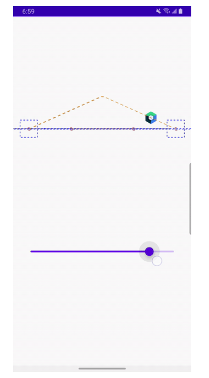
在这里,您可以看到路径用虚线表示。
这些虚线在处理复杂的动画时将非常有用,尤其是在寻求在具有不同大小和分辨率的设备上实现精度和一致性时。
现在是时候深入到代码部分了
- 让我们从定义
MotionScene文件开始。
{
  ConstraintSets: { //Two constraint sets - Start and End
    //1. Collapsed
    start: {
      collapsing_box: {
        width: 'parent',
        height: 200,
        start: ['parent', 'start'],
        end: ['parent', 'end'],
        bottom: ['parent', 'top', -50],
        translationZ: -10,
        alpha: 0
      },
      data_content: {
        top: ['collapsing_box', 'bottom'],
        bottom: ['parent', 'bottom'],
        start: ['parent', 'start'],
        end: ['parent', 'end']
      },
      content_img: {  // Assigned ID for profile pic, which we'll use in the code for the reference
        width: 90,
        height: 142,
        top: ['parent', 'top', 100], //top Constraint => [Constraining to what, where to, Margin value]
        start: ['parent', 'start', 16], //start Constraint
      },
      motion_text: {
        top: ['parent', 'top', 20],
        start: ['parent', 'start', 16],
        translationZ: -7
      },
      piranha_flower: {
        width: 40,
        height: 90,
        top: ['collapsing_box', 'bottom', -70],
        end: ['parent', 'end', 20],
        translationZ: -8
      },
      piranha_tunnel: {
        width: 60,
        height: 100,
        top: ['collapsing_box', 'bottom', -30],
        end: ['parent', 'end', 10],
        translationZ: -8
      }
    },
    //2. Expanded
    end: {
      collapsing_box: {  //Background
        width: 'parent',
        height: 200,
        start: ['parent', 'start'],
        end: ['parent', 'end'],
        top: ['parent', 'top'],
        translationZ: -10,
        alpha: 1
      },
      content_img: {
        width: 90,
        height: 142,
        top: ['data_content', 'top', -70],
        start: ['parent', 'start', 4],
      },
      data_content: {
        top: ['collapsing_box', 'bottom'],
        start: ['collapsing_box', 'start'],
        end: ['collapsing_box', 'end']
      },
      motion_text: {
        bottom: ['collapsing_box', 'bottom', 10],
        start: ['content_img', 'end', 2]
      },
      piranha_flower: {
        width: 40,
        height: 90,
        top: ['collapsing_box', 'bottom', 80],
        end: ['parent', 'end', 20],
        translationZ: -10
      },
      piranha_tunnel: {
        width: 60,
        height: 100,
        top: ['collapsing_box', 'bottom', -20],
        end: ['parent', 'end', 10],
        translationZ: -10
      }
    }
  },
  Transitions: {  //to set transition properties between Start and End point.
    default: {
      from: 'start',
      to: 'end',
      pathMotionArc: 'startHorizontal', // Text will move down with slight circular arc
      KeyFrames: {
        KeyAttributes: [  //We define different Attr and how we want this to Animate, during transition for a specific composable
          {
            target: ['content_img'],
            //[collapsed -> expanded]
            frames: [0, 5, 10, 15, 20, 25, 30, 35, 40, 45, 50, 55, 60, 65, 70, 75, 80, 85, 90, 95, 100], //For frames we pass a List containing number between 0 - 100
            rotationZ: [0, 9, 18, 27, 36, 45, 54, 63, 72, 81, 90, 81, 72, 63, 54, 45, 36, 27, 18, 9, 0],  //For dangling effect
            translationX: [0, 9, 18, 27, 36, 45, 54, 63, 72, 81, 90, 81, 72, 63, 54, 45, 36, 27, 18, 9, 0],
            translationY: [0, -14, -28, -42, -56, -70, -84, -98, -112, -126, -130, -126, -112, -98, -84, -70, -56, -42, -28, -14, 0],
            translationZ: [-1.0, -0.9, -0.8, -0.7, -0.6, -0.5, -0.4, -0.3, -0.2, -0.1, 0.0, 0.0, 0.1, 0.1, 0.1, 0.1, 0.1, 0.1, 0.1, 0.1, 0.1]
          },
          {
            target: ['data_content'],
            frames: [0, 5, 10, 15, 20, 25, 30, 35, 40, 45, 50, 55, 60, 65, 70, 75, 80, 85, 90, 95, 100],  //For frames we pass a List containing number between 0 - 100
            translationY: [110, 98, 92, 87, 80, 75, 70, 65, 60, 55, 50, 45, 40, 35, 30, 25, 20, 15, 10, 5, 2]
          }
        ]
      }
    }
  }
}
- 现在我们使用了 Scaffold 来实现折叠功能。为此,我们需要一个文件来表示顶部栏,另一个文件来表示其余内容。
@Composable
fun MainScreenContent() {
    val marioToolbarHeightRange = with(LocalDensity.current) {
        MinToolbarHeight.roundToPx()..MaxToolbarHeight.roundToPx()
    }
    val toolbarState = rememberSaveable(saver = MiExitUntilCollapsedState.Saver) {
        MiExitUntilCollapsedState(marioToolbarHeightRange)
    }
    val scrollState = rememberScrollState()
    toolbarState.scrollValue = scrollState.value

    Scaffold(
        modifier = Modifier
            .fillMaxSize(),
        content = {
            MarioMotionHandler(
                list = populateList(),
                columns = 2,
                modifier = Modifier.fillMaxSize(),
                scrollState = scrollState,
                progress = toolbarState.progress
            )
        })
}
- 最后,将列表项内容与折叠动画组件一起添加。在这里,我们将使用 MotionScene 文件。
@Composable
fun MarioMotionHandler(
    list: List<MiItem>,
    columns: Int,
    modifier: Modifier = Modifier,
    scrollState: ScrollState = rememberScrollState(),
    contentPadding: PaddingValues = PaddingValues(0.dp),
    progress: Float
) {
    val context = LocalContext.current
    val chunkedList = remember(list, columns) {
        list.chunked(columns)
    }
    // To include raw file, the JSON5 script file
    val motionScene = remember {
        context.resources.openRawResource(R.raw.motion_scene_mario)
            .readBytes()
            .decodeToString()   //readBytes -> cuz we want motionScene in a String format
    }

    MotionLayout(
        motionScene = MotionScene(content = motionScene),
        progress = progress,
        modifier = Modifier
            .fillMaxSize()
            .background(MarioRedLight)
    ) {

        /**
         * bg - image
         **/
        Image(
            painter = painterResource(id = R.drawable.ic_mario_level),
            contentDescription = "Toolbar Image",
            contentScale = ContentScale.FillBounds,
            modifier = Modifier
                .layoutId("collapsing_box")
                .fillMaxWidth()
                .drawWithCache {
                    val gradient = Brush.verticalGradient(
                        colors = listOf(Color.Transparent, Color.Black),
                        startY = size.height / 3,
                        endY = size.height
                    )
                    onDrawWithContent {
                        drawContent()
                        drawRect(gradient, blendMode = BlendMode.Multiply)
                    }
                },
            alignment = BiasAlignment(0f, 1f - ((1f - progress) * 0.50f)),
        )

        /**
         * Text - Collapsing
         */
        Text(
            text = stringResource(id = R.string.collapsing_text_minion),
            color = MarioRedDark,
            modifier = Modifier
                .layoutId("motion_text")
                .zIndex(1f),
            fontFamily = FontFamily(
                Font(R.font.super_mario_bros, FontWeight.Light)
            ),
            fontSize = 14.sp
        )

        /**
         * Main image
         **/
        Image(
            painter = painterResource(id = R.drawable.ic_mario_reversed),
            contentScale = ContentScale.Fit,
            modifier = Modifier
                .layoutId("content_img")
                .clip(RoundedCornerShape(5.dp)),
            contentDescription = "Animating Mario Image"
        )

        /**
         * Grid
         **/
        Column(
            modifier = modifier
                .verticalScroll(scrollState)
                .layoutId("data_content")
                .background(MarioRedLight),
        ) {
            Spacer(
                modifier = Modifier
                    .fillMaxWidth()
                    .height(contentPadding.calculateTopPadding())
            )

            chunkedList.forEach { chunk ->
                Row(
                    modifier = Modifier
                        .fillMaxWidth()
                        .wrapContentHeight()
                ) {

                    Spacer(
                        modifier = Modifier
                            .fillMaxHeight()
                            .width(contentPadding.calculateStartPadding(LocalLayoutDirection.current))
                    )

                    chunk.forEach { listItem ->
                        GridCharacterCard(
                            miItem = listItem,
                            modifier = Modifier
                                .padding(2.dp)
                                .weight(1f)
                        )
                    }

                    val emptyCells = columns - chunk.size
                    if (emptyCells > 0) {
                        Spacer(modifier = Modifier.weight(emptyCells.toFloat()))
                    }

                    Spacer(
                        modifier = Modifier
                            .fillMaxHeight()
                            .width(contentPadding.calculateEndPadding(LocalLayoutDirection.current))
                    )
                }
            }

            Spacer(
                modifier = Modifier
                    .fillMaxWidth()
                    .height(140.dp)
            )
        }

        /**
         * piranha flower
         **/
        Image(
            painter = painterResource(id = R.drawable.ic_piranha_flower),
            contentScale = ContentScale.Fit,
            modifier = Modifier
                .layoutId("piranha_flower"),
            contentDescription = "Piranha Flower"
        )

        /**
         * piranha tunnel
         **/
        Image(
            painter = painterResource(id = R.drawable.ic_piranha_tunnel),
            contentScale = ContentScale.Fit,
            modifier = Modifier
                .layoutId("piranha_tunnel"),
            contentDescription = "Piranha Tunnel"
        )
    }
}
网格列表实现如下:
@Composable
fun GridCharacterCard(
    miItem: MiItem,
    modifier: Modifier = Modifier
) {
    Card(
        modifier = modifier.aspectRatio(0.66f),
        shape = RoundedCornerShape(8.dp)
    ) {
        Box(
            modifier = Modifier
                .fillMaxSize()
                .background(Gray245)
        ) {
            miItem.itemImage?.let { painterResource(it) }?.let {
                Image(
                    painter = it,
                    contentDescription = miItem.itemDescription,
                    contentScale = ContentScale.FillWidth,
                    modifier = Modifier
                        .padding(35.dp)
                        .fillMaxWidth()
                )
            }
            TopBar()
            miItem.itemName?.let { BottomBar(it) }
        }
    }
}

@Composable
private fun BoxScope.TopBar() {
    Box(
        modifier = Modifier
            .fillMaxWidth()
            .fillMaxHeight(0.093f)
            .background(MarioRedDark)
            .padding(horizontal = 8.dp, vertical = 2.dp)
            .align(Alignment.TopCenter)
    ) {
        Row(
            modifier = Modifier
                .fillMaxHeight(0.75f)
                .wrapContentWidth()
                .align(Alignment.CenterStart),
            horizontalArrangement = Arrangement.spacedBy(2.dp),
            verticalAlignment = Alignment.CenterVertically
        ) {
            Icon(
                imageVector = Icons.Rounded.Star,
                contentDescription = "Golden star 1",
                tint = GoldYellow
            )
            Icon(
                imageVector = Icons.Rounded.Star,
                contentDescription = "Golden star 2",
                tint = GoldYellow
            )
            Icon(
                imageVector = Icons.Rounded.Star,
                contentDescription = "Golden star 3",
                tint = GoldYellow
            )
        }

        Row(
            modifier = Modifier
                .fillMaxHeight(0.75f)
                .wrapContentWidth()
                .align(Alignment.CenterEnd),
            horizontalArrangement = Arrangement.spacedBy(2.dp),
            verticalAlignment = Alignment.CenterVertically
        ) {
            Image(
                painter = painterResource(id = R.drawable.ic_coin),
                contentScale = ContentScale.Fit,
                modifier = Modifier
                    .clip(RoundedCornerShape(5.dp)),
                contentDescription = "Coin"
            )
            Text(
                text = "87",
                color = Color.Black,
                modifier = Modifier,
                fontFamily = FontFamily(
                    Font(R.font.super_mario_bros, FontWeight.Normal)
                ),
            )
        }
    }
}

@Composable
private fun BoxScope.BottomBar(text: String) {
    Box(
        modifier = Modifier
            .fillMaxWidth()
            .fillMaxHeight(0.14f)
            .background(MarioRedDark)
            .align(Alignment.BottomCenter)
    ) {
        Text(
            text = text,
            textAlign = TextAlign.Center,
            maxLines = 1,
            overflow = TextOverflow.Ellipsis,
            modifier = Modifier
                .fillMaxWidth()
                .align(Alignment.Center),
            fontFamily = FontFamily(
                Font(R.font.super_mario_bros, FontWeight.Normal)
            )
        )
    }
}
代码分析完成,看看最终效果

结论
到此为止,希望这篇博客能激发你对使用 Jetpack Compose 中的 MotionLayout 的无限可能性的探索。继续尝试并推动这个强大框架的边界。你可以从Github访问源代码。
GitHub
https://github.com/Mindinventory/MarioInMotion
