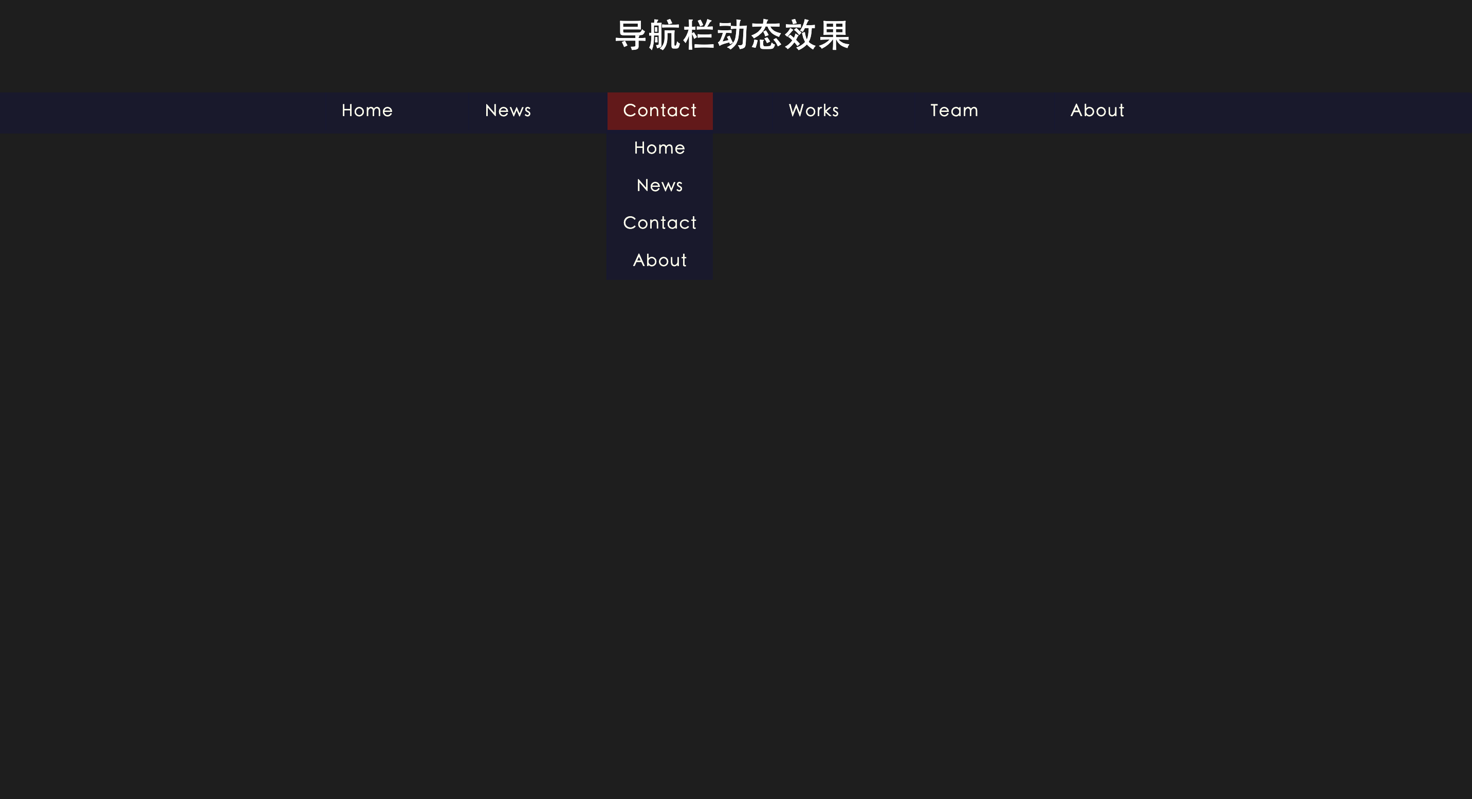
效果如下:
<!DOCTYPE html>
<html lang="en" >
<head>
  <meta charset="UTF-8">
  <title>导航栏动态效果</title>
  <link rel="stylesheet" href="./style/style.css">
</head>
<body>
  <h1>导航栏动态效果</h1>
<nav>
  <ul class="main">
    <li>
      <a href="#">Home</a>
      <ul class="drop menu1">
        <li><a href="#">Home</a></li>
        <li><a href="#">news</a></li>
        <li><a href="#">contact</a></li>
        <li><a href="#">about</a></li>
      </ul>
    </li>
    <li><a href="#">news</a>
      <ul class="drop menu2">
        <li><a href="#">Home</a></li>
        <li><a href="#">news</a></li>
        <li><a href="#">contact</a></li>
        <li><a href="#">about</a></li>
      </ul>
    </li>
    <li><a href="#">contact</a>
      <ul class="drop menu3">
        <li><a href="#">Home</a></li>
        <li><a href="#">news</a></li>
        <li><a href="#">contact</a></li>
        <li><a href="#">about</a></li>
      </ul>
    </li>
    <li><a href="#">works</a>
      <ul class="drop menu4">
        <li><a href="#">Home</a></li>
        <li><a href="#">news</a></li>
        <li><a href="#">contact</a></li>
        <li><a href="#">about</a></li>
      </ul>
    </li>
    <li><a href="#">team</a>
      <ul class="drop menu5">
        <li><a href="#">Home</a></li>
        <li><a href="#">news</a></li>
        <li><a href="#">contact</a></li>
        <li><a href="#">about</a></li>
      </ul>
    </li>
    <li><a href="#">about</a>
      <ul class="drop menu6">
        <li><a href="#">Home</a></li>
        <li><a href="#">news</a></li>
        <li><a href="#">contact</a></li>
        <li><a href="#">about</a></li>
      </ul>
    </li>
  </ul>
</nav>
</body>

</html>
* {
    margin: 0;
    padding: 0;
    box-sizing: border-box;
}

body {
    background-color: #1e1e1e;
    background-size: cover;
    height: 100vh;
    font-family: "Raleway", sans-serif;
    letter-spacing: 1px;
}

h1 {
    text-align: center;
    color: #fff;
    padding-top: 20px;
}

ul {
    list-style: none;
}

nav {
    height: 40px;
    margin: 40px auto;
    background-color: rgba(23, 23, 50, 0.7);
    text-align: center;
    border-radius: 4px;
}

.main {
    display: flex;
    justify-content: center;
}

.main>li {
    margin: 0 2%;
}

.main>li a {
    border-left: 1px solid rgba(23, 23, 50, 1);
}

a {
    text-decoration: none;
    color: #ffe;
    text-transform: capitalize;
    font-family: monospace;
    display: block;
    padding: 10px 15px;
    font-size: 16px;
    transition: background-color 0.5s ease-in-out;
    font-family: "Raleway", sans-serif;
}

a:hover {
    background-color: #631818;
}

.drop li {
    opacity: 0;
    transform-origin: top center;
}

.drop li a {
    background-color: rgba(23, 23, 50, 0.7);
    padding: 10px 0;
}


/*------------- menu1 animation -------------------*/

.main li:hover .menu1 li:first-of-type {
    animation: menu1 0.3s ease-in-out forwards;
    animation-delay: 0.3s;
}

.main li:hover .menu1 li:nth-of-type(2) {
    animation: menu1 0.3s ease-in-out forwards;
    animation-delay: 0.6s;
}

.main li:hover .menu1 li:nth-of-type(3) {
    animation: menu1 0.3s ease-in-out forwards;
    animation-delay: 0.9s;
}

.main li:hover .menu1 li:last-of-type {
    animation: menu1 0.3s ease-in-out forwards;
    animation-delay: 1.2s;
}

@keyframes menu1 {
    from {
        opacity: 0;
        transform: translateX(30px) rotateY(90deg);
    }
    to {
        opacity: 1;
        transform: translateX(0) rotateY(0);
    }
}


/*------------- menu2 animation -------------------*/

.main li:hover .menu2 li:first-of-type {
    animation: menu2 0.3s ease-in-out forwards;
    animation-delay: 0.3s;
}

.main li:hover .menu2 li:nth-of-type(2) {
    animation: menu2 0.3s ease-in-out forwards;
    animation-delay: 0.6s;
}

.main li:hover .menu2 li:nth-of-type(3) {
    animation: menu2 0.3s ease-in-out forwards;
    animation-delay: 0.9s;
}

.main li:hover .menu2 li:last-of-type {
    animation: menu2 0.3s ease-in-out forwards;
    animation-delay: 1.2s;
}

@keyframes menu2 {
    0% {
        opacity: 0;
        transform: scale(0.7);
    }
    50% {
        opacity: 0.5;
        transform: scale(1.1);
    }
    100% {
        opacity: 1;
        transform: scale(1);
    }
}


/*------------- menu3 animation -------------------*/

.main li:hover .menu3 li:first-of-type {
    animation: menu3 0.3s ease-in-out forwards;
    animation-delay: 0.3s;
}

.main li:hover .menu3 li:nth-of-type(2) {
    animation: menu3 0.3s ease-in-out forwards;
    animation-delay: 0.6s;
}

.main li:hover .menu3 li:nth-of-type(3) {
    animation: menu3 0.3s ease-in-out forwards;
    animation-delay: 0.9s;
}

.main li:hover .menu3 li:last-of-type {
    animation: menu3 0.3s ease-in-out forwards;
    animation-delay: 1.2s;
}

@keyframes menu3 {
    0% {
        opacity: 0;
        transform: translateX(20px);
    }
    100% {
        opacity: 1;
        transform: translateX(0);
    }
}


/*------------- menu4 animation -------------------*/

.main li:hover .menu4 li:first-of-type {
    animation: menu4 0.3s ease-in-out forwards;
    animation-delay: 0.3s;
}

.main li:hover .menu4 li:nth-of-type(2) {
    animation: menu4 0.3s ease-in-out forwards;
    animation-delay: 0.6s;
}

.main li:hover .menu4 li:nth-of-type(3) {
    animation: menu4 0.3s ease-in-out forwards;
    animation-delay: 0.9s;
}

.main li:hover .menu4 li:last-of-type {
    animation: menu4 0.3s ease-in-out forwards;
    animation-delay: 1.2s;
}

@keyframes menu4 {
    0% {
        opacity: 0;
        transform: translateX(50px) rotate(-90deg);
    }
    100% {
        opacity: 1;
        transform: translateX(0) rotate(0);
    }
}


/*------------- menu5 animation -------------------*/

.main li:hover .menu5 li:first-of-type {
    animation: menu5 0.3s ease-in-out forwards;
    animation-delay: 0.3s;
}

.main li:hover .menu5 li:nth-of-type(2) {
    animation: menu5 0.3s ease-in-out forwards;
    animation-delay: 0.6s;
}

.main li:hover .menu5 li:nth-of-type(3) {
    animation: menu5 0.3s ease-in-out forwards;
    animation-delay: 0.9s;
}

.main li:hover .menu5 li:last-of-type {
    animation: menu5 0.3s ease-in-out forwards;
    animation-delay: 1.2s;
}

@keyframes menu5 {
    0% {
        opacity: 0;
        transform: rotateX(-90deg);
    }
    100% {
        opacity: 1;
        transform: rotateX(0);
    }
}


/*------------- menu6 animation -------------------*/

.main li:hover .menu6 li:first-of-type {
    animation: menu6 0.3s ease-in-out forwards;
    animation-delay: 0.2s;
}

.main li:hover .menu6 li:nth-of-type(2) {
    animation: menu6 0.3s ease-in-out forwards;
    animation-delay: 0.4s;
}

.main li:hover .menu6 li:nth-of-type(3) {
    animation: menu6 0.3s ease-in-out forwards;
    animation-delay: 0.6s;
}

.main li:hover .menu6 li:last-of-type {
    animation: menu6 0.3s ease-in-out forwards;
    animation-delay: 0.8s;
}

@keyframes menu6 {
    0% {
        opacity: 0;
        transform: scale(3);
    }
    100% {
        opacity: 1;
        transform: scale(1);
    }
}


/* my button style */

.white-mode {
    text-decoration: none;
    padding: 7px 10px;
    background-color: #122;
    border-radius: 3px;
    color: #fff;
    transition: 0.35s ease-in-out;
    position: absolute;
    left: 15px;
    bottom: 15px;
    font-family: sans-serif;
}

.white-mode:hover {
    background-color: #fff;
    color: #122;
}