- 文章信息 - Author: Jack Lee (jcLee95)
Visit me at: https://jclee95.blog.csdn.net
Email: 291148484@163.com.
Shenzhen Chine
Address of this article:https://blog.csdn.net/qq_28550263/article/details/131387856
【介绍】:本文介绍 Flutter 按钮类组件。
目 录
1 凸起按钮:RaisedButton组件- 1.1 创建RaisedButton组件
- 1.2 设置RaisedButton样式
- 1.3 设置RaisedButton形状
- 1.4 设置RaisedButton点击事件
- 1.5 禁用RaisedButton组件
- 1.6 小结
- 1.7 已弃用:推荐使用 TextButton 替代。
2 扁平按钮:FlatButton组件- 2.1 创建FlatButton
- 2.2 常用属性
- 2.3 示例
- 2.4 已弃用:推荐使用 ElevatedButton 替代。
3. 轮廓按钮:OutlineButton组件- 4. 图标按钮:IconButton组件
- 5. 浮动操作按钮:FloatingActionButton组件
- 6. 弹出菜单按钮:PopupMenuButton组件
- 7. iOS样式按钮:CupertinoButton组件
- 8. 文本按钮:TextButton组件 (没有轮廓或填充颜色的按钮)
- 9. 提升按钮:ElevatedButton组件
- 10. 轮廓按钮:OutlinedButton组件
- 11. 填充按钮:FilledButton组件
RaisedButton组件是Flutter中的一个基本按钮组件,它具有凸起的立体效果。我们可以使用它来创建具有点击事件的按钮。
1.1 创建RaisedButton组件
要在Flutter中创建一个RaisedButton组件,我们可以使用RaisedButton构造函数。例如:
RaisedButton(
  onPressed: () {
    // 点击事件处理
  },
  child: Text('点击我'),
)
1.2 设置RaisedButton样式
我们可以使用color、textColor等属性为RaisedButton组件设置样式。以下是一个示例:
RaisedButton(
  onPressed: () {
    // 点击事件处理
  },
  child: Text('点击我'),
  color: Colors.blue,
  textColor: Colors.white,
)
1.3 设置RaisedButton形状
我们可以使用shape属性为RaisedButton组件设置形状。为此,我们需要创建一个ShapeBorder对象并传递给shape属性。以下是一个示例:
RaisedButton(
  onPressed: () {
    // 点击事件处理
  },
  child: Text('点击我'),
  color: Colors.blue,
  textColor: Colors.white,
  shape: RoundedRectangleBorder(
    borderRadius: BorderRadius.circular(10),
  ),
)
1.4 设置RaisedButton点击事件
我们可以使用onPressed属性为RaisedButton组件设置点击事件。以下是一个示例:
RaisedButton(
  onPressed: () {
    // 点击事件处理
    print('按钮被点击');
  },
  child: Text('点击我'),
  color: Colors.blue,
  textColor: Colors.white,
)
1.5 禁用RaisedButton组件
要禁用RaisedButton组件,我们可以将onPressed属性设置为null。禁用状态下的按钮不会响应点击事件。以下是一个示例:
RaisedButton(
  onPressed: null,
  child: Text('禁用按钮'),
  color: Colors.blue,
  textColor: Colors.white,
)
1.6 小结
RaisedButton组件是Flutter中一个常用的按钮组件,具有凸起的立体效果。我们可以通过设置不同的属性,如样式、形状、点击事件等,轻松地自定义按钮的显示方式和功能。在接下来的章节中,我们将学习其他基本组件,如FlatButton和IconButton组件。
1.7 已弃用:推荐使用 TextButton 替代。
根据文档,FlatButton、RaisedButton 和 OutlineButton 已经分别被 TextButton、ElevatedButton 和 OutlinedButton 取代。ButtonTheme 也已经被 TextButtonTheme、ElevatedButtonTheme 和 OutlinedButtonTheme 取代。请参考:https://docs.flutter.dev/release/breaking-changes/buttons
FlatButton是Flutter中的一个按钮类组件,它是一个无立体感的按钮,通常用于较为不突出的操作。在用户与其交互时,FlatButton会显示一些视觉效果,如水波纹。接下来,我们将介绍FlatButton组件的基本使用方法和属性。
2.1 创建FlatButton
要创建一个FlatButton,我们可以使用FlatButton构造函数。以下是一个简单的示例:
FlatButton(
  onPressed: () {
    // 在这里处理按钮点击事件
  },
  child: Text('点击我'),
)
2.2 常用属性
FlatButton具有许多可定制的属性,以下是一些常用的属性:
onPressed: 这是一个回调函数,当用户点击按钮时会触发此函数。如果此属性为null,按钮将被禁用。child: 此属性定义了按钮内部的内容,通常是一个Text或Icon组件。color: 设置按钮的背景颜色。disabledColor: 设置禁用状态下按钮的背景颜色。highlightColor: 设置按钮按下时的高亮颜色。splashColor: 设置按钮点击时水波纹的颜色。textColor: 设置按钮内文本的颜色。padding: 设置按钮内的填充。
2.3 示例
下面是一个使用FlatButton的简单示例:
FlatButton(
  onPressed: () {
    // 在这里处理按钮点击事件
    print('FlatButton被点击了');
  },
  child: Text('点击我'),
  color: Colors.blue,
  textColor: Colors.white,
  padding: EdgeInsets.all(16.0),
)
在这个示例中,我们创建了一个带有蓝色背景和白色文本的FlatButton。当用户点击按钮时,控制台将输出“FlatButton被点击了”。
2.4 已弃用:推荐使用 ElevatedButton 替代。
根据文档,FlatButton、RaisedButton 和 OutlineButton 已经分别被 TextButton、ElevatedButton 和 OutlinedButton 取代。ButtonTheme 也已经被 TextButtonTheme、ElevatedButtonTheme 和 OutlinedButtonTheme 取代。请参考:https://docs.flutter.dev/release/breaking-changes/buttons
在本节中,我们将介绍Flutter中的OutlineButton组件,包括创建OutlineButton、设置OutlineButton样式、设置OutlineButton形状、设置OutlineButton点击事件以及禁用OutlineButton组件等内容。
3.1 创建OutlineButton组件要创建一个OutlineButton,我们可以使用OutlineButton构造函数。以下是一个简单的示例:
OutlineButton(
  onPressed: () {
    // 在这里处理按钮点击事件
  },
  child: Text('点击我'),
)
OutlineButton具有许多可定制的属性,以下是一些常用的属性:
borderSide: 设置按钮边框的样式。highlightedBorderColor: 设置按钮按下时边框的颜色。disabledBorderColor: 设置禁用状态下按钮边框的颜色。splashColor: 设置按钮点击时水波纹的颜色。textColor: 设置按钮内文本的颜色。padding: 设置按钮内的填充。
我们可以通过shape属性设置OutlineButton的形状。例如,我们可以设置按钮的圆角程度:
OutlineButton(
  onPressed: () {
    // 在这里处理按钮点击事件
  },
  child: Text('点击我'),
  shape: RoundedRectangleBorder(
    borderRadius: BorderRadius.circular(10.0),
  ),
)
要设置OutlineButton的点击事件,我们需要为onPressed属性提供一个回调函数。当用户点击按钮时,这个回调函数将被触发。
OutlineButton(
  onPressed: () {
    // 在这里处理按钮点击事件
    print('OutlineButton被点击了');
  },
  child: Text('点击我'),
)
如果我们想要禁用OutlineButton组件,只需要将onPressed属性设置为null即可。
OutlineButton(
  onPressed: null,
  child: Text('我是禁用的按钮'),
)
在本节中,我们介绍了OutlineButton组件的基本用法和一些常用属性。通过使用OutlineButton,我们可以轻松地为Flutter应用程序添加带有边框的按钮。
3.7 已弃用:推荐使用 OutlinedButton 替代根据文档,FlatButton、RaisedButton 和 OutlineButton 已经分别被 TextButton、ElevatedButton 和 OutlinedButton 取代。ButtonTheme 也已经被 TextButtonTheme、ElevatedButtonTheme 和 OutlinedButtonTheme 取代。请参考:https://docs.flutter.dev/release/breaking-changes/buttons
4. 图标按钮:IconButton组件官方文档位置:https://api.flutter.dev/flutter/material/IconButton-class.html
在本节中,我们将介绍Flutter中的IconButton组件,包括创建IconButton、设置IconButton样式、设置IconButton点击事件以及禁用IconButton组件等内容。
4.1 创建IconButton组件要创建一个IconButton,我们可以使用IconButton构造函数。
例如:
import 'package:flutter/material.dart';
void main() {
runApp(MyApp());
}
class MyApp extends StatelessWidget {
Widget build(BuildContext context) {
return MaterialApp(
home: Scaffold(
appBar: AppBar(title: Text('IconButton Example')),
body: Center(
child: IconButton(
icon: Icon(Icons.favorite),
// 在这里处理按钮点击事件
onPressed: () {
print('IconButton pressed!');
},
color: Colors.red,
iconSize: 48,
tooltip: 'Add to favorites',
),
),
),
);
}
}
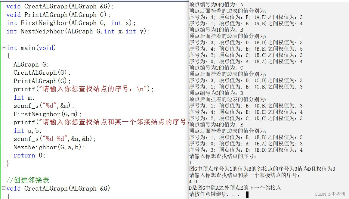
在这个示例中,我们创建了一个 IconButton 组件。
其中 icon 属性设置为一个爱心图标,这里使用的图标是谷歌在Flutter内置图标,Icon是图标类,可以参考博文《flutter中使用图标(含自制图标库方案)》,地址为:https://jclee95.blog.csdn.net/article/details/123309530。
代码中,我们设置了onPressed属性,当图标按钮被点击时,会在控制台打印“IconButton pressed!”。图标的颜色为红色,大小为48。通过tooltip属性,我们设置了一个提示信息“Add to favorites”,当用户长按图标时,会显示这个提示信息。
点击后可在控制台看见:
IconButton具有许多可定制的属性,以下是一些常用的属性:
color: 设置图标的颜色。highlightColor: 设置按钮按下时的高亮颜色。splashColor: 设置按钮点击时水波纹的颜色。iconSize: 设置图标的大小。
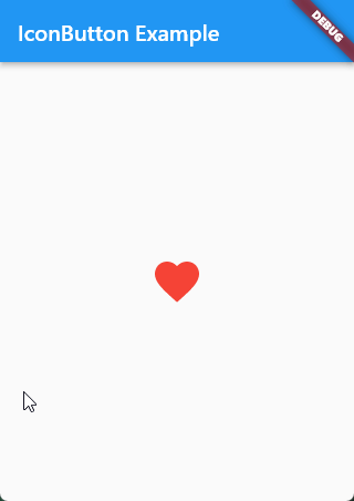
要设置IconButton的点击事件,我们需要为onPressed属性提供一个回调函数。当用户点击按钮时,这个回调函数将被触发。
IconButton(
  onPressed: () {
    // 在这里处理按钮点击事件
    print('IconButton被点击了');
  },
  icon: Icon(Icons.favorite),
)
如果我们想要禁用IconButton组件,只需要将onPressed属性设置为null即可。
IconButton(
  onPressed: null,
  icon: Icon(Icons.favorite),
)
在本节中,我们介绍了IconButton组件的基本用法和一些常用属性。通过使用IconButton,我们可以轻松地为Flutter应用程序添加图标按钮。
5. 浮动操作按钮:FloatingActionButton组件官方文档位置:https://api.flutter.dev/flutter/material/FloatingActionButton-class.html
在本节中,我们将介绍Flutter中的FloatingActionButton组件,包括创建FloatingActionButton、设置FloatingActionButton样式、设置FloatingActionButton点击事件以及禁用FloatingActionButton组件等内容。
5.1 创建FloatingActionButton组件要创建一个FloatingActionButton,我们可以使用FloatingActionButton构造函数。
例如:
import 'package:flutter/material.dart';
void main() {
runApp(MyApp());
}
class MyApp extends StatelessWidget {
Widget build(BuildContext context) {
return MaterialApp(
home: Scaffold(
appBar: AppBar(title: Text('FloatingActionButton Example')),
body: Center(
child: Text('Floating Action Button Example'),
),
floatingActionButton: FloatingActionButton(
onPressed: () {
print('FloatingActionButton pressed!');
},
child: Icon(Icons.add),
backgroundColor: Colors.blue,
tooltip: 'Add new item',
),
),
);
}
}
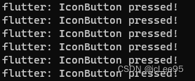
在这个示例中,我们创建了一个 FloatingActionButton 按钮,并设置了其 onPressed 属性,当按钮被点击时,会在控制台打印“FloatingActionButton pressed!”。
按钮的子组件为一个加号图标。按钮的背景颜色为蓝色。
通过 tooltip 属性,我们设置了一个提示信息“Add new item”,当用户长按按钮时,会显示这个提示信息。FloatingActionButton 被添加到了 Scaffold 的 floatingActionButton 属性中,使其在屏幕右下角浮动显示。
FloatingActionButton具有许多可定制的属性,以下是一些常用的样式属性:
backgroundColor: 设置按钮的背景颜色。foregroundColor: 设置按钮内图标的颜色。splashColor: 设置按钮点击时水波纹的颜色。elevation: 设置按钮的阴影大小。shape: 设置按钮的形状。
要设置FloatingActionButton的点击事件,我们需要为onPressed属性提供一个回调函数。当用户点击按钮时,这个回调函数将被触发。
FloatingActionButton(
  onPressed: () {
    // 在这里处理按钮点击事件
    print('FloatingActionButton被点击了');
  },
  child: Icon(Icons.add),
)
如果我们想要禁用FloatingActionButton组件,只需要将onPressed属性设置为null即可。
FloatingActionButton(
  onPressed: null,
  child: Icon(Icons.add),
)
在本节中,我们介绍了FloatingActionButton组件的基本用法和一些常用属性。通过使用FloatingActionButton,我们可以轻松地为Flutter应用程序添加浮动操作按钮,通常用于执行应用程序中的主要操作。
6. 弹出菜单按钮:PopupMenuButton组件官方文档位置:https://api.flutter.dev/flutter/material/PopupMenuButton-class.html
在本节中,我们将介绍Flutter中的PopupMenuButton组件,包括创建PopupMenuButton、设置PopupMenuButton样式、设置PopupMenuButton点击事件以及自定义PopupMenuButton菜单项等内容。
6.1 创建PopupMenuButton组件要创建一个PopupMenuButton,我们可以使用PopupMenuButton构造函数。
例如:
import 'package:flutter/material.dart';
void main() {
runApp(MyApp());
}
class MyApp extends StatelessWidget {
Widget build(BuildContext context) {
return MaterialApp(
home: Scaffold(
appBar: AppBar(title: Text('PopupMenuButton Example')),
body: Center(
child: PopupMenuButton<String>(
itemBuilder: (BuildContext context) {
return {'Option 1', 'Option 2', 'Option 3'}
.map((String choice) {
return PopupMenuItem<String>(
value: choice,
child: Text(choice),
);
}).toList();
},
onSelected: (String value) {
print('Selected: $value');
},
icon: Icon(Icons.more_vert),
tooltip: 'Show menu',
),
),
),
);
}
}
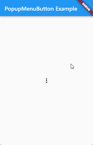
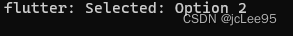
在这个示例中,我们创建了一个 PopupMenuButton组件。itemBuilder 属性用于构建弹出菜单的选项,我们在这里创建了3个选项,分别为“Option 1”,“Option 2”和“Option 3”。由于设置了 onSelected 属性,当用户选择一个选项时,会在控制台打印“Selected: ”和选项的值。设置了 icon 属性为一个垂直三点图标。通过 tooltip 属性,我们设置了一个提示信息“Show menu”,当用户长按按钮时,会显示这个提示信息。如图所示:
可以在控制台上看到打印结果:
PopupMenuButton具有许多可定制的属性,以下是一些常用的属性:
icon: 设置按钮的图标。color: 设置按钮的颜色。shape: 设置按钮的形状。elevation: 设置按钮的阴影大小。
要设置PopupMenuButton的点击事件,我们需要为onSelected属性提供一个回调函数。当用户点击某个菜单项时,这个回调函数将被触发。
PopupMenuButton(
  itemBuilder: (BuildContext context) {
    return [
      PopupMenuItem(
        value: 'item1',
        child: Text('菜单项1'),
      ),
      PopupMenuItem(
        value: 'item2',
        child: Text('菜单项2'),
      ),
    ];
  },
  onSelected: (value) {
    // 在这里处理菜单项点击事件
    print('选中的菜单项:$value');
  },
)
我们可以通过修改PopupMenuItem的属性来自定义菜单项的样式。以下是一些常用的属性:
value: 设置菜单项的值,当用户点击该菜单项时,这个值将被传递给onSelected回调函数。height: 设置菜单项的高度。enabled: 设置菜单项是否可点击。textStyle: 设置菜单项文本的样式。
在本节中,我们介绍了PopupMenuButton组件的基本用法和一些常用属性。通过使用PopupMenuButton,我们可以轻松地为Flutter应用程序添加弹出菜单按钮,从而提供更丰富的操作选项。
7. iOS样式按钮:CupertinoButton组件官方文档位置:https://api.flutter.dev/flutter/cupertino/CupertinoButton-class.html
在本节中,我们将介绍Flutter中的CupertinoButton组件,包括创建CupertinoButton、设置CupertinoButton样式、设置CupertinoButton点击事件以及禁用CupertinoButton组件等内容。CupertinoButton组件是为iOS设计的按钮样式,可以帮助我们轻松实现与iOS原生应用类似的界面效果。
7.1 创建 CupertinoButton 组件要创建一个CupertinoButton,我们可以使用CupertinoButton构造函数。以下是一个简单的示例:
import 'package:flutter/cupertino.dart';
import 'package:flutter/material.dart';
void main() {
runApp(const MyApp());
}
class MyApp extends StatelessWidget {
const MyApp({super.key});
Widget build(BuildContext context) {
return MaterialApp(
home: Scaffold(
appBar: AppBar(title: const Text('CupertinoButton Example')),
body: Center(
child: CupertinoButton(
onPressed: () {
print('CupertinoButton pressed!');
},
color: Colors.blue,
padding:
const EdgeInsets.symmetric(horizontal: 16.0, vertical: 8.0),
borderRadius: BorderRadius.circular(8.0),
child: const Text('Press me'),
),
),
),
);
}
}
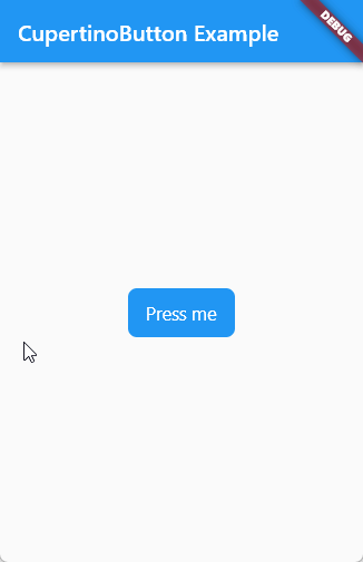
在这个示例中,我们创建了一个 CupertinoButton 组件。
通过设置 onPressed属性,当按钮被点击时,会在控制台打印“CupertinoButton pressed!”。按钮的子组件为一个文本组件,显示“Press me”。
按钮的背景颜色为蓝色。通过 padding 属性,我们设置了按钮的内边距为水平 16 像素,垂直 8 像素。设置了 borderRadius 属性,使按钮的圆角半径为 8 像素。
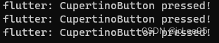
我们点击三次,可以在控制台上看到:
CupertinoButton具有许多可定制的属性,以下是一些常用的属性:
color: 设置按钮的背景颜色。disabledColor: 设置按钮在禁用状态下的颜色。padding: 设置按钮内边距。borderRadius: 设置按钮的圆角半径。minSize: 设置按钮的最小尺寸。pressedOpacity: 设置按钮在按下状态下的透明度。
要设置CupertinoButton的点击事件,我们需要为onPressed属性提供一个回调函数。当用户点击按钮时,这个回调函数将被触发。
CupertinoButton(
  onPressed: () {
    // 在这里处理按钮点击事件
    print('CupertinoButton被点击了');
  },
  child: Text('iOS样式按钮'),
)
如果我们想要禁用CupertinoButton组件,只需要将onPressed属性设置为null即可。
CupertinoButton(
  onPressed: null,
  child: Text('iOS样式按钮'),
)
在本节中,我们介绍了CupertinoButton组件的基本用法和一些常用属性。通过使用CupertinoButton,我们可以轻松地为Flutter应用程序添加iOS风格的按钮,从而实现与iOS原生应用类似的界面效果。
8. 文本按钮:TextButton组件 (没有轮廓或填充颜色的按钮)官方文档位置:https://api.flutter.dev/flutter/material/TextButton-class.html
在本节中,我们将介绍Flutter中的TextButton组件,包括创建TextButton、设置TextButton样式、设置TextButton点击事件以及禁用TextButton组件等内容。TextButton是一个简单的文本按钮,没有背景和边框,通常用于辅助操作或次要操作。
8.1 创建TextButton组件要创建一个TextButton,我们可以使用TextButton构造函数。以下是一个简单的示例:
import 'package:flutter/material.dart';
void main() {
runApp(const MyApp());
}
class MyApp extends StatelessWidget {
const MyApp({super.key});
Widget build(BuildContext context) {
return MaterialApp(
home: Scaffold(
appBar: AppBar(title: const Text('TextButton Example')),
body: Center(
child: TextButton(
onPressed: () {
print('TextButton pressed!');
},
style: TextButton.styleFrom(
foregroundColor: Colors.blue,
padding:
const EdgeInsets.symmetric(horizontal: 16.0, vertical: 8.0),
),
child: const Text(
'Press me',
style: TextStyle(fontSize: 20),
),
),
),
),
);
}
}
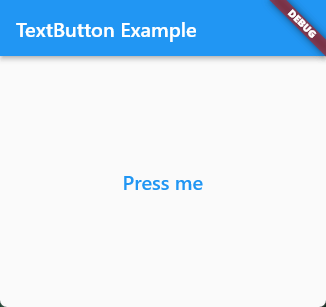
在这个示例中,我们创建了一个TextButton组件。
按钮的子组件为一个文本组件,显示“Press me”,字体大小为20像素。通过style属性和TextButton.styleFrom方法,我们设置了按钮的文本颜色为蓝色,内边距为水平16像素,垂直8像素。
通过设置 onPressed 属性,当按钮被点击时,会在控制台打印“TextButton pressed!”:
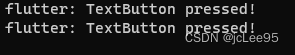
(这里我点了两次)
TextButton具有许多可定制的属性,以下是一些常用的属性:
style: 使用ButtonStyle设置按钮的样式,包括文本颜色、背景颜色、边框等。onSurface: 设置按钮在禁用状态下的文本颜色。
以下是一个设置TextButton样式的示例:
TextButton(
  onPressed: () {
    // 在这里处理按钮点击事件
  },
  child: Text('TextButton'),
  style: ButtonStyle(
    foregroundColor: MaterialStateProperty.all(Colors.red),
  ),
)
要设置TextButton的点击事件,我们需要为onPressed属性提供一个回调函数。当用户点击按钮时,这个回调函数将被触发。
TextButton(
  onPressed: () {
    // 在这里处理按钮点击事件
    print('TextButton被点击了');
  },
  child: Text('TextButton'),
)
如果我们想要禁用TextButton组件,只需要将onPressed属性设置为null即可。
TextButton(
  onPressed: null,
  child: Text('TextButton'),
)
在本节中,我们介绍了TextButton组件的基本用法和一些常用属性。通过使用TextButton,我们可以轻松地为Flutter应用程序添加简洁的文本按钮,实现清晰且易于理解的界面。
9. 提升按钮:ElevatedButton组件在本节中,我们将介绍Flutter中的ElevatedButton组件,包括创建ElevatedButton、设置ElevatedButton样式、设置ElevatedButton点击事件以及禁用ElevatedButton组件等内容。ElevatedButton是一个Material Design风格的按钮,它具有浮动效果并在按下时显示阴影。
9.1 创建ElevatedButton组件要创建一个ElevatedButton,我们可以使用ElevatedButton构造函数。以下是一个简单的示例:
ElevatedButton(
  onPressed: () {
    // 在这里处理按钮点击事件
  },
  child: Text('ElevatedButton'),
)
ElevatedButton具有许多可定制的属性,以下是一些常用的属性:
style: 使用ButtonStyle设置按钮的样式,包括背景颜色、边框、阴影等。onPrimary: 设置按钮文本和图标的颜色。elevation: 设置按钮的阴影大小。
例如:
import 'package:flutter/material.dart';
void main() {
runApp(const MyApp());
}
class MyApp extends StatelessWidget {
const MyApp({super.key});
Widget build(BuildContext context) {
return MaterialApp(
home: Scaffold(
appBar: AppBar(title: const Text('ElevatedButton Example')),
body: Center(
child: ElevatedButton(
onPressed: () {
print('ElevatedButton pressed!');
},
style: ElevatedButton.styleFrom(
backgroundColor: Colors.blue,
padding:
const EdgeInsets.symmetric(horizontal: 16.0, vertical: 8.0),
shape: RoundedRectangleBorder(
borderRadius: BorderRadius.circular(8.0),
),
),
child: const Text(
'Press me',
style: TextStyle(fontSize: 20),
),
),
),
),
);
}
}
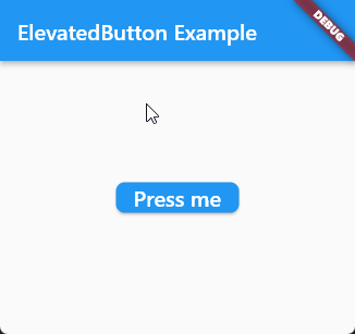
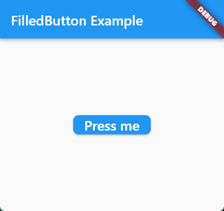
在这个示例中,我们创建了一个 ElevatedButton 组件。
按钮的子组件为一个文本组件,显示“Press me”,字体大小为20像素。通过 style 属性和 ElevatedButton.styleFrom方法,我们设置了按钮的背景颜色为蓝色,内边距为水平 16 像素,垂直 8 像素。此外,我们还设置了按钮的形状为圆角矩形,圆角半径为 8 像素。
通过设置 onPressed 属性,当按钮被点击时,会在控制台打印“ElevatedButton pressed!”。
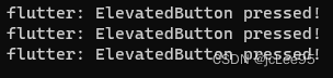
(这里我点了3次)
要设置ElevatedButton的点击事件,我们需要为onPressed属性提供一个回调函数。当用户点击按钮时,这个回调函数将被触发。
ElevatedButton(
  onPressed: () {
    // 在这里处理按钮点击事件
    print('ElevatedButton被点击了');
  },
  child: Text('ElevatedButton'),
)
如果我们想要禁用ElevatedButton组件,只需要将onPressed属性设置为null即可。
ElevatedButton(
  onPressed: null,
  child: Text('ElevatedButton'),
)
在本节中,我们介绍了ElevatedButton组件的基本用法和一些常用属性。通过使用ElevatedButton,我们可以轻松地为Flutter应用程序添加Material Design风格的按钮,实现美观且具有良好交互效果的界面。
10. 轮廓按钮:OutlinedButton组件在本节中,我们将介绍Flutter中的OutlinedButton组件,包括创建OutlinedButton、设置OutlinedButton样式、设置OutlinedButton点击事件以及禁用OutlinedButton组件等内容。OutlinedButton是一个带有边框的按钮,没有背景颜色,通常用于次要操作或与其他按钮区分。
10.1 创建OutlinedButton组件要创建一个OutlinedButton,我们可以使用OutlinedButton构造函数。例如:
import 'package:flutter/material.dart';
void main() {
runApp(const MyApp());
}
class MyApp extends StatelessWidget {
const MyApp({super.key});
Widget build(BuildContext context) {
return MaterialApp(
home: Scaffold(
appBar: AppBar(title: const Text('OutlinedButton Example')),
body: Center(
child: OutlinedButton(
onPressed: () {
print('OutlinedButton pressed!');
},
style: OutlinedButton.styleFrom(
foregroundColor: Colors.blue,
side: const BorderSide(color: Colors.blue, width: 2),
padding:
const EdgeInsets.symmetric(horizontal: 16.0, vertical: 8.0),
shape: RoundedRectangleBorder(
borderRadius: BorderRadius.circular(8.0),
),
),
child: const Text(
'Press me',
style: TextStyle(fontSize: 20),
),
),
),
),
);
}
}
在这个示例中,我们创建了一个 OutlinedButton 组件。
按钮的子组件为一个文本组件,显示“Press me”,字体大小为20像素。
通过style属性和 OutlinedButton.styleFrom方法,我们设置了按钮的文本颜色为蓝色,边框颜色为蓝色,边框宽度为 2 像素,内边距为水平 16 像素,垂直 8 像素。此外,我们还设置了按钮的形状为圆角矩形,圆角半径为 8 像素。
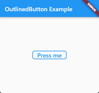
通过设置其 onPressed 属性,当按钮被点击时,会在控制台打印“OutlinedButton pressed!”:
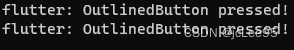
(这里我点击了2次)
10.2 设置OutlinedButton样式OutlinedButton具有许多可定制的属性,以下是一些常用的属性:
style: 使用ButtonStyle设置按钮的样式,包括文本颜色、边框颜色、边框宽度等。onSurface: 设置按钮在禁用状态下的文本颜色。
以下是一个设置OutlinedButton样式的示例:
OutlinedButton(
  onPressed: () {
    // 在这里处理按钮点击事件
  },
  child: Text('OutlinedButton'),
  style: ButtonStyle(
    foregroundColor: MaterialStateProperty.all(Colors.red),
    side: MaterialStateProperty.all(BorderSide(color: Colors.red, width: 2)),
  ),
)
要设置OutlinedButton的点击事件,我们需要为onPressed属性提供一个回调函数。当用户点击按钮时,这个回调函数将被触发。
OutlinedButton(
  onPressed: () {
    // 在这里处理按钮点击事件
    print('OutlinedButton被点击了');
  },
  child: Text('OutlinedButton'),
)
如果我们想要禁用OutlinedButton组件,只需要将onPressed属性设置为null即可。
OutlinedButton(
  onPressed: null,
  child: Text('OutlinedButton'),
)
在本节中,我们介绍了OutlinedButton组件的基本用法和一些常用属性。通过使用OutlinedButton,我们可以轻松地为Flutter应用程序添加带有边框的按钮,实现清晰且易于理解的界面。与其他类型的按钮相比,轮廓按钮更适合次要操作或与其他按钮进行区分。
11. 填充按钮:FilledButton组件Flutter 2.6 添加的组件。
在本章节中,我们将学习如何在Flutter中使用FilledButton组件。FilledButton是一种填充按钮,可以用于各种场景,如提交表单、触发事件等。我们将从创建FilledButton组件开始,然后设置组件样式,并最后处理事件。
11.1 创建FilledButton组件首先,我们需要创建一个FilledButton组件。在Flutter中,你可以使用FilledButton构造函数来创建一个FilledButton组件。
以下是Flutter官方提供的一个例子:
import 'package:flutter/material.dart';
/// Flutter code sample for [FilledButton].
void main() {
runApp(const FilledButtonApp());
}
class FilledButtonApp extends StatelessWidget {
const FilledButtonApp({super.key});
Widget build(BuildContext context) {
return MaterialApp(
theme: ThemeData(
colorSchemeSeed: const Color(0xff6750a4), useMaterial3: true),
home: Scaffold(
appBar: AppBar(title: const Text('FilledButton Sample')),
body: Center(
child: Row(
mainAxisSize: MainAxisSize.min,
children: <Widget>[
Column(children: <Widget>[
const SizedBox(height: 30),
const Text('Filled'),
const SizedBox(height: 15),
FilledButton(
onPressed: () {},
child: const Text('Enabled'),
),
const SizedBox(height: 30),
const FilledButton(
onPressed: null,
child: Text('Disabled'),
),
]),
const SizedBox(width: 30),
Column(children: <Widget>[
const SizedBox(height: 30),
const Text('Filled tonal'),
const SizedBox(height: 15),
FilledButton.tonal(
onPressed: () {},
child: const Text('Enabled'),
),
const SizedBox(height: 30),
const FilledButton.tonal(
onPressed: null,
child: Text('Disabled'),
),
])
],
),
),
),
);
}
}
](https://img-blog.csdnimg.cn/dde36c2b8a8b41b79f79b3a304ca739d.gif)
接下来,我们将学习如何设置FilledButton组件的样式。FilledButton组件提供了一些属性,如style,可以用来定制组件的样式。下面是一个设置FilledButton样式的示例:
import 'package:flutter/material.dart';
void main() {
runApp(const MyApp());
}
class MyApp extends StatelessWidget {
const MyApp({super.key});
Widget build(BuildContext context) {
return MaterialApp(
home: Scaffold(
appBar: AppBar(
title: const Text('FilledButton 样式示例'),
),
body: Center(
child: FilledButton(
onPressed: () {
print('点击了 FilledButton');
},
style: ButtonStyle(
backgroundColor: MaterialStateProperty.all<Color>(Colors.blue),
foregroundColor: MaterialStateProperty.all<Color>(Colors.white),
textStyle: MaterialStateProperty.all<TextStyle>(
const TextStyle(fontSize: 20),
),
padding: MaterialStateProperty.all<EdgeInsetsGeometry>(
const EdgeInsets.symmetric(horizontal: 32, vertical: 16),
),
),
child: const Text('点击我'),
),
),
),
);
}
}
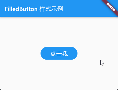
在这个示例中,我们设置了FilledButton的背景颜色、前景颜色、文本样式和内边距。
另一个样式更加丰富的例子是:
import 'package:flutter/material.dart';
void main() {
runApp(const MyApp());
}
class MyApp extends StatelessWidget {
const MyApp({super.key});
Widget build(BuildContext context) {
return MaterialApp(
home: Scaffold(
appBar: AppBar(title: const Text('FilledButton Example')),
body: Center(
child: TextButton(
onPressed: () {
print('FilledButton pressed!');
},
style: ButtonStyle(
backgroundColor: MaterialStateProperty.all(Colors.orange),
foregroundColor: MaterialStateProperty.all(Colors.white),
padding: MaterialStateProperty.all(
const EdgeInsets.symmetric(horizontal: 24.0, vertical: 12.0)),
shape: MaterialStateProperty.all(RoundedRectangleBorder(
borderRadius: BorderRadius.circular(12.0),
)),
side: MaterialStateProperty.all(
const BorderSide(color: Colors.deepOrange, width: 3)),
elevation: MaterialStateProperty.all(6.0),
shadowColor: MaterialStateProperty.all(Colors.orangeAccent),
),
child: const Text(
'Press me',
style: TextStyle(fontSize: 20, fontWeight: FontWeight.bold),
),
),
),
),
);
}
}
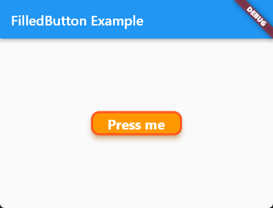
在这个示例中,我们为FilledButton添加了以下样式:
- 按钮背景颜色为橙色。
- 按钮上的文本颜色为白色,字体大小为20,字体加粗。
- 按钮内边距为水平24像素,垂直12像素。
- 按钮形状为圆角矩形,圆角半径为12像素。
- 按钮边框为深橙色,宽度为3像素。
- 按钮阴影高度为6.0,阴影颜色为橙色。
其效果为:
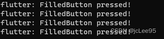
最后,我们将学习如何处理FilledButton组件的事件。当用户点击FilledButton时,可以通过onPressed属性来处理事件。下面是一个处理FilledButton点击事件的示例:
import 'package:flutter/material.dart';
void main() {
runApp(const MyApp());
}
class MyApp extends StatelessWidget {
const MyApp({super.key});
Widget build(BuildContext context) {
return MaterialApp(
home: Scaffold(
appBar: AppBar(
title: const Text('FilledButton 事件示例'),
),
body: Center(
child: FilledButton(
onPressed: () {
print('点击了 FilledButton');
// 在这里处理点击事件
},
child: const Text('点击我'),
),
),
),
);
}
}
在这个示例中,我们在onPressed属性中添加了一个回调函数,用于处理FilledButton的点击事件。
我们在这个小节中介绍了如何在 Flutter 中使用 FilledButton 组件,包括如何创建 FilledButton 组件,设置组件样式,以及处理事件。