目录
一.基础组件
Blank:填充控件
Button:按钮
ButtonType枚举说明
Text:文本显示
QRCode
二.常用布局
线性布局(Row和Column)
层叠布局
弹性布局(Flex)
一.基础组件
Blank:填充控件
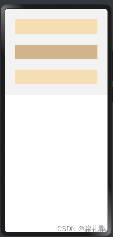
这个是鸿蒙新增的Android开发中没有的组件,主要作用是空白填充组件,在容器主轴方向上,空白填充组件具有自动填充容器空余部分的能力。仅当父组件为Row/Column时生效。
1.使用方式
|
|
min:空白填充组件在容器主轴上的最小大小。默认值:0。在父组件横向排列子组件时如果没有设置父组件的宽度并且没有设置min则看不见Blank填充显示,此时min参数就发挥作用了。
color:填充颜色
2.示例
|
|
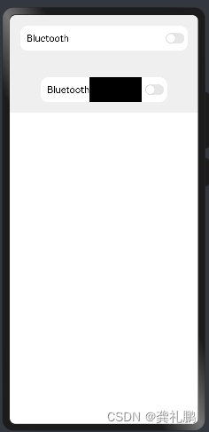
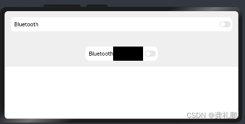
3.显示内容
竖屏状态
横屏状态
Button:按钮
按钮组件,可快速创建不同样式的按钮。
1.使用方式
有两种使用方式如下:
|
|
type:描述按钮显示样式。默认值:ButtonType.Capsule
stateEffect:按钮按下时是否开启按压态显示效果,当设置为false时,按压效果关闭。默认值:true
说明:当开启按压态显示效果,开发者设置状态样式时,会基于状态样式设置完成后的背景色再进行颜色叠加。
|
|
label:按钮文本内容。如果设置了label则不能在Button中设置子组件
属性
type:同上
stateEffect:同上
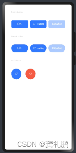
ButtonType枚举说明
Capsule:胶囊型按钮(圆角默认为高度的一半)。
Circle:圆形按钮。
Normal:普通按钮(默认不带圆角)。
示例:
|
|
显示样式:
Text:文本显示
显示一段文本的组件。
用法
Text(content?: string | Resource)
content:文本内容。包含子组件Span时不生效,显示Span内容,并且此时text组件的样式不生效。默认值:' '
属性
| 名称 | 参数类型 | 描述 |
|---|---|---|
| textAlign | TextAlign | 设置文本段落在水平方向的对齐方式 默认值:TextAlign.Start 说明: 文本段落宽度占满Text组件宽度;可通过align属性控制文本段落在垂直方向上的位置。 从API version 9开始,该接口支持在ArkTS卡片中使用。 |
| textOverflow | {overflow: TextOverflow} | 设置文本超长时的显示方式。 默认值:{overflow: TextOverflow.Clip} 说明: 文本截断是按字截断。例如,英文以单词为最小单位进行截断,若需要以字母为单位进行截断,可在字母间添加零宽空格:\u200B。 需配合maxLines使用,单独设置不生效。 从API version 9开始,该接口支持在ArkTS卡片中使用。 |
| maxLines | number | 设置文本的最大行数。 默认值:Infinity 说明: 默认情况下,文本是自动折行的,如果指定此参数,则文本最多不会超过指定的行。如果有多余的文本,可以通过 textOverflow来指定截断方式。 从API version 9开始,该接口支持在ArkTS卡片中使用。 |
| lineHeight | string | number | Resource | 设置文本的文本行高,设置值不大于0时,不限制文本行高,自适应字体大小,Length为number类型时单位为fp。 从API version 9开始,该接口支持在ArkTS卡片中使用。 |
| decoration | { type: TextDecorationType, color?: ResourceColor } | 设置文本装饰线样式及其颜色。 默认值:{ type: TextDecorationType.None, color:Color.Black } 从API version 9开始,该接口支持在ArkTS卡片中使用。 |
| baselineOffset | number | string | 设置文本基线的偏移量,默认值0。 从API version 9开始,该接口支持在ArkTS卡片中使用。 说明: 设置该值为百分比时,按默认值显示。 |
| letterSpacing | number | string | 设置文本字符间距。 从API version 9开始,该接口支持在ArkTS卡片中使用。 说明: 设置该值为百分比时,按默认值显示。 |
| minFontSize | number | string | Resource | 设置文本最小显示字号。 需配合maxFontSize以及maxline或布局大小限制使用,单独设置不生效。 从API version 9开始,该接口支持在ArkTS卡片中使用。 |
| maxFontSize | number | string | Resource | 设置文本最大显示字号。 需配合minFontSize以及maxline或布局大小限制使用,单独设置不生效。 从API version 9开始,该接口支持在ArkTS卡片中使用。 |
| textCase | TextCase | 设置文本大小写。 默认值:TextCase.Normal 从API version 9开始,该接口支持在ArkTS卡片中使用。 |
| copyOption9+ | CopyOptions | 组件支持设置文本是否可复制粘贴。 默认值:CopyOptions.None 该接口支持在ArkTS卡片中使用。 |
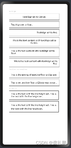
示例1
textAlign,textOverflow,maxLines,lineHeight使用示例。
|
|
显示内容如下:
示例2
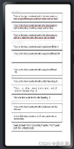
decoration,baselineOffset,letterSpacing,textCase使用示例:
|
|
显示内容如下:
QRCode
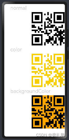
用于显示单个二维码的组件。
用法:
QRCode(value: string)
value:传入用于生成二维码的字符串
属性:
color:设置二维码颜色
backgroundColor:设置二维码背景颜色
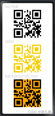
示例:
|
|
显示如下:
二.常用布局
线性布局(Row和Column)
Row和Colum的线性布局,类似于android的LinearLayout,其中Row是横向的线性布局,Column是竖向的线性布局
参数:
|
|
space是item中间的间距
属性:
|
|
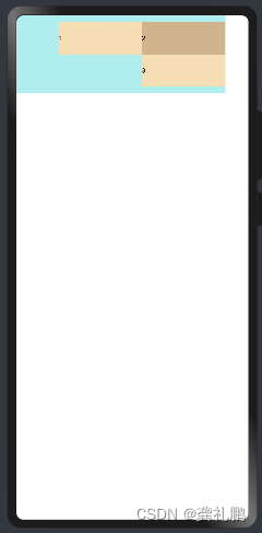
alignItems:这个是Column中子组件的左中右布局方向,Row同理是子组件的上中下方向
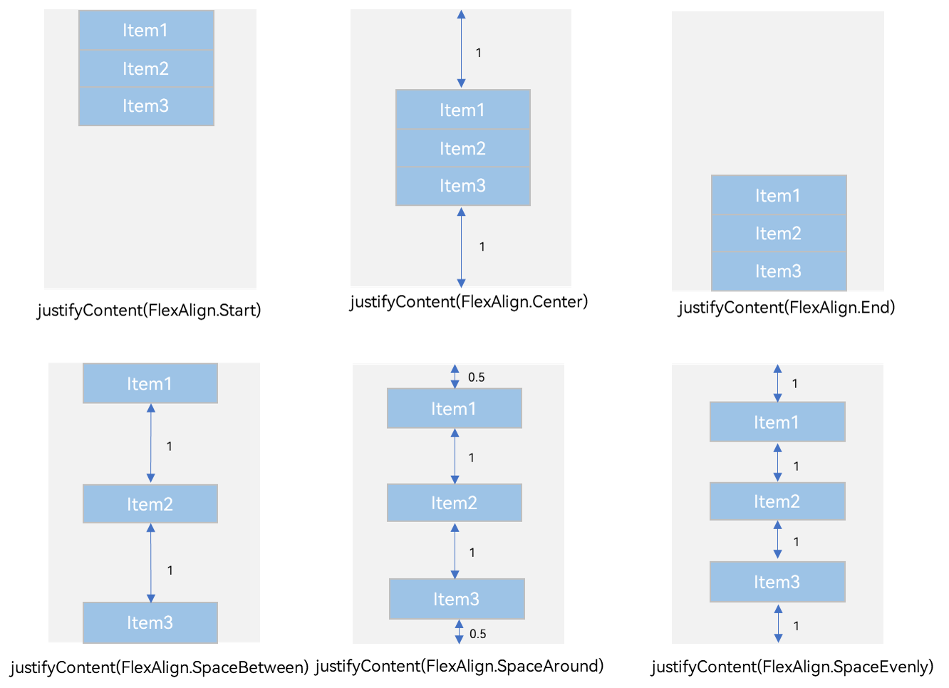
justifyContent:这个是Column中子组件的竖向方向布局,Row中同理是子组件中横向的布局,不过值较多,需要结合图片理解,如下:
示例:
|
|
|
|
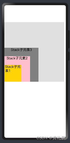
层叠布局
类似于android的帧布局,子组件可以叠加上去,并且可以控制叠加的顺序。
主要参数:
alignContent:对其方式,子控件对齐父控件的位置
zIndex:子组件的叠层排序,zIndex值大的组件会覆盖在zIndex值小的组件上方。
示例:
|
|
显示如下:
弹性布局(Flex)
Android中没有对应的布局,简单来说就是更加人性化的将子组件放到合适的位置,在设置可以换行的情况下子组件比较多宽度不足的情况下自动将子组件换行到下一行显示
使用方式:
| 参数名 | 参数类型 | 必填 | 默认值 | 参数描述 |
|---|---|---|---|---|
| direction | FlexDirection | 否 | FlexDirection.Row | 子组件在Flex容器上排列的方向,即主轴的方向。 |
| wrap | FlexWrap | 否 | FlexWrap.NoWrap | Flex容器是单行/列还是多行/列排列。 说明: 在多行布局时,通过交叉轴方向,确认新行堆叠方向。 |
| justifyContent | FlexAlign | 否 | FlexAlign.Start | 子组件在Flex容器主轴上的对齐格式。 |
| alignItems | ItemAlign | 否 | ItemAlign.Start | 子组件在Flex容器交叉轴上的对齐格式。 |
| alignContent | FlexAlign | 否 | FlexAlign.Start | 交叉轴中有额外的空间时,多行内容的对齐方式。仅在wrap为Wrap或WrapReverse下生效。 |
示例:
|
|
显示如下: