WPF 自定义DataGrid控件样式
样式一:
样式代码:
 <!--DataGrid样式-->
        <Style TargetType="DataGrid">
            <!--网格线颜色-->
            <Setter Property="CanUserResizeColumns" Value="false"/>
            <Setter Property="Background" Value="#FFF7EDAD" />
            <Setter Property="BorderBrush" Value="#FFF5F7F5" />
            <Setter Property="HorizontalGridLinesBrush">
                <Setter.Value>
                    <SolidColorBrush Color="#d6c79b"/>
                </Setter.Value>
            </Setter>
            <Setter Property="VerticalGridLinesBrush">
                <Setter.Value>
                    <SolidColorBrush Color="#d6c79b"/>
                </Setter.Value>
            </Setter>
        </Style>

        <!--标题栏样式-->
        <Style TargetType="DataGridColumnHeader">
            <Setter Property="SnapsToDevicePixels" Value="True" />
            <Setter Property="MinWidth" Value="0" />
            <Setter Property="MinHeight" Value="28" />
            <Setter Property="Foreground" Value="#323433" />
            <Setter Property="FontSize" Value="14" />
            <Setter Property="Cursor" Value="Hand" />
            <Setter Property="Template">
                <Setter.Value>
                    <ControlTemplate TargetType="DataGridColumnHeader">
                        <Border x:Name="BackgroundBorder" BorderThickness="0,1,0,1"
                             BorderBrush="#e6dbba"
                              Width="Auto">
                            <Grid >
                                <Grid.ColumnDefinitions>
                                    <ColumnDefinition Width="*" />
                                </Grid.ColumnDefinitions>
                                <ContentPresenter  Margin="0,0,0,0" VerticalAlignment="Center" HorizontalAlignment="Center"/>
                                <Path x:Name="SortArrow" Visibility="Collapsed" Data="M0,0 L1,0 0.5,1 z" Stretch="Fill"  Grid.Column="2" Width="8" Height="6" Fill="White" Margin="0,0,50,0"
                            VerticalAlignment="Center" RenderTransformOrigin="1,1" />
                                <Rectangle Width="1" Fill="#d6c79b" HorizontalAlignment="Right" Grid.ColumnSpan="1" />
                            </Grid>
                        </Border>
                    </ControlTemplate>
                </Setter.Value>
            </Setter>
            <Setter Property="Height" Value="25"/>
        </Style>
        <!--行样式触发-->
        <!--背景色改变必须先设置cellStyle 因为cellStyle会覆盖rowStyle样式-->
        <Style  TargetType="DataGridRow">
            <Setter Property="Background" Value="#F2F2F2" />
            <Setter Property="Height" Value="25"/>
            <Setter Property="Foreground" Value="Black" />
            <Style.Triggers>
                <!--隔行换色-->
                <Trigger Property="AlternationIndex" Value="0" >
                    <Setter Property="Background" Value="#e7e7e7" />
                </Trigger>
                <Trigger Property="AlternationIndex" Value="1" >
                    <Setter Property="Background" Value="#f2f2f2" />
                </Trigger>

                <Trigger Property="IsMouseOver" Value="True">
                    <Setter Property="Background" Value="LightGray"/>
                    <!--<Setter Property="Foreground" Value="White"/>-->
                </Trigger>

                <Trigger Property="IsSelected" Value="True">
                    <Setter Property="Foreground" Value="Black"/>
                </Trigger>
            </Style.Triggers>
        </Style>

        <!--单元格样式触发-->
        <Style TargetType="DataGridCell">
            <Setter Property="Template">
                <Setter.Value>
                    <ControlTemplate TargetType="DataGridCell">
                        <TextBlock TextAlignment="Center" VerticalAlignment="Center"  >
                           <ContentPresenter />
                        </TextBlock>
                    </ControlTemplate>
                </Setter.Value>
            </Setter>
            <Style.Triggers>
                <Trigger Property="IsSelected" Value="True">
                    <Setter Property="Foreground" Value="Black"/>
                </Trigger>
            </Style.Triggers>
        </Style>
引用示例:
<DataGrid x:Name="DataGrid" AutoGenerateColumns="False" VerticalAlignment="Top"
CanUserSortColumns="False" Margin="5" IsReadOnly="True"
CanUserResizeColumns="False" CanUserResizeRows="False" SelectionMode="Single"
CanUserReorderColumns="False" AlternationCount="2" RowHeaderWidth="0" CanUserAddRows="False" >
<DataGrid.Columns>
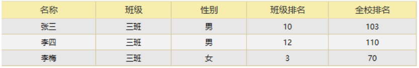
<DataGridTextColumn Header="名称" Width="150" Binding="{Binding Name}"/>
<DataGridTextColumn Header="班级" Width="120" Binding="{Binding Class}"/>
<DataGridTextColumn Header="性别" Width="120" Binding="{Binding Sex}"/>
<DataGridTextColumn Header="班级排名" Width="130" Binding="{Binding ClassRank}"/>
<DataGridTextColumn Header="全校排名" Width="140" Binding="{Binding SchoolRank}"/>
</DataGrid.Columns>
</DataGrid>
初始化绑定数据C#代码:
public partial class MainWindow : Window
    {
        public MainWindow()
        {
            InitializeComponent();

            StudentList = new List<StudentInfo>()
            {
                new StudentInfo()
                {
                    Name="张三",
                    Class="三班",
                    Sex="男",
                    ClassRank=10,
                    SchoolRank=103
                },
                 new StudentInfo()
                {
                    Name="李四",
                    Class="三班",
                    Sex="男",
                    ClassRank=12,
                    SchoolRank=110
                },
                  new StudentInfo()
                {
                    Name="李梅",
                    Class="三班",
                    Sex="女",
                    ClassRank=3,
                    SchoolRank=70
                },
             };
            this.DataGrid.ItemsSource = StudentList;
        }

        public List<StudentInfo> StudentList { get; set; }
        public class StudentInfo
        {
            public string Name { get; set; }
            public string Class { get; set; }
            public string Sex { get; set; }
            public int ClassRank { get; set; }
            public int SchoolRank { get; set; }
        }
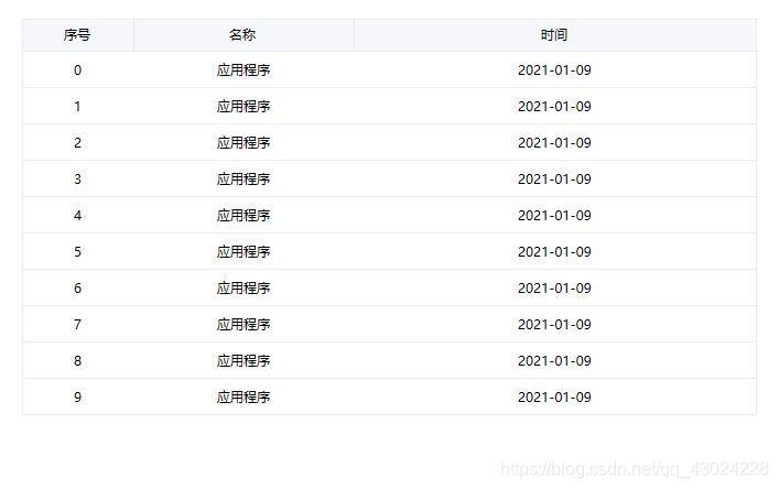
效果展示:
样式二:
上面的代码实现了隔行换色的效果,但是没有鼠标选中效果。另外有些用户希望能够进行列头拖动及排序。那么就需要做以下更改:
添加DataGridRow样式:
<Style x:Key="AlertCount1" TargetType="DataGridRow">
            <Setter Property="Background" Value="#F2F2F2" />
            <Setter Property="Height" Value="25"/>
            <Setter Property="Foreground" Value="Black" />
            <Style.Triggers>
                <Trigger Property="AlternationIndex" Value="0" >
                    <Setter Property="Background" Value="White" />
                </Trigger>
                <Trigger Property="IsMouseOver" Value="True">
                    <Setter Property="Background" Value="LightGray"/>
                </Trigger>

                <Trigger Property="IsSelected" Value="True">
                    <Setter Property="Foreground" Value="Black"/>
                    <Setter Property="Background" Value="LightGray"/>
                </Trigger>
            </Style.Triggers>
        </Style>
在引用时,设置DataGrid的RowStyle="{StaticResource AlertCount1}"且AlternationCount=“1”。这样就可以实现突出选中效果,取消隔行显示效果。要实现表头拖动,使用上面的样式代码是不行的,上面的样式代码去掉了拖动的控件。要实现拖动需要将其加上。
样式三:
<ResourceDictionary xmlns="http://schemas.microsoft.com/winfx/2006/xaml/presentation"
                    xmlns:x="http://schemas.microsoft.com/winfx/2006/xaml"
                    xmlns:local="clr-namespace:WpfApp5"
                    xmlns:sys="clr-namespace:System;assembly=mscorlib">
    <sys:Double x:Key="DataGridRow.Height">33</sys:Double>

    <!--  表格外边框线粗细,一般不修改  -->
    <Thickness x:Key="DataGrid.BorderThickness" Bottom="1" Left="1" Right="1" Top="1"/>
    <!--  列头边框粗细,一般不修改  -->
    <Thickness x:Key="ColumnHeader.BorderThickness" Bottom="0" Left="0" Right="1" Top="0"/>
    <!--  行边框粗细,一般不修改  -->
    <Thickness x:Key="DataGridRow.BorderThickness" Bottom="0" Left="0" Right="0" Top="1"/>

    <!--  表格外边框颜色  -->
    <SolidColorBrush x:Key="DataGrid.BorderBrush" Color="#E9ECF1" />
    <!--  列头背景色  -->
    <SolidColorBrush x:Key="ColumnHeader.Background" Color="#F6F7FB" />
    <!--  列头边框颜色  -->
    <SolidColorBrush x:Key="ColumnHeader.BorderBrush" Color="#E9ECF1" />
    <!--  行边框颜色  -->
    <SolidColorBrush x:Key="DataGridRow.BorderBrush" Color="#E9ECF1" />
    <!--  行默认背景颜色  -->
    <SolidColorBrush x:Key="DataGridRow.Normal.Background" Color="#FFFFFF" />
    <!--  行默认文字颜色  -->
    <SolidColorBrush x:Key="DataGridRow.Normal.Foreground" Color="#000000" />
    <!--  行悬浮背景颜色  -->
    <SolidColorBrush x:Key="DataGridRow.MouseOver.Background" Color="#F6F7FB" />
    <!--  行悬浮文字颜色  -->
    <SolidColorBrush x:Key="DataGridRow.MouseOver.Foreground" Color="#000000" />
    <!--  行选中背景颜色  -->
    <SolidColorBrush x:Key="DataGridRow.Selected.Background" Color="#F6F7FB" />
    <!--  行选中文字颜色  -->
    <SolidColorBrush x:Key="DataGridRow.Selected.Foreground" Color="#000000" />

    <Style TargetType="DataGrid">
        <!--  网格线颜色  -->
        <Setter Property="RowHeaderWidth" Value="0" />
        <Setter Property="BorderThickness" Value="{StaticResource DataGrid.BorderThickness}" />
        <Setter Property="HeadersVisibility" Value="Column" />
        <Setter Property="Background" Value="{StaticResource ColumnHeader.Background}" />
        <Setter Property="BorderBrush" Value="{StaticResource DataGrid.BorderBrush}" />
        <Setter Property="HorizontalGridLinesBrush" Value="#00E9ECF1" />
        <Setter Property="VerticalGridLinesBrush" Value="#00E9ECF1" />
        <Setter Property="UseLayoutRounding" Value="True" />
        <Setter Property="SnapsToDevicePixels" Value="True" />
        <Setter Property="AutoGenerateColumns" Value="False" />
        <Setter Property="CanUserAddRows" Value="False" />
        <Setter Property="CanUserReorderColumns" Value="False" />
        <Setter Property="CanUserResizeColumns" Value="False" />
        <Setter Property="CanUserResizeRows" Value="False" />
        <Setter Property="CanUserSortColumns" Value="False" />
        <Setter Property="GridLinesVisibility" Value="None" />
        <Setter Property="IsReadOnly" Value="True" />
        <Setter Property="RowHeight" Value="{StaticResource DataGridRow.Height}" />
        <Setter Property="SelectionMode" Value="Single" />
    </Style>
    <!--列头样式-->
    <Style TargetType="DataGridColumnHeader">
        <Setter Property="SnapsToDevicePixels" Value="True" />
        <Setter Property="Foreground" Value="#000000" />
        <Setter Property="FontSize" Value="12" />
        <Setter Property="Cursor" Value="Hand" />
        <Setter Property="Height" Value="28" />
        <Setter Property="Template">
            <Setter.Value>
                <ControlTemplate TargetType="DataGridColumnHeader">
                    <Border x:Name="BackgroundBorder" Width="Auto" Margin="-1,0"
                            BorderBrush="{StaticResource ColumnHeader.BorderBrush}"
                            BorderThickness="{StaticResource ColumnHeader.BorderThickness}"
                            SnapsToDevicePixels="True" UseLayoutRounding="True">
                        <ContentPresenter Margin="5,0" HorizontalAlignment="Center" VerticalAlignment="Center" />
                    </Border>
                </ControlTemplate>
            </Setter.Value>
        </Setter>
    </Style>
    <!--  行样式触发  背景色改变必须先设置cellStyle 因为cellStyle会覆盖rowStyle样式  -->
    <Style TargetType="{x:Type DataGridRow}">
        <Setter Property="Background" Value="{StaticResource DataGridRow.Normal.Background}" />
        <Setter Property="Foreground" Value="{StaticResource DataGridRow.MouseOver.Foreground}" />
        <Setter Property="SnapsToDevicePixels" Value="true" />
        <Setter Property="UseLayoutRounding" Value="True" />
        <Setter Property="Validation.ErrorTemplate" Value="{x:Null}" />
        <Setter Property="BorderThickness" Value="{StaticResource DataGridRow.BorderThickness}" />
        <Setter Property="BorderBrush" Value="{StaticResource DataGridRow.BorderBrush}" />
        <Setter Property="ValidationErrorTemplate">
            <Setter.Value>
                <ControlTemplate>
                    <TextBlock Margin="0,0,0,0" VerticalAlignment="Center" Foreground="Red" Text="!" />
                </ControlTemplate>
            </Setter.Value>
        </Setter>
        <Setter Property="Template">
            <Setter.Value>
                <ControlTemplate TargetType="{x:Type DataGridRow}">
                    <Border x:Name="DGR_Border" Margin="0,0,0,-1"
                            Background="{TemplateBinding Background}"
                            BorderBrush="{TemplateBinding BorderBrush}"
                            BorderThickness="{TemplateBinding BorderThickness}"
                            SnapsToDevicePixels="True" UseLayoutRounding="True">
                        <SelectiveScrollingGrid>
                            <SelectiveScrollingGrid.ColumnDefinitions>
                                <ColumnDefinition Width="Auto" />
                                <ColumnDefinition Width="*" />
                            </SelectiveScrollingGrid.ColumnDefinitions>
                            <SelectiveScrollingGrid.RowDefinitions>
                                <RowDefinition Height="*" MinHeight="{StaticResource DataGridRow.Height}" />
                                <RowDefinition Height="Auto" />
                            </SelectiveScrollingGrid.RowDefinitions>
                            <DataGridCellsPresenter Grid.Column="1"
                                                    ItemsPanel="{TemplateBinding ItemsPanel}"
                                                    SnapsToDevicePixels="{TemplateBinding SnapsToDevicePixels}" />
                            <DataGridDetailsPresenter Grid.Row="1" Grid.Column="1"
                                                      SelectiveScrollingGrid.SelectiveScrollingOrientation="{Binding AreRowDetailsFrozen,
                                                                                                                     ConverterParameter={x:Static SelectiveScrollingOrientation.Vertical},
                                                                                                                     Converter={x:Static DataGrid.RowDetailsScrollingConverter},
                                                                                                                     RelativeSource={RelativeSource AncestorType={x:Type DataGrid}}}"
                                                      Visibility="{TemplateBinding DetailsVisibility}" />
                            <DataGridRowHeader Grid.RowSpan="2" SelectiveScrollingGrid.SelectiveScrollingOrientation="Vertical"
                                               Visibility="{Binding HeadersVisibility,
                                                                    ConverterParameter={x:Static DataGridHeadersVisibility.Row},
                                                                    Converter={x:Static DataGrid.HeadersVisibilityConverter},
                                                                    RelativeSource={RelativeSource AncestorType={x:Type DataGrid}}}" />
                        </SelectiveScrollingGrid>
                    </Border>
                    <ControlTemplate.Triggers>
                        <Trigger Property="IsMouseOver" Value="True">
                            <Setter Property="Foreground" Value="{StaticResource DataGridRow.MouseOver.Foreground}" />
                            <Setter Property="Background" Value="{StaticResource DataGridRow.MouseOver.Background}" />
                        </Trigger>
                        <Trigger Property="IsSelected" Value="True">
                            <Setter Property="Foreground" Value="{StaticResource DataGridRow.Selected.Foreground}" />
                            <Setter Property="Background" Value="{StaticResource DataGridRow.Selected.Background}" />
                        </Trigger>
                    </ControlTemplate.Triggers>
                </ControlTemplate>
            </Setter.Value>
        </Setter>
    </Style>
    <!--  单元格样式触发  -->
    <Style TargetType="DataGridCell">
        <Setter Property="Template">
            <Setter.Value>
                <ControlTemplate TargetType="DataGridCell">
                    <Border x:Name="Bg" Background="Transparent" UseLayoutRounding="True">
                        <ContentPresenter HorizontalAlignment="Center" VerticalAlignment="Center" />
                    </Border>
                </ControlTemplate>
            </Setter.Value>
        </Setter>
        <Style.Triggers>
            <Trigger Property="IsSelected" Value="True">
                <Setter Property="Background" Value="Transparent" />
                <Setter Property="Foreground" Value="#000000" />
            </Trigger>
        </Style.Triggers>
    </Style>
</ResourceDictionary>
引用:
<StackPanel>
        <DataGrid x:Name="grd" ItemsSource="{Binding DataList}" AutoGenerateColumns="False" Margin="20">
            <DataGrid.Columns>
                <DataGridTextColumn Binding="{Binding Index}" Header="序号" Width="100"/>
                <DataGridTextColumn Binding="{Binding Name}" Header="名称" Width="200"/>
                <DataGridTextColumn Binding="{Binding Remark}" Header="时间" Width="*"/>
            </DataGrid.Columns>
        </DataGrid>
    </StackPanel>
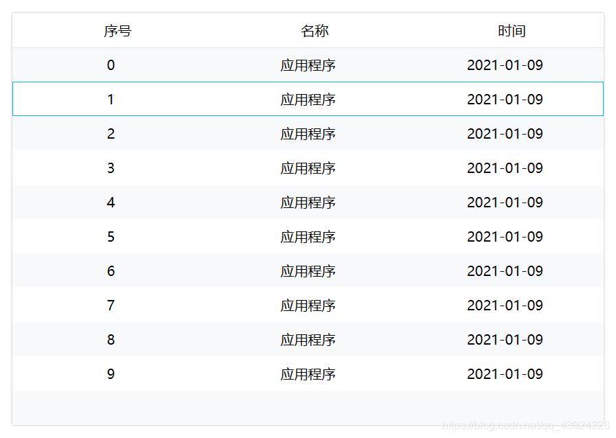
效果:
样式四:
<Style TargetType="{x:Type DataGrid}">
<Setter Property="Background" Value="{DynamicResource {x:Static SystemColors.ControlBrushKey}}"/>
<Setter Property="Foreground" Value="{DynamicResource {x:Static SystemColors.ControlTextBrushKey}}"/>
<Setter Property="BorderBrush" Value="#FF688CAF"/>
<Setter Property="BorderThickness" Value="1"/>
<Setter Property="RowDetailsVisibilityMode" Value="VisibleWhenSelected"/>
<Setter Property="ScrollViewer.CanContentScroll" Value="true"/>
<Setter Property="ScrollViewer.PanningMode" Value="Both"/>
<Setter Property="Stylus.IsFlicksEnabled" Value="False"/>
<Setter Property="AutoGenerateColumns" Value="False"/>
<Setter Property="ColumnHeaderHeight" Value="50"/>
<Setter Property="FontSize" Value="20"/>
<Setter Property="RowHeight" Value="50"/>
<Setter Property="AlternationCount" Value="2"/>
<Setter Property="Template">
<Setter.Value>
<ControlTemplate TargetType="{x:Type DataGrid}">
<Grid>
<Border Background="White" CornerRadius="0">
<Border.Effect>
<DropShadowEffect ShadowDepth="0" Direction="0" Color="#FFDADADA"/>
</Border.Effect>
</Border>
<Border BorderBrush="{TemplateBinding BorderBrush}" BorderThickness="{TemplateBinding BorderThickness}" Background="{TemplateBinding Background}" Padding="{TemplateBinding Padding}" SnapsToDevicePixels="True">
<ScrollViewer x:Name="DG_ScrollViewer" Focusable="false">
<ScrollViewer.Template>
<ControlTemplate TargetType="{x:Type ScrollViewer}">
<Grid>
<Grid.ColumnDefinitions>
<ColumnDefinition Width="Auto"/>
<ColumnDefinition Width="*"/>
<ColumnDefinition Width="Auto"/>
</Grid.ColumnDefinitions>
<Grid.RowDefinitions>
<RowDefinition Height="Auto"/>
<RowDefinition Height="*"/>
<RowDefinition Height="Auto"/>
</Grid.RowDefinitions>
<Grid Background="White" Grid.Column="1">
<Grid.Effect>
<DropShadowEffect Direction="270" Color="#FFF3F3F3"/>
</Grid.Effect>
</Grid>
<Button Command="{x:Static DataGrid.SelectAllCommand}" Focusable="false" Style="{DynamicResource {ComponentResourceKey ResourceId=DataGridSelectAllButtonStyle, TypeInTargetAssembly={x:Type DataGrid}}}" Visibility="{Binding HeadersVisibility, ConverterParameter={x:Static DataGridHeadersVisibility.All}, Converter={x:Static DataGrid.HeadersVisibilityConverter}, RelativeSource={RelativeSource AncestorType={x:Type DataGrid}}}" Width="{Binding CellsPanelHorizontalOffset, RelativeSource={RelativeSource AncestorType={x:Type DataGrid}}}"/>
<DataGridColumnHeadersPresenter x:Name="PART_ColumnHeadersPresenter" Grid.Column="1" Visibility="{Binding HeadersVisibility, ConverterParameter={x:Static DataGridHeadersVisibility.Column}, Converter={x:Static DataGrid.HeadersVisibilityConverter}, RelativeSource={RelativeSource AncestorType={x:Type DataGrid}}}"/>
<ScrollContentPresenter x:Name="PART_ScrollContentPresenter" CanContentScroll="{TemplateBinding CanContentScroll}" Grid.ColumnSpan="2" Grid.Row="1"/>
<ScrollBar x:Name="PART_VerticalScrollBar" Grid.Column="2" Maximum="{TemplateBinding ScrollableHeight}" Orientation="Vertical" Grid.Row="1" Visibility="{TemplateBinding ComputedVerticalScrollBarVisibility}" Value="{Binding VerticalOffset, Mode=OneWay, RelativeSource={RelativeSource TemplatedParent}}" ViewportSize="{TemplateBinding ViewportHeight}"/>
<Grid Grid.Column="1" Grid.Row="2">
<Grid.ColumnDefinitions>
<ColumnDefinition Width="{Binding NonFrozenColumnsViewportHorizontalOffset, RelativeSource={RelativeSource AncestorType={x:Type DataGrid}}}"/>
<ColumnDefinition Width="*"/>
</Grid.ColumnDefinitions>
<ScrollBar x:Name="PART_HorizontalScrollBar" Grid.Column="1" Maximum="{TemplateBinding ScrollableWidth}" Orientation="Horizontal" Visibility="{TemplateBinding ComputedHorizontalScrollBarVisibility}" Value="{Binding HorizontalOffset, Mode=OneWay, RelativeSource={RelativeSource TemplatedParent}}" ViewportSize="{TemplateBinding ViewportWidth}"/>
</Grid>
</Grid>
</ControlTemplate>
</ScrollViewer.Template>
<ItemsPresenter SnapsToDevicePixels="{TemplateBinding SnapsToDevicePixels}"/>
</ScrollViewer>
</Border>
</Grid>
</ControlTemplate>
</Setter.Value>
</Setter>
<Style.Triggers>
<MultiTrigger>
<MultiTrigger.Conditions>
<Condition Property="IsGrouping" Value="true"/>
<Condition Property="VirtualizingPanel.IsVirtualizingWhenGrouping" Value="false"/>
</MultiTrigger.Conditions>
<Setter Property="ScrollViewer.CanContentScroll" Value="false"/>
</MultiTrigger>
</Style.Triggers>
</Style>
<Style TargetType="DataGridColumnHeader">
<Setter Property="Background" Value="Transparent"/>
<Setter Property="VerticalContentAlignment" Value="Center"/>
<Setter Property="HorizontalContentAlignment" Value="Center"/>
<Setter Property="Template">
<Setter.Value>
<ControlTemplate TargetType="DataGridColumnHeader">
<Grid Background="{TemplateBinding Background}">
<!--<Grid.ColumnDefinitions>
<ColumnDefinition/>
<ColumnDefinition Width="20"/>
</Grid.ColumnDefinitions>-->
<ContentPresenter Margin="20 0 0 0" VerticalAlignment="{TemplateBinding VerticalContentAlignment}" HorizontalAlignment="{TemplateBinding HorizontalContentAlignment}"/>
<!--<TextBlock Grid.Column="1" x:Name="SortArrow" Visibility="Visible" VerticalAlignment="Center" FontFamily="/DataGrid;component/Fonts/#FontAwesome"/>-->
</Grid>
<!--<ControlTemplate.Triggers>
<Trigger Property="SortDirection" Value="Ascending">
<Setter TargetName="SortArrow" Property="Visibility" Value="Visible" />
<Setter TargetName="SortArrow" Property="Text" Value="" />
</Trigger>
<Trigger Property="SortDirection" Value="Descending">
<Setter TargetName="SortArrow" Property="Visibility" Value="Visible" />
<Setter TargetName="SortArrow" Property="Text" Value="" />
</Trigger>
</ControlTemplate.Triggers>-->
</ControlTemplate>
</Setter.Value>
</Setter>
</Style>
<Style TargetType="DataGridRow">
<Setter Property="Cursor" Value="Hand"/>
<Setter Property="Template" >
<Setter.Value>
<ControlTemplate TargetType="DataGridRow">
<Grid >
<Border x:Name="border" Background="{TemplateBinding Background}" BorderThickness="1" BorderBrush="Transparent"/>
<DataGridCellsPresenter />
</Grid>
<ControlTemplate.Triggers>
<Trigger Property="IsMouseOver" Value="True">
<Setter Property="BorderBrush" TargetName="border" Value="#00BCD4"/>
</Trigger>
<Trigger Property="IsSelected" Value="true">
<Setter Property="BorderBrush" TargetName="border" Value="#00BCD4"/>
</Trigger>
</ControlTemplate.Triggers>
</ControlTemplate>
</Setter.Value>
</Setter>
<Style.Triggers>
<Trigger Property="ItemsControl.AlternationIndex"
Value="0">
<Setter Property="Background" Value="#F8F9FA" />
</Trigger>
<Trigger Property="ItemsControl.AlternationIndex"
Value="1">
<Setter Property="Background" Value="White" />
</Trigger>
</Style.Triggers>
</Style>
<Style TargetType="DataGridCell">
<Setter Property="Background" Value="Transparent"/>
<Setter Property="VerticalContentAlignment" Value="Center"/>
<Setter Property="HorizontalContentAlignment" Value="Center"/>
<Setter Property="Template">
<Setter.Value>
<ControlTemplate TargetType="DataGridCell">
<Grid Background="{TemplateBinding Background}">
<ContentPresenter VerticalAlignment="{TemplateBinding VerticalContentAlignment}" HorizontalAlignment="{TemplateBinding HorizontalContentAlignment}"/>
</Grid>
<ControlTemplate.Triggers>
<Trigger Property="IsSelected" Value="true">
<Setter Property="Foreground" Value="Black" />
</Trigger>
</ControlTemplate.Triggers>
</ControlTemplate>
</Setter.Value>
</Setter>
</Style>
使用方式:
<DataGrid x:Name="grd" ItemsSource="{Binding DataList}"  Margin="20" BorderThickness="0" Background="Transparent" CanUserSortColumns="False" SelectionMode="Single" HorizontalGridLinesBrush="Black" VerticalGridLinesBrush="Black" GridLinesVisibility="None" RowDetailsVisibilityMode="Collapsed" ForceCursor="True" >
            <DataGrid.Columns>
                <DataGridTextColumn Binding="{Binding Index}" Header="序号" Width="*" ClipboardContentBinding="{x:Null}"/>
                <DataGridTextColumn Binding="{Binding Name}" Header="名称" Width="*" ClipboardContentBinding="{x:Null}"/>
                <DataGridTextColumn Binding="{Binding Remark}" Header="时间" Width="*" ClipboardContentBinding="{x:Null}"/>
            </DataGrid.Columns>
        </DataGrid>
效果:
样式五:
<!--DataGrid样式-->
    <Style TargetType="DataGrid">
        <Setter Property="RowHeaderWidth" Value="0"></Setter>
        <Setter Property="AutoGenerateColumns" Value="False"></Setter>
        <Setter Property="CanUserAddRows" Value="False"></Setter>
        <Setter Property="CanUserResizeColumns" Value="False"></Setter>
        <Setter Property="CanUserResizeRows" Value="False"></Setter>
        <Setter Property="HorizontalGridLinesBrush" Value="LightGray"></Setter>
        <Setter Property="VerticalGridLinesBrush" Value="LightGray"></Setter>
        <Setter Property="IsReadOnly" Value="True"></Setter>
        <Setter Property="BorderThickness" Value="1,0"></Setter>
        <Setter Property="BorderBrush" Value="LightGray"></Setter>
        <Setter Property="RowHeight" Value="30"></Setter>
        <Setter Property="VerticalScrollBarVisibility" Value="Auto"></Setter>
    </Style>

    <!--DataGrid表头样式-->
    <Style TargetType="DataGridColumnHeader">
        <Setter Property="FontSize" Value="16"></Setter>
        <Setter Property="Background" Value="{StaticResource BgColor}"></Setter>
        <Setter Property="BorderThickness" Value="0,0,1,1"></Setter>
        <Setter Property="BorderBrush" Value="LightGray"></Setter>
        <Setter Property="HorizontalContentAlignment" Value="Center"></Setter>
    </Style>

<!--DataGrid复选框样式-->
 <Style TargetType="CheckBox" x:Key="VerticalCheckBox">
        <Setter Property="VerticalAlignment" Value="Center"></Setter>
        <Setter Property="FontSize" Value="16"></Setter>
        <Setter Property="Template">
            <Setter.Value>
                <ControlTemplate TargetType="{x:Type CheckBox}">
                    <StackPanel Name="sp" HorizontalAlignment="Center" >
                        <ContentPresenter HorizontalAlignment="Center" Margin="2"></ContentPresenter>
                        <Border x:Name="bd" BorderThickness="1.5" Height="20" Width="20" BorderBrush="Gray" >
                            <Border.Background>
                                <LinearGradientBrush StartPoint="0,0"  EndPoint="1,1">
                                    <GradientStop Color="LightGray" Offset="0.05"/>
                                    <GradientStop Color="White" Offset="1"/>
                                </LinearGradientBrush>
                            </Border.Background>
                            <Path Name="checkPath" Width="18" Height="16" Stroke="Black"  StrokeThickness="2"></Path>
                        </Border>
                    </StackPanel>
                    <ControlTemplate.Triggers>
                        <Trigger Property="IsChecked" Value="True">
                            <Setter TargetName="checkPath" Property="Data" Value="M 1.5,5 L 7,13 17,0"></Setter>
                        </Trigger>
                        <Trigger Property="IsMouseOver" Value="True">
                            <Setter TargetName="bd" Property="Background" Value="LightGray"></Setter>
                        </Trigger>
                    </ControlTemplate.Triggers>
                </ControlTemplate>
            </Setter.Value>
        </Setter>
    </Style>

    <!--DataGrid单元格选中样式-->
    <Style TargetType="DataGridCell">
        <Style.Triggers>
            <Trigger Property="IsSelected" Value="True">
                <Setter Property="Background" Value="#FFC7CBCA"/>
                <Setter Property="BorderThickness" Value="0"></Setter>
            </Trigger>
        </Style.Triggers>
    </Style>

    <!--DataGrid按钮样式 蓝-->
    <Style x:Key="btnInfo" TargetType="Button">
        <Setter Property="Width" Value="70"></Setter>
        <Setter Property="Foreground" Value="White"></Setter>
        <Setter Property="FontSize" Value="12"></Setter>
        <Setter Property="Margin" Value="0,2"></Setter>
        <Setter Property="Template">
            <Setter.Value>
                <ControlTemplate TargetType="Button">
                    <Border Name="bd" CornerRadius="3" BorderThickness="1" BorderBrush="LightGray" Background="#FF2F6DC1">
                        <ContentPresenter Content="{TemplateBinding ContentControl.Content}" HorizontalAlignment="Center" VerticalAlignment="Center"  />
                    </Border>
                    <ControlTemplate.Triggers>
                        <Trigger Property="Button.IsMouseOver" Value="True">
                            <Setter TargetName="bd" Property="Opacity" Value="0.6"></Setter>
                        </Trigger>
                        <Trigger Property="IsPressed" Value="True">
                            <Setter TargetName="bd" Property="Background" Value="#FF9BCEF7"></Setter>
                        </Trigger>
                    </ControlTemplate.Triggers>
                </ControlTemplate>
            </Setter.Value>
        </Setter>
    </Style>
效果:
下面是对DataGrid控件的补充:
控件常用方法:
BeginEdit:使DataGrid进入编辑状态。
CancelEdit:取消DataGrid的编辑状态。
CollapseRowGroup:闭合DataGrid的行分组。
CommitEdit:确认DataGrid的编辑完成。
ExpandRowGroup:展开DataGrid的行分组。
GetGroupFromItem:从具体Item中得到分组。
ScrollIntoView:滚动DataGrid视图。
控件常用属性:
AlternatingRowBackground:获取或设置一个笔刷用来描绘DataGrid奇数行的背景。
AreRowDetailsFrozen:获取或设置一个值用来判断是否冻结每行内容的详细信息。
AreRowGroupHeadersFrozen:获取或设置一个值用来判断是否冻结分组行的头部。
AutoGenerateColumns:获取或设置一个值用来判断是否允许自动生成表列。
CanUserReorderColumns:获取或设置一个值用来判断是否允许用户重新排列表列的位置。
CanUserSortColumns:获取或设置一个值用来判断是否允许用户按列对表中内容进行排序。
CellStyle:获取或设置单元格的样式。
ColumnHeaderHeight:获取或设置列头的高度。
ColumnHeaderStyle:获取或设置列头的样式。
Columns:获取组件中包含所有列的集合。
ColumnWidth:获取或设置列宽。
CurrentColumn:获取或设置包含当前单元格的列。
CurrentItem:获取包含当前单元格且与行绑定的数据项。
DragIndicatorStyle:获取或设置当拖曳列头时的样式。
DropLocationIndicatorStyle:获取或设置呈现列头时的样式。
FrozenColumnCount:获取或设置冻结列的个数。
GridLinesVisibility:获取或设置网格线的显示形式。
HeadersVisibility:获取或设置行头及列头的显示形式。
HorizontalGridLinesBrush:获取或设置水平网格线的笔刷。
HorizontalScrollBarVisibility:获取或设置水平滚动条的显示样式。
IsReadOnly:获取或设置DataGrid是否为只读。
MaxColumnWidth:获取或设置DataGrid的最大列宽。
MinColumnWidth:获取或设置DataGrid的最小列宽。
RowBackground:获取或设置用于填充行背景的笔刷。
RowDetailsTemplate:获取或设置被用于显示行详细部分的内容的模板。
RowDetailsVisibilityMode:获取或设置一个值用以判定行详细部分是否显示。
RowGroupHeaderStyles:获取呈现行分组头部的样式。
RowHeaderStyle:获取或设置呈现行头的样式。
RowHeaderWidth:获取或设置行头的宽度。
RowHeight:获取或设置每行的高度。
RowStyle:获取或设置呈现行时的样式。
SelectedIndex:获取或设置当前选中部分的索引值。
SelectedItem:获取或设置与当前被选中行绑定的数据项。
SelectedItems:获取与当前被选中的各行绑定的数据项们的列表(List)。
SelectionMode:获取或设置DataGrid的选取模式。
VerticalGridLinesBrush:获取或设置垂直网格线的笔刷。
VerticalScrollBarVisibility:获取或设置垂直滚动条的显示样式。
原:https://www.cnblogs.com/xiaomingg/p/8736305.html
![[数据结构与算法(严蔚敏 C语言第二版)]第1章 绪论(课后习题+答案解析)](https://img-blog.csdnimg.cn/1f5b53fe76a945978b85c6d121399f9c.png)