效果如下图:

APIs
ConfigProvider
| 参数 | 说明 | 类型 | 默认值 |
|---|
| theme | 主题对象 | Theme | {} |
| abstract | boolean | 是否不存在 DOM 包裹元素 | true |
| tag | string | ConfigProvider 被渲染成的元素,abstract 为 true 时有效 | ‘div’ |
Theme Type
| 名称 | 说明 | 类型 | 默认值 |
|---|
| common? | 全局通用配置,优先级低于组件配置 | Config | undefined |
| ComponentName? | 组件自定义配置 | Config | undefined |
Config Type
| 名称 | 说明 | 类型 | 默认值 |
|---|
| primaryColor? | 主题色 | string | undefined |
ComponentName Type
| 名称 | 值 |
|---|
| ComponentName | ‘Alert’ | ‘BackTop’ | ‘Button’ | ‘Calendar’ | ‘Carousel’ | ‘Checkbox’ | ‘ColorPicker’ | ‘DatePicker’ | ‘FloatButton’ | ‘Image’ | ‘Input’ | ‘InputNumber’ | ‘InputSearch’ | ‘LoadingBar’ | ‘Message’ | ‘Modal’ | ‘Notification’ | ‘Pagination’ | ‘Popconfirm’ | ‘Progress’ | ‘Radio’ | ‘Select’ | ‘Slider’ | ‘Spin’ | ‘Steps’ | ‘Swiper’ | ‘Switch’ | ‘Tabs’ | ‘Textarea’ | ‘TextScroll’ | ‘Upload’ |
Slots
| 名称 | 说明 | 类型 |
|---|
| default | 内容 | v-slot:default |
创建全局化配置组件 ConfigProvider.vue
<script setup lang="ts">
import { reactive, computed, watch, provide } from 'vue'
import { TinyColor } from '@ctrl/tinycolor'
import { generate } from '@ant-design/colors'
export interface Theme {
common?: {
primaryColor?: string
}
Alert?: {
primaryColor?: string
}
BackTop?: {
primaryColor?: string
}
Button?: {
primaryColor?: string
}
Calendar?: {
primaryColor?: string
}
Carousel?: {
primaryColor?: string
}
Checkbox?: {
primaryColor?: string
}
ColorPicker?: {
primaryColor?: string
}
DatePicker?: {
primaryColor?: string
}
FloatButton?: {
primaryColor?: string
}
Image?: {
primaryColor?: string
}
Input?: {
primaryColor?: string
}
InputNumber?: {
primaryColor?: string
}
InputSearch?: {
primaryColor?: string
}
LoadingBar?: {
primaryColor?: string
}
Message?: {
primaryColor?: string
}
Modal?: {
primaryColor?: string
}
Notification?: {
primaryColor?: string
}
Pagination?: {
primaryColor?: string
}
Popconfirm?: {
primaryColor?: string
}
Progress?: {
primaryColor?: string
}
Radio?: {
primaryColor?: string
}
Select?: {
primaryColor?: string
}
Slider?: {
primaryColor?: string
}
Spin?: {
primaryColor?: string
}
Steps?: {
primaryColor?: string
}
Swiper?: {
primaryColor?: string
}
Switch?: {
primaryColor?: string
}
Tabs?: {
primaryColor?: string
}
Textarea?: {
primaryColor?: string
}
TextScroll?: {
primaryColor?: string
}
Upload?: {
primaryColor?: string
}
}
export interface Props {
theme?: Theme
abstract?: boolean
tag?: string
}
const props = withDefaults(defineProps<Props>(), {
theme: () => ({}),
abstract: true,
tag: 'div'
})
interface ThemeColor {
colorPalettes: string[]
shadowColor: string
}
const commonThemeColor = reactive<ThemeColor>({
colorPalettes: [],
shadowColor: ''
})
const componentsThemeColor = reactive<Record<string, ThemeColor>>({
Alert: {
colorPalettes: [],
shadowColor: ''
},
BackTop: {
colorPalettes: [],
shadowColor: ''
},
Button: {
colorPalettes: [],
shadowColor: ''
},
Calendar: {
colorPalettes: [],
shadowColor: ''
},
Carousel: {
colorPalettes: [],
shadowColor: ''
},
Checkbox: {
colorPalettes: [],
shadowColor: ''
},
ColorPicker: {
colorPalettes: [],
shadowColor: ''
},
DatePicker: {
colorPalettes: [],
shadowColor: ''
},
FloatButton: {
colorPalettes: [],
shadowColor: ''
},
Image: {
colorPalettes: [],
shadowColor: ''
},
Input: {
colorPalettes: [],
shadowColor: ''
},
InputNumber: {
colorPalettes: [],
shadowColor: ''
},
InputSearch: {
colorPalettes: [],
shadowColor: ''
},
LoadingBar: {
colorPalettes: [],
shadowColor: ''
},
Message: {
colorPalettes: [],
shadowColor: ''
},
Modal: {
colorPalettes: [],
shadowColor: ''
},
Notification: {
colorPalettes: [],
shadowColor: ''
},
Pagination: {
colorPalettes: [],
shadowColor: ''
},
Popconfirm: {
colorPalettes: [],
shadowColor: ''
},
Progress: {
colorPalettes: [],
shadowColor: ''
},
Radio: {
colorPalettes: [],
shadowColor: ''
},
Select: {
colorPalettes: [],
shadowColor: ''
},
Slider: {
colorPalettes: [],
shadowColor: ''
},
Spin: {
colorPalettes: [],
shadowColor: ''
},
Steps: {
colorPalettes: [],
shadowColor: ''
},
Swiper: {
colorPalettes: [],
shadowColor: ''
},
Switch: {
colorPalettes: [],
shadowColor: ''
},
Tabs: {
colorPalettes: [],
shadowColor: ''
},
Textarea: {
colorPalettes: [],
shadowColor: ''
},
TextScroll: {
colorPalettes: [],
shadowColor: ''
},
Upload: {
colorPalettes: [],
shadowColor: ''
}
})
provide('common', commonThemeColor)
provide('components', componentsThemeColor)
const commonTheme = computed(() => {
if ('common' in props.theme) {
return props.theme.common
}
return null
})
const componentsTheme = computed(() => {
const themes = { ...props.theme }
if ('common' in themes) {
delete themes.common
}
return themes
})
watch(
commonTheme,
(to) => {
const colorPalettes = getColorPalettes(to?.primaryColor || '#1677ff')
commonThemeColor.colorPalettes = colorPalettes
commonThemeColor.shadowColor = getAlphaColor(colorPalettes[0])
},
{
immediate: true
}
)
watch(
componentsTheme,
(to) => {
Object.keys(to).forEach((key: string) => {
const primaryColor = to[key as keyof Theme]?.primaryColor || commonTheme.value?.primaryColor || '#1677ff'
const colorPalettes = getColorPalettes(primaryColor)
componentsThemeColor[key].colorPalettes = colorPalettes
componentsThemeColor[key].shadowColor = getAlphaColor(colorPalettes[0])
})
},
{
immediate: true
}
)
function getColorPalettes(primaryColor: string): string[] {
return generate(primaryColor)
}
function isStableColor(color: number): boolean {
return color >= 0 && color <= 255
}
function getAlphaColor(frontColor: string, backgroundColor: string = '#ffffff'): string {
const { r: fR, g: fG, b: fB, a: originAlpha } = new TinyColor(frontColor).toRgb()
if (originAlpha < 1) return frontColor
const { r: bR, g: bG, b: bB } = new TinyColor(backgroundColor).toRgb()
for (let fA = 0.01; fA <= 1; fA += 0.01) {
const r = Math.round((fR - bR * (1 - fA)) / fA)
const g = Math.round((fG - bG * (1 - fA)) / fA)
const b = Math.round((fB - bB * (1 - fA)) / fA)
if (isStableColor(r) && isStableColor(g) && isStableColor(b)) {
return new TinyColor({ r, g, b, a: Math.round(fA * 100) / 100 }).toRgbString()
}
}
return new TinyColor({ r: fR, g: fG, b: fB, a: 1 }).toRgbString()
}
</script>
<template>
<slot v-if="abstract"></slot>
<component v-else :is="tag" class="m-config-provider">
<slot></slot>
</component>
</template>
在要使用的页面引入
其中所有组件均源自 Vue Amazing UI 组件库,也包括本组件
<script setup lang="ts">
import Calendar from './Calendar.vue'
import { ref, h } from 'vue'
import { format } from 'date-fns'
import { MessageOutlined, CommentOutlined, MinusOutlined, PlusOutlined } from '@ant-design/icons-vue'
import type {
ConfigProviderTheme,
CarouselImage,
SelectOption,
StepsItem,
TabsItem,
TextScrollItem,
UploadFileType
} from 'vue-amazing-ui'
const primaryColor = ref<string>('#ff6900')
const commonPrimaryColor = ref<string>('#1677ff')
const buttonPrimaryColor = ref<string>('#18a058')
const theme = ref<ConfigProviderTheme>({
common: {
primaryColor: commonPrimaryColor.value
},
Button: {
primaryColor: buttonPrimaryColor.value
}
})
const checkboxChecked = ref<boolean>(false)
const cardDate = ref<number>(Date.now())
const dateValue = ref<string>(format(new Date(), 'yyyy-MM-dd'))
const inputValue = ref<string>('')
const inputNumberValue = ref<number>(3)
const inputSearchValue = ref<string>('')
const cardRef = ref()
const loadingBarRef = ref()
const messageRef = ref()
const modalRef = ref()
const notificationRef = ref()
const page = ref<number>(1)
const radioChecked = ref<boolean>(false)
const images = ref<CarouselImage[]>([
{
name: 'image-1',
src: 'https://cdn.jsdelivr.net/gh/themusecatcher/resources@0.1.2/1.jpg',
link: 'https://cdn.jsdelivr.net/gh/themusecatcher/resources@0.1.2/1.jpg'
},
{
name: 'image-2',
src: 'https://cdn.jsdelivr.net/gh/themusecatcher/resources@0.1.2/2.jpg',
link: 'https://cdn.jsdelivr.net/gh/themusecatcher/resources@0.1.2/2.jpg'
},
{
name: 'image-3',
src: 'https://cdn.jsdelivr.net/gh/themusecatcher/resources@0.1.2/3.jpg',
link: 'https://cdn.jsdelivr.net/gh/themusecatcher/resources@0.1.2/3.jpg'
},
{
name: 'image-4',
src: 'https://cdn.jsdelivr.net/gh/themusecatcher/resources@0.1.2/4.jpg'
},
{
name: 'image-5',
src: 'https://cdn.jsdelivr.net/gh/themusecatcher/resources@0.1.2/5.jpg'
}
])
const options = ref<SelectOption[]>([
{
label: '北京市',
value: 1
},
{
label: '上海市',
value: 2
},
{
label: '纽约市',
value: 3
},
{
label: '旧金山',
value: 4
},
{
label: '布宜诺斯艾利斯',
value: 5
},
{
label: '伊斯坦布尔',
value: 6
},
{
label: '拜占庭',
value: 7
},
{
label: '君士坦丁堡',
value: 8
}
])
const selectedValue = ref<number>(5)
const percent = ref<number>(80)
const sliderValue = ref<number>(50)
const stepsItems = ref<StepsItem[]>([
{
title: 'Step 1',
description: 'description 1'
},
{
title: 'Step 2',
description: 'description 2'
},
{
title: 'Step 3',
description: 'description 3'
}
])
const current = ref<number>(2)
const switchChecked = ref<boolean>(false)
const tabItems = ref<TabsItem[]>([
{
key: '1',
tab: 'Tab 1',
content: 'Content of Tab Pane 1'
},
{
key: '2',
tab: 'Tab 2',
content: 'Content of Tab Pane 2'
},
{
key: '3',
tab: 'Tab 3',
content: 'Content of Tab Pane 3'
},
{
key: '4',
tab: 'Tab 4',
content: 'Content of Tab Pane 4'
},
{
key: '5',
tab: 'Tab 5',
content: 'Content of Tab Pane 5'
},
{
key: '6',
tab: 'Tab 6',
content: 'Content of Tab Pane 6'
}
])
const activeKey = ref<string>('1')
const textareaValue = ref<string>('')
const scrollItems = ref<TextScrollItem[]>([
{
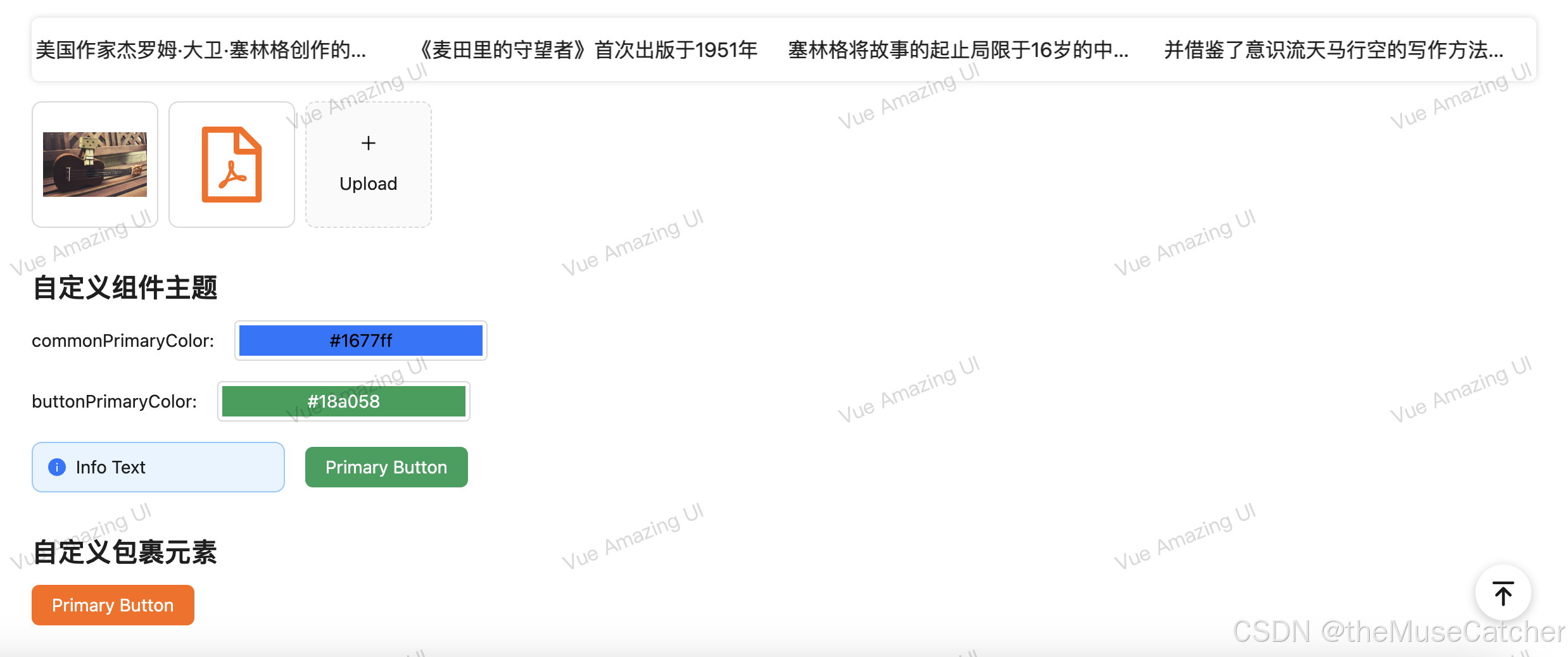
title: '美国作家杰罗姆·大卫·塞林格创作的唯一一部长篇小说',
href: 'https://blog.csdn.net/Dandrose?type=blog',
target: '_blank'
},
{
title: '《麦田里的守望者》首次出版于1951年',
href: 'https://blog.csdn.net/Dandrose?type=blog',
target: '_blank'
},
{
title: '塞林格将故事的起止局限于16岁的中学生霍尔顿·考尔菲德从离开学校到纽约游荡的三天时间内'
},
{
title: '并借鉴了意识流天马行空的写作方法,充分探索了一个十几岁少年的内心世界',
href: 'https://blog.csdn.net/Dandrose?type=blog',
target: '_blank'
},
{
title: '愤怒与焦虑是此书的两大主题,主人公的经历和思想在青少年中引起强烈共鸣',
href: 'https://blog.csdn.net/Dandrose?type=blog',
target: '_blank'
}
])
const fileList = ref<UploadFileType[]>([
{
name: '1.jpg',
url: 'https://cdn.jsdelivr.net/gh/themusecatcher/resources@0.1.2/1.jpg'
},
{
name: 'Markdown.pdf',
url: 'https://cdn.jsdelivr.net/gh/themusecatcher/resources@0.1.2/Markdown.pdf'
}
])
function onIncrease(scale: number) {
const res = percent.value + scale
if (res > 100) {
percent.value = 100
} else {
percent.value = res
}
}
function onDecline(scale: number) {
const res = percent.value - scale
if (res < 0) {
percent.value = 0
} else {
percent.value = res
}
}
</script>
<template>
<div>
<h1>{{ $route.name }} {{ $route.meta.title }}</h1>
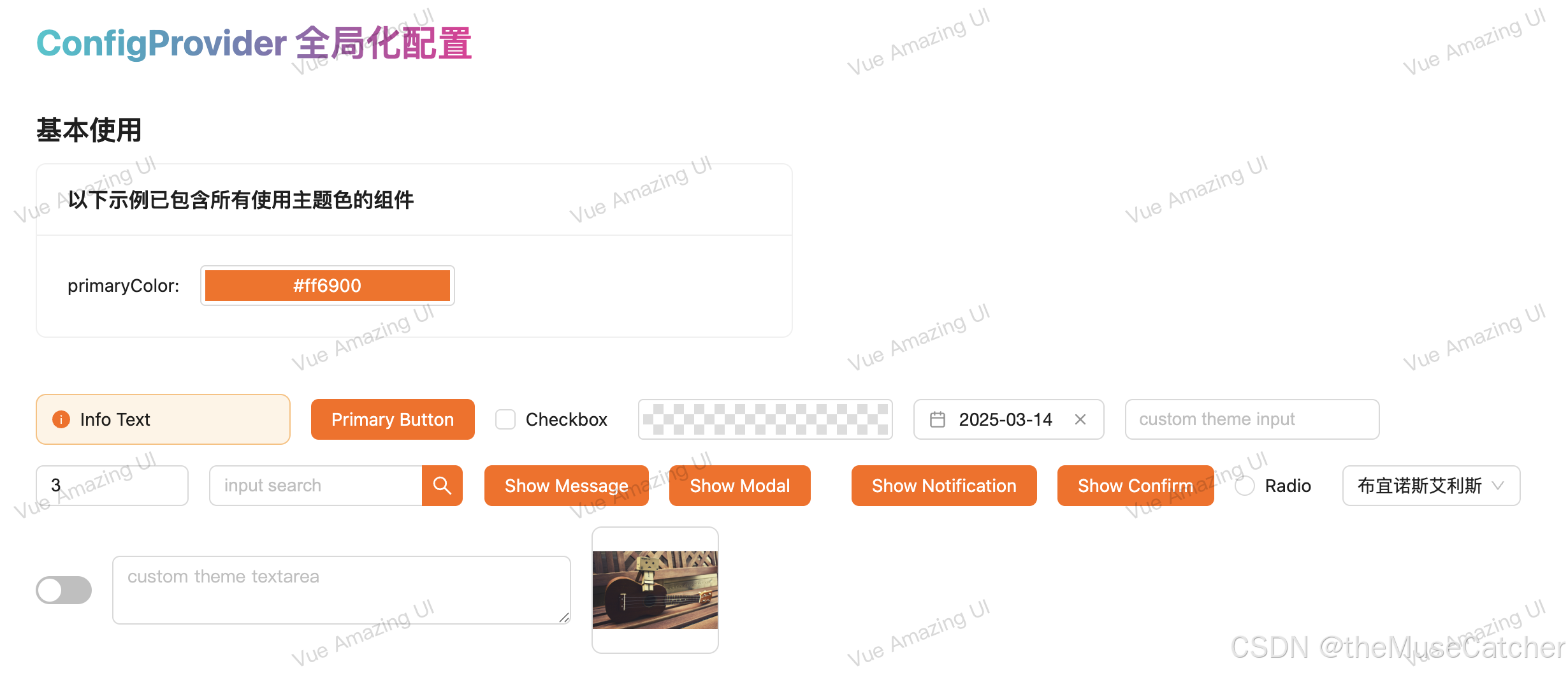
<h2 class="mt30 mb10">基本使用</h2>
<Card width="50%" title="以下示例已包含所有使用主题色的组件">
<Space align="center"> primaryColor:<ColorPicker style="width: 200px" v-model:value="primaryColor" /> </Space>
</Card>
<br />
<br />
<ConfigProvider :theme="{ common: { primaryColor } }">
<Flex vertical>
<Space align="center">
<Alert style="width: 200px" message="Info Text" type="info" show-icon />
<BackTop />
<Button type="primary">Primary Button</Button>
<Checkbox v-model:checked="checkboxChecked">Checkbox</Checkbox>
<ColorPicker :width="200" />
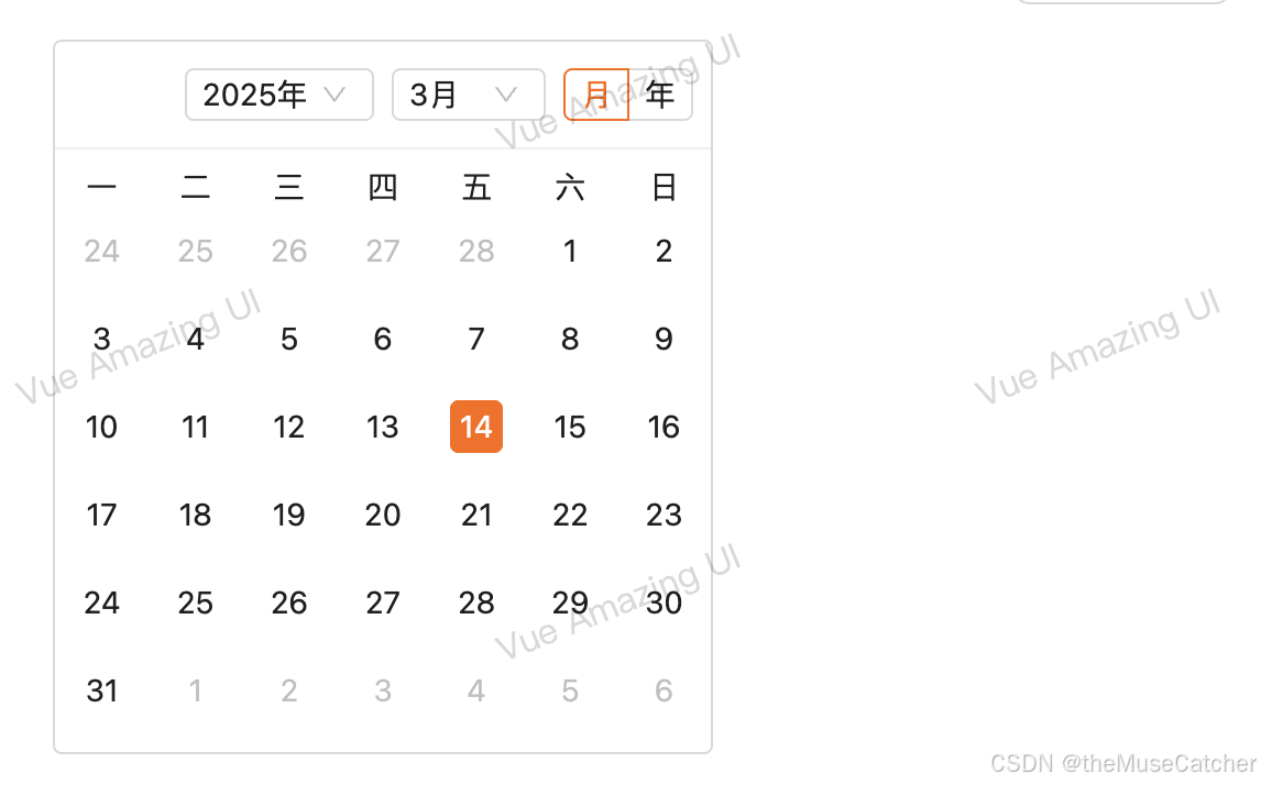
<DatePicker v-model="dateValue" format="yyyy-MM-dd" placeholder="请选择日期" />
<Input :width="200" v-model:value="inputValue" placeholder="custom theme input" />
<InputNumber :width="120" v-model:value="inputNumberValue" placeholder="please input" />
<InputSearch
:width="200"
v-model:value="inputSearchValue"
:search-props="{ type: 'primary' }"
placeholder="input search"
/>
<Button type="primary" @click="messageRef.info('This is an info message')">Show Message</Button>
<Message ref="messageRef" />
<Button
type="primary"
@click="modalRef.info({ title: 'This is an info modal', content: 'Some descriptions ...' })"
>Show Modal</Button
>
<Modal ref="modalRef" />
<Button
type="primary"
@click="notificationRef.info({ title: 'Notification Title', description: 'This is a normal notification' })"
>Show Notification</Button
>
<Notification ref="notificationRef" />
<Popconfirm title="Custom Theme" description="There will have some descriptions ..." icon="info">
<Button type="primary">Show Confirm</Button>
</Popconfirm>
<Radio v-model:checked="radioChecked">Radio</Radio>
<Select :options="options" v-model="selectedValue" />
<Switch v-model="switchChecked" />
<Textarea :width="360" v-model:value="textareaValue" placeholder="custom theme textarea" />
<Image src="https://cdn.jsdelivr.net/gh/themusecatcher/resources@0.1.2/1.jpg" />
</Space>
<Calendar v-model:value="cardDate" display="card" />
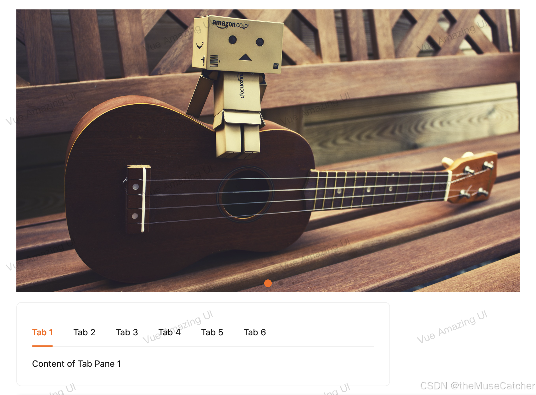
<Carousel style="margin-left: 0" :images="images" :width="800" :height="450" />
<Card width="50%" style="height: 300px; transform: translate(0)">
<FloatButton type="primary" :right="96">
<template #icon>
<MessageOutlined />
</template>
</FloatButton>
<FloatButton type="primary" shape="square">
<template #icon>
<CommentOutlined />
</template>
</FloatButton>
</Card>
<LoadingBar ref="loadingBarRef" :container-style="{ position: 'absolute' }" :to="cardRef" />
<div
ref="cardRef"
style="position: relative; width: 50%; padding: 48px 36px; border-radius: 8px; border: 1px solid #f0f0f0"
>
<Space>
<Button type="primary" @click="loadingBarRef.start()">Start</Button>
<Button @click="loadingBarRef.finish()">Finish</Button>
<Button type="danger" @click="loadingBarRef.error()">Error</Button>
</Space>
</div>
<Pagination v-model:page="page" :total="500" show-quick-jumper />
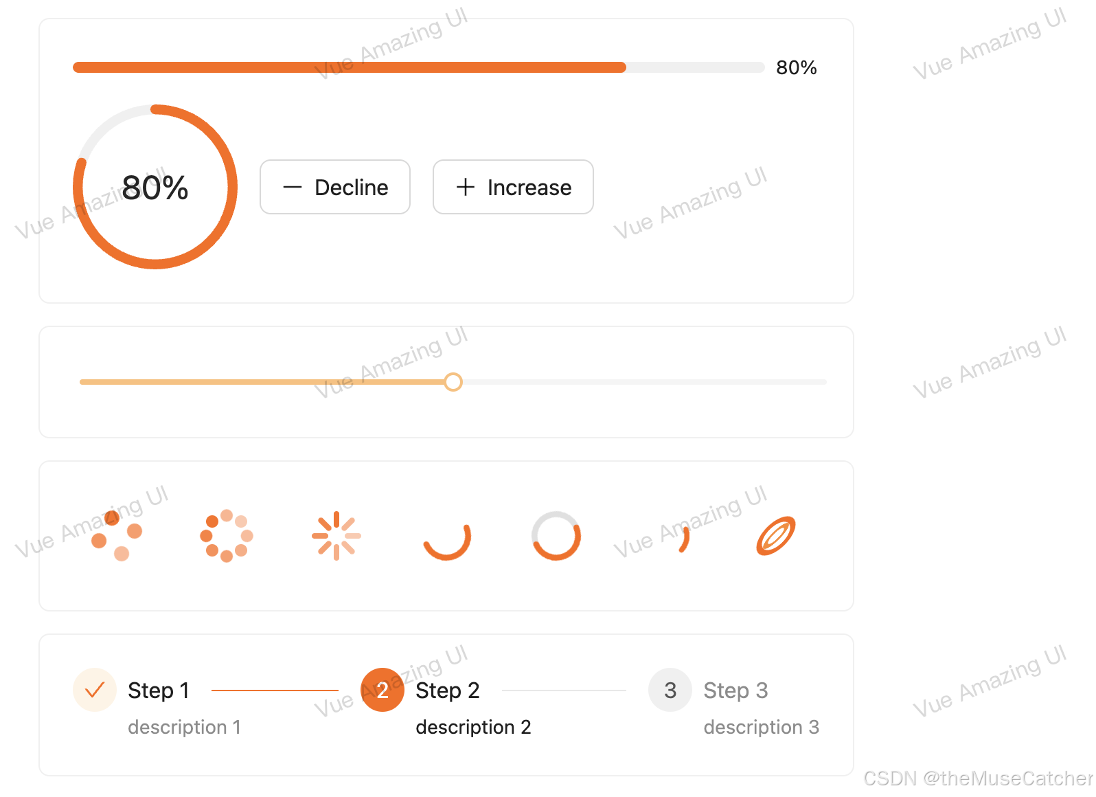
<Card width="50%">
<Flex vertical>
<Progress :percent="percent" />
<Space align="center">
<Progress type="circle" :percent="percent" />
<Button @click="onDecline(5)" size="large" :icon="() => h(MinusOutlined)">Decline</Button>
<Button @click="onIncrease(5)" size="large" :icon="() => h(PlusOutlined)">Increase</Button>
</Space>
</Flex>
</Card>
<Card width="50%">
<Slider v-model:value="sliderValue" />
</Card>
<Card width="50%">
<Flex style="height: 60px">
<Spin spinning />
<Spin spinning indicator="spin-dot" />
<Spin spinning indicator="spin-line" />
<Spin spinning :spin-circle-percent="50" indicator="ring-circle" />
<Spin spinning :spin-circle-percent="50" indicator="ring-rail" />
<Spin spinning indicator="dynamic-circle" />
<Spin spinning indicator="magic-ring" />
</Flex>
</Card>
<Card width="50%">
<Steps :items="stepsItems" v-model:current="current" />
</Card>
<Swiper
style="margin-left: 0"
:images="images"
:width="800"
:height="450"
:speed="800"
:pagination="{
dynamicBullets: true,
clickable: true
}"
/>
<Card width="50%">
<Tabs :items="tabItems" v-model:active-key="activeKey" />
</Card>
<TextScroll :items="scrollItems" />
<Upload v-model:fileList="fileList" />
</Flex>
</ConfigProvider>
<h2 class="mt30 mb10">自定义组件主题</h2>
<Flex vertical>
<Space align="center">
commonPrimaryColor:<ColorPicker style="width: 200px" v-model:value="commonPrimaryColor" />
</Space>
<Space align="center">
buttonPrimaryColor:<ColorPicker style="width: 200px" v-model:value="buttonPrimaryColor" />
</Space>
<ConfigProvider :theme="theme">
<Space align="center">
<Alert style="width: 200px" message="Info Text" type="info" show-icon />
<Button type="primary">Primary Button</Button>
</Space>
</ConfigProvider>
</Flex>
<h2 class="mt30 mb10">自定义包裹元素</h2>
<ConfigProvider :abstract="false" tag="span" :theme="{ common: { primaryColor: '#ff6900' } }">
<Button type="primary">Primary Button</Button>
</ConfigProvider>
</div>
</template>


