从底部弹起的滚动选择器。支持五种选择器,通过mode来区分,分别是普通选择器,多列选择器,时间选择器,日期选择器,省市区选择器,默认是普通选择器。
学习一下日期选择器
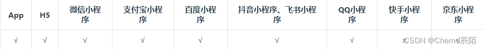
平台差异说明
日期选择默认在App端和H5端(PC版Chrome以及PC版FireFox)调用的是os的原生日期选择控件,在不同平台有不同的ui表现,当配置fields参数后使用统一的展示方式。
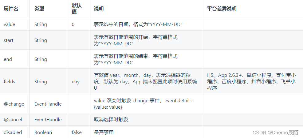
属性说明
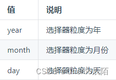
fields 有效值
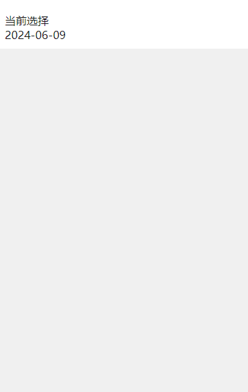
演示效果:
完整代码:
<template>
	<view class="pages">
		<!-- picker时间选择 -->
		<view class="uni-list">
			<view class="uni-list-cell">
				<view class="uni-list-cell-left">
					当前选择
				</view>
				<view class="uni-list-cell-db">
					<picker mode="date" :value="date" :start="startDate" :end="endDate" @change="bindDateChange">
						<view class="uni-input">{{date}}</view>
					</picker>
				</view>
			</view>
		</view>
	</view>
</template>

<script>
	export default {
		data() {
			const currentDate = this.getDate({
				format: true
			})
			return {
				index: 0,
				date: currentDate,
			}
		},
		computed: {
			startDate() {
				return this.getDate('start');
			},
			endDate() {
				return this.getDate('end');
			}
		},
		methods: {
			bindDateChange: function(e) {
				this.date = e.detail.value
			},
			getDate(type) {
				const date = new Date();
				let year = date.getFullYear();
				let month = date.getMonth() + 1;
				let day = date.getDate();

				if (type === 'start') {
					year = year - 60;
				} else if (type === 'end') {
					year = year + 2;
				}
				month = month > 9 ? month : '0' + month;
				day = day > 9 ? day : '0' + day;
				return `${year}-${month}-${day}`;
			}
		}
	}
</script>

<style scoped lang="scss">
	.pages {
		background-color: #eee;
		height: 100vh;
	}
	.uni-list{
		background-color: #fff;
		// margin: 10px;
		margin-top: 10px;
		padding: 10px;
	}

</style>