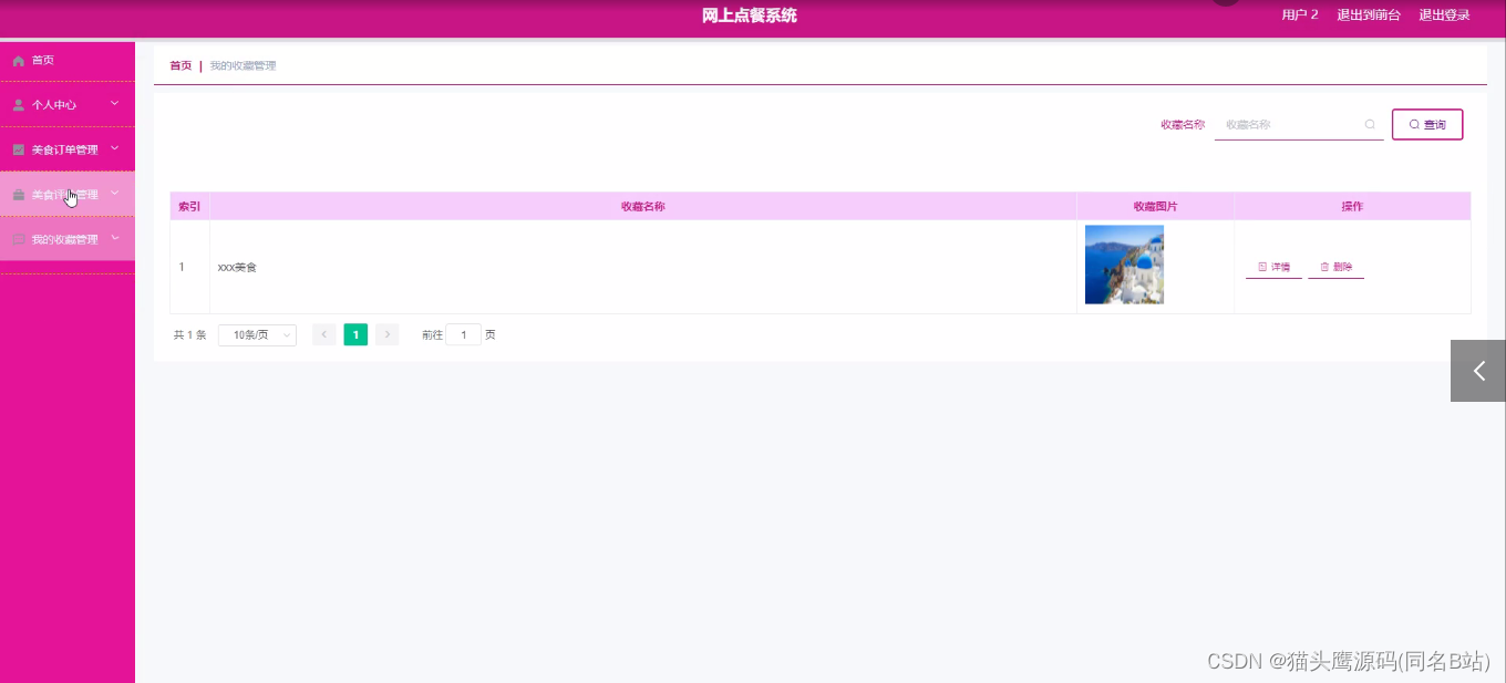
这里打包分享150套简洁漂亮的html个人简历源码,个人主页源码,作为个人简介网页版,它的风格是简约大气的,扁平化的个人主页网站模板。
如果有用请点赞收藏,无加密源码,直接拿来就可以用的。它是html+css网页设计源码,html5网页静态模板。我分别给文件上命名了,一目了然,大家拿来就可以直接套用的,有代码能力的也可以修改一些版块。

一个优质的HTML5网站模板对于个人展示和简历展示来说是非常重要的。它不仅能够能让你的个人品牌更加专业和吸引人,也能帮助你在众多求职者中脱颖而出。
html5个人主页模板合集链接:
模板源码 密码:A688
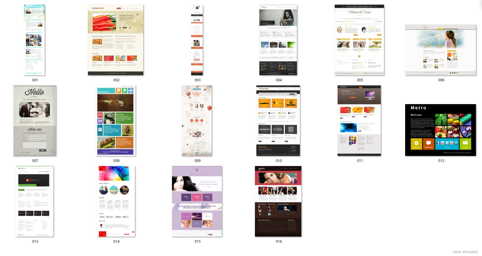
下面的部分预览图:
html5橘红色网页模版jetro是一款基于html5开发的响应试网页,包含了首页,产品页,博客页面,文章页面以及联系页面等。能够在桌面电脑、平板电脑已经智能手机进行完美的展示。

Clean简洁响应式HTML5博客模板下载_简洁 响应式 博客 blog 个人 个人主页 bootstrap 简单 技术开发 灰色

CSS3仿Flash动画个人博客模板是一款横向全屏切换的个人博客模板下载
CSS3炫酷个人简历网站模板是一款黑色酷炫风格的个人简历模板下载。

Emotion简洁多图展示企业整站模板_棕色 简洁 展示 图片 企业 整站 响应式 手机 幻灯 大图 标准 外贸 英文 博客 咨询 服务 律师

下面的部分源码:
index源代码:
<!DOCTYPE html>
<html>
<head>
<title>Home </title>
<meta http-equiv="Content-Type" content="text/html; charset=utf-8"/>
<meta name="viewport" content="width=device-width, initial-scale=1, maximum-scale=1"/>
<link href='http://fonts.googleapis.com/css?family=Open+Sans' rel='stylesheet' type='text/css'/>
<link href="css/style.css" rel="stylesheet" type="text/css" media="all"/>
<script type="text/javascript" src="js/jquery.js"></script>
<!-- jQuery -->
<!--start slider-->
<link href="css/camera.css" rel="stylesheet" type="text/css" media="all" />
<script src="js/jquery.min.js"></script>
<script type='text/javascript' src="js/jquery.mobile.customized.min.js"></script>
<script type='text/javascript' src="js/jquery.easing.1.3.js"></script>
<script type='text/javascript' src="js/camera.min.js"></script>
<script>
jQuery(function(){
jQuery('#camera_wrap_2').camera({
loader: 'bar',
pagination: false,
thumbnails: true
});
});
</script>
<!--end slider-->
<!--start gallery-->
<script type="text/javascript" src="js/jquery.easing.min.js"></script>
<script type="text/javascript" src="js/jquery.mixitup.min.js"></script>
<script type="text/javascript">
$(function () {
var filterList = {
init: function () {
// MixItUp plugin
// http://mixitup.io
$('#gallerylist').mixitup({
targetSelector: '.portfolio',
filterSelector: '.filter',
effects: ['fade'],
easing: 'snap',
// call the hover effect
onMixEnd: filterList.hoverEffect()
});
},
hoverEffect: function () {
// Simple parallax effect
$('#gallerylist .portfolio').hover(
function () {
$(this).find('.label').stop().animate({bottom: 0}, 200, 'easeOutQuad');
$(this).find('img').stop().animate({top: -30}, 500, 'easeOutQuad');
},
function () {
$(this).find('.label').stop().animate({bottom: -40}, 200, 'easeInQuad');
$(this).find('img').stop().animate({top: 0}, 300, 'easeOutQuad');
}
);
}
};
// Run the show!
filterList.init();
});
</script>
<!--Add fancyBox main JS and CSS files-->
<script src="js/jquery.magnific-popup.js" type="text/javascript"></script>
<script>
$(document).ready(function() {
$('.popup-with-zoom-anim').magnificPopup({
type: 'inline',
fixedContentPos: false,
fixedBgPos: true,
overflowY: 'auto',
closeBtnInside: true,
preloader: false,
midClick: true,
removalDelay: 300,
mainClass: 'my-mfp-zoom-in'
});
});
</script>
</head>
<body>
<!--star-wrap-->
<div class="wrap">
<!--header-->
<div class="header">
<!--start-logo-->
<div class="logo">
<a href="index.html"><h1>jet<span>ro</span></h1></a>
</div>
<!--end-logo-->
<!--start-menu-->
<div class="menu">
<a class="toggleMenu" href="#"><img src="images/nav.png" alt= " " /></a>
<ul class="nav">
<li class="active"><a href="index.html">home</a></li>
<li ><a href="about.html">about us</a></li>
<li><a href="blog.html">blog</a></li>
<li><a href="portfolio.html">portfolio</a></li>
<li><a href="contact.html">contact us</a></li>
<div class="clear"> </div>
</ul>
<script type="text/javascript" src="js/responsive-nav.js"></script>
</div>
<div class="clear"> </div>
<!--end-menu-->
</div>
</div>
<!--end-header-->
<!--end wrap-->
<!-- start slider -->
<div class="main-con">
<div class="slider">
<div class="color"> <span> </span></div>
<div class="wrap">
<div class="fluid_container">
<div class="camera_wrap camera_magenta_skin" id="camera_wrap_2">
<div data-thumb="images/them1.png" data-src="images/slider1.jpg">
<div class="camera_caption fadeFromBottom">
<h2>slider one</h2>
<p>Lorem ipsum dolor sit amet, consectetur adipisicing elit, sed do eiusmod tempor incididunt ut labore et dolore magna aliqua.</p>
</div>
</div>
<div data-thumb="images/them2.jpg" data-src="images/slider2.jpg">
<div class="camera_caption fadeFromBottom">
<h2>slider two</h2>
<p>Lorem ipsum dolor sit amet, consectetur adipisicing elit, sed do eiusmod tempor incididunt ut labore et dolore magna aliqua. </p>
</div>
</div>
<div data-thumb="images/them3.jpg" data-src="images/slider3.jpg">
<div class="camera_caption fadeFromBottom">
<h2>slider three</h2>
<p>Lorem ipsum dolor sit amet, consectetur adipisicing elit, sed do eiusmod tempor incididunt ut labore et dolore magna aliqua.</p>
</div>
</div>
<div data-thumb="images/them4.jpg" data-src="images/slider4.jpg">
<div class="camera_caption fadeFromBottom">
<h2>slider four</h2>
<p>Lorem ipsum dolor sit amet, consectetur adipisicing elit, sed do eiusmod tempor incididunt ut labore et dolore magna aliqua. </p>
</div>
</div>
<div data-thumb="images/them2.jpg" data-src="images/slider2.jpg">
<div class="camera_caption fadeFromBottom">
<h2>slider ofive</h2>
<p>Lorem ipsum dolor sit amet, consectetur adipisicing elit, sed do eiusmod tempor incididunt ut labore et dolore magna aliqua.</p>
</div>
</div>
<div data-thumb="images/them6.jpg" data-src="images/slider6.jpg">
<div class="camera_caption fadeFromBottom">
<h2>slider six</h2>
<p>Lorem ipsum dolor sit amet, consectetur adipisicing elit, sed do eiusmod tempor incididunt ut labore et dolore magna aliqua.</p>
</div>
</div>
</div><!-- #camera_wrap_2 -->
</div><!-- .fluid_container -->
<div class="clear"></div>
</div>
</div>
<!--end slider-->
<!--start home-page-con-->
<div class="home-page-con">
<div class="wrap">
<div class="top-grids">
<div class="top-grid">
<div class="top-grid-info">
<img src="images/por.png" style="margin-top: 4px;" alt=" "/>
<h2>check out my lastest portfolio items</h2>
<div class="clear"> </div>
</div>
<p>Lorem ipsum dolor sit amet, consectetur adipisicing elit, sed do eiusmod tempor incididunt ut labore et dolore magna aliqua. Ut enim ad minim veniam, quis nostrud exercitation ullamco laboris nisi ut aliquip ex ea commodo consequat. </p>
<a class="btn" href="portofolioitem.html">More</a>
</div>
<div class="top-grid">
<div class="top-grid-info">
<img src="images/wrok.png" alt=" "/>
<h2>check out my lastest portfolio items</h2>
<div class="clear"> </div>
</div>
<p>Lorem ipsum dolor sit amet, consectetur adipisicing elit, sed do eiusmod tempor incididunt ut labore et dolore magna aliqua. Ut enim ad minim veniam, quis nostrud exercitation ullamco laboris nisi ut aliquip ex ea commodo consequat. </p>
<a class="btn" href="portofolioitem.html">More</a>
</div>
<div class="top-grid">
<div class="top-grid-info">
<img src="images/connect.png" alt=" "/>
<h2>check out my lastest portfolio items</h2>
<div class="clear"> </div>
</div>
<p>Lorem ipsum dolor sit amet, consectetur adipisicing elit, sed do eiusmod tempor incididunt ut labore et dolore magna aliqua. Ut enim ad minim veniam, quis nostrud exercitation ullamco laboris nisi ut aliquip ex ea commodo consequat. </p>
<a class="btn" href="portofolioitem.html">More</a>
</div>
<div class="clear"> </div>
</div>
<div class="heading">
<h2>recent wroks</h2>
<h6> </h6>
<div class="clear"> </div>
</div>
<!--end home-page-con-->
<div class="main_btm">
<!--start-mfp -->
<div id="small-dialog1" class="mfp-hide">
<div class="pop_up">
<h2>character desing</h2>
<img src="images/popup.jpg" alt=" "/>
<p class="para">Sed ut perspiciatis unde omnis iste natus error sit voluptatem accusantium doloremque laudantium, totam rem aperiam, eaque ipsa quae ab illo inventore veritatis et quasi architecto beatae vitae dicta sunt explicabo. Nemo enim ipsam voluptatem quia voluptas sit aspernatur aut odit aut fugit, sed quia consequuntur magni dolores eos qui ratione voluptatem sequi nesciunt.</p>
</div>
</div>
<!--end-mfp -->
<!--start-content-->
<div class="gallery">
<div class="clear"> </div>
<div class="container">
<div id="gallerylist">
<div class="gallerylist-wrapper">
<a class="popup-with-zoom-anim" href="#small-dialog1">
<img src="images/image1.jpg" alt="Image 1"/>
<span><img src="images/plus.png" alt=" "/> </span>
<div class="desc">
<h2>character desing</h2>
<h3>june 15,2014</h3>
</div>
</a>
</div>
<div class="gallerylist-wrapper">
<a class="popup-with-zoom-anim" href="#small-dialog1">
<img src="images/image2.jpg" alt="Image 2"/>
<span><img src="images/plus.png" alt=" "/> </span>
<div class="desc">
<h2>brochure desing</h2>
<h3>june 15,2014</h3>
</div>
</a>
</div>
<div class="gallerylist-wrapper">
<a class="popup-with-zoom-anim" href="#small-dialog1">
<img src="images/image3.jpg" alt="Image 3" />
<span><img src="images/plus.png" alt=" "/> </span>
<div class="desc">
<h2>social media buttons</h2>
<h3>june 15,2014</h3>
</div>
</a>
</div>
<div class="gallerylist-wrapper">
<a class="popup-with-zoom-anim" href="#small-dialog1">
<img src="images/image4.jpg" alt="Image 4" />
<span><img src="images/plus.png" alt=" "/> </span>
<div class="desc">
<h2>10 amazing websites</h2>
<h3>june 15,2014</h3>
</div>
</a>
</div>
</div>
</div>
</div><!-- container -->
<script type="text/javascript" src="js/fliplightbox.min.js"></script>
<script type="text/javascript">$('body').flipLightBox()</script>
<div class="clear"> </div>
</div>
</div>
</div>
<!--End-gallery-->
<!--start footer-->
<div class="footer">
<div class="footer-main wrap">
<div class="footer-grids">
<div class="fgrid">
<h3>about jetro</h3>
<p>Lorem ipsum dolor sit amet, consectetur adipisicing elit, sed do eiusmod tempor incididunt ut labore et dolore magna aliqua,Ut enim ad minim veniam.</p>
<p>Lorem ipsum dolor sit amet, consectetur adipisicing elit, sed do eiusmod tempor incididunt.</p>
</div>
<div class="fgrid">
<h3>twitter widget</h3>
<div>
<p><a href="#">@Lorem ipsum</a> What an awesome design with great functioality:)</p>
<a href="#">about 1 hour ago</a>
</div>
<div>
<p><a href="#">@Lorem ipsum</a> What an awesome design with great functioality:)</p>
<a href="#">about 2 hour ago</a>
</div>
<div>
<p>Follow <a href="#">@Lorem ipsum</a></p>
</div>
</div>
<div class="fgrid">
<h3>contact us</h3>
<p>Lorem ipsum dolor sit amet, consectetur adipisicing elit, sed do eiusmod tempor incididunt ut labore et dolore magna aliqua,Ut enim ad minim veniam.</p>
<a href="#"><p>information@jetro.com</p></a>
<h4>1,22,333,4444</h4>
<div class="social-media">
<ul>
<li> <span class="simptip-position-bottom simptip-movable" data-tooltip="Facebook"><a href="#" target="_blank"> </a></span></li>
<li><span class="simptip-position-bottom simptip-movable" data-tooltip="twitter"><a href="#" target="_blank"> </a> </span></li>
<li><span class="simptip-position-bottom simptip-movable" data-tooltip="email"><a href="#" target="_blank"> </a></span></li>
<li><span class="simptip-position-bottom simptip-movable" data-tooltip="rss"><a href="#" target="_blank"> </a></span></li>
<li><span class="simptip-position-bottom simptip-movable" data-tooltip="vimeo"><a href="#" target="_blank"> </a></span></li>
</ul>
</div>
</div>
<div class="clear"> </div>
</div>
</div>
</div>
<!--end footer-->
<div class="copy-right">
<div class="wrap">
<div class="copy-right-left">
<p>Copyright © 2014.Company name All rights reserved.<a target="_blank" href="http://guantaow.taobao.com/">厚朴网络淘宝店</a><a target="_blank" href="http://www.moobnn.com">网页模板</a></p>
</div>
</div>
</div>
</div>
<div style="display:none"><script src='http://v7.cnzz.com/stat.php?id=155540&web_id=155540' language='JavaScript' charset='gb2312'></script></div>
</body>
</html>
style源代码:
/*
Author: W3layouts
Author URL: http://w3layouts.com
License: Creative Commons Attribution 3.0 Unported
License URL: http://creativecommons.org/licenses/by/3.0/
 /* reset */
html,body,div,span,applet,object,iframe,h1,h2,h3,h4,h5,h6,p,blockquote,pre,a,abbr,acronym,address,big,cite,code,del,dfn,em,img,ins,kbd,q,s,samp,small,strike,strong,sub,sup,tt,var,b,u,i,dl,dt,dd,ol,nav ul,nav li,fieldset,form,label,legend,table,caption,tbody,tfoot,thead,tr,th,td,article,aside,canvas,details,embed,figure,figcaption,footer,header,hgroup,menu,nav,output,ruby,section,summary,time,mark,audio,video{margin:0;padding:0;border:0;font-size:100%;font:inherit;vertical-align:baseline;}
article, aside, details, figcaption, figure,footer, header, hgroup, menu, nav, section {display: block;}
ol,ul{list-style:none;margin:0;padding:0;}
blockquote,q{quotes:none;}
blockquote:before,blockquote:after,q:before,q:after{content:'';content:none;}
table{border-collapse:collapse;border-spacing:0;}
/* start editing from here */
a{text-decoration:none;}
.txt-rt{text-align:right;}/* text align right */
.txt-lt{text-align:left;}/* text align left */
.txt-center{text-align:center;}/* text align center */
.float-rt{float:right;}/* float right */
.float-lt{float:left;}/* float left */
.clear{clear:both;}/* clear float */
.pos-relative{position:relative;}/* Position Relative */
.pos-absolute{position:absolute;}/* Position Absolute */
.vertical-base{	vertical-align:baseline;}/* vertical align baseline */
.vertical-top{	vertical-align:top;}/* vertical align top */
.underline{	padding-bottom:5px;	border-bottom: 1px solid #eee; margin:0 0 20px 0;}/* Add 5px bottom padding and a underline */
nav.vertical ul li{	display:block;}/* vertical menu */
nav.horizontal ul li{	display: inline-block;}/* horizontal menu */
img{max-width:100%;}
/*end reset*/
@font-face {
    font-family: 'bebasregular';
    src: url('../fonts/BEBAS___-webfont.eot');
    src: url('../fonts/BEBAS___-webfont.eot?#iefix') format('embedded-opentype'),
         url('../fonts/BEBAS___-webfont.woff') format('woff'),
         url('../fonts/BEBAS___-webfont.ttf') format('truetype'),
         url('../fonts/BEBAS___-webfont.svg#bebasregular') format('svg');
    font-weight: normal;
    font-style: normal;
}
@font-face {
    font-family: 'open_sansregular';
    src: url('../fonts/OpenSans-Regular-webfont.eot');
    src: url('../fonts/OpenSans-Regular-webfont.eot?#iefix') format('embedded-opentype'),
         url('../fonts/OpenSans-Regular-webfont.woff') format('woff'),
         url('../fonts/OpenSans-Regular-webfont.ttf') format('truetype'),
         url('../fonts/OpenSans-Regular-webfont.svg#open_sansregular') format('svg');
    font-weight: normal;
    font-style: normal;
}
body {
    font-family: 'bebasregular';
     background:#FFF;
}
.wrap{
	width:70%;
	margin:0 auto;
	transition:all .2s linear;
	-moz-transition:all .2s linear;/* firefox */
	-webkit-transition:all .2s linear; /* safari and chrome */
	-o-transition:all .2s linear; /* opera */
	-ms-transition:all .2s linear;

}
/********start-header************/
.header_top{

	border-radius:5px;
	-webkit-border-radius:5px;
	-moz-border-radius:5px;
	-o-border-radius:5px;
	position:relative;
}
/*********start-logo **********/
.logo{
	float:left;
	margin: 15px 10px;
}
.logo a h1
{
	font-size: 2.5em;
	margin-bottom: 0px;
	text-align: center;
	font-family: 'bebasregular';
}
.logo a h1 {
	color: #e8603c;
}

.logo a h1 span{
	color: #f3af9d;
}
.color
{
	background: #f2b19c;
	width: 100%;
	height: 50px;
	position: absolute;
}
/********end-logo*********/
/**start-nav**/
	.menu {
	float:right;
    z-index: 1;
    margin-top: 5px;
}
.menu ul{
	margin-left:6px;
}
.menu li{
	float:left;
}
.menu li a{
	 color:#FFF;
	 font-size:1em;
	 padding:25px 20px;
	 display: block;
	 text-align:center;
	 color:#B9B9B9;
	 -webkit-transition: all 0.5s ease-in-out;
	 -moz-transition: all 0.5s ease-in-out;
	 -o-transition: all 0.5s ease-in-out;
	 transition: all 0.5s ease-in-out;
	 position:relative;
}
.menu li a:hover{
	color:#e8603c;

}
.menu li.active a{
	color:#e8603c;

}
.menu li i img{
	margin-bottom:-10px;
	margin-right:10px;
}
.menu li a span.messages{
	position:absolute;
	top:10px;
	right:20px;
	font-size:1em;
	color:#FFF;
	background:#e64c65;
	padding: 3px 0px 0px 0px;
	width: 25px;
	height: 22px;
	border-radius:0.8em;
	-webkit-border-radius:0.8em;
	-moz-border-radius:0.8em;
	-o-border-radius:0.8em;
}
.toggleMenu {
    display:  none;
    background:#e8603c;
    padding:10px 10px 5px 10px;
    border-radius:2em;
    -webkit-border-radius:2em;
    -moz-border-radius:2em;
    -o-border-radius:2em;
}
.toggleMenu:hover{
	background:#f3af9d;
}
.nav:before,
.nav:after {
    content: " ";
    display: table;
}
.nav:after {
    clear: both;
}
.nav ul {
    list-style: none;
}
.nav > li > a {
    display: block;
}

/**end-nav***/
/********end-header*******/
/*********content********/
.color
{
	background: #f2b19c;
	width: 100%;
	height: 50px;
	position: absolute;
}
.color span {
	background: #FFF;
	padding: 1.6em 0.8em;
	width: 69.6%;
	display: block;
	margin: 0 auto;
}
.top-grids
{
	padding: 40px 0px;
}
.top-grid
{
	width:30%;
	float:left;
	margin-right:5%;
}
.top-grid:nth-child(3)
{
	margin-right: 0px;
}
.top-grid-info
{
	padding-bottom: 2em;
}
.top-grid-img
{
	padding: 30px 0px;
}
.top-grid-info img
{
	float:left;

}
.top-grid-info h2
{
	width:75%;
	float:right;
	color: #e8603c;
	font-size:1.3em;

}
.top-grid p
{
	font-family: 'open_sansregular';
	font-size: 0.875em;
	color: #353535;
	line-height: 1.9em;
	padding-bottom: 25px;
}
.btn {
	color: #fff ;
	background: #E8663C;
	border: 2px solid  #e8603c;
	text-transform: uppercase;
	padding: 0.4em 1.2em;
	font-size: 0.89em;
	transition: 0.5s all;
	-webkit-transition: 0.5s all;
	-moz-transition: 0.5s all;
	-o-transition: 0.5s all;
	display: inline-block;
}
.btn:hover
{
	background: #F2B19C;
	border: 2px solid  #F2B19C;

}
.heading
{
	padding-bottom: 3em;

}
.heading h2{
	float:left;
	color: #e8603c;
	font-size:1.3em;
}
.heading h6{
	width: 85%;
	height: 25px;
	float:right;
	background:url(../images/line.jpg);
}

#gallerylist {
	-webkit-box-sizing: border-box;
	-moz-box-sizing: border-box;
	-o-box-sizing: border-box;
	overflow:hidden;
	width:100%;
}
.gallerylist-wrapper {
	overflow:hidden;
	position: relative !important;
	cursor:pointer;
	width: 23%;
	margin-right:2.6%;
	background: #fff;
	float: left;
}
.gallerylist img {
	max-width:100%;
	position: relative;
	-webkit-filter: grayscale(100%);
	opacity: 5;
	transition: all 300ms!important;
	-webkit-transition: all 300ms!important;
	-moz-transition: all 300ms!important;
}

.gallerylist-wrapper:nth-child(4)
{
	margin-right: 0px;
}
.gallerylist-wrapper img{
	width: 100%;
}
.desc
{
	padding: 10px;
	border: 1px solid #ECE9E9;
	border-top: none;
}
.desc h2
{

	font-size:15px;
	color:#b9b9b9;
	margin-bottom:10px;
	text-transform: capitalize;
	text-transform: capitalize;
	-webkit-transition: all 0.5s ease-in-out;
	-moz-transition: all 0.5s ease-in-out;
	-o-transition: all 0.5s ease-in-out;
	transition: all 0.5s ease-in-out;
}
.desc h2:hover
{
	color:#e8603c;
}
.desc h3
{

	font-size:13px;
	color:#e8603c;
	margin-bottom:5px;
	text-transform: capitalize;
	-webkit-transition: all 0.5s ease-in-out;
	-moz-transition: all 0.5s ease-in-out;
	-o-transition: all 0.5s ease-in-out;
	transition: all 0.5s ease-in-out;
}
.desc h3:hover
{
	color:#b9b9b9;
}
/* Magnific Popup CSS */
.mfp-bg {
   top: 0;
   left: 0;
   width: 100%;
   height: 100%;
   z-index: 1042;
   overflow: hidden;
   position: fixed;
   background: #0b0b0b;
   opacity: 0.9;
   filter: alpha(opacity=80); }

.mfp-wrap {
   top: 0;
   left: 0;
   width: 100%;
   height: 100%;
   z-index: 1043;
   position: fixed;
   outline: none !important;
   -webkit-backface-visibility: hidden;
 }
.mfp-hide {
  display: none !important;
}
button.mfp-close,
button.mfp-arrow {
   overflow: visible;
   cursor: pointer;
   background: transparent;
   border: 0;
   -webkit-appearance: none;
   display: block;
   padding: 0;
   z-index: 1046; }

button::-moz-focus-inner {
   padding: 0;
   border: 0; }

.mfp-close {
   width:30px;
   height:30px;
   line-height: 44px;
   position: absolute;
   right: 0;
   top: 0;
   text-decoration: none;
   text-align: center;
   opacity: 0.65;
   padding: 0 0 18px 10px;
   color: white;
   font-style: normal;
   font-size: 28px;
   outline:none;
 }
  .mfp-close:hover, .mfp-close:focus {
    opacity: 9; }
  .mfp-close:active {
    top: 0px; }

.mfp-close-btn-in .mfp-close {
  color: #333333; }
/* Styles for dialog window */
/* pop_up */
.pop_up h2{
	text-transform: capitalize;
	font-size: 1.5em;
	color: #E8603C;
	margin-bottom: 5%;
}
.pop_up img{
	padding-bottom: 20px;
}
.pop_up p{
	font-size: 1em;
	color: #B9B9B9;
	line-height: 1.8em;
	font-family: 'open_sansregular';
}
#small-dialog1{
	background: white;
	padding: 20px 30px;
	text-align: left;
	max-width: 400px;
	margin: 40px auto;
	position: relative;
	border-radius:2px;
	-webkit-border-radius:2px;
	-moz-border-radius:2px;
	-o-border-radius:2px;
}

.my-mfp-zoom-in #small-dialog1 {
	opacity: 0;
	-webkit-transition: all 0.2s ease-in-out;
	-moz-transition: all 0.2s ease-in-out;
	-o-transition: all 0.2s ease-in-out;
	transition: all 0.2s ease-in-out;
	-webkit-transform: scale(0.8);
	-moz-transform: scale(0.8);
	-ms-transform: scale(0.8);
	-o-transform: scale(0.8);
	transform: scale(0.8);
}
/* animate in */
.my-mfp-zoom-in.mfp-ready #small-dialog1 {
	opacity: 1;
	-webkit-transform: scale(1);
	-moz-transform: scale(1);
	-ms-transform: scale(1);
	-o-transform: scale(1);
	transform: scale(1);
}
/* animate out */
.my-mfp-zoom-in.mfp-removing #small-dialog1{
	-webkit-transform: scale(0.8);
	-moz-transform: scale(0.8);
	-ms-transform: scale(0.8);
	-o-transform: scale(0.8);
	transform: scale(0.8);
	opacity: 0;
}

.pop_up p a{
	font-size: 1em;
	color: #555555;
	line-height: 1.8em;
}
/*********end-content****/
/*********start about**********/
.top-heading
{
	background: #f2b19c;
}
.top-heading h1{
	text-align: left;
	padding: 17px 25px;
	color: #FFF;
	font-size: 1.5em;
	background: #E8603C;
	border-right: 10px solid #FFF;
	border-left: 10px solid #FFF;
}
/*******about-grids******************/
.content
{
	width:98%;
	margin: 0 auto;
}
/***********grid-left******************/
.grid-left
{
	width:70%;
	float:left;
}
.grid-right
{
	width:25%;
	float:right;
}
.main-grid p
{
font-family: 'open_sansregular';
color: #525252;
font-size: 0.85em;
padding: 22px 0px;
font-weight: 100;
line-height: 1.9em;
}
.grid-left-img
{
width:100%;
}
.grid-left-img i
{
	float: left;
	width:30%;
}
.grid-left-img p{
	float:right;
	width: 67%;
	padding: 0px;

}
.grid-left p span
{
	color: #e8663c;
	font-size:3em;
}
.grid-left span h6
{
	color: #E8663C;
	float: left;
	width: 10%;
	padding: 47px 0px;
	border-right: 8px solid #E8663C;
	margin: 30px 0px;
}
.grid-left span p
{
	float:right;
	width:86%;
	padding: 0px;
	margin: 30px 0px;
	font-weight: 400;
	font-style: italic;
}
.two-grids p
{
	width:47%;
	float:left;
	margin-right: 6%;
}
.two-grids p:nth-child(2)
{
	margin-right: 0px;
}
.three-grids p{
	width:30%;
	float:left;
	margin-right: 5%;
}
.three-grids p:nth-child(3)
{
	margin-right:0px;
}
/*****************color-boxs******************/
.color-boxs h6
{
	font-family: 'open_sansregular';
	padding: 20px;
	text-align: center;
	margin: 25px 0px;
	font-style: italic;
}
.color-boxs h6:nth-child(1)
{
	color:#b3d73a;
	background: #effeb9;
	border:1px solid #98c601;
}
.color-boxs h6:nth-child(2)
{
	color:#eb5439;
	background: #fbcbc1;
	border:1px solid #eb5439;
}

.color-boxs h6:nth-child(3)
{
	color:#fab418;
	background: #ffe9ad;
	border:1px solid #fab418;
}
.color-boxs h6:nth-child(4)
{
	color:#6ea4d5;
	background: #d1e4f3;
	border:1px solid #4d8fcb;
}

 .alert.style-1.message
{
    color:#b3d73a;
	background: #effeb9;
	border:1px solid #98c601;
	text-align: center;
}
.alert.style-1.success
 {
    color:#eb5439;
	background: #fbcbc1;
	border:1px solid #eb5439;
	text-align: center;
  }
.alert.style-1.error
{
	color:#fab418;
	background: #ffe9ad;
	border:1px solid #fab418;
	text-align: center;
}
 .alert.style-1.info
{
	color:#6ea4d5;
	background: #d1e4f3;
	border:1px solid #4d8fcb;
	text-align: center;
}
/*****************end color-boxs******************/
/*********** end grid-left******************/
/**************grid-right*******************/
.grid-right-headings
{
	padding: 20px 0px;

}
.grid-right-headings h2 a{
	 width:20%;
	float:left;
	color: #e8603c;
	font-size:1em;
}
.grid-right-headings h6{
	width: 60%;
	height: 21px;
	float:right;
	background:url(../images/line.jpg);
}
.side-bar p {
	font-family: 'open_sansregular';
	color: #525252;
	font-size: 0.85em;
	padding: 22px 0px;
	font-weight: 100;
	line-height: 1.9em;
}
.seach-links p
{
	padding: 2px;
}
.seach-links p a
{
	font-family: 'open_sansregular';
	color: #525252;
	font-weight: 100;
	line-height: 1.9em;
	-webkit-transition: all 0.5s ease-in-out;
	-moz-transition: all 0.5s ease-in-out;
	-o-transition: all 0.5s ease-in-out;
	transition: all 0.5s ease-in-out;
}
.seach-links p a:hover{
	color:#E8603C;
}
.gallery ul{
}
.gallery ul li{
	list-style: none;
	float:left;
	width:21.3%;
	margin-right: 10px;
	margin-bottom: 10px;
}
.gallery  li a
{
	background: #fbcbc1;
	border:1px solid #eb5439;
	text-decoration: none;
	display: block;
	padding: 45%;
}
.gallery ul li:nth-child(4),.gallery ul li:nth-child(4)
{
	margin-right: 0px;
}
/**************end grid-right*******************/
/*********end about************/
/****************start blog***************/
.blog-grids
{
	width:98%;
	margin: 10px 0px;
	position: relative;
}
.blog-grids .blog-left p
{
font-family: 'open_sansregular';
color: #525252;
font-size: 0.85em;
padding: 22px 0px;
font-weight: 100;
line-height: 1.9em;
}
/***********blog-left******************/
.blog-left
{
	width:70%;
	float:left;
	margin: 20px 10px;
}
.sinfo
{
	padding: 40px 0px;
}
.sinfo-left
{
	width:25%;
	float:left;
}
.sinfo-left h3
{
	color:#E8663C;
	font-size:0.9em;
	padding: 13px 0px;
	-webkit-transition: all 0.5s ease-in-out;
	-moz-transition: all 0.5s ease-in-out;
	-o-transition: all 0.5s ease-in-out;
	transition: all 0.5s ease-in-out;
}
.hover:hover
{
	color:#B9B9B9;
}
.hover1:hover
{
	color:#E8663C;
}
.sinfo-left span
{
	color:#B9B9B9;
	font-size:0.85em;
	font-family: 'open_sansregular';
	font-weight: 100;
}
.sinfo-left span a
{
	color:#B9B9B9;
	font-size:1em;
	font-family: 'open_sansregular';
	font-weight: 100;
	-webkit-transition: all 0.5s ease-in-out;
	-moz-transition: all 0.5s ease-in-out;
	-o-transition: all 0.5s ease-in-out;
	transition: all 0.5s ease-in-out;
}
.sinfo-left span i
{
	border-right: 1px solid #B9B9B9;
	padding-right: 15px;
}
.sinfo-left span a i:nth-child(1):hover {
color: #E8663C;
}
.sinfo-left span a i:nth-child(2):hover {
color: #E8663C;
}
.sinfo-left span i:nth-child(2)
{
	padding-left: 15px;
	border: none;
}
.sinfo-right
{
	width:75%;
	float:right;
}
.sinfo-right h4 a
{
	color:#E8663C;
	font-size:1.5em;
	word-spacing: 7px;
}
.blog-left h6
{
	width: 97%;
	height: 18px;
	background: url(../images/line.jpg);
	margin-left: 10px;
	margin: 20px 0px 20px 0px;
}
.jesus
{
	margin-top: 60px;
}
.jesus img {
width: 100%;
}
.text
{
	background: #f2f2f2;
	margin: 50px 0px;
}
.text span
{
float:left;
}
.text > span {
	background: url(../images/spriteimg.png) no-repeat 0 0;
	display: block;
	height: 30px;
	width: 30px;
	background-position: -255px 0px;
	margin: 30px 20px;
}
.icon
{
	position: absolute;
	left: -8.3%;
	background: #E8663C;
	padding: 25px;
}

.icon a > span {
	background: url(../images/spriteimg.png) no-repeat 0 0;
	display: block;
	height: 40px;
	width: 40px;
	background-position: -91px 0px;
}
.icon1
{
	position: absolute;
	left: -8.4%;
	background: #E8663C;
	padding: 25px;
}
.icon1 a > span {
	background: url(../images/spriteimg.png) no-repeat 0 0;
	display: block;
	height: 40px;
	width: 40px;
	background-position: -138px 0px;
}
.icon2 a > span
{
	background-position: -174px 0px;
}
.icon3 a > span
{
	background-position: -215px 7px;
}
.icon4 a > span
{
	background-position: -280px 0px;
}
.vedieo {
margin-top: 60px;
}
.text p{
	float:right;
	width:90%;
}
.text-2 {
	margin: 50px 0px;
}
.text-2 h4 a
{
	color:#E8663C;
	font-size:1.3em;
	word-spacing: 7px;
	margin-top: 40px;
}
.text-2 span
{
	color:#B9B9B9;
	font-size:0.8em;
	font-family: 'open_sansregular';
}
.page-numbers
{
	margin: 50px 0px;
	margin-left: 10px;
}
.page-numbers ul li{
	display: inline-block;
	float: left;
	margin:0 1px;
}
.page-numbers ul li a{
	display: block;
	color:#fff;
	background:#F2B19C;
	padding:8px 13px;
	font-size:0.9em;
	text-align:center;
	-webkit-transition: all 0.5s ease-in-out;
	-moz-transition: all 0.5s ease-in-out;
	-o-transition: all 0.5s ease-in-out;
	transition: all 0.5s ease-in-out;
}
.page-numbers li a:hover{
	background:#E8663C;

}
.page-numbers ul  li.active a
{
background:#E8663C;
}
.prdoduce-grids{
	float:left;
	margin-left:10px;
	margin-top:20px;
}
/***********grid-right******************/
.blog-right
{
	width:25%;
	float:right;
}
/****************end blog***************/
/***************start portfolio**********/
.container {
	position: relative;
	-webkit-transition: all 1s ease;
	-moz-transition: all 1s ease;
	-o-transition: all 1s ease;
	transition: all 1s ease;
}
#filters {
	margin:3% 1%;
	padding:0;
	list-style:none;
}
#filters li {
	float:left;
}
#filters li span {
	display: block;
	padding: 10px 30px;
	text-decoration: none;
	color: #B9B9B9;
	cursor: pointer;
	font-size: 0.85em;
	text-transform: capitalize;
	-webkit-transition: all 0.5s ease-in-out;
	-moz-transition: all 0.5s ease-in-out;
	-o-transition: all 0.5s ease-in-out;
	transition: all 0.5s ease-in-out;

}
#filters li span:hover{
	background:#EA5A4B;
	color:#fff;
}
#filters li span.active {
	background:#EA5A4B;
	color:#fff;
}
#portfoliolist .portfolio {
	-webkit-box-sizing: border-box;
	-moz-box-sizing: border-box;
	-o-box-sizing: border-box;
	width:23%;
	margin:1%;
	margin-bottom: 4%;
	display:none;
	float:left;
	overflow:hidden;
}
.portfolio-wrapper {
	overflow:hidden;
	position: relative !important;
	cursor:pointer;
}
.portfolio img {
	width:100%;
	position: relative;
	transition: all 300ms!important;
	-webkit-transition: all 300ms!important;
	-moz-transition: all 300ms!important;
}
.portofolio-item h1{

	padding: 20px 25px;
	color: #E8603C;
	font-size: 1.5em;
	margin: 1% 0%;
}
.portfolio-wrapper  a{
	display:block;
}
.portfolio-wrapper  a span {
	position: absolute;
	width: 100%;
	height: 72%;
	top: 0px;
	left: 0px;
	text-align: center;
	line-height: 7em;
	color: #FFF;
	font-family: 'fontleroybrownregular';
	text-shadow: 0px 1px 1px rgba(255, 255, 255, 0.6);
	font-size: 2em;
	opacity: 0;
	filter: alpha(opacity=0);
	-ms-filter: "progid:DXImageTransform.Microsoft.Alpha(opacity=0)";
	background: rgba(0, 0, 0, 0.61);
	-moz-transition: opacity 0.3s linear;
	-o-transition: opacity 0.3s linear;
	-ms-transition: opacity 0.3s linear;
	transition: opacity 0.3s linear;
	-webkit-appearance: none;
	text-transform: capitalize;
	-webkit-transition: 0.9s;
	-moz-transition: 0.9s;
	-o-transition: 0.9s;
	transition: 0.9s;
}
.portfolio-wrapper a:hover span{
	opacity: 1;
}
.portfolio-wrapper  a span img{
	width:40px;
	height:40px;
}
.gallerylist-wrapper  a{
	display:block;
}
.gallerylist-wrapper  a span {
	position: absolute;
	width: 100%;
	height: 71%;
	top: 0px;
	left: 0px;
	text-align: center;
	line-height: 6.5em;
	color: #FFF;
	font-family: 'fontleroybrownregular';
	text-shadow: 0px 1px 1px rgba(255, 255, 255, 0.6);
	font-size: 2em;
	opacity: 0;
	filter: alpha(opacity=0);
	-ms-filter: "progid:DXImageTransform.Microsoft.Alpha(opacity=0)";
	background: rgba(0, 0, 0, 0.61);
	-moz-transition: opacity 0.3s linear;
	-o-transition: opacity 0.3s linear;
	-ms-transition: opacity 0.3s linear;
	transition: opacity 0.3s linear;
	-webkit-appearance: none;
	text-transform: capitalize;
	-webkit-transition: 0.9s;
	-moz-transition: 0.9s;
	-o-transition: 0.9s;
	transition: 0.9s;
}
.gallerylist-wrapper a:hover span{
	opacity: 1;
}
.gallerylist-wrapper  a span img{
	width:40px;
	height:40px;
}

/*  #Mobile (Portrait) - Note: Design for a width of 320px */
@media only screen and (max-width: 767px) {


	#portfoliolist .portfolio {
		width:48%;
		margin:1%;
	}

	#ads {
		display:none;
	}

}
/* #Mobile (Landscape) - Note: Design for a width of 480px */
@media only screen and (min-width: 480px) and (max-width: 767px) {

	#ads {
		display:none;
	}

}
/* #Clearing */

/* Self Clearing Goodness */
.container:after { content: "\0020"; display: block; height: 0; clear: both; visibility: hidden; }

.clearfix:before,
.clearfix:after,
.row:before,
.row:after {
  content: '\0020';
  display: block;
  overflow: hidden;
  visibility: hidden;
  width: 0;
  height: 0; }
.row:after,
.clearfix:after {
  clear: both; }
.row,
.clearfix {
  zoom: 1; }

.clear {
  clear: both;
  display: block;
  overflow: hidden;
  visibility: hidden;
  width: 0;
  height: 0;
}
.portofolio-item-con {
	margin: 1%;
	margin-top: 1%;
}
.banner
{
	margin: 1%;
	margin-top: 1%;
}
.banner img {
	width: 100%;
}
.img-info
{
	margin-left: 1%;
}
.img-info p{
	font-family: 'open_sansregular';
	color: #525252;
	font-size: 0.85em;
	padding: 22px 0px;
	font-weight: 100;
	line-height: 1.9em;
}
.img-info p:nth-child(2)
{
	padding-bottom: 40px;
}
/* end gallery */
/***************end portfolio***********/
/***************start contact us********/
.contact-grids
{
	width:98%;
	margin-left: 1%;
	margin-top: 2%;
}
.contact-left
{
	float:left;
	width:70%;
	margin-top: 3%;
}
.contact-right
{
	width:25%;
	float:right;
}
/* start Contact */
.contact{
	margin-top: 7%;
}
.company_address{
	float: left;
	width: 28.3333%;
	margin-right: 4%;

}
.company_address p{
	font-family: 'open_sansregular';
	color: #525252;
	font-size: 0.85em;
	font-weight: 100;
	line-height: 1.9em;
	padding: 0.2em 0em;
}
.company_address h3{
	color:#E8603C;
	font-size:1em;
	line-height:1.8em;
	margin-top: 4%;
	font-family: 'open_sansregular';
	font-weight: 700;
}
.company_address p a{
	color:#EA5A4B;
	-webkit-transition: 0.9s;
	-moz-transition: 0.9s;
	-o-transition: 0.9s;
	transition: 0.9s;
}
.company_address p a:hover{
	color:#000000;
}
.contact-form{
	float: left;
	width: 67.3333%;
}
.contact-form span label{
	color: #E8603C;
	display: block;
	font-size: 1em;
	padding-bottom: 5px;
}
.contact-form input[type="text"] {
	margin-bottom:4%;
	font-family: 'open_sansregular';
	font-size: 0.85em;
	float:left;
	width:46.999999%;
	background: #FFFFFF;
	border: 1px solid #E8603C;
	color: #E8603C;
	padding: 8px;
	display: block;
	outline: none;
	-webkit-appearance: none;
	text-transform: capitalize;
	-webkit-transition: 0.9s;
	-moz-transition: 0.9s;
	-o-transition: 0.9s;
	transition: 0.9s;
}
.contact-form input[type="text"].right{
	margin-right: 10px;
}
.contact-form input[type="text"]:hover{
	border:1px solid #EA5A4B;
}
.contact-form textarea {
	font-family: 'open_sansregular';
	font-size: 0.85em;
	background: #FFFFFF;
	border: 1px solid #EA5A4B;
	color:#E8603C;
	padding: 8px;
	display: block;
	width: 98%;
	outline: none;
	-webkit-appearance: none;
	text-transform: capitalize;
	-webkit-transition: 0.9s;
	-moz-transition: 0.9s;
	-o-transition: 0.9s;
	transition: 0.9s;
}
.contact-form textarea{
	resize:none;
	height:120px;
}
.contact-form textarea:hover{
	border:1px solid #EA5A4B;
}
.contact-form input[type="submit"]{
	font-family: 'bebasregular';
	margin-top:4%;
	cursor:pointer;
	-webkit-appearance: none;
	padding: 12px 30px;
	border: 1px solid #E8603C;
	background: #E8603C;
	display: inline-block;
	font-size: 1em;
	text-transform: uppercase;
	color: #ffffff;
	-webkit-transition: 0.9s;
	-moz-transition: 0.9s;
	-o-transition: 0.9s;
	transition: 0.9s;
}
.contact-form input[type="submit"]:hover{
	background: #F2B19C;
}

/**************end contact us********/
/*********start-footer*******/
.footer
{
	background: #f2b19c;
	margin-top:4em;
}
.footer-main
{
	width:70%;
	margin: 0 auto;
	border-left: 10px solid #FFF;
border-right: 10px solid #FFF;
}
.footer-grids
{
	width:100%;
	background: #e8663c;
	padding-bottom: 30px;
}
.fgrid
{
	width:29%;
	float:left;
	margin-left:4%;
}

.fgrid h3{
	color:#fff;
	font-size:2em;
	padding-top: 30px;
padding-bottom: 10px;
}
.fgrid  a{
	color:#f09a7f;
	font-size:15px;
	font-family: 'open_sansregular';
	margin-right: 3px;
	transition: 0.5s all;
	-webkit-transition: 0.5s all;
	-moz-transition: 0.5s all;
	-o-transition: 0.5s all;
	display: inline-block;
}
.fgrid  a:hover{
	color:#fff;
}
.fgrid p{
	color:#fff;
	font-size:15px;
	padding-top:20px;
	font-family: 'open_sansregular';
}
.fgrid a p{
	color:#fff;
	font-size:15px;
	padding-top:20px;
	font-family: 'open_sansregular';
	display: inline-block;
}
.fgrid h4{
	color:#fff;
	font-size:15px;
	font-family: 'open_sansregular';
}
/*---social-media-----*/
.social-media {
	margin-top: 20px;
}
.social-media li{
	float:left;
	margin: 0px 10px 10px 0;
	display:inline-block;
}
.social-media li a {
	height:32px;
	width: 32px;
	display: block;
	background:url(../images/soc_media.png);
}
.social-media li a:hover {
	zoom: 1;
	filter: alpha(opacity=50);
	opacity: 0.7;
	-webkit-transition: opacity .15s ease-in-out;
	-moz-transition: opacity .15s ease-in-out;
	-ms-transition: opacity .15s ease-in-out;
	-o-transition: opacity .15s ease-in-out;
	transition: opacity .15s ease-in-out;
}
/*--------social simptip--------*/
[data-tooltip] {
	position: relative;
	display: inline-block;
}
[data-tooltip].simptip-position-bottom:before {
	border-bottom-color: #F2B19C;
}
[data-tooltip].simptip-position-bottom:after {
	background-color: #F2B19C;
	color: #000;
}
[data-tooltip]:before {
	content: '';
	position: absolute;
	border-width: 6px;
	border-style: solid;
	border-color: rgba(0, 0, 0, 0);
}
[data-tooltip]:before, [data-tooltip]:after {
	position: absolute;
	visibility: hidden;
	opacity: 0;
	z-index: 999999;
}
[data-tooltip]:after {
	height: 22px;
	padding: 11px 11px 0;
	font-size: 13px;
	line-height: 11px;
	content: attr(data-tooltip);
	white-space: nowrap;
}
[data-tooltip]:hover, [data-tooltip]:focus {
	background-color: rgba(0, 0, 0, 0);
}
[data-tooltip]:hover:before, [data-tooltip]:hover:after, [data-tooltip]:focus:before, [data-tooltip]:focus:after {
	visibility: visible;
	opacity: 1;
}
.simptip-position-bottom.simptip-movable:before {
	margin-top: -15px;
}
.simptip-position-bottom.simptip-movable:after {
	margin-top: -3px;
}
.simptip-position-bottom:before, .simptip-position-bottom:after, .simptip-position-top:before, .simptip-position-top:after {
	left: 32%;
}
.simptip-position-bottom:before, .simptip-position-bottom:after {
	top: 110%;
}
.simptip-position-bottom:after, .simptip-position-top:after {
	margin-left: -18px;
}
.simptip-position-right.simptip-movable:before, .simptip-position-right.simptip-movable:after, .simptip-position-left.simptip-movable:before, .simptip-position-left.simptip-movable:after, .simptip-position-top.simptip-movable:before, .simptip-position-top.simptip-movable:after, .simptip-position-bottom.simptip-movable:before, .simptip-position-bottom.simptip-movable:after {
	-webkit-transition: all .1s linear;
	-moz-transition: all .1s linear;
	-o-transition: all .1s linear;
	-ms-transition: all .1s linear;
	transition: all .1s linear;
}
.simptip-position-bottom.simptip-movable:hover:before, .simptip-position-bottom.simptip-movable:hover:after {
	-webkit-transform: translateY(10px);
	-moz-transform: translateY(10px);
	-ms-transform: translateY(10px);
	-o-transform: translateY(10px);
	transform: translateY(10px);
}
/*------------end social simptip----------------*/
.social-media li:nth-child(1) a{
	background: url(../images/soc_media.png) 14% 0%;
}
.social-media li:nth-child(2) a{
	background: url(../images/soc_media.png) 28% 0%;
}
.social-media li:nth-child(3) a{
	background: url(../images/soc_media.png) 42% 0%;
}
.social-media li:nth-child(4) a{
	background: url(../images/soc_media.png) 0% 0%;
}
.social-media li:nth-child(5) a{
	background: url(../images/soc_media.png) 86% 0%;
}
/*---start-copy-right----*/
.copy-right{
	background: #FFF;
	padding: 1em 0;
	text-align: center;
	color: #FFF;
	border-top: 1px solid rgba(90, 88, 88, 0.23);
}
.copy-right-left{
	margin-top: 4px;
}
.copy-right-left p{
	color: #B9B7B7;
	font-size: 0.875em;
}
.copy-right-left p a{
	color:#E8663C;
	transition:0.5s all;
	-webkit-transition:0.5s all;
	-moz-transition:0.5s all;
	-o-transition:0.5s all;
}
.copy-right-left p a:hover{
	color:#B9B7B7;
}
/*****nav media Queries*********/
@media screen and (max-width:800px) {
	.menu {
		margin: 24px 0px 20px 15px;
	}
	.menu li a{
	 color:#fff;
	}
    .active {
        display: block;
    }
    .menu li a{
    	text-align:left;
    }
    .nav {
     list-style: none;
     *zoom: 1;
     width:100%;
	 position: absolute;
	 left: 0;
	 background:#F3AF9D;
	 top:70px;
	 border-radius: 5px;
	 -webkit-border-radius: 5px;
	 -moz-border-radius: 5px;
	 -o-border-radius: 5px;
	 z-index: 999;
    }
    .nav:after {
		content: '';
		position: absolute;
		right: 125px;
		top: -9px;
		border-left:10px solid rgba(0, 0, 0, 0);
		border-right:10px solid rgba(0, 0, 0, 0);
		border-bottom:10px solid #e8603c;
	}
    .nav li ul{
    	width:100%;
    }
    .menu ul{
    	margin:0;
    }
    .nav > li.hover > ul {
        width:100%;
    }
    .nav > li {
        float: none;
        display:block;
    }
    .nav ul {
        display: block;
        width: 100%;
    }
   .nav > li.hover > ul , .nav li li.hover ul {
        position: static;
    }
    .nav li {
    	border-bottom:5px solid rgba(39, 39, 39, 0);
    	border-top: 1px solid #FFBBA9;
    }
     .nav li:nth-child(1)
     {
     	border-top:none;
     }
 }
 @media screen and (max-width:640px)
 {
 	.nav:after {
		right: 100px;
 }
 }
  @media screen and (max-width:480px)
 {
 	.nav:after {
		right: 80px;
 }
 }
  @media screen and (max-width:320px)
 {
 	.nav:after {
		right: 60px;
 }
 }
  @media screen and (max-width:240px)
 {
 	.nav:after {
		right: 40px;
 }
 }
 @media all and (max-width: 1024px) {
    .menu li a {
		padding:20px 20px;
	}
 }
/*********end nav media Queries*******/
/*********contact forom Queries*******/
/***** Media Quries *****/
/*  GO FULL WIDTH AT LESS THAN 1280 PIXELS */
@media only screen and (max-width: 1280px) {
	.contact-form input[type="text"] {
		width: 45.999999%;
	}
	.camera_caption {
		width: 45%;
		left: 10%;
		top: 10%;
	}
}
/*  GO FULL WIDTH AT LESS THAN 1024 PIXELS */
@media only screen and (max-width: 1024px) {
	.camera_caption {
		width: 45%;
		left: 10%;
		top: 10%;
	}
}
/*  GO FULL WIDTH AT LESS THAN 800 PIXELS */

@media only screen and (max-width: 800px) {
	.contact-form input[type="text"] {
		width: 92%;
	}
	.contact-form textarea {
	width: 92%;
	}
	.grid3_txt h3 a {
		-webkit-text-stroke: 0px;
		font-size: 1em;
		line-height: 2.4em;
	}
}
/*  GO FULL WIDTH AT LESS THAN 640 PIXELS */

@media only screen and (max-width: 640px){
	.images_1_of_3 {
		width: 47.333%;
	}
	.hide{
		display: none;
	}
	#filters li span {
		padding: 6px 10px;
	}
	.content_left {
		float: none;
		width: 99.333333%;
		margin-right: 0%;
	}
	.sidebar {
		float: none;
		width: 99.333333%;
	}
	.sidebar_txt {
		margin-top: 0%;
	}
	.sidebar_txt h2 {
		margin: 2% 0 2%;
	}
	.company_address {
		float: none;
		width: 99.3333%;
		margin-right: 0%;
	}
	.contact-form {
		margin-top: 6%;
		float: none;
		width: 98.3333%;

	}
}
/*  GO FULL WIDTH AT LESS THAN 480 PIXELS */

@media only screen and (max-width: 480px) {
	.menu ul li a {
		font-size: 13px;
		padding: 4px 8px;
	}
	.span_1_of_3 {
		float: none;
		width: 99.999999%;
	}
	.span_1_of_3.right {
		margin-right: 0%;
	}
	#filters li span {
		padding: 4px 7px;
		font-size: 13px;
	}
	.span_1_of_3 p {
		margin-bottom: 4%;
	}
	.span_1_of_3 h2 {
		margin-bottom: 0%;
	}
	.main_btm h2 a {
		padding: 6px 2px;
	}
}
/*  GO FULL WIDTH AT LESS THAN 320 PIXELS */

@media only screen and (max-width: 320px) {
	.logo {
		text-align:center;
	}
	.menu {
	float: right;
	text-align: center;
	margin: 17px 0px 20px 15px;
	}
	.contact-form input[type="text"] {
		width: 92.999999%;
	}
	.contact-form textarea {
		width: 92.999999%;
	}
	.images_1_of_3 {
		margin-top:4%;
		width: 99.333%;
	}
	.grid_1_of_3 {
		margin-left: 0%;
	}
	.blog_date_left {
		float: none;
		width: 99.333333%;
		margin-right: 0%;
	}
	.blog_date_right {
		float: left;
		width: 99.333333%;
	}
}
/*******end contact from Queries*************/

/***********reponsive-media Quries****************/
@media only screen and (max-width:1440px) and (min-width:1366px){
.wrap
{
	width:75%;
}
.color span {
width: 74.6%;
}
.top-grid
{
	margin-right: 5%;
}
.gallerylist-wrapper
{
	margin-right: 2.6%;
}
.gallery ul li {;
width: 21.1%;
}
.icon,.icon1,.icon1.icon2
{
	left: -8.5%;
}
.text p {
	width: 89%;
}
.gallerylist-wrapper a span
{
	height: 70%;
	line-height: 6.1em;
}
.portfolio-wrapper a span
{
	height: 70%;
	line-height: 6.1em;
}
}
/******/
@media only screen and (max-width:1366px) and (min-width:1280px)
{
.wrap
{
	width:80%;
}
.color span
{
	width: 79.6%;
}
.top-grid {
	margin-right:5%;
}
.gallerylist-wrapper {
	margin-right: 2.6%;
}
.gallery ul li {
width: 21.1%;
}
.icon,.icon1,.icon1.icon2
{
	left: -8.5%;
}
.text p {
width: 88%;
}
.gallerylist-wrapper a span {
		height: 70%;
	line-height: 6.1em;
}
.portfolio-wrapper a span
{
	height: 70%;
	line-height: 6em;
}
/***/
.grid-right-headings h6 {
width: 54%;
}
.three-grids p {
margin-right: 5%;
}
.fgrid {
margin-left: 3%;
}
}
/******/
@media only screen and (max-width:1280px) and (min-width:1024px)
{
.wrap
{
	width:85%;
}
.color span
{
	width: 84.9%;
}
.top-grid {
	margin-right:5%;
}
.gallerylist-wrapper {
	margin-right: 2.6%;
}
.gallery ul li {
	width: 21.1%;
}
.icon,.icon1,.icon1.icon2
{
	left: -6.5%;
	padding: 14px;
}
.text p {
	width: 88%;
}
.gallerylist-wrapper a span {
	height: 70%;
	line-height: 6.1em;
}
.portfolio-wrapper a span
{
	height: 70%;
	line-height: 6em;
}
/***/
.grid-right-headings h6 {
width: 54%;
}
.three-grids p {
margin-right: 5%;
}
.fgrid {
margin-left: 3%;
}
/***/
#filters {
margin: 1.5% 1%;
}
.fgrid h3 {
font-size: 1.8em;
}
}
/******/
@media only screen and (max-width:1024px) and (min-width:768px)
{
.wrap
{
	width:85%;
}
.color span
{
	width: 84.5%;
}
.top-grid {
	margin-right:5%;
}
.gallerylist-wrapper {
	margin-right: 2.6%;
}
.gallery ul li {
width: 20%;
}
.icon,.icon1,.icon1.icon2
{
	left: -8%;
	padding: 14px;
}
.text p {
width: 86%;
}
.gallerylist-wrapper a span {
	height: 65%;
	line-height: 5em;
}
.portfolio-wrapper a span
{
	height: 70%;
	line-height: 6em;
}
/***/
.grid-right-headings h6 {
	width: 54%;
}
.three-grids p {
	margin-right: 5%;
}
.fgrid {
	margin-left: 3%;
}
/***/
#filters {
	margin: 1.5% 1%;
}
.fgrid h3 {
	font-size: 1.8em;
}
.camera_thumbs {
	display: none;
}
.heading h6 {
	width: 83%;
}
.grid-left-img i
{
	float: none;
	width: 100%;
}
.grid-left-img img
{
	width:100%;
	display:block;
	float: none;
}
.grid-left-img p
{
	float: none;
	width:100%;
	padding: 0px;
	margin-top: 1em;

}
.sinfo-left {
	width: 100%;
	float: none;
}
.sinfo-right {
	width: 100%;
	float: none;
	margin-top:1em;
}
.sinfo {
	margin-left: 10px;
	padding: 10px 0px;
}
.page-numbers {
	margin: 2px 0px;
}
}
/******/
@media only screen and (max-width:768px) and (min-width:640px)
{
.wrap
{
	width:85%;
}
.color span
{
	width: 84.5%;
}
.menu li a {
	padding: 7px 20px;
	font-size: 0.8em;
}
.nav:after {
	right: 67px;
}
.top-grid
{
	width: 100%;
	float: none;
	margin-right: 0%;
}
.top-grid:nth-child(2),.top-grid:nth-child(3)
{
	margin-top: 4%;
}
.top-grid-info h2
{
	width: 88%;
	line-height: 2.7em;
}
.top-grid-info {
	padding-bottom: 0.8em;
}
.gallerylist-wrapper {
	margin-right: 2.6%;
	width: 48.5%;
	margin-top: 5%;
}
.gallerylist-wrapper:nth-child(2),.gallerylist-wrapper:nth-child(4) {
	margin-right: 0%;
}
.gallery ul li
{
	width: 23.5%;
}
.gallery ul li:nth-child(5),.gallery ul li:nth-child(6),.gallery ul li:nth-child(7),.gallery ul li:nth-child(8)
{
	display:none;
}
.icon,.icon1,.icon1.icon2
{
	left: -10%;
	padding: 9px;
}
.icon a > span {
	height: 37px;
	width: 34px;
}
.icon1 a > span {
	height: 37px;
	width: 34px;
}
.text p {
	width: 86%;
}
.gallerylist-wrapper a span {
	height: 75%;
	line-height: 8em;
}
.portfolio-wrapper a span
{
	height: 74.5%;
	line-height: 8em;
}
.fgrid:nth-child(1),.fgrid:nth-child(2){
	display:none;
}
.fgrid {
	width:100%;
	float: none;
	margin-left:0%;
	margin-bottom:1.5em;
}
.fgrid{
	text-align:center;
}
.fgrid p {
	width:80%;
	margin:0 auto;
}
.fgrid a p {
	padding-top: 00px;
}
.social-media li {
	float:none;
}
/***/
.grid-right-headings h6 {
	width: 80%;
}
.three-grids p {
	margin-right: 5%;
}
.fgrid {
	margin-left: 3%;
}
/***/
#filters {
	margin: 1.5% 1%;
}
.fgrid h3 {
	font-size: 1.8em;
}
.camera_thumbs {
	display: none;
}
.heading h6 {
	width: 75%;
}
.grid-left-img i
{
	float: none;
	width: 100%;
}
.grid-left-img img
{
	width:100%;
	display:block;
	float: none;
}
.grid-left-img p
{
	float: none;
	width:100%;
	padding: 0px;
	margin-top: 1em;
}
.sinfo-left {
	width: 100%;
	float: none;
}
.sinfo-right {
	width: 100%;
	float: none;
	margin-top:1em;
}
.sinfo {
	margin-left: 10px;
	padding: 10px 0px;
}
.page-numbers {
	margin: 2px 10px;
}
.grid-left {
	width: 100%;
	float: none;
}
.grid-right {
	width: 100%;
	float: none;
	margin-top: 5%;
}
.content {
		width: 97%;
}
.three-grids {
	display: none;
}
.gallery {
	margin-top: 2%;
}
.blog-left {
	width: 100%;
	float: none;
	margin: 0px;
}
.blog-grids {
	width: 97%;
	margin: 10px 10px;
}
.blog-right
{
	width:100%;
	float:none;
}
.text-2 {
	margin: 20px 0px;
}
.contact-left {
	float: none;
	width: 100%;
}
.contact-right {
	float: none;
	width: 100%;
	margin-top: 4%;
}
.portofolio-item h1 {
	font-size: 1.1em;
}
}
/******/
@media only screen and (max-width:640px) and (min-width:480px)
{
.wrap
{
	width:90%;
}
.color span
{
	width: 88%;
}
.menu li a {
	padding: 7px 20px;
	font-size: 0.8em;
}
.nav:after {
	right: 67px;
}
.top-grid
{
	width: 100%;
	float: none;
	margin-right: 0%;
}
.top-grid:nth-child(2),.top-grid:nth-child(3)
{
	margin-top: 4%;
}
.top-grid-info h2
{
	width: 88%;
	line-height: 2.7em;
	font-size: 1.1em;
}
.heading {
	padding-bottom: 0.5em;
}
.top-grid-info {
	padding-bottom: 0.5em;
}
.gallerylist-wrapper {
	margin-right: 2.6%;
	width: 48.5%;
	margin-top: 5%;
}
.gallerylist-wrapper:nth-child(2),.gallerylist-wrapper:nth-child(4) {
	margin-right: 0%;
}
.gallery ul li
{
	width: 23.5%;
}
.gallery ul li:nth-child(5),.gallery ul li:nth-child(6),.gallery ul li:nth-child(7),.gallery ul li:nth-child(8)
{
	display:none;
}
.icon,.icon1,.icon1.icon2
{
	left: -10%;
	padding: 8px;
}
.icon a > span {
	height: 33px;
	width: 30px;
}
.icon1 a > span {
	height: 37px;
	width: 34px;
}
.text p {
	width: 86%;
}
.gallerylist-wrapper a span {
	height: 73%;
	line-height: 7em;
}
.portfolio-wrapper a span
{
	height: 72%;
	line-height: 7em;
}
.fgrid:nth-child(1),.fgrid:nth-child(2){
	display:none;
}
.fgrid {
	width:100%;
	float: none;
	margin-left:0%;
	margin-bottom:1.5em;
}
.fgrid{
	text-align:center;
}
.fgrid p {
	width:80%;
	margin:0 auto;
}
.fgrid a p {
	padding-top: 00px;
}
.social-media li {
	float:none;
}
.main {
	width: 97%;
	margin: 10px 10px;
}
/***/
.grid-right-headings h6 {
	width: 80%;
}
.three-grids p {
	margin-right: 5%;
}
.fgrid {
	margin-left: 3%;
}
/***/
#filters {
	margin: 1.5% 1%;
}
.fgrid h3 {
	font-size: 1.8em;
}
.camera_thumbs {
	display: none;
}
.heading h6 {
	width: 75%;
}
.grid-left-img i
{
	float: none;
	width: 100%;
}
.grid-left-img img
{
	width:100%;
	display:block;
	float: none;
}
.grid-left-img p
{
	float: none;
	width:100%;
	padding: 0px;
	margin-top: 1em;
}
.sinfo-left {
	width: 100%;
	float: none;
}
.sinfo-right {
	width: 100%;
	float: none;
	margin-top:1em;
}
.sinfo {
	margin-left: 10px;
	padding: 10px 0px;
}
.page-numbers {
	margin: 2px 10px;
}
.grid-left {
	width: 100%;
	float: none;
}
.grid-right {
	width: 100%;
	float: none;
	margin-top: 5%;
}
.content {
		width: 97%;
}
.three-grids {
	display: none;
}
.gallery {
	margin-top: 0%;
}
.blog-left {
	width: 100%;
	float: none;
	margin: 0px;
}
.blog-grids {
	width: 97%;
	margin: 10px 10px;
}
.blog-right
{
	width:100%;
	float:none;
}
.text-2 {
	margin: 20px 0px;
}
.contact-left {
	float: none;
	width: 100%;
}
.contact-right {
	float: none;
	width: 100%;
	margin-top: 4%;
}
.portofolio-item h1 {
	font-size: 1.0em;
}
.top-grids {
	padding: 30px 0px;
}
}
/******/
@media only screen and (max-width:480px) and (min-width:320px)
{
.wrap
{
	width:90%;
}
.color span
{
	width: 88%;
}
.menu li a {
	padding: 7px 20px;
	font-size: 0.8em;
}
.nav:after {
	right: 33px;
}
.top-grid
{
	width: 100%;
	float: none;
	margin-right: 0%;
}
.top-grid:nth-child(2),.top-grid:nth-child(3)
{
	margin-top: 4%;
}
.top-grid-info h2
{
	width: 80%;
	line-height: 2.7em;
	font-size: 1.1em;
}
.heading {
	padding-bottom: 0.5em;
}
.top-grid-info {
	padding-bottom: 0.5em;
}
.gallerylist-wrapper {
	margin-right: 2.6%;
	width: 48.5%;
	margin-top: 5%;
}
.gallerylist-wrapper:nth-child(2),.gallerylist-wrapper:nth-child(4) {
	margin-right: 0%;
}
.gallery ul li
{
	width: 23%;
}
.gallery ul li:nth-child(5),.gallery ul li:nth-child(6),.gallery ul li:nth-child(7),.gallery ul li:nth-child(8)
{
	display:none;
}
.icon,.icon1,.icon1.icon2
{
	left: -10%;
	padding: 8px;
	display: none;
}
.sinfo-right h4 a {
	font-size: 1.2em;
}
.text p {
	width: 86%;
}
.gallerylist-wrapper a span {
	height: 67%;
	line-height: 5.5em;
}
.top-heading h1 {
	font-size: 1.2em;
	padding: 10px 25px;
}
.portfolio-wrapper a span
{
	height: 65%;
	line-height: 5em;
}
.fgrid:nth-child(1),.fgrid:nth-child(2){
	display:none;
}
.fgrid {
	text-align: left;
	margin: 10px 10px;
}
.fgrid p {
	width: 100%;
	margin: 0 auto;
	padding-top: 10px;
}
.main {
	width: 95%;
	margin: 10px 10px;
}
/***/
.grid-right-headings h6 {
	width: 74%;
}
.three-grids
{
	display:none;
}
.fgrid {
	margin-left: 3%;
}
/***/
#filters {
	margin: 1.5% 1%;
}
.fgrid h3 {
	font-size: 1.3em;
	padding-top: 15px;
}
.camera_thumbs {
	display: none;
}
.heading h2 {
font-size: 1.1em;
}
.heading h6 {
	width: 70%;
}
.grid-left-img i
{
	float: none;
	width: 100%;
}
.grid-left-img img
{
	width:100%;
	display:block;
	float: none;
}
.grid-left-img p
{
	float: none;
	width:100%;
	padding: 0px;
	margin-top: 1em;
}
.sinfo-left {
	width: 100%;
	float: none;
}
.sinfo-right {
	width: 100%;
	float: none;
	margin-top:1em;
}
.sinfo {
	margin-left: 10px;
	padding: 10px 0px;
}
.page-numbers {
	margin: 2px 10px;
}
.grid-left {
	width: 100%;
	float: none;
}
.grid-right {
	width: 100%;
	float: none;
	margin-top: 5%;
}
.content {
		width: 95%;
}
.three-grids {
	display: none;
}
.gallery {
	margin-top: 0%;
}
.blog-left {
	width: 100%;
	float: none;
	margin: 0px;
}
.blog-grids {
	width: 95%;
	margin: 10px 10px;
}
.blog-right
{
	width:100%;
	float:none;
}
.text-2 {
	margin: 20px 0px;
}
.contact-left {
	float: none;
	width: 100%;
}
.contact-right {
	float: none;
	width: 100%;
	margin-top: 4%;
}
.portofolio-item h1 {
	font-size: 1.0em;
}
.top-grids {
	padding: 30px 0px;
}
.logo a h1 {
	font-size: 2.1em;
}
.grid-left-img p {
display: none;
}
}
@media only screen and (max-width:320px) and (min-width:240px)
{
.wrap
{
	width:90%;
}
.color span
{
	width: 88%;
}
.menu li a {
	padding: 7px 20px;
	font-size: 0.8em;
}
.nav:after {
	right: 23px;
}
.top-grid
{
	width: 100%;
	float: none;
	margin-right: 0%;
}
.top-grid:nth-child(2),.top-grid:nth-child(3)
{
	margin-top: 4%;
}
.top-grid-info h2
{
	width: 73%;
	line-height: 2em;
	font-size: 1em;
}
.heading {
	padding-bottom: 0.5em;
}
.top-grid-info {
	padding-bottom: 0.5em;
}
.gallerylist-wrapper {
	margin-right: 0%;
	width: 100%;
	margin-top: 5%;
	float:none;
}
.gallery ul li
{
	width: 22%;
}
.gallery ul li:nth-child(5),.gallery ul li:nth-child(6),.gallery ul li:nth-child(7),.gallery ul li:nth-child(8)
{
	display:none;
}
.icon,.icon1,.icon1.icon2
{
	left: -10%;
	padding: 8px;
	display: none;
}
.sinfo-right h4 a {
	font-size: 1em;
}
.text p {
	width: 70%;
}
.gallerylist-wrapper a span {
	height: 72%;
	line-height: 7em;
}
.top-heading h1 {
font-size: 1.2em;
}
.portfolio-wrapper a span
{
	height: 72%;
	line-height: 7em;
}
.fgrid:nth-child(1),.fgrid:nth-child(2){
	display:none;
}
.text-2 h4 a {

	font-size: 1em;
}
.fgrid {
	text-align: left;
	margin: 10px 10px;
}
.fgrid p {
	width: 100%;
	margin: 0 auto;
	padding-top: 10px;
}
.main {
	width: 95%;
	margin: 10px 10px;
}
/***/
.grid-right-headings h6 {
	width: 59%;
}
.three-grids
{
	display:none;
}
.fgrid {
	margin-left: 3%;
	width: 100%;
	float: none;
}
/***/
#filters {
	margin: 6.5% 0.5%;
}
#portfoliolist .portfolio {
	width: 100%;
	margin: 0%;
}
.fgrid h3 {
	font-size: 1.3em;
	padding-top: 15px;
}
.camera_thumbs {
	display: none;
}
.heading h2 {
font-size: 1.1em;
}
.heading h6 {
	width: 50%;
}
.grid-left-img i
{
	float: none;
	width: 100%;
}
.two-grids {
	display: none;
}
.grid-left-img img
{
	width:100%;
	display:block;
	float: none;
}
.grid-left-img p
{
	float: none;
	width:100%;
	padding: 0px;
	margin-top: 1em;
}
.grid-left span h6 {
	color: #E8663C;
	float: left;
	width: 10%;
	padding: 150px 0px;
	border-right: 8px solid #E8663C;
	margin: 40px 0px;
}
.grid-left span p {
	float: right;
	width: 80%;
	padding: 0px;
	margin: 30px 0px;
	font-weight: 400;
	font-style: italic;
}
.sinfo-left {
	width: 100%;
	float: none;
}
.sinfo-right {
	width: 100%;
	float: none;
	margin-top:1em;
}
.sinfo {
	margin-left: 10px;
	padding: 10px 0px;
}
.page-numbers {
	margin: 2px 10px;
}
.grid-left {
	width: 100%;
	float: none;
}
.grid-right {
	width: 100%;
	float: none;
	margin-top: 5%;
}
.content {
		width: 95%;
}
.three-grids {
	display: none;
}
.gallery {
	margin-top: 0%;
}
.blog-left {
	width: 100%;
	float: none;
	margin: 0px;
}
.blog-grids {
	width: 93%;
	margin: 0 auto;
	margin-top: 10px;
}
.blog-right
{
	width:100%;
	float:none;
}
.text-2 {
	margin: 20px 0px;
}
.contact-left {
	float: none;
	width: 100%;
}
.contact-right {
	float: none;
	width: 100%;
	margin-top: 4%;
}
.portofolio-item h1 {
	font-size: 1.0em;
}
.top-grids {
	padding: 30px 0px;
}
.logo a h1 {
	font-size: 2.1em;
}
.gallerylist-wrapper:nth-child(3),.gallerylist-wrapper:nth-child(4)
{
display:none;
}
#filters li span {
font-size: 12px;
}
}
其它模板预览图:

优质的HTML5网站模板,十分简洁好看,适合个人展示,也可以当简历网站模板,可以自己修改后使用!!
一个优质的HTML5网站模板对于个人展示和简历展示来说是非常重要的。它不仅能够帮助你在众多求职者中脱颖而出,还能让你的个人品牌更加专业和吸引人。
HTML5网站模板的设计非常简洁美观,给人一种清新、舒适的感觉。它采用了现代化的设计风格,注重细节和用户体验,使得整个网站的界面看起来非常精致和专业。无论是个人展示还是简历展示,这样的设计都能够吸引访问者的注意力,让他们对你的个人形象留下深刻的印象。
另外,模板也可以作为简历网站模板使用。你可以在其中添加你的教育背景、工作经历、项目经验等信息,让雇主能够更全面地了解你的能力和经验。同时,模板还提供了一些实用的功能,比如在线下载简历、联系方式等,方便雇主与你取得联系。
最重要的是,这款模板非常易于修改和使用。即使你没有太多的网页设计经验,也能够轻松地进行自定义。只需要使用简单的HTML和CSS代码,就可以对模板进行修改和调整,使其符合你的需求和个人风格。


![[分章:阅读]《我的第一本算法书》](https://img-home.csdnimg.cn/images/20230724024159.png?origin_url=file%3A%2F%2F%2FC%3A%5CUsers%5CAdministrator%5CAppData%5CLocal%5CTemp%5Cksohtml13556%5Cwps41.png&pos_id=mqmGGETO)