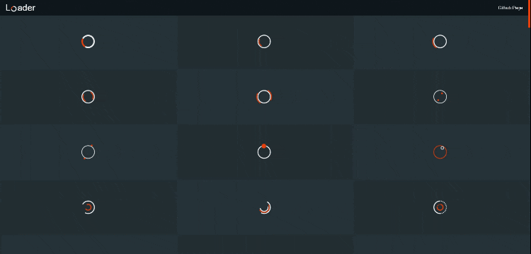
方式一、纯CSS实现
代码:根据需要复制
<!DOCTYPE html>
<html lang="en">
<head>
  <meta charset="UTF-8">
  <title>CSS Animation Library for Developers and Ninjas</title>
  <style>
    /* -----------------------------------------
  =Default css to make the demo more pretty
-------------------------------------------- */
    body {
      margin: 0 auto;
      padding: 20px;
      max-width: 1200px;
      overflow-y: scroll;
      font-family: "Open Sans", sans-serif;
      font-weight: 400;
      color: #777;
      background-color: #f7f7f7;
      -webkit-font-smoothing: antialiased;
      -webkit-text-size-adjust: 100%;
      -ms-text-size-adjust: 100%;
    }

    .content {
      padding: 15px;
      overflow: hidden;
      background-color: #e7e7e7;
      background-color: rgba(0, 0, 0, 0.06);
    }

    h1 {
      padding-bottom: 15px;
      border-bottom: 1px solid #d8d8d8;
      font-weight: 600;
    }

    h1 span {
      font-family: monospace, serif;
    }

    h3 {
      padding-bottom: 20px;
      box-shadow: 0 1px 0 rgba(0, 0, 0, 0.1), 0 2px 0 rgba(255, 255, 255, 0.9);
    }

    p {
      margin: 0;
      padding: 10px 0;
      color: #777;
    }

    .clear {
      clear: both;
    }

    /* -----------------------------------------
  =CSS3 Loading animations
-------------------------------------------- */

    /* =Elements style
---------------------- */
    .load-wrapp {
      float: left;
      width: 100px;
      height: 100px;
      margin: 0 10px 10px 0;
      padding: 20px 20px 20px;
      border-radius: 5px;
      text-align: center;
      background-color: #d8d8d8;
    }

    .load-wrapp p {
      padding: 0 0 20px;
    }

    .load-wrapp:last-child {
      margin-right: 0;
    }

    .line {
      display: inline-block;
      width: 15px;
      height: 15px;
      border-radius: 15px;
      background-color: #4b9cdb;
    }

    .ring-1 {
      width: 10px;
      height: 10px;
      margin: 0 auto;
      padding: 10px;
      border: 7px dashed #4b9cdb;
      border-radius: 100%;
    }

    .ring-2 {
      position: relative;
      width: 45px;
      height: 45px;
      margin: 0 auto;
      border: 4px solid #4b9cdb;
      border-radius: 100%;
    }

    .ball-holder {
      position: absolute;
      width: 12px;
      height: 45px;
      left: 17px;
      top: 0px;
    }

    .ball {
      position: absolute;
      top: -11px;
      left: 0;
      width: 16px;
      height: 16px;
      border-radius: 100%;
      background: #4282b3;
    }

    .letter-holder {
      padding: 16px;
    }

    .letter {
      float: left;
      font-size: 14px;
      color: #777;
    }

    .square {
      width: 12px;
      height: 12px;
      border-radius: 4px;
      background-color: #4b9cdb;
    }

    .spinner {
      position: relative;
      width: 45px;
      height: 45px;
      margin: 0 auto;
    }

    .bubble-1,
    .bubble-2 {
      position: absolute;
      top: 0;
      width: 25px;
      height: 25px;
      border-radius: 100%;
      background-color: #4b9cdb;
    }

    .bubble-2 {
      top: auto;
      bottom: 0;
    }

    .bar {
      float: left;
      width: 15px;
      height: 6px;
      border-radius: 2px;
      background-color: #4b9cdb;
    }

    /* =Animate the stuff
------------------------ */
    .load-1 .line:nth-last-child(1) {
      animation: loadingA 1.5s 1s infinite;
    }

    .load-1 .line:nth-last-child(2) {
      animation: loadingA 1.5s 0.5s infinite;
    }

    .load-1 .line:nth-last-child(3) {
      animation: loadingA 1.5s 0s infinite;
    }

    .load-2 .line:nth-last-child(1) {
      animation: loadingB 1.5s 1s infinite;
    }

    .load-2 .line:nth-last-child(2) {
      animation: loadingB 1.5s 0.5s infinite;
    }

    .load-2 .line:nth-last-child(3) {
      animation: loadingB 1.5s 0s infinite;
    }

    .load-3 .line:nth-last-child(1) {
      animation: loadingC 0.6s 0.1s linear infinite;
    }

    .load-3 .line:nth-last-child(2) {
      animation: loadingC 0.6s 0.2s linear infinite;
    }

    .load-3 .line:nth-last-child(3) {
      animation: loadingC 0.6s 0.3s linear infinite;
    }

    .load-4 .ring-1 {
      animation: loadingD 1.5s 0.3s cubic-bezier(0.17, 0.37, 0.43, 0.67) infinite;
    }

    .load-5 .ball-holder {
      animation: loadingE 1.3s linear infinite;
    }

    .load-6 .letter {
      animation-name: loadingF;
      animation-duration: 1.6s;
      animation-iteration-count: infinite;
      animation-direction: linear;
    }

    .l-1 {
      animation-delay: 0.48s;
    }

    .l-2 {
      animation-delay: 0.6s;
    }

    .l-3 {
      animation-delay: 0.72s;
    }

    .l-4 {
      animation-delay: 0.84s;
    }

    .l-5 {
      animation-delay: 0.96s;
    }

    .l-6 {
      animation-delay: 1.08s;
    }

    .l-7 {
      animation-delay: 1.2s;
    }

    .l-8 {
      animation-delay: 1.32s;
    }

    .l-9 {
      animation-delay: 1.44s;
    }

    .l-10 {
      animation-delay: 1.56s;
    }

    .load-7 .square {
      animation: loadingG 1.5s cubic-bezier(0.17, 0.37, 0.43, 0.67) infinite;
    }

    .load-8 .line {
      animation: loadingH 1.5s cubic-bezier(0.17, 0.37, 0.43, 0.67) infinite;
    }

    .load-9 .spinner {
      animation: loadingI 2s linear infinite;
    }

    .load-9 .bubble-1,
    .load-9 .bubble-2 {
      animation: bounce 2s ease-in-out infinite;
    }

    .load-9 .bubble-2 {
      animation-delay: -1s;
    }

    .load-10 .bar {
      animation: loadingJ 2s cubic-bezier(0.17, 0.37, 0.43, 0.67) infinite;
    }

    @keyframes loadingA {
      0 {
        height: 15px;
      }

      50% {
        height: 35px;
      }

      100% {
        height: 15px;
      }
    }

    @keyframes loadingB {
      0 {
        width: 15px;
      }

      50% {
        width: 35px;
      }

      100% {
        width: 15px;
      }
    }

    @keyframes loadingC {
      0 {
        transform: translate(0, 0);
      }

      50% {
        transform: translate(0, 15px);
      }

      100% {
        transform: translate(0, 0);
      }
    }

    @keyframes loadingD {
      0 {
        transform: rotate(0deg);
      }

      50% {
        transform: rotate(180deg);
      }

      100% {
        transform: rotate(360deg);
      }
    }

    @keyframes loadingE {
      0 {
        transform: rotate(0deg);
      }

      100% {
        transform: rotate(360deg);
      }
    }

    @keyframes loadingF {
      0% {
        opacity: 0;
      }

      100% {
        opacity: 1;
      }
    }

    @keyframes loadingG {
      0% {
        transform: translate(0, 0) rotate(0deg);
      }

      50% {
        transform: translate(70px, 0) rotate(360deg);
      }

      100% {
        transform: translate(0, 0) rotate(0deg);
      }
    }

    @keyframes loadingH {
      0% {
        width: 15px;
      }

      50% {
        width: 35px;
        padding: 4px;
      }

      100% {
        width: 15px;
      }
    }

    @keyframes loadingI {
      100% {
        transform: rotate(360deg);
      }
    }

    @keyframes bounce {

      0%,
      100% {
        transform: scale(0);
      }

      50% {
        transform: scale(1);
      }
    }

    @keyframes loadingJ {

      0%,
      100% {
        transform: translate(0, 0);
      }

      50% {
        transform: translate(80px, 0);
        background-color: #f5634a;
        width: 25px;
      }
    }
  </style>
</head>

<body>
  <div class="content">
    <h3>CSS3 Loading animations</h3>
    <div class="load-wrapp">
      <div class="load-1">
        <p>Loading 1</p>
        <div class="line"></div>
        <div class="line"></div>
        <div class="line"></div>
      </div>
    </div>
    <div class="load-wrapp">
      <div class="load-2">
        <p>Loading 2</p>
        <div class="line"></div>
        <div class="line"></div>
        <div class="line"></div>
      </div>
    </div>
    <div class="load-wrapp">
      <div class="load-3">
        <p>Loading 3</p>
        <div class="line"></div>
        <div class="line"></div>
        <div class="line"></div>
      </div>
    </div>
    <div class="load-wrapp">
      <!-- Loading 4 don't work on firefox because of the border-radius and the "dashed" style. -->
      <div class="load-4">
        <p>Loading 4</p>
        <div class="ring-1"></div>
      </div>
    </div>
    <div class="load-wrapp">
      <div class="load-5">
        <p>Loading 5</p>
        <div class="ring-2">
          <div class="ball-holder">
            <div class="ball"></div>
          </div>
        </div>
      </div>
    </div>
    <div class="load-wrapp">
      <div class="load-6">
        <p>Loading 6</p>
        <div class="letter-holder">
          <div class="l-1 letter">L</div>
          <div class="l-2 letter">o</div>
          <div class="l-3 letter">a</div>
          <div class="l-4 letter">d</div>
          <div class="l-5 letter">i</div>
          <div class="l-6 letter">n</div>
          <div class="l-7 letter">g</div>
          <div class="l-8 letter">.</div>
          <div class="l-9 letter">.</div>
          <div class="l-10 letter">.</div>
        </div>
      </div>
    </div>
    <div class="load-wrapp">
      <div class="load-7">
        <p>Loading 7</p>
        <div class="square-holder">
          <div class="square"></div>
        </div>
      </div>
    </div>
    <div class="load-wrapp">
      <div class="load-8">
        <p>Loading 8</p>
        <div class="line"></div>
      </div>
    </div>
    <div class="load-wrapp">
      <div class="load-9">
        <p>Loading 9</p>
        <div class="spinner">
          <div class="bubble-1"></div>
          <div class="bubble-2"></div>
        </div>
      </div>
    </div>
    <div class="load-wrapp">
      <div class="load-10">
        <p>Loading 10</p>
        <div class="bar"></div>
      </div>
    </div>
  </div>
  <div class="clear"></div>
</body>
</html>
方式二、svg+css实现

代码:
<!DOCTYPE html>
<html lang="en">

<head>
  <meta charset="UTF-8">
  <title>CSS Animation Library for Developers and Ninjas</title>
  <style>
    body {
      padding: 1em;
      background: #2B3134;
      color: #777;
      text-align: center;
      font-family: "Gill sans", sans-serif;
      width: 80%;
      margin: 0 auto;
    }

    h1 {
      margin: 1em 0;
      border-bottom: 1px dashed;
      padding-bottom: 1em;
      font-weight: lighter;
    }

    p {
      font-style: italic;
    }

    .loader {
      margin: 0 0 2em;
      height: 100px;
      width: 20%;
      text-align: center;
      padding: 1em;
      margin: 0 auto 1em;
      display: inline-block;
      vertical-align: top;
    }

    /*
  Set the color of the icon
*/
    svg path,
    svg rect {
      fill: #4b9cdb;
    }
  </style>
</head>

<body>
  <h1>SVG Loading Images</h1>

  <!-- 1 -->
  <div class="loader loader--style1" title="0">
    <svg version="1.1" id="loader-1" xmlns="http://www.w3.org/2000/svg" xmlns:xlink="http://www.w3.org/1999/xlink"
      x="0px" y="0px" width="40px" height="40px" viewBox="0 0 40 40" enable-background="new 0 0 40 40"
      xml:space="preserve">
      <path opacity="0.2" fill="#000"
        d="M20.201,5.169c-8.254,0-14.946,6.692-14.946,14.946c0,8.255,6.692,14.946,14.946,14.946
    s14.946-6.691,14.946-14.946C35.146,11.861,28.455,5.169,20.201,5.169z M20.201,31.749c-6.425,0-11.634-5.208-11.634-11.634
    c0-6.425,5.209-11.634,11.634-11.634c6.425,0,11.633,5.209,11.633,11.634C31.834,26.541,26.626,31.749,20.201,31.749z" />
      <path fill="#000" d="M26.013,10.047l1.654-2.866c-2.198-1.272-4.743-2.012-7.466-2.012h0v3.312h0
    C22.32,8.481,24.301,9.057,26.013,10.047z">
        <animateTransform attributeType="xml" attributeName="transform" type="rotate" from="0 20 20" to="360 20 20"
          dur="0.5s" repeatCount="indefinite" />
      </path>
    </svg>
  </div>

  <!-- 2 -->
  <div class="loader loader--style2" title="1">
    <svg version="1.1" id="loader-1" xmlns="http://www.w3.org/2000/svg" xmlns:xlink="http://www.w3.org/1999/xlink"
      x="0px" y="0px" width="40px" height="40px" viewBox="0 0 50 50" style="enable-background:new 0 0 50 50;"
      xml:space="preserve">
      <path fill="#000"
        d="M25.251,6.461c-10.318,0-18.683,8.365-18.683,18.683h4.068c0-8.071,6.543-14.615,14.615-14.615V6.461z">
        <animateTransform attributeType="xml" attributeName="transform" type="rotate" from="0 25 25" to="360 25 25"
          dur="0.6s" repeatCount="indefinite" />
      </path>
    </svg>
  </div>

  <!-- 3  -->
  <div class="loader loader--style3" title="2">
    <svg version="1.1" id="loader-1" xmlns="http://www.w3.org/2000/svg" xmlns:xlink="http://www.w3.org/1999/xlink"
      x="0px" y="0px" width="40px" height="40px" viewBox="0 0 50 50" style="enable-background:new 0 0 50 50;"
      xml:space="preserve">
      <path fill="#000"
        d="M43.935,25.145c0-10.318-8.364-18.683-18.683-18.683c-10.318,0-18.683,8.365-18.683,18.683h4.068c0-8.071,6.543-14.615,14.615-14.615c8.072,0,14.615,6.543,14.615,14.615H43.935z">
        <animateTransform attributeType="xml" attributeName="transform" type="rotate" from="0 25 25" to="360 25 25"
          dur="0.6s" repeatCount="indefinite" />
      </path>
    </svg>
  </div>

  <!-- 4 -->
  <div class="loader loader--style4" title="3">
    <svg version="1.1" id="Layer_1" xmlns="http://www.w3.org/2000/svg" xmlns:xlink="http://www.w3.org/1999/xlink"
      x="0px" y="0px" width="24px" height="24px" viewBox="0 0 24 24" style="enable-background:new 0 0 50 50;"
      xml:space="preserve">
      <rect x="0" y="0" width="4" height="7" fill="#333">
        <animateTransform attributeType="xml" attributeName="transform" type="scale" values="1,1; 1,3; 1,1" begin="0s"
          dur="0.6s" repeatCount="indefinite" />
      </rect>

      <rect x="10" y="0" width="4" height="7" fill="#333">
        <animateTransform attributeType="xml" attributeName="transform" type="scale" values="1,1; 1,3; 1,1" begin="0.2s"
          dur="0.6s" repeatCount="indefinite" />
      </rect>
      <rect x="20" y="0" width="4" height="7" fill="#333">
        <animateTransform attributeType="xml" attributeName="transform" type="scale" values="1,1; 1,3; 1,1" begin="0.4s"
          dur="0.6s" repeatCount="indefinite" />
      </rect>
    </svg>
  </div>

  <!-- 5 -->
  <div class="loader loader--style5" title="4">
    <svg version="1.1" id="Layer_1" xmlns="http://www.w3.org/2000/svg" xmlns:xlink="http://www.w3.org/1999/xlink"
      x="0px" y="0px" width="24px" height="30px" viewBox="0 0 24 30" style="enable-background:new 0 0 50 50;"
      xml:space="preserve">
      <rect x="0" y="0" width="4" height="10" fill="#333">
        <animateTransform attributeType="xml" attributeName="transform" type="translate" values="0 0; 0 20; 0 0"
          begin="0" dur="0.6s" repeatCount="indefinite" />
      </rect>
      <rect x="10" y="0" width="4" height="10" fill="#333">
        <animateTransform attributeType="xml" attributeName="transform" type="translate" values="0 0; 0 20; 0 0"
          begin="0.2s" dur="0.6s" repeatCount="indefinite" />
      </rect>
      <rect x="20" y="0" width="4" height="10" fill="#333">
        <animateTransform attributeType="xml" attributeName="transform" type="translate" values="0 0; 0 20; 0 0"
          begin="0.4s" dur="0.6s" repeatCount="indefinite" />
      </rect>
    </svg>
  </div>

  <!-- 6 -->
  <div class="loader loader--style6" title="5">
    <svg version="1.1" id="Layer_1" xmlns="http://www.w3.org/2000/svg" xmlns:xlink="http://www.w3.org/1999/xlink"
      x="0px" y="0px" width="24px" height="30px" viewBox="0 0 24 30" style="enable-background:new 0 0 50 50;"
      xml:space="preserve">
      <rect x="0" y="13" width="4" height="5" fill="#333">
        <animate attributeName="height" attributeType="XML" values="5;21;5" begin="0s" dur="0.6s"
          repeatCount="indefinite" />
        <animate attributeName="y" attributeType="XML" values="13; 5; 13" begin="0s" dur="0.6s"
          repeatCount="indefinite" />
      </rect>
      <rect x="10" y="13" width="4" height="5" fill="#333">
        <animate attributeName="height" attributeType="XML" values="5;21;5" begin="0.15s" dur="0.6s"
          repeatCount="indefinite" />
        <animate attributeName="y" attributeType="XML" values="13; 5; 13" begin="0.15s" dur="0.6s"
          repeatCount="indefinite" />
      </rect>
      <rect x="20" y="13" width="4" height="5" fill="#333">
        <animate attributeName="height" attributeType="XML" values="5;21;5" begin="0.3s" dur="0.6s"
          repeatCount="indefinite" />
        <animate attributeName="y" attributeType="XML" values="13; 5; 13" begin="0.3s" dur="0.6s"
          repeatCount="indefinite" />
      </rect>
    </svg>
  </div>

  <!-- 7 -->
  <div class="loader loader--style7" title="6">
    <svg version="1.1" id="Layer_1" xmlns="http://www.w3.org/2000/svg" xmlns:xlink="http://www.w3.org/1999/xlink"
      x="0px" y="0px" width="24px" height="30px" viewBox="0 0 24 30" style="enable-background:new 0 0 50 50;"
      xml:space="preserve">
      <rect x="0" y="0" width="4" height="20" fill="#333">
        <animate attributeName="opacity" attributeType="XML" values="1; .2; 1" begin="0s" dur="0.6s"
          repeatCount="indefinite" />
      </rect>
      <rect x="7" y="0" width="4" height="20" fill="#333">
        <animate attributeName="opacity" attributeType="XML" values="1; .2; 1" begin="0.2s" dur="0.6s"
          repeatCount="indefinite" />
      </rect>
      <rect x="14" y="0" width="4" height="20" fill="#333">
        <animate attributeName="opacity" attributeType="XML" values="1; .2; 1" begin="0.4s" dur="0.6s"
          repeatCount="indefinite" />
      </rect>
    </svg>
  </div>

  <!-- 8 -->
  <div class="loader loader--style8" title="7">
    <svg version="1.1" id="Layer_1" xmlns="http://www.w3.org/2000/svg" xmlns:xlink="http://www.w3.org/1999/xlink"
      x="0px" y="0px" width="24px" height="30px" viewBox="0 0 24 30" style="enable-background:new 0 0 50 50;"
      xml:space="preserve">
      <rect x="0" y="10" width="4" height="10" fill="#333" opacity="0.2">
        <animate attributeName="opacity" attributeType="XML" values="0.2; 1; .2" begin="0s" dur="0.6s"
          repeatCount="indefinite" />
        <animate attributeName="height" attributeType="XML" values="10; 20; 10" begin="0s" dur="0.6s"
          repeatCount="indefinite" />
        <animate attributeName="y" attributeType="XML" values="10; 5; 10" begin="0s" dur="0.6s"
          repeatCount="indefinite" />
      </rect>
      <rect x="8" y="10" width="4" height="10" fill="#333" opacity="0.2">
        <animate attributeName="opacity" attributeType="XML" values="0.2; 1; .2" begin="0.15s" dur="0.6s"
          repeatCount="indefinite" />
        <animate attributeName="height" attributeType="XML" values="10; 20; 10" begin="0.15s" dur="0.6s"
          repeatCount="indefinite" />
        <animate attributeName="y" attributeType="XML" values="10; 5; 10" begin="0.15s" dur="0.6s"
          repeatCount="indefinite" />
      </rect>
      <rect x="16" y="10" width="4" height="10" fill="#333" opacity="0.2">
        <animate attributeName="opacity" attributeType="XML" values="0.2; 1; .2" begin="0.3s" dur="0.6s"
          repeatCount="indefinite" />
        <animate attributeName="height" attributeType="XML" values="10; 20; 10" begin="0.3s" dur="0.6s"
          repeatCount="indefinite" />
        <animate attributeName="y" attributeType="XML" values="10; 5; 10" begin="0.3s" dur="0.6s"
          repeatCount="indefinite" />
      </rect>
    </svg>
  </div>
</body>

</html>
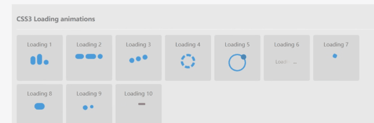
三、炫酷loading大集合
(100+ loading样式,总有你喜欢的) demo地址
<!DOCTYPE html>
<html lang="en">
<head>
<meta charset="UTF-8">
<meta name="viewport" content="width=device-width, initial-scale=1.0">
<title>Document</title>
</head>
<style>
*, *:after, *:before {
box-sizing: border-box;
}
::-webkit-scrollbar {
width: 8px;
height: 8px;
}
/* Track */
::-webkit-scrollbar-track {
background: #263238;
}
/* Handle */
::-webkit-scrollbar-thumb {
background: #FF3D00;
}
/* Handle on hover */
::-webkit-scrollbar-thumb:hover {
background: #fff;
}
body {
margin: 0;
padding-top: 50px;
display: flex;
flex-wrap: wrap;
background: #263238;
font-family: Arial, Helvetica, sans-serif;
}
body.pop {
overflow: hidden;
}
section {
min-width: 200px;
width: 33.33%;
height: 200px;
padding: 10px;
position: relative;
display: flex;
align-items: center;
justify-content: center;
color: #ccc;
cursor: pointer;
transition: 0.3s linear;
}
section:nth-child(2n + 1) {
background: rgba(0, 0, 0, 0.1);
}
section:hover {
background: rgba(0, 0, 0, 0.3);
}
@media (max-width: 768px) {
section {
width: 50%;
}
}
@media (max-width: 480px) {
section {
width: 100%;
}
}
header {
background: #0d161b;
padding: 10px 20px;
min-height: 50px;
position: fixed;
top: 0;
left: 0;
width: 100%;
display: flex;
align-items: center;
z-index: 2000;
justify-content: space-between;
}
.brand {
color: #fff;
font-size: 32px;
display: inline-block;
position: relative;
text-decoration: none;
}
.brand::after {
content: "";
position: absolute;
left: 20px;
bottom: 5px;
border: 3px solid #FFF;
border-bottom-color: #FF3D00;
width: 20px;
height: 20px;
border-radius: 50%;
animation: rotation 0.6s linear infinite;
}
.nav-btn {
color: #fff;
text-decoration: none;
}
.loader-1 {
width: 48px;
height: 48px;
border: 5px solid #FFF;
border-bottom-color: #FF3D00;
border-radius: 50%;
display: inline-block;
animation: rotation 1s linear infinite;
}
.loader-2 {
width: 48px;
height: 48px;
border: 3px solid #FFF;
border-radius: 50%;
display: inline-block;
position: relative;
animation: rotation 1s linear infinite;
}
.loader-2:after {
content: "";
position: absolute;
left: 50%;
top: 50%;
transform: translate(-50%, -50%);
width: 40px;
height: 40px;
border-radius: 50%;
border: 3px solid transparent;
border-bottom-color: #FF3D00;
}
.loader-3 {
width: 48px;
height: 48px;
border: 3px solid #FFF;
border-radius: 50%;
display: inline-block;
position: relative;
animation: rotation 1s linear infinite;
}
.loader-3:after {
content: "";
position: absolute;
left: 50%;
top: 50%;
transform: translate(-50%, -50%);
width: 56px;
height: 56px;
border-radius: 50%;
border: 3px solid transparent;
border-bottom-color: #FF3D00;
}
.loader-4 {
width: 48px;
height: 48px;
border: 3px solid #FFF;
border-radius: 50%;
display: inline-block;
position: relative;
animation: rotation 1s linear infinite;
}
.loader-4:after {
content: "";
position: absolute;
left: 50%;
top: 50%;
transform: translate(-50%, -50%);
width: 40px;
height: 40px;
border-radius: 50%;
border: 3px solid;
border-color: #FF3D00 transparent;
}
.loader-5 {
width: 48px;
height: 48px;
border: 3px solid #FFF;
border-radius: 50%;
display: inline-block;
position: relative;
animation: rotation 1s linear infinite;
}
.loader-5:after {
content: "";
position: absolute;
left: 50%;
top: 50%;
transform: translate(-50%, -50%);
width: 56px;
height: 56px;
border-radius: 50%;
border: 3px solid;
border-color: #FF3D00 transparent;
}
.loader-6 {
width: 48px;
height: 48px;
border: 2px solid #FFF;
border-radius: 50%;
display: inline-block;
position: relative;
animation: rotation 1s linear infinite;
}
.loader-6:after, .loader-6:before {
content: "";
position: absolute;
left: 0;
top: 0;
background: #FF3D00;
width: 6px;
height: 6px;
transform: translate(150%, 150%);
border-radius: 50%;
}
.loader-6:before {
left: auto;
top: auto;
right: 0;
bottom: 0;
transform: translate(-150%, -150%);
}
.loader-7 {
width: 48px;
height: 48px;
border: 2px solid #FFF;
border-radius: 50%;
display: inline-block;
position: relative;
animation: rotation 1s linear infinite;
}
.loader-7:after, .loader-7:before {
content: "";
position: absolute;
left: 0;
top: 0;
background: #FF3D00;
width: 6px;
height: 6px;
border-radius: 50%;
}
.loader-7:before {
left: auto;
top: auto;
right: 0;
bottom: 0;
}
.loader-8 {
width: 48px;
height: 48px;
border: 3px solid #FFF;
border-radius: 50%;
display: inline-block;
position: relative;
animation: rotation 1s linear infinite;
}
.loader-8:after {
content: "";
position: absolute;
left: 0;
top: 0;
background: #FF3D00;
width: 16px;
height: 16px;
transform: translate(-50%, 50%);
border-radius: 50%;
}
.loader-9 {
width: 48px;
height: 48px;
border-radius: 50%;
display: inline-block;
position: relative;
border: 2px solid #FF3D00;
animation: rotation 1s linear infinite;
}
.loader-9:after {
content: "";
position: absolute;
left: 4px;
top: 4px;
border: 2px solid #FFF;
width: 12px;
height: 12px;
border-radius: 50%;
}
.loader-10 {
width: 48px;
height: 48px;
border-radius: 50%;
display: inline-block;
position: relative;
border: 3px solid;
border-color: #FFF #FFF transparent;
animation: rotation 1s linear infinite;
}
.loader-10:after {
content: "";
position: absolute;
left: 0;
right: 0;
top: 0;
bottom: 0;
margin: auto;
border: 3px solid;
border-color: transparent #FF3D00 #FF3D00;
width: 24px;
height: 24px;
border-radius: 50%;
animation: rotationBack 0.5s linear infinite;
transform-origin: center center;
}
.loader-11 {
width: 48px;
height: 48px;
border-radius: 50%;
display: inline-block;
position: relative;
border: 3px solid;
border-color: #FFF #FFF transparent transparent;
animation: rotation 1s linear infinite;
}
.loader-11:after, .loader-11:before {
content: "";
position: absolute;
left: 0;
right: 0;
top: 0;
bottom: 0;
margin: auto;
border: 3px solid;
border-color: transparent transparent #FF3D00 #FF3D00;
width: 40px;
height: 40px;
border-radius: 50%;
animation: rotationBack 0.5s linear infinite;
transform-origin: center center;
}
.loader-11:before {
width: 32px;
height: 32px;
border-color: #FFF #FFF transparent transparent;
animation: rotation 1.5s linear infinite;
}
.loader-12 {
width: 48px;
height: 48px;
border: 3px dotted #FFF;
border-style: solid solid dotted dotted;
border-radius: 50%;
display: inline-block;
position: relative;
animation: rotation 2s linear infinite;
}
.loader-12:after {
content: "";
position: absolute;
left: 0;
right: 0;
top: 0;
bottom: 0;
margin: auto;
border: 3px dotted #FF3D00;
border-style: solid solid dotted;
width: 24px;
height: 24px;
border-radius: 50%;
animation: rotationBack 1s linear infinite;
transform-origin: center center;
}
.loader-13 {
width: 48px;
height: 48px;
border: 2px solid #FFF;
border-radius: 50%;
display: inline-block;
position: relative;
animation: rotation 1s linear infinite;
}
.loader-13:after {
content: "";
position: absolute;
left: 50%;
top: 0;
background: #FF3D00;
width: 3px;
height: 24px;
transform: translateX(-50%);
}
.loader-14 {
width: 48px;
height: 48px;
display: inline-block;
position: relative;
}
.loader-14::after, .loader-14::before {
content: "";
width: 48px;
height: 48px;
border-radius: 50%;
border: 2px solid #FFF;
position: absolute;
left: 0;
top: 0;
animation: animloader14 2s linear infinite;
}
.loader-14::after {
animation-delay: 1s;
}
.loader-15 {
width: 48px;
height: 48px;
border: 5px dotted #FFF;
border-radius: 50%;
display: inline-block;
position: relative;
animation: rotation 2s linear infinite;
}
.loader-16 {
width: 48px;
height: 48px;
border-radius: 50%;
display: inline-block;
position: relative;
background: linear-gradient(0deg, rgba(255, 61, 0, 0.2) 33%, #ff3d00 100%);
animation: rotation 1s linear infinite;
}
.loader-16:after {
content: "";
position: absolute;
left: 50%;
top: 50%;
transform: translate(-50%, -50%);
width: 44px;
height: 44px;
border-radius: 50%;
background: #263238;
}
.loader-17 {
width: 48px;
height: 48px;
border-radius: 50%;
display: inline-block;
border-top: 3px solid #FFF;
border-right: 3px solid transparent;
animation: rotation 1s linear infinite;
}
.loader-18 {
width: 48px;
height: 48px;
border-radius: 50%;
display: inline-block;
border-top: 4px solid #FFF;
border-right: 4px solid transparent;
animation: rotation 1s linear infinite;
}
.loader-18:after {
content: "";
position: absolute;
left: 0;
top: 0;
width: 48px;
height: 48px;
border-radius: 50%;
border-bottom: 4px solid #FF3D00;
border-left: 4px solid transparent;
}
.loader-19 {
width: 48px;
height: 48px;
border-radius: 50%;
display: inline-block;
border-top: 4px solid #FFF;
border-right: 4px solid transparent;
animation: rotation 1s linear infinite;
}
.loader-19:after {
content: "";
position: absolute;
left: 0;
top: 0;
width: 48px;
height: 48px;
border-radius: 50%;
border-left: 4px solid #FF3D00;
border-bottom: 4px solid transparent;
animation: rotation 0.5s linear infinite reverse;
}
.loader-20 {
width: 48px;
height: 48px;
border: 5px solid;
border-color: #FF3D00 transparent;
border-radius: 50%;
display: inline-block;
animation: rotation 1s linear infinite;
}
.loader-21 {
width: 48px;
height: 48px;
border-radius: 50%;
display: inline-block;
position: relative;
border: 10px solid;
border-color: rgba(255, 255, 255, 0.15) rgba(255, 255, 255, 0.25) rgba(255, 255, 255, 0.35) rgba(255, 255, 255, 0.5);
animation: rotation 1s linear infinite;
}
.loader-22 {
width: 48px;
height: 48px;
border-radius: 50%;
display: inline-block;
position: relative;
border: 10px solid;
animation: animloader51 1s linear infinite alternate;
}
.loader-23 {
width: 48px;
height: 48px;
border: 3px solid #FFF;
border-bottom-color: transparent;
border-radius: 50%;
display: inline-block;
position: relative;
animation: rotation 1s linear infinite;
}
.loader-23:after {
content: "";
position: absolute;
left: 20px;
top: 31px;
border: 10px solid transparent;
border-right-color: #FFF;
transform: rotate(-40deg);
}
.loader-24 {
width: 48px;
height: 48px;
border-width: 3px;
border-style: dashed solid solid dotted;
border-color: #FF3D00 #FF3D00 transparent #FF3D00;
border-radius: 50%;
display: inline-block;
position: relative;
animation: rotation 1s linear infinite;
}
.loader-24:after {
content: "";
position: absolute;
left: 20px;
top: 31px;
border: 10px solid transparent;
border-right-color: #FF3D00;
transform: rotate(-40deg);
}
.loader-25 {
width: 48px;
height: 48px;
background: #FFF;
display: inline-block;
border-radius: 50%;
animation: animloader14 1s ease-in infinite;
}
.loader-26 {
width: 48px;
height: 48px;
display: inline-block;
position: relative;
}
.loader-26::after, .loader-26::before {
content: "";
width: 48px;
height: 48px;
border-radius: 50%;
background: #FFF;
position: absolute;
left: 0;
top: 0;
animation: animloader14 2s linear infinite;
}
.loader-26::after {
animation-delay: 1s;
}
.loader-27 {
width: 48px;
height: 48px;
display: inline-block;
position: relative;
}
.loader-27::after, .loader-27::before {
content: "";
width: 48px;
height: 48px;
border-radius: 50%;
background: #FFF;
position: absolute;
left: 0;
top: 0;
animation: animloader27 2s ease-in-out infinite;
}
.loader-27::after {
animation-delay: 1s;
}
.loader-28 {
width: 48px;
height: 48px;
border-radius: 50%;
display: inline-block;
animation: animloader28 1s linear infinite;
}
.loader-29 {
border: 24px solid #FFF;
border-bottom-color: #FF3D00;
border-radius: 50%;
display: inline-block;
position: relative;
animation: rotation 1s linear infinite;
}
.loader-30 {
border: 2px solid #FFF;
width: 48px;
height: 48px;
background: #FF3D00;
border-radius: 50%;
display: inline-block;
position: relative;
animation: rotation 2s linear infinite;
}
.loader-30:after {
content: "";
position: absolute;
left: 50%;
top: 50%;
border: 24px solid;
border-color: transparent #FFF;
border-radius: 50%;
transform: translate(-50%, -50%);
}
.loader-31 {
width: 48px;
height: 48px;
background: #FFF;
border-radius: 50%;
display: inline-block;
position: relative;
animation: rotation 1s linear infinite;
}
.loader-31:after {
content: "";
position: absolute;
left: 6px;
top: 10px;
width: 12px;
height: 12px;
color: #FF3D00;
background: currentColor;
border-radius: 50%;
box-shadow: 25px 2px, 10px 22px;
}
.loader-32 {
width: 48px;
height: 48px;
border: 4px solid;
background: rgba(255, 255, 255, 0.2);
border-color: transparent #FFF #FFF transparent;
border-radius: 50%;
display: inline-block;
position: relative;
animation: rotation 1s ease-in-out infinite;
}
.loader-32:after {
content: "";
position: absolute;
left: 50%;
top: 50%;
border: 12px solid;
border-color: transparent #FF3D00 #FF3D00 transparent;
transform: translate(-50%, -50%);
border-radius: 50%;
}
.loader-33 {
border: 2px solid;
border-color: transparent #FFF;
width: 48px;
height: 48px;
border-radius: 50%;
display: inline-block;
position: relative;
animation: rotation 2s linear infinite;
}
.loader-33:after {
content: "";
position: absolute;
left: 50%;
top: 50%;
border: 24px solid;
border-color: transparent rgba(255, 255, 255, 0.15);
border-radius: 50%;
transform: translate(-50%, -50%);
}
.loader-34 {
border: 24px solid;
border-color: rgba(255, 255, 255, 0.15) rgba(255, 255, 255, 0.25) rgba(255, 255, 255, 0.35) rgba(255, 255, 255, 0.5);
border-radius: 50%;
display: inline-block;
animation: animloader34 1s linear infinite;
}
.loader-35 {
width: 48px;
height: 48px;
border-radius: 50%;
display: inline-block;
position: relative;
animation: rotation 1s linear infinite;
}
.loader-35:after, .loader-35:before {
content: "";
position: absolute;
left: 0;
top: 0;
background: #FF3D00;
width: 16px;
height: 16px;
transform: translate(-50%, 50%);
border-radius: 50%;
}
.loader-35:before {
left: auto;
right: 0;
background: #FFF;
transform: translate(50%, 100%);
}
.loader-36 {
width: 48px;
height: 48px;
border-radius: 50%;
display: inline-block;
position: relative;
animation: zeroRotation 1s linear infinite alternate;
}
.loader-36:after, .loader-36:before {
content: "";
position: absolute;
left: 0;
top: 0;
background: #FF3D00;
width: 16px;
height: 16px;
transform: translate(-50%, 50%);
border-radius: 50%;
}
.loader-36:before {
left: auto;
right: 0;
transform: translate(50%, 100%);
}
.loader-37 {
width: 48px;
height: 48px;
display: inline-block;
position: relative;
color: #FFF;
animation: rotation 1s linear infinite;
}
.loader-37:after, .loader-37:before {
content: "";
position: absolute;
width: 24px;
height: 24px;
top: 0;
background-color: #FFF;
border-radius: 50%;
animation: scale50 1s infinite ease-in-out;
}
.loader-37:before {
top: auto;
bottom: 0;
background-color: #FF3D00;
animation-delay: 0.5s;
}
.loader-38 {
width: 48px;
height: 48px;
display: inline-block;
position: relative;
color: #FFF;
animation: rotation 1s linear infinite;
}
.loader-38:after, .loader-38:before {
content: "";
position: absolute;
width: 24px;
height: 24px;
top: 50%;
left: 50%;
transform: scale(0.5) translate(0, 0);
background-color: #FFF;
border-radius: 50%;
animation: animloader38 1s infinite ease-in-out;
}
.loader-38:before {
background-color: #FF3D00;
transform: scale(0.5) translate(-48px, -48px);
}
.loader-39 {
width: 16px;
height: 16px;
border-radius: 50%;
display: inline-block;
position: relative;
background: #FFF;
animation: shadowExpandX 2s linear infinite alternate;
}
.loader-40 {
width: 16px;
height: 16px;
border-radius: 50%;
display: inline-block;
position: relative;
background: #FFF;
box-shadow: -24px 0 #FFF, 24px 0 #FFF;
animation: shadowPulse 2s linear infinite;
}
.loader-41 {
width: 16px;
height: 16px;
border-radius: 50%;
display: inline-block;
position: relative;
background: #FF3D00;
color: #FFF;
box-shadow: -24px 0, 24px 0;
animation: rotation 2s ease-in-out infinite;
}
.loader-42 {
width: 12px;
height: 12px;
border-radius: 50%;
display: inline-block;
position: relative;
color: #FFF;
animation: animloader42 1s linear infinite alternate;
}
.loader-43 {
width: 10px;
height: 10px;
border-radius: 50%;
display: inline-block;
position: relative;
color: #FFF;
left: -100px;
animation: shadowRolling 2s linear infinite;
}
.loader-44 {
width: 12px;
height: 12px;
border-radius: 50%;
display: inline-block;
position: relative;
color: #FFF;
animation: animloader44 2s linear infinite;
}
.loader-45 {
width: 12px;
height: 12px;
border-radius: 50%;
display: inline-block;
position: relative;
color: #FFF;
animation: animloader45 1s linear infinite alternate;
}
.loader-46 {
width: 40px;
height: 40px;
border-radius: 50%;
display: inline-block;
position: relative;
}
.loader-46::after {
content: "";
width: 16px;
height: 16px;
border-radius: 50%;
position: absolute;
left: 0;
transform: translate(-50%, 100%);
animation: animloader46 1s linear infinite;
top: 0;
}
.loader-47 {
width: 48px;
height: 48px;
display: inline-block;
position: relative;
}
.loader-47::after, .loader-47::before {
content: "";
width: 48px;
height: 48px;
border: 2px solid #FFF;
position: absolute;
left: 0;
top: 0;
animation: rotation 2s ease-in-out infinite;
}
.loader-47::after {
border-color: #FF3D00;
animation-delay: 1s;
}
.loader-48 {
width: 48px;
height: 48px;
display: inline-block;
position: relative;
}
.loader-48::after, .loader-48::before {
content: "";
width: 48px;
height: 48px;
border: 4px solid #FFF;
position: absolute;
left: 0;
top: 0;
animation: animloader14 2s ease-in-out infinite;
}
.loader-48::after {
border-color: #FF3D00;
animation-delay: 1s;
}
.loader-49 {
width: 48px;
height: 48px;
display: inline-block;
position: relative;
}
.loader-49::after, .loader-49::before {
content: "";
width: 48px;
height: 48px;
border: 2px solid #FFF;
position: absolute;
left: 0;
top: 0;
animation: rotation 2s ease-in-out infinite alternate;
}
.loader-49::after {
border-color: #FF3D00;
animation-direction: alternate-reverse;
}
.loader-50 {
width: 48px;
height: 48px;
display: inline-block;
position: relative;
}
.loader-50::after, .loader-50::before {
content: "";
width: 48px;
height: 48px;
border: 2px solid #FFF;
position: absolute;
left: 0;
top: 0;
animation: scaleOut 2s ease-in-out infinite;
}
.loader-50::after {
border-color: #FF3D00;
animation-delay: 1s;
}
.loader-51 {
width: 48px;
height: 48px;
display: inline-block;
position: relative;
}
.loader-51::after, .loader-51::before {
content: "";
width: 48px;
height: 48px;
border: 2px solid #FFF;
position: absolute;
left: 0;
top: 0;
animation: rotationBreak 3s ease-in-out infinite alternate;
}
.loader-51::after {
border-color: #FF3D00;
animation-direction: alternate-reverse;
}
.loader-52 {
width: 48px;
height: 48px;
display: inline-block;
position: relative;
border: 2px solid #FFF;
animation: rotation 2s linear infinite;
}
.loader-52:after, .loader-52:before {
content: "";
position: absolute;
left: 0;
right: 0;
top: 0;
bottom: 0;
margin: auto;
border: 2px solid #FF3D00;
width: 38px;
height: 38px;
animation: rotationBack 1.5s linear infinite;
transform-origin: center center;
}
.loader-52:before {
width: 28px;
height: 28px;
border-color: #FFF;
animation: rotation 1s linear infinite;
}
.loader-53 {
width: 48px;
height: 48px;
display: inline-block;
position: relative;
background: #FFF;
animation: flipX 1s linear infinite;
}
.loader-54 {
width: 48px;
height: 48px;
display: inline-block;
position: relative;
color: #FFF;
border: 1px solid;
animation: fill 2s linear infinite alternate;
}
.loader-55 {
width: 48px;
height: 48px;
display: inline-block;
position: relative;
background: #FFF;
animation: zeroRotation 1s ease infinite alternate-reverse;
}
.loader-56 {
width: 24px;
height: 24px;
display: inline-block;
position: relative;
background: #FFF;
animation: animloader56 2s linear infinite;
}
.loader-57 {
width: 48px;
height: 48px;
display: inline-block;
position: relative;
}
.loader-57::after {
content: "";
width: 24px;
height: 24px;
position: absolute;
left: 0;
top: 0;
background: #FFF;
color: #FFF;
animation: animloader57 2s linear infinite alternate;
}
.loader-58 {
width: 48px;
height: 48px;
display: inline-block;
position: relative;
}
.loader-58::before {
content: "";
width: 24px;
height: 24px;
position: absolute;
left: 0;
top: -24px;
animation: animloader58 2s linear infinite alternate;
}
.loader-58::after {
content: "";
position: absolute;
left: 0;
top: 0;
width: 24px;
height: 24px;
background: rgba(255, 255, 255, 0.85);
box-shadow: 0 0 10px rgba(0, 0, 0, 0.15);
animation: animloader58m 2s linear infinite alternate;
}
.loader-59 {
width: 48px;
height: 48px;
display: inline-block;
position: relative;
transform: rotate(45deg);
}
.loader-59::before {
content: "";
width: 24px;
height: 24px;
position: absolute;
left: 0;
top: -24px;
animation: animloader59 4s ease infinite;
}
.loader-59::after {
content: "";
position: absolute;
left: 0;
top: 0;
width: 24px;
height: 24px;
background: rgba(255, 255, 255, 0.85);
box-shadow: 0 0 10px rgba(0, 0, 0, 0.15);
animation: animloader56 2s ease infinite;
}
.loader-60 {
width: 16px;
height: 16px;
box-shadow: 0 30px, 0 -30px;
border-radius: 4px;
background: currentColor;
display: inline-block;
position: relative;
color: #FFF;
left: -30px;
animation: animloader60 2s ease infinite;
}
.loader-60::after, .loader-60::before {
content: "";
width: 16px;
height: 16px;
box-shadow: 0 30px, 0 -30px;
border-radius: 4px;
background: currentColor;
color: #FFF;
position: absolute;
left: 30px;
top: 0;
animation: animloader60 2s 0.2s ease infinite;
}
.loader-60::before {
animation-delay: 0.4s;
left: 60px;
}
[data-index="61"] {
align-items: normal;
padding-top: 75px;
}
.loader-61 {
width: 8px;
height: 40px;
border-radius: 4px;
display: inline-block;
position: relative;
background: currentColor;
color: #FFF;
animation: animloader61m 0.3s 0.3s linear infinite alternate;
}
.loader-61::after, .loader-61::before {
content: "";
width: 8px;
height: 40px;
border-radius: 4px;
background: currentColor;
position: absolute;
bottom: 0;
left: 20px;
animation: animloader61 0.3s 0.45s linear infinite alternate;
}
.loader-61::before {
left: -20px;
animation-delay: 0s;
}
.loader-62 {
width: 8px;
height: 40px;
border-radius: 4px;
display: inline-block;
position: relative;
background: currentColor;
color: #FFF;
animation: animloader61 0.3s 0.3s linear infinite alternate;
}
.loader-62::after, .loader-62::before {
content: "";
width: 8px;
height: 40px;
border-radius: 4px;
background: currentColor;
position: absolute;
top: 50%;
transform: translateY(-50%);
left: 20px;
animation: animloader61 0.3s 0.45s linear infinite alternate;
}
.loader-62::before {
left: -20px;
animation-delay: 0s;
}
.loader-63 {
width: 8px;
height: 48px;
display: inline-block;
position: relative;
border-radius: 4px;
left: -40px;
animation: animloader63 1s linear infinite alternate;
}
.loader-64 {
width: 8px;
height: 48px;
display: inline-block;
position: relative;
border-radius: 4px;
left: -60px;
color: #FFF;
animation: animloader64 0.6s linear infinite;
}
.loader-65 {
width: 48px;
height: 6px;
display: inline-block;
position: relative;
border-radius: 4px;
top: -50px;
color: #FFF;
animation: animloader65 0.6s linear infinite;
}
[data-index="66"] {
justify-content: normal;
padding-left: 15%;
}
.loader-66 {
width: 4.8px;
height: 4.8px;
display: inline-block;
position: relative;
border-radius: 4px;
color: #FFF;
background: currentColor;
animation: animloader66 0.3s 0.3s linear infinite alternate;
}
.loader-66::after, .loader-66::before {
content: "";
width: 4.8px;
height: 4.8px;
border-radius: 4px;
background: currentColor;
position: absolute;
left: 0;
top: 15px;
animation: animloader66 0.3s 0.45s linear infinite alternate;
}
.loader-66::after {
top: -15px;
animation-delay: 0s;
}
.loader-67 {
width: 4.8px;
height: 4.8px;
display: inline-block;
position: relative;
border-radius: 4px;
color: #FFF;
background: currentColor;
animation: animloader66 0.3s 0.3s linear infinite alternate;
}
.loader-67::after, .loader-67::before {
content: "";
width: 4.8px;
height: 4.8px;
border-radius: 4px;
background: currentColor;
position: absolute;
left: 50%;
transform: translateX(-50%);
top: 15px;
animation: animloader66 0.3s 0.45s linear infinite alternate;
}
.loader-67::after {
top: -15px;
animation-delay: 0s;
}
.loader-68 {
width: 8px;
height: 48px;
display: inline-block;
position: relative;
border-radius: 4px;
left: -100px;
animation: animloader68 1s linear infinite alternate;
}
.loader-69 {
width: 20px;
height: 12px;
display: inline-block;
position: relative;
border-radius: 4px;
color: #FFF;
background: currentColor;
animation: animloader69 0.6s 0.3s ease infinite alternate;
}
.loader-69::after, .loader-69::before {
content: "";
width: 20px;
height: 12px;
background: currentColor;
position: absolute;
border-radius: 4px;
top: 0;
right: 110%;
animation: animloader69 0.6s ease infinite alternate;
}
.loader-69::after {
left: 110%;
right: auto;
animation-delay: 0.6s;
}
.loader-70 {
width: 100%;
height: 4.8px;
display: inline-block;
position: relative;
background: rgba(255, 255, 255, 0.15);
overflow: hidden;
}
.loader-70::after {
content: "";
width: 96px;
height: 4.8px;
background: #FFF;
position: absolute;
top: 0;
left: 0;
animation: hitZak 1s linear infinite alternate;
}
.loader-71 {
width: 100%;
height: 4.8px;
display: inline-block;
position: relative;
background: rgba(255, 255, 255, 0.15);
overflow: hidden;
}
.loader-71::after {
content: "";
width: 192px;
height: 4.8px;
background: #FFF;
position: absolute;
top: 0;
left: 0;
animation: animloader71 2s linear infinite;
}
.loader-72 {
width: 100%;
height: 4.8px;
display: inline-block;
position: relative;
background: rgba(255, 255, 255, 0.15);
overflow: hidden;
}
.loader-72::after {
content: "";
width: 0;
height: 4.8px;
background: #FFF;
position: absolute;
top: 0;
left: 0;
animation: animFw 10s linear infinite;
}
[data-index="73"] {
justify-content: normal;
}
.loader-73 {
width: 0;
height: 4.8px;
display: inline-block;
position: relative;
background: #FFF;
box-shadow: 0 0 10px rgba(255, 255, 255, 0.5);
animation: animFw 8s linear infinite;
}
.loader-73::after, .loader-73::before {
content: "";
width: 10px;
height: 1px;
background: #FFF;
position: absolute;
top: 9px;
right: -2px;
opacity: 0;
transform: rotate(-45deg) translateX(0px);
animation: coli1 0.3s linear infinite;
}
.loader-73::before {
top: -4px;
transform: rotate(45deg);
animation: coli2 0.3s linear infinite;
}
.loader-74 {
width: 100%;
height: 4.8px;
display: inline-block;
position: relative;
overflow: hidden;
}
.loader-74::after {
content: "";
width: 96px;
height: 4.8px;
background: #FFF;
position: absolute;
top: 0;
left: 0;
animation: hitZak 0.6s ease-in-out infinite alternate;
}
.loader-75 {
width: 100%;
height: 4.8px;
display: inline-block;
background: rgba(255, 255, 255, 0.15);
position: relative;
overflow: hidden;
}
.loader-75::after {
content: "";
width: 0%;
height: 4.8px;
background-color: #FFF;
background-image: linear-gradient(45deg, rgba(0, 0, 0, 0.25) 25%, transparent 25%, transparent 50%, rgba(0, 0, 0, 0.25) 50%, rgba(0, 0, 0, 0.25) 75%, transparent 75%, transparent);
background-size: 15px 15px;
position: absolute;
top: 0;
left: 0;
animation: animFw 6s ease-in infinite;
}
.loader-76 {
width: 100%;
height: 4.8px;
display: inline-block;
background: rgba(255, 255, 255, 0.15);
position: relative;
overflow: hidden;
}
.loader-76::after {
content: "";
width: 0%;
height: 4.8px;
background-color: #FFF;
font-size: 15px;
background-image: linear-gradient(45deg, rgba(0, 0, 0, 0.25) 25%, transparent 25%, transparent 50%, rgba(0, 0, 0, 0.25) 50%, rgba(0, 0, 0, 0.25) 75%, transparent 75%, transparent);
background-size: 1em 1em;
position: absolute;
top: 0;
left: 0;
animation: animFw 10s ease-in infinite, barStripe 1s linear infinite;
}
.loader-77 {
width: 100%;
height: 8px;
display: inline-block;
position: relative;
overflow: hidden;
}
.loader-77::before {
content: "";
top: 0;
left: 0;
height: 100%;
width: 100%;
position: absolute;
background-color: rgba(255, 255, 255, 0.15);
background-image: linear-gradient(45deg, rgba(0, 0, 0, 0.25) 25%, transparent 25%, transparent 50%, rgba(0, 0, 0, 0.25) 50%, rgba(0, 0, 0, 0.25) 75%, transparent 75%, transparent);
background-size: 15px 15px;
z-index: 10;
}
.loader-77::after {
content: "";
width: 0%;
height: 100%;
background-color: #FFF;
position: absolute;
border-radius: 0 4px 4px 0;
top: 0;
left: 0;
animation: animFw 10s ease-in infinite;
}
.loader-78 {
width: 100%;
height: 12px;
display: inline-block;
background-color: #FFF;
background-image: linear-gradient(45deg, rgba(0, 0, 0, 0.25) 25%, transparent 25%, transparent 50%, rgba(0, 0, 0, 0.25) 50%, rgba(0, 0, 0, 0.25) 75%, transparent 75%, transparent);
font-size: 30px;
background-size: 1em 1em;
animation: barStripe 1s linear infinite;
}
.loader-79 {
width: 96px;
height: 16px;
display: inline-block;
background-color: #FFF;
border: 1px solid #FFF;
border-radius: 4px;
background-image: linear-gradient(45deg, rgba(0, 0, 0, 0.25) 25%, transparent 25%, transparent 50%, rgba(0, 0, 0, 0.25) 50%, rgba(0, 0, 0, 0.25) 75%, transparent 75%, transparent);
font-size: 30px;
background-size: 1em 1em;
animation: barStripe 1s linear infinite;
}
.loader-80 {
width: 96px;
height: 24px;
display: inline-block;
background-color: #FFF;
border: 1px solid #FFF;
border-radius: 4px;
background: linear-gradient(45deg, transparent 49%, #FFF 50%, #FFF 50%, transparent 51%, transparent), linear-gradient(-45deg, transparent 49%, #FFF 50%, #FFF 50%, transparent 51%, transparent);
font-size: 15px;
background-size: 1em 1em;
animation: barStripe 0.6s linear infinite;
}
.loader-81 {
width: 130px;
height: 48px;
display: inline-block;
background: linear-gradient(45deg, #000 25%, transparent 25%, transparent 75%, #000 75%, #000 100%), linear-gradient(45deg, #000 25%, white 25%, white 75%, #000 75%, #000 100%);
font-size: 10px;
background-size: 32px 32px;
animation: raceBoard 0.6s linear infinite;
background-position: 0 0, 16px 16px;
}
.loader-82 {
width: 48px;
height: 48px;
display: inline-block;
position: relative;
background-color: #FFF;
background: radial-gradient(ellipse at center, #FF3D00 0%, #FF3D00 14%, #FFF 15%, #FFF 100%);
background-size: cover;
background-position: center;
border-radius: 50%;
}
.loader-82::after, .loader-82::before {
content: "";
position: absolute;
height: 16px;
width: 4px;
background: #FF3D00;
top: 50%;
left: 50%;
transform: translateX(-50%) rotate(0deg);
transform-origin: 25% 0;
animation: rotation 10s linear infinite;
}
.loader-82::before {
height: 22px;
width: 2px;
transform: translateX(-50%) rotate(0deg);
animation-duration: 1s;
}
.loader-83 {
width: 175px;
height: 80px;
position: relative;
}
.loader-83::before {
content: "";
left: 60px;
bottom: 18px;
position: absolute;
width: 36px;
height: 36px;
border-radius: 50%;
background-color: #FFF;
background-image: radial-gradient(circle 8px at 18px 18px, #263238 100%, transparent 0), radial-gradient(circle 4px at 18px 0px, #263238 100%, transparent 0), radial-gradient(circle 4px at 0px 18px, #263238 100%, transparent 0), radial-gradient(circle 4px at 36px 18px, #263238 100%, transparent 0), radial-gradient(circle 4px at 18px 36px, #263238 100%, transparent 0), radial-gradient(circle 4px at 30px 5px, #263238 100%, transparent 0), radial-gradient(circle 4px at 30px 5px, #263238 100%, transparent 0), radial-gradient(circle 4px at 30px 30px, #263238 100%, transparent 0), radial-gradient(circle 4px at 5px 30px, #263238 100%, transparent 0), radial-gradient(circle 4px at 5px 5px, #263238 100%, transparent 0);
background-repeat: no-repeat;
animation: rotationBack 3s linear infinite;
}
.loader-83::after {
content: "";
left: 94px;
bottom: 15px;
position: absolute;
width: 24px;
height: 24px;
border-radius: 50%;
background-color: #FFF;
background-image: radial-gradient(circle 5px at 12px 12px, #263238 100%, transparent 0), radial-gradient(circle 2.5px at 12px 0px, #263238 100%, transparent 0), radial-gradient(circle 2.5px at 0px 12px, #263238 100%, transparent 0), radial-gradient(circle 2.5px at 24px 12px, #263238 100%, transparent 0), radial-gradient(circle 2.5px at 12px 24px, #263238 100%, transparent 0), radial-gradient(circle 2.5px at 20px 3px, #263238 100%, transparent 0), radial-gradient(circle 2.5px at 20px 3px, #263238 100%, transparent 0), radial-gradient(circle 2.5px at 20px 20px, #263238 100%, transparent 0), radial-gradient(circle 2.5px at 3px 20px, #263238 100%, transparent 0), radial-gradient(circle 2.5px at 3px 3px, #263238 100%, transparent 0);
background-repeat: no-repeat;
animation: rotationBack 4s linear infinite reverse;
}
.loader-84 {
width: 15px;
height: 20px;
background: #FFF;
display: inline-block;
position: relative;
animation: bump 0.4s ease-in infinite alternate;
}
.loader-84::after {
content: "";
left: 50%;
top: 100%;
transform: translate(-50%, 0);
position: absolute;
border: 15px solid transparent;
border-top-color: #FFF;
}
.loader-85 {
width: 15px;
height: 20px;
background: #FFF;
display: inline-block;
position: relative;
animation: bump 0.4s linear infinite alternate;
}
.loader-85::after {
content: "";
left: 50%;
bottom: 100%;
transform: translate(-50%, 0);
position: absolute;
border: 15px solid transparent;
border-bottom-color: #FFF;
}
.loader-86 {
width: 48px;
height: 12px;
background: #FFF;
display: inline-block;
position: relative;
}
.loader-86::after {
content: "";
left: 50%;
bottom: 0;
transform: translate(-50%, 0);
position: absolute;
border: 15px solid transparent;
border-top-color: #FFF;
animation: bump 0.4s ease-in-out infinite alternate;
}
.loader-86::before {
content: "";
left: 50%;
bottom: 25px;
transform: translate(-50%, 0);
position: absolute;
width: 15px;
height: 20px;
background: #FFF;
animation: bump 0.4s ease-in-out infinite alternate;
}
.loader-87 {
width: 48px;
height: 12px;
background: #FFF;
display: inline-block;
position: relative;
}
.loader-87::after {
content: "";
left: 50%;
top: -47px;
transform: translate(-50%, 0);
position: absolute;
border: 15px solid transparent;
border-bottom-color: #FFF;
animation: bump 0.4s ease-in-out infinite alternate;
}
.loader-87::before {
content: "";
left: 50%;
bottom: 15px;
transform: translate(-50%, 0);
position: absolute;
width: 15px;
height: 20px;
background: #FFF;
animation: bump 0.4s ease-in-out infinite alternate;
}
.loader-88 {
width: 48px;
height: 24px;
display: inline-block;
position: relative;
color: #FFF;
border: 1px solid;
animation: fillX 2s linear infinite;
}
.loader-88::after {
content: "";
position: absolute;
left: 100%;
top: 50%;
transform: translateY(-50%);
background: #FFF;
width: 5px;
height: 12px;
}
.loader-89 {
width: 48px;
height: 24px;
display: inline-block;
position: relative;
border: 1px solid #FFF;
}
.loader-89::after {
content: "";
position: absolute;
left: 100%;
top: 50%;
transform: translateY(-50%);
border: 1px solid #FFF;
width: 5px;
height: 12px;
}
.loader-89::before {
content: "";
position: absolute;
left: -8px;
top: 50%;
transform: translateY(-50%);
height: 80%;
width: 6px;
animation: animloader89 2s linear infinite;
}
.loader-90 {
width: 48px;
height: 48px;
display: inline-block;
position: relative;
border: 4px solid #FFF;
animation: fill 2s linear infinite alternate;
color: rgba(255, 61, 0, 0.9);
border-radius: 0 0 4px 4px;
}
.loader-90::after {
content: "";
position: absolute;
left: 100%;
top: 50%;
transform: translateY(-50%);
border: 4px solid #FFF;
width: 20px;
height: 25px;
border-radius: 0 4px 4px 0;
}
.loader-91 {
width: 32px;
height: 72px;
display: inline-block;
position: relative;
border: 2px solid #FFF;
animation: animloader91 2s linear infinite alternate;
color: #FF3D00;
border-radius: 0 0 4px 4px;
transform: perspective(140px) rotateX(-45deg);
}
.loader-92 {
width: 48px;
height: 40px;
display: inline-block;
position: relative;
background: #FFF;
border-radius: 15% 15% 35% 35%;
}
.loader-92::after {
content: "";
position: absolute;
left: 45px;
top: 8px;
border: 4px solid #FFF;
width: 16px;
height: 20px;
border-radius: 0 4px 4px 0;
}
.loader-92::before {
content: "";
position: absolute;
width: 1px;
height: 10px;
color: #FFF;
top: -15px;
left: 11px;
animation: animloader92 1s ease infinite;
}
.loader-93 {
width: 96px;
height: 48px;
display: inline-block;
position: relative;
background: #FFF;
border-radius: 48px 48px 0 0;
overflow: hidden;
}
.loader-93::after {
content: "";
position: absolute;
width: 24px;
height: 12px;
border-radius: 24px 24px 0 0;
background: #FF3D00;
left: 50%;
transform: translateX(-50%);
bottom: 0;
}
.loader-93::before {
content: "";
position: absolute;
width: 4px;
height: 32px;
left: 0;
right: 0;
margin: auto;
bottom: 0;
background: #FF3D00;
transform-origin: 50% 100%;
animation: animloader93 2s linear infinite alternate;
}
.loader-94 {
width: 48px;
height: 48px;
display: inline-block;
position: relative;
border: 3px solid #FFF;
border-radius: 50%;
animation: animloader94 2s linear infinite;
}
.loader-94::after {
content: "";
width: 6px;
height: 24px;
background: #FFF;
transform: rotate(-45deg);
position: absolute;
bottom: -20px;
left: 46px;
}
.loader-95 {
width: 48px;
height: 48px;
display: inline-block;
position: relative;
}
.loader-95::after {
content: "";
width: 48px;
height: 48px;
left: 0;
bottom: 0;
position: absolute;
border-radius: 50% 50% 0;
border: 15px solid #FFF;
transform: rotate(45deg) translate(0, 0);
animation: animMarker 0.4s ease-in-out infinite alternate;
}
.loader-95::before {
content: "";
position: absolute;
left: 0;
right: 0;
margin: auto;
top: 150%;
width: 24px;
height: 4px;
border-radius: 50%;
background: rgba(0, 0, 0, 0.2);
animation: animShadow 0.4s ease-in-out infinite alternate;
}
.loader-96 {
width: 48px;
height: 48px;
background: #FF3D00;
display: inline-block;
position: relative;
animation: rotationBack 1s ease-in-out infinite reverse;
}
.loader-96::before {
content: "";
left: 0;
top: 0;
transform: rotate(45deg);
position: absolute;
width: 48px;
height: 48px;
background: #FF3D00;
box-shadow: 0 0 5px rgba(0, 0, 0, 0.15);
}
.loader-96::after {
content: "";
width: 32px;
height: 32px;
border-radius: 50%;
position: absolute;
left: 50%;
top: 50%;
background: #FFF;
transform: translate(-50%, -50%);
box-shadow: 0 0 5px rgba(0, 0, 0, 0.15);
}
.loader-97 {
width: 60px;
height: 60px;
display: inline-block;
position: relative;
background: radial-gradient(ellipse at center, #FFF 69%, rgba(0, 0, 0, 0) 70%), linear-gradient(to right, rgba(0, 0, 0, 0) 47%, #FFF 48%, #FFF 52%, rgba(0, 0, 0, 0) 53%);
background-size: 20px 20px, 20px auto;
background-repeat: repeat-x;
background-position: center bottom, center -5px;
}
.loader-97::before, .loader-97::after {
content: "";
position: absolute;
left: -20px;
top: 0;
width: 20px;
height: 60px;
background: radial-gradient(ellipse at center, #FFF 69%, rgba(0, 0, 0, 0) 70%), linear-gradient(to right, rgba(0, 0, 0, 0) 47%, #FFF 48%, #FFF 52%, rgba(0, 0, 0, 0) 53%);
background-size: 20px 20px, 20px auto;
background-repeat: no-repeat;
background-position: center bottom, center -5px;
transform: rotate(0deg);
transform-origin: 50% 0%;
animation: animPend 1s linear infinite alternate;
}
.loader-97::after {
animation: animPend2 1s linear infinite alternate;
left: 100%;
}
.loader-98 {
width: 24px;
height: 80px;
border: 1px solid #FFF;
border-radius: 0 0 50px 50px;
position: relative;
box-shadow: 0px 0px #FF3D00 inset;
background-image: linear-gradient(#FF3D00 100px, transparent 0);
background-position: 0px 0px;
background-size: 22px 80px;
background-repeat: no-repeat;
animation: animloader98 6s linear infinite;
}
.loader-98::after {
content: "";
top: -6px;
left: 50%;
transform: translateX(-50%);
position: absolute;
border: 1px solid #FFF;
border-radius: 50%;
width: 28px;
height: 6px;
}
.loader-98::before {
content: "";
left: 0;
bottom: -4px;
border-radius: 50%;
position: absolute;
width: 6px;
height: 6px;
animation: animloader98s 6s linear infinite;
}
.loader-99 {
width: 20px;
height: 20px;
margin-top: 80px;
border-radius: 50%;
background: #FF3D00;
border: 5px solid #FFF;
position: relative;
}
.loader-99::before {
content: "";
position: absolute;
left: 50%;
bottom: 10px;
transform: translateX(-50%);
width: 8px;
height: 80px;
border: 2px solid #FFF;
border-bottom: none;
background: #FFF;
color: #FF3D00;
border-radius: 50px 50px 0 0;
box-shadow: 0px 0px inset;
animation: animloader99 6s linear infinite;
}
.loader-100 {
width: 180px;
height: 140px;
background-image: radial-gradient(circle 25px at 25px 25px, #FFF 100%, transparent 0), radial-gradient(circle 50px at 50px 50px, #FFF 100%, transparent 0), radial-gradient(circle 25px at 25px 25px, #FFF 100%, transparent 0), radial-gradient(circle 15px at 15px 15px, #FFF 100%, transparent 0), linear-gradient(#FFF 50px, transparent 0);
background-size: 50px 50px, 100px 75px, 50px 50px, 30px 32px, 136px 20px;
background-repeat: no-repeat;
background-position: 0px 30px, 30px 0px, 113px 29px, 147px 50px, 23px 60px;
position: relative;
}
.loader-100::after {
content: "";
position: absolute;
left: 2px;
top: 65px;
width: 2px;
height: 6px;
color: #FFF;
animation: animloader100 0.6s linear infinite;
}
.loader-101 {
width: 175px;
height: 80px;
background-image: radial-gradient(circle 25px at 25px 25px, #FFF 100%, transparent 0), radial-gradient(circle 50px at 50px 50px, #FFF 100%, transparent 0), radial-gradient(circle 25px at 25px 25px, #FFF 100%, transparent 0), linear-gradient(#FFF 50px, transparent 0);
background-size: 50px 50px, 100px 76px, 50px 50px, 120px 40px;
background-position: 0px 30px, 37px 0px, 122px 30px, 25px 40px;
background-repeat: no-repeat;
position: relative;
}
.loader-101::after {
content: "";
left: 50%;
bottom: 0;
transform: translate(-50%, 0);
position: absolute;
border: 15px solid transparent;
border-top-color: #FF3D00;
animation: fadePush 1s linear infinite;
}
.loader-101::before {
content: "";
left: 50%;
bottom: 30px;
transform: translate(-50%, 0);
position: absolute;
width: 15px;
height: 15px;
background: #FF3D00;
animation: fadePush 1s linear infinite;
}
.loader-102 {
width: 175px;
height: 80px;
background-image: radial-gradient(circle 25px at 25px 25px, #FFF 100%, transparent 0), radial-gradient(circle 50px at 50px 50px, #FFF 100%, transparent 0), radial-gradient(circle 25px at 25px 25px, #FFF 100%, transparent 0), linear-gradient(#FFF 50px, transparent 0);
background-size: 50px 50px, 100px 76px, 50px 50px, 120px 40px;
background-position: 0px 30px, 37px 0px, 122px 30px, 25px 40px;
background-repeat: no-repeat;
position: relative;
}
.loader-102::after {
content: "";
left: 50%;
bottom: 30px;
transform: translate(-50%, 0);
position: absolute;
border: 15px solid transparent;
border-bottom-color: #FF3D00;
animation: fadePull 1s linear infinite;
}
.loader-102::before {
content: "";
left: 50%;
bottom: 15px;
transform: translate(-50%, 0);
position: absolute;
width: 15px;
height: 15px;
background: #FF3D00;
animation: fadePull 1s linear infinite;
}
.loader-103 {
width: 175px;
height: 80px;
background-image: radial-gradient(circle 25px at 25px 25px, #FFF 100%, transparent 0), radial-gradient(circle 50px at 50px 50px, #FFF 100%, transparent 0), radial-gradient(circle 25px at 25px 25px, #FFF 100%, transparent 0), linear-gradient(#FFF 50px, transparent 0);
background-size: 50px 50px, 100px 76px, 50px 50px, 120px 40px;
background-position: 0px 30px, 37px 0px, 122px 30px, 25px 40px;
background-repeat: no-repeat;
position: relative;
}
.loader-103::after {
content: "";
left: 0;
right: 0;
margin: auto;
bottom: 20px;
position: absolute;
width: 36px;
height: 36px;
border-radius: 50%;
border: 5px solid transparent;
border-color: #FF3D00 transparent;
animation: rotation 1s linear infinite;
}
.loader-104 {
width: 175px;
height: 80px;
background-image: radial-gradient(circle 25px at 25px 25px, #FFF 100%, transparent 0), radial-gradient(circle 50px at 50px 50px, #FFF 100%, transparent 0), radial-gradient(circle 25px at 25px 25px, #FFF 100%, transparent 0), linear-gradient(#FFF 50px, transparent 0);
background-size: 50px 50px, 100px 76px, 50px 50px, 120px 40px;
background-position: 0px 30px, 37px 0px, 122px 30px, 25px 40px;
background-repeat: no-repeat;
position: relative;
}
.loader-104::before {
content: "";
left: 60px;
bottom: 18px;
position: absolute;
width: 36px;
height: 36px;
border-radius: 50%;
background-color: #FF3D00;
background-image: radial-gradient(circle 8px at 18px 18px, #FFF 100%, transparent 0), radial-gradient(circle 4px at 18px 0px, #FFF 100%, transparent 0), radial-gradient(circle 4px at 0px 18px, #FFF 100%, transparent 0), radial-gradient(circle 4px at 36px 18px, #FFF 100%, transparent 0), radial-gradient(circle 4px at 18px 36px, #FFF 100%, transparent 0), radial-gradient(circle 4px at 30px 5px, #FFF 100%, transparent 0), radial-gradient(circle 4px at 30px 5px, #FFF 100%, transparent 0), radial-gradient(circle 4px at 30px 30px, #FFF 100%, transparent 0), radial-gradient(circle 4px at 5px 30px, #FFF 100%, transparent 0), radial-gradient(circle 4px at 5px 5px, #FFF 100%, transparent 0);
background-repeat: no-repeat;
animation: rotationBack 3s linear infinite;
}
.loader-104::after {
content: "";
left: 94px;
bottom: 15px;
position: absolute;
width: 24px;
height: 24px;
border-radius: 50%;
background-color: #FF3D00;
background-image: radial-gradient(circle 5px at 12px 12px, #FFF 100%, transparent 0), radial-gradient(circle 2.5px at 12px 0px, #FFF 100%, transparent 0), radial-gradient(circle 2.5px at 0px 12px, #FFF 100%, transparent 0), radial-gradient(circle 2.5px at 24px 12px, #FFF 100%, transparent 0), radial-gradient(circle 2.5px at 12px 24px, #FFF 100%, transparent 0), radial-gradient(circle 2.5px at 20px 3px, #FFF 100%, transparent 0), radial-gradient(circle 2.5px at 20px 3px, #FFF 100%, transparent 0), radial-gradient(circle 2.5px at 20px 20px, #FFF 100%, transparent 0), radial-gradient(circle 2.5px at 3px 20px, #FFF 100%, transparent 0), radial-gradient(circle 2.5px at 3px 3px, #FFF 100%, transparent 0);
background-repeat: no-repeat;
animation: rotationBack 4s linear infinite reverse;
}
.loader-105 {
width: 175px;
height: 80px;
background-image: linear-gradient(#263238 50px, transparent 0), radial-gradient(circle 25px at 25px 25px, #FFF 100%, transparent 0), radial-gradient(circle 50px at 50px 50px, #FFF 100%, transparent 0), radial-gradient(circle 25px at 25px 25px, #FFF 100%, transparent 0), linear-gradient(#FFF 50px, transparent 0);
background-size: 64px 6px, 50px 50px, 100px 76px, 50px 50px, 120px 40px;
background-position: 55px 60px, 0px 30px, 37px 0px, 122px 30px, 25px 40px;
background-repeat: no-repeat;
position: relative;
}
.loader-105::after {
content: "";
position: absolute;
left: 50%;
transform: translateX(-50%) rotate(-180deg);
top: 62px;
height: 64px;
width: 60px;
background-color: #FFF;
background-image: linear-gradient(#DDD 20px, transparent 0), linear-gradient(#DDD 5px, transparent 0), linear-gradient(#DDD 10px, transparent 0), linear-gradient(#DDD 10px, transparent 0);
background-size: 50px 20px;
background-position: 5px 36px, 5px 25px, 5px 10px;
background-repeat: no-repeat;
border-radius: 2px 2px 4px 4px;
z-index: 10;
box-shadow: 0px -4px 7px rgba(0, 0, 0, 0.5);
animation: animloader105 4s linear infinite;
}
.loader-106 {
width: 32px;
height: 90px;
margin-bottom: 20px;
position: relative;
border-radius: 50% 50% 0 0;
border-bottom: 10px solid #FF3D00;
background-color: #FFF;
background-image: radial-gradient(ellipse at center, #FFF 34%, #FF3D00 35%, #FF3D00 54%, #FFF 55%), linear-gradient(#FF3D00 10px, transparent 0);
background-size: 28px 28px;
background-position: center 20px, center 2px;
background-repeat: no-repeat;
animation: animloader106back 1s linear infinite alternate;
}
.loader-106::before {
content: "";
position: absolute;
left: 50%;
transform: translateX(-50%);
width: 64px;
height: 44px;
border-radius: 50%;
box-shadow: 0px 15px #FF3D00 inset;
top: 67px;
}
.loader-106::after {
content: "";
position: absolute;
left: 50%;
transform: translateX(-50%) rotate(45deg);
width: 34px;
height: 34px;
top: 112%;
background: radial-gradient(ellipse at center, #ffdf00 8%, rgba(249, 62, 0, 0.6) 24%, rgba(0, 0, 0, 0) 100%);
border-radius: 50% 50% 0;
background-repeat: no-repeat;
background-position: -44px -44px;
background-size: 100px 100px;
box-shadow: 4px 4px 12px 0px rgba(255, 61, 0, 0.5);
animation: animloader106 1s linear infinite alternate;
}
.loader-107 {
width: 106px;
height: 56px;
background-image: linear-gradient(#FFF 50px, transparent 0), linear-gradient(#FFF 50px, transparent 0), linear-gradient(#FFF 50px, transparent 0), linear-gradient(#FFF 50px, transparent 0), radial-gradient(circle 14px, #FFF 100%, transparent 0);
background-size: 48px 15px, 15px 35px, 15px 35px, 25px 15px, 28px 28px;
background-position: 25px 5px, 58px 20px, 25px 17px, 2px 37px, 76px 0px;
background-repeat: no-repeat;
position: relative;
transform: rotate(-45deg);
}
.loader-107::after, .loader-107::before {
content: "";
position: absolute;
width: 56px;
height: 56px;
border: 6px solid #FFF;
border-radius: 50%;
left: -45px;
top: -10px;
background-repeat: no-repeat;
background-image: linear-gradient(#FFF 64px, transparent 0), linear-gradient(#FFF 66px, transparent 0), radial-gradient(circle 4px, #FFF 100%, transparent 0);
background-size: 40px 1px, 1px 40px, 8px 8px;
background-position: center center;
animation: rotation 0.3s linear infinite;
}
.loader-107::before {
left: 25px;
top: 60px;
}
.loader-108 {
width: 48px;
height: 24px;
color: #FFF;
background: currentColor;
border-radius: 50% 50% 0 0;
position: relative;
margin-top: 36px;
animation: animloader108 4s linear infinite;
}
.loader-108::after {
content: "";
position: absolute;
left: 50%;
transform: translateX(-50%);
width: 28px;
height: 28px;
border-radius: 50%;
background: currentColor;
top: -34px;
animation: animloader108s 4s linear infinite;
}
.loader-109 {
font-size: 48px;
font-family: Arial, Helvetica, sans-serif;
font-weight: bold;
color: #FF3D00;
letter-spacing: 2px;
position: relative;
}
.loader-109::after {
content: "Loading";
position: absolute;
left: 0;
top: 0;
color: #FFF;
width: 100%;
height: 100%;
overflow: hidden;
animation: animloader110 6s linear infinite;
}
.loader-110 {
font-size: 48px;
font-family: Arial, Helvetica, sans-serif;
font-weight: bold;
color: #FFF;
letter-spacing: 2px;
position: relative;
}
.loader-110::after {
content: "Loading";
position: absolute;
left: 0;
top: 0;
color: #263238;
text-shadow: 0 0 2px #FFF, 0 0 1px #FFF, 0 0 1px #FFF;
width: 100%;
height: 100%;
overflow: hidden;
animation: animloader110 6s linear infinite;
}
.loader-111 {
font-size: 48px;
font-family: Arial, Helvetica, sans-serif;
font-weight: bold;
color: #263238;
text-shadow: 0 0 2px #FFF, 0 0 1px #FFF, 0 0 1px #FFF;
letter-spacing: 2px;
position: relative;
}
.loader-111::after {
content: "Loading";
position: absolute;
left: 0;
top: 0;
color: #FFF;
width: 100%;
height: 100%;
overflow: hidden;
animation: animloader111 6s linear infinite;
}
.loader-112 {
font-size: 48px;
font-family: Arial, Helvetica, sans-serif;
font-weight: bold;
color: #FFF;
position: relative;
}
.loader-112::before {
content: "";
position: absolute;
left: 34px;
bottom: 8px;
width: 30px;
height: 30px;
border-radius: 50%;
border: 5px solid #FFF;
border-bottom-color: #FF3D00;
animation: rotation 0.6s linear infinite;
}
.loader-113 {
color: #FFF;
position: relative;
font-family: Arial, Helvetica, sans-serif;
font-size: 48px;
letter-spacing: 4px;
}
.loader-113::before {
content: "";
position: absolute;
right: 70px;
bottom: 10px;
height: 28px;
width: 5.15px;
background: currentColor;
animation: animloader113L 1s linear infinite alternate;
}
.loader-113::after {
content: "";
width: 10px;
height: 10px;
position: absolute;
left: 125px;
top: 2px;
border-radius: 50%;
background: red;
animation: animloader113 1s linear infinite alternate;
}
.loader-114 {
color: #FFF;
position: relative;
font-family: Arial, Helvetica, sans-serif;
font-size: 48px;
letter-spacing: 4px;
}
.loader-114::before {
content: "";
position: absolute;
right: 70px;
bottom: 10px;
height: 28px;
width: 5.15px;
background: currentColor;
}
.loader-114::after {
content: "";
width: 8px;
height: 8px;
position: absolute;
left: 125px;
top: 2px;
border-radius: 50%;
background: red;
animation: animloader114 1s ease-in infinite;
}
.loader-115 {
color: #FFF;
position: relative;
font-size: 48px;
font-family: Arial, Helvetica, sans-serif;
}
.loader-115::after {
content: "";
width: 5px;
height: 5px;
background: currentColor;
position: absolute;
bottom: 10px;
right: -5px;
animation: animloader115 1s linear infinite;
}
.loader-116 {
color: #FFF;
position: relative;
font-family: Arial, Helvetica, sans-serif;
font-size: 48px;
letter-spacing: 4px;
}
.loader-116::before {
content: "";
position: absolute;
right: 70px;
bottom: 10px;
height: 28px;
width: 5px;
background: currentColor;
}
.loader-116::after {
content: "";
width: 4px;
height: 4px;
background: currentColor;
position: absolute;
right: 70px;
top: 8px;
animation: animloader116 0.6s ease-out infinite alternate;
}
.loader-117 {
color: #FFF;
position: relative;
font-family: Arial, Helvetica, sans-serif;
font-size: 48px;
letter-spacing: 4px;
}
.loader-117::before {
content: "";
position: absolute;
right: 68px;
bottom: 10px;
height: 28px;
width: 7px;
outline: 1px solid #FFF;
color: #FF3D00;
animation: animloader117 1s linear infinite alternate;
}
.loader-117::after {
content: "";
width: 4px;
height: 4px;
background: #FF3D00;
position: absolute;
right: 70px;
top: 8px;
animation: animloader116 1s ease-out infinite alternate;
}
.loader-118 {
position: relative;
}
.loader-118::before {
content: "Loading";
color: #FFF;
font-family: Arial, Helvetica, sans-serif;
font-size: 48px;
letter-spacing: 2px;
display: inline-block;
animation: floating 1s ease-out infinite alternate;
}
.loader-118::after {
content: "";
width: 100%;
height: 10px;
background: rgba(0, 0, 0, 0.15);
position: absolute;
left: 0;
top: 100%;
filter: blur(4px);
border-radius: 50%;
animation: animloader118 1s ease-out infinite alternate;
}
.loader-119 {
font-size: 48px;
letter-spacing: 2px;
font-family: Arial, Helvetica, sans-serif;
color: #FFF;
animation: animloader119 1s ease-in infinite alternate;
}
.loader-120 {
font-size: 48px;
font-family: Arial, Helvetica, sans-serif;
font-weight: bold;
color: #FF3D00;
letter-spacing: 2px;
position: relative;
}
.loader-120::after {
content: "Loading";
position: absolute;
left: 0;
top: 0;
color: #FFF;
width: 100%;
height: 100%;
overflow: hidden;
animation: animloader111 10s ease-in infinite;
}
.loader-121 {
width: 95%;
height: 100px;
background-image: linear-gradient(100deg, transparent, rgba(38, 50, 56, 0.5) 50%, transparent 80%), radial-gradient(circle 50px at 50px 50px, #FFF 99%, transparent 0), linear-gradient(#FFF 20px, transparent 0), linear-gradient(#FFF 20px, transparent 0), linear-gradient(#FFF 20px, transparent 0);
background-repeat: no-repeat;
background-size: 75px 100px, 100px 100px, 125px 20px, 260px 20px, 260px 20px;
background-position: -50% 0, 0 0, 120px 0, 120px 40px, 120px 80px, 120px 120px;
animation: animloader121 1s linear infinite;
}
.loader-122 {
width: 95%;
height: 100px;
background-image: linear-gradient(100deg, transparent, rgba(38, 50, 56, 0.5) 50%, transparent 80%), linear-gradient(#FFF 100px, transparent 0), linear-gradient(#FFF 20px, transparent 0), linear-gradient(#FFF 20px, transparent 0), linear-gradient(#FFF 20px, transparent 0);
background-repeat: no-repeat;
background-size: 75px 100px, 100px 100px, 125px 20px, 260px 20px, 260px 20px;
background-position: -50% 0, 0 0, 120px 0, 120px 40px, 120px 80px, 120px 120px;
animation: animloader121 1s linear infinite;
}
.loader-123 {
width: 95%;
height: 100px;
position: relative;
background-image: linear-gradient(100deg, transparent, rgba(38, 50, 56, 0.5) 50%, transparent 80%), linear-gradient(#FFF 20px, transparent 0), linear-gradient(#FFF 20px, transparent 0), linear-gradient(#FFF 20px, transparent 0);
background-repeat: no-repeat;
background-size: 75px 100px, 125px 20px, 260px 20px, 260px 20px;
background-position: 0% 0, 120px 0, 120px 40px, 120px 80px;
animation: animloader123 1s linear infinite;
}
.loader-123::after {
content: "";
width: 100px;
height: 100px;
border-radius: 8px;
background: #FFF;
position: absolute;
top: 0;
left: 0;
}
.loader-124 {
width: 320px;
height: 150px;
position: relative;
background: #FFF;
}
.loader-124::after {
content: "";
width: calc(100% - 30px);
height: calc(100% - 30px);
top: 15px;
left: 15px;
position: absolute;
background-image: linear-gradient(100deg, transparent, rgba(255, 255, 255, 0.5) 50%, transparent 80%), linear-gradient(#DDD 56px, transparent 0), linear-gradient(#DDD 24px, transparent 0), linear-gradient(#DDD 18px, transparent 0), linear-gradient(#DDD 66px, transparent 0);
background-repeat: no-repeat;
background-size: 75px 130px, 55px 56px, 160px 30px, 260px 20px, 290px 56px;
background-position: 0% 0, 0 0, 70px 5px, 70px 38px, 0px 66px;
animation: animloader124 1s linear infinite;
}
.loader-125 {
width: 320px;
height: 150px;
position: relative;
background: #FFF;
}
.loader-125::after {
content: "";
width: calc(100% - 30px);
height: calc(100% - 30px);
top: 15px;
left: 15px;
position: absolute;
background-image: linear-gradient(100deg, transparent, rgba(255, 255, 255, 0.5) 50%, transparent 80%), radial-gradient(circle 28px at 28px 28px, #DDD 99%, transparent 0), linear-gradient(#DDD 24px, transparent 0), linear-gradient(#DDD 18px, transparent 0), linear-gradient(#DDD 66px, transparent 0);
background-repeat: no-repeat;
background-size: 75px 130px, 55px 56px, 160px 30px, 260px 20px, 290px 56px;
background-position: 0% 0, 0 0, 70px 5px, 70px 38px, 0px 66px;
animation: animloader124 1s linear infinite;
}
.loader-126 {
width: 164px;
height: 170px;
position: relative;
background: #FFF;
}
.loader-126::after {
content: "";
width: calc(100% - 30px);
height: calc(100% - 30px);
top: 15px;
left: 15px;
position: absolute;
background-image: linear-gradient(90deg, transparent, rgba(255, 255, 255, 0.5) 50%, transparent 100%), linear-gradient(#DDD 74px, transparent 0), linear-gradient(#DDD 16px, transparent 0), linear-gradient(#DDD 24px, transparent 0);
background-repeat: no-repeat;
background-size: 50px 170px, 100% 74px, 100% 16px, 100% 32px;
background-position: 0 0, 0 0, 0px 85px, 0px 110px;
animation: animloader126 1s linear infinite;
}
/* keyFrames */
@keyframes rotation {
0% {
transform: rotate(0deg);
}
100% {
transform: rotate(360deg);
}
}
@keyframes rotationBack {
0% {
transform: rotate(0deg);
}
100% {
transform: rotate(-360deg);
}
}
@keyframes rotationBreak {
0% {
transform: rotate(0);
}
25% {
transform: rotate(90deg);
}
50% {
transform: rotate(180deg);
}
75% {
transform: rotate(270deg);
}
100% {
transform: rotate(360deg);
}
}
@keyframes zeroRotation {
0% {
transform: scale(1) rotate(0deg);
}
100% {
transform: scale(0) rotate(360deg);
}
}
@keyframes shadowExpandX {
0% {
box-shadow: 0 0, 0 0;
color: rgba(255, 255, 255, 0.2);
}
100% {
box-shadow: -24px 0, 24px 0;
color: rgba(255, 255, 255, 0.8);
}
}
@keyframes shadowPulse {
33% {
background: #FFF;
box-shadow: -24px 0 #FF3D00, 24px 0 #FFF;
}
66% {
background: #FF3D00;
box-shadow: -24px 0 #FFF, 24px 0 #FFF;
}
100% {
background: #FFF;
box-shadow: -24px 0 #FFF, 24px 0 #FF3D00;
}
}
@keyframes shadowRolling {
0% {
box-shadow: 0px 0 rgba(255, 255, 255, 0), 0px 0 rgba(255, 255, 255, 0), 0px 0 rgba(255, 255, 255, 0), 0px 0 rgba(255, 255, 255, 0);
}
12% {
box-shadow: 100px 0 white, 0px 0 rgba(255, 255, 255, 0), 0px 0 rgba(255, 255, 255, 0), 0px 0 rgba(255, 255, 255, 0);
}
25% {
box-shadow: 110px 0 white, 100px 0 white, 0px 0 rgba(255, 255, 255, 0), 0px 0 rgba(255, 255, 255, 0);
}
36% {
box-shadow: 120px 0 white, 110px 0 white, 100px 0 white, 0px 0 rgba(255, 255, 255, 0);
}
50% {
box-shadow: 130px 0 white, 120px 0 white, 110px 0 white, 100px 0 white;
}
62% {
box-shadow: 200px 0 rgba(255, 255, 255, 0), 130px 0 white, 120px 0 white, 110px 0 white;
}
75% {
box-shadow: 200px 0 rgba(255, 255, 255, 0), 200px 0 rgba(255, 255, 255, 0), 130px 0 white, 120px 0 white;
}
87% {
box-shadow: 200px 0 rgba(255, 255, 255, 0), 200px 0 rgba(255, 255, 255, 0), 200px 0 rgba(255, 255, 255, 0), 130px 0 white;
}
100% {
box-shadow: 200px 0 rgba(255, 255, 255, 0), 200px 0 rgba(255, 255, 255, 0), 200px 0 rgba(255, 255, 255, 0), 200px 0 rgba(255, 255, 255, 0);
}
}
@keyframes animloader14 {
0% {
transform: scale(0);
opacity: 1;
}
100% {
transform: scale(1);
opacity: 0;
}
}
@keyframes scale50 {
0%, 100% {
transform: scale(0);
}
50% {
transform: scale(1);
}
}
@keyframes scaleOut {
0% {
transform: scale(0);
}
100% {
transform: scale(1);
}
}
@keyframes animloader27 {
0%, 100% {
transform: scale(0);
opacity: 1;
}
50% {
transform: scale(1);
opacity: 0;
}
}
@keyframes animloader28 {
0% {
box-shadow: -72px 0 #FFF inset;
}
100% {
box-shadow: 48px 0 #FFF inset;
}
}
@keyframes animloader38 {
50% {
transform: scale(1) translate(-50%, -50%);
}
}
@keyframes animloader42 {
0% {
box-shadow: -38px -6px, -14px 6px, 14px -6px;
}
33% {
box-shadow: -38px 6px, -14px -6px, 14px 6px;
}
66% {
box-shadow: -38px -6px, -14px 6px, 14px -6px;
}
100% {
box-shadow: -38px 6px, -14px -6px, 14px 6px;
}
}
@keyframes animloader44 {
0% {
box-shadow: 14px 0 0 -2px, 38px 0 0 -2px, -14px 0 0 -2px, -38px 0 0 -2px;
}
25% {
box-shadow: 14px 0 0 -2px, 38px 0 0 -2px, -14px 0 0 -2px, -38px 0 0 2px;
}
50% {
box-shadow: 14px 0 0 -2px, 38px 0 0 -2px, -14px 0 0 2px, -38px 0 0 -2px;
}
75% {
box-shadow: 14px 0 0 2px, 38px 0 0 -2px, -14px 0 0 -2px, -38px 0 0 -2px;
}
100% {
box-shadow: 14px 0 0 -2px, 38px 0 0 2px, -14px 0 0 -2px, -38px 0 0 -2px;
}
}
@keyframes animloader45 {
0% {
box-shadow: -38px -12px, -14px 0, 14px 0, 38px 0;
}
33% {
box-shadow: -38px 0px, -14px -12px, 14px 0, 38px 0;
}
66% {
box-shadow: -38px 0px, -14px 0, 14px -12px, 38px 0;
}
100% {
box-shadow: -38px 0, -14px 0, 14px 0, 38px -12px;
}
}
@keyframes animloader46 {
0% {
background: white;
box-shadow: 9px -19px 0 -1px rgba(255, 255, 255, 0), 28px -19px 0 -2px rgba(255, 255, 255, 0), 39px -5px 0 -3px rgba(255, 255, 255, 0), 34px 10px 0 -4px rgba(255, 255, 255, 0), 22px 17px 0 -5px rgba(255, 255, 255, 0), 9px 16px 0 -6px rgba(255, 255, 255, 0);
}
14% {
background: rgba(255, 255, 255, 0);
box-shadow: 9px -19px 0 -1px white, 28px -19px 0 -2px rgba(255, 255, 255, 0), 39px -5px 0 -3px rgba(255, 255, 255, 0), 34px 10px 0 -4px rgba(255, 255, 255, 0), 22px 17px 0 -5px rgba(255, 255, 255, 0), 9px 16px 0 -6px rgba(255, 255, 255, 0);
}
28% {
background: rgba(255, 255, 255, 0);
box-shadow: 9px -19px 0 -1px rgba(255, 255, 255, 0), 28px -19px 0 -2px white, 39px -5px 0 -3px rgba(255, 255, 255, 0), 34px 10px 0 -4px rgba(255, 255, 255, 0), 22px 17px 0 -5px rgba(255, 255, 255, 0), 9px 16px 0 -6px rgba(255, 255, 255, 0);
}
42% {
background: rgba(255, 255, 255, 0);
box-shadow: 9px -19px 0 -1px rgba(255, 255, 255, 0), 28px -19px 0 -2px rgba(255, 255, 255, 0), 39px -5px 0 -3px white, 34px 10px 0 -4px rgba(255, 255, 255, 0), 22px 17px 0 -5px rgba(255, 255, 255, 0), 9px 16px 0 -6px rgba(255, 255, 255, 0);
}
57% {
background: rgba(255, 255, 255, 0);
box-shadow: 9px -19px 0 -1px rgba(255, 255, 255, 0), 28px -19px 0 -2px rgba(255, 255, 255, 0), 39px -5px 0 -3px rgba(255, 255, 255, 0), 34px 10px 0 -4px white, 22px 17px 0 -5px rgba(255, 255, 255, 0), 9px 16px 0 -6px rgba(255, 255, 255, 0);
}
71% {
background: rgba(255, 255, 255, 0);
box-shadow: 9px -19px 0 -1px rgba(255, 255, 255, 0), 28px -19px 0 -2px rgba(255, 255, 255, 0), 39px -5px 0 -3px rgba(255, 255, 255, 0), 34px 10px 0 -4px rgba(255, 255, 255, 0), 22px 17px 0 -5px white, 9px 16px 0 -6px rgba(255, 255, 255, 0);
}
85% {
background: rgba(255, 255, 255, 0);
box-shadow: 9px -19px 0 -1px rgba(255, 255, 255, 0), 28px -19px 0 -2px rgba(255, 255, 255, 0), 39px -5px 0 -3px rgba(255, 255, 255, 0), 34px 10px 0 -4px rgba(255, 255, 255, 0), 22px 17px 0 -5px rgba(255, 255, 255, 0), 9px 16px 0 -6px white;
}
100% {
background: rgba(255, 255, 255, 0.5);
box-shadow: 9px -19px 0 -1px rgba(255, 255, 255, 0), 28px -19px 0 -2px rgba(255, 255, 255, 0), 39px -5px 0 -3px rgba(255, 255, 255, 0), 34px 10px 0 -4px rgba(255, 255, 255, 0), 22px 17px 0 -5px rgba(255, 255, 255, 0), 9px 16px 0 -6px rgba(255, 255, 255, 0);
}
}
@keyframes animloader34 {
0% {
border-color: rgba(255, 255, 255, 0.15) rgba(255, 255, 255, 0.25) rgba(255, 255, 255, 0.35) rgba(255, 255, 255, 0.75);
}
33% {
border-color: rgba(255, 255, 255, 0.75) rgba(255, 255, 255, 0.15) rgba(255, 255, 255, 0.25) rgba(255, 255, 255, 0.35);
}
66% {
border-color: rgba(255, 255, 255, 0.35) rgba(255, 255, 255, 0.75) rgba(255, 255, 255, 0.15) rgba(255, 255, 255, 0.25);
}
100% {
border-color: rgba(255, 255, 255, 0.25) rgba(255, 255, 255, 0.35) rgba(255, 255, 255, 0.75) rgba(255, 255, 255, 0.15);
}
}
@keyframes animloader51 {
0% {
border-color: white rgba(255, 255, 255, 0) rgba(255, 255, 255, 0) rgba(255, 255, 255, 0);
}
33% {
border-color: white white rgba(255, 255, 255, 0) rgba(255, 255, 255, 0);
}
66% {
border-color: white white white rgba(255, 255, 255, 0);
}
100% {
border-color: white white white white;
}
}
@keyframes animloader57 {
0% {
box-shadow: 0 0, 0 0, 0 0;
}
33% {
box-shadow: 24px 0px, 24px 0px, 24px 0px;
}
66% {
box-shadow: 24px 24px, 24px 24px, 24px 0px;
}
100% {
box-shadow: 0px 24px, 24px 24px, 24px 0px;
}
}
@keyframes animloader58 {
0%, 32% {
box-shadow: 0 24px white, 24px 24px rgba(255, 255, 255, 0), 24px 48px rgba(255, 255, 255, 0), 0px 48px rgba(255, 255, 255, 0);
}
33%, 65% {
box-shadow: 0 24px white, 24px 24px white, 24px 48px rgba(255, 255, 255, 0), 0px 48px rgba(255, 255, 255, 0);
}
66%, 99% {
box-shadow: 0 24px white, 24px 24px white, 24px 48px white, 0px 48px rgba(255, 255, 255, 0);
}
100% {
box-shadow: 0 24px white, 24px 24px white, 24px 48px white, 0px 48px white;
}
}
@keyframes animloader58m {
0% {
transform: translate(0, 0) rotateX(0) rotateY(0);
}
33% {
transform: translate(100%, 0) rotateX(0) rotateY(180deg);
}
66% {
transform: translate(100%, 100%) rotateX(-180deg) rotateY(180deg);
}
100% {
transform: translate(0, 100%) rotateX(-180deg) rotateY(360deg);
}
}
@keyframes flipX {
0% {
transform: perspective(200px) rotateX(0deg) rotateY(0deg);
}
50% {
transform: perspective(200px) rotateX(-180deg) rotateY(0deg);
}
100% {
transform: perspective(200px) rotateX(-180deg) rotateY(-180deg);
}
}
@keyframes fill {
0% {
box-shadow: 0 0 inset;
}
100% {
box-shadow: 0 -48px inset;
}
}
@keyframes fillX {
0% {
box-shadow: 0 0 inset;
}
100% {
box-shadow: 48px 0 inset;
}
}
@keyframes animloader56 {
0% {
transform: translate(0, 0) rotateX(0) rotateY(0);
}
25% {
transform: translate(100%, 0) rotateX(0) rotateY(180deg);
}
50% {
transform: translate(100%, 100%) rotateX(-180deg) rotateY(180deg);
}
75% {
transform: translate(0, 100%) rotateX(-180deg) rotateY(360deg);
}
100% {
transform: translate(0, 0) rotateX(0) rotateY(360deg);
}
}
@keyframes animloader59 {
0% {
box-shadow: 0 24px rgba(255, 255, 255, 0), 24px 24px rgba(255, 255, 255, 0), 24px 48px rgba(255, 255, 255, 0), 0px 48px rgba(255, 255, 255, 0);
}
12% {
box-shadow: 0 24px white, 24px 24px rgba(255, 255, 255, 0), 24px 48px rgba(255, 255, 255, 0), 0px 48px rgba(255, 255, 255, 0);
}
25% {
box-shadow: 0 24px white, 24px 24px white, 24px 48px rgba(255, 255, 255, 0), 0px 48px rgba(255, 255, 255, 0);
}
37% {
box-shadow: 0 24px white, 24px 24px white, 24px 48px white, 0px 48px rgba(255, 255, 255, 0);
}
50% {
box-shadow: 0 24px white, 24px 24px white, 24px 48px white, 0px 48px white;
}
62% {
box-shadow: 0 24px rgba(255, 255, 255, 0), 24px 24px white, 24px 48px white, 0px 48px white;
}
75% {
box-shadow: 0 24px rgba(255, 255, 255, 0), 24px 24px rgba(255, 255, 255, 0), 24px 48px white, 0px 48px white;
}
87% {
box-shadow: 0 24px rgba(255, 255, 255, 0), 24px 24px rgba(255, 255, 255, 0), 24px 48px rgba(255, 255, 255, 0), 0px 48px white;
}
100% {
box-shadow: 0 24px rgba(255, 255, 255, 0), 24px 24px rgba(255, 255, 255, 0), 24px 48px rgba(255, 255, 255, 0), 0px 48px rgba(255, 255, 255, 0);
}
}
@keyframes animloader60 {
0% {
top: 0;
color: white;
}
50% {
top: 30px;
color: rgba(255, 255, 255, 0.2);
}
100% {
top: 0;
color: white;
}
}
@keyframes animloader61 {
0% {
height: 48px;
}
100% {
height: 4.8px;
}
}
@keyframes animloader61m {
0% {
height: 40px;
transform: translateY(0);
}
100% {
height: 10px;
transform: translateY(30px);
}
}
@keyframes animloader63 {
0% {
box-shadow: 20px 0 rgba(255, 255, 255, 0.25), 40px 0 white, 60px 0 white;
}
50% {
box-shadow: 20px 0 white, 40px 0 rgba(255, 255, 255, 0.25), 60px 0 white;
}
100% {
box-shadow: 20px 0 white, 40px 0 white, 60px 0 rgba(255, 255, 255, 0.25);
}
}
@keyframes animloader64 {
0% {
box-shadow: 20px -10px, 40px 10px, 60px 0px;
}
25% {
box-shadow: 20px 0px, 40px 0px, 60px 10px;
}
50% {
box-shadow: 20px 10px, 40px -10px, 60px 0px;
}
75% {
box-shadow: 20px 0px, 40px 0px, 60px -10px;
}
100% {
box-shadow: 20px -10px, 40px 10px, 60px 0px;
}
}
@keyframes animloader65 {
0% {
box-shadow: -10px 20px, 10px 35px, 0px 50px;
}
25% {
box-shadow: 0px 20px, 0px 35px, 10px 50px;
}
50% {
box-shadow: 10px 20px, -10px 35px, 0px 50px;
}
75% {
box-shadow: 0px 20px, 0px 35px, -10px 50px;
}
100% {
box-shadow: -10px 20px, 10px 35px, 0px 50px;
}
}
@keyframes animloader66 {
0% {
width: 4.8px;
}
100% {
width: 48px;
}
}
@keyframes animloader68 {
0% {
box-shadow: 20px 0 rgba(255, 255, 255, 0), 40px 0 rgba(255, 255, 255, 0), 60px 0 rgba(255, 255, 255, 0), 80px 0 rgba(255, 255, 255, 0), 100px 0 rgba(255, 255, 255, 0);
}
20% {
box-shadow: 20px 0 white, 40px 0 rgba(255, 255, 255, 0), 60px 0 rgba(255, 255, 255, 0), 80px 0 rgba(255, 255, 255, 0), 100px 0 rgba(255, 255, 255, 0);
}
40% {
box-shadow: 20px 0 white, 40px 0 white, 60px 0 rgba(255, 255, 255, 0), 80px 0 rgba(255, 255, 255, 0), 100px 0 rgba(255, 255, 255, 0);
}
60% {
box-shadow: 20px 0 white, 40px 0 white, 60px 0 white, 80px 0 rgba(255, 255, 255, 0), 100px 0 rgba(255, 255, 255, 0);
}
80% {
box-shadow: 20px 0 white, 40px 0 white, 60px 0 white, 80px 0 white, 100px 0 rgba(255, 255, 255, 0);
}
100% {
box-shadow: 20px 0 white, 40px 0 white, 60px 0 white, 80px 0 white, 100px 0 white;
}
}
@keyframes animloader69 {
0% {
width: 20px;
}
100% {
width: 48px;
}
}
@keyframes animloader71 {
0% {
left: 0;
transform: translateX(-100%);
}
100% {
left: 100%;
transform: translateX(0%);
}
}
@keyframes animloader89 {
0% {
box-shadow: 11px 0 rgba(255, 255, 255, 0), 22px 0 rgba(255, 255, 255, 0), 33px 0 rgba(255, 255, 255, 0), 44px 0 rgba(255, 255, 255, 0);
}
25% {
box-shadow: 11px 0 white, 22px 0 rgba(255, 255, 255, 0), 33px 0 rgba(255, 255, 255, 0), 44px 0 rgba(255, 255, 255, 0);
}
50% {
box-shadow: 11px 0 white, 22px 0 white, 33px 0 rgba(255, 255, 255, 0), 44px 0 rgba(255, 255, 255, 0);
}
75% {
box-shadow: 11px 0 white, 22px 0 white, 33px 0 white, 44px 0 rgba(255, 255, 255, 0);
}
100% {
box-shadow: 11px 0 white, 22px 0 white, 33px 0 white, 44px 0 white;
}
}
@keyframes animloader91 {
0% {
box-shadow: 0 0 inset;
}
100% {
box-shadow: 0 -70px inset;
}
}
@keyframes animloader92 {
0% {
box-shadow: 2px 0px rgba(255, 255, 255, 0), 12px 0px rgba(255, 255, 255, 0.3), 20px 0px rgba(255, 255, 255, 0);
}
50% {
box-shadow: 2px -5px rgba(255, 255, 255, 0.5), 12px -3px rgba(255, 255, 255, 0.5), 20px -2px rgba(255, 255, 255, 0.6);
}
100% {
box-shadow: 2px -8px rgba(255, 255, 255, 0), 12px -5px rgba(255, 255, 255, 0), 20px -5px rgba(255, 255, 255, 0);
}
}
@keyframes animloader93 {
0% {
transform: rotate(-70deg);
}
10% {
transform: rotate(-40deg);
}
20%, 45%, 35% {
transform: rotate(-10deg);
}
40%, 30% {
transform: rotate(-30deg);
}
50%, 60% {
transform: rotate(20deg);
}
55%, 65%, 75% {
transform: rotate(40deg);
}
70% {
transform: rotate(45deg);
}
85%, 90% {
transform: rotate(50deg);
}
95% {
transform: rotate(75deg);
}
100%, 93% {
transform: rotate(70deg);
}
}
@keyframes animloader94 {
0% {
transform: translate(-10px, -10px);
}
25% {
transform: translate(-10px, 10px);
}
50% {
transform: translate(10px, 10px);
}
75% {
transform: translate(10px, -10px);
}
100% {
transform: translate(-10px, -10px);
}
}
@keyframes animloader98 {
0% {
background-position: 0px 80px;
}
100% {
background-position: 0px 0px;
}
}
@keyframes animloader98s {
0% {
box-shadow: 4px -10px rgba(255, 255, 255, 0), 6px 0px rgba(255, 255, 255, 0), 8px -15px rgba(255, 255, 255, 0), 12px 0px rgba(255, 255, 255, 0);
}
20% {
box-shadow: 4px -20px rgba(255, 255, 255, 0), 8px -10px rgba(255, 255, 255, 0), 10px -30px rgba(255, 255, 255, 0.5), 15px -5px rgba(255, 255, 255, 0);
}
40% {
box-shadow: 2px -40px rgba(255, 255, 255, 0.5), 8px -30px rgba(255, 255, 255, 0.4), 8px -60px rgba(255, 255, 255, 0.5), 12px -15px rgba(255, 255, 255, 0.5);
}
60% {
box-shadow: 4px -60px rgba(255, 255, 255, 0.5), 6px -50px rgba(255, 255, 255, 0.4), 10px -90px rgba(255, 255, 255, 0.5), 15px -25px rgba(255, 255, 255, 0.5);
}
80% {
box-shadow: 2px -80px rgba(255, 255, 255, 0.5), 4px -70px rgba(255, 255, 255, 0.4), 8px -120px rgba(255, 255, 255, 0), 12px -35px rgba(255, 255, 255, 0.5);
}
100% {
box-shadow: 4px -100px rgba(255, 255, 255, 0), 8px -90px rgba(255, 255, 255, 0), 10px -120px rgba(255, 255, 255, 0), 15px -45px rgba(255, 255, 255, 0);
}
}
@keyframes animloader99 {
0% {
box-shadow: 0px 0px inset;
}
100% {
box-shadow: 0px -80px inset;
}
}
@keyframes animloader100 {
0% {
box-shadow: 25px 0 white, 50px 0 white, 75px 0 white, 100px 0 white, 125px 0 white, 150px 0 white, 25px 0 white, 50px 0 white, 75px 0 white, 100px 0 white, 125px 0 white, 150px 0 white;
}
50% {
box-shadow: 25px 20px white, 50px 60px rgba(255, 255, 255, 0), 75px 30px rgba(255, 255, 255, 0), 100px 70px rgba(255, 255, 255, 0), 125px 40px white, 150px 60px rgba(255, 255, 255, 0), 25px 20px white, 50px 30px white, 75px 10px white, 100px 30px white, 125px 30px rgba(255, 255, 255, 0), 150px 30px rgba(255, 255, 255, 0);
}
100% {
box-shadow: 25px 60px rgba(255, 255, 255, 0), 50px 60px rgba(255, 255, 255, 0), 75px 50px rgba(255, 255, 255, 0), 100px 70px rgba(255, 255, 255, 0), 125px 70px rgba(255, 255, 255, 0), 150px 60px rgba(255, 255, 255, 0), 25px 80px rgba(255, 255, 255, 0), 50px 80px rgba(255, 255, 255, 0), 75px 70px rgba(255, 255, 255, 0), 100px 60px rgba(255, 255, 255, 0), 125px 30px rgba(255, 255, 255, 0), 150px 30px rgba(255, 255, 255, 0);
}
}
@keyframes animloader105 {
0% {
height: 64px;
}
90%, 100% {
height: 0px;
}
}
@keyframes animloader106back {
0%, 30%, 70% {
transform: translateY(0px);
}
20%, 40%, 100% {
transform: translateY(-5px);
}
}
@keyframes animloader106 {
0% {
box-shadow: 4px 4px 12px 2px rgba(255, 61, 0, 0.75);
width: 34px;
height: 34px;
background-position: -44px -44px;
background-size: 100px 100px;
}
100% {
box-shadow: 2px 2px 8px 0px rgba(255, 61, 0, 0.5);
width: 30px;
height: 28px;
background-position: -36px -36px;
background-size: 80px 80px;
}
}
@keyframes animloader108 {
0% {
box-shadow: 0 0 0 -2px, 0 0 0 -2px, 0 0 0 -5px, 0 0 0 -5px;
}
20% {
box-shadow: 40px -1px 0 -2px, 0 0 0 -2px, 40px -1px 0 -5px, 0 0 0 -5px;
}
40% {
box-shadow: 40px -1px 0 -2px, -40px -1px 0 -2px, 40px -1px 0 -5px, -40px -1px 0 -5px;
}
60% {
box-shadow: 40px -1px 0 -2px, -40px -1px 0 -2px, 23px -29px 0 -5px, -40px -1px 0 -5px;
}
80%, 95% {
box-shadow: 40px -1px 0 -2px, -40px -1px 0 -2px, 23px -29px 0 -5px, -23px -29px 0 -5px;
}
100% {
box-shadow: 40px -1px 0 -2px rgba(255, 255, 255, 0), -40px -1px 0 -2px rgba(255, 255, 255, 0), 23px -29px 0 -5px rgba(255, 255, 255, 0), -23px -29px 0 -5px rgba(255, 255, 255, 0);
}
}
@keyframes animloader108s {
0% {
box-shadow: 0 0 0 -2px, 0 0 0 -2px, 0 0 0 -5px, 0 0 0 -5px;
}
20% {
box-shadow: 40px 2px 0 -2px, 0 0 0 -2px, 40px 2px 0 -5px, 0 0 0 -5px;
}
40% {
box-shadow: 40px 2px 0 -2px, -40px 2px 0 -2px, 40px 2px 0 -5px, -40px 2px 0 -5px;
}
60% {
box-shadow: 40px 2px 0 -2px, -40px 2px 0 -2px, 23px -23px 0 -5px, -40px 2px 0 -5px;
}
80%, 95% {
box-shadow: 40px 2px 0 -2px, -40px 2px 0 -2px, 23px -23px 0 -5px, -23px -23px 0 -5px;
}
100% {
box-shadow: 40px 2px 0 -2px rgba(255, 255, 255, 0), -40px 2px 0 -2px rgba(255, 255, 255, 0), 23px -23px 0 -5px rgba(255, 255, 255, 0), -23px -23px 0 -5px rgba(255, 255, 255, 0);
}
}
@keyframes animloader115 {
0% {
box-shadow: 10px 0 rgba(255, 255, 255, 0), 20px 0 rgba(255, 255, 255, 0);
}
50% {
box-shadow: 10px 0 white, 20px 0 rgba(255, 255, 255, 0);
}
100% {
box-shadow: 10px 0 white, 20px 0 white;
}
}
@keyframes animloader116 {
0% {
top: 8px;
transform: rotate(0deg) scale(1);
}
100% {
top: 0px;
transform: rotate(180deg) scale(1.5);
}
}
@keyframes animloader117 {
0% {
box-shadow: 0 0 inset;
}
100% {
box-shadow: 0 -28px inset;
}
}
@keyframes animMarker {
0% {
transform: rotate(45deg) translate(5px, 5px);
}
100% {
transform: rotate(45deg) translate(-5px, -5px);
}
}
@keyframes animShadow {
0% {
transform: scale(0.5);
}
100% {
transform: scale(1);
}
}
@keyframes bump {
0% {
transform: translate(-50%, 5px);
}
100% {
transform: translate(-50%, -5px);
}
}
@keyframes animPend {
0% {
transform: rotate(22deg);
}
50% {
transform: rotate(0deg);
}
}
@keyframes animPend2 {
0%, 55% {
transform: rotate(0deg);
}
100% {
transform: rotate(-22deg);
}
}
@keyframes animloader85 {
0%, 100% {
transform: translateX(-150%);
}
50% {
transform: translateX(150%);
}
}
@keyframes barStripe {
0% {
background-position: 1em 0;
}
100% {
background-position: 0 0;
}
}
@keyframes raceBoard {
0% {
background-position: 0 0, 16px 16px;
}
100% {
background-position: 32px 0px, 48px 16px;
}
}
@keyframes fadePush {
0% {
transform: translate(-50%, -15px);
opacity: 0;
}
50% {
transform: translate(-50%, 0px);
opacity: 1;
}
100% {
transform: translate(-50%, 15px);
opacity: 0;
}
}
@keyframes fadePull {
0% {
transform: translate(-50%, 15px);
opacity: 0;
}
50% {
transform: translate(-50%, 0px);
opacity: 1;
}
100% {
transform: translate(-50%, -15px);
opacity: 0;
}
}
@keyframes hitZak {
0% {
left: 0;
transform: translateX(-1%);
}
100% {
left: 100%;
transform: translateX(-99%);
}
}
@keyframes animFw {
0% {
width: 0;
}
100% {
width: 100%;
}
}
@keyframes coli1 {
0% {
transform: rotate(-45deg) translateX(0px);
opacity: 0.7;
}
100% {
transform: rotate(-45deg) translateX(-45px);
opacity: 0;
}
}
@keyframes coli2 {
0% {
transform: rotate(45deg) translateX(0px);
opacity: 1;
}
100% {
transform: rotate(45deg) translateX(-45px);
opacity: 0.7;
}
}
@keyframes animloader121 {
0% {
background-position: 0% 0, 0 0, 120px 0, 120px 40px, 120px 80px, 120px 120px;
}
100% {
background-position: 100% 0, 0 0, 120px 0, 120px 40px, 120px 80px, 120px 120px;
}
}
@keyframes animloader123 {
0% {
background-position: 0% 0, 120px 0, 120px 40px, 120px 80px;
}
100% {
background-position: 100% 0, 120px 0, 120px 40px, 120px 80px;
}
}
@keyframes animloader124 {
0% {
background-position: 0% 0, 0 0, 70px 5px, 70px 38px, 0px 66px;
}
100% {
background-position: 150% 0, 0 0, 70px 5px, 70px 38px, 0px 66px;
}
}
@keyframes animloader126 {
0% {
background-position: 0 0, 0 0, 0px 85px, 0px 110px;
}
100% {
background-position: 150% 0, 0 0, 0px 85px, 0px 110px;
}
}
@keyframes floating {
0% {
transform: translateY(0);
}
100% {
transform: translateY(-25px);
}
}
@keyframes animloader110 {
0% {
height: 100%;
}
100% {
height: 0%;
}
}
@keyframes animloader111 {
0% {
width: 0%;
}
100% {
width: 100%;
}
}
@keyframes animloader113 {
0% {
transform: translate(0px, 0px) scaleX(1);
}
14% {
transform: translate(-12px, -16px) scaleX(1.05);
}
28% {
transform: translate(-27px, -28px) scaleX(1.07);
}
42% {
transform: translate(-46px, -35px) scaleX(1.1);
}
57% {
transform: translate(-70px, -37px) scaleX(1.1);
}
71% {
transform: translate(-94px, -32px) scaleX(1.07);
}
85% {
transform: translate(-111px, -22px) scaleX(1.05);
}
100% {
transform: translate(-125px, -9px) scaleX(1);
}
}
@keyframes animloader113L {
0% {
box-shadow: 0 -6px, -122.9px -8px;
}
25%, 75% {
box-shadow: 0 0px, -122.9px -8px;
}
100% {
box-shadow: 0 0px, -122.9px -16px;
}
}
@keyframes animloader114 {
0% {
transform: translateY(8px) scaleY(1) scaleX(1.25);
}
25%, 75% {
transform: translateY(-5px) scaleY(1.2) scaleX(1);
}
50% {
transform: translateY(-10px) scaleY(1) scaleX(1);
}
100% {
transform: translateY(8px) scaleY(0.8) scaleX(0.8);
}
}
@keyframes animloader118 {
0% {
transform: scale(0.8);
}
100% {
transform: scale(1.2);
}
}
@keyframes animloader119 {
0% {
filter: blur(0px);
transform: skew(0deg);
}
100% {
filter: blur(3px);
transform: skew(-4deg);
}
}
</style>
<body>
<header><a class="brand" href="https://github.com/ytanck/demos/tree/master/css_loading">L ader</a><a class="nav-btn" href="https://github.com/ytanck/demos/tree/master/css_loading">Github Page</a></header>
<section><span class="loader-1"> </span></section>
<section><span class="loader-2"> </span></section>
<section><span class="loader-3"> </span></section>
<section><span class="loader-4"> </span></section>
<section><span class="loader-5"> </span></section>
<section><span class="loader-6"> </span></section>
<section><span class="loader-7"> </span></section>
<section><span class="loader-8"> </span></section>
<section><span class="loader-9"> </span></section>
<section><span class="loader-10"> </span></section>
<section><span class="loader-11"> </span></section>
<section><span class="loader-12"> </span></section>
<section><span class="loader-13"> </span></section>
<section><span class="loader-14"> </span></section>
<section><span class="loader-15"> </span></section>
<section><span class="loader-16"> </span></section>
<section><span class="loader-17"> </span></section>
<section><span class="loader-18"> </span></section>
<section><span class="loader-19"> </span></section>
<section><span class="loader-20"> </span></section>
<section><span class="loader-21"> </span></section>
<section><span class="loader-22"> </span></section>
<section><span class="loader-23"> </span></section>
<section><span class="loader-24"> </span></section>
<section><span class="loader-25"> </span></section>
<section><span class="loader-26"> </span></section>
<section><span class="loader-27"> </span></section>
<section><span class="loader-28"> </span></section>
<section><span class="loader-29"> </span></section>
<section><span class="loader-30"> </span></section>
<section><span class="loader-31"> </span></section>
<section><span class="loader-32"> </span></section>
<section><span class="loader-33"> </span></section>
<section><span class="loader-34"> </span></section>
<section><span class="loader-35"> </span></section>
<section><span class="loader-36"> </span></section>
<section><span class="loader-37"> </span></section>
<section><span class="loader-38"> </span></section>
<section><span class="loader-39"> </span></section>
<section><span class="loader-40"> </span></section>
<section><span class="loader-41"> </span></section>
<section><span class="loader-42"> </span></section>
<section><span class="loader-43"> </span></section>
<section><span class="loader-44"> </span></section>
<section><span class="loader-45"> </span></section>
<section><span class="loader-46"> </span></section>
<section><span class="loader-47"> </span></section>
<section><span class="loader-48"> </span></section>
<section><span class="loader-49"> </span></section>
<section><span class="loader-50"> </span></section>
<section><span class="loader-51"> </span></section>
<section><span class="loader-52"> </span></section>
<section><span class="loader-53"> </span></section>
<section><span class="loader-54"> </span></section>
<section><span class="loader-55"> </span></section>
<section><span class="loader-56"> </span></section>
<section><span class="loader-57"> </span></section>
<section><span class="loader-58"> </span></section>
<section><span class="loader-59"> </span></section>
<section><span class="loader-60"> </span></section>
<section><span class="loader-61"> </span></section>
<section><span class="loader-62"> </span></section>
<section><span class="loader-63"> </span></section>
<section><span class="loader-64"> </span></section>
<section><span class="loader-65"> </span></section>
<section><span class="loader-66"> </span></section>
<section><span class="loader-67"> </span></section>
<section><span class="loader-68"> </span></section>
<section><span class="loader-69"> </span></section>
<section><span class="loader-70"> </span></section>
<section><span class="loader-71"> </span></section>
<section><span class="loader-72"> </span></section>
<section><span class="loader-73"> </span></section>
<section><span class="loader-74"> </span></section>
<section><span class="loader-75"> </span></section>
<section><span class="loader-76"> </span></section>
<section><span class="loader-77"> </span></section>
<section><span class="loader-78"> </span></section>
<section><span class="loader-79"> </span></section>
<section><span class="loader-80"> </span></section>
<section><span class="loader-81"> </span></section>
<section><span class="loader-82"> </span></section>
<section><span class="loader-83"> </span></section>
<section><span class="loader-84"> </span></section>
<section><span class="loader-85"> </span></section>
<section><span class="loader-86"> </span></section>
<section><span class="loader-87"> </span></section>
<section><span class="loader-88"> </span></section>
<section><span class="loader-89"> </span></section>
<section><span class="loader-90"> </span></section>
<section><span class="loader-91"> </span></section>
<section><span class="loader-92"> </span></section>
<section><span class="loader-93"> </span></section>
<section><span class="loader-94"> </span></section>
<section><span class="loader-95"> </span></section>
<section><span class="loader-96"> </span></section>
<section><span class="loader-97"> </span></section>
<section><span class="loader-98"> </span></section>
<section><span class="loader-99"> </span></section>
<section><span class="loader-100"> </span></section>
<section><span class="loader-101"> </span></section>
<section><span class="loader-102"> </span></section>
<section><span class="loader-103"> </span></section>
<section><span class="loader-104"> </span></section>
<section><span class="loader-105"> </span></section>
<section><span class="loader-106"> </span></section>
<section><span class="loader-107"> </span></section>
<section><span class="loader-108"> </span></section>
<section><span class="loader-109">Loading</span></section>
<section><span class="loader-110">Loading</span></section>
<section><span class="loader-111">Loading</span></section>
<section><span class="loader-112">L ading</span></section>
<section><span class="loader-113">Load ng</span></section>
<section><span class="loader-114">Load ng</span></section>
<section><span class="loader-115">Loading</span></section>
<section><span class="loader-116">Load ng</span></section>
<section><span class="loader-117">Load ng</span></section>
<section><span class="loader-118"> </span></section>
<section><span class="loader-119">Loading</span></section>
<section><span class="loader-120">Loading</span></section>
<section><span class="loader-121"></span></section>
<section><span class="loader-122"></span></section>
<section><span class="loader-123"></span></section>
<section><span class="loader-124"></span></section>
<section><span class="loader-125"></span></section>
<section><span class="loader-126"></span></section>
</body>
</html>
更多前端资源==> GitHub
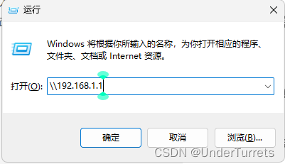


![[论文阅读]DeepFusion](https://img-blog.csdnimg.cn/direct/7aea0198a8a6438c84b14e0fb4ff44b6.png)