文章目录
- 效果
- 过程
- 灯泡闪亮实现(animation和box-shadow)
- 控制灯泡闪亮时间和顺序(animation-delay)
- 按钮开关
- 代码
- html
- css
- js
- 参考
- 代码1
- 代码2
前端demo目录
效果
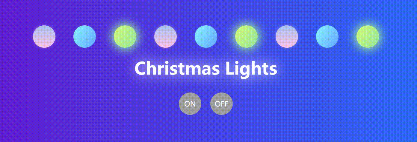
效果预览:https://codepen.io/karshey/pen/zYyBRWZ
参考:
Pure CSS Christmas Lights (codepen.io)
Christmas Lights (codepen.io)
过程
灯泡闪亮实现(animation和box-shadow)
效果:
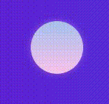
以单个灯泡闪亮为例。灯泡闪亮的实现原理是CSS动画animation和阴影box-shadow。
亮的时候其实就是显示与背景色相同的阴影:
box-shadow: h-shadow v-shadow blur spread color inset;
水平阴影的位置|垂直阴影的位置|模糊距离|阴影的尺寸|阴影的颜色|将外部阴影 (outset) 改为内部阴影
这里只需要用到模糊距离|阴影的尺寸|阴影的颜色。
只需要在动画开头和结尾有阴影,中间的时候阴影消失,就会有灯泡闪亮与熄灭的效果
@keyframes glow-red {

    /* 开头和结尾都亮 */
    0%,
    100% {
        /* 放大阴影相当于亮了 */
        box-shadow: 0 0 20px 5px #fbc2eb;
    }

    50% {
        box-shadow: none;
    }
}
这里我们命名粉色灯泡的动画效果为glow-red,我们就要在animation中使用到它。
animation的子属性:
animation-name: 指定一个@keyframes的名称,动画将要使用这个@keyframes定义。animation-duration: 整个动画需要的时长。animation-timing-function: 动画进行中的时速控制,比如ease或linear.animation-delay: 动画延迟时间。animation-direction: 动画重复执行时运动的方向。animation-iteration-count: 动画循环执行的次数。animation-fill-mode: 设置动画执行完成后/开始执行前的状态,比如,你可以让动画执行完成后停留在最后一幕,或恢复到初始状态。animation-play-state: 暂停/启动动画。
在这里,我们只需要令动画时间为1s(animation-duration),执行无限次(animation-iteration-count)即可。
animation: glow-red 1s infinite;
综上,单个粉色灯泡相关代码:
.red {
    background-image: linear-gradient(to top, #fbc2eb 0%, #a6c1ee 100%);
    animation: glow-red 1s infinite;
}

@keyframes glow-red {

    /* 开头和结尾都亮 */
    0%,
    100% {
        /* 放大阴影相当于亮了 */
        box-shadow: 0 0 20px 5px #fbc2eb;
    }

    50% {
        box-shadow: none;
    }
}
控制灯泡闪亮时间和顺序(animation-delay)
此时灯泡是同时闪亮的。
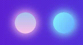
我们希望灯泡闪亮是按顺序的:粉色先,蓝色其次,最后绿色。
实现方法:为灯泡设置动画开始的时间,即延迟时间animation-delay。
如,令粉色没有延迟时间,蓝色延迟0.3s,绿色延迟0.6s。
.red {
    background-image: linear-gradient(to top, #fbc2eb 0%, #a6c1ee 100%);
    animation: glow-red 1s infinite;
}

.blue {
    background-image: linear-gradient(120deg, #89f7fe 0%, #66a6ff 100%);
    animation: glow-blue 1s infinite;
    animation-delay: 0.3s;
}

.green {
    background-image: linear-gradient(120deg, #d4fc79 0%, #96e6a1 100%);
    animation: glow-green 1s infinite;
    animation-delay: 0.6s;
}
效果:
按钮开关
想要有按钮ON和OFF,点击ON就开灯,点击OFF就关灯。
添加按钮和对应点击事件:
OFF按钮的事件:获取节点,并设置关灯。
const item = document.getElementsByClassName('item')
const len = item.length

function offLight() {
    for (let i = 0; i < len; i++) {
        item[i].style.animation = 'none'
        item[i].style.background = '#9e9e9e'
    }
}
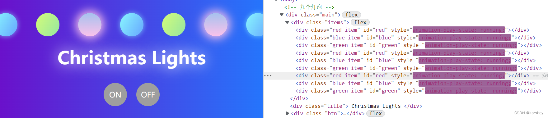
ON按钮的事件:移除原先的syle并令animationPlayState 开始。
这里不写item[i].style.animationPlayState = 'running’也可以。
function onLight() {
    for (let i = 0; i < len; i++) {
        item[i].removeAttribute('style')
        //可以不写
        item[i].style.animationPlayState = 'running'
    }
}
点击OFF时:相当于添加了停止动画和灰色背景色的样式,覆盖了原先的样式。
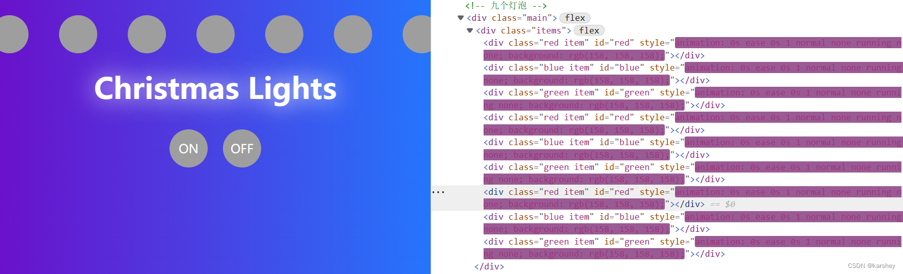
因此,点击ON时:需要把OFF添加的style去除掉。这里不添加item[i].style.animationPlayState = 'running'也可以亮灯,因为没有style后就显示原先CSS的亮灯效果了。
代码
html
<!DOCTYPE html>
<html lang="en">

<head>
    <meta charset="UTF-8">
    <meta name="viewport" content="width=device-width, initial-scale=1.0">
    <title>圣诞节灯泡</title>
    <link rel="stylesheet" href="style.css">
</head>

<body>
    <!-- 九个灯泡 -->
    <div class="main">
        <div class="items">
            <div class="red item" id="red"></div>
            <div class="blue item" id="blue"></div>
            <div class="green item" id="green"></div>
            <div class="red item" id="red"></div>
            <div class="blue item" id="blue"></div>
            <div class="green item" id="green"></div>
            <div class="red item" id="red"></div>
            <div class="blue item" id="blue"></div>
            <div class="green item" id="green"></div>
        </div>
        <div class="title">
            Christmas Lights
        </div>
        <div class="btn">
            <div onclick="onLight()">ON</div>
            <div onclick="offLight()">OFF</div>
        </div>
    </div>


</body>

</html>

<script src="index.js"></script>
css
body {
    margin: 0;
    padding: 0;
    background-image: linear-gradient(to right, #6a11cb 0%, #2575fc 100%);
}

.red {
    background-image: linear-gradient(to top, #fbc2eb 0%, #a6c1ee 100%);
    animation: glow-red 1s infinite;
}

.blue {
    background-image: linear-gradient(120deg, #89f7fe 0%, #66a6ff 100%);
    animation: glow-blue 1s infinite;
    animation-delay: 0.3s;
}

.green {
    background-image: linear-gradient(120deg, #d4fc79 0%, #96e6a1 100%);
    animation: glow-green 1s infinite;
    animation-delay: 0.6s;
}

.main {
    display: flex;
    flex-direction: column;
    margin-top: 100px;
    justify-content: center;
    align-items: center;
}

.items {
    display: flex;
}

.title {
    font-size: 38px;
    font-weight: 700;
    color: #fff;
    text-shadow: 0 0 30px #fff;
}

.btn {
    margin-top: 20px;
    display: flex;
}

.btn div {
    width: 50px;
    height: 50px;
    border-radius: 50%;
    line-height: 50px;
    text-align: center;
    background-color: #9e9e9e;
    color: #fff;
    margin: 10px;
    cursor: pointer;
}

.item {
    height: 50px;
    width: 50px;
    border-radius: 50%;
    display: inline-block;
    margin: 20px;
}

@keyframes glow-red {

    /* 开头和结尾都亮 */
    0%,
    100% {
        /* 放大阴影相当于亮了 */
        box-shadow: 0 0 20px 5px #fbc2eb;
    }

    50% {
        box-shadow: none;
    }
}

@keyframes glow-blue {

    /* 开头和结尾都亮 */
    0%,
    100% {
        /* 放大阴影相当于亮了 */
        box-shadow: 0 0 20px 5px #89f7fe;
    }

    50% {
        box-shadow: none;
    }
}

@keyframes glow-green {

    /* 开头和结尾都亮 */
    0%,
    100% {
        /* 放大阴影相当于亮了 */
        box-shadow: 0 0 20px 5px #96e6a1;
    }

    50% {
        box-shadow: none;
    }
}
js
const item = document.getElementsByClassName('item')
const len = item.length


function onLight() {
    for (let i = 0; i < len; i++) {
        item[i].removeAttribute('style')
        // item[i].style.animationPlayState = 'running'
    }
}

function offLight() {
    for (let i = 0; i < len; i++) {
        item[i].style.animation = 'none'
        item[i].style.background = '#9e9e9e'
    }
}
参考
Pure CSS Christmas Lights (codepen.io)
Christmas Lights (codepen.io)
CSS动画技术中animation的使用介绍 – WEB骇客 (webhek.com)
在线SCSS转CSS工具 - UU在线工具 (uutool.cn)
免费的渐变背景CSS3样式 | oulu.me
代码1
Pure CSS Christmas Lights (codepen.io)
html:
<!DOCTYPE html>
<html lang="en">

<head>
    <meta charset="UTF-8">
    <meta name="viewport" content="width=device-width, initial-scale=1.0">
    <title>Document</title>
    <link rel="stylesheet" href="style.css">
</head>
<ul class="lightrope">
    <li></li>
    <li></li>
    <li></li>
    <li></li>
    <li></li>
    <li></li>
    <li></li>
    <li></li>
    <li></li>
    <li></li>
    <li></li>
    <li></li>
    <li></li>
    <li></li>
    <li></li>
    <li></li>
    <li></li>
    <li></li>
    <li></li>
    <li></li>
    <li></li>
    <li></li>
    <li></li>
    <li></li>
    <li></li>
    <li></li>
    <li></li>
    <li></li>
    <li></li>
    <li></li>
    <li></li>
    <li></li>
    <li></li>
    <li></li>
    <li></li>
    <li></li>
    <li></li>
    <li></li>
    <li></li>
    <li></li>
    <li></li>
    <li></li>
</ul>

</html>
css:将链接中的scss转为了css。
body {
    background: #000;
}

.lightrope {
    text-align: center;
    white-space: nowrap;
    overflow: hidden;
    position: absolute;
    z-index: 1;
    margin: -15px 0 0 0;
    padding: 0;
    pointer-events: none;
    width: 100%;
}

.lightrope li {
    position: relative;
    animation-fill-mode: both;
    animation-iteration-count: infinite;
    list-style: none;
    margin: 0;
    padding: 0;
    display: block;
    width: 12px;
    height: 28px;
    border-radius: 50%;
    margin: 20px;
    display: inline-block;
    background: #00f7a5;
    box-shadow: 0px 4.6666666667px 24px 3px #00f7a5;
    animation-name: flash-1;
    animation-duration: 2s;
}

.lightrope li:nth-child(2n+1) {
    background: aqua;
    box-shadow: 0px 4.6666666667px 24px 3px rgba(0, 255, 255, 0.5);
    animation-name: flash-2;
    animation-duration: 0.4s;
}

.lightrope li:nth-child(4n+2) {
    background: #f70094;
    box-shadow: 0px 4.6666666667px 24px 3px #f70094;
    animation-name: flash-3;
    animation-duration: 1.1s;
}

.lightrope li:nth-child(odd) {
    animation-duration: 1.8s;
}

.lightrope li:nth-child(3n+1) {
    animation-duration: 1.4s;
}

.lightrope li:before {
    content: "";
    position: absolute;
    background: #222;
    width: 10px;
    height: 9.3333333333px;
    border-radius: 3px;
    top: -4.6666666667px;
    left: 1px;
}

.lightrope li:after {
    content: "";
    top: -14px;
    left: 9px;
    position: absolute;
    width: 52px;
    height: 18.6666666667px;
    border-bottom: solid #222 2px;
    border-radius: 50%;
}

.lightrope li:last-child:after {
    content: none;
}

.lightrope li:first-child {
    margin-left: -40px;
}

@keyframes flash-1 {

    0%,
    100% {
        background: #00f7a5;
        box-shadow: 0px 4.6666666667px 24px 3px #00f7a5;
    }

    50% {
        background: rgba(0, 247, 165, 0.4);
        box-shadow: 0px 4.6666666667px 24px 3px rgba(0, 247, 165, 0.2);
    }
}

@keyframes flash-2 {

    0%,
    100% {
        background: aqua;
        box-shadow: 0px 4.6666666667px 24px 3px aqua;
    }

    50% {
        background: rgba(0, 255, 255, 0.4);
        box-shadow: 0px 4.6666666667px 24px 3px rgba(0, 255, 255, 0.2);
    }
}

@keyframes flash-3 {

    0%,
    100% {
        background: #f70094;
        box-shadow: 0px 4.6666666667px 24px 3px #f70094;
    }

    50% {
        background: rgba(247, 0, 148, 0.4);
        box-shadow: 0px 4.6666666667px 24px 3px rgba(247, 0, 148, 0.2);
    }
}
代码2
Christmas Lights (codepen.io)
链接里有代码。