目录
一、博客页面介绍
二、实现博客列表页
1、先实现导航栏
2、页面主体
左侧区域的实现:编辑
右侧页面的实现:编辑
博客列表页代码汇总:
三、实现博客详情页
代码实现:
四、实现博客登录页编辑
五、博客编辑页
六、全部代码展示
blog_detail.html
blog_edit.html
blog_list.html
login.html
blog_detail.css
blog_edit.css
blog_list.css
common.css
login.css
一、博客页面介绍
要实现一个博客系统,我们得先构造出它的页面:
一共有四个页面:
1、博客列表页
2、博客详情页:
显示这一个博客里面的具体内容
3、登录页

4、博客编辑页
发布新博客,在这个博客页面进行编辑
关于里面的 markdown 编辑器,我们直接使用开源的项目集成进来即可,不需要我们从头实现
二、实现博客列表页
1、先实现导航栏
导航栏各个页面都有
我们把导航栏的样式给单独放到一个common.css 中,让各个页面来引用
通过对导航栏进行调整,我们目前的导航栏是这个样子的:
但是我们还缺少一个半透明的效果, 我们可以在设置导航栏颜色的地方加一个数值 a
表示的就是透明度:
加上透明度后,我们的导航栏是这个样子的:

    <!-- 这是一个导航栏 -->
    <div class="nav">
        <img src="image/logo2.png" alt="">
        <span class = "title">我的博客系统</span>
        <!-- 这个标签仅仅用于占位,把这几个 a 标签挤到右侧去 -->
        <div class="spacer"></div>
        <a href="#">主页</a>
        <a href="#">写博客</a>
        <a href="#">注销</a>
    </div>
common.css 部分代码:
/* 写样式的起手:先取出浏览器的公共样式,并且设置 border-box,避免元素盒子被内边距和边框撑大 */
*{
    margin:0;
    padding:0;
    box-sizing: border-box;
}

html,body{
    /*
    html 是我们页面的最顶层元素,高度 100% 是相对父元素来说是 100%(和父元素一样高)
    对于 html 标签来说,父元素就是浏览器窗口,浏览器窗口多高,html 就多高
    body 的父亲是 html ,设为 100%,意思是 body 和 html 一样高
    此时,body 和 html 高度和浏览器窗口一样高
    如果不设置高度,此时元素的默认高度取决于内部的内容
     */
    height: 100%;

}

body{
    /* 相对路径的基准路径,就是当前文件所在路径 */
    background-image: url(../image/背景图.jpg);
    background-repeat: no-repeat;
    background-size: cover;
    background-position: center center;
}

/* 实现导航栏的样式 */

.nav{
     /* 宽度和父元素一样宽 */
     /* 块级元素来说,样式默认就是100% */
    width:100%;
    height: 50px;
    background-color: rgba(50, 50, 50,0.4);
    color: white;

    /* 导航栏里面的元素都是水平排列,弹性布局来设置 */
    display: flex;
    /* 垂直方向子元素居中 */
    align-items: center;

}

.nav img{
    width:40px;
    height: 40px;
    margin-left:30px;
    margin-right: 10px;
    /* 让元素变圆,把内切圆半径设置为宽度的一半,此时就正好是一个圆形 */
    border-radius: 50%;
}

.nav .spacer{
    width:70%
}

.nav a{
    color: white;
    /* 去掉下划线 */
    text-decoration: none;
    /* 为了让这几个 a 标签不要贴的这么紧凑,加上个内边距
    使用 外边距也行,但是内边距更好,内边距也是元素的内容,可以增大用户点击的面积*/
    padding:0 10px;

}
2、页面主体

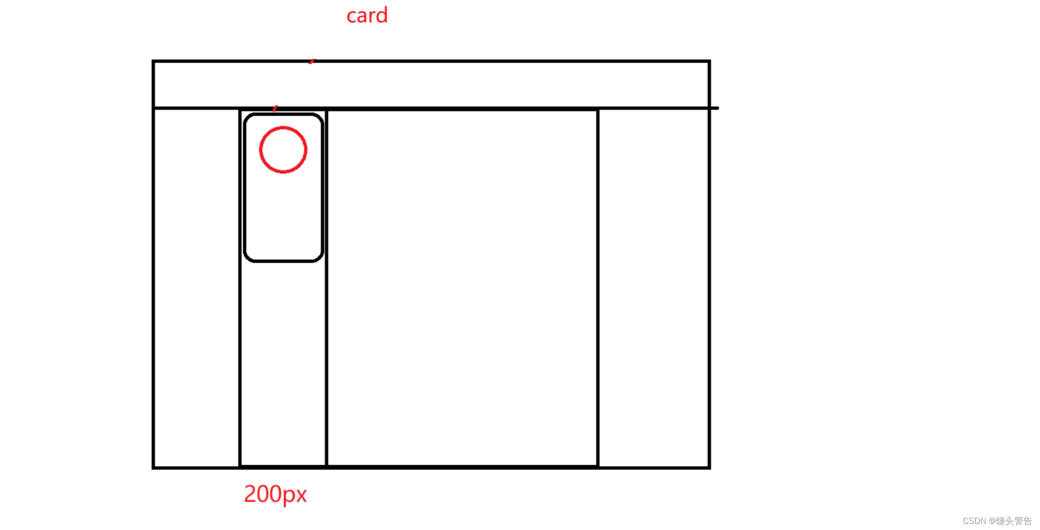
设置高度的时候,我们要注意主体页面的高度应该是整个页面的高度减去导航栏的高度
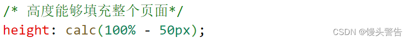
这里的 calc 相当于是 CSS 提供的一个函数
calc可以帮助我们计算页面的尺寸,针对 绝对值 和 百分数 尺寸进行混合运算
注意:这里的 - 两侧必须要有一个空格, - 有可能是标识符的一部分,如果 CSS 要想表示减法运算,就得加上空格
左侧区域的实现: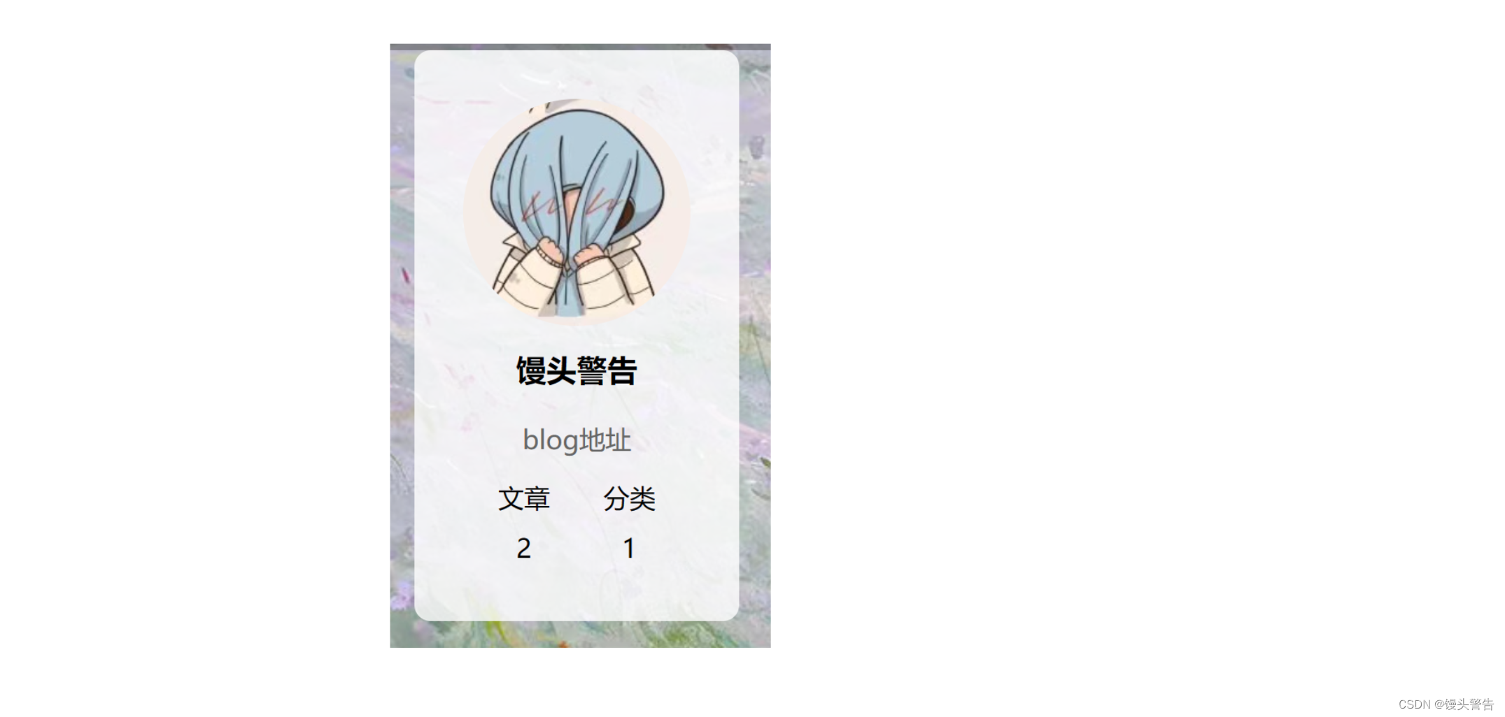
我们给图片设置成 140px * 140px,左右各自留 30px 的间距
同时让图片和上方也有 30px 的间距
右侧页面的实现: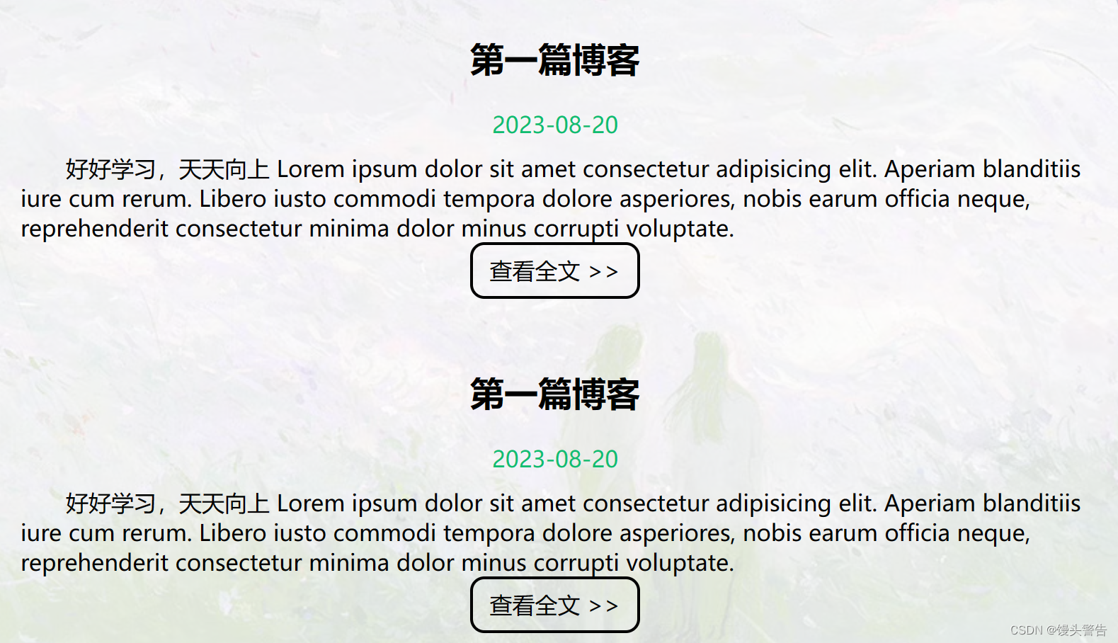
先搞定一片,其他的就好办了
注意:在 html 中,存在一些转义字符: < < > >

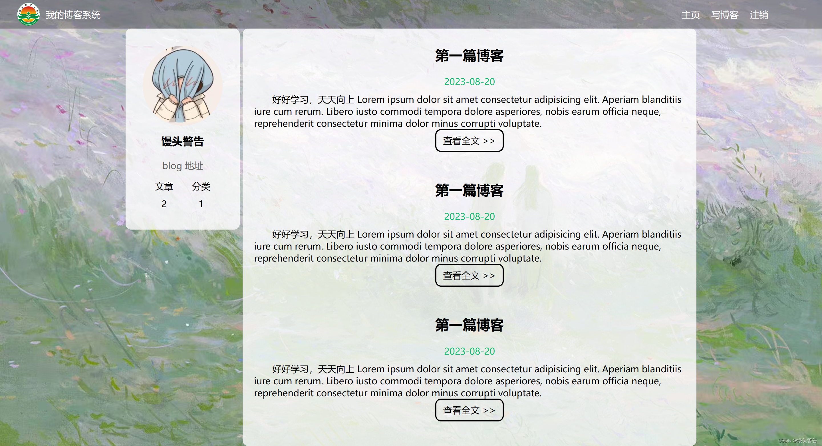
现在有一个问题,那就是当我们多展示几篇博客之后,便会出现这种情况:

针对这个滚动的问题, 我们就可以把滚动条加到 containner-right 上
这样滚动的时候,就不会整个页面一起滚动了,而是只滚动一部分
博客列表页代码汇总:
common.css:
/* 写样式的起手:先取出浏览器的公共样式,并且设置 border-box,避免元素盒子被内边距和边框撑大 */
*{
    margin:0;
    padding:0;
    box-sizing: border-box;
}

html,body{
    /*
    html 是我们页面的最顶层元素,高度 100% 是相对父元素来说是 100%(和父元素一样高)
    对于 html 标签来说,父元素就是浏览器窗口,浏览器窗口多高,html 就多高
    body 的父亲是 html ,设为 100%,意思是 body 和 html 一样高
    此时,body 和 html 高度和浏览器窗口一样高
    如果不设置高度,此时元素的默认高度取决于内部的内容
     */
    height: 100%;

}

body{
    /* 相对路径的基准路径,就是当前文件所在路径 */
    background-image: url(../image/背景图.jpg);
    background-repeat: no-repeat;
    background-size: cover;
    background-position: center center;
}

/* 实现导航栏的样式 */

.nav{
     /* 宽度和父元素一样宽 */
     /* 块级元素来说,样式默认就是100% */
    width:100%;
    height: 50px;
    background-color: rgba(50, 50, 50,0.4);
    color: white;

    /* 导航栏里面的元素都是水平排列,弹性布局来设置 */
    display: flex;
    /* 垂直方向子元素居中 */
    align-items: center;

}

.nav img{
    width:40px;
    height: 40px;
    margin-left:30px;
    margin-right: 10px;
    /* 让元素变圆,把内切圆半径设置为宽度的一半,此时就正好是一个圆形 */
    border-radius: 50%;
}

.nav .spacer{
    width:70%
}

.nav a{
    color: white;
    /* 去掉下划线 */
    text-decoration: none;
    /* 为了让这几个 a 标签不要贴的这么紧凑,加上个内边距
    使用 外边距也行,但是内边距更好,内边距也是元素的内容,可以增大用户点击的面积*/
    padding:0 10px;

}

/* 编写页面主体样式 */
.containner{
    /* 设置主体部分宽度 1000px */
    width: 1000px;
    /* 高度能够填充整个页面*/
    height: calc(100% - 50px);
    /* 水平居中 */
    margin:0 auto;


    /* 弹性布局 */
    display: flex;
    align-items: center;
    justify-content: space-between;
}

.containner-left{
    /* 尺寸写百分数是相对于父元素为基准的 ,这里的父元素是 containner */
    height:100%;
    width:200px;


}

.containner-right{
    height:100%;
    /* 此处不设置为800,而是留了 5px,作为中缝 */
    width:795px;

    background-color: rgba(255, 255, 255,0.8);
    border-radius: 10px;

    /* 让这个元素自己能带上滚动条 */
    /* 这个属性表示如果内容没有溢出,就没有滚动条,如果溢出,就有滚动条 */
    overflow: auto;
}

/* 左侧用户信息 */
.card{
    background-color: rgba(255, 255, 255,0.8);
    border-radius: 10px;
    /* 设置内间距,让内容和边框之间有点距离 */
    padding:30px;
}

/* 用户头像 */
.card img{
    width:140px;
    height:140px;
    border-radius: 50%;
}

/* 用户名字 */
.card h3{
    /* 让文字水平居中 */
    text-align: center;
    /* 让文字和上下都有边距 */
    /* 此处使用内边距和外边距都可,但是会更倾向于 内边距 */
    padding:10px;
}

/* 用户的 blog 链接 */
.card a{
    /* a 标签是行内标签 */
    text-align: center;
    /* 为了配合上述样式,设置成块级元素 */
    display: block;
    color: #666;
    text-decoration: none;
    padding:10px;
}

.card .counter{
    /* 为了让里面的元素水平排列,使用弹性布局 */
    display: flex;
    justify-content: space-around;
    padding:5px;
}
blog_list.css
/* 这个文件是给博客列表页实现的样式 */

/* 设置整个博客的容易样式 */
.blog{
    width:100%;
    padding: 20px;
}

.blog .title{
    text-align: center;
    font-size: 24px;
    font-weight: 700;
    padding: 10px;
}

.blog .date{
    text-align: center;
    color: rgb(15,189,114);
    padding:10px;
}

.blog .desc{
    text-indent: 2em;
}

.blog a{
    /* a 标签不方便设置样式,所以设置成块级元素 */
    display: block;
    width:120px;
    height:40px;
    /* 设置水平居中 */
    margin-top: 20px auto;
    margin-left: auto;
    margin-right: auto;
    /* 设置一个边框 */
    border: 2px solid black;
    /* 让文字水平居中 */
    text-align: center;
    /* 让文字垂直居中 */
    line-height: 35px;
    /* 去掉下划线*/
    text-decoration: none;
    /* 文字改成黑色 */
    color: black;
    /* 圆角矩形 */
    border-radius: 10px;
    /* 给鼠标悬停加一个过度效果 */
    transition:all 0.8s;
}

/* 设置一下,让鼠标滑倒按钮上有一个变化 */
.blog a:hover{
    color:white;
    background-color: #666;
}
blog_list.html
<!DOCTYPE html>
<html lang="en">
<head>
<meta charset="UTF-8">
<meta name="viewport" content="width=device-width, initial-scale=1.0">
<title>博客列表页</title>
<link rel="stylesheet" href="CSS/common.css">
<link rel="stylesheet" href="CSS/blog_list.css">
</head>
<body>
<!-- 这是一个导航栏 -->
<div class="nav">
<img src="image/logo2.png" alt="">
<span class = "title">我的博客系统</span>
<!-- 这个标签仅仅用于占位,把这几个 a 标签挤到右侧去 -->
<div class="spacer"></div>
<a href="#">主页</a>
<a href="#">写博客</a>
<a href="#">注销</a>
</div>
<!-- 页面主体部分 -->
<div class="containner">
<!-- 左侧信息 -->
<div class="containner-left">
<!-- 使用这个 .card 表示用户信息 -->
<div class="card">
<!-- 用户头像 -->
<img src="image/logo.jpg" alt="">
<!-- 用户名字 -->
<h3>馒头警告</h3>
<a href="#">blog 地址</a>
<div class="counter">
<span>文章</span>
<span>分类</span>
</div>
<div class="counter">
<span>2</span>
<span>1</span>
</div>
</div>
</div>
<!-- 右侧信息 -->
<div class="containner-right">
<!-- 表示一篇博客 -->
<div class="blog">
<!-- 博客的标题 -->
<div class="title">第一篇博客</div>
<!-- 发布时间 -->
<div class="date">2023-08-20</div>
<!-- 博客的摘要 -->
<div class="desc">好好学习,天天向上 Lorem ipsum dolor sit amet consectetur adipisicing elit. Aperiam blanditiis iure cum rerum. Libero iusto commodi tempora dolore asperiores, nobis earum officia neque, reprehenderit consectetur minima dolor minus corrupti voluptate.</div>
<!-- 查看全文按钮 -->
<a href="#">查看全文 >> </a>
</div>
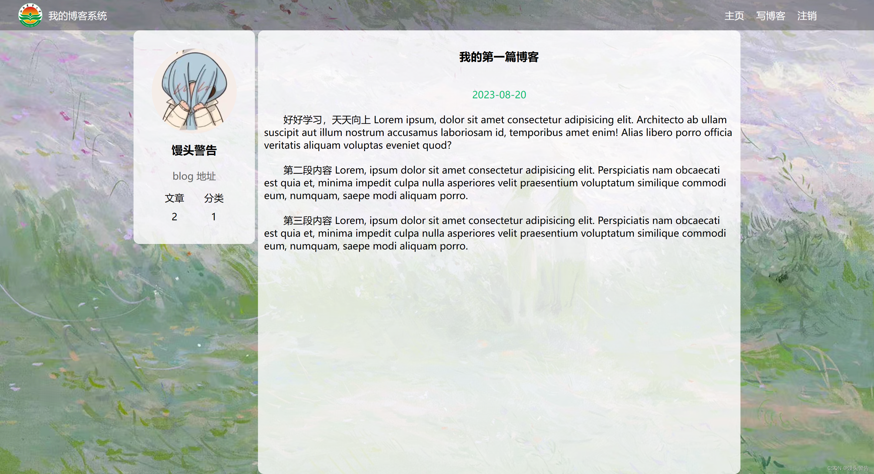
</div>三、实现博客详情页
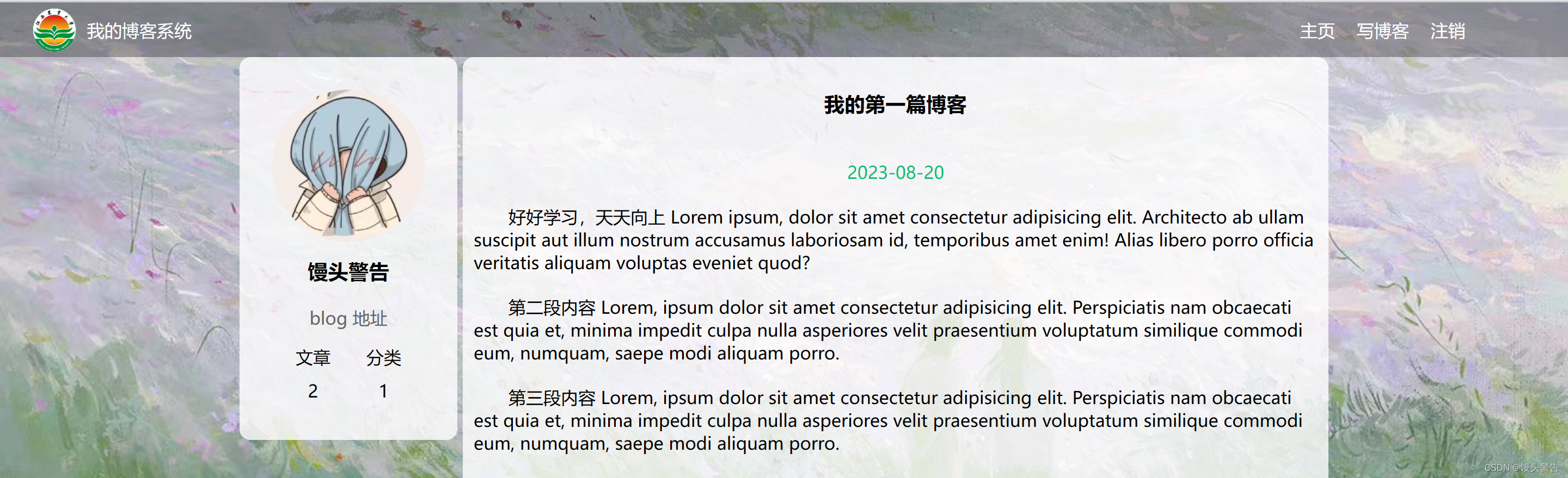
导航栏和左侧部分代码,我们可以直接将之前博客列表页相关部分的复制过来
此时,只需要对右侧主体部分进行编写即可
代码实现:
blog_detail.css
/* 这个样式给多个详情页使用 */

.containner-right .title{
    text-align: center;
    padding: 30px;

}

.containner-right .date{
    color: rgb(15,189,114);
    text-align:  center;
    padding:10px;

}

.containner-right .content p{
    text-indent: 2em;
    padding :10px;
}
blog_detail.html
<!DOCTYPE html>
<html lang="en">
<head>
    <meta charset="UTF-8">
    <meta name="viewport" content="width=device-width, initial-scale=1.0">
    <title>博客详情页</title>
    <link rel="stylesheet" href="CSS/common.css">
    <link rel="stylesheet" href="CSS/blog_detail.css">
</head>
<body>
     <!-- 这是一个导航栏 -->
     <div class="nav">
        <img src="image/logo2.png" alt="">
        <span class = "title">我的博客系统</span>
        <!-- 这个标签仅仅用于占位,把这几个 a 标签挤到右侧去 -->
        <div class="spacer"></div>
        <a href="#">主页</a>
        <a href="#">写博客</a>
        <a href="#">注销</a>
    </div>
    <div class="containner">
        <!-- 左侧信息 -->
        <div class="containner-left">
            <!-- 使用这个 .card 表示用户信息 -->
            <div class="card">
                <!-- 用户头像 -->
                <img src="image/logo.jpg" alt="">
                <!-- 用户名字 -->
                <h3>馒头警告</h3>
                <a href="#">blog 地址</a>
                <div class="counter">
                    <span>文章</span>
                    <span>分类</span>
                </div>
                <div class="counter">
                    <span>2</span>
                    <span>1</span>
                </div>
            </div>
        </div>
        <!-- 右侧信息 -->
        <div class="containner-right">
            <!-- 博客标题 -->
            <h3 class="title">我的第一篇博客</h3>
            <!-- 博客发布时间 -->
            <div class="date">2023-08-20</div>
            <!-- 博客正文 -->
            <div class="content">
                <p>
                    好好学习,天天向上 Lorem ipsum, dolor sit amet consectetur adipisicing elit. Architecto ab ullam suscipit aut illum nostrum accusamus laboriosam id, temporibus amet enim! Alias libero porro officia veritatis aliquam voluptas eveniet quod?
                </p>
                <p>
                    第二段内容 Lorem, ipsum dolor sit amet consectetur adipisicing elit. Perspiciatis nam obcaecati est quia et, minima impedit culpa nulla asperiores velit praesentium voluptatum similique commodi eum, numquam, saepe modi aliquam porro.
                </p>
                <p>
                    第三段内容 Lorem, ipsum dolor sit amet consectetur adipisicing elit. Perspiciatis nam obcaecati est quia et, minima impedit culpa nulla asperiores velit praesentium voluptatum similique commodi eum, numquam, saepe modi aliquam porro.
                </p>
            </div>
        </div>
    </div>
</body>
</html>
四、实现博客登录页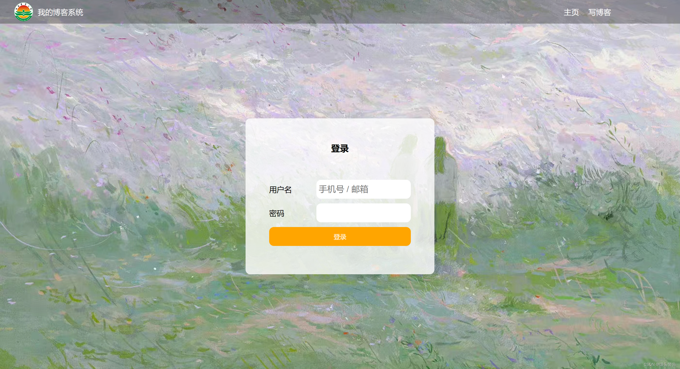
注意:登录页面是没有登录按钮的
注销指的是登录状态,在登录页面还没有进行登录,所以不应该提供注销按钮
在 CSS 中,实现垂直水平居中,有很多的写法
我们可以使用前面学过的弹性布局
代码:
login.html
<!DOCTYPE html>
<html lang="en">
<head>
    <meta charset="UTF-8">
    <meta name="viewport" content="width=device-width, initial-scale=1.0">
    <title>登录页面</title>
    <link rel="stylesheet" href="CSS/common.css">
    <link rel="stylesheet" href="CSS/login.css">
</head>
<body>
     <!-- 这是一个导航栏 -->
     <div class="nav">
        <img src="image/logo2.png" alt="">
        <span class = "title">我的博客系统</span>
        <!-- 这个标签仅仅用于占位,把这几个 a 标签挤到右侧去 -->
        <div class="spacer"></div>
        <a href="#">主页</a>
        <a href="#">写博客</a>
    </div>
    <!-- 正文部分 -->
    <!-- 贯穿整个页面的容器 -->
    <div class="login-container">
        <!-- 垂直水平居中的对话框 -->
        <div class="login-dialog">
            <h3>登录</h3>
            <div class="row">
                <span>用户名</span>
                <input type="text" id = "username" placeholder="手机号 / 邮箱">
            </div>
            <div class="row">
                <span>密码</span>
                <input type="password" id = "password">
            </div>
            <div class="row">
                <button id = "submit">登录</button>
            </div>
        </div>
    </div>

</body>
</html>
login.css
/* 这个文件专门放登录页面的样式 */
.login-container{
    width:100%;
    height:calc(100% - 50px);
    /* 为了让对话框能垂直水平居中,使用弹性布局 */
    display: flex;
    justify-content: center;
    align-items: center;
}

.login-dialog{
    width:400px;
    height:330px;
    background-color: rgba(255,255,255,0.8);
    border-radius: 10px;
}

.login-dialog h3{
    text-align: center;
    padding:50px 0;
}

.login-dialog .row{
    display: flex;
    height: 50px;
    justify-content: center;
    align-items: center;
}

.login-dialog .row span{
    width: 100px;
}

#username,#password{
    width:200px;
    height: 40px;
    border-radius: 10px;
    /* 去掉边框 */
    border: none;
    /* 放大字体 */
    font-size: 18px;
    padding-left:5px;
}

#submit{
    width:300px;
    height: 40px;
    color: white;
    background-color: orange;
    border: none;
    border-radius: 10px;
}

#submit:active{
    background-color: #666;
}
五、博客编辑页
editor.md
我们要做的工作:
1、把项目下载下来
2、把项目引入到我们的代码中
3、编写少量代码进行初始化
editor.md 还依赖了另外一个 js 库 : jquery
如何引入 jquery?
1、网上找到 jquery 源码
打开浏览器,在搜索框中输入 jquery cdn

然后找到这个链接,点开
我们在其中选择这个版本的 jquery:
然后直接复制链接,在新的浏览器页打开
打开链接后,我们所看到的这些东西就是源码:
在这里,我们有两种做法:
1、直接全选这个页面里面的代码,新建一个 js 文件,粘贴进去就行了
2、 直接把 cdn 的地址,直接写到 src 的属性中,就不需要手动粘贴了
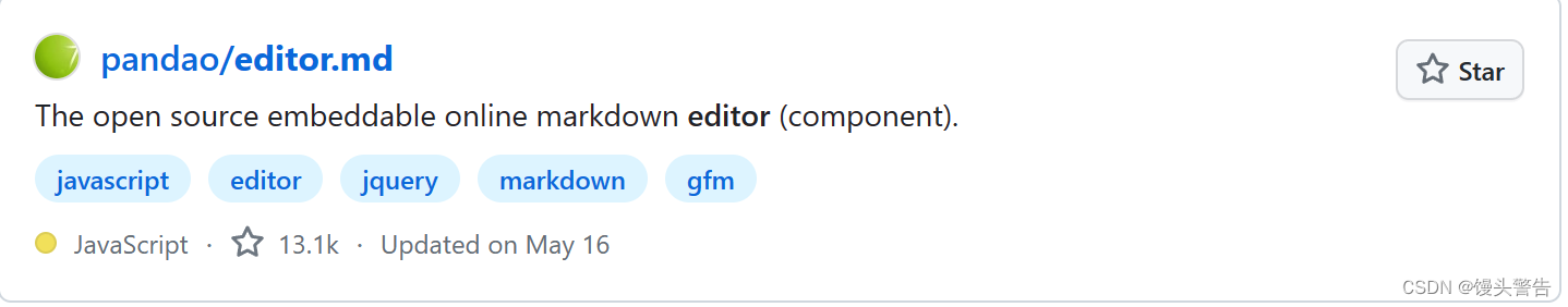
2、引入 editor.md
这个东西需要在 github 中查找
如果 github 打不开,可以尝试使用 steam ++ 作为加速器
在 guthub 中搜索 editor.md
然后把源码下载下来
然后将文件拷贝到博客页面目录中,并且把这个目录名改成 editor.md
当前,我们已经把库下载下来了,就需要把这个库引入到项目代码中,也就是让 html 引入库里的文件(引入 css 和 js 文件)
如何引入 editor.md?
1、先保证页面中有一个 id 为 editor 的 div

2、引入 editor.md 对应的 css 和 js ,这些引入代码,必须放到 jquery 引入代码的下面
<!-- 引入 editor.md 的依赖 -->
    <link rel="stylesheet" href="editor.md/css/editormd.min.css" />
    <script src="js/jquery.min.js"></script>
    <script src="editor.md/lib/marked.min.js"></script>
    <script src="editor.md/lib/prettify.min.js"></script>
    <script src="editor.md/editormd.js"></script>
注意:此处代码中的路径必须要和磁盘中的路径一致
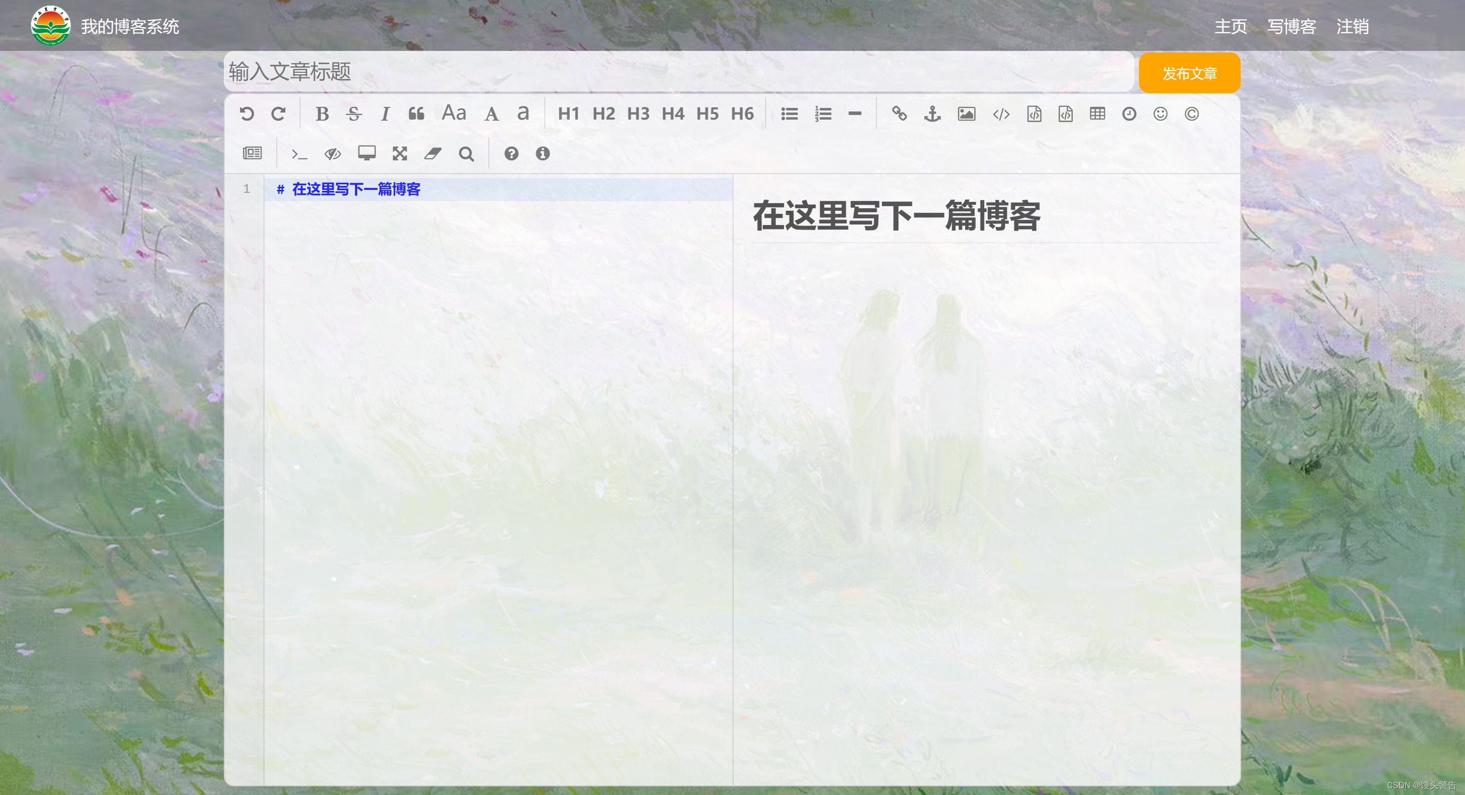
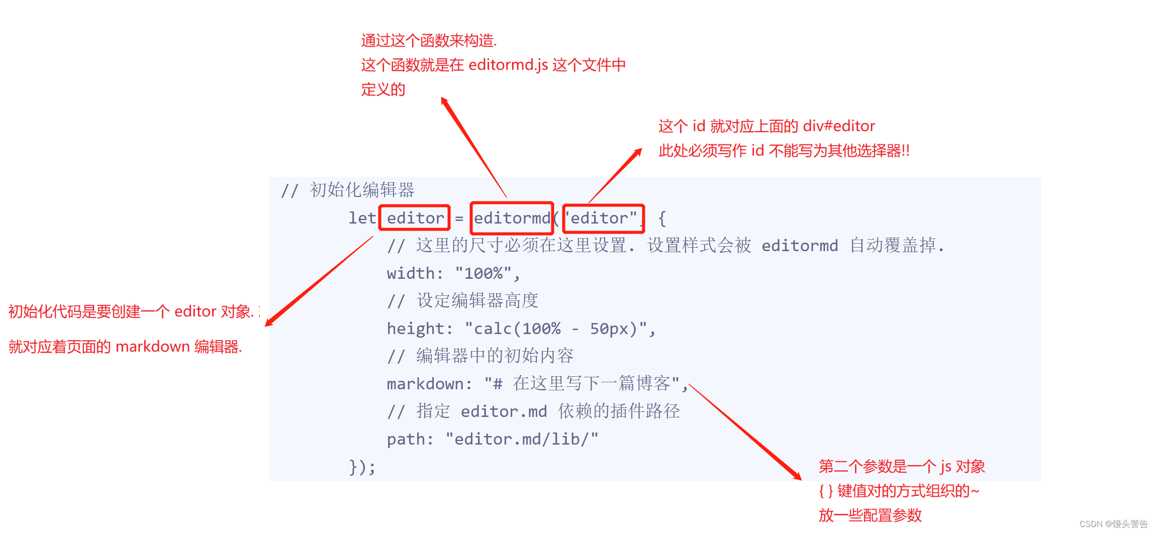
3、编写初始化代码(官方文档上有,直接复制粘贴即可)
 // 初始化编辑器
        let editor = editormd("editor", {
            // 这里的尺寸必须在这里设置. 设置样式会被 editormd 自动覆盖掉.
            width: "100%",
            // 设定编辑器高度
            height: "calc(100% - 50px)",
            // 编辑器中的初始内容
            markdown: "# 在这里写下一篇博客",
            // 指定 editor.md 依赖的插件路径
            path: "editor.md/lib/"
        });
此时,markdown 编译器就引入完毕了
当我们给 #editor 设置背景半透明,但是没有生效
这是因为, #editor 自身半透明,但是这里面的元素不是透明的,导致仍然看不到背景
我们可以通过 opacity 设置半透明
这个会使所有的子元素都变成半透明
六、全部代码展示
blog_detail.html
<!DOCTYPE html>
<html lang="en">
<head>
    <meta charset="UTF-8">
    <meta name="viewport" content="width=device-width, initial-scale=1.0">
    <title>博客详情页</title>
    <link rel="stylesheet" href="CSS/common.css">
    <link rel="stylesheet" href="CSS/blog_detail.css">
</head>
<body>
     <!-- 这是一个导航栏 -->
     <div class="nav">
        <img src="image/logo2.png" alt="">
        <span class = "title">我的博客系统</span>
        <!-- 这个标签仅仅用于占位,把这几个 a 标签挤到右侧去 -->
        <div class="spacer"></div>
        <a href="#">主页</a>
        <a href="#">写博客</a>
        <a href="#">注销</a>
    </div>
    <div class="containner">
        <!-- 左侧信息 -->
        <div class="containner-left">
            <!-- 使用这个 .card 表示用户信息 -->
            <div class="card">
                <!-- 用户头像 -->
                <img src="image/logo.jpg" alt="">
                <!-- 用户名字 -->
                <h3>馒头警告</h3>
                <a href="#">blog 地址</a>
                <div class="counter">
                    <span>文章</span>
                    <span>分类</span>
                </div>
                <div class="counter">
                    <span>2</span>
                    <span>1</span>
                </div>
            </div>
        </div>
        <!-- 右侧信息 -->
        <div class="containner-right">
            <!-- 博客标题 -->
            <h3 class="title">我的第一篇博客</h3>
            <!-- 博客发布时间 -->
            <div class="date">2023-08-20</div>
            <!-- 博客正文 -->
            <div class="content">
                <p>
                    好好学习,天天向上 Lorem ipsum, dolor sit amet consectetur adipisicing elit. Architecto ab ullam suscipit aut illum nostrum accusamus laboriosam id, temporibus amet enim! Alias libero porro officia veritatis aliquam voluptas eveniet quod?
                </p>
                <p>
                    第二段内容 Lorem, ipsum dolor sit amet consectetur adipisicing elit. Perspiciatis nam obcaecati est quia et, minima impedit culpa nulla asperiores velit praesentium voluptatum similique commodi eum, numquam, saepe modi aliquam porro.
                </p>
                <p>
                    第三段内容 Lorem, ipsum dolor sit amet consectetur adipisicing elit. Perspiciatis nam obcaecati est quia et, minima impedit culpa nulla asperiores velit praesentium voluptatum similique commodi eum, numquam, saepe modi aliquam porro.
                </p>
            </div>
        </div>
    </div>
</body>
</html>
blog_edit.html
<!DOCTYPE html>
<html lang="en">
<head>
    <meta charset="UTF-8">
    <meta name="viewport" content="width=device-width, initial-scale=1.0">
    <title>博客详情页</title>
    <link rel="stylesheet" href="CSS/common.css">
    <link rel="stylesheet" href="CSS/blog_detail.css">
</head>
<body>
     <!-- 这是一个导航栏 -->
     <div class="nav">
        <img src="image/logo2.png" alt="">
        <span class = "title">我的博客系统</span>
        <!-- 这个标签仅仅用于占位,把这几个 a 标签挤到右侧去 -->
        <div class="spacer"></div>
        <a href="#">主页</a>
        <a href="#">写博客</a>
        <a href="#">注销</a>
    </div>
    <div class="containner">
        <!-- 左侧信息 -->
        <div class="containner-left">
            <!-- 使用这个 .card 表示用户信息 -->
            <div class="card">
                <!-- 用户头像 -->
                <img src="image/logo.jpg" alt="">
                <!-- 用户名字 -->
                <h3>馒头警告</h3>
                <a href="#">blog 地址</a>
                <div class="counter">
                    <span>文章</span>
                    <span>分类</span>
                </div>
                <div class="counter">
                    <span>2</span>
                    <span>1</span>
                </div>
            </div>
        </div>
        <!-- 右侧信息 -->
        <div class="containner-right">
            <!-- 博客标题 -->
            <h3 class="title">我的第一篇博客</h3>
            <!-- 博客发布时间 -->
            <div class="date">2023-08-20</div>
            <!-- 博客正文 -->
            <div class="content">
                <p>
                    好好学习,天天向上 Lorem ipsum, dolor sit amet consectetur adipisicing elit. Architecto ab ullam suscipit aut illum nostrum accusamus laboriosam id, temporibus amet enim! Alias libero porro officia veritatis aliquam voluptas eveniet quod?
                </p>
                <p>
                    第二段内容 Lorem, ipsum dolor sit amet consectetur adipisicing elit. Perspiciatis nam obcaecati est quia et, minima impedit culpa nulla asperiores velit praesentium voluptatum similique commodi eum, numquam, saepe modi aliquam porro.
                </p>
                <p>
                    第三段内容 Lorem, ipsum dolor sit amet consectetur adipisicing elit. Perspiciatis nam obcaecati est quia et, minima impedit culpa nulla asperiores velit praesentium voluptatum similique commodi eum, numquam, saepe modi aliquam porro.
                </p>
            </div>
        </div>
    </div>
</body>
</html>
blog_list.html
<!DOCTYPE html>
<html lang="en">
<head>
<meta charset="UTF-8">
<meta name="viewport" content="width=device-width, initial-scale=1.0">
<title>博客列表页</title>
<link rel="stylesheet" href="CSS/common.css">
<link rel="stylesheet" href="CSS/blog_list.css">
</head>
<body>
<!-- 这是一个导航栏 -->
<div class="nav">
<img src="image/logo2.png" alt="">
<span class = "title">我的博客系统</span>
<!-- 这个标签仅仅用于占位,把这几个 a 标签挤到右侧去 -->
<div class="spacer"></div>
<a href="#">主页</a>
<a href="#">写博客</a>
<a href="#">注销</a>
</div>
<!-- 页面主体部分 -->
<div class="containner">
<!-- 左侧信息 -->
<div class="containner-left">
<!-- 使用这个 .card 表示用户信息 -->
<div class="card">
<!-- 用户头像 -->
<img src="image/logo.jpg" alt="">
<!-- 用户名字 -->
<h3>馒头警告</h3>
<a href="#">blog 地址</a>
<div class="counter">
<span>文章</span>
<span>分类</span>
</div>
<div class="counter">
<span>2</span>
<span>1</span>
</div>
</div>
</div>
<!-- 右侧信息 -->
<div class="containner-right">
<!-- 表示一篇博客 -->
<div class="blog">
<!-- 博客的标题 -->
<div class="title">第一篇博客</div>
<!-- 发布时间 -->
<div class="date">2023-08-20</div>
<!-- 博客的摘要 -->
<div class="desc">好好学习,天天向上 Lorem ipsum dolor sit amet consectetur adipisicing elit. Aperiam blanditiis iure cum rerum. Libero iusto commodi tempora dolore asperiores, nobis earum officia neque, reprehenderit consectetur minima dolor minus corrupti voluptate.</div>
<!-- 查看全文按钮 -->
<a href="#">查看全文 >> </a>
</div>
<!-- 表示一篇博客 -->
<div class="blog">
<!-- 博客的标题 -->
<div class="title">第一篇博客</div>
<!-- 发布时间 -->
<div class="date">2023-08-20</div>
<!-- 博客的摘要 -->
<div class="desc">好好学习,天天向上 Lorem ipsum dolor sit amet consectetur adipisicing elit. Aperiam blanditiis iure cum rerum. Libero iusto commodi tempora dolore asperiores, nobis earum officia neque, reprehenderit consectetur minima dolor minus corrupti voluptate.</div>
<!-- 查看全文按钮 -->
<a href="#">查看全文 >> </a>
</div>
<!-- 表示一篇博客 -->
<div class="blog">
<!-- 博客的标题 -->
<div class="title">第一篇博客</div>
<!-- 发布时间 -->
<div class="date">2023-08-20</div>
<!-- 博客的摘要 -->
<div class="desc">好好学习,天天向上 Lorem ipsum dolor sit amet consectetur adipisicing elit. Aperiam blanditiis iure cum rerum. Libero iusto commodi tempora dolore asperiores, nobis earum officia neque, reprehenderit consectetur minima dolor minus corrupti voluptate.</div>
<!-- 查看全文按钮 -->
<a href="#">查看全文 >> </a>
</div>
</div>
</body>
</html>login.html
<!DOCTYPE html>
<html lang="en">
<head>
    <meta charset="UTF-8">
    <meta name="viewport" content="width=device-width, initial-scale=1.0">
    <title>登录页面</title>
    <link rel="stylesheet" href="CSS/common.css">
    <link rel="stylesheet" href="CSS/login.css">
</head>
<body>
     <!-- 这是一个导航栏 -->
     <div class="nav">
        <img src="image/logo2.png" alt="">
        <span class = "title">我的博客系统</span>
        <!-- 这个标签仅仅用于占位,把这几个 a 标签挤到右侧去 -->
        <div class="spacer"></div>
        <a href="#">主页</a>
        <a href="#">写博客</a>
    </div>
    <!-- 正文部分 -->
    <!-- 贯穿整个页面的容器 -->
    <div class="login-container">
        <!-- 垂直水平居中的对话框 -->
        <div class="login-dialog">
            <h3>登录</h3>
            <div class="row">
                <span>用户名</span>
                <input type="text" id = "username" placeholder="手机号 / 邮箱">
            </div>
            <div class="row">
                <span>密码</span>
                <input type="password" id = "password">
            </div>
            <div class="row">
                <button id = "submit">登录</button>
            </div>
        </div>
    </div>

</body>
</html>
blog_detail.css
/* 这个样式给多个详情页使用 */

.containner-right .title{
    text-align: center;
    padding: 30px;

}

.containner-right .date{
    color: rgb(15,189,114);
    text-align:  center;
    padding:10px;

}

.containner-right .content p{
    text-indent: 2em;
    padding :10px;
}
blog_edit.css
/* 这个文件用来写博客编辑页的样式 */

.blog-edit-container{
    width: 1000px;
    height: calc(100% - 50px);
    margin:0 auto;
}

.blog-edit-container .title{
    height: 50px;
    display: flex;
    align-items: center;
    justify-content: space-between;
}

#title{
    height: 40px;
    width: 895px;
    border: none;
    padding-left: 5px;
    font-size: 20px;
    border-radius: 10px;
    /* 去掉轮廓线(鼠标选中后的黑圈) */
    outline: none;
    /* 设置背景半透明 */
    background-color: rgba(255,255,255,0.7);
}
/*  获取到焦点*/
#title:focus{
    background-color: white;
}
#submit{
    height: 40px;
    width: 100px;
    color:white;
    background-color: orange;
    border-radius: 10px;
    border: none;
}

#submit:active{
    background-color: #666;
}

#editor{
    border-radius: 10px;
    opacity: 80%;

}
blog_list.css
/* 这个文件是给博客列表页实现的样式 */

/* 设置整个博客的容易样式 */
.blog{
    width:100%;
    padding: 20px;
}

.blog .title{
    text-align: center;
    font-size: 24px;
    font-weight: 700;
    padding: 10px;
}

.blog .date{
    text-align: center;
    color: rgb(15,189,114);
    padding:10px;
}

.blog .desc{
    text-indent: 2em;
}

.blog a{
    /* a 标签不方便设置样式,所以设置成块级元素 */
    display: block;
    width:120px;
    height:40px;
    /* 设置水平居中 */
    margin-top: 20px auto;
    margin-left: auto;
    margin-right: auto;
    /* 设置一个边框 */
    border: 2px solid black;
    /* 让文字水平居中 */
    text-align: center;
    /* 让文字垂直居中 */
    line-height: 35px;
    /* 去掉下划线*/
    text-decoration: none;
    /* 文字改成黑色 */
    color: black;
    /* 圆角矩形 */
    border-radius: 10px;
    /* 给鼠标悬停加一个过度效果 */
    transition:all 0.8s;
}

/* 设置一下,让鼠标滑倒按钮上有一个变化 */
.blog a:hover{
    color:white;
    background-color: #666;
}
common.css
/* 写样式的起手:先取出浏览器的公共样式,并且设置 border-box,避免元素盒子被内边距和边框撑大 */
*{
    margin:0;
    padding:0;
    box-sizing: border-box;
}

html,body{
    /*
    html 是我们页面的最顶层元素,高度 100% 是相对父元素来说是 100%(和父元素一样高)
    对于 html 标签来说,父元素就是浏览器窗口,浏览器窗口多高,html 就多高
    body 的父亲是 html ,设为 100%,意思是 body 和 html 一样高
    此时,body 和 html 高度和浏览器窗口一样高
    如果不设置高度,此时元素的默认高度取决于内部的内容
     */
    height: 100%;

}

body{
    /* 相对路径的基准路径,就是当前文件所在路径 */
    background-image: url(../image/背景图.jpg);
    background-repeat: no-repeat;
    background-size: cover;
    background-position: center center;
}

/* 实现导航栏的样式 */

.nav{
     /* 宽度和父元素一样宽 */
     /* 块级元素来说,样式默认就是100% */
    width:100%;
    height: 50px;
    background-color: rgba(50, 50, 50,0.4);
    color: white;

    /* 导航栏里面的元素都是水平排列,弹性布局来设置 */
    display: flex;
    /* 垂直方向子元素居中 */
    align-items: center;

}

.nav img{
    width:40px;
    height: 40px;
    margin-left:30px;
    margin-right: 10px;
    /* 让元素变圆,把内切圆半径设置为宽度的一半,此时就正好是一个圆形 */
    border-radius: 50%;
}

.nav .spacer{
    width:70%
}

.nav a{
    color: white;
    /* 去掉下划线 */
    text-decoration: none;
    /* 为了让这几个 a 标签不要贴的这么紧凑,加上个内边距
    使用 外边距也行,但是内边距更好,内边距也是元素的内容,可以增大用户点击的面积*/
    padding:0 10px;

}

/* 编写页面主体样式 */
.containner{
    /* 设置主体部分宽度 1000px */
    width: 1000px;
    /* 高度能够填充整个页面*/
    height: calc(100% - 50px);
    /* 水平居中 */
    margin:0 auto;


    /* 弹性布局 */
    display: flex;
    align-items: center;
    justify-content: space-between;
}

.containner-left{
    /* 尺寸写百分数是相对于父元素为基准的 ,这里的父元素是 containner */
    height:100%;
    width:200px;


}

.containner-right{
    height:100%;
    /* 此处不设置为800,而是留了 5px,作为中缝 */
    width:795px;

    background-color: rgba(255, 255, 255,0.8);
    border-radius: 10px;

    /* 让这个元素自己能带上滚动条 */
    /* 这个属性表示如果内容没有溢出,就没有滚动条,如果溢出,就有滚动条 */
    overflow: auto;
}

/* 左侧用户信息 */
.card{
    background-color: rgba(255, 255, 255,0.8);
    border-radius: 10px;
    /* 设置内间距,让内容和边框之间有点距离 */
    padding:30px;
}

/* 用户头像 */
.card img{
    width:140px;
    height:140px;
    border-radius: 50%;
}

/* 用户名字 */
.card h3{
    /* 让文字水平居中 */
    text-align: center;
    /* 让文字和上下都有边距 */
    /* 此处使用内边距和外边距都可,但是会更倾向于 内边距 */
    padding:10px;
}

/* 用户的 blog 链接 */
.card a{
    /* a 标签是行内标签 */
    text-align: center;
    /* 为了配合上述样式,设置成块级元素 */
    display: block;
    color: #666;
    text-decoration: none;
    padding:10px;
}

.card .counter{
    /* 为了让里面的元素水平排列,使用弹性布局 */
    display: flex;
    justify-content: space-around;
    padding:5px;
}
login.css
/* 这个文件专门放登录页面的样式 */
.login-container{
    width:100%;
    height:calc(100% - 50px);
    /* 为了让对话框能垂直水平居中,使用弹性布局 */
    display: flex;
    justify-content: center;
    align-items: center;
}

.login-dialog{
    width:400px;
    height:330px;
    background-color: rgba(255,255,255,0.8);
    border-radius: 10px;
}

.login-dialog h3{
    text-align: center;
    padding:50px 0;
}

.login-dialog .row{
    display: flex;
    height: 50px;
    justify-content: center;
    align-items: center;
}

.login-dialog .row span{
    width: 100px;
}

#username,#password{
    width:200px;
    height: 40px;
    border-radius: 10px;
    /* 去掉边框 */
    border: none;
    /* 放大字体 */
    font-size: 18px;
    padding-left:5px;
}

#submit{
    width:300px;
    height: 40px;
    color: white;
    background-color: orange;
    border: none;
    border-radius: 10px;
}

#submit:active{
    background-color: #666;
}