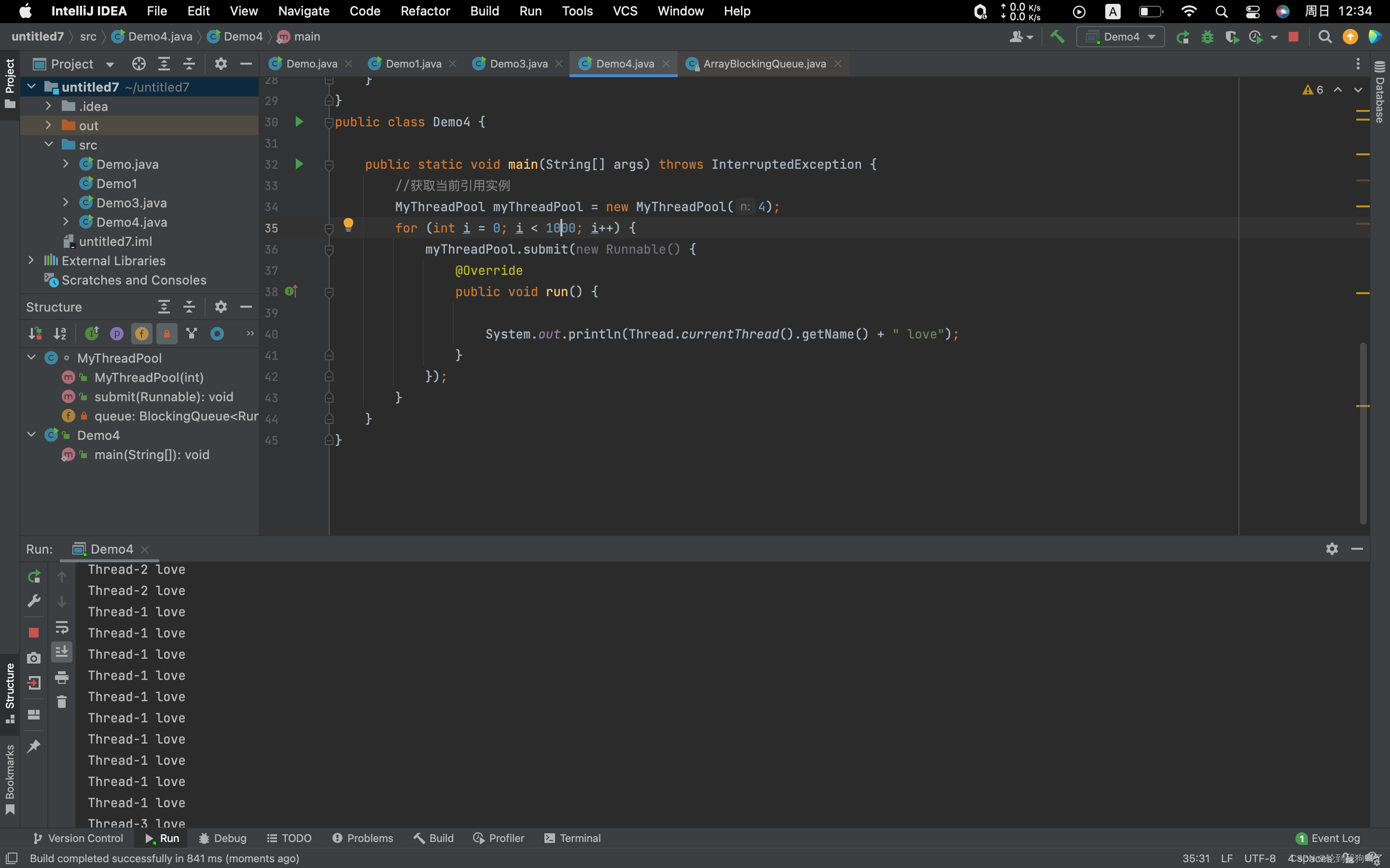
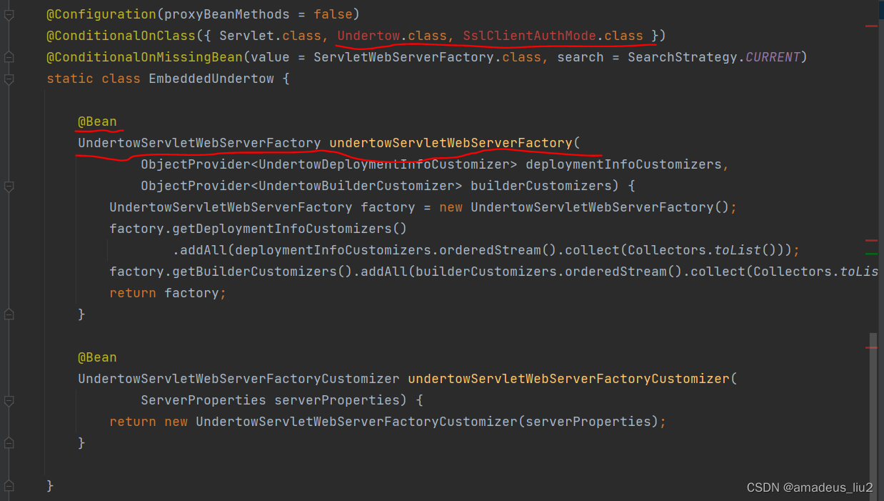
先看效果(图片没有声,可以下载源码看看,比这更好~):

再看代码(查看更多):
<!DOCTYPE html>
<html lang="en">
<head>
<meta charset="UTF-8">
<title>在线吉他调音</title>
<style>
:root {
--dark: #282828;
--black: #0a180b;
--c-mouth: #7c1d1c;
--track: #2220;
--thumb: #4caf50;
--c-classic: #ff9800;
--c-electric: #00aaff;
}
html {
width: 100vw;
height: 100vh;
overflow: hidden;
}
body {
margin: 0;
padding: 0;
overflow: hidden;
display: flex;
justify-content: center;
align-items: center;
width: 100vw;
height: 100vh;
perspective: 100vmin;
font-family: Arial, Helvetica, serif;
--vol: 0.05;
}
body * {
box-sizing: border-box;
}
/*** HEADER ***/
header {
padding: 10px;
background: var(--dark);
height: 60px;
position: fixed;
width: 100%;
z-index: 1;
top: 0;
box-shadow: #00000030 0px 2px 6px, #00000040 0px 2px 6px;
}
/*** Title ***/
h1 {
display: inline-block;
font-weight: normal;
color: #ffffff;
font-size: 30px;
margin: 0px 0px 0 60px;
padding: 0px 20px 0 0;
border-right: 1px solid #000;
float: left;
position: relative;
background: linear-gradient(90deg, #fff0 calc(100% - 1px), #fff2 100%);
height: 40px;
}
h1:before {
content: "";
float: left;
width: 45px;
height: 45px;
background: linear-gradient(-42deg, #686868 , #e6e6e6, #686868);
margin-right: 10px;
position: absolute;
z-index: -1;
left: -60px;
transform: rotate(-45deg) scale(0.85);
border-radius: 35% 66% 40% 15% / 40% 66% 35% 15%;
margin-top: -11px;
padding: 2px;
background-color: #151515;
box-shadow: #00000026 0 0 5px 3px, 0 0 2px 0px #000, 0 0 15px 5px #1118 inset, 0 0 4px 3px #fff inset;
cursor: pointer;
border: 2px solid #111111;
border-color: #222 #222121 #222222 #1e1e1e;
box-sizing: initial;
}
h1:after {
content: "";
width: 40px;
height: 30px;
border-radius: 100%;
background: repeating-linear-gradient(60deg, #fff0 0 1px , #6668 0 2px, #fff0 0 3px), repeating-linear-gradient(-60deg, #fff0 0 1px , #6668 0 2px, #fff0 0 3px);
position: absolute;
left: -53px;
top: 0px;
cursor: pointer;
}
h1 a {
color: #fff;
}
h1:hover a, h1:hover a span, h1 a.imgTitle {
color: #00b8ff;
text-shadow: 0 0 3px #00b8ff, 0 0 4px #00b8ff, 0 0 5px #00b8ff;
}
h1 a.imgTitle span:nth-child(even) {
color: #83dcff;
text-shadow: 0 0 2px #00b8ff, 0 0 3px #00b8ff, 0 0 4px #00b8ff
}
h1 span {
float: left;
text-transform: uppercase;
position: relative;
}
h1 span:nth-child(1) {
font-size: 1.5em;
line-height: 0.725em;
transform: scaleY(1.2);
top: 5px;
}
h1 span:nth-child(2) {
font-size: 15px;
position: absolute;
left: 50px;
margin-top: -3px;
color: #ccc;
transform: scaleX(1.75);
}
h1 span:nth-child(3) {
margin-left: -1px;
margin-top: -2px;
font-size: 1.05em;
top: 11px;
transform: scaleY(1.2);
}
h1 span:nth-child(4) {
font-size: 12px;
margin-left: 8px;
top: 12px;
color: #999;
transform: scaleX(1.5);
}
h1 span:nth-child(5) {
font-size: 19px;
font-weight: bold;
top: 23px;
left: -42px;
}
h1 span:nth-child(6) {
margin-left: -37px;
font-size: 11px;
margin-top: 24px;
color: #ccc;
transform: scaleX(1.2);
}
/*** Link ***/
a.josetxu-btn {
background: url(https://josetxu.com/wp-content/themes/josetxu-code/images/profile.jpg) no-repeat center center #ffffff;
background-size: calc(36px);
float: left;
width: 40px;
height: 40px;
border-radius: 2px;
margin-left: 20px;
text-align: left;
filter: grayscale(1);
position: relative;
}
a.josetxu-btn:before, a.josetxu-btn:after {
content: "CREATED BY";
font-size: 8px;
color: #b9b9b9;
background: linear-gradient(90deg, #fff0 calc(100% - 1px), #fff2 100%);
min-width: 68px;
border-radius: 0;
margin-left: 40px;
float: left;
padding: 7px 0 3px 6px;
border-right: 1px solid #000;
}
a.josetxu-btn:after {
content: "JOSETXU";
color: #fff;
font-size: 11px;
padding: 2px 0 7px 5px;
min-width: 69px;
}
a.josetxu-btn:hover {
background-image: url(https://assets.codepen.io/256997/internal/avatars/users/default.png?width=40);
filter: none;
}
a.josetxu-btn:hover:before {
color: #ff6600;
}
a.josetxu-btn:hover:after {
color: #ff6600;
}
/*** Buttons ***/
header button {
float: right;
height: 40px;
cursor: pointer;
width: 45px;
margin: 0 10px;
border: 0;
background: #fff0;
position: relative;
border-radius: 1px;
transition: all 0.25s ease 0s;
}
header button:disabled {
cursor: default;
box-shadow: 0 0 0 4px var(--dark), 0 0 0 7px var(--c-classic);
}
header button:disabled:before {
cursor: default;
opacity: 1;
}
header button:disabled:hover:before {
opacity: 1;
}
header button + button:disabled {
box-shadow: 0 0 0 4px var(--dark), 0 0 0 7px var(--c-electric);
}
header button:before {
opacity: 0.5;
}
header button:hover:before {
opacity: 0.9;
}
header button:after {
content: "ELECTRIC";
position: absolute;
color: #0008;
font-size: 10px;
top: 53px;
left: -8px;
padding: 0 5px;
border-radius: 2px;
max-height: 0;
height: 100%;
font-weight: bold;
transition: all 0.25s ease 0s;
z-index: -1;
overflow: hidden;
transform-origin: center top;
width: 50px;
text-shadow: 0px 1px 2px #fffc, 0px 0px 1px #000;
background: var(--c-electric);
display: flex;
align-items: center;
justify-content: center;
}
header button#e-classic:after {
content: "CLASSIC";
background: var(--c-classic);
}
header button:hover:after {
max-height: 21px;
}
button#e-classic:before {
content: "";
position: absolute;
width: 100%;
height: 100%;
top: 0;
left: 0;
background:
radial-gradient(circle at 50% 5px, var(--dark) 6px, var(--c-classic) 7px 9px, var(--dark) 10px, #fff0 11px ),
radial-gradient(ellipse at 50% -25px, var(--c-classic) 19px, #fff0 20px ),
radial-gradient(ellipse at 50% 55px, var(--c-classic) 23px, #fff0 24px ),
radial-gradient(circle at 50% 31px, var(--c-classic) 22px, #fff0 23px ),
var(--dark);
border-radius: 7px 7px 12px 12px;
}
button#e-electric:before {
content: "";
position: absolute;
width: 100%;
height: 100%;
top: 0;
left: 0;
background:
conic-gradient(from 0deg at 0 100%, var(--dark) 0 25%, #fff0 0 100%),
conic-gradient(from 0deg at 0 100%, var(--dark) 0 25%, #fff0 0 100%),
conic-gradient(from 0deg at 0 100%, var(--c-electric) 0 25%, #fff0 0 100%),
radial-gradient(circle at 50% -4px, var(--dark) 9px, #fff0 10px ),
radial-gradient(ellipse at 32px 0px, var(--dark) 6px, #fff0 7px ),
radial-gradient(ellipse at 13px 0px, var(--dark) 6px, #fff0 7px ),
radial-gradient(ellipse at 50% -6px, var(--c-electric) 19px, #fff0 20px ),
radial-gradient(ellipse at 50% 55px, var(--c-electric) 23px, #fff0 24px ),
radial-gradient(circle at 50% 31px, var(--c-electric) 22px, #fff0 23px ),
var(--dark);
border-radius: 7px 7px 15px 15px;
background-repeat: no-repeat;
background-size: 11px 4px, 11px 4px, 7px 15px, 100% 100%, 100% 100%, 100% 100%, 100% 100%, 100% 100%, 100% 100%, 100% 100%;
background-position: 17px 22px, 17px 16px, 19px -2px, 0 0, 0 0, 0 0, 0 0, 0 0, 0 0, 0 0;
}
/******* GUITAR *******/
.tuner-body {
width: 100vw;
height: 360px;
text-align: center;
}
.tuner-body button.string {
background-color: #fff0;
position: relative;
border: none;
float: left;
width: 100%;
margin: 7px 0;
height: 40px;
outline: none;
cursor: pointer;
padding: 0;
z-index: 1;
}
.tuner-body button.string:before {
content: "";
position: absolute;
top: 0;
left: -10px;
height: 100%;
width: calc(100% + 20px);
background: repeating-linear-gradient(90deg, #ddc190 1px 2px, #ababab 0px 3px, #000c 4px);
border-top: 1px solid #000;
border-bottom: 1px solid #000;
box-sizing: border-box;
z-index: 0;
box-shadow: 0px 10px 5px -1px #0004, 0 0 2px 0 #0008;
}
.tuner-body button#s6.string:before,
.tuner-body button#s6.string:after {
height: 9px;
top: calc(50% - 4.5px);
}
.tuner-body button#s5.string:before,
.tuner-body button#s5.string:after {
height: 8px;
top: calc(50% - 4px);
}
.tuner-body button#s4.string:before,
.tuner-body button#s4.string:after {
height: 7px;
top: calc(50% - 3.5px);
}
.tuner-body button#s3.string:before,
.tuner-body button#s3.string:after {
height: 6px;
top: calc(50% - 3px);
}
.tuner-body button#s2.string:before,
.tuner-body button#s2.string:after {
height: 5px;
top: calc(50% - 2.5px);
}
.tuner-body button#s1.string:before,
.tuner-body button#s1.string:after {
height: 4px;
top: calc(50% - 2px);
}
.tuner-body button.string:first-child {
margin-top: 26px;
}
/*** Shine Effect ***/
.tuner-body button.string:hover:after,
.tuner-body button.string.playing-sound:after {
content: "";
position: absolute;
height: 9px;
top: calc(50% - 4.5px);
left: 0;
width: 100%;
background: #00c9ff80;
box-shadow: 0 0 1.5vmin 0vmin #ffffff80;
z-index: 0;
}
.tuner-body button.string.playing-sound:after {
z-index: -1;
}
@keyframes vibrate {
0%, 100% { margin-top: 0; }
25% { margin-top: -1px; }
75% { margin-top: 1px; }
}
.tuner-body button.string.playing-sound:before {
animation: vibrate 0.1s ease-in-out 0s infinite
}
.tuner-body button.string.playing-sound:active:before {
animation: none;
}
/***** GUITARS ****/
.tuner-body:before, .tuner-body:after, .notes:after {
content: "";
position: absolute;
width: 100%;
height: 100%;
left: 0;
top: 0;
}
.notes + .notes:after {
display: none;
}
/*** Classic ***/
.tuner-body.e-classic:after {
--dot: radial-gradient(circle, var(--c-mouth) calc(68% - 1px), #fff0 68% 100%);
background:
var(--dot), var(--dot), var(--dot), var(--dot), var(--dot), var(--dot), var(--dot), var(--dot), var(--dot), var(--dot), var(--dot), var(--dot), var(--dot), var(--dot), var(--dot), var(--dot), var(--dot), var(--dot), var(--dot), var(--dot);
background-position:
calc(50% - 216px) 50%, calc(50% - 204px) calc(50% + 70px), calc(50% - 175px) calc(50% + 125px), calc(50% - 125px) calc(50% + 175px), calc(50% - 70px) calc(50% + 204px), 50% calc(50% + 215px), calc(50% + 70px) calc(50% + 204px), calc(50% + 125px) calc(50% + 175px), calc(50% + 175px) calc(50% + 125px), calc(50% + 204px) calc(50% + 70px), calc(50% + 215px) 50%, calc(50% + 204px) calc(50% - 70px), calc(50% + 175px) calc(50% - 125px ), calc(50% + 125px) calc(50% - 175px), calc(50% + 70px) calc(50% - 204px), 50% calc(50% - 216px), calc(50% - 70px) calc(50% - 204px), calc(50% - 125px) calc(50% - 175px), calc(50% - 175px) calc(50% - 125px), calc(50% - 204px) calc(50% - 70px);
background-size:
40px 40px, 38px 38px, 36px 36px, 34px 34px, 32px 32px, 30px 30px, 28px 28px, 26px 26px, 24px 24px, 22px 22px, 20px 20px, 18px 18px, 16px 16px, 14px 14px, 12px 12px, 10px 10px, 8px 8px, 6px 6px, 4px 4px, 3px 3px;
background-size:
10px 10px, 15px 15px, 20px 20px, 25px 25px, 30px 30px, 40px 40px, 30px 30px, 25px 25px, 20px 20px, 15px 15px, 10px 10px, 15px 15px, 20px 20px, 25px 25px, 30px 30px, 40px 40px, 30px 30px, 20px 20px, 15px 15px, 10px 10px;
background-repeat: no-repeat;
}
.tuner-body.e-classic:before {
background:
linear-gradient(180deg, var(--c-mouth) 5%, #fff0 30% 70%, var(--c-mouth) 95%),
linear-gradient(180deg, #000d 5%, #fff0 40% 60%, #000d 95%),
radial-gradient(circle at 50% 50%, #c5a05e 0 135px, #bb8d3c 173px, #ff5e00 178px 185px, var(--c-mouth) 186px 195px, #ff5e00 196px 235px, var(--c-mouth) 236px 245px, #ff5e00 246px 100% );
}
.tuner-body.e-classic .notes:after {
left: calc(50vw - 174px);
top: calc(50% - 174px);
width: 348px;
height: 348px;
background:
radial-gradient(circle at calc(50% + 5px) calc(50% + 2.5px), #fff0 175px, var(--c-mouth) 185px),
radial-gradient(circle at 40% 55%, #fff0 175px, #0004 195px, #000c 220px);
border-radius: 100%;
left: calc(50vw - 176px);
top: calc(50% - 178px);
width: 350px;
height: 350px;
}
/*** Strings Clasic ***/
.tuner-body.e-classic button.string:nth-child(n+4):before {
background:#fff8;
}
/*** Electric ***/
.tuner-body.e-electric::before {
background: linear-gradient(180deg, #000 5%, #0566c2, #000 95%);
}
.tuner-body.e-electric:after, .tuner-body.e-electric .notes:after {
--p-inner: #080808;
--p-outer: #fffeee;
--p-side: #141414;
background:
var(--dot), var(--dot), var(--dot), var(--dot), var(--dot), var(--dot),
var(--dot), var(--dot), var(--dot), var(--dot), var(--dot), var(--dot),
radial-gradient(circle at 120px 41px, var(--p-outer) 38px, #fff0 calc(38px + 1.5px) 100%),
radial-gradient(circle at 120px calc(100% - 41px), var(--p-outer) 38px, #fff0 calc(38px + 1.5px) 100%),
radial-gradient(circle at 41px calc(100% - 41px), var(--p-inner) 37px, #fff0 calc(37px + 1.5px) 100%),
radial-gradient(circle at 41px 41px, var(--p-inner) 37px, #fff0 calc(37px + 1.5px) 100%),
radial-gradient(circle at 119px 39px, #686868 37px, #fff0 calc(37px + 1.5px) 100%),
radial-gradient(circle at 119px calc(100% - 37px), #686868 37px, #fff0 calc(37px + 1.5px) 100%),
radial-gradient(circle at 41px calc(100% - 37px), #686868 37px, #fff0 calc(37px + 1.5px) 100%),
radial-gradient(circle at 40px 39px, #686868 36px, #fff0 calc(36px + 1.5px) 100%),
linear-gradient(180deg, #121212 40px, #fff0 0 calc(100% - 40px), #121212 0 100%),
linear-gradient(90deg, #111 3px, var(--p-inner) 4px calc(50% - 3px), #111 50%, var(--p-outer) calc(50% + 3px) calc(100% - 3px), #fff0 100%),
linear-gradient(45deg, #242424 2px, #fff0 3px 100%), linear-gradient(-45deg, #242424 2px, #fff0 3px 100%),
linear-gradient(135deg, #242424 2px, #fff0 3px 100%), linear-gradient(225deg, #242424 2px, #fff0 3px 100%), #121212;
width: 180px;
left: calc(50% - 25px);
height: 380px;
top: calc(50% - 190px);
border-radius: 10px;
border: 10px solid #181818;
border-width: 25px 10px;
box-sizing: border-box;
--dot: radial-gradient(circle, #ebebeb 3px, #adadad 8px, #000 9px, #fff0 10px 100%);
background-repeat: no-repeat;
background-size:
22px 22px, 22px 22px, 22px 22px, 22px 22px, 22px 22px, 22px 22px, 22px 22px, 22px 22px, 22px 22px, 22px 22px, 22px 22px, 22px 22px, 100% 100%, 100% 100%, 100% 100%, 100% 100%, 100% 100%, 100% 100%, 100% 100%, 100% 100%, 100% 100%, 100% 100%, 100% 100%, 100% 100%;
background-position:
109px 20px, 109px 74px, 109px 128px, 109px 182px, 109px 236px, 109px 290px, 29px 20px, 29px 74px, 29px 128px, 29px 182px, 29px 236px, 29px 290px, 0 0, 0 0, 0 0, 0 0, 0 0, 0 0, 0 0, 0 0, 0 0, 0 0, 0 0, 0 0;
box-shadow:
0 0 3px 1px #262626, -1px 1px 0px 0px var(--p-side), -2px 1px 0px 0px var(--p-side), -3px 2px 0px 0px var(--p-side), -4px 2px 0px 0px var(--p-side), -5px 3px 0px 0px var(--p-side), -6px 3px 0px 0px var(--p-side), -7px 4px 0px 0px var(--p-side), -8px 4px 0px 0px var(--p-side), -9px 5px 0px 0px #20202080, -9px 5px 0px 0px #101010, -15px 10px 10px 0px #0008, 0 0 3px 1px #262626 inset;
}
.tuner-body.e-electric .notes:after {
left: calc(50vw - 300px);
--p-inner: #fffeee;
--p-outer: #080808;
}
/*** Strings Electric ***/
.e-electric button#s1:before {
background: repeating-linear-gradient(0deg, #ababab 1px 2px, #000c 3px);
}
.e-electric button#s2:before {
background: repeating-linear-gradient(0deg, #ababab 1px 3px, #000c 4px);
}
.e-electric button.string:before {
background: repeating-linear-gradient(120deg, #ababab 1px 2px, #000c 3px);
}
/*** String Vibration Effect ***/
@property --bgp1 {
syntax: '<percentage>';
inherits: false;
initial-value: 50%;
}
button.playing-sound span {
--bgp1: 50%;
background-image:
repeating-radial-gradient(#fff 0.0001%, #fff0 .0025%, #fff0 .065%, #fff0 0.091%),
repeating-radial-gradient(#fff 0.0001%, #fff0 .0025%, #fff0 .0675%, #fff0 0.0875%);
background-size: 100% var(--bgp1), 100% var(--bgp1);
background-repeat: no-repeat;
background-position: 50% 50%, 50% 50%;
position: absolute;
width: 100%;
height: 100%;
left: 0;
top: 0;
z-index: -1;
animation: particles 4s ease 0s infinite;
animation-fill-mode: forwards;
filter: drop-shadow(0 0 1px #fff) drop-shadow(0 0 2px #fff) blur(1px);
transition-property: all;
opacity: 0;
}
@keyframes particles {
0% { --bgp1: 50%; opacity: 0; }
1% { opacity: 0.9; }
100% { --bgp1: 100%; opacity:0; }
}
/*** NOTES ***/
.notes span {
width: 100%;
color: #171717;
font-size: 30px;
text-shadow: -1px -1px 1px #000000, 0px 0px 1px #6f6f6f;
padding: 0;
opacity: 0.65;
height: 100%;
display: flex;
align-items: center;
justify-content: center;
}
.notes {
position: absolute;
height: 364px;
width: 85px;
z-index: 0;
margin: 0 auto;
padding: 20px 0;
display: flex;
flex-direction: column;
}
.notes .lightOn {
--clr: #00aaff;
color: var(--clr);
text-shadow: 0px 0px 5px var(--clr), 0px 0px 10px var(--clr), 0px 0px 15px var(--clr), 0px 0px 20px var(--clr), 0px 0px 25px var(--clr), 0px 0px 25px var(--clr), 0px 0px 35px var(--clr), 1px 1px 2px #00000080, -1px -1px 2px #00000080, 0px 0px 2px #000000;
transition: all 0.2s ease;
opacity: 1;
}
.e-classic .notes .lightOn {
--clr: #ff9800;
}
.notes > span:before {
content: "";
position: absolute;
background: #282828;
width: 52px;
height: 52px;
z-index: -1;
left: 50%;
border-radius: 5px;
box-shadow: 0px 1px 3px 3px #000 inset, 1px 2px 5px -1px #fff8, -1px -1px 5px -1px #000;
transform: translateX(-50%);
}
.notes + .notes {
right: 2vmin;
}
.notes + .notes span:before {
width: 100%;
}
/*** Move Pick ***/
#move-pick {
transition: 0.01s;
width: 70px;
height: 70px;
background: linear-gradient(-42deg, #686868 , #e6e6e6, #686868);
position: absolute;
z-index: 1;
right: 30px;
bottom: 65px;
border-radius: 35% 66% 40% 15% / 40% 66% 35% 15%;
padding: 2px;
background-color: #151515;
box-shadow: #00000026 0 0 5px 3px, 0 0 2px 0px #000, 0 0 15px 5px #1118 inset, 0 0 4px 3px #fff inset;
cursor: pointer;
border: 2px solid #111111;
border-color: #222 #222121 #222222 #1e1e1e;
box-sizing: initial;
display: none;
}
#move-pick:before {
content: "";
width: 100%;
height: 60%;
border-radius: 100%;
background: repeating-linear-gradient(60deg, #fff0 0 1px , #6668 0 2px, #fff0 0 3px), repeating-linear-gradient(-60deg, #fff0 0 1px , #6668 0 2px, #fff0 0 3px);
position: absolute;
left: 3px;
top: 11px;
transform: rotate(45deg);
}
#guitar-body.pickActive #move-pick {
display: block;
}
/*** FOOTER ***/
footer {
background: var(--dark);
position: fixed;
bottom: 0;
width: 100%;
height: 60px;
display: flex;
justify-content: space-between;
padding: 10px;
box-shadow: rgba(0, 0, 0, 0.16) 0px -2px 6px, rgba(0, 0, 0, 0.25) 0px -2px 6px;
}
footer:before, footer:after {
content: "";
position: absolute;
right: 27%;
border-right: 1px solid #000;
float: left;
border-left: 1px solid #fff2;
height: 40px;
}
footer:before {
right: inherit;
left: 27%;
}
footer > div {
width: 120px;
height: 40px;
display: inline-flex;
justify-content: space-evenly;
position: relative;
margin-left: 25px;
margin-right: 25px;
font-size: 14px;
background: var(--dark);
}
.buttons {
width: 220px;
}
/*** Volume Slider ***/
.slider-value {
--fbc: #4caf50;
width: 22px;
float: right;
margin: 0;
position: absolute;
right: 0px;
background: #121212;
color: var(--fbc) !important;
text-align: center;
border-radius: 2px;
border: 1px solid #000;
top: -2px;
box-shadow: #00000026 0 0 5px 3px, 0 0 2px 0px #000, 0 0 10px 10px #111 inset, 1px 1px 2px 0 #fff3, -1px -1px 2px 0 #000;
}
#volume:active + .slider-value {
--fbc: #4caf50;
box-shadow: 0 0 10px 0 var(--fbc) inset, 0 0 10px 0 var(--fbc), 1px 1px 2px 0 #fff3, -1px -1px 2px 0 #000 !important;
}
/*** Range ***/
input[type='range'] {
cursor: pointer;
bottom: 0;
position: absolute;
height: 17px;
width: calc(100% + 2px);
background:
linear-gradient(90deg, #4caf5080 0 calc(var(--vol) * 100%), #fff0 0 100%),
radial-gradient(#fff0 40px, #111),
linear-gradient(-182deg, var(--dark) 5px, #fff0 6px 100%),
linear-gradient(2deg, var(--dark) 5px, #fff0 6px 100%),
linear-gradient(180deg, #fff0 6px, var(--thumb) 0 9px, #fff0 0 100%),
repeating-linear-gradient(90deg, #fff0 0 2%, #fff8 calc(3% - 1px), var(--thumb) 0 calc(4% + 1px), #fff0 0 5%), var(--dark);
margin: 0;
--c1: #fff4;
--c2: #4a4a4a;
--bo: 2px;
--bx: -1px -1px 3px var(--c1), 2px 2px 3px #0008, 0 0 2px 0 #000 inset;
--range-bgsz: 100% 50%, 100% 100%;
--range-bgps: 0px 45%, 0 0;
--range-bgln: linear-gradient(90deg, #fff0 4px, #0008 0 5px, #222 6px, #fff0 0 7px, #0008 0 8px, #111 0 9px, #fff0 0 10px, #0008 0 11px, #222 12px, #fff0 0 100%);
border: 1px solid #111111;
border-color: #010101 #121212 #2f2f2f #181818;
border-radius: 3px;
box-shadow: 1px 1px 2px 0 #fff3, -1px -1px 2px 0 #000;
}
input[type='range']:focus {
outline: none;
}
input[type='range'],
input[type='range']::-webkit-slider-runnable-track,
input[type='range']::-webkit-slider-thumb {
-webkit-appearance: none;
}
input[type=range]::-webkit-slider-thumb {
background: var(--range-bgln), var(--thumb);
background-size: var(--range-bgsz);
background-position: var(--range-bgps);
background-repeat: no-repeat;
width: 20px;
height: 22px;
border: var(--bo) solid var(--black);
border-radius: 2px;
margin-top: -10px;
box-shadow: var(--bx);
}
input[type=range]::-moz-range-thumb {
background: var(--range-bgln), var(--thumb);
background-size: var(--range-bgsz);
background-position: var(--range-bgps);
background-repeat: no-repeat;
width: 20px;
height: 22px;
border: var(--bo) solid var(--black);
border-radius: 2px;
margin-top: -10px;
box-shadow: var(--bx);
}
input[type=range]::-webkit-slider-runnable-track {
background-color: var(--track);
height: 3px;
}
input[type=range]:focus::-webkit-slider-runnable-track {
outline: none;
}
input[type=range]::-moz-range-track {
background-color: var(--track);
height: 5px;
}
/*** Buttons ***/
footer button {
height: 40px;
width: 40px;
border: 0;
cursor: pointer;
border-radius: 1px;
}
.buttons button {
padding: 2px;
background-color: #151515;
box-shadow: #00000026 0 0 5px 3px, 0 0 2px 0px #000, 0 0 10px 10px #111 inset, 1px 1px 2px 0 #fff3, -1px -1px 2px 0 #000;
cursor: pointer;
border: 2px solid #111111;
border-color: #010101 #121212 #222222 #181818;
box-sizing: initial;
position: relative;
margin-top: -4px;
--b-top: #085d7f;
--b-bot: #176fa5;
--b-bor: #15546e;
--b-tra: #4084af;
--b-lig: #0087dd;
}
.buttons button:before {
content: "\25CB \A \2579";
width: 100%;
height: 100%;
float: left;
text-align: center;
background: linear-gradient(180deg, var(--b-top), var(--b-tra));
box-sizing: border-box;
display: flex;
justify-content: center;
align-items: center;
border-top: 0 solid #292929;
border-bottom: 0 solid transparent;
color: #fff7;
font-family: Arial, Helvetica, serif;
text-shadow: -1px -1px 0 #0000004a;
border-radius: 2px;
font-size: 12px;
box-shadow: 0 0px 10px 3px #0008 inset;
white-space: pre-wrap;
line-height: 19px;
}
.buttons button:before {
border-top: 5px solid var(--b-bor);
}
button.active:before, button#btnStop:active:before {
border-top: 0 solid #fff0;
box-shadow: 0 -2px 10px 1px var(--b-lig);
border-bottom: 5px solid var(--b-bor);
}
button#btnStop {
--b-top: #7f0808;
--b-bot: #a51717;
--b-bor: #852828; /*#560303*/
--b-tra: #af4040;
--b-lig: #dd0000;
}
/*** Pick ***/
.pick {
display: flex;
justify-content: flex-start;
padding-left: 20px;
}
button#btnPick {
transform: rotate(-45deg) scale(0.85);
margin-top: -12px;
background: linear-gradient(-42deg, #686868 , #e6e6e6, #686868);
position: absolute;
border-radius: 35% 66% 40% 15% / 40% 66% 35% 15%;
padding: 2px;
background-color: #151515;
box-shadow: -1px 1px 2px 0px #fff3, 1px -2px 3px -1px #000;
cursor: pointer;
border: 2px solid #111111;
border-color: #222 #222121 #222222 #1e1e1e;
box-sizing: initial;
width: 45px;
height: 45px;
}
button#btnPick.active {
background: linear-gradient(44deg, #00000030, #0000009e, #00000030);
}
button#btnPick:before {
content: "";
width: 100%;
height: 60%;
border-radius: 100%;
background: repeating-linear-gradient(60deg, #fff0 0 1px , #6668 0 2px, #fff0 0 3px), repeating-linear-gradient(-60deg, #fff0 0 1px , #6668 0 2px, #fff0 0 3px);
position: absolute;
left: 1px;
top: 8px;
transform: rotate(45deg);
}
button#btnPick.active:before {
display: none;
}
/*** Buttons Text ***/
footer input:after {
content: "VOLUME";
position: absolute;
color: #4caf50;
left: 0;
top: -27px;
background: #121212;
padding: 1px 6px;
border: 1px solid #000;
box-sizing: border-box;
border-radius: 2px;
font-size: 12px;
box-shadow: #00000026 0 0 5px 3px, 0 0 2px 0px #000, 0 0 10px 10px #111 inset, 1px 1px 2px 0 #fff3, -1px -1px 2px 0 #000;
}
footer button:after {
content: "STOP";
position: absolute;
color: #fff;
left: -62px;
top: 0px;
background: #121212;
padding: 1px 6px;
border: 1px solid #000;
color: #983030;
border-radius: 2px;
font-size: 12px;
box-shadow: #00000026 0 0 5px 3px, 0 0 2px 0px #000, 0 0 10px 10px #111 inset, 1px 1px 2px 0 #fff3, -1px -1px 2px 0 #000;
}
#btnHold:after {
content: "HOLD";
left: inherit;
right: -62px;
color: #0061b1;
}
#btnPick:after {
content: "PICK";
color: #929292;
transform: translate(125px, 60px) rotate(45deg);
font-size: 14px;
height: 17.18px;
transform-origin: center top;
top: -1px;
}
/*** Buttons Hover ***/
#volume:active + .slider-value,
footer input:active:after,
footer button:active:after,
#btnHold.active:after,
#btnPick.active:after {
text-shadow: 0 0 5px #1a1a1a;
border-color: var(--fbc);
box-shadow: 0 5px 10px 0 var(--fbc) inset, 0 2px 10px 0 var(--fbc), 1px 1px 2px 0 #fff3, -1px -1px 2px 0 #000;
color: var(--fbc);
transition: all 0.25s ease 0s;
}
#volume:active:after,
#volume:active + .slider-value {
--fbc: #4caf50;
}
#btnStop:active:after {
--fbc: #c91212;
transition-duration: 0s;
}
#btnHold:active:after, #btnHold.active:after {
--fbc: #0a7fdf;
}
#btnPick:active:after , #btnPick.active:after {
--fbc: #95abbc;
}
audio {
display: none;
}
/*** MOBILE Landscape ***/
@media only screen and (max-width: 580px) {
h1::before {
display: none;
}
h1 {
margin-left: 0;
padding-right: 12px;
}
a.josetxu-btn {
margin-left: 12px;
width: 0;
}
a.josetxu-btn:before, a.josetxu-btn:after {
margin-left: 0;
}
.tuner-body {
margin-top: -10vh;
}
.tuner-body:before, .tuner-body:after, .notes:after {
margin-top: -5vh;
}
footer {
height: 130px;
}
footer:before {
display: none;
}
footer:after {
right: 50%;
}
.buttons {
position: fixed;
bottom: 10px;
width: 95%;
margin: 0 auto;
left: 10px;
text-align: center;
}
.buttons button {
margin-left: 0;
}
.buttons:before {
content: "";
position: absolute;
left: 5%;
border-top: 1px solid #000;
float: left;
border-bottom: 1px solid #fff2;
width: 90%;
top: -17px;
height: 0;
}
.notes:after {
display: none;
}
.notes {
left: -7px;
}
.notes + .notes {
right: inherit;
left: 70px;
}
.tuner-body.e-classic .notes {
left: 100px;
}
.tuner-body.e-classic .notes + .notes {
left: 175px;
}
.tuner-body.e-electric:after {
left: calc(50% - 10px);
}
.tuner-body.e-classic .notes:after {
display: block;
left: calc(50vw - 275px);
top: calc(50% - 143px);
}
.tuner-body.e-classic .notes + .notes:after {
display: none;
}
}
/*** MOBILE Portrait ***/
@media only screen and (max-height: 400px) {
.tuner-body button.string {
margin: 0;
}
.tuner-body button.string:first-child {
margin-top: 60px;
}
.tuner-body.e-electric:after, .tuner-body.e-electric .notes:after {
transform: scale(0.735);
}
.notes:after {
left: calc(50vw - 160px);
transform: scale(1);
}
.notes {
transform: scale(0.75);
}
.tuner-body.e-electric .notes:after {
transform: scale(1);
left: 200px;
}
.tuner-body.e-classic .notes:after {
transform: scale(1.345);
left: 256px;
}
}
</style>
</head>
<body>
<section>
<div class="tuner-body e-electric" id="guitar-body">
<button onmouseover="pickString(this.id)" onclick="clickString(this.id)" class="string" id="s6"><span></span></button>
<button onmouseover="pickString(this.id)" onclick="clickString(this.id)" class="string" id="s5"><span></span></button>
<button onmouseover="pickString(this.id)" onclick="clickString(this.id)" class="string" id="s4"><span></span></button>
<button onmouseover="pickString(this.id)" onclick="clickString(this.id)" class="string" id="s3"><span></span></button>
<button onmouseover="pickString(this.id)" onclick="clickString(this.id)" class="string" id="s2"><span></span></button>
<button onmouseover="pickString(this.id)" onclick="clickString(this.id)" class="string" id="s1"><span></span></button>
<div class="notes">
<span class="" id="s6Note">E</span>
<span class="" id="s5Note">A</span>
<span class="" id="s4Note">D</span>
<span class="" id="s3Note">G</span>
<span class="" id="s2Note">B</span>
<span class="" id="s1Note">E</span>
</div>
<div class="notes">
<span class="" id="s6Nota">MI</span>
<span class="" id="s5Nota">LA</span>
<span class="" id="s4Nota">RE</span>
<span class="" id="s3Nota">SOL</span>
<span class="" id="s2Nota">SI</span>
<span class="" id="s1Nota">MI</span>
</div>
<div id="move-pick"></div>
</div>
</section>
<footer>
<div class="slider">
<input id="volume" type="range" min="0" max="1" value="0.5" step="0.1" oninput="setVolume(this.value)" onchange="setVolume(this.value)" autocomplete="off">
<div class="slider-value">5</div>
</div>
<div class="buttons">
<button onfocus="stopStrings()" class="" id="btnStop"></button>
<button onclick="holdSound()" class="" id="btnHold"></button>
</div>
<div class="pick">
<button onclick="usePick()" class="" id="btnPick"></button>
</div>
</footer>
<audio id="as1" src="https://cdn.josetxu.com/audio/egs-1.mp3"></audio>
<audio id="as2" src="https://cdn.josetxu.com/audio/egs-2.mp3"></audio>
<audio id="as3" src="https://cdn.josetxu.com/audio/egs-3.mp3"></audio>
<audio id="as4" src="https://cdn.josetxu.com/audio/egs-4.mp3"></audio>
<audio id="as5" src="https://cdn.josetxu.com/audio/egs-5.mp3"></audio>
<audio id="as6" src="https://cdn.josetxu.com/audio/egs-6.mp3"></audio>
</body>
</html>