css设置八等分圆

news2024/10/9 6:25:38

在这里插入图片描述
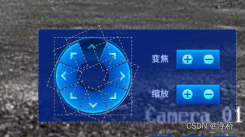
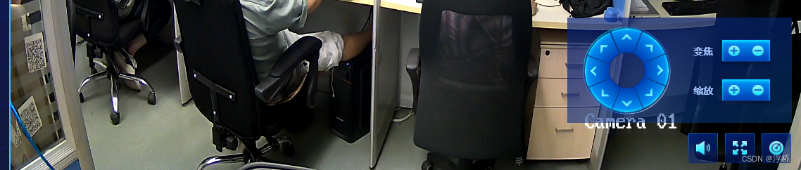
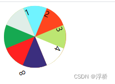
现需要上图样式的布局,我通过两张向右方的图片,通过定位和旋转完成了布局。在这里插入图片描述
在这里插入图片描述

在这里插入图片描述

问题:
由于是通过旋转获取到的样式,实际的盒子是一个长方形,当鼠标移入对应的箭头时选中的可能是其他盒子,如第一张设计稿可以看出,先需要移入对应块添加事件。

解决方法: 又画了一个圆,将圆平分成8等分通过css样式覆盖保证移入时能移入对应的块。然后覆盖到原本的环形块上,背景透明就可以看到想要的效果和实现事件。设计中心空白不能点击,多添加一个小圆环覆盖。
在这里插入图片描述
参考地址:https://blog.csdn.net/yatsov/article/details/81590011

八等分圆代码

<!DOCTYPE html>
<html>
<head>
    <title>CSS等分圆</title>
    <meta charset="utf-8">
    <style type="text/css">

        .circle-left{
            width: 62.5px;height: 125px;
            border-radius: 0px 62.5px 62.5px 0px;
            position: absolute;
            right: 0;
            transform-origin: 0 50%;
        }

        .circle-left:hover{
          background-color: yellowgreen !important;
        }
        .circle-right{
            width: 62.5px;height: 125px;
            border-radius:  62.5px 0px 0px 62.5px ;
            position: absolute;
            right: 0;
            transform-origin: 100% 50%;
        }
        #circle0{
            width: 125px;
            height: 125px;
            border-radius: 62.5px;
            background-color: yellowgreen;
            position: relative;
            transform: rotate(-22.5deg);
        }
         #circle2{
            background-color: #70f3ff;
        }
         #circle3{
            background-color: #ff461f;
            transform: rotate(45deg);
        }
        #circle4{
            background-color: #bce672;
            transform: rotate(90deg);
        }
        #circle5{
            background-color: #ffffff;
            transform: rotate(135deg);
        }
         #circle6{
            background-color: #3b2e7e;
            transform: rotate(-135deg);
        }
         #circle7{
            background-color: #ff2121;
            transform: rotate(270deg);
        }
         #circle8{
            background-color: #16a951;
            transform: rotate(315deg);
        }
        #circle9{
            background-color: #e0eee8;
            transform: rotate(45deg)
        }
        #left{
            clip: rect(0px 62.5px 125px 0px);
            position: absolute;
            right: 0px;
            width: 62.5px;
            height: 125px;
            overflow: hidden;
        }
        #right{
            clip: rect(0px 62.5px 125px 0px);
            position: absolute;
            left: 0px;
            width: 62.5px;
            height: 125px;
            overflow: hidden;
        }
    </style>
</head>
<body>

    <div id="circle0">
        <div id="left">
            <div class="circle-left" id="circle2">1</div>
            <div class="circle-left" id="circle3">2</div>
            <div class="circle-left" id="circle4">3</div>
            <div class="circle-left" id="circle5">4</div>
        </div>
        <div id="right">
            <div class="circle-right" id="circle9">6</div>
            <div class="circle-right" id="circle8">7</div>
            <div class="circle-right" id="circle7">8</div>
            <div class="circle-right" id="circle6">9</div>
        </div>
    </div>
</body>
</html>
``

## 实际业务样式代码
```vue
<template>
  <div class="control">
    <!-- 加add 减subtract -->
    <div class="control_img_box" title="关闭声音">
      <img src="@/assets/image/vol.png" alt="">
    </div>
    <div class="control_img_box" title="进入全屏">
      <img @click="screenfull" src="@/assets/image/full.png" alt="">
    </div>
    <div class="control_img_box" @click="setCameraControl" title="云台控制器">
      <img src="@/assets/image/control.png" alt="">
    </div>

    <!-- 云台控件 摄像头控制 -->
    <div class="camera-control" v-show="isShowCameraControl">
      <div class="camera-control-left flex">
        <div class="content-box">
          <!-- 拼接辅助线 -->
          <!-- <div class="line1"></div>
          <div class="line2"></div> -->
          <!-- 展示圆环 -->
          <div class="img-box" :class="'img-box'+(i+1)" v-for="(url,i) in imgArr" :key="i">
            <img @mouseenter="handleMouseEnter(i)" @mouseleave="handleMouseLeave(i)" :src="url" alt="">
          </div>
          <!-- 绑定事件的透明圆环 -->
          <div id="circle0">
            <div id="left">
              <div class="circle-left" @mouseenter="handleMouseEnter(1)" @mouseleave="handleMouseLeave(1)" id="circle2"></div>
              <div class="circle-left" @mouseenter="handleMouseEnter(2)" @mouseleave="handleMouseLeave(2)" id="circle3"></div>
              <div class="circle-left" @mouseenter="handleMouseEnter(3)" @mouseleave="handleMouseLeave(3)" id="circle4"></div>
              <div class="circle-left" @mouseenter="handleMouseEnter(4)" @mouseleave="handleMouseLeave(4)" id="circle5"></div>
            </div>
            <div id="right">
              <div class="circle-right" @mouseenter="handleMouseEnter(8)" @mouseleave="handleMouseLeave(8)" id="circle9"></div>
              <div class="circle-right" @mouseenter="handleMouseEnter(7)" @mouseleave="handleMouseLeave(7)" id="circle8"></div>
              <div class="circle-right" @mouseenter="handleMouseEnter(6)" @mouseleave="handleMouseLeave(6)" id="circle7"></div>
              <div class="circle-right" @mouseenter="handleMouseEnter(5)" @mouseleave="handleMouseLeave(5)" id="circle6"></div>
            </div>
            <div class="center"></div>
          </div>
        </div>
      </div>
      <div class="camera-control-right">
        <div class="btn-list">
          <div>变焦</div>
          <div class="btn-box">
            <div class="flex" @click="toZoom('add')">
              <img src="@/assets/image/add.png" alt="">
            </div>
            <div class="flex" @click="toZoom('minus')">
              <img src="@/assets/image/minus.png" alt="">
            </div>
          </div>
        </div>
        <div class="btn-list">
          <div>缩放</div>
          <div class="btn-box">
            <div class="flex" @click="toScale('add')">
              <img src="@/assets/image/add.png" alt="">
            </div>
            <div class="flex" @click="toScale('minus')">
              <img src="@/assets/image/minus.png" alt="">
            </div>
          </div>
        </div>
      </div>
    </div>
  </div>
</template>

<script>
import img from '@/assets/image/arrows.png'
import img2 from '@/assets/image/arrows21.png'
export default {
    name: '',
    components: {},
    props: [],
    data() {
        return {
            isShowCameraControl: false,
            imgArr: [img, img, img, img, img, img, img, img],
        }
    },
    mounted() {},
    methods: {
        handleMouseEnter(i) {
            this.$set(this.imgArr, i - 1, img2)
        },
        handleMouseLeave(i) {
            this.$set(this.imgArr, i - 1, img)
        },
        setCameraControl() {
            this.isShowCameraControl = !this.isShowCameraControl
        },
        screenfull() {
            this.$emit('screenfull')
        },
        toScale(str) {
            console.log('缩放', str)
        },
        toZoom(str) {
            console.log('变焦', str)
        }
    }
}
</script>
<style lang='scss' scoped>
.control {
    position: absolute;
    left: 0px;
    bottom: 0px;
    width: 100%;
    padding: 15px 7px;
    display: flex;
    justify-content: flex-end;

    &_img_box {
        cursor: pointer;
        padding: 10px 10px 6px;
        margin-right: 10px;
        background: linear-gradient(162deg, rgba(3, 33, 120, 0.9) 0%, rgba(3, 33, 120, 0.4) 100%);
        border-radius: 3px;
        opacity: 1;
        border: 1px solid;
        border-image: linear-gradient(180deg, rgba(18, 106, 205, 1), rgba(11, 87, 173, 0)) 1 1;

        > img {
            width: 20px;
            height: 20px;
        }
    }

    .camera-control {
        position: absolute;
        display: flex;
        top: -150px;
        right: 16px;
        padding: 6px 10px;
        width: 319px;
        height: 150px;
        background: linear-gradient(to bottom right, #032078ab 30%, #0b57ad60 100%);

        > div {
            flex: 1;
        }
        &-left {
            .content-box {
                position: relative;
                width: 125px;
                height: 125px;
                border-radius: 50%;
                background: url('@/assets/image/circle.png');
                background-size: 125px 125px;

                .circle-left {
                    width: 62.5px;
                    height: 125px;
                    border-radius: 0px 62.5px 62.5px 0px;
                    position: absolute;
                    right: 0;
                    transform-origin: 0 50%;
                }
                .circle-right {
                    width: 62.5px;
                    height: 125px;
                    border-radius: 62.5px 0px 0px 62.5px;
                    position: absolute;
                    right: 0;
                    transform-origin: 100% 50%;
                }
                #circle0 {
                    position: absolute;
                    left: 0px;
                    top: 0px;
                    width: 125px;
                    height: 125px;
                    border-radius: 62.5px;
                    position: relative;
                    transform: rotate(-22.5deg);

                    .center {
                        position: absolute;
                        left: 50%;
                        top: 50%;
                        transform: translate(-50%, -50%);
                        width: 50px;
                        height: 50px;
                        border-radius: 50%;
                    }
                }

                #circle3 {
                    transform: rotate(45deg);
                }
                #circle4 {
                    transform: rotate(90deg);
                }
                #circle5 {
                    transform: rotate(135deg);
                }
                #circle6 {
                    transform: rotate(-135deg);
                }
                #circle7 {
                    transform: rotate(270deg);
                }
                #circle8 {
                    transform: rotate(315deg);
                }
                #circle9 {
                    transform: rotate(45deg);
                }

                #left {
                    clip: rect(0px 62.5px 125px 0px);
                    position: absolute;
                    right: 0px;
                    width: 62.5px;
                    height: 125px;
                    overflow: hidden;
                }
                #right {
                    clip: rect(0px 62.5px 125px 0px);
                    position: absolute;
                    left: 0px;
                    width: 62.5px;
                    height: 125px;
                    overflow: hidden;
                }

                .line1 {
                    position: absolute;
                    width: 125px;
                    height: 2px;
                    background: red;
                    left: 50%;
                    margin-left: -62.5px;
                    top: 50%;
                    margin-top: -1px;
                    z-index: 999;
                }

                .line2 {
                    position: absolute;
                    left: 50%;
                    margin-top: -62.5px;
                    top: 50%;
                    margin-left: -1px;
                    width: 2px;
                    height: 125px;
                    background: red;
                    z-index: 999;
                }

                .img-box {
                    // width: 54px;
                    // height: 58px;
                    position: absolute;

                    // > img {
                    //     width: 54px;
                    //     height: 58px;
                    // }
                }

                .img-box1 {
                    left: 31px;
                    top: -14px;
                    transform: rotate(-90deg);
                }

                .img-box2 {
                    left: 64px;
                    top: -2px;
                    transform: rotate(-45deg);
                }

                .img-box3 {
                    left: 79px;
                    top: 29px;
                    transform: rotate(0deg);
                }

                .img-box4 {
                    left: 67px;
                    top: 62px;
                    transform: rotate(46deg);
                }

                .img-box5 {
                    left: 36px;
                    top: 77px;
                    transform: rotate(90deg);
                }

                .img-box6 {
                    left: 4px;
                    top: 66px;
                    transform: rotate(135deg);
                }

                .img-box7 {
                    left: -12px;
                    top: 35px;
                    transform: rotate(-180deg);
                }

                .img-box8 {
                    left: -1px;
                    top: 2px;
                    transform: rotate(-135deg);
                }
            }
        }

        &-right {
            display: flex;
            flex-direction: column;
            justify-content: center;
            align-items: center;
            font-size: 14px;
            font-weight: bold;
            color: #a5c3ff;

            .btn-list {
                display: flex;
                align-items: center;
                margin: 12px 0px;
            }
            .btn-box {
                width: 70px;
                height: 32px;
                margin-left: 12px;
                background: linear-gradient(180deg, #009afc 0%, #003cb1 100%);
                box-shadow: inset 0px 2px 4px 0px #08ebff, 0px 4px 4px 0px rgba(0, 0, 0, 0.25);
                border-radius: 2px;
                border: 1px solid #0e2977;
                display: flex;

                > div {
                    width: 35px;
                    height: 32px;
                    cursor: pointer;
                    > img {
                        width: 16px;
                        height: 16px;
                    }
                }
            }
        }
    }
}
</style>

本文来自互联网用户投稿,该文观点仅代表作者本人,不代表本站立场。本站仅提供信息存储空间服务,不拥有所有权,不承担相关法律责任。如若转载,请注明出处:http://www.coloradmin.cn/o/790903.html

如若内容造成侵权/违法违规/事实不符,请联系多彩编程网进行投诉反馈,一经查实,立即删除!

相关文章

uniapp 语音文本播报功能

最近uniapp项目上遇到一个需求 就是在接口调用成功的时候加上语音播报 &#xff0c; ‘创建成功’ ‘开始成功’ ‘结束成功’ 之类的。 因为是固定的文本 &#xff0c;所以我先利用工具生成了 文本语音mp3文件&#xff0c;放入项目中&#xff0c;直接用就好了。 这里用到的工…

Android adb shell 查看App内存(java堆内存/vss虚拟内存/详细的内存状况/内存快照hprof)和系统可用内存

1.adb shell 获取app 进程的pid adb shell "ps|grep com.xxx包名"根据某个渠道包&#xff0c;去查询对应的pid&#xff0c;如下所示&#xff1a; 2.通过adb shell 查看设备的java dalvik 堆内存的最大值 执行命令行&#xff1a; adb shell getprop dalvik.vm.h…

【Java SE】继承与多态

目录 【1】继承 【1.1】为什么要继承 【1.2】继承概念 【1.3】继承的语法 【1.4】父类成员访问 【1.4.1】子类中访问父类的成员变量 【1.4.2】子类中访问父类的成员变量 【1.5】super关键字 【1.6】子类构造方法 【1.7】super和this 【1.8】再谈初始化 【1.9】prot…

element-plus中的collapse组件中的箭头图标移到左边问题解决(改进版)

1、问题BUG 这个问题虽然解决了&#xff0c;但是依旧有一些bug&#xff0c;首先我们来看一下&#xff0c;他的样式变成了什么样的。 下面就是我们修改后的样子了&#xff0c;但是对于我们的需求来说&#xff0c;左边的箭头样式是没问题了 可是到了箭头到了右边却变成了下面的…

17_LinuxLCD驱动

目录 Framebuffer设备 LCD驱动简析 LCD驱动程序编写 LCD屏幕参数节点信息修改 LCD 屏幕背光节点信息 使能Linux logo显示 设置LCD作为终端控制台 Framebuffer设备 先来回顾一下裸机的时候LCD驱动是怎么编写的,裸机LCD驱动编写流程如下: 1.初始化I.MX6U的eLCDIF控制器,…

Gumbel Softmax Trick

Gumbel Softmax Trick 重参数化技巧&#xff08;re-parameters trick&#xff09;Gumbel softmax trick基于Softmax的采样基于Gumbel-max的采样基于Gumbel-softmax采样Softmax中的温度系数tau 算法学习之gumbel softmax 【Learning Notes】Gumbel 分布及应用浅析 gumbel-softma…

Failed to connect to 127.0.0.1 port 7890科学上网导致的问题

找了很多种解法&#xff1a; 首先这个.config配置文件有两个地方存在&#xff1a;先使用第一种方式&#xff0c;不管用再试第二种 第一个位置git安装路径&#xff1a;不需要重启 E:\git\Git\etc&#xff0c;这个需要看你自己的安装路径&#xff0c;找到http_proxy删除即可第二…

类型转换函数

再论类型转换 标准数据类型之间会进行隐式的类型安全转换 转换规则如下&#xff1a; 问题 普通类型与类类型之间能否进行类型转换&#xff1f; 类类型之间能否进行类型转换&#xff1f; 再论构造函数 构造函数可以定义不同类型的参数 参数满足下列条件时称为转换构造函数…

LocalDateTime的json格式化问题

目录 解决&#xff1a; 1、注册日期序列化器 2、自定义LocalDateTime的JSON格式 3、使用第三方库 总结&#xff1a; 实体类中定义了LocalDateTime类型的属性&#xff0c;获取数据会出现以下日期格式问题&#xff1a; 讲述&#xff1a; 对于LocalDateTime的JSON序列化和反序…

解析数据可视化工具:如何选择最合适的软件

在当今信息爆炸的时代&#xff0c;数据已成为各行各业的重要资源。为了更好地理解和分析数据&#xff0c;数据可视化成为一种必不可少的工具。市面上数据可视化工具不说上千也有上百&#xff0c;什么帆软、powerbi、把阿里datav&#xff0c;腾讯云图、山海鲸可视化等等等等&…

【VCS】(6)Code Coverage

Code Coverage VCS 中 Code Coverage 的类型Code Coverage Flow代码覆盖率选项Lab Code Coverage初步尝试其他格式的覆盖率报告屏蔽部分代码屏蔽整个模块 设计和验证到底要做到什么程度&#xff1f; 这里其中一个指标就是 Code Coverage。 代码覆盖率一般考虑以下几个方面&…

前置操作符和后置操作符

下面的代码有没有区别&#xff1f;为什么&#xff1f; 意想不到的事实 现代编译器产品会对代码进行优化 优化使得最终的二进制程序更加高效 优化后的二进制程序丢失了 C/C 的原生语义 不可能从编译后的二进制程序还原 C/C 程序 思考 操作符可以重载吗&#xff1f; 如何区分…

V1.4基站仓储三代标签操作指导

一、管理系统使用 1、启动v1.4基站 插上电源&#xff0c;用网线连接基站和电脑。基站默认ip为192.168.1.200&#xff0c;所以需要修改电脑的IP地址为192.168.1.x&#xff0c;例如&#xff1a;192.168.1.100 ​ 注&#xff1a;当基站第二个灯&#xff08;绿色&#xff09;闪烁…

DAY12_JSPEL表达式JSTL标签MVC模式和三层架构

目录 1 JSP 概述2 JSP 快速入门2.1 搭建环境2.2 导入 JSP 依赖2.3 创建 jsp 页面2.4 编写代码2.5 测试 3 JSP 原理4 JSP 脚本4.1 JSP 脚本分类4.2 案例4.2.1 需求4.2.2 实现4.2.3 成品代码4.2.4 测试 4.3 JSP 缺点 5 EL 表达式5.1 概述5.2 代码演示5.3 域对象 6 JSTL标签6.1 概…

leetcode数据结构题解(Java实现)(存在重复元素、最大子数组和、两数之和、合并两个有序数组)

文章目录 第一天217. 存在重复元素53.最大子数组和 第二天1. 两数之和88. 合并两个有序数组 第一天 217. 存在重复元素 题解思路&#xff1a;首先题目需要的是判断数组中是否存在相同的数字&#xff0c;存在返回true,不存在就返回false。 那么显然可以这样做&#xff0c;先进行…

全光谱护眼灯怎么选择?护眼灯全光谱和自然光谱的区别

一、全光谱护眼台灯的挑选技巧 全光谱&#xff1a;想要护眼台灯能有自然光的效果&#xff0c;选择台灯时建议选择全光谱台灯&#xff0c;并且显色指数大于Ra95以上的&#xff0c;显色指数越高越还原色彩&#xff0c;并且选择RGO豁免蓝光才是真的不会伤害眼睛的。 照射面积&…

Python(四十)for-in练习题——100到999之间的水仙花数

❤️ 专栏简介&#xff1a;本专栏记录了我个人从零开始学习Python编程的过程。在这个专栏中&#xff0c;我将分享我在学习Python的过程中的学习笔记、学习路线以及各个知识点。 ☀️ 专栏适用人群 &#xff1a;本专栏适用于希望学习Python编程的初学者和有一定编程基础的人。无…

2023年发布的25个开源大型语言模型总结

大型语言模型(llm)是一种人工智能(AI)&#xff0c;在大量文本和代码数据集上进行训练。它们可以用于各种任务&#xff0c;包括生成文本、翻译语言和编写不同类型的创意内容。 今年开始&#xff0c;人们对开源LLM越来越感兴趣。这些模型是在开源许可下发布的&#xff0c;这意味…

Redis Stream 流的深度解析与实现高级消息队列【一万字】

详细介绍了 Redis 5.0 版本新增加的数据结构Stream的使用方式以及原理&#xff0c;如何实现更加可靠的消息队列。 文章目录 Stream 概述2 Stream基本结构3 存储数据3.1 Entry ID3.2 数量限制 4 获取数据4.1 范围查询4.2 独立消费消息4.2.1 非阻塞使用4.2.2 阻塞的使用 4.3 消费…

【Spring定时器】SpringBoot整合Quartz

SpringBoot整合Quartz 简单介绍 简单操作 导入相关pom依赖 <dependency><groupId>org.springframework.boot</groupId><artifactId>spring-boot-starter-quartz</artifactId></dependency>创建继承类MyQuartz package com.ustc.quartz; …