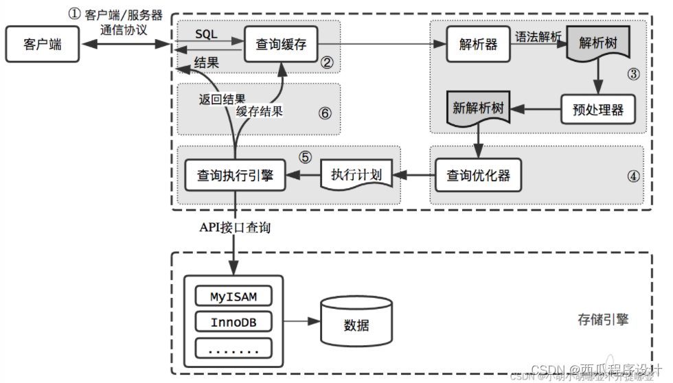
其他文章
WPF MaterialDesign 初学项目实战(0):github 项目Demo运行
WPF MaterialDesign 初学项目实战(1)首页搭建
WPF MaterialDesign 初学项目实战(2)首页导航栏样式
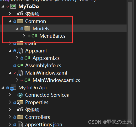
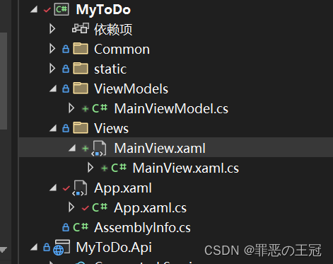
创建侧边栏实体类
新建MenuBar文件
- Common
- Models
- MenuBar
- Models
添加基本成员
using MaterialDesignColors.Recommended;
using Prism.Mvvm;
using System;
using System.Collections.Generic;
using System.Linq;
using System.Text;
using System.Threading.Tasks;

namespace MyToDo.Common.Models
{
    /// <summary>
    /// 系统导航菜单
    /// </summary>
    public class MenuBar : BindableBase//继承BindableBase可以动态修改
    {
        /// <summary>
        /// 菜单图标
        /// </summary>
        public string? Icon { get; set; }

        /// <summary>
        /// 标题
        /// </summary>
        public string? Title { get; set; }

        /// <summary>
        /// 命名空间
        /// </summary>
        public string? NameSpace { get; set; }

    }
}
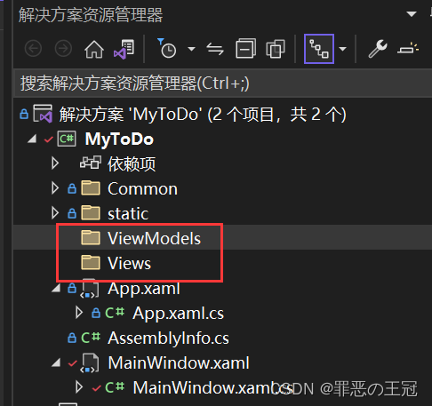
创建Views和ViewModels文件夹
注意,Views和VIewModels文件夹的名字是一定要这么写,这和Prism框架的自动绑定有关
绑定关系为:
- Views
- xxxView
- ViewModels
- xxxViewModel
自动绑定命名空间为:
xmlns:prism="http://prismlibrary.com/"
prism:ViewModelLocator.AutoWireViewModel="True"
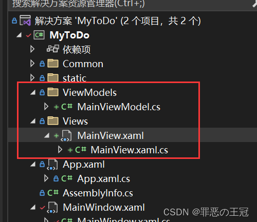
创建MainView和MainViewModel文件
将MainWindow内容复制到MainView里面,将命名空间进行修改
<Window x:Class="MyToDo.Views.MainView"
        xmlns="http://schemas.microsoft.com/winfx/2006/xaml/presentation"
        xmlns:x="http://schemas.microsoft.com/winfx/2006/xaml"
        xmlns:d="http://schemas.microsoft.com/expression/blend/2008"
        xmlns:mc="http://schemas.openxmlformats.org/markup-compatibility/2006"
        xmlns:local="clr-namespace:MyToDo"
        mc:Ignorable="d"
        Title="MainWindow"
        Height="768"
        Width="1280"
        xmlns:prism="http://prismlibrary.com/"
        prism:ViewModelLocator.AutoWireViewModel="True"        xmlns:materialDesign="http://materialdesigninxaml.net/winfx/xaml/themes"
        TextElement.Foreground="{DynamicResource MaterialDesignBody}"
        TextElement.FontWeight="Regular"
        TextElement.FontSize="13"
        TextOptions.TextFormattingMode="Ideal"
        TextOptions.TextRenderingMode="Auto"
        WindowStartupLocation="CenterScreen"
        WindowStyle="None"
        Background="{DynamicResource MaterialDesignPaper}"
        FontFamily="{DynamicResource MaterialDesignFont}">
    <materialDesign:DialogHost DialogTheme="Inherit"
                               Identifier="RootDialog"
                               SnackbarMessageQueue="{Binding ElementName=MainSnackbar, Path=MessageQueue}">

        <materialDesign:DrawerHost IsLeftDrawerOpen="{Binding ElementName=MenuToggleButton, Path=IsChecked}">
            <materialDesign:DrawerHost.LeftDrawerContent>
                <DockPanel MinWidth="220">

                </DockPanel>
            </materialDesign:DrawerHost.LeftDrawerContent>

            <DockPanel>
                <materialDesign:ColorZone Padding="16"
                                          x:Name="MainBody"
                                          materialDesign:ElevationAssist.Elevation="Dp4"
                                          DockPanel.Dock="Top"
                                          Mode="PrimaryMid">
                    <DockPanel LastChildFill="False">
                        <StackPanel Orientation="Horizontal">
                            <ToggleButton x:Name="MenuToggleButton"
                                          AutomationProperties.Name="HamburgerToggleButton"
                                          IsChecked="False"
                                          Style="{StaticResource MaterialDesignHamburgerToggleButton}" />

                            <Button Margin="24,0,0,0"
                                    materialDesign:RippleAssist.Feedback="{Binding RelativeSource={RelativeSource Self}, Path=Foreground, Converter={StaticResource BrushRoundConverter}}"
                                    Command="{Binding MovePrevCommand}"
                                    Content="{materialDesign:PackIcon Kind=ArrowLeft,
                                                        Size=24}"
                                    Foreground="{Binding RelativeSource={RelativeSource AncestorType={x:Type FrameworkElement}}, Path=(TextElement.Foreground)}"
                                    Style="{StaticResource MaterialDesignToolButton}"
                                    ToolTip="Previous Item" />

                            <Button Margin="16,0,0,0"
                                    materialDesign:RippleAssist.Feedback="{Binding RelativeSource={RelativeSource Self}, Path=Foreground, Converter={StaticResource BrushRoundConverter}}"
                                    Command="{Binding MoveNextCommand}"
                                    Content="{materialDesign:PackIcon Kind=ArrowRight,
                                                        Size=24}"
                                    Foreground="{Binding RelativeSource={RelativeSource AncestorType={x:Type FrameworkElement}}, Path=(TextElement.Foreground)}"
                                    Style="{StaticResource MaterialDesignToolButton}"
                                    ToolTip="Next Item" />


                            <TextBlock Margin="25,0,0,0"
                                       HorizontalAlignment="Center"
                                       VerticalAlignment="Center"
                                       AutomationProperties.Name="Material Design In XAML Toolkit"
                                       FontSize="22"
                                       Text="笔记本" />
                        </StackPanel>

                        <StackPanel Orientation="Horizontal"
                                    DockPanel.Dock="Right">
                            <Image Width="25"
                                   Height="25"
                                   Source="/static/img/User/icon.png">
                                <Image.Clip>
                                    <EllipseGeometry Center="12.5,12.5"
                                                     RadiusX="12.5"
                                                     RadiusY="12.5" />
                                </Image.Clip>
                            </Image>
                            <Button x:Name="minBtn"
                                    Content="一"
                                    Style="{StaticResource MaterialDesignFlatMidBgButton}" />
                            <Button x:Name="maxBtn"
                                    Content="口"
                                    Style="{StaticResource MaterialDesignFlatMidBgButton}" />
                            <Button x:Name="closeBtn"
                                    Content="X"
                                    Style="{StaticResource MaterialDesignFlatMidBgButton}" />
                        </StackPanel>


                    </DockPanel>
                </materialDesign:ColorZone>

            </DockPanel>
        </materialDesign:DrawerHost>
    </materialDesign:DialogHost>
</Window>
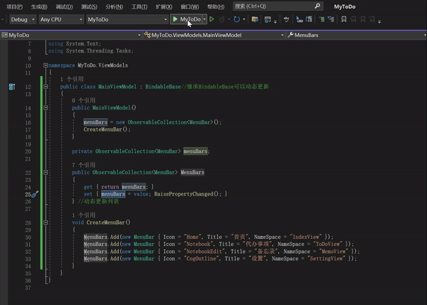
MainViewModel文件,添加View文件上下文
using MyToDo.Common.Models;
using Prism.Mvvm;
using System;
using System.Collections.Generic;
using System.Collections.ObjectModel;
using System.Linq;
using System.Text;
using System.Threading.Tasks;

namespace MyToDo.ViewModels
{
    public class MainViewModel : BindableBase//继承BindableBase可以动态更新
    {
        public MainViewModel()
        {
            MenuBars = new ObservableCollection<MenuBar>();
            CreateMenuBar();
        }

        private ObservableCollection<MenuBar> menuBars;

        public ObservableCollection<MenuBar> MenuBars
        {
            get { return menuBars; }
            set { menuBars= value; RaisePropertyChanged(); }
        } //动态更新列表

        void CreateMenuBar()
        {
            MenuBars.Add(new MenuBar { Icon = "Home", Title = "首页", NameSpace = "IndexView" });
            MenuBars.Add(new MenuBar { Icon = "Notebook", Title = "代办事项", NameSpace = "ToDoView" });
            MenuBars.Add(new MenuBar { Icon = "NotebookEdit", Title = "备忘录", NameSpace = "MemoView" });
            MenuBars.Add(new MenuBar { Icon = "CogOutline", Title = "设置", NameSpace = "SettingView" });
        }
    }
}
PS:为什么要有private menuBars 和 public MenuBars
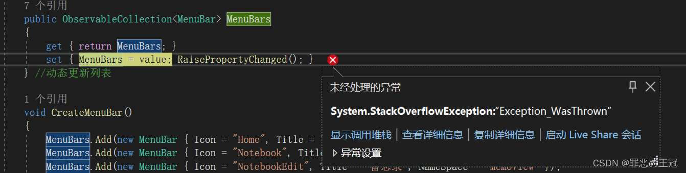
        public ObservableCollection<MenuBar> MenuBars
        {
            get { return MenuBars; }//这里会报错
            set { MenuBars = value; RaisePropertyChanged(); }
        } //动态更新列表


        private ObservableCollection<MenuBar> menuBars;
        public ObservableCollection<MenuBar> MenuBars
        {
            get { return menuBars; }
            set { menuBars= value; RaisePropertyChanged(); }
        } //动态更新列表
删除原来的MainWindow文件
在App.xmal里面修改启动窗口
 public partial class App : PrismApplication
    {
        /// <summary>
        /// 重写运行主窗口
        /// </summary>
        /// <returns></returns>
        /// <exception cref="NotImplementedException"></exception>
        protected override Window CreateShell()
        {
            //重定向主窗口
            - return Container.Resolve<MainWindow>();
            + return Container.Resolve<MainView>();

        }

        /// <summary>
        /// 依赖注入
        /// </summary>
        /// <param name="containerRegistry"></param>
        protected override void RegisterTypes(IContainerRegistry containerRegistry)
        {

        }
    }
将元素添加到MainView页面
绑定数据上下文:{Binding 属性名}
注意:Views文件夹和ViewModels文件夹必须这样命名,启用Prism的自动联系上下文功能,并且对应文件名为MainView和MainViewModels
prism启动上下文功能:
xmlns:prism="http://prismlibrary.com/"
prism:ViewModelLocator.AutoWireViewModel="True"
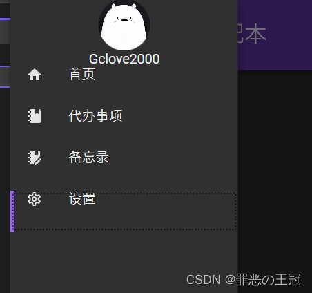
<materialDesign:DrawerHost IsLeftDrawerOpen="{Binding ElementName=MenuToggleButton, Path=IsChecked}">
            <materialDesign:DrawerHost.LeftDrawerContent>
                <DockPanel MinWidth="220">
                    <StackPanel>
                        <Image Width="50"
                               Height="50"
                               Source="/static/img/User/icon.png">
                            <Image.Clip>
                                <EllipseGeometry Center="25,25"
                                                 RadiusX="25"
                                                 RadiusY="25" />
                            </Image.Clip>
                        </Image>
                        <TextBlock  Text="Gclove2000"
                                    HorizontalAlignment="Center"
                                    />

                        <ListBox ItemsSource="{Binding MenuBars}" >
                            <ListBox.ItemTemplate>
                                <DataTemplate>
                                    <StackPanel Orientation="Horizontal">
                                        <materialDesign:PackIcon Kind="{Binding Icon}" />
                                        <TextBlock Text="{Binding Title}" Margin="10,0"/>
                                    </StackPanel>
                                </DataTemplate>
                            </ListBox.ItemTemplate>
                        </ListBox>
                    </StackPanel>
                </DockPanel>
            </materialDesign:DrawerHost.LeftDrawerContent>
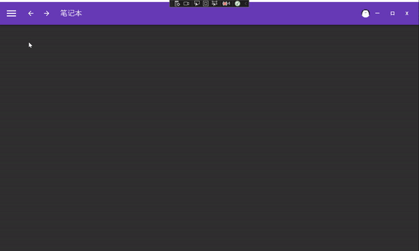
运行效果:
修改MaterialDesign 的默认主题
在App.xmal文件中修改为黑色主题
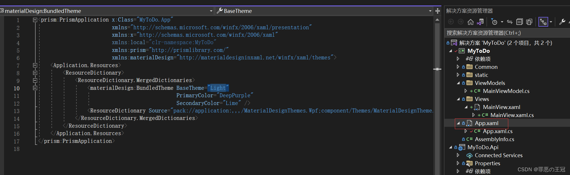
<prism:PrismApplication x:Class="MyToDo.App"
                        xmlns="http://schemas.microsoft.com/winfx/2006/xaml/presentation"
                        xmlns:x="http://schemas.microsoft.com/winfx/2006/xaml"
                        xmlns:local="clr-namespace:MyToDo"
                        xmlns:prism="http://prismlibrary.com/"
                        xmlns:materialDesign="http://materialdesigninxaml.net/winfx/xaml/themes">
    <Application.Resources>
        <ResourceDictionary>
            <ResourceDictionary.MergedDictionaries>
                <materialDesign:
                - BundledTheme BaseTheme="Light"
                + BundledTheme BaseTheme="Dark"
                                             PrimaryColor="DeepPurple"
                                             SecondaryColor="Lime" />
                <ResourceDictionary Source="pack://application:,,,/MaterialDesignThemes.Wpf;component/Themes/MaterialDesignTheme.Defaults.xaml" />
            </ResourceDictionary.MergedDictionaries>
        </ResourceDictionary>
    </Application.Resources>
</prism:PrismApplication>
如何添加自定义样式
在App.xmal文件中添加样式信息
<prism:PrismApplication x:Class="MyToDo.App"
                        xmlns="http://schemas.microsoft.com/winfx/2006/xaml/presentation"
                        xmlns:x="http://schemas.microsoft.com/winfx/2006/xaml"
                        xmlns:local="clr-namespace:MyToDo"
                        xmlns:prism="http://prismlibrary.com/"
                        xmlns:materialDesign="http://materialdesigninxaml.net/winfx/xaml/themes">
    <Application.Resources>
        <ResourceDictionary>
            <ResourceDictionary.MergedDictionaries>
                <materialDesign:BundledTheme BaseTheme="Dark"
                                             PrimaryColor="DeepPurple"
                                             SecondaryColor="Lime" />
                <ResourceDictionary Source="pack://application:,,,/MaterialDesignThemes.Wpf;component/Themes/MaterialDesignTheme.Defaults.xaml" />
            </ResourceDictionary.MergedDictionaries>
            <!--自定义样式 样式名:MyListBoxItemStyle,样式挂载:ListBoxItem-->
            <Style x:Key="MyListBoxItemStyle" TargetType="ListBoxItem">
                <!--自定义高度-->
                <Setter Property="MinHeight"
                        Value="40" />
                <Setter Property="Template">
                    <Setter.Value>
                        <!--影响属性 ListBoxItem-->
                        <ControlTemplate TargetType="{x:Type ListBoxItem}">
                            <Grid>
                                <Border x:Name="borderHeader" />
                                <Border x:Name="border" />
                                <ContentPresenter HorizontalAlignment="{TemplateBinding HorizontalAlignment}"
                                                  VerticalAlignment="{TemplateBinding VerticalAlignment}"/>
                            </Grid>

                            <!--触发器-->
                            <ControlTemplate.Triggers>
                                <!--ListBoxItem点击时触发-->
                                <Trigger Property="IsSelected" Value="True">
                                    <Setter Property="BorderThickness"
                                            TargetName="borderHeader"  Value="4,0,0,0"/>
                                    <Setter Property="BorderBrush"
                                            TargetName="borderHeader"
                                            Value="{DynamicResource PrimaryHueLightBrush}" />
                                </Trigger>
                            </ControlTemplate.Triggers>
                        </ControlTemplate>
                    </Setter.Value>
                </Setter>
            </Style>
        </ResourceDictionary>
    </Application.Resources>
</prism:PrismApplication>
在对应元素中引用样式
<ListBox ItemsSource="{Binding MenuBars}"
+ ItemContainerStyle="{StaticResource MyListBoxItemStyle}" >
                            <ListBox.ItemTemplate>
                                <DataTemplate>
                                    <StackPanel Orientation="Horizontal">
                                        <materialDesign:PackIcon Kind="{Binding Icon}" Margin="15,0" />
                                        <TextBlock Text="{Binding Title}" Margin="10,0"/>
                                    </StackPanel>
                                </DataTemplate>
                            </ListBox.ItemTemplate>
                        </ListBox>
实现效果:有点丑,可以后面改一下
设置点击范围
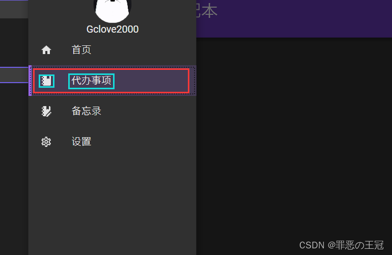
<StackPanel Orientation="Horizontal"
            VerticalAlignment="Center"
            + Background="Transparent">没设置为蓝色点击范围,设置了为红色点击范围
    <materialDesign:PackIcon Kind="{Binding Icon}"
                             Margin="15,0" />
    <TextBlock Text="{Binding Title}"
               Margin="10,0" />
</StackPanel>
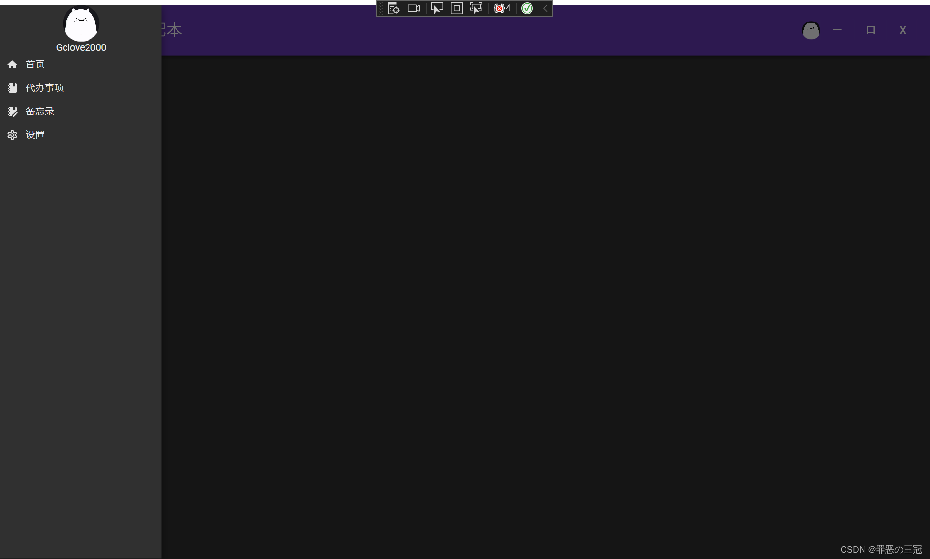
设置鼠标悬停效果
也是设置触发器
App.xmal
<!--自定义样式 样式名:MyListBoxItemStyle,样式挂载:ListBoxItem-->
<Style x:Key="MyListBoxItemStyle" TargetType="ListBoxItem">
   <!--自定义高度-->
   <Setter Property="MinHeight"
           Value="40" />
   <Setter Property="Template">
       <Setter.Value>
           <!--影响属性 ListBoxItem-->
           <ControlTemplate TargetType="{x:Type ListBoxItem}">
               <Grid>
                   <Border x:Name="borderHeader" />
                   <Border x:Name="border" />
                   <ContentPresenter HorizontalAlignment="{TemplateBinding HorizontalAlignment}"
                                     VerticalAlignment="{TemplateBinding VerticalAlignment}"/>
               </Grid>

               <!--触发器-->
               <ControlTemplate.Triggers>
                   <!--ListBoxItem点击时触发-->
                   <Trigger Property="IsSelected" Value="True">
                       <Setter Property="BorderThickness"
                               TargetName="borderHeader"  Value="4,0,0,0"/>
                       <Setter Property="BorderBrush"
                               TargetName="borderHeader"
                               Value="{DynamicResource PrimaryHueLightBrush}" />
                       <Setter TargetName="border"
                               Property="Background"
                               Value="{DynamicResource PrimaryHueLightBrush}" />
                       <Setter TargetName="border"
                               Property="Opacity"
                               Value="0.4" />
                   </Trigger>
                   <!--鼠标悬停触发器触发器-->
                   + <Trigger Property="IsMouseOver" Value="True">
                   +    <Setter TargetName="border"
                   +            Property="Background"
                   +            Value="{DynamicResource PrimaryHueLightBrush}" />
                   +    <Setter TargetName="border"
                   +            Property="Opacity"
                   +            Value="0.4" />
                   + </Trigger>
               </ControlTemplate.Triggers>
           </ControlTemplate>
       </Setter.Value>
   </Setter>
</Style>
最终效果: