前言
为什么会有这篇文章呢,是因为之前关于TabLayout的使用陆陆续续也写了好几篇了,感觉比较分散,且不成体系,写这篇文章的目的就是希望能把各种效果的实现一次性讲齐,所以也有了标题的「看这篇就够了」。
TabLayout作为导航组件来说,使用场景非常的多,也意味着要满足各种各样的需求。
在效果实现上,有同学会选择自定义View来做,定制性高,但易用性、稳定性、维护性不敢保证,使用官方组件能避免这些不确定性,一是开源,有很多大佬共建,会不停的迭代;二是经过大型app验证,比如google play;有了这两点,基本可以放心大胆的使用官方组件了。
那可能有的同学又会说,道理我都懂,可是不满足需求啊,只能自定义了。是的,早期的api确实不够丰富,在某些需求的实现上显得捉襟见肘,但是google也在不断的迭代,目前为止,常见的样式都能满足。
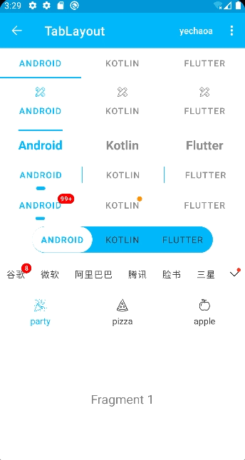
效果图
简介
TabLayout:一个横向可滑动的菜单导航ui组件。
Tab:TabLayout中的item,可以通过newTab()创建。
TabView:Tab的实例,是一个包含ImageView和TextView的线性布局。
TabItem:一种特殊的“视图”,在TabLayout中可以显式声明Tab。
官方文档:
https://developer.android.google.cn/reference/com/google/android/material/tabs/TabLayout?hl=en
功能拆解
Material Design 组件最新正式版依赖:
implementation 'com.google.android.material:material:1.5.0'
1.基础实现
1.1 xml动态写法
 <com.google.android.material.tabs.TabLayout
        android:id="@+id/tab_layout1"
        android:layout_width="match_parent"
        android:layout_height="wrap_content"
        android:background="@color/white"
        app:tabIndicatorColor="@color/colorPrimary"
        app:tabMaxWidth="200dp"
        app:tabMinWidth="100dp"
        app:tabMode="fixed"
        app:tabSelectedTextColor="@color/colorPrimary"
        app:tabTextColor="@color/gray" />
只写一个Layout,item可以配合ViewPager来生成。
1.2 xml静态写法
 <com.google.android.material.tabs.TabLayout
         android:layout_height="wrap_content"
         android:layout_width="match_parent">

     <com.google.android.material.tabs.TabItem
             android:text="@string/tab_text"/>

     <com.google.android.material.tabs.TabItem
             android:icon="@drawable/ic_android"/>

 </com.google.android.material.tabs.TabLayout>
属于固定写法,比如我们非常确定item有几个,可以通过TabItem显式声明。
1.3 kotlin/java代码写法
val tab = mBinding.tabLayout7.newTab()
tab.text = it.key
//...
mBinding.tabLayout7.addTab(tab)
这种情况适合Tab的数据是动态的,比如接口数据回来之后,再创建Tab并添加到TabLayout中。
2.添加图标
mBinding.tabLayout2.getTabAt (index )?.setIcon (R.mipmap.ic_launcher )
获取Tab然后设置icon。
Tab内部其实是一个TextView和ImageView,添加图标就是给ImageView设置icon。
3.字体大小、加粗
通过app:tabTextAppearance给TabLayout设置文本样式
<com.google.android.material.tabs.TabLayout
    ...
    app:tabTextAppearance="@style/MyTabLayout"
    />
style:
<style name="MyTabLayout">
    <item name="android:textSize">20sp</item>
    <item name="android:textStyle">bold</item>
    <item name="android:textAllCaps">false</item>
</style>
比如这里设置了字体大小和加粗。
默认字体大小14sp:
<dimen name="design_tab_text_size">14sp</dimen>4.去掉Tab长按提示文字
长按Tab时会有一个提示文字,类似Toast一样。
/**
 * 隐藏长按显示文本
 */
private fun hideToolTipText(tab: TabLayout.Tab) {
    // 取消长按事件
    tab.view.isLongClickable = false
    // api 26 以上 设置空text
    if (Build.VERSION.SDK_INT > Build.VERSION_CODES.O) {
        tab.view.tooltipText = ""
    }
}
可以取消长按事件,在api26以上也可以设置提示文本为空。
5.去掉下划线indicator
app:tabIndicatorHeight="0dp"设置高度为0即可。
注意,单纯设置tabIndicatorColor为透明,其实不准确,默认还是有2dp的,根本瞒不过射鸡师的眼睛。
6.下划线的样式

通过app:tabIndicator可以设置自定义的样式,比如通过shape设置圆角和宽度。
<com.google.android.material.tabs.TabLayout
    ...
    app:tabIndicator="@drawable/shape_tab_indicator"
    app:tabIndicatorColor="@color/colorPrimary"
    />
注意:Indicator的颜色在shape中设置是无效的,需要通过app:tabIndicatorColor设置才可以。
shape:
<?xml version="1.0" encoding="utf-8"?>
<layer-list xmlns:android="http://schemas.android.com/apk/res/android">
    <item
        android:width="15dp"
        android:height="5dp"
        android:gravity="center">
        <shape>
            <corners android:radius="5dp" />
            <!--color无效,源码用tabIndicatorColor-->
            <solid android:color="@color/colorPrimary" />
        </shape>
    </item>
</layer-list>
7.下划线的宽度
默认情况下,tabIndicator的宽度是填充整个Tab的,比如上图中的第一个,我们可以简单的设置不填充,与文本对齐,即第二个效果。
app:tabIndicatorFullWidth="false"也可以像上一节那样,通过shape自定义tabIndicator的宽度。
8.Tab分割线

  /** A {@link LinearLayout} containing {@link Tab} instances for use with {@link TabLayout}. */
  public final class TabView extends LinearLayout {

  }
通过源码可以看到内部实现TabView继承至LinearLayout,我们知道LinearLayout是可以给子view设置分割线的,那我们就可以通过遍历来添加分割线。
//设置 分割线
for (index in 0..mBinding.tabLayout4.tabCount) {
    val linearLayout = mBinding.tabLayout4.getChildAt(index) as? LinearLayout
    linearLayout?.let {
        it.showDividers = LinearLayout.SHOW_DIVIDER_MIDDLE
        it.dividerDrawable = ContextCompat.getDrawable(this, R.drawable.shape_tab_divider)
        it.dividerPadding = 30
    }
}
shape_tab_divider:
<?xml version="1.0" encoding="utf-8"?>
<shape xmlns:android="http://schemas.android.com/apk/res/android">
    <solid android:color="@color/colorPrimary" />
    <size android:width="1dp" android:height="10dp" />
</shape>
9.TabLayout样式

上图中的效果其实是TabLayout样式+tabIndicator样式形成的一个「整体」的效果。
TabLayout是两边半圆的一个长条,这个我们通过编写shape设置给其背景即可实现。
shape_tab_bg:
<?xml version="1.0" encoding="utf-8"?>
<shape xmlns:android="http://schemas.android.com/apk/res/android">
    <corners android:radius="999dp" />
    <solid android:color="@color/colorPrimary" />
</shape>
这个效果的关键在于tabIndicator的高度与TabLayout的高度相同,所以二者高度设置一致即可。
shape_full_tab_indicator:
<?xml version="1.0" encoding="utf-8"?>
<layer-list xmlns:android="http://schemas.android.com/apk/res/android">
    <item android:gravity="center" android:top="0.5dp" android:bottom="0.5dp">
        <shape>
            <!-- 上下边距合计1dp 高度减少1dp -->
            <size android:height="41dp" />
            <corners android:radius="999dp" />
            <solid android:color="@color/white" />
        </shape>
    </item>
</layer-list>
TabLayout:
<com.google.android.material.tabs.TabLayout
android:id="@+id/tab_layout6"
android:layout_width="wrap_content"
android:layout_height="42dp"
android:layout_gravity="center"
android:layout_marginTop="10dp"
android:background="@drawable/shape_tab_bg"
app:tabIndicator="@drawable/shape_full_tab_indicator"
app:tabIndicatorColor="@color/white"
app:tabIndicatorFullWidth="true"
app:tabIndicatorHeight="42dp"
app:tabMinWidth="96dp"
app:tabMode="fixed"
app:tabSelectedTextColor="@color/colorPrimary"
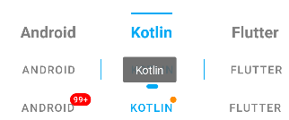
app:tabTextColor="@color/black" />10.Tab添加小红点
添加小红点的功能还是比较常见的,好在TabLayout也提供了这种能力,其实添加起来也非常简单,难在未知。
可以设置带数字的红点,也可以设置没有数字单纯的一个点。
通过getOrCreateBadge可以对红点进行简单的配置:
// 数字
mBinding.tabLayout5.getTabAt(defaultIndex)?.let { tab ->
    tab.orCreateBadge.apply {
        backgroundColor = Color.RED
        maxCharacterCount = 3
        number = 99999
        badgeTextColor = Color.WHITE
    }
}

// 红点
mBinding.tabLayout5.getTabAt(1)?.let { tab ->
    tab.orCreateBadge.backgroundColor = ContextCompat.getColor(this, R.color.orange)
}
getOrCreateBadge实际上是获取或创建BadgeDrawable。
通过源码发现,BadgeDrawable除了TabLayout引用之外,还有NavigationBarItemView、NavigationBarMenuView、NavigationBarView,意味着它们也同样具备着小红点这种能力。其实别的view也是可以具备的。
关于小红点这里就不展开了,非常推荐查看我之前写的这篇:【涨姿势】你没用过的BadgeDrawable。
https://blog.csdn.net/yechaoa/article/details/122272822?spm=1001.2014.3001.5501
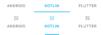
11.获取隐藏的Tab
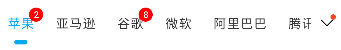
上一节中我们实现了小红点效果,那如果一屏显示不够的情况下,如何提示未展示的信息呢,比如上面我们如何把未显示的tab且有数字的Tab提示出来呢?常见的解决方案都是在尾部加一个红点提示。
那么问题来了,如何判断某一个Tab是否可见呢,翻看了源码,可惜并没有提供相应的api,那只能我们自己实现了。
我们前面添加小红点是根据Tab添加的,Tab内部实现也是一个view,那view就可以判断其是否可见。
private fun isShowDot(): Boolean {
    var showIndex = 0
    var tipCount = 0
    companyMap.keys.forEachIndexed { index, _ ->
        mBinding.tabLayout7.getTabAt(index)?.let { tab ->
            val tabView = tab.view as LinearLayout
            val rect = Rect()
            val visible = tabView.getLocalVisibleRect(rect)
            // 可见范围小于80%也在计算范围之内,剩下20%宽度足够红点透出(可自定义)
            if (visible && rect.right > tab.view.width * 0.8) {
                showIndex = index
            } else {
                //if (index > showIndex) // 任意一个有count的tab隐藏就会显示,比如第一个在滑动过程中会隐藏,也在计算范围之内
                if (index > lastShowIndex) { // 只检测右侧隐藏且有count的tab 才在计算范围之内
                    tab.badge?.let { tipCount += it.number }
                }
            }

        }
    }
    lastShowIndex = showIndex
    return tipCount > 0
}
上面的方法中就是判断是否需要显示右侧提示的小红点。
计算规则:Tab不可见,且Tab上的红点数字大于0的即在计算范围之内。
这里有一个优化的点,比如上图中的“腾讯”Tab,它是可见的,但是红点不可见,那么问题就来了,如果我们没有提示到,是很容易产生客诉的,所以这里在计算的时候也加了一个条件,就是可见范围小于80%也在计算范围之内,剩下20%的宽度是足够Tab上的红点透出的(也可自定义)。
同时在TabLayout滑动的过程中也应该加上判断显示的逻辑:
// mBinding.tabLayout7.setOnScrollChangeListener() // min api 23 (6.0)
// 适配 5.0  滑动过程中判断右侧小红点是否需要显示
mBinding.tabLayout7.viewTreeObserver.addOnScrollChangedListener {
    mBinding.vArrowDot.visibility = if (isShowDot()) View.VISIBLE else View.INVISIBLE
}
还有初始化时的判断逻辑:
override fun onResume() {
super.onResume()
// 初始化判断右侧小红点是否需要显示
mBinding.tabLayout7.viewTreeObserver.addOnGlobalLayoutListener(object : ViewTreeObserver.OnGlobalLayoutListener {
override fun onGlobalLayout() {
mBinding.vArrowDot.visibility = if (isShowDot()) View.VISIBLE else View.INVISIBLE
mBinding.tabLayout7.viewTreeObserver.removeOnGlobalLayoutListener(this)
}
})
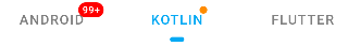
}12.Tab宽度自适应

细心的同学会发现,这个TabLayout的item左右间距都是一样的,不管标题是两个字还是四个字的,左右间距都是相等的,而实际上的效果是两个字的Tab要比四个字的Tab左右间距要大一些的,那这个效果是怎么实现的呢?
实际上是我们设置了tabMinWidth:
app :tabMinWidth="50dp"
源码中默认的是:
private int getTabMinWidth() {
    if (requestedTabMinWidth != INVALID_WIDTH) {
      // If we have been given a min width, use it
      return requestedTabMinWidth;
    }
    // Else, we'll use the default value
    return (mode == MODE_SCROLLABLE || mode == MODE_AUTO) ? scrollableTabMinWidth : 0;
}
requestedTabMinWidth是根据xml设置获取的。
假如xml没设置tabMinWidth的情况下,且tabMode是scrollable的情况下,会返回默认配置,否则为0,即tabMode为fixed的情况。
系统默认配置scrollableTabMinWidth:
<dimen name="design_tab_scrollable_min_width"> 72dp</dimen>
在两个字和四个字的标题都存在的情况下,两个字用这个默认宽度就会有多余的间距,所以会出现间距不均等的情况,通过设置覆盖默认即可解决。
13.自定义Item View
前面讲到Tab内部实现是一个View,那我们就可以通过官方提供api(setCustomView)来自定义这个view。
setCustomView的两种方式:
1. public Tab setCustomView(@Nullable View view)
2. public Tab setCustomView(@LayoutRes int resId)
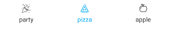
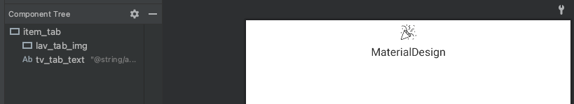
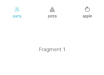
我们先编写一个自定义的布局文件,布局文件比较简单,一个LottieAnimationView和TextView。
再通过Tab添加进去即可。
val animMap = mapOf("party" to R.raw.anim_confetti, "pizza" to R.raw.anim_pizza, "apple" to R.raw.anim_apple)

animMap.keys.forEach { s ->
    val tab = mBinding.tabLayout8.newTab()
    val view = LayoutInflater.from(this).inflate(R.layout.item_tab, null)
    val imageView = view.findViewById<LottieAnimationView>(R.id.lav_tab_img)
    val textView = view.findViewById<TextView>(R.id.tv_tab_text)
    imageView.setAnimation(animMap[s]!!)
    imageView.setColorFilter(Color.BLUE)
    textView.text = s
    tab.customView = view
    mBinding.tabLayout8.addTab(tab)
}
14.使用Lottie
Lottie是一个可以在多平台展示动画的库,相信很多同学都已经用过了,就不详细展开了,感兴趣的可以查看Lottie官方文档。
Lottie依赖:
implementation "com.airbnb.android:lottie:5.0.1"
上一节中我们实现了自定义TabLayout的Item View,在这个自定义的布局中,我们用LottieAnimationView来承载动画的展示。
<?xml version="1.0" encoding="utf-8"?>
<androidx.appcompat.widget.LinearLayoutCompat xmlns:android="http://schemas.android.com/apk/res/android"
    xmlns:app="http://schemas.android.com/apk/res-auto"
    android:id="@+id/item_tab"
    android:layout_width="match_parent"
    android:layout_height="wrap_content"
    android:gravity="center"
    android:orientation="vertical">

    <com.airbnb.lottie.LottieAnimationView
        android:id="@+id/lav_tab_img"
        android:layout_width="30dp"
        android:layout_height="30dp"
        app:lottie_colorFilter="@color/black"
        app:lottie_rawRes="@raw/anim_confetti" />

    <TextView
        android:id="@+id/tv_tab_text"
        android:layout_width="wrap_content"
        android:layout_height="wrap_content"
        android:text="@string/app_name"
        android:textColor="@color/black"
        android:textSize="14sp" />

</androidx.appcompat.widget.LinearLayoutCompat>
添加的方式也在上一节中讲过了,我们只需要控制好选中、未选中的状态即可。
mBinding.tabLayout8.addOnTabSelectedListener(object : OnTabSelectedListener {
    override fun onTabSelected(tab: TabLayout.Tab?) {
        tab?.setSelected()
        tab?.let { mBinding.viewPager.currentItem = it.position }
    }

    override fun onTabUnselected(tab: TabLayout.Tab?) {
        tab?.setUnselected()
    }

    override fun onTabReselected(tab: TabLayout.Tab?) {

    }
})
这里通过两个扩展方法分别处理不同的状态。
1. 选中状态,播放动画并设置icon颜色。
/**
     * 选中状态
     */
    fun TabLayout.Tab.setSelected() {
        this.customView?.let {
            val textView = it.findViewById<TextView>(R.id.tv_tab_text)
            val selectedColor = ContextCompat.getColor(this@TabLayoutActivity, R.color.colorPrimary)
            textView.setTextColor(selectedColor)

            val imageView = it.findViewById<LottieAnimationView>(R.id.lav_tab_img)
            if (!imageView.isAnimating) {
                imageView.playAnimation()
            }
            setLottieColor(imageView, true)
        }
    }
2. 未选中状态,停止动画并还原初始状态,然后设置icon颜色。
/**
 * 未选中状态
 */
fun TabLayout.Tab.setUnselected() {
    this.customView?.let {
        val textView = it.findViewById<TextView>(R.id.tv_tab_text)
        val unselectedColor = ContextCompat.getColor(this@TabLayoutActivity, R.color.black)
        textView.setTextColor(unselectedColor)

        val imageView = it.findViewById<LottieAnimationView>(R.id.lav_tab_img)
        if (imageView.isAnimating) {
            imageView.cancelAnimation()
            imageView.progress = 0f // 还原初始状态
        }
        setLottieColor(imageView, false)
    }
}
关于修改lottie icon的颜色,目前网上的答案参差不齐,还是源码来的直接。
源码:
if (ta.hasValue(R.styleable.LottieAnimationView_lottie_colorFilter)) {
  int colorRes = ta.getResourceId(R.styleable.LottieAnimationView_lottie_colorFilter, -1);
  ColorStateList csl = AppCompatResources.getColorStateList(getContext(), colorRes);
  SimpleColorFilter filter = new SimpleColorFilter(csl.getDefaultColor());
  KeyPath keyPath = new KeyPath("**");
  LottieValueCallback<ColorFilter> callback = new LottieValueCallback<>(filter);
  addValueCallback(keyPath, LottieProperty.COLOR_FILTER, callback);
}
所以直接借鉴即可:
/**
 * set lottie icon color
 */
private fun setLottieColor(imageView: LottieAnimationView?, isSelected: Boolean) {
    imageView?.let {
        val color = if (isSelected) R.color.colorPrimary else R.color.black
        val csl = AppCompatResources.getColorStateList(this@TabLayoutActivity, color)
        val filter = SimpleColorFilter(csl.defaultColor)
        val keyPath = KeyPath("**")
        val callback = LottieValueCallback<ColorFilter>(filter)
        it.addValueCallback(keyPath, LottieProperty.COLOR_FILTER, callback)
    }
}动画文件的下载网站推荐:lordicon。
https://lordicon.com/
15.关联ViewPager
15.1 编写FragmentPagerAdapter
private inner class SimpleFragmentPagerAdapter constructor(fm: FragmentManager) :
    FragmentPagerAdapter(fm, BEHAVIOR_RESUME_ONLY_CURRENT_FRAGMENT) {

    private val tabTitles = arrayOf("Android", "Kotlin", "Flutter")
    private val fragment = arrayOf(Fragment1(), Fragment2(), Fragment3())

    override fun getItem(position: Int): Fragment {
        return fragment[position]
    }

    override fun getCount(): Int {
        return fragment.size
    }

    override fun getPageTitle(position: Int): CharSequence {
        return tabTitles[position]
    }
}
15.2 给ViewPager设置Adapter
mBinding.viewPager.adapter = SimpleFragmentPagerAdapter(supportFragmentManager)
15.3 给TabLayout关联ViewPager
mBinding.tabLayout1.setupWithViewPager (mBinding.viewPager )
以上即可把TabLayout和ViewPager关联起来,TabLayout的Tab也会由FragmentPagerAdapter中的标题自动生成。
15.4 setupWithViewPager源码分析
究竟是怎么关联起来的呢?
下面是setupWithViewPager中的部分源码:
if (viewPager != null) {
    this.viewPager = viewPager;
    if (this.pageChangeListener == null) {
        // 步骤1
        this.pageChangeListener = new TabLayout.TabLayoutOnPageChangeListener(this);
    }

    this.pageChangeListener.reset();
    viewPager.addOnPageChangeListener(this.pageChangeListener);
    // 步骤2
    this.currentVpSelectedListener = new TabLayout.ViewPagerOnTabSelectedListener(viewPager);
    // 步骤3
    this.addOnTabSelectedListener(this.currentVpSelectedListener);
    PagerAdapter adapter = viewPager.getAdapter();
    if (adapter != null) {
        this.setPagerAdapter(adapter, autoRefresh);
    }

    if (this.adapterChangeListener == null) {
        this.adapterChangeListener = new TabLayout.AdapterChangeListener();
    }

    this.adapterChangeListener.setAutoRefresh(autoRefresh);
    // 步骤4
    viewPager.addOnAdapterChangeListener(this.adapterChangeListener);
    this.setScrollPosition(viewPager.getCurrentItem(), 0.0F, true);
}
1. 先是创建了TabLayout.TabLayoutOnPageChangeListener,并设置给了viewPager.addOnPageChangeListener。
2. 然后又创建了TabLayout.ViewPagerOnTabSelectedListener(viewPager),并传入当前viewPager,然后设置给了addOnTabSelectedListener。
3. 所以,经过这种你来我往的操作之后,设置TabLayout的选中下标和设置ViewPager的选中下标,其实效果是一毛一样的,因为联动起来了…
另外,FragmentPagerAdapter已经废弃了,官方推荐使用viewpager2 和 FragmentStateAdapter 代替。
Deprecated Switch to androidx.viewpager2.widget.ViewPager2 and use androidx.viewpager2.adapter.FragmentStateAdapter instead.
16.常用API整理
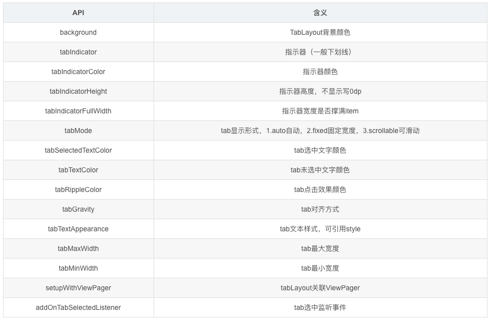
16.1 TabLayout
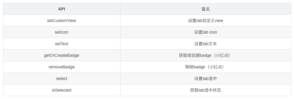
16.2 TabLayout.Tab
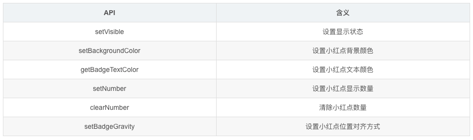
16.3 BadgeDrawable
Github:
https://github.com/yechaoa/MaterialDesign