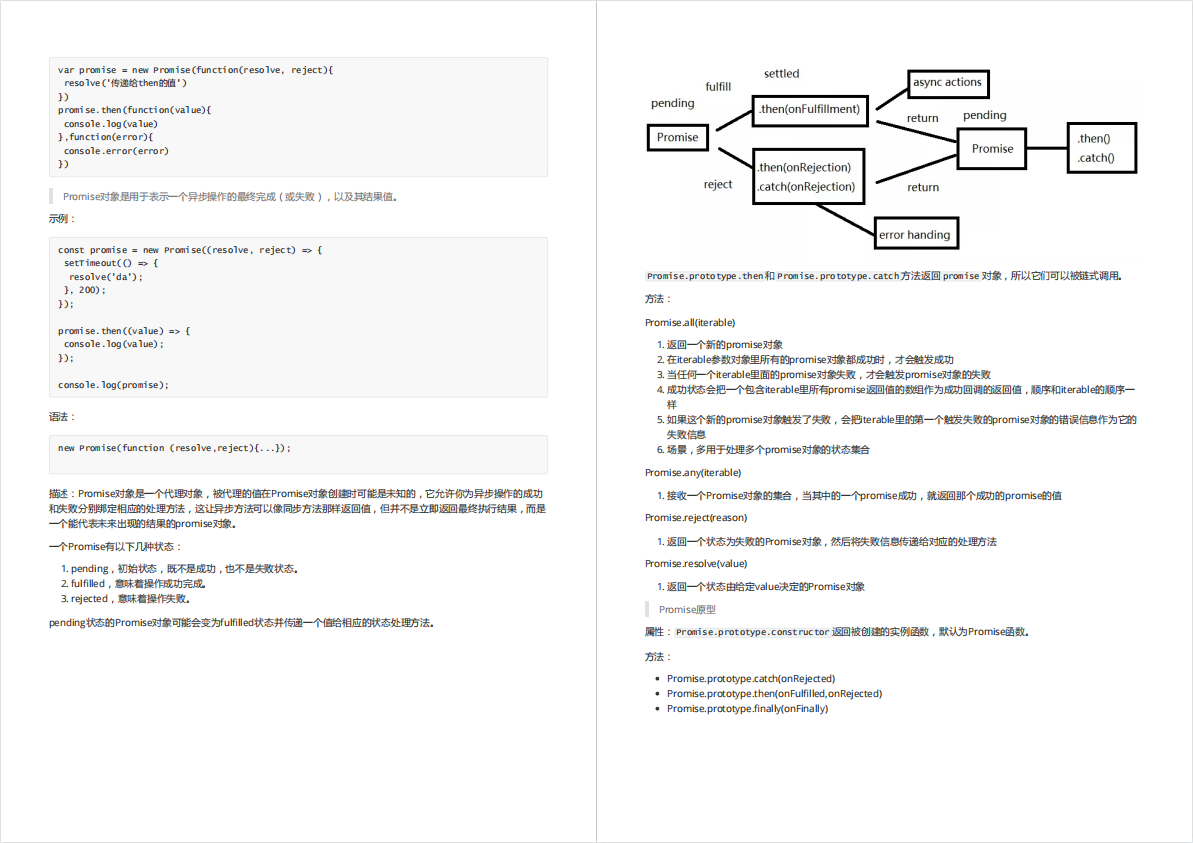
普通的modal组件如下:
我们写的modal额外支持,后面没有蒙版,并且Modal框能够拖拽
还支持渲染在文档流里,上面的都是fixed布局,我们这个正常渲染到文档下面:
render部分
<RenderDialog{...restState}visible={visible}prefixCls={prefixCls}header={renderHeader}attach={attach}closeBtn={renderCloseIcon()}classPrefix={classPrefix}onClose={onClose}onConfirm={onConfirm}footer={footer === true ? defaultFooter() : footer}ref={dialogDom}/>
大家记住这个RenderDialog,接下来都是上面传参的解释:
resetState: 是对象,一堆属性的集合,哪些属性呢,我们往下看
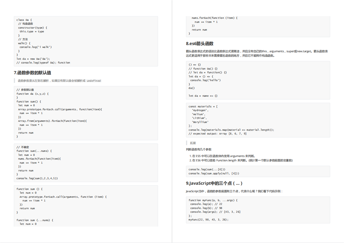
// 其实默认参数写到这里并不科学,因为react有个静态属性defaultProps属性支持合并propsconst [state, setState] = useSetState<DialogProps>({width: 520, // 默认宽度是520visible: false, // 默认visible是falsezIndex: 2500, // 默认zIndex 2500placement: 'center', // 默认渲染到屏幕中间mode: 'modal', // 默认的模式是modal是ant那种渲染结果,其他模式我们下面谈showOverlay: true, // 是否展示透明黑色蒙版destroyOnClose: false, // 关闭弹窗的时候是否销毁里面的内容draggable: false, // 是否能拖拽modalpreventScrollThrough: true, // 防止滚动穿透...props,});
restState在下面,除了state上某些属性。
 const { visible, // 控制对话框是否显示 attach, // 对话框挂载的节点,默认挂在组件本身的位置。数据类型为 String 时,会被当作选择器处理,进行节点查询。示例:'body' 或 () => document.body closeBtn, // 关闭按钮,可以自定义。值为 true 显示默认关闭按钮,值为 false 不显示关闭按钮。值类型为 string 则直接显示值,// 底部操作栏,默认会有“确认”和“取消”两个按钮。值为 true 显示默认操作按钮,值为 false 不显示任何内容,值类型为 Function 表示自定义底部内容 footer = true, // 如果“取消”按钮存在,则点击“取消”按钮时触发,同时触发关闭事件 onCancel = noop, // 如果“确认”按钮存在,则点击“确认”按钮时触发,或者键盘按下回车键时触发 onConfirm = noop, // 如果“确认”按钮存在,则点击“确认”按钮时触发,或者键盘按下回车键时触发 cancelBtn = cancelText, // 取消按钮,可自定义。值为 null 则不显示取消按钮。值类型为字符串,则表示自定义按钮文本,值类型为 Object 则表示透传 Button 组件属性。 confirmBtn = confirmText, // 确认按钮。值为 null 则不显示确认按钮。值类型为字符串,则表示自定义按钮文本,值类型为 Object 则表示透传 Button 组件属性。 onClose = noop, // 关闭事件,点击取消按钮、点击关闭按钮、点击蒙层、按下 ESC 等场景下触发 ...restState
 } = state;
说了这么多,我们接着看RenderDialog组件上传入的属性。
prefixCls不讲了,是css属性前缀,一个字符串,接着看header属性被包装为renderHeader
const renderHeader = useMemo(() => {if (!state.header) return null;const iconMap = {info: <InfoCircleFilledIcon className={`${classPrefix}-is-info`} />,warning: <InfoCircleFilledIcon className={`${classPrefix}-is-warning`} />,error: <InfoCircleFilledIcon className={`${classPrefix}-is-error`} />,success: <CheckCircleFilledIcon className={`${classPrefix}-is-success`} />,};return (<div className={`${prefixCls}__header-content`}>{iconMap[state.theme]}{state.header}</div>);// eslint-disable-next-line react-hooks/exhaustive-deps}, [state.header, state.theme, prefixCls, classPrefix]);
其实就是在header的文字前面多了一个icon,比如成功的弹窗如下:
接着看closeBtn属性
const renderCloseIcon = () => {if (closeBtn === false) return null;if (closeBtn === true) return <CloseIcon style={{ verticalAlign: 'unset' }} />;return closeBtn || <CloseIcon style={{ verticalAlign: 'unset' }} />;};
这个是右上角关闭按钮的Icon,很简单,如果是false,什么都不许安然,如果是undefined或者true渲染这个icon。
好了,我们把整个代码放到下面,有代码注释,没写注释的是上面咋们已经讲过的内容,接着就要进入RenderDialog这个组件内部了。
import 的部分省略了

// 渲染 footer的button方法
const renderDialogButton = (btn: TdDialogProps['cancelBtn'], defaultProps: ButtonProps) => {let result = null;if (isString(btn)) {result = <Button {...defaultProps}>{btn}</Button>;}else if (isFunction(btn)) {result = btn();}return result;
};

const Dialog = forwardRef((props: DialogProps, ref: React.Ref<DialogInstance>) => {// 这部分忽略就好,用来获取全局配置的css前缀字符串const { classPrefix } = useConfig();// 这个也忽略,获取icon组件的const { CloseIcon, InfoCircleFilledIcon, CheckCircleFilledIcon } = useGlobalIcon({CloseIcon: TdCloseIcon,InfoCircleFilledIcon: TdInfoCircleFilledIcon,CheckCircleFilledIcon: TdCheckCircleFilledIcon,});// 用来引用dialog弹框的domconst dialogDom = useRef<HTMLDivElement>();const [state, setState] = useSetState<DialogProps>({width: 520,visible: false,zIndex: 2500,placement: 'center',mode: 'modal',showOverlay: true,destroyOnClose: false,draggable: false,preventScrollThrough: true,...props,});

 // 国际化有关的const [local, t] = useLocaleReceiver('dialog');const confirmText = t(local.confirm);const cancelText = t(local.cancel);const {visible,attach,closeBtn,footer = true,onCancel = noop,onConfirm = noop,cancelBtn = cancelText,confirmBtn = confirmText,onClose = noop,...restState} = state;useEffect(() => { setState((prevState) => ({...prevState,...props,}));}, [props, setState, isPlugin]);const prefixCls = `${classPrefix}-dialog`;const renderCloseIcon = () => {if (closeBtn === false) return null;if (closeBtn === true) return <CloseIcon style={{ verticalAlign: 'unset' }} />;return closeBtn || <CloseIcon style={{ verticalAlign: 'unset' }} />;};

 // 这里把一些外部方法暴露给调用者,只需要传入ref就可以获取React.useImperativeHandle(ref, () => ({show() {setState({ visible: true });},hide() {setState({ visible: false });},destroy() {setState({ visible: false, destroyOnClose: true });},update(newOptions) {setState((prevState) => ({...prevState,...(newOptions as DialogProps),}));},}));const renderHeader = useMemo(() => {if (!state.header) return null;const iconMap = {info: <InfoCircleFilledIcon className={`${classPrefix}-is-info`} />,warning: <InfoCircleFilledIcon className={`${classPrefix}-is-warning`} />,error: <InfoCircleFilledIcon className={`${classPrefix}-is-error`} />,success: <CheckCircleFilledIcon className={`${classPrefix}-is-success`} />,};return (<div className={`${prefixCls}__header-content`}>{iconMap[state.theme]}{state.header}</div>);// eslint-disable-next-line react-hooks/exhaustive-deps}, [state.header, state.theme, prefixCls, classPrefix]);

// 渲染footer的时候,点击取消按钮会用到const handleCancel = (e: React.MouseEvent<HTMLButtonElement>) => {onCancel({ e });onClose({ e, trigger: 'cancel' });};

// 渲染footer的时候,点击确认按钮会用到const handleConfirm = (e: React.MouseEvent<HTMLButtonElement>) => {onConfirm({ e });};const defaultFooter = () => {const renderCancelBtn = renderDialogButton(cancelBtn, { variant: 'outline' });const renderConfirmBtn = renderDialogButton(confirmBtn, { theme: 'primary' });return (<>{renderCancelBtn &&React.cloneElement(renderCancelBtn, {onClick: handleCancel,...renderCancelBtn.props,})}{renderConfirmBtn &&React.cloneElement(renderConfirmBtn, {onClick: handleConfirm,...renderConfirmBtn.props,})}</>);};return (<RenderDialog{...restState}visible={visible}prefixCls={prefixCls}header={renderHeader}attach={attach}closeBtn={renderCloseIcon()}classPrefix={classPrefix}onClose={onClose}onConfirm={onConfirm}footer={footer === true ? defaultFooter() : footer}ref={dialogDom}/>);
});

Dialog.displayName = 'Dialog';
Dialog.defaultProps = dialogDefaultProps;

export default Dialog;
接着,我们要渲染的部分其实很简单,包括
- 背后的黑色蒙层
- 弹框* 弹框的标题* 弹框的内容区域* 弹框的footer
- 还需要弹框动画,比如zoom或者fade
渲染黑色蒙层
代码如下,很简单
const renderMask = () => {let maskElement;if (showOverlay) {maskElement = (<CSSTransitionin={visible}appeartimeout={transitionTime}classNames={`${prefixCls}-fade`}mountOnEnterunmountOnExitnodeRef={maskRef}><div ref={maskRef} className={`${prefixCls}__mask`} /></CSSTransition>);}return maskElement;};
首先介绍一下CSSTransition,这是react-transition-group动画库的一个组件,用来帮助我们实现css动画的。 其中一些属性说明如下:
- in: ture就是开始动画,false就是停止动画
- appear:boolean,为
false时当CSSTransition控件加载完毕后不执行动画,为true时控件加载完毕则立即执行动画。如果要组件初次渲染就有动画,则需要设成true。 - timeout 动画时间
- classNames:动画的类名,比如classNames:‘demo’,会自动在进入动画的时候帮你把类名改为 demo-enter-active, demo-enter-done, 在退出动画同样会有类名的改变。
- mountOnEnter:一进来的时候不显示dom元素
- unmountOnExit:boolean,为
true时组件将移除处于隐藏状态的元素,为false时组件保持动画结束时的状态而不移除元素。一般要设成true。 - nodeRef,获取蒙层的ref
蒙层主要靠css实现,我们看下css
position: fixed;top: 0;left: 0;width: 100%;height: 100%;z-index: 1;background: var(--td-mask-active);pointer-events: auto;
渲染弹框主体
也非常简单啊,我们把注释写在下面的代码里了,其中有一个需要小小注意的功能就是拖拽功能
// 渲染Dialog主体const renderDialog = () => {const dest: any = {};// 把width变为有px结尾的字符串if (props.width !== undefined) {dest.width = GetCSSValue(props.width);}// normal 场景下,需要设置 zindex 为auto 避免出现多个 dialog,normal 出现在最上层if (props.mode === 'normal') {dest.zIndex = 'auto';}// 获取footerconst footer = props.footer ? <div className={`${prefixCls}__footer`}>{props.footer}</div> : null;// 获取headerconst { header } = props;// 获取Dialog bodyconst body = <div className={`${prefixCls}__body`}>{props.body || props.children}</div>;// 关闭按钮,可以自定义。值为 true 显示默认关闭按钮,值为 false 不显示关闭按钮。值类型为 string 则直接显示值,如:“关闭”。const closer = closeBtn && (<span onClick={handleCloseBtnClick} className={`${prefixCls}__close`}>{closeBtn}</span>);const validWindow = typeof window === 'object';// 获取屏幕高度const screenHeight = validWindow ? window.innerHeight || document.documentElement.clientHeight : undefined;// 获取屏幕宽度const screenWidth = validWindow ? window.innerWidth || document.documentElement.clientWidth : undefined;// 设置styleconst style = { ...dest, ...props.style };let dialogOffset = { x: 0, y: 0 };// 拖拽代码实现部分const onDialogMove = (e: MouseEvent) => {// offsetWidth是指元素的宽 + padding + border的总和const { style, offsetWidth, offsetHeight } = dialog.current;// diffX是指弹框部分距离body左边部分let diffX = e.clientX - dialogOffset.x;let diffY = e.clientY - dialogOffset.y;// 拖拽上左边界限制if (diffX < 0) diffX = 0;if (diffY < 0) diffY = 0;// 右边的限制if (screenWidth - offsetWidth - diffX < 0) diffX = screenWidth - offsetWidth;// 下边的限制if (screenHeight - offsetHeight - diffY < 0) diffY = screenHeight - offsetHeight;style.position = 'absolute';style.left = `${diffX}px`;style.top = `${diffY}px`;};const onDialogMoveEnd = () => {// 恢复指针样式为默认,并且注销mousemove, mouseup事件dialog.current.style.cursor = 'default';document.removeEventListener('mousemove', onDialogMove);document.removeEventListener('mouseup', onDialogMoveEnd);};// 拖拽开始,对应mouseDown事件const onDialogMoveStart = (e: React.MouseEvent<HTMLDivElement>) => {contentClickRef.current = true;// 阻止事件冒泡, mode === 'modeless才能拖拽if (canDraggable && e.currentTarget === e.target) {const { offsetLeft, offsetTop, offsetHeight, offsetWidth } = dialog.current;// 如果弹出框超出屏幕范围 不能进行拖拽if (offsetWidth > screenWidth || offsetHeight > screenHeight) return;// 拖拽样式设置为movedialog.current.style.cursor = 'move';// 计算鼠标 e.clientX是鼠标在屏幕的坐标,offsetLeft是Dialog主体跟body的距离// 所以e.clientX - offsetLeft就是鼠标在是Dialog主体上的横坐标const diffX = e.clientX - offsetLeft;const diffY = e.clientY - offsetTop;dialogOffset = {x: diffX,y: diffY,};// 此时把mousemove和mouseup事件也绑定一下,其实不建议绑定在这里直接操作domdocument.addEventListener('mousemove', onDialogMove);document.addEventListener('mouseup', onDialogMoveEnd);}};// 顶部定位实现const positionStyle: any = {};if (props.top) {const topValue = GetCSSValue(props.top);positionStyle.paddingTop = topValue;}// 此处获取定位方式 top 优先级较高 存在时 默认使用 top 定位const positionClass = classnames(`${prefixCls}__position`,{ [`${prefixCls}--top`]: !!props.top },`${props.placement && !props.top ? `${prefixCls}--${props.placement}` : ''}`,);// 然后就是用css去渲染header body和footerconst dialogElement = (<div className={isNormal ? '' : `${prefixCls}__wrap`}><div className={isNormal ? '' : positionClass} style={positionStyle} onClick={onMaskClick} ref={dialogPosition}><divref={dialog}style={style}className={classnames(`${prefixCls}`, `${prefixCls}--default`)}onMouseDown={onDialogMoveStart}><div className={classnames(`${prefixCls}__header`)}>{header}{closer}</div>{body}{footer}</div></div></div>);return (<CSSTransitionin={props.visible}appearmountOnEnterunmountOnExit={destroyOnClose}timeout={transitionTime}classNames={`${prefixCls}-zoom`}onEntered={props.onOpened}onExited={onAnimateLeave}nodeRef={dialog}>{dialogElement}</CSSTransition>);};
我们这里贴一下css部分:
header:
.t-dialog__header {color: var(--td-text-color-primary);font: var(--td-font-title-medium);font-weight: 600;display: flex;align-items: flex-start;word-break: break-word;
}
这里注意下:word-wrap:break-word
它会把整个单词看成一个整体,如果该行末端宽度不够显示整个单词,它会自动把整个单词放到下一行,而不会把单词截断掉的。
body
.t-dialog__body {padding: 16px 0;color: var(--td-text-color-secondary);font: var(--td-font-body-medium);overflow: auto;word-break: break-word;
}
footer
width: 100%;text-align: right;padding: 16px 0 0 0;
好了,我们结合一下弹框和蒙层,看下render函数
const render = () => {// 。。。省略css部分// 如果不是 modal 模式 默认没有 mask 也就没有相关点击 mask 事件const dialog = (<div ref={wrap} className={wrapClass} style={wrapStyle} onKeyDown={handleKeyDown} tabIndex={0}>{mode === 'modal' && renderMask()}{dialogBody} // 这里就是我们上面讲的renderDialog</div>);return dialog;};
设置body overflow:hiiden
为啥要设置body overflow:hiiden这个属性呢,你打开modal弹窗的时候,如果此时body还有滚动条,那么你滚动鼠标滚轮还可以向下滑动,但是一般情况下,我们打开弹框,是希望用户目标锁定在当前交互,此时最好不要允许用户滚动界面。
当然你也可以允许用户滚动,我们用一个preventScrollThrough参数控制。
先记住当前body的css样式,以及body的overflow的值,代码如下
useLayoutEffect(() => {bodyOverflow.current = document.body.style.overflow;bodyCssTextRef.current = document.body.style.cssText;}, []);
 const isModal = mode === 'modal';
useLayoutEffect(() => { // 只有modal数量小于1的时候才重置样式,因为可能出现多个弹框,那么关闭一个弹框就出现滚动条明显不对if (isModal) {const openDialogDom = document.querySelectorAll(`${prefixCls}__mode`);if (openDialogDom.length < 1) {document.body.style.cssText = bodyCssTextRef.current;}// 组件销毁后重置 body 样式return () => {if (isModal) {// 此处只能查询 mode 模式的 dialog 个数 因为 modeless 会点击透传 normal 是正常文档流const openDialogDom = document.querySelectorAll(`${prefixCls}__mode`);if (openDialogDom.length < 1) {document.body.style.cssText = bodyCssTextRef.current;document.body.style.overflow = bodyOverflow.current;}} };}, [preventScrollThrough, attach, visible, mode, isModal, showInAttachedElement, prefixCls]);
上面的代码还有一个问题,就是我们需要preventScrollThrough这个参数去控制是否可以body滚动页面,这个也是算比ant更丰富的功能。
const isModal = mode === 'modal';
 useLayoutEffect(() => {// 处于显示态if (visible) {// isModal表示是否是普通弹框,就是带黑色蒙层的// bodyOverflow.current 引用的是body的overflow属性// preventScrollThrough是代表是否可以滚动body// !showInAttachedElement表示不挂载到其他dom上if (isModal && bodyOverflow.current !== 'hidden' && preventScrollThrough && !showInAttachedElement) {// 求出滚动条的宽度const scrollWidth = window.innerWidth - document.body.offsetWidth;// 减少回流if (bodyCssTextRef.current === '') {let bodyCssText = 'overflow: hidden;';if (scrollWidth > 0) {bodyCssText += `position: relative;width: calc(100% - ${scrollWidth}px);`;}document.body.style.cssText = bodyCssText;} else {if (scrollWidth > 0) {document.body.style.width = `calc(100% - ${scrollWidth}px)`;document.body.style.position = 'relative';}document.body.style.overflow = 'hidden';}}// 刚进页面就focus到弹框组件上if (wrap.current) {wrap.current.focus();}} else if (isModal) {const openDialogDom = document.querySelectorAll(`${prefixCls}__mode`);if (openDialogDom.length < 1) {document.body.style.cssText = bodyCssTextRef.current;}}// 组件销毁后重置 body 样式return () => {if (isModal) {// 此处只能查询 mode 模式的 dialog 个数 因为 modeless 会点击透传 normal 是正常文档流const openDialogDom = document.querySelectorAll(`${prefixCls}__mode`);if (openDialogDom.length < 1) {document.body.style.cssText = bodyCssTextRef.current;document.body.style.overflow = bodyOverflow.current;}} else {document.body.style.cssText = bodyCssTextRef.current;document.body.style.overflow = bodyOverflow.current;}};}, [preventScrollThrough, attach, visible, mode, isModal, showInAttachedElement, prefixCls]);
其实还有一个逻辑,是把弹窗渲染到任意dom里,需要一个Portal组件,我们这里就不说了,后续将Popup或者叫trigger组件的时候我们讲吧。一篇文档内容太多不好消化。
好了,主逻辑已经写完了,很简单吧!
接下来看下完整代码,没有注释的部分是上面已经讲过的
省去了import

// 把css的数字转为有px结尾的字符串,,这里其实应该写到一个utils文件夹里,不应该跟主代码混在一起
function GetCSSValue(v: string | number) {return Number.isNaN(Number(v)) ? v : `${Number(v)}px`;
}

// 动画执行时间,这里其实应该写到一个constants文件里,不应该跟主代码混在一起
const transitionTime = 300;

const RenderDialog = forwardRef((props: RenderDialogProps, ref: React.Ref<HTMLDivElement>) => {// 这里不用看,跟国际化有关const [local] = useLocaleReceiver('dialog');const {prefixCls, attach, // 对话框挂载的节点,默认挂在组件本身的位置。数据类型为 String 时,会被当作选择器处理,进行节点查询。示例:'body' 或 () => document.bodyvisible, // 控制对话框是否显示mode, // 对话框类型,有三种:模态对话框、非模态对话框和普通对话框。弹出「模态对话框」时,只能操作对话框里面的内容,不能操作其他内容。弹出「非模态对话框」时,则可以操作页面内所有内容。「普通对话框」是指没有脱离文档流的对话框,可以在这个基础上开发更多的插件zIndex, // 对话框层级,Web 侧样式默认为 2500,移动端和小程序样式默认为 1500showOverlay, // 是否显示遮罩层onEscKeydown = noop,// 按下 ESC 时触发事件onClosed = noop, // 对话框消失动画效果结束后触发onClose = noop, // 关闭事件,点击取消按钮、点击关闭按钮、点击蒙层、按下 ESC 等场景下触发onCloseBtnClick = noop, // 点击右上角关闭按钮时触发onOverlayClick = noop, // 如果蒙层存在,点击蒙层时触发onConfirm = noop, // 如果“确认”按钮存在,则点击“确认”按钮时触发,或者键盘按下回车键时触发preventScrollThrough, // 防止滚动穿透closeBtn, // 关闭按钮,可以自定义。值为 true 显示默认关闭按钮,值为 false 不显示关闭按钮。值类型为 string 则直接显示值,如:“关闭”。值类型为 TNode,则表示呈现自定义按钮示例closeOnEscKeydown, // 按下 ESC 时是否触发对话框关闭事件confirmOnEnter, // 是否在按下回车键时,触发确认事件closeOnOverlayClick, // 点击蒙层时是否触发关闭事件destroyOnClose, // 是否在关闭弹框的时候销毁子元素showInAttachedElement, // 仅在挂载元素中显示抽屉,默认在浏览器可视区域显示。父元素需要有定位属性,如:position: relative} = props;const wrap = useRef<HTMLDivElement>(); // 挂载到包裹弹框的dom上,包裹了好几层。。。const dialog = useRef<HTMLDivElement>(); // 引用弹窗domconst dialogPosition = useRef<HTMLDivElement>(); // 包裹弹窗,用于定位的dom引用const maskRef = useRef<HTMLDivElement>(); // 蒙层的dom引用const bodyOverflow = useRef<string>(); const bodyCssTextRef = useRef<string>();const contentClickRef = useRef(false);const isModal = mode === 'modal';const isNormal = mode === 'normal';const canDraggable = props.draggable && mode === 'modeless';const dialogOpenClass = `${prefixCls}__${mode}`;useLayoutEffect(() => {bodyOverflow.current = document.body.style.overflow;bodyCssTextRef.current = document.body.style.cssText;}, []);useLayoutEffect(() => {if (visible) {if (isModal && bodyOverflow.current <img src="https://developer.mozilla.org/en-US/docs/Web/API/KeyboardEvent/keyCodeif (e.key === 'Escape') {e.stopPropagation();onEscKeydown({ e });if (closeOnEscKeydown ?? local.closeOnEscKeydown) {onClose({ e, trigger: 'esc' });}} else if (e.key === 'Enter' || e.key === 'NumpadEnter') {// 回车键触发点击确认事件e.stopPropagation();if (confirmOnEnter) {onConfirm({ e });}}};// 渲染Dialog主体const renderDialog = () => {const dest: any = {};// 把width变为有px结尾的字符串if (props.width !== undefined) {dest.width = GetCSSValue(props.width);}// normal 场景下,需要设置 zindex 为auto 避免出现多个 dialog,normal 出现在最上层if (props.mode === 'normal') {dest.zIndex = 'auto';}// 获取footerconst footer = props.footer ? <div className={`${prefixCls}__footer`}>{props.footer}</div> : null;// 获取headerconst { header } = props;// 获取Dialog bodyconst body = <div className={`${prefixCls}__body`}>{props.body || props.children}</div>;// 关闭按钮,可以自定义。值为 true 显示默认关闭按钮,值为 false 不显示关闭按钮。值类型为 string 则直接显示值,如:“关闭”。const closer = closeBtn && (<span onClick={handleCloseBtnClick} className={`${prefixCls}__close`}>{closeBtn}</span>);const validWindow = typeof window === 'object';// 获取屏幕高度const screenHeight = validWindow ? window.innerHeight || document.documentElement.clientHeight : undefined;// 获取屏幕宽度const screenWidth = validWindow ? window.innerWidth || document.documentElement.clientWidth : undefined;// 设置styleconst style = { ...dest, ...props.style };let dialogOffset = { x: 0, y: 0 };// 拖拽代码实现部分const onDialogMove = (e: MouseEvent) => {// offsetWidth是指元素的宽 + padding + border的总和const { style, offsetWidth, offsetHeight } = dialog.current;// diffX是指弹框部分距离body左边部分let diffX = e.clientX - dialogOffset.x;let diffY = e.clientY - dialogOffset.y;// 拖拽上左边界限制if (diffX < 0) diffX = 0;if (diffY < 0) diffY = 0;// 右边的限制if (screenWidth - offsetWidth - diffX < 0) diffX = screenWidth - offsetWidth;// 下边的限制if (screenHeight - offsetHeight - diffY < 0) diffY = screenHeight - offsetHeight;style.position = 'absolute';style.left = `${diffX}px`;style.top = `${diffY}px`;};const onDialogMoveEnd = () => {// 恢复指针样式为默认,并且注销mousemove, mouseup事件dialog.current.style.cursor = 'default';document.removeEventListener('mousemove', onDialogMove);document.removeEventListener('mouseup', onDialogMoveEnd);};// 拖拽开始,对应mouseDown事件const onDialogMoveStart = (e: React.MouseEvent<HTMLDivElement>) => {contentClickRef.current = true;// 阻止事件冒泡, mode === 'modeless才能拖拽if (canDraggable && e.currentTarget === e.target) {const { offsetLeft, offsetTop, offsetHeight, offsetWidth } = dialog.current;// 如果弹出框超出屏幕范围 不能进行拖拽if (offsetWidth > screenWidth || offsetHeight > screenHeight) return;// 拖拽样式设置为movedialog.current.style.cursor = 'move';// 计算鼠标 e.clientX是鼠标在屏幕的坐标,offsetLeft是Dialog主体跟body的距离// 所以e.clientX - offsetLeft就是鼠标在是Dialog主体上的横坐标const diffX = e.clientX - offsetLeft;const diffY = e.clientY - offsetTop;dialogOffset = {x: diffX,y: diffY,};// 此时把mousemove和mouseup事件也绑定一下,其实不建议绑定在这里直接操作domdocument.addEventListener('mousemove', onDialogMove);document.addEventListener('mouseup', onDialogMoveEnd);}};// 顶部定位实现const positionStyle: any = {};if (props.top) {const topValue = GetCSSValue(props.top);positionStyle.paddingTop = topValue;}// 此处获取定位方式 top 优先级较高 存在时 默认使用 top 定位const positionClass = classnames(`${prefixCls}__position`,{ [`${prefixCls}--top`]: !!props.top },`${props.placement && !props.top ? `${prefixCls}--${props.placement}` : ''}`,);const dialogElement = (<div className={isNormal ? '' : `${prefixCls}__wrap`}><div className={isNormal ? '' : positionClass} style={positionStyle} onClick={onMaskClick} ref={dialogPosition}><divref={dialog}style={style}className={classnames(`${prefixCls}`, `${prefixCls}--default`)}onMouseDown={onDialogMoveStart}><div className={classnames(`${prefixCls}__header`)}>{header}{closer}</div>{body}{footer}</div></div></div>);return (<CSSTransitionin={props.visible}appearmountOnEnterunmountOnExit={destroyOnClose}timeout={transitionTime}classNames={`${prefixCls}-zoom`}onEntered={props.onOpened}onExited={onAnimateLeave}nodeRef={dialog}>{dialogElement}</CSSTransition>);};const renderMask = () => {let maskElement;if (showOverlay) {maskElement = (<CSSTransitionin={visible}appeartimeout={transitionTime}classNames={`${prefixCls}-fade`}mountOnEnterunmountOnExitnodeRef={maskRef}><div ref={maskRef} className={`${prefixCls}__mask`} /></CSSTransition>);}return maskElement;};const render = () => {const style: CSSProperties = {};if (visible) {style.display = 'block';}const wrapStyle = {...style,zIndex,};const dialogBody = renderDialog();const wrapClass = classnames(props.className,`${prefixCls}__ctx`,!isNormal ? `${prefixCls}__ctx--fixed` : '',visible ? dialogOpenClass : '',isModal && showInAttachedElement ? `${prefixCls}__ctx--absolute` : '',props.mode === 'modeless' ? `${prefixCls}__ctx--modeless` : '',);// 如果不是 modal 模式 默认没有 mask 也就没有相关点击 mask 事件const dialog = (<div ref={wrap} className={wrapClass} style={wrapStyle} onKeyDown={handleKeyDown} tabIndex={0}>{mode === 'modal' && renderMask()}{dialogBody}</div>);let dom = null;if (visible || wrap.current) {// normal 模式 attach 无效if (attach === '' || isNormal) {dom = dialog;} else {dom = (<CSSTransitionin={visible}appeartimeout={transitionTime}mountOnEnterunmountOnExit={destroyOnClose}nodeRef={portalRef}><Portal attach={attach} ref={portalRef}>{dialog}</Portal></CSSTransition>);}}return dom;};return render()" style="margin: auto" />
});

RenderDialog.defaultProps = dialogDefaultProps;

export default RenderDialog;
最后
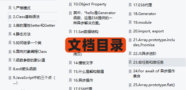
最近还整理一份JavaScript与ES的笔记,一共25个重要的知识点,对每个知识点都进行了讲解和分析。能帮你快速掌握JavaScript与ES的相关知识,提升工作效率。

有需要的小伙伴,可以点击下方卡片领取,无偿分享