本项目实现了从中国教育在线(eol.cn)的公开 API 接口爬取高校相关数据,并对数据进行清洗、分析与可视化展示。主要包括以下功能:
- 爬取高校基础信息及访问量数据
- 数据清洗与格式转换
- 多维度数据分析与可视化,如高校数量分布、热度排名、地理分布等
Part1: 爬取所查学校里面院校库的网页数据并保存为“全国大学数据.csv”文件


代码如下:
import os
import json
import time
import random
import numpy as np
import pandas as pd
import plotly as py
from time import sleep
import plotly.express as px
from bs4 import BeautifulSoup
from requests_html import HTMLSession, UserAgent
# 定义获取随机请求头的函数
def get_header():
from fake_useragent import UserAgent
location = os.getcwd() + '/fake_useragent.json'
try:
ua = UserAgent(path=location)
return ua.random
except:
# 如果无法加载配置文件,使用默认的UserAgent
return UserAgent().random
# 高校数据
def get_size(page=1):
url = 'https://api.eol.cn/gkcx/api/?access_token=&admissions=¢ral=&department=&dual_class=&f211=&f985=&is_doublehigh=&is_dual_class=&keyword=&nature=&page={0}&province_id=&ranktype=&request_type=1&school_type=&signsafe=&size=20&sort=view_total&top_school_id=[2941]&type=&uri=apidata/api/gk/school/lists'.format(
page)
session = HTMLSession()
user_agent = UserAgent().random
header = {"User-Agent": user_agent}
try:
res = session.post(url, headers=header)
res.raise_for_status() # 如果响应状态码不是200,引发HTTPError
data = json.loads(res.text)
size = 0
if data["message"] == '成功---success':
size = data["data"]["numFound"]
return size
except:
print(f"请求第 {page} 页数据时出错,返回 None")
return None
def get_university_info(size, page_size=20):
page_cnt = int(size / page_size) if size % page_size == 0 else int(size / page_size) + 1
print(f'一共{page_cnt}页数据,即将开始爬取...')
session2 = HTMLSession()
df_result = pd.DataFrame()
for index in range(1, page_cnt + 1):
print(f'正在爬取第 {index}/{page_cnt} 页数据')
url = 'https://api.eol.cn/gkcx/api/?access_token=&admissions=¢ral=&department=&dual_class=&f211=&f985=&is_doublehigh=&is_dual_class=&keyword=&nature=&page={0}&province_id=&ranktype=&request_type=1&school_type=&signsafe=&size=20&sort=view_total&top_school_id=[2941]&type=&uri=apidata/api/gk/school/lists'.format(
index)
user_agent = UserAgent().random
header = {"User-Agent": user_agent}
try:
res = session2.post(url, headers=header)
res.raise_for_status()
with open("res.text", "a+", encoding="utf-8") as file:
file.write(res.text)
data = json.loads(res.text)
if data["message"] == '成功---success':
df_data = pd.DataFrame(data["data"]["item"])
df_result = pd.concat([df_result, df_data], ignore_index=True)
time.sleep(random.randint(5, 7))
except:
print(f"处理第 {index} 页数据时出错,跳过该页")
continue
return df_result
size = get_size()
if size is not None:
df_result = get_university_info(size)
df_result.to_csv('全国大学数据.csv', encoding='gbk', index=False)
else:
print("获取数据总数量时出错,程序终止。")Part2: 用访问量排序来查询保存下来的“全国大学数据.csv”文件
效果图如下:

代码如下:
# 对数据进行处理
if not university.empty:
    university = university.loc[:, ['name', 'nature_name', 'province_name', 'belong',
                                    'city_name', 'dual_class_name', 'f211', 'f985', 'level_name',
                                    'type_name', 'view_month_number', 'view_total_number',
                                    'view_week_number', 'rank']]
    c_name = ['大学名称', '办学性质', '省份', '隶属', '城市', '高校层次',
              '211院校', '985院校', '级别', '类型', '月访问量', '总访问量', '周访问量', '排名']
    university.columns = c_name

    # 访问量排序
    print(university.sort_values(by='总访问量', ascending=False).head())
Part3: 用条形图显示全国各省的 “双一流” 和 “非双一流” 高校数量
效果图如下:
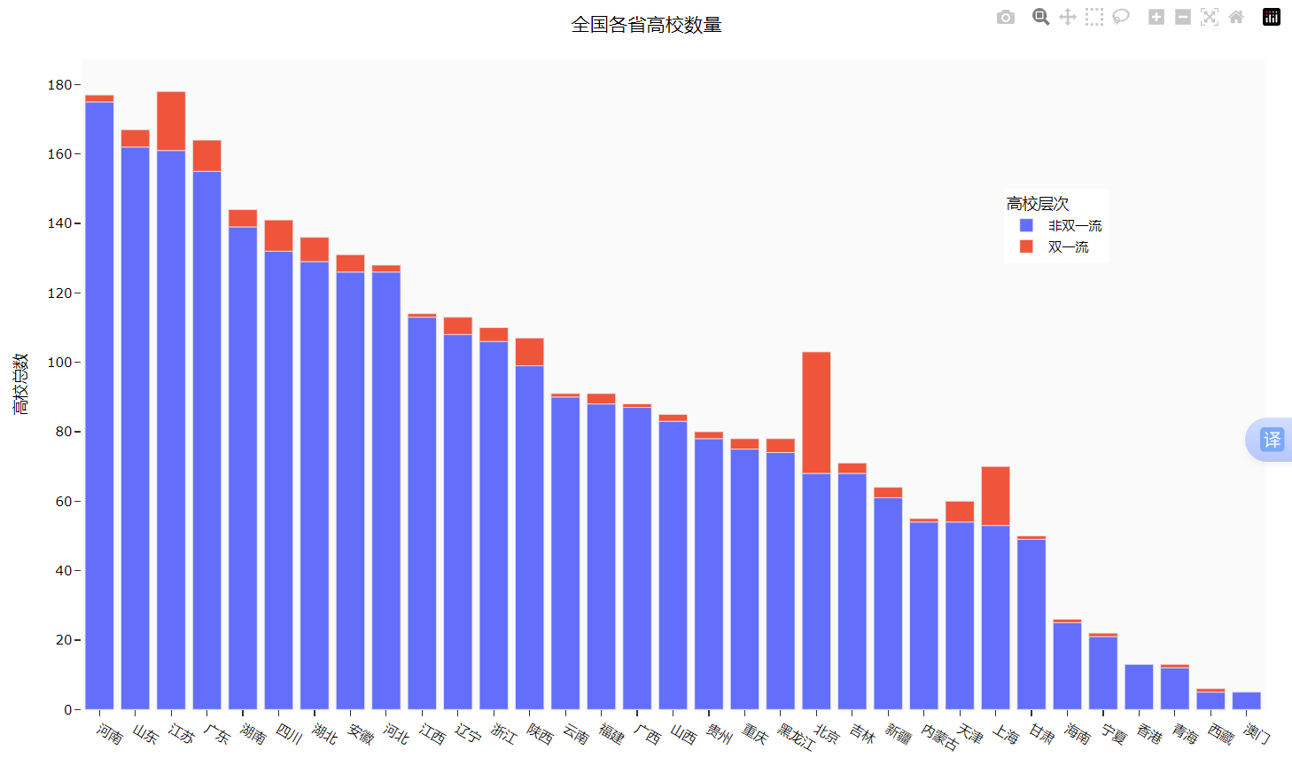
代码如下:
    # 显示全国双一流和非双一流的高校数量
    university['高校总数'] = 1
    university.fillna({'高校层次': '非双一流'}, inplace=True)
    university_by_province = university.pivot_table(index=['省份', '高校层次'],
                                                    values='高校总数', aggfunc='count')
    university_by_province.reset_index(inplace=True)
    university_by_province.sort_values(by=['高校总数'], ascending=False, inplace=True)

    # 查询全国各省高校数量
    fig = px.bar(university_by_province,
                 x="省份",
                 y="高校总数",
                 color="高校层次")
    fig.update_layout(
        title='全国各省高校数量',
        xaxis_title="省份",
        yaxis_title="高校总数",
        template='ggplot2',
        font=dict(
            size=12,
            color="Black",
        ),
        margin=dict(l=40, r=20, t=50, b=40),
        xaxis=dict(showgrid=False),
        yaxis=dict(showgrid=False),
        plot_bgcolor="#fafafa",
        legend=dict(yanchor="top",
                    y=0.8,
                    xanchor="left",
                    x=0.78)
    )
    fig.show()
Part4: 根据 “全国省市区行政区划.xlsx” 文件结合 “全国大学数据.csv” 中的经纬度生成全国高校地理分布图
    # 生成全国高校地理分布图
    try:
        df = pd.read_excel('./data/全国省市区行政区划.xlsx', header=1)
        df_l = df.query("层级==2").loc[:, ['全称', '经度', '纬度']]
        df_l = df_l.reset_index(drop=True).rename(columns={'全称': '城市'})
        df7 = university.pivot_table('大学名称', '城市', aggfunc='count')
        df7 = df7.merge(df_l, on='城市', how='left')
        df7.sort_values(by='大学名称', ascending=False)
        df7['text'] = df7['城市'] + '<br>大学总数 ' + (df7['大学名称']).astype(str) + '个'

        limits = [(0, 10), (11, 20), (21, 50), (51, 100), (101, 200)]
        colors = ["royalblue", "crimson", "lightseagreen", "orange", "red"]

        import plotly.graph_objects as go

        fig = go.Figure()
        for i in range(len(limits)):
            lim = limits[i]
            df_sub = df7[df7['大学名称'].map(lambda x: lim[0] <= x <= lim[1])]
            fig.add_trace(go.Scattergeo(
                locationmode='ISO-3',
                lon=df_sub['经度'],
                lat=df_sub['纬度'],
                text=df_sub['text'],
                marker=dict(
                    size=df_sub['大学名称'],
                    color=colors[i],
                    line_color='rgb(40, 40, 40)',
                    line_width=0.5,
                    sizemode='area'
                ),
                name='{0} - {1}'.format(lim[0], lim[1])))

        fig.update_layout(
            title_text='全国高校地理分布图',
            showlegend=True,
            geo=dict(
                scope='asia',
                landcolor='rgb(217, 217, 217)',
            ),
            template='ggplot2',
            font=dict(
                size=12,
                color="Black",
            ),
            legend=dict(yanchor="top",
                        y=1.,
                        xanchor="left",
                        x=1)
        )
        fig.show()
Part5: 针对全国高校的热度排行创建一个柱状图,并在其中创建一个散点图用来显示高校名称和周访问量。
效果图如下:
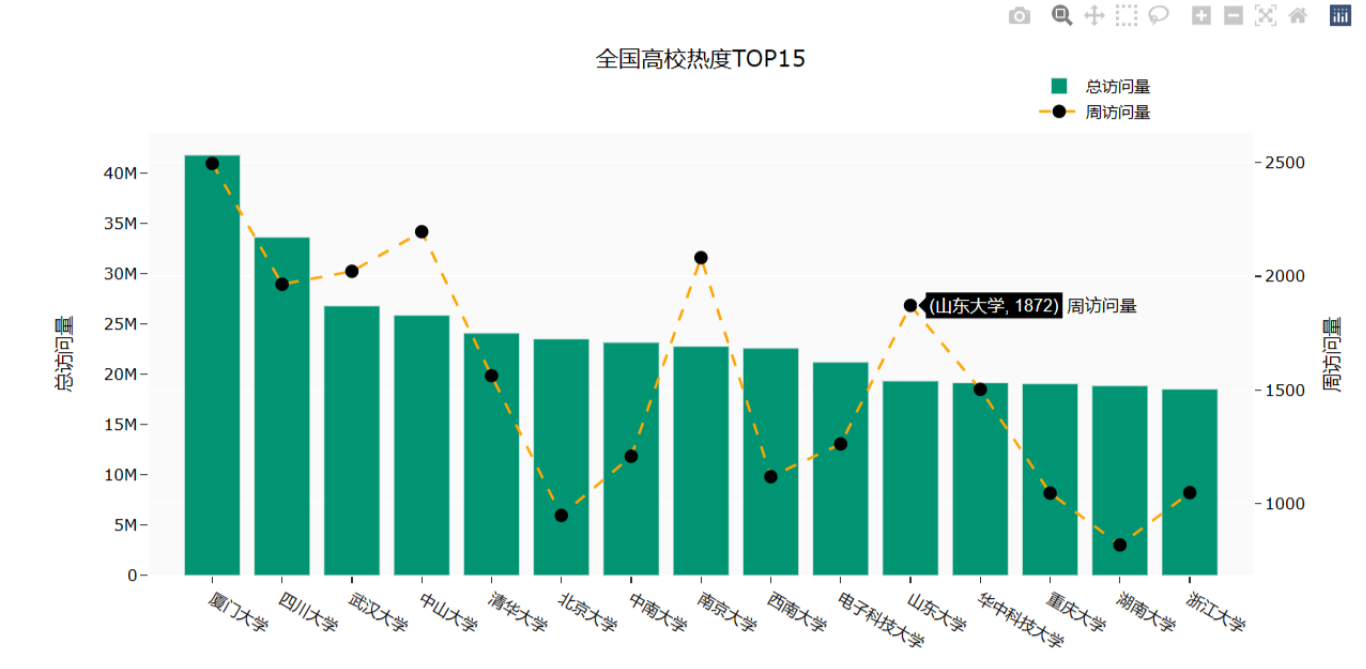
        # 全国高校热度TOP15
        import plotly.graph_objects as go

        fig = go.Figure()
        df3 = university.sort_values(by='总访问量', ascending=False)
        fig.add_trace(go.Bar(
            x=df3.loc[:15, '大学名称'],
            y=df3.loc[:15, '总访问量'],
            name='总访问量',
            marker_color='#009473',
            textposition='inside',
            yaxis='y1'
        ))
        fig.add_trace(go.Scatter(
            x=df3.loc[:15, '大学名称'],
            y=df3.loc[:15, '周访问量'],
            name='周访问量',
            mode='markers+text+lines',
            marker_color='black',
            marker_size=10,
            textposition='top center',
            line=dict(color='orange', dash='dash'),
            yaxis='y2'
        ))
        fig.update_layout(
            title='全国高校热度TOP15',
            xaxis_title="大学名称",
            yaxis_title="总访问量",
            template='ggplot2',
            font=dict(
                size=12,
                color="Black",
            ),
            xaxis=dict(showgrid=False),
            yaxis=dict(showgrid=False),
            plot_bgcolor="#fafafa",
            yaxis2=dict(showgrid=True, overlaying='y', side='right', title='周访问量'),
            legend=dict(yanchor="top",
                        y=1.15,
                        xanchor="left",
                        x=0.8)
        )
        fig.show()
Part6: 查询热度排名前十的省份内前三的学校
效果图如下:
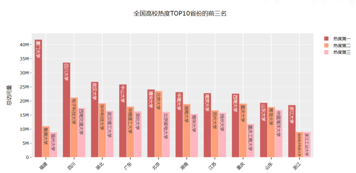
代码如下:
        # 全国高校热度TOP10省份的前三名
        df9 = university.loc[:, ['省份', '大学名称', '总访问量']]
        df9['前三'] = df9.drop_duplicates()['总访问量'].groupby(by=df9['省份']).rank(method='first',
                                                                                     ascending=False)
        df_10 = df9[df9['前三'].map(lambda x: True if x < 4 else False)]
        df_10['前三'] = df_10['前三'].astype(int)

        df_pt = df_10.pivot_table(values='总访问量', index='省份', columns='前三')
        df_pt_2 = df_pt.sort_values(by=1, ascending=False)[:10]
        df_labels_1 = df9[df9['前三'] == 1].set_index('省份').loc[df_pt_2.index, '大学名称'][:10]
        df_labels_2 = df9[df9['前三'] == 2].set_index('省份').loc[df_pt_2.index, '大学名称'][:10]
        df_labels_3 = df9[df9['前三'] == 3].set_index('省份').loc[df_pt_2.index, '大学名称'][:10]

        x = df_pt_2.index
        fig = go.Figure()
        fig.add_trace(go.Bar(
            x=x,
            y=df_pt_2[1],
            name='热度第一',
            marker_color='indianred',
            textposition='inside',
            text=df_labels_1.values,
            textangle=90
        ))
        fig.add_trace(go.Bar(
            x=x,
            y=df_pt_2[2],
            name='热度第二',
            marker_color='lightsalmon',
            textposition='inside',
            text=df_labels_2.values,
            textangle=90
        ))
        fig.add_trace(go.Bar(
            x=x,
            y=df_pt_2[3],
            name='热度第三',
            marker_color='lightpink',
            textposition='inside',
            text=df_labels_3.values,
            textangle=90
        ))
        fig.update_layout(barmode='group', xaxis_tickangle=-45)
        fig.update_layout(
            title='全国高校热度TOP10省份的前三名',
            xaxis_title="省份",
            yaxis_title="总访问量",
            template='ggplot2',
            font=dict(
                size=12,
                color="Black",
            ),
            barmode='group', xaxis_tickangle=-45
        )
        fig.show()
Part7: 查询北京市热度排名前十五的学校
效果图如下:
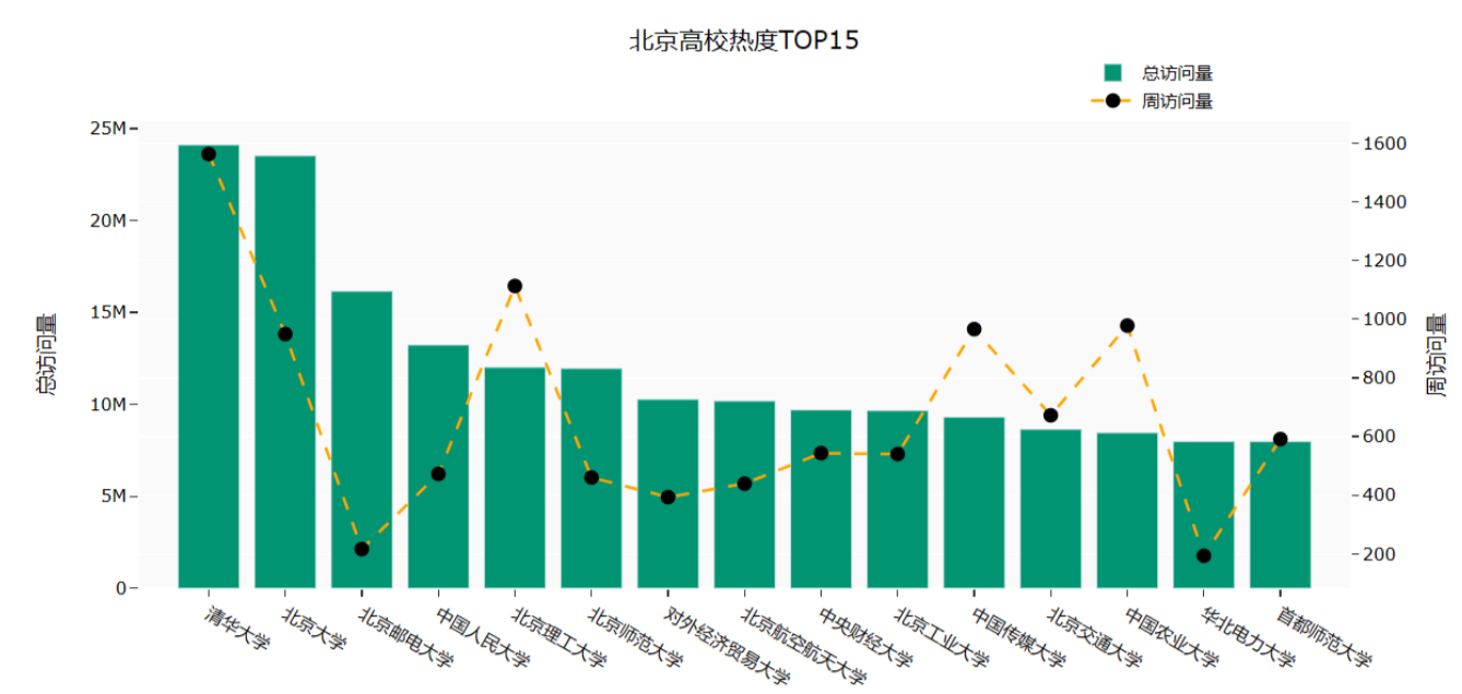
代码如下:
        # 查询北京市热度排名前十五的学校
        df_bj = university.query("高校层次 == '双一流' and 城市== '北京市'").iloc[:15, :]

        fig = go.Figure()
        df3 = university.sort_values(by='总访问量', ascending=False)

        fig.add_trace(go.Bar(
            x=df_bj['大学名称'],
            y=df_bj['总访问量'],
            name='总访问量',
            marker_color='#009473',
            textposition='inside',
            yaxis='y1'
        ))
        fig.add_trace(go.Scatter(
            x=df_bj['大学名称'],
            y=df_bj['周访问量'],
            name='周访问量',
            mode='markers+text+lines',
            marker_color='black',
            marker_size=10,
            textposition='top center',
            line=dict(color='orange', dash='dash'),
            yaxis='y2'
        ))
        fig.update_layout(
            title='北京高校热度TOP15',
            xaxis_title="大学名称",
            yaxis_title="总访问量",
            template='ggplot2',
            font=dict(size=12, color="Black", ),
            xaxis=dict(showgrid=False),
            yaxis=dict(showgrid=False),
            plot_bgcolor="#fafafa",
            yaxis2=dict(showgrid=True, overlaying='y', side='right', title='周访问量'),
            legend=dict(yanchor="top",
                        y=1.15,
                        xanchor="left",
                        x=0.78)
        )
        fig.show()
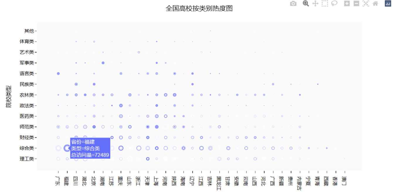
Part8: 查询全国高校按类别划分的热度图
效果图如下:
 代妈如下:
代妈如下:
        # 查询全国高校按类别划分的热度图
        df5 = university.loc[:, ['城市', '高校层次', '211院校', '985院校']]
        df5['总数'] = 1
        df5['211院校'] = df5['211院校'].map(lambda x: '是' if x == 1 else '否')
        df5['985院校'] = df5['985院校'].map(lambda x: '是' if x == 1 else '否')

        df6 = df5.pivot_table(index=['城市', '985院校'], values='总数').reset_index()

        fig = px.scatter(university,
                         x="省份", y="类型",
                         size="总访问量"
                         )
        fig.update_layout(
            title='全国高校按类别热度图',
            xaxis_title="省份",
            yaxis_title="院校类型",
            template='ggplot2',
            font=dict(
                size=12,
                color="Black",
            ),
            xaxis=dict(showgrid=False),
            yaxis=dict(showgrid=False),
            plot_bgcolor="#fafafa",
        )
        fig.show()
    except FileNotFoundError:
        print("行政区划数据文件未找到,请检查文件路径和文件名。")
else:
    print("数据读取失败,无法进行后续操作。")
爬虫全部代码如下:
import os
import json
import time
import random
import numpy as np
import pandas as pd
import plotly as py
from time import sleep
import plotly.express as px
from bs4 import BeautifulSoup
from requests_html import HTMLSession, UserAgent
# 定义获取随机请求头的函数
def get_header():
from fake_useragent import UserAgent
location = os.getcwd() + '/fake_useragent.json'
try:
ua = UserAgent(path=location)
return ua.random
except:
# 如果无法加载配置文件,使用默认的UserAgent
return UserAgent().random
# 高校数据
def get_size(page=1):
url = 'https://api.eol.cn/gkcx/api/?access_token=&admissions=¢ral=&department=&dual_class=&f211=&f985=&is_doublehigh=&is_dual_class=&keyword=&nature=&page={0}&province_id=&ranktype=&request_type=1&school_type=&signsafe=&size=20&sort=view_total&top_school_id=[2941]&type=&uri=apidata/api/gk/school/lists'.format(
page)
session = HTMLSession()
user_agent = UserAgent().random
header = {"User-Agent": user_agent}
try:
res = session.post(url, headers=header)
res.raise_for_status() # 如果响应状态码不是200,引发HTTPError
data = json.loads(res.text)
size = 0
if data["message"] == '成功---success':
size = data["data"]["numFound"]
return size
except:
print(f"请求第 {page} 页数据时出错,返回 None")
return None
def get_university_info(size, page_size=20):
page_cnt = int(size / page_size) if size % page_size == 0 else int(size / page_size) + 1
print(f'一共{page_cnt}页数据,即将开始爬取...')
session2 = HTMLSession()
df_result = pd.DataFrame()
for index in range(1, page_cnt + 1):
print(f'正在爬取第 {index}/{page_cnt} 页数据')
url = 'https://api.eol.cn/gkcx/api/?access_token=&admissions=¢ral=&department=&dual_class=&f211=&f985=&is_doublehigh=&is_dual_class=&keyword=&nature=&page={0}&province_id=&ranktype=&request_type=1&school_type=&signsafe=&size=20&sort=view_total&top_school_id=[2941]&type=&uri=apidata/api/gk/school/lists'.format(
index)
user_agent = UserAgent().random
header = {"User-Agent": user_agent}
try:
res = session2.post(url, headers=header)
res.raise_for_status()
with open("res.text", "a+", encoding="utf-8") as file:
file.write(res.text)
data = json.loads(res.text)
if data["message"] == '成功---success':
df_data = pd.DataFrame(data["data"]["item"])
df_result = pd.concat([df_result, df_data], ignore_index=True)
time.sleep(random.randint(5, 7))
except:
print(f"处理第 {index} 页数据时出错,跳过该页")
continue
return df_result
size = get_size()
if size is not None:
df_result = get_university_info(size)
df_result.to_csv('全国大学数据.csv', encoding='gbk', index=False)
else:
print("获取数据总数量时出错,程序终止。")
# 查询总访问量排序下的全国大学数据文件
# 读取数据
try:
university = pd.read_csv('D:/E盘文件/课程/大三下课程/Python/课堂练习/全国大学数据.csv', encoding='gbk')
except FileNotFoundError:
print("数据文件未找到,请检查文件路径和文件名。")
university = pd.DataFrame()
# 对数据进行处理
if not university.empty:
university = university.loc[:, ['name', 'nature_name', 'province_name', 'belong',
'city_name', 'dual_class_name', 'f211', 'f985', 'level_name',
'type_name', 'view_month_number', 'view_total_number',
'view_week_number', 'rank']]
c_name = ['大学名称', '办学性质', '省份', '隶属', '城市', '高校层次',
'211院校', '985院校', '级别', '类型', '月访问量', '总访问量', '周访问量', '排名']
university.columns = c_name
# 访问量排序
print(university.sort_values(by='总访问量', ascending=False).head())
# 显示全国双一流和非双一流的高校数量
university['高校总数'] = 1
university.fillna({'高校层次': '非双一流'}, inplace=True)
university_by_province = university.pivot_table(index=['省份', '高校层次'],
values='高校总数', aggfunc='count')
university_by_province.reset_index(inplace=True)
university_by_province.sort_values(by=['高校总数'], ascending=False, inplace=True)
# 查询全国各省高校数量
fig = px.bar(university_by_province,
x="省份",
y="高校总数",
color="高校层次")
fig.update_layout(
title='全国各省高校数量',
xaxis_title="省份",
yaxis_title="高校总数",
template='ggplot2',
font=dict(
size=12,
color="Black",
),
margin=dict(l=40, r=20, t=50, b=40),
xaxis=dict(showgrid=False),
yaxis=dict(showgrid=False),
plot_bgcolor="#fafafa",
legend=dict(yanchor="top",
y=0.8,
xanchor="left",
x=0.78)
)
fig.show()
# 生成全国高校地理分布图
try:
df = pd.read_excel('D:/E盘文件/课程/大三下课程/Python/课堂练习/全国省市区行政区划.xlsx', header=1)
df_l = df.query("层级==2").loc[:, ['全称', '经度', '纬度']]
df_l = df_l.reset_index(drop=True).rename(columns={'全称': '城市'})
df7 = university.pivot_table('大学名称', '城市', aggfunc='count')
df7 = df7.merge(df_l, on='城市', how='left')
df7.sort_values(by='大学名称', ascending=False)
df7['text'] = df7['城市'] + '<br>大学总数 ' + (df7['大学名称']).astype(str) + '个'
limits = [(0, 10), (11, 20), (21, 50), (51, 100), (101, 200)]
colors = ["royalblue", "crimson", "lightseagreen", "orange", "red"]
import plotly.graph_objects as go
fig = go.Figure()
for i in range(len(limits)):
lim = limits[i]
df_sub = df7[df7['大学名称'].map(lambda x: lim[0] <= x <= lim[1])]
fig.add_trace(go.Scattergeo(
locationmode='ISO-3',
lon=df_sub['经度'],
lat=df_sub['纬度'],
text=df_sub['text'],
marker=dict(
size=df_sub['大学名称'],
color=colors[i],
line_color='rgb(40, 40, 40)',
line_width=0.5,
sizemode='area'
),
name='{0} - {1}'.format(lim[0], lim[1])))
fig.update_layout(
title_text='全国高校地理分布图',
showlegend=True,
geo=dict(
scope='asia',
landcolor='rgb(217, 217, 217)',
),
template='ggplot2',
font=dict(
size=12,
color="Black",
),
legend=dict(yanchor="top",
y=1.,
xanchor="left",
x=1)
)
fig.show()
# 全国高校热度TOP15
import plotly.graph_objects as go
fig = go.Figure()
df3 = university.sort_values(by='总访问量', ascending=False)
fig.add_trace(go.Bar(
x=df3.loc[:15, '大学名称'],
y=df3.loc[:15, '总访问量'],
name='总访问量',
marker_color='#009473',
textposition='inside',
yaxis='y1'
))
fig.add_trace(go.Scatter(
x=df3.loc[:15, '大学名称'],
y=df3.loc[:15, '周访问量'],
name='周访问量',
mode='markers+text+lines',
marker_color='black',
marker_size=10,
textposition='top center',
line=dict(color='orange', dash='dash'),
yaxis='y2'
))
fig.update_layout(
title='全国高校热度TOP15',
xaxis_title="大学名称",
yaxis_title="总访问量",
template='ggplot2',
font=dict(
size=12,
color="Black",
),
xaxis=dict(showgrid=False),
yaxis=dict(showgrid=False),
plot_bgcolor="#fafafa",
yaxis2=dict(showgrid=True, overlaying='y', side='right', title='周访问量'),
legend=dict(yanchor="top",
y=1.15,
xanchor="left",
x=0.8)
)
fig.show()
# 全国高校热度TOP10省份的前三名
df9 = university.loc[:, ['省份', '大学名称', '总访问量']]
df9['前三'] = df9.drop_duplicates()['总访问量'].groupby(by=df9['省份']).rank(method='first',
ascending=False)
df_10 = df9[df9['前三'].map(lambda x: True if x < 4 else False)]
df_10['前三'] = df_10['前三'].astype(int)
df_pt = df_10.pivot_table(values='总访问量', index='省份', columns='前三')
df_pt_2 = df_pt.sort_values(by=1, ascending=False)[:10]
df_labels_1 = df9[df9['前三'] == 1].set_index('省份').loc[df_pt_2.index, '大学名称'][:10]
df_labels_2 = df9[df9['前三'] == 2].set_index('省份').loc[df_pt_2.index, '大学名称'][:10]
df_labels_3 = df9[df9['前三'] == 3].set_index('省份').loc[df_pt_2.index, '大学名称'][:10]
x = df_pt_2.index
fig = go.Figure()
fig.add_trace(go.Bar(
x=x,
y=df_pt_2[1],
name='热度第一',
marker_color='indianred',
textposition='inside',
text=df_labels_1.values,
textangle=90
))
fig.add_trace(go.Bar(
x=x,
y=df_pt_2[2],
name='热度第二',
marker_color='lightsalmon',
textposition='inside',
text=df_labels_2.values,
textangle=90
))
fig.add_trace(go.Bar(
x=x,
y=df_pt_2[3],
name='热度第三',
marker_color='lightpink',
textposition='inside',
text=df_labels_3.values,
textangle=90
))
fig.update_layout(barmode='group', xaxis_tickangle=-45)
fig.update_layout(
title='全国高校热度TOP10省份的前三名',
xaxis_title="省份",
yaxis_title="总访问量",
template='ggplot2',
font=dict(
size=12,
color="Black",
),
barmode='group', xaxis_tickangle=-45
)
fig.show()
# 查询北京市热度排名前十五的学校
df_bj = university.query("高校层次 == '双一流' and 城市== '北京市'").iloc[:15, :]
fig = go.Figure()
df3 = university.sort_values(by='总访问量', ascending=False)
fig.add_trace(go.Bar(
x=df_bj['大学名称'],
y=df_bj['总访问量'],
name='总访问量',
marker_color='#009473',
textposition='inside',
yaxis='y1'
))
fig.add_trace(go.Scatter(
x=df_bj['大学名称'],
y=df_bj['周访问量'],
name='周访问量',
mode='markers+text+lines',
marker_color='black',
marker_size=10,
textposition='top center',
line=dict(color='orange', dash='dash'),
yaxis='y2'
))
fig.update_layout(
title='北京高校热度TOP15',
xaxis_title="大学名称",
yaxis_title="总访问量",
template='ggplot2',
font=dict(size=12, color="Black", ),
xaxis=dict(showgrid=False),
yaxis=dict(showgrid=False),
plot_bgcolor="#fafafa",
yaxis2=dict(showgrid=True, overlaying='y', side='right', title='周访问量'),
legend=dict(yanchor="top",
y=1.15,
xanchor="left",
x=0.78)
)
fig.show()
# 查询全国高校按类别划分的热度图
df5 = university.loc[:, ['城市', '高校层次', '211院校', '985院校']]
df5['总数'] = 1
df5['211院校'] = df5['211院校'].map(lambda x: '是' if x == 1 else '否')
df5['985院校'] = df5['985院校'].map(lambda x: '是' if x == 1 else '否')
df6 = df5.pivot_table(index=['城市', '985院校'], values='总数').reset_index()
fig = px.scatter(university,
x="省份", y="类型",
size="总访问量"
)
fig.update_layout(
title='全国高校按类别热度图',
xaxis_title="省份",
yaxis_title="院校类型",
template='ggplot2',
font=dict(
size=12,
color="Black",
),
xaxis=dict(showgrid=False),
yaxis=dict(showgrid=False),
plot_bgcolor="#fafafa",
)
fig.show()
except FileNotFoundError:
print("行政区划数据文件未找到,请检查文件路径和文件名。")
else:
print("数据读取失败,无法进行后续操作。")