因上篇 Element-UI自学实践(一) 文字过多,不便于观看,故另起一篇。
5. 反馈组件
反馈组件用于与用户进行交互,提供即时反馈,包括警告(Alert)、消息提示(Message)、消息弹窗(MessageBox)、通知(Notification)、对话框(Dialog)、抽屉(Drawer)等。
Alert 警告
<el-alert> 用于页面中展示提示信息。
type:指定样式,success、info、warning、error,默认为info。effect:改变主题,light、darkshow-icon:显示 Alert 的 iconcenter:文字水平居中description:帮助你更好地介绍,我们称之为辅助性文字。
<template>
<div>
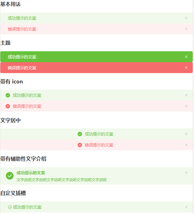
<h3>基本用法</h3>
<el-alert title="成功提示的文案" type="success"> </el-alert>
<el-alert title="错误提示的文案" type="error"> </el-alert>
<h3>主题</h3>
<el-alert title="成功提示的文案" type="success" effect="dark"> </el-alert>
<el-alert title="错误提示的文案" type="error" effect="dark"> </el-alert>
<h3>带有 icon</h3>
<el-alert title="成功提示的文案" type="success" show-icon> </el-alert>
<el-alert title="错误提示的文案" type="error" show-icon> </el-alert>
<h3>文字居中</h3>
<el-alert title="成功提示的文案" type="success" show-icon center></el-alert>
<el-alert title="错误提示的文案" type="error" show-icon center> </el-alert>
<h3>带有辅助性文字介绍</h3>
<el-alert title="成功提示的文案" type="success" show-icon
description="文字说明文字说明文字说明文字说明文字说明文字说明"
>
</el-alert>
<h3>自定义插槽</h3>
<el-alert type="success">
<template slot="title">
<i class="el-icon-circle-check"></i>
成功提示的文案
</template>
</el-alert>
</div>
</template>
<script>
export default {
name: "HomeView",
data() {
return {};
},
};
</script>
Message 消息提示
this.$message() 方法常用于主动操作后的反馈提示。
type:指定样式,success、info、warning、error,默认为info。showClose:可以人工关闭center:文字水平居中dangerouslyUseHTMLString:设置为true,message就会被当作HTML片段处理。
<template>
<div>
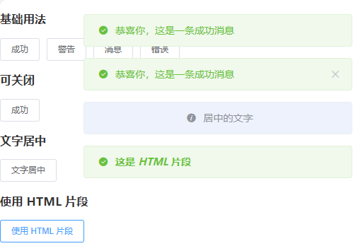
<h3>基础用法</h3>
<el-button :plain="true" @click="open1">成功</el-button>
<el-button :plain="true" @click="open2">警告</el-button>
<el-button :plain="true" @click="open3">消息</el-button>
<el-button :plain="true" @click="open4">错误</el-button>
<h3>可关闭</h3>
<el-button :plain="true" @click="open5">成功</el-button>
<h3>文字居中</h3>
<el-button :plain="true" @click="openCenter">文字居中</el-button>
<h3>使用 HTML 片段</h3>
<el-button :plain="true" @click="openHTML">使用 HTML 片段</el-button>
</div>
</template>
<script>
export default {
name: "HomeView",
methods: {
open1() {
this.$message({
message: "恭喜你,这是一条成功消息",
type: "success",
});
},
open2() {
this.$message({
message: "警告哦,这是一条警告消息",
type: "warning",
});
},
open3() {
this.$message("这是一条消息提示");
},
open4() {
this.$message.error("错了哦,这是一条错误消息");
},
open5() {
this.$message({
showClose: true,
message: "恭喜你,这是一条成功消息",
type: "success",
});
},
openCenter() {
this.$message({
message: "居中的文字",
center: true,
});
},
openHTML() {
this.$message({
dangerouslyUseHTMLString: true,
message: "<strong>这是 <i>HTML</i> 片段</strong>",
type: "success"
});
}
},
};
</script>
Notification 通知
this.$notify() 悬浮出现在页面角落,显示全局的通知提醒消息。接收一个 options 对象参数,可以设置 title 字段和 message 字段,用于设置通知的标题和正文。
默认情况下,经过一段时间后 Notification 组件会自动关闭,但是通过设置 duration,可以控制关闭的时间间隔,特别的是,如果设置为 0,则不会自动关闭。
type:指定样式,success、info、warning、error,默认为info。showClose:可以人工关闭position:定义 Notification 的弹出位置,top-right、top-left、bottom-right、bottom-left,默认为top-rightdangerouslyUseHTMLString:设置为true,message就会被当作HTML片段处理。
<template>
<div>
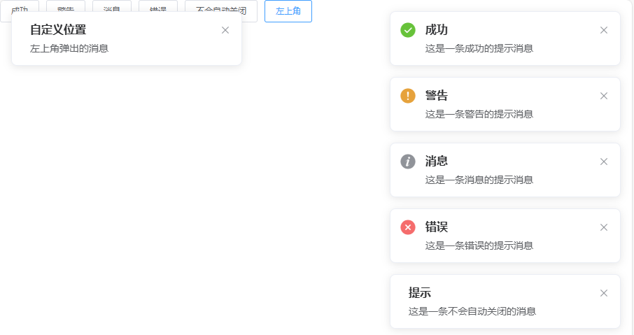
<el-button plain @click="open1"> 成功 </el-button>
<el-button plain @click="open2"> 警告 </el-button>
<el-button plain @click="open3"> 消息 </el-button>
<el-button plain @click="open4"> 错误 </el-button>
<el-button plain @click="open5"> 不会自动关闭 </el-button>
<el-button plain @click="open6"> 左上角 </el-button>
</div>
</div>
</template>
<script>
export default {
name: "HomeView",
methods: {
open1() {
this.$notify({
title: "成功",
message: "这是一条成功的提示消息",
type: "success",
});
},
open2() {
this.$notify({
title: "警告",
message: "这是一条警告的提示消息",
type: "warning",
});
},
open3() {
this.$notify.info({
title: "消息",
message: "这是一条消息的提示消息",
});
},
open4() {
this.$notify.error({
title: "错误",
message: "这是一条错误的提示消息",
});
},
open5() {
this.$notify({
title: "提示",
message: "这是一条不会自动关闭的消息",
duration: 0
});
},
open6() {
this.$notify({
title: '自定义位置',
message: '左上角弹出的消息',
position: 'top-left'
});
}
},
};
</script>
MessageBox 弹出框
MessageBox 弹出框实现的一套模态对话框组件,用于 alert(消息提示)、confirm(确认消息)和 prompt(提交内容),适合展示较为简单的内容。如果需要弹出较为复杂的内容,请使用 Dialog。
$alter:提示弹出框,只有一个确定按钮$confirm:确认弹出框,有两个按钮:确定和取消,分别返回true和false$prompt:提交弹出框,确定,取消,输入框,确定返回输入框的值(不输入为空),取消返回Null
消息提示
调用 $alert 方法即可打开消息提示,接收了两个参数,message 和 title。默认会返回一个 Promise 对象便于进行后续操作的处理。
<template>
  <div>
    <el-button type="text" @click="open">点击打开 Message Box</el-button>
  </div>
</template>

<script>
export default {
  name: "HomeView",
  methods: {
    open() {
      this.$alert("这是一段内容", "标题名称", {
        confirmButtonText: '确定',
        type: "warning",
      }).then(() => {
        this.$message({
          type: "success",
          message: "删除成功!",
        });
      }).catch(() => {
        this.$message({
          type: "info",
          message: "已取消删除",
        });
      });
    }
  }
};
</script>
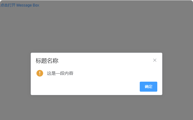
点击 “确认”,弹出 “删除成功!”;点击 “x”,弹出 “已取消删除”。
确认消息
调用 $confirm 方法即可打开确认消息,我们可以传入 options 作为第三个参数,它是一个字面量对象。
<template>
  <div>
    <el-button type="text" @click="open">点击打开 Message Box</el-button>
  </div>
</template>

<script>
export default {
  name: "HomeView",
  methods: {
    open() {
      this.$confirm("此操作将永久删除该文件, 是否继续?", "提示", {
        confirmButtonText: '确定',
        cancelButtonText: '取消',
        type: 'warning'
      }).then(() => {
        this.$message({
          type: "success",
          message: "删除成功!",
        });
      }).catch(() => {
        this.$message({
          type: "info",
          message: "已取消删除",
        });
      });
    }
  }
};
</script>
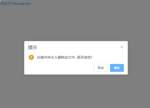
点击 “确认”,弹出 “删除成功!”;点击 “x” 或者 “取消”,弹出 “已取消删除”。
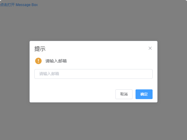
提交内容
调用 $prompt 方法即可打开提交内容提示,可以用 inputPattern 字段自己规定匹配模式,或者用 inputValidator 规定校验函数,可以返回 Boolean 或 String,返回 false 或字符串时均表示校验未通过,同时返回的字符串相当于定义了 inputErrorMessage 字段。此外,可以用 inputPlaceholder 字段来定义输入框的占位符。
<template>
  <div>
    <el-button type="text" @click="open">点击打开 Message Box</el-button>
  </div>
</template>

<script>
export default {
  name: "HomeView",
  methods: {
    open() {
      this.$prompt("请输入邮箱", "提示", {
        confirmButtonText: '确定',
        cancelButtonText: '取消',
        inputPlaceholder: '请输入邮箱',
        inputPattern: /[\w!#$%&'*+/=?^_`{|}~-]+(?:\.[\w!#$%&'*+/=?^_`{|}~-]+)*@(?:[\w](?:[\w-]*[\w])?\.)+[\w](?:[\w-]*[\w])?/,
        inputErrorMessage: '邮箱格式不正确',
        type: 'warning'
      }).then(({ value }) => {
        this.$message({
          type: "success",
          message: '你的邮箱是: ' + value
        });
      }).catch(() => {
        this.$message({
          type: "info",
          message: '取消输入'
        });
      });
    }
  }
};
</script>
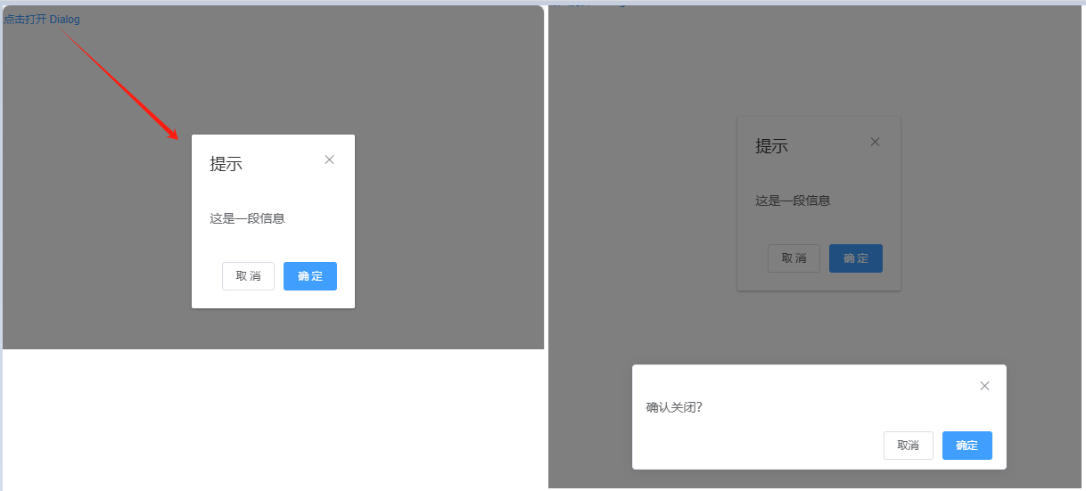
Dialog 对话框
<el-dialog> 在保留当前页面状态的情况下,弹出用户交互页面。Dialog 分为两个部分:body 和 footer,footer 需要具名为 footer 的 slot。
title:定义标题visible:Boolean,为true时显示 Dialogbefore-close:仅当用户通过点击关闭图标或遮罩关闭 Dialog 时起效。如果你在footer具名slot里添加了用于关闭 Dialog 的按钮,那么可以在按钮的点击回调函数里加入before-close的相关逻辑。
<template>
  <div>
    <el-button type="text" @click="dialogVisible = true">点击打开 Dialog</el-button>

    <el-dialog
      title="提示"
      :visible.sync="dialogVisible"
      width="30%"
      :before-close="handleClose"
    >
      <!-- body -->
      <span>这是一段信息</span>
      <!-- footer -->
      <span slot="footer" class="dialog-footer">
        <el-button @click="dialogVisible = false">取 消</el-button>
        <el-button type="primary" @click="dialogVisible = false">确 定</el-button>
      </span>
    </el-dialog>
  </div>
</template>
<script>
export default {
  data() {
    return {
      dialogVisible: false
    };
  },
  methods: {
    handleClose(done) {
      this.$confirm("确认关闭?")
        .then(() => {
          done();
        })
        .catch(() => {});
    }
  }
};
</script>
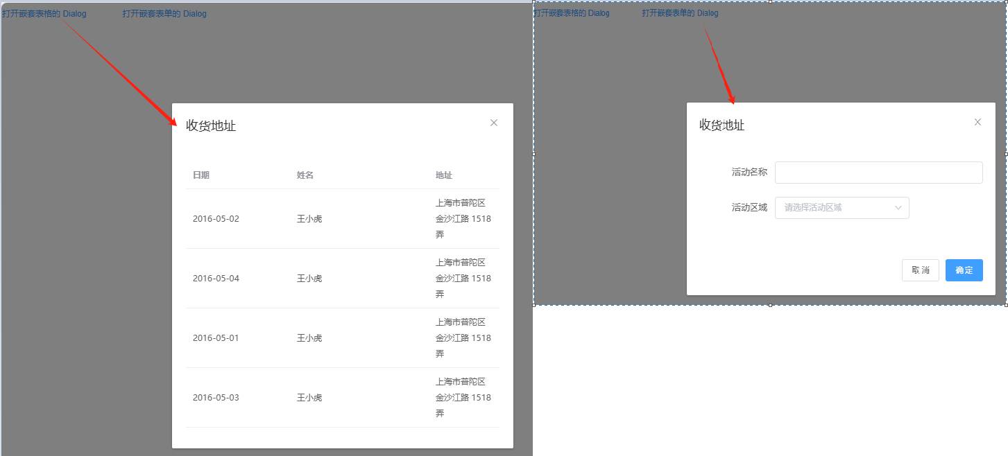
自定义内容
Dialog 组件的内容可以是任意的,甚至可以是表格或表单。
<template>
  <div>
    <!-- Table -->
    <el-button type="text" @click="dialogTableVisible = true">打开嵌套表格的 Dialog</el-button>

    <el-dialog title="收货地址" :visible.sync="dialogTableVisible">
      <el-table :data="gridData">
        <el-table-column property="date" label="日期" width="150"></el-table-column>
        <el-table-column property="name" label="姓名" width="200"></el-table-column>
        <el-table-column property="address" label="地址"></el-table-column>
      </el-table>
    </el-dialog>

    <!-- Form -->
    <el-button type="text" @click="dialogFormVisible = true" style="margin-left:50px;">打开嵌套表单的 Dialog</el-button>

    <el-dialog title="收货地址" :visible.sync="dialogFormVisible">
      <el-form :model="form">
        <el-form-item label="活动名称" :label-width="formLabelWidth">
          <el-input v-model="form.name" autocomplete="off"></el-input>
        </el-form-item>
        <el-form-item label="活动区域" :label-width="formLabelWidth">
          <el-select v-model="form.region" placeholder="请选择活动区域">
            <el-option label="区域一" value="shanghai"></el-option>
            <el-option label="区域二" value="beijing"></el-option>
          </el-select>
        </el-form-item>
      </el-form>
      <div slot="footer" class="dialog-footer">
        <el-button @click="dialogFormVisible = false">取 消</el-button>
        <el-button type="primary" @click="dialogFormVisible = false">确 定</el-button>
      </div>
    </el-dialog>
  </div>
</template>
<script>
export default {
  data() {
    return {
      dialogTableVisible: false,
      dialogFormVisible: false,
      gridData: [{
          date: "2016-05-02",
          name: "王小虎",
          address: "上海市普陀区金沙江路 1518 弄",
        },{
          date: "2016-05-04",
          name: "王小虎",
          address: "上海市普陀区金沙江路 1518 弄",
        },{
          date: "2016-05-01",
          name: "王小虎",
          address: "上海市普陀区金沙江路 1518 弄",
        },{
          date: "2016-05-03",
          name: "王小虎",
          address: "上海市普陀区金沙江路 1518 弄",
      }],
      form: {
        name: "",
        region: ""
      },
      formLabelWidth: "120px",
    };
  }
};
</script>
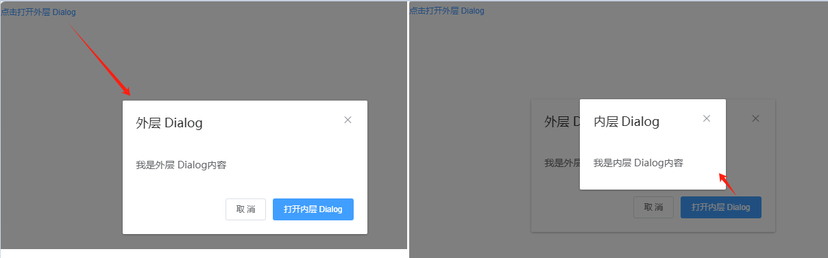
嵌套的 Dialog
如果需要在一个 Dialog 内部嵌套另一个 Dialog,需要使用 append-to-body 属性。
正常情况下,我们不建议使用嵌套的 Dialog,如果需要在页面上同时显示多个 Dialog,可以将它们平级放置。对于确实需要嵌套 Dialog 的场景,我们提供了 append-to-body 属性。
<template>
  <div>
    <el-button type="text" @click="outerVisible = true">点击打开外层 Dialog</el-button>

    <el-dialog title="外层 Dialog" :visible.sync="outerVisible">
      <el-dialog
        width="30%"
        title="内层 Dialog"
        :visible.sync="innerVisible"
        append-to-body
      >
      <span>我是内层 Dialog内容</span>
      </el-dialog>

      <span>我是外层 Dialog内容</span>
      <div slot="footer" class="dialog-footer">
        <el-button @click="outerVisible = false">取 消</el-button>
        <el-button type="primary" @click="innerVisible = true">打开内层 Dialog</el-button>
      </div>
    </el-dialog>
  </div>
</template>

<script>
export default {
  name: "HomeView",
  data() {
    return {
      outerVisible: false,
      innerVisible: false,
    };
  },
};
</script>
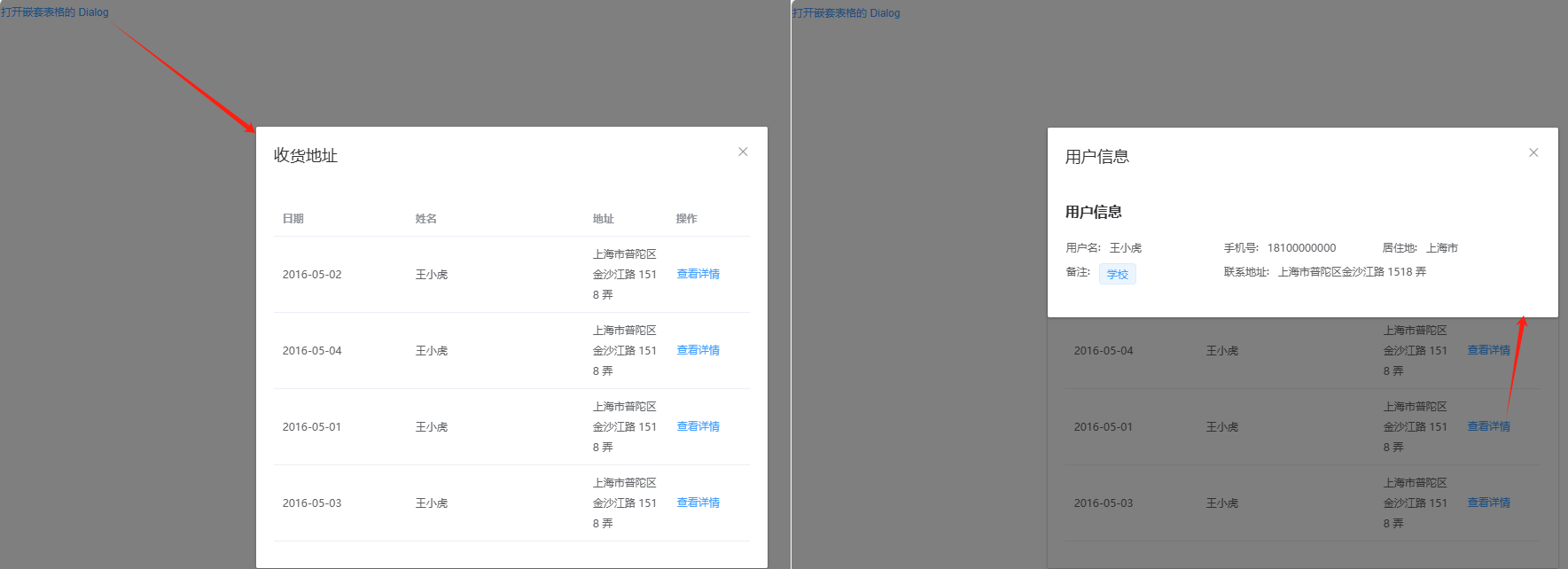
嵌套平级放置 Dialog
<template>
  <div>
    <el-button type="text" @click="dialogTableVisible = true">打开嵌套表格的 Dialog</el-button>

    <el-dialog title="收货地址" :visible.sync="dialogTableVisible">
      <el-table :data="gridData">
        <el-table-column property="date" label="日期" width="150"></el-table-column>
        <el-table-column property="name" label="姓名" width="200"></el-table-column>
        <el-table-column property="address" label="地址"></el-table-column>
        <el-table-column label="操作">
          <template slot-scope="scope">
            <el-button type="text" @click="innerVisible = true">查看详情</el-button>
          </template>
        </el-table-column>
      </el-table>
    </el-dialog>

    <el-dialog title="用户信息" :visible.sync="innerVisible">
      <el-descriptions title="用户信息">
        <el-descriptions-item label="用户名">王小虎</el-descriptions-item>
        <el-descriptions-item label="手机号">18100000000</el-descriptions-item>
        <el-descriptions-item label="居住地">上海市</el-descriptions-item>
        <el-descriptions-item label="备注">
          <el-tag size="small">学校</el-tag>
        </el-descriptions-item>
        <el-descriptions-item label="联系地址">上海市普陀区金沙江路 1518 弄</el-descriptions-item>
      </el-descriptions>
    </el-dialog>
  </div>
</template>

<script>
export default {
  name: "HomeView",
  data() {
    return {
      dialogTableVisible: false,
      innerVisible: false,
      gridData: [{
          date: "2016-05-02",
          name: "王小虎",
          address: "上海市普陀区金沙江路 1518 弄",
        },{
          date: "2016-05-04",
          name: "王小虎",
          address: "上海市普陀区金沙江路 1518 弄",
        },{
          date: "2016-05-01",
          name: "王小虎",
          address: "上海市普陀区金沙江路 1518 弄",
        },{
          date: "2016-05-03",
          name: "王小虎",
          address: "上海市普陀区金沙江路 1518 弄",
      }]
    };
  }
};
</script>
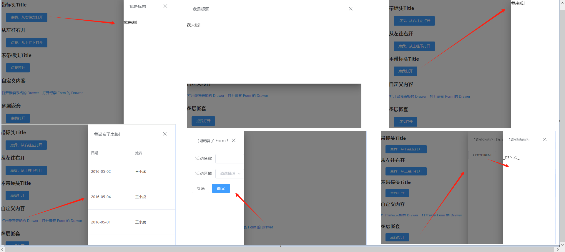
Drawer 抽屉
有些时候,<el-dialog> 组件并不满足我们的需求,比如你的表单很长,亦或是你需要临时展示一些文档,<el-drawer> 拥有和 <el-dialog>几乎相同的 API,在 UI 上带来不一样的体验。
<el-drawer> 在保留当前页面状态的情况下,弹出用户交互页面。Drawer 分为两个部分:title 和 body,title 需要具名为 title 的 slot。需要注意的是, Drawer 默认是从右往左打开, 当然可以设置对应的 direction。
title:定义标题withHeader:控制是否显示 header 栏, 默认为true,当此项为 false 时,title attribute 和 title slot 均不生效visible:Boolean,为true时显示 Drawerdirection:Drawer 打开的方向,rtl / ltr / ttb / btt,默认rtl(从右往左打开)before-close:仅当用户通过点击关闭图标或遮罩关闭 Drawer 时起效。可以在按钮的点击回调函数里加入before-close的相关逻辑。closeDrawer:用于关闭 Drawer, 该方法会调用传入的before-close方法
<template>
  <div>
    <h3>带标头Title</h3>
    <el-button @click="drawer = true" type="primary" style="margin-left: 16px">
      点我,从右往左打开
    </el-button>
    <el-drawer
      title="我是标题"
      :visible.sync="drawer"
      direction="rtl"
      :before-close="handleClose"
    >
      <span>我来啦!</span>
    </el-drawer>

    <h3>从左往右开</h3>
    <el-button @click="drawer2 = true" type="primary" style="margin-left: 16px">
      点我,从上往下打开
    </el-button>
    <el-drawer
      title="我是标题"
      :visible.sync="drawer2"
      direction="ttb"
      :before-close="handleClose"
    >
      <span>我来啦!</span>
    </el-drawer>

    <h3>不带标头Title</h3>
    <el-button @click="drawer3 = true" type="primary" style="margin-left: 16px">
      点我打开
    </el-button>
    <el-drawer title="我是标题" :visible.sync="drawer3" :with-header="false">
      <span>我来啦!</span>
    </el-drawer>

    <h3>自定义内容</h3>
    <el-button type="text" @click="table = true">打开嵌套表格的 Drawer</el-button>
    <el-button type="text" @click="dialog = true">打开嵌套 Form 的 Drawer</el-button>
    <el-drawer
      title="我嵌套了表格!"
      :visible.sync="table"
      direction="rtl"
      size="50%"
    >
      <el-table :data="gridData">
        <el-table-column property="date" label="日期" width="150" ></el-table-column>
        <el-table-column property="name" label="姓名" width="200" ></el-table-column>
        <el-table-column property="address" label="地址"></el-table-column>
      </el-table>
    </el-drawer>

    <el-drawer
      title="我嵌套了 Form !"
      :before-close="handleClose"
      :visible.sync="dialog"
      direction="ltr"
      custom-class="demo-drawer"
      ref="drawer"
    >
      <div class="demo-drawer__content">
        <el-form :model="form">
          <el-form-item label="活动名称" :label-width="formLabelWidth">
            <el-input v-model="form.name" autocomplete="off"></el-input>
          </el-form-item>
          <el-form-item label="活动区域" :label-width="formLabelWidth">
            <el-select v-model="form.region" placeholder="请选择活动区域">
              <el-option label="区域一" value="shanghai"></el-option>
              <el-option label="区域二" value="beijing"></el-option>
            </el-select>
          </el-form-item>
        </el-form>
        <div class="demo-drawer__footer">
          <el-button @click="cancelForm">取 消</el-button>
          <el-button type="primary" @click="$refs.drawer.closeDrawer()" :loading="loading" >{{ loading ? "提交中 ..." : "确 定" }}</el-button>
        </div>
      </div>
    </el-drawer>

    <h3>多层嵌套</h3>
    <el-button @click="drawer4 = true" type="primary" style="margin-left: 16px">
      点我打开
    </el-button>
    <el-drawer title="我是外面的 Drawer" :visible.sync="drawer4" size="50%">
      <div>
        <el-button @click="innerDrawer = true">打开里面的!</el-button>
        <el-drawer
          title="我是里面的"
          :append-to-body="true"
          :before-close="handleClose"
          :visible.sync="innerDrawer"
        >
          <p>_(:зゝ∠)_</p>
        </el-drawer>
      </div>
    </el-drawer>
  </div>
</template>

<script>
export default {
  name: "HomeView",
  data() {
    return {
      drawer: false,
      drawer2: false,
      drawer3: false,
      drawer4: false,
      table: false,
      dialog: false,
      loading: false,
      innerDrawer: false,
      gridData: [{
        date: "2016-05-02",
        name: "王小虎",
        address: "上海市普陀区金沙江路 1518 弄",
      },{
        date: "2016-05-04",
        name: "王小虎",
        address: "上海市普陀区金沙江路 1518 弄",
      },{
        date: "2016-05-01",
        name: "王小虎",
        address: "上海市普陀区金沙江路 1518 弄",
      },{
        date: "2016-05-03",
        name: "王小虎",
        address: "上海市普陀区金沙江路 1518 弄",
      }],
      form: {
        name: "",
        region: "",
      },
      formLabelWidth: "80px",
      timer: null,
    };
  },
  methods: {
    handleClose(done) {
      this.$confirm("确认关闭?")
        .then((_) => {
          done();
        })
        .catch((_) => {});
    },
    cancelForm() {
      this.loading = false;
      this.dialog = false;
      clearTimeout(this.timer);
    }
  }
};
</script>
6. 其他组件
如加载(Loading)、文字提示(Tooltip)、弹出框(Popover)、确认框(Popconfirm)、卡片(Card)、折叠面板(Collapse)、时间线(Timeline)、分割线(Divider)、无限滚动(InfiniteScroll)等。
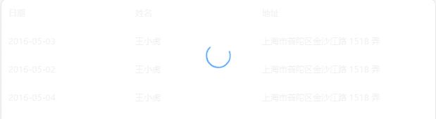
Loading 加载
组件通过自定义指令 v-loading 使用加载层,绑定 Boolean 即可。默认状况下,Loading 遮罩会插入到绑定元素的子节点,通过添加 body 修饰符,可以使遮罩插入至 DOM 中的 body 上。
<template>
  <div>
    <el-table v-loading="loading" :data="tableData" style="width: 100%">
      <el-table-column prop="date" label="日期" width="180"> </el-table-column>
      <el-table-column prop="name" label="姓名" width="180"> </el-table-column>
      <el-table-column prop="address" label="地址"> </el-table-column>
    </el-table>
  </div>
</template>

<script>
export default {
  name: "HomeView",
  data() {
    return {
      loading: true,
      tableData: [
        {
          date: "2016-05-03",
          name: "王小虎",
          address: "上海市普陀区金沙江路 1518 弄",
        },
        {
          date: "2016-05-02",
          name: "王小虎",
          address: "上海市普陀区金沙江路 1518 弄",
        },
        {
          date: "2016-05-04",
          name: "王小虎",
          address: "上海市普陀区金沙江路 1518 弄",
        },
      ]
    };
  },
};
</script>
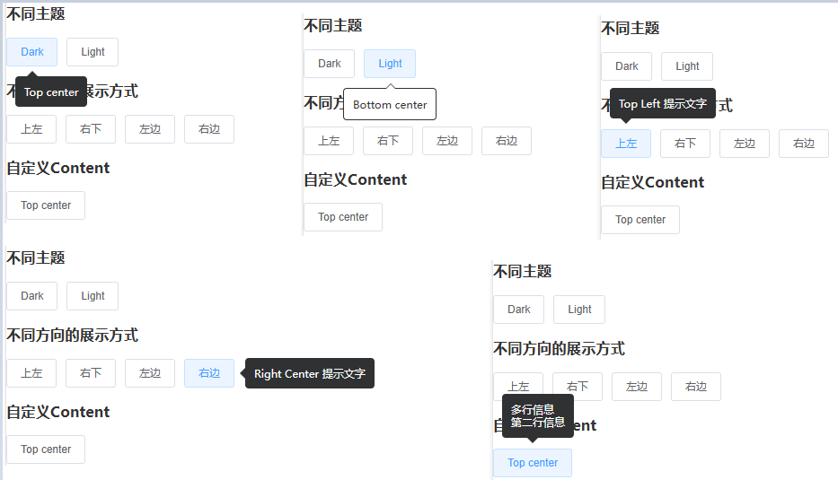
Tooltip 文字提示
<el-tooltip> 常用于展示鼠标 hover 时的提示信息。
content:决定hover时的提示信息。placement:Tooltip 的出现位置effect:提供的主题,dark/light,默认为dark。
<template>
  <div>
    <h3>不同主题</h3>
    <el-tooltip content="Top center" placement="top">
      <el-button>Dark</el-button>
    </el-tooltip>
    <el-tooltip content="Bottom center" placement="bottom" effect="light">
      <el-button>Light</el-button>
    </el-tooltip>

    <h3>不同方向的展示方式</h3>
    <el-tooltip effect="dark" content="Top Left 提示文字" placement="top-start">
      <el-button>上左</el-button>
    </el-tooltip>
    <el-tooltip effect="dark" content="Right Bottom 提示文字" placement="right-end">
      <el-button>右下</el-button>
    </el-tooltip>
    <el-tooltip effect="dark" content="Left Center 提示文字" placement="left">
      <el-button>左边</el-button>
    </el-tooltip>
    <el-tooltip class="item" effect="dark" content="Right Center 提示文字" placement="right">
      <el-button>右边</el-button>
    </el-tooltip>

    <h3>自定义Content</h3>
    <el-tooltip placement="top">
      <div slot="content">多行信息<br />第二行信息</div>
      <el-button>Top center</el-button>
    </el-tooltip>
  </div>
</template>

<script>
export default {
  name: "HomeView"
};
</script>
Popover 弹出框
<el-popover> 与 <el-tooltip>很类似,它们都是基于 Vue-popper 开发的,很多属性类似。以下列出 <el-popover> 常用属性:
trigger:用于设置何时触发 Popover,hover、click、focus、manual。默认click。对于触发 Popover 的元素,有两种写法:使用slot="reference"的具名插槽,或使用自定义指令v-popover指向 Popover 的索引ref。content:嵌套多种类型信息value / v-model:状态是否可见,Boolean,默认false。
<template>
  <div>
    <el-popover
      placement="top-start"
      title="标题"
      width="200"
      trigger="hover"
      content="这是一段内容,这是一段内容,这是一段内容,这是一段内容。">
      <el-button slot="reference">hover 激活</el-button>
    </el-popover>

    <el-popover
      placement="bottom"
      title="标题"
      width="200"
      trigger="click"
      content="这是一段内容,这是一段内容,这是一段内容,这是一段内容。">
      <el-button v-popover:popover>click 激活</el-button>
    </el-popover>

    <h3>嵌套信息</h3>
    <el-popover placement="right" width="400" trigger="click">
      <el-table :data="gridData">
        <el-table-column width="150" property="date" label="日期"></el-table-column>
        <el-table-column width="100" property="name" label="姓名"></el-table-column>
        <el-table-column width="300" property="address" label="地址"></el-table-column>
      </el-table>
      <el-button slot="reference">click 激活</el-button>
    </el-popover>

    <h3>嵌套操作</h3>
    <el-popover
      placement="top"
      width="160"
      v-model="visible">
      <p>这是一段内容这是一段内容确定删除吗?</p>
      <div style="text-align: right; margin: 0">
        <el-button size="mini" type="text" @click="visible = false">取消</el-button>
        <el-button type="primary" size="mini" @click="visible = false">确定</el-button>
      </div>
      <el-button slot="reference">删除</el-button>
    </el-popover>
  </div>
</template>

<script>
export default {
  name: "HomeView",
  data() {
    return {
      visible: false,
      gridData: [{
          date: "2016-05-02",
          name: "王小虎",
          address: "上海市普陀区金沙江路 1518 弄",
        },{
          date: "2016-05-04",
          name: "王小虎",
          address: "上海市普陀区金沙江路 1518 弄",
        },{
          date: "2016-05-01",
          name: "王小虎",
          address: "上海市普陀区金沙江路 1518 弄",
        },{
          date: "2016-05-03",
          name: "王小虎",
          address: "上海市普陀区金沙江路 1518 弄",
      }],
    };
  }
};
</script>
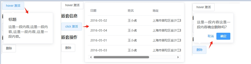
Popconfirm 气泡确认框
<el-popconfirm> 的属性与 <el-popover> 很类似,本身自带“取消”、“确认”按钮。需要注意的是,<el-popconfirm> 只有 title 属性可用,content 属性不会被展示。以下列出 <el-popconfirm> 常用属性:
title:标题confirm-button-text:确认按钮文字cancel-button-text:取消按钮文字icon:Iconconfirm:点击确认按钮时触发cancel:点击取消按钮时触发
<template>
  <div>
    <h3>基本用法</h3>
    <el-popconfirm title="这是一段内容确定删除吗?">
      <el-button slot="reference">删除</el-button>
    </el-popconfirm>

    <h3>自定义</h3>
    <el-popconfirm
      confirm-button-text="好的"
      cancel-button-text="不用了"
      icon="el-icon-info"
      icon-color="red"
      @confirm="confirmHandle"
      @cancel="cancelHandle"
      title="这是一段内容确定删除吗?"
    >
      <el-button slot="reference">删除</el-button>
    </el-popconfirm>
  </div>
</template>

<script>
export default {
  name: "HomeView",
  methods: {
    confirmHandle() {
      console.log("confirmHandle");
    },
    cancelHandle() {
      console.log("cancelHandle");
    }
  }
};
</script>
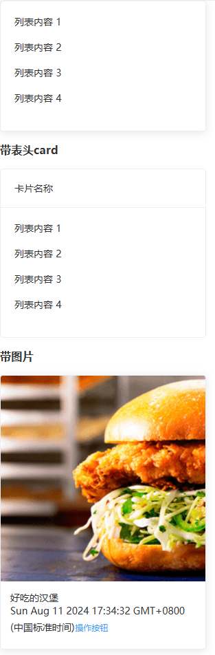
Card 卡片
<el-card> 组件包括 header 和 body 部分,header 部分需要有显式具名 slot 分发,同时也是可选的。
header:设置卡片标题shadow:设置阴影显示,always / hover / never,默认alwaysbody-style:设置 body 的样式,object
<template>
  <div>
    <el-card class="box-card" shadow="always">
      <div v-for="o in 4" :key="o" class="text item">
        {{ "列表内容 " + o }}
      </div>
    </el-card>

    <h3>带表头card</h3>
    <el-card class="box-card" shadow="hover">
      <div slot="header" class="clearfix">
        <span>卡片名称</span>
        <el-button style="float: right; padding: 3px 0" type="text"操作按钮</el-button>
      </div>
      <div v-for="o in 4" :key="o" class="text item">
        {{ "列表内容 " + o }}
      </div>
    </el-card>

    <h3>带图片</h3>
    <el-card :body-style="{ padding: '0px' }" class="box-card">
      <img src="https://shadow.elemecdn.com/app/element/hamburger.9cf7b091-55e9-11e9-a976-7f4d0b07eef6.png" class="image"/>
      <div style="padding: 14px">
        <span>好吃的汉堡</span>
        <div class="bottom clearfix">
          <time class="time">{{ currentDate }}</time>
          <el-button type="text" class="button">操作按钮</el-button>
        </div>
      </div>
    </el-card>
  </div>
</template>

<script>
export default {
  name: "HomeView",
  data() {
    return {
      currentDate: new Date()
    };
  }
};
</script>

<style>
.text {
  font-size: 14px;
}
.item {
  margin-bottom: 18px;
}
.box-card {
  width: 300px;
}
.image {
  width: 100%;
  display: block;
}
</style>
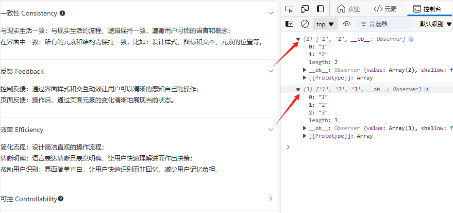
Collapse 折叠面板
<el-collapse> 通过折叠面板收纳内容区域
value / v-model:当前激活的面板accordion:是否手风琴模式,每次只能展开一个面板change:当前激活面板改变时触发事件
<el-collapse-item> 设置折叠面板项
name:唯一标志符title:面板标题,可以通过具名slot来实现自定义面板的标题内容,以实现增加图标等效果。
<template>
  <div>
    <el-collapse v-model="activeNames" @change="handleChange">
      <el-collapse-item name="1">
        <span slot="title"> 一致性 Consistency <i class="el-icon-info"></i> </span>
        <div>与现实生活一致:与现实生活的流程、逻辑保持一致,遵循用户习惯的语言和概念;</div>
        <div>在界面中一致:所有的元素和结构需保持一致,比如:设计样式、图标和文本、元素的位置等。</div>
      </el-collapse-item>
      <el-collapse-item title="反馈 Feedback" name="2">
        <div>控制反馈:通过界面样式和交互动效让用户可以清晰的感知自己的操作;</div>
        <div>页面反馈:操作后,通过页面元素的变化清晰地展现当前状态。</div>
      </el-collapse-item>
      <el-collapse-item title="效率 Efficiency" name="3">
        <div>简化流程:设计简洁直观的操作流程;</div>
        <div>清晰明确:语言表达清晰且表意明确,让用户快速理解进而作出决策;</div>
        <div>帮助用户识别:界面简单直白,让用户快速识别而非回忆,减少用户记忆负担。</div>
      </el-collapse-item>
      <el-collapse-item name="4">
        <template slot="title">
          可控 Controllability <i class="el-icon-question"></i>
        </template>
        <div>用户决策:根据场景可给予用户操作建议或安全提示,但不能代替用户进行决策;</div>
        <div>结果可控:用户可以自由的进行操作,包括撤销、回退和终止当前操作等。</div>
      </el-collapse-item>
    </el-collapse>
  </div>
</template>

<script>
export default {
  name: "HomeView",
  data() {
    return {
      activeNames: ["1"]
    };
  },
  methods: {
    handleChange(val) {
      console.log(val);
    }
  }
};
</script>
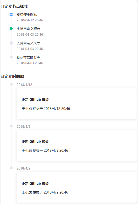
Timeline 时间线
<el-timeline> 通常用于展示一系列事件的发生顺序,时间戳是其区分于其他控件的重要特征,每个事件可以有标题和详细描述。
步骤条 <el-steps> 用于引导用户按照特定的步骤完成一个任务。每个步骤通常有标题和描述,可以通过指定当前步骤来显示进度。
timestamp:时间戳placement:时间戳位置,top / bottom,默认bottomtype:节点类型,primary / success / warning / danger / infocolor:节点颜色size:节点尺寸,normal / largeicon:节点图标
<template>
  <div>
    <h3>⾃定义节点样式</h3>
    <el-timeline>
      <el-timeline-item
        v-for="(activity, index) in activities"
        :key="index"
        :icon="activity.icon"
        :type="activity.type"
        :color="activity.color"
        :size="activity.size"
        :timestamp="activity.timestamp"
      >
        {{ activity.content }}
      </el-timeline-item>
    </el-timeline>

    <h3>⾃定义时间戳</h3>
    <el-timeline>
      <el-timeline-item timestamp="2018/4/12" placement="top">
        <el-card>
          <h4>更新 Github 模板</h4>
          <p>王小虎 提交于 2018/4/12 20:46</p>
        </el-card>
      </el-timeline-item>
      <el-timeline-item timestamp="2018/4/3" placement="top">
        <el-card>
          <h4>更新 Github 模板</h4>
          <p>王小虎 提交于 2018/4/3 20:46</p>
        </el-card>
      </el-timeline-item>
      <el-timeline-item timestamp="2018/4/2" placement="top">
        <el-card>
          <h4>更新 Github 模板</h4>
          <p>王小虎 提交于 2018/4/2 20:46</p>
        </el-card>
      </el-timeline-item>
    </el-timeline>
  </div>
</template>

<script>
export default {
  name: "HomeView",
  data() {
    return {
      activities: [{
        content: "支持使用图标",
        timestamp: "2018-04-12 20:46",
        size: "large",
        type: "primary",
        icon: "el-icon-more",
      },{
        content: "支持自定义颜色",
        timestamp: "2018-04-03 20:46",
        color: "#0bbd87",
      },{
        content: "支持自定义尺寸",
        timestamp: "2018-04-03 20:46",
        size: "large",
      },{
        content: "默认样式的节点",
        timestamp: "2018-04-03 20:46",
      }]
    };
  }
};
</script>
Divider 分割线
<el-divider> 区隔内容的分割线。
direction:设置分割线方向,horizontal / vertical,默认horizontalcontent-position:设置分割线文案的位置,left / right / center,默认center
<template>
  <div>
    <span>青春是一个短暂的美梦, 当你醒来时, 它早已消失无踪</span>
    <el-divider></el-divider>
    <span>少量的邪恶足以抵消全部高贵的品质, 害得人声名狼藉</span>
    <el-divider content-position="left">少年包青天</el-divider>
    <span>饿了别叫妈, 叫饿了么</span>
    <el-divider><i class="el-icon-mobile-phone"></i></el-divider>
    <span>为了无法计算的价值</span>
    <el-divider content-position="right">阿里云</el-divider>

    <span>雨纷纷</span>
    <el-divider direction="vertical"></el-divider>
    <span>旧故里</span>
    <el-divider direction="vertical"></el-divider>
    <span>草木深</span>
  </div>
</template>

<script>
export default {
  name: "HomeView"
};
</script>

InfiniteScroll 无限滚动
滚动至底部时,加载更多数据。要实现滚动加载的列表上上添加 v-infinite-scroll ,并赋值相应的加载方法,可实现滚动到底部时自动执行加载方法。
infinite-scroll-disabled:是否禁用,booleaninfinite-scroll-immediate:是否立即执行加载方法,以防初始状态下内容无法撑满容器。boolean
<template>
  <div>
    <div class="infinite-list-wrapper" style="overflow: auto">
      <ul
        class="list"
        v-infinite-scroll="load"
        infinite-scroll-disabled="disabled"
      >
        <li v-for="(i, index) in list" class="list-item" :key="index">
          {{ index }}+ {{ i.title }}
        </li>
      </ul>
      <p v-if="loading" style="color: red;">加载中...</p>
      <p v-if="noMore" style="color: green;">没有更多了</p>
    </div>
  </div>
</template>

<script>
export default {
  data() {
    return {
      count: 1, //起始页数值为0
      loading: false,
      totalPages: 10, //取后端返回内容的总页数
      list: [], //后端返回的数组
    };
  },
  computed: {
    noMore() {
      return this.count >= this.totalPages - 1;
    },
    disabled() {
      return this.loading || this.noMore;
    },
  },
  created() {
    this.getMessage();
  },
  methods: {
    load() {
      //滑到底部时进行加载
      this.loading = true;
      setTimeout(() => {
        this.count += 1; //页数+1
        this.getMessage(); //调用接口,此时页数+1,查询下一页数据
        this.loading = false;
      }, 2000);
    },
    //没有后端的情况
    getMessage() {
      let templist = [{
          title: "我爱您 你却爱着她",
      },{
          title: "我爱您 你却爱着她",
      },{
          title: "我爱您 你却爱着她",
      },{
          title: "我爱您 你却爱着她",
      }];
      this.list = this.list.concat(templist);
      this.loading = false;
    },
    //有后端的情况
    // getMessage() {
    //   let params = {
    //     pageNumber: this.count,
    //     pageSize: 10 //每页查询条数
    //   };
    //   console.log(params);
    //   request({
    //     url:"/getfollowlist",
    //     method:'post',
    //     data:{
    //         params
    //     }
    // }).then(res =>{
    //   console.log(res);
    //   this.list = this.list.concat(res.data.list);
    //   //因为每次后端返回的都是数组,所以这边把数组拼接到一起 concat() 方法用于连接两个或多个数组。 该方法不会改变现有的数组,而仅仅会返回被连接数组的一个副本
    //   this.loading = false;
    //  }).catch(err =>{ console.log(err);});
    // }
  },
};
</script>
<style scoped>
/* 解决进去后一直自己加载的问题,加 height: 100vh;,意思为 height: 100%; */
.infinite-list-wrapper {
  height: 100vh;
  .list-item {
    height: 110px;
  }
}
</style>
无限加载
⚠️注意:复制官方代码发现,我还没滚动,他就无限加载,查阅资料发现,infinite-list-wrapper 需要加上 height: 100vh;,意思为 height: 100%;。
el-table实现无限向下滚动懒加载数据

![[笔记] 某振动分析软件的可能侦测范围](https://i-blog.csdnimg.cn/direct/404de835301b482285ecd3be6cb16136.png)