在典型的探索性数据分析工作流程中,数据可视化和统计建模是两个不同的阶段,而我们也希望能够在最终的可视化结果中将相关统计指标呈现出来,如何让将两种有效结合,使得数据探索更加简单快捷呢?今天这篇推文就告诉你如何高效解决这个问题。
-
R-ggstatsplot 统计可视化包介绍
-
R-ggstatsplot 统计类型
-
更多详细的数据可视化教程,可订阅我们的店铺课程:
-

R-ggstatsplot 统计可视化包介绍
R-ggplot2 拥有超强的可视化绘制能力(小编用完果断安利)我们是知道的,但对于数据的统计分析结果进行展示,ggplot2还也有所欠缺,而R-ggstatsplot包的出现则可弥补不足(小编在研究生期间可没少使用该包绘图)。
-
官网 https://indrajeetpatil.github.io/ggstatsplot/
-
提供的绘图函数
-
ggbetweenstats:(violin plots) 用于比较多组/条件之间的统计可视化结果
-
ggwithinstats:(violin plots) 用于比较多组/条件内部间的统计可视化结果
-
gghistostats:(histograms) 用于数字型变量的分布。
-
ggdotplotstats:(dot plots/charts) 用于表示有关标记数字变量的信息分布抢矿
-
ggscatterstats:(scatterplots) 用于表示两个变量之间的相关性。
-
ggcorrmat:(correlation matrices) 用于表示多个变量之间的相关性。
-
ggpiestats:(pie charts) 用于表示类别型数据。
-
ggbarstats:(bar charts) 用于表示类别型数据
-
ggcoefstats:(dot-and-whisker plots) 用于回归模型和meta-分析。
接下来,我们就列举几个常用的可视化函数进行展示。
R-ggstatsplot 统计类型
-
ggbetweenstats
plot2 <- ggstatsplot::ggbetweenstats(
  data = datasets::morley,
  x = Expt,
  y = Speed,
  type = "nonparametric",
  plot.type = "box",
  title = "ggbetweenstats example02",
  xlab = "The experiment number",
  ylab = "Speed-of-light measurement",
  caption = "Visualization by DataCharm",
  pairwise.comparisons = TRUE,
  p.adjust.method = "fdr",
  outlier.tagging = TRUE,
  outlier.label = Run,
  ggtheme = hrbrthemes::theme_ipsum(base_family = "Roboto Condensed"),
  ggstatsplot.layer = FALSE
)
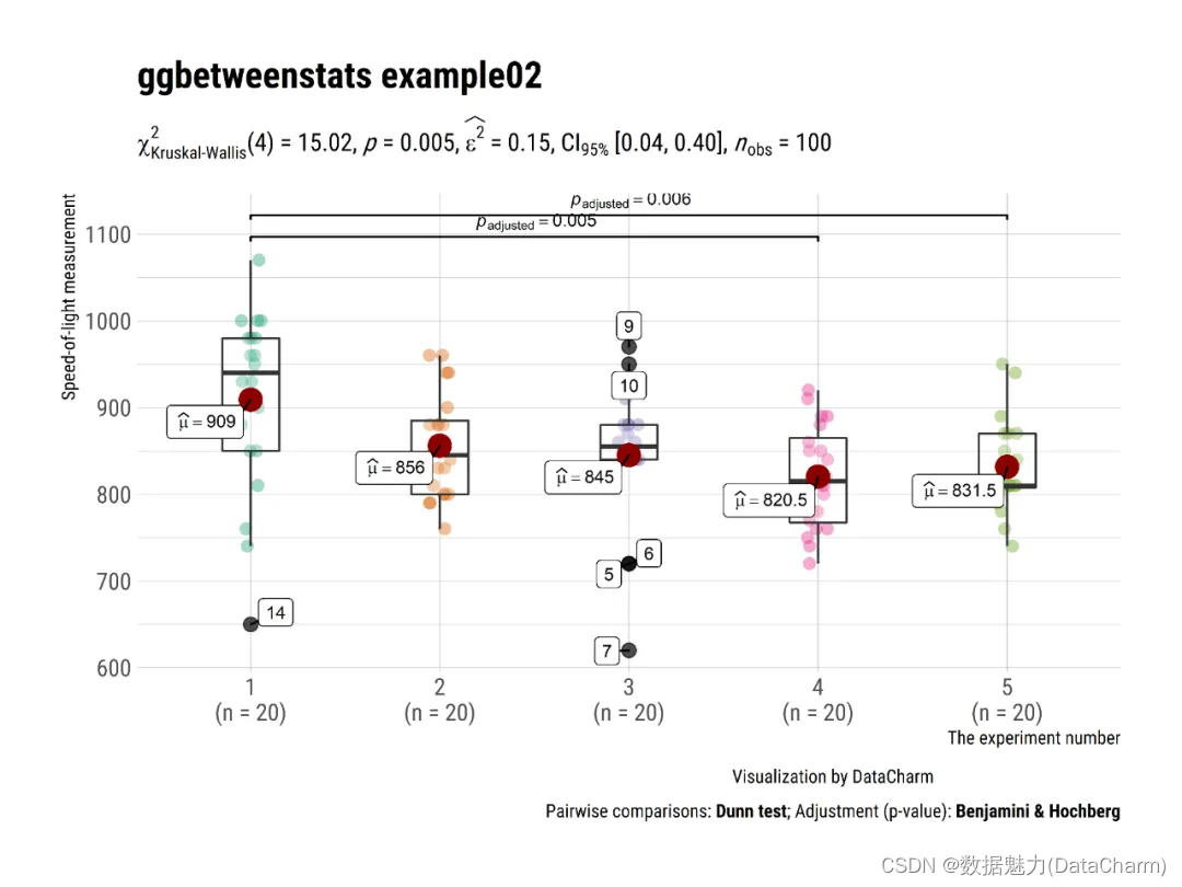
ggbetweenstats
-
ggwithinstats
# for reproducibility and data
set.seed(123)
library(WRS2)

# plot
plot3 <- ggwithinstats(
  data = WineTasting,
  x = Wine,
  y = Taste,
  title = "Wine tasting",
  caption = "Data source: `WRS2` R package",
  ggtheme = hrbrthemes::theme_ipsum(base_family = "Roboto Condensed"),
  ggstatsplot.layer = FALSE
)
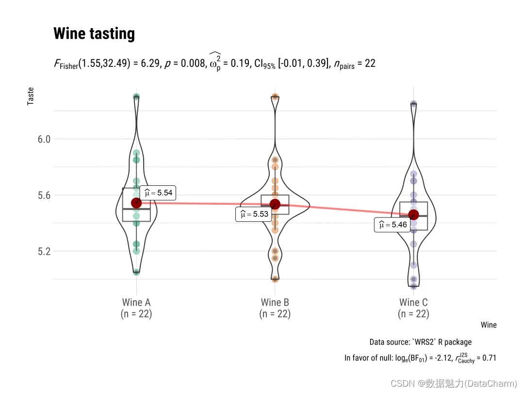
ggwithinstats
-
gghistostats
# for reproducibility
set.seed(123)

# plot
plot4 <- gghistostats(
  data = ggplot2::msleep, # dataframe from which variable is to be taken
  x = awake, # numeric variable whose distribution is of interest
  title = "Amount of time spent awake", # title for the plot
  caption = substitute(paste(italic("Source: "), "Mammalian sleep data set")),
  test.value = 12, # default value is 0
  binwidth = 1, # binwidth value (experiment)
  ggtheme = hrbrthemes::theme_ipsum(base_family = "Roboto Condensed"), # choosing a different theme
  ggstatsplot.layer = FALSE # turn off ggstatsplot theme layer
)
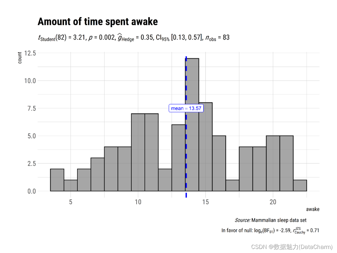
gghistostats
-
grouped_gghistostats
# for reproducibility
set.seed(123)

# plot
plot5 <- grouped_gghistostats(
  data = dplyr::filter(
    .data = movies_long,
    genre %in% c("Action", "Action Comedy", "Action Drama", "Comedy")
  ),
  x = budget,
  test.value = 50,
  type = "nonparametric",
  xlab = "Movies budget (in million US$)",
  grouping.var = genre, # grouping variable
  normal.curve = TRUE, # superimpose a normal distribution curve
  normal.curve.args = list(color = "red", size = 1),
  title.prefix = "Movie genre",
  ggtheme = hrbrthemes::theme_ipsum(base_family = "Roboto Condensed"),
  # modify the defaults from `ggstatsplot` for each plot
  ggplot.component = ggplot2::labs(caption = "Source: IMDB.com"),
  plotgrid.args = list(nrow = 2),
  annotation.args = list(title = "Movies budgets for different genres")
)
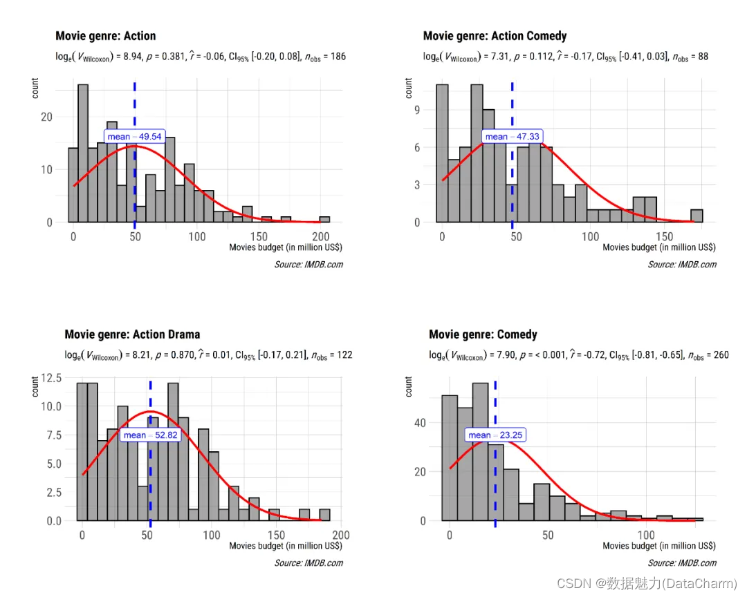
grouped_gghistostats
-
ggscatterstats
plot6 <- ggscatterstats(
  data = ggplot2::msleep,
  x = sleep_rem,
  y = awake,
  xlab = "REM sleep (in hours)",
  ylab = "Amount of time spent awake (in hours)",
  title = "Understanding mammalian sleep",
  ggtheme = hrbrthemes::theme_ipsum(base_family = "Roboto Condensed")
)
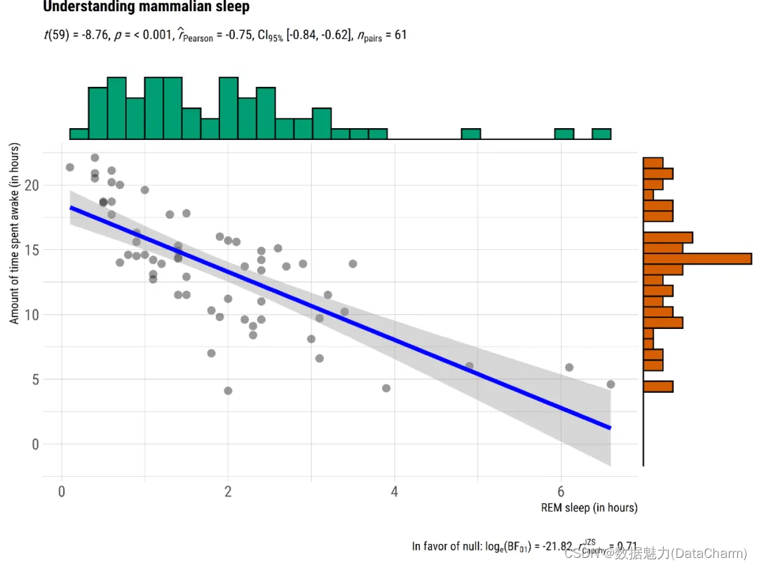
ggscatterstats
-
ggcorrmat
# for reproducibility
set.seed(123)

# as a default this function outputs a correlation matrix plot
plot7 <- ggcorrmat(
  data = ggplot2::msleep,
  colors = c("#B2182B", "white", "#4D4D4D"),
  title = "Correlalogram for mammals sleep dataset",
  subtitle = "sleep units: hours; weight units: kilograms",
  ggtheme = hrbrthemes::theme_ipsum(base_family = "Roboto Condensed")
)
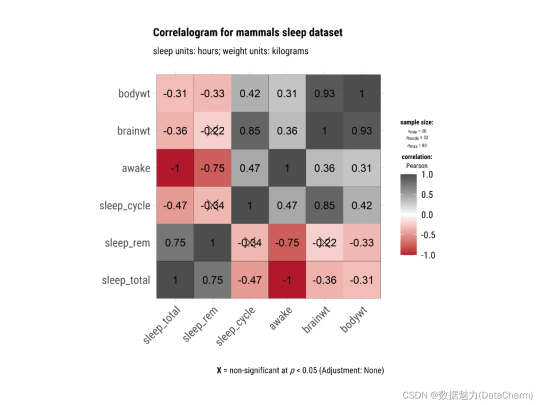
ggcorrmat
-
ggbarstats
# for reproducibility
set.seed(123)
library(ggplot2)

# plot
plot8 <- ggbarstats(
  data = movies_long,
  x = mpaa,
  y = genre,
  title = "MPAA Ratings by Genre",
  xlab = "movie genre",
  legend.title = "MPAA rating",
  ggtheme = hrbrthemes::theme_ipsum(base_family = "Roboto Condensed"),
  ggplot.component = list(ggplot2::scale_x_discrete(guide = ggplot2::guide_axis(n.dodge = 2))),
  palette = "Set2"
)
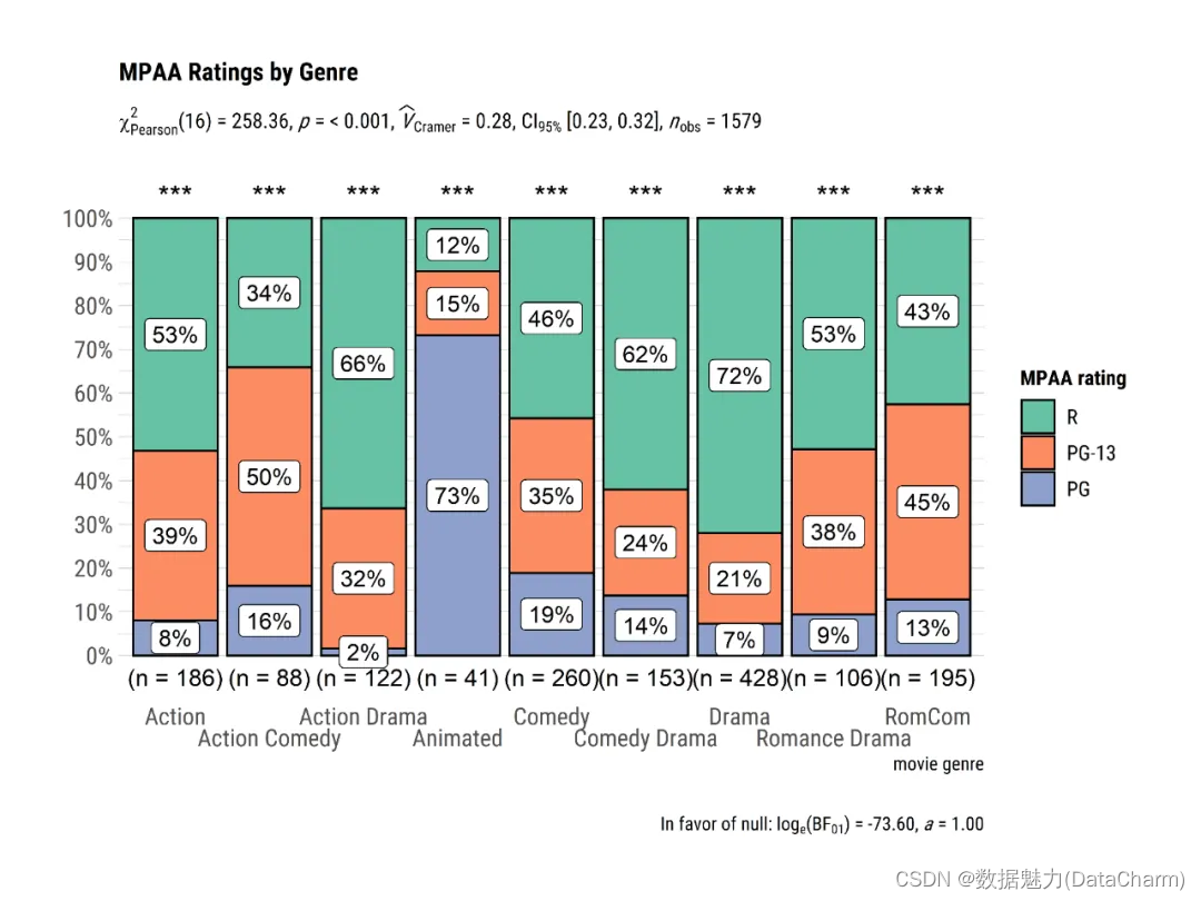
ggbarstats
跟多详细例子,小伙伴们可参考官网进行解读。其保存图片的方式使用ggsave()即可。
总结
这一篇推文我们介绍了R-ggstatsplot进行统计分析并将结果可视化,极大省去了绘制单独指标的时间,为统计分析及可视化探索提供非常便捷的方式,感兴趣的小伙伴可仔细阅读哦~~