在上一篇文章中,创建了一个空白的文章模块页面。在这一篇文章,让我们来向页面中填充内容。
目录
- 页面效果
- 涉及uniapp组件
- 1.view
- 2.swiper
- 3.scroll-view
- 4.属性解读
- 1) class="style1 style2 .."
- 2) circular单属性无赋值
- 3) :autoplay="autoplay"
- 4) @scrolltolower=“lower”属性前加@
- 一、顶部banner图
- 二、静态按钮列表
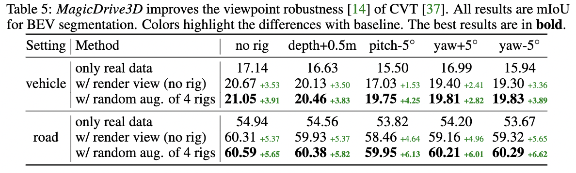
- 三、横向滚动图
- 四、动态列表 + 详情跳转
- 五、详情页面
- 参考资料
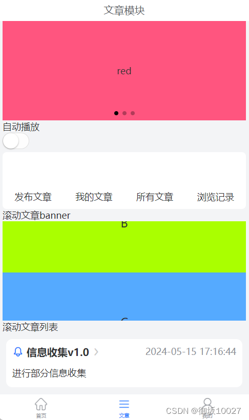
页面效果
填充前的页面

填充后的页面
涉及uniapp组件
1.view
视图容器,类似传统html中的div,用于包裹各种元素的内容。
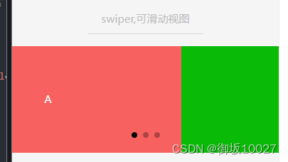
2.swiper
滑块视图,可上下和左右滑动,一般作为banner轮播图。
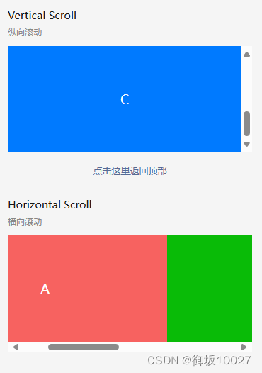
3.scroll-view
区域滚动视图,有纵向滚动和横向滚动。
4.属性解读
例子:
a.<swiper class="article-swiper" circular :autoplay="autoplay" :indicator-dots="true" :duration="1000"></swiper>

b.<scroll-view :scroll-top="scrollTop" scroll-y="true" class="scroll-Y" show-scrollbar="true" @scrolltoupper="upper"
				@scrolltolower="lower" @scroll="scroll" ></scroll-view>
1) class=“style1 style2 …”
class赋值的是自定义样式,具体样式定义内容在vue文件的
2) circular单属性无赋值
等价于circular=“true”,属性的静态绑定写法,不会变更
3) :autoplay=“autoplay”
vue中属性的动态绑定写法,绑定一个参数,参数值可根据界面操作(比如button、switch)变更
4) @scrolltolower=“lower”属性前加@
vue中动态绑定方法的写法
一、顶部banner图
/pages/article/article.vue
<template>
	<view class="u-p-l-10 u-p-r-10">
	  /**
		* class="article-swiper":样式为style中自定义的.article-swiper{...}
		* circular:是否采用衔接滑动
		* :autoplay="autoplay":是否自动切换,此处设置动态绑定autoplay参数
		* indicator-dots:是否显示面板展示点
		* duration="1000":滑动动画时长
		*
		*/
		<swiper class="article-swiper" circular :autoplay="autoplay" indicator-dots duration="1000">
			/**
			* swiper下的每个swiper-item是一个滑动切换区域
			*/
			<swiper-item>

				<view class="article-swiper-item uni-bg-red">red</view>
			</swiper-item>
			<swiper-item>
				<view class="article-swiper-item uni-bg-green">green</view>
			</swiper-item>
			<swiper-item>
				<view class="article-swiper-item uni-bg-blue">blue</view>
			</swiper-item>
		</swiper>
		<view >
			<view>自动播放</view>
			/**
			 * switch 开关选择器
			 * :checked="autoplay":是否选中,由autoplay参数决定
			 * @change="changeAutoplay":checked改变时触发change事件,绑定changeAutoplay方法
			*/
				<switch :checked="autoplay" @change="changeAutoplay" />
			</view>
	</view>
</template>
<script>
	import config from "@/common/config.js"
	export default {
		data() {
			return {
				// 自动播放参数:默认值是true
				autoplay: true
			}
		},
		methods: {
			changeAutoplay(e) {
				// 点击时开关状态取反
			    this.autoplay = !this.autoplay
			}
		}
	}
</script>
<style lang="scss" scoped>
	.article-swiper {
		height: 300rpx;
	}

	.article-swiper-item {
		display: block;
		height: 300rpx;
		line-height: 300rpx;
		text-align: center;
	}

	.uni-bg-red {
		background-color: rgb(255, 85, 127);
	}

	.uni-bg-green {
		background-color: rgb(170, 255, 0);
	}

	.uni-bg-blue {
		background-color: rgb(85, 170, 255);
	}
</style>
二、静态按钮列表
/pages/article/article.vue
<template>
	<view class="u-p-l-10 u-p-r-10">
		<view>
			<view class="rowClass">
				<u-row>
				/**
				 * u-row、u-col:流式栅格系统,随着屏幕或视口分为 24 份,可以迅速简便地创建布局。
				 * span:定义u-col应该跨越的列数
				 * v-for="(item,index) in navList":列表渲染指令
				 *	(1) navList:data中的源数据数组
				 *  (2) item:data数据navList数组的别名
				 *  (3) index:navList数组的索引
				 * @tap="clickNav(item):方法暂未定义
				 *
				 * image:按钮图片
				 * item.name:静态按钮名称
				 */
					<u-col span="3" text-align="center" v-for="(item,index) in navList" :key="index">
						<view class="u-padding-20" @tap="clickNav(item)" hover-class="hoverClass">
							<image :src="item.src" style="width: 90rpx;height: 90rpx;" mode="widthFix"></image>
							<view class="tabName">{{item.name}}</view>
						</view>
					</u-col>
				</u-row>
			</view>
		</view>
	</view>
</template>
<script>
	import config from "@/common/config.js"
	export default {
		data() {
			return {
				navList:[
					{name:"发布文章",url:"pages/center/publishArticle"},
					{name:"我的文章",url:"pages/center/myArticle"},
					{name:"所有文章",url:"pages/center/allArticle"},
					{name:"浏览记录"}
				]
			}
		}
	}
</script>
<style lang="scss" scoped>
.rowClass{
		border-radius: 8px;
		background-color: rgb(255, 255, 255);
		margin-top: 10rpx;
		text-align: center;
	}

	.hoverClass{
		background-color: #E4E7ED;
	}

	.tabName{
		font-size: 28rpx;
		color: $u-main-color;
	}
</style>
三、横向滚动图
/pages/article/article.vue
<template>
	<view class="u-p-l-10 u-p-r-10">
		<view>
			<view >
				<text>滚动文章banner</text>
			</view>
			<view>
			/**
				 * :scroll-top="scrollTop":设置竖向滚动条位置
				 * scroll-y="true":允许纵向滚动
				 * show-scrollbar="true":是否出现滚动条,仅支持app-nvue
				 * @scrolltoupper="upper":滚动到顶部/左边,会触发 scrolltoupper 事件
				 * @scrolltolower="lower":滚动到底部/右边,会触发 scrolltolower 事件
				 * @scroll="scroll":滚动时触发
				 *
				 */
				<scroll-view :scroll-top="scrollTop" scroll-y="true" class="scroll-Y" show-scrollbar="true" @scrolltoupper="upper"
					@scrolltolower="lower" @scroll="scroll" >
					<view id="demo1" class="scroll-view-item uni-bg-red">A</view>
					<view id="demo2" class="scroll-view-item uni-bg-green">B</view>
					<view id="demo3" class="scroll-view-item uni-bg-blue">C</view>

				</scroll-view>
			</view>
		</view>
	</view>
</template>
<script>
	import config from "@/common/config.js"
	export default {
		data() {
			return {
				scrollTop: 0,
				old: {
					scrollTop: 0
				}
			}
		},
		methods: {
			upper: function(e) {
				console.log(e)
			},
			lower: function(e) {
				console.log(e)
			},
			scroll: function(e) {
				console.log(e)
				this.old.scrollTop = e.detail.scrollTop
			}
		}
	}
</script>
<style lang="scss" scoped>
.uni-bg-red {
		background-color: rgb(255, 85, 127);
	}

	.uni-bg-green {
		background-color: rgb(170, 255, 0);
	}

	.uni-bg-blue {
		background-color: rgb(85, 170, 255);
	}

	.scroll-Y {
			height: 300rpx;
	}

	.scroll-view-item {
			height: 300rpx;
			line-height: 300rpx;
			text-align: center;
			font-size: 36rpx;
	}
</style>
四、动态列表 + 详情跳转
/pages/article/article.vue
<template>
	<view class="u-p-l-10 u-p-r-10">
		<view>
			<view >
				<text>滚动文章列表</text>
			</view>
			<view class="wrap">
				<scroll-view scroll-Y style="heignt: 100%;width 100%">
					<view>
					/**
					 * @click="clickContent(item):点击触发clickContent方法,跳转详情页面
					 */
						<view class="tabSwiper" v-for="(item,value) in articleList" :key="item.id" @click="clickContent(item)">
							<view class="top">
								<view class="left">
									<u-icon name="bell" :size="35" color="#2979ff"></u-icon>
									<view class="title">{{ item.title }}</view>
									<u-icon name="arrow-right" color="rgb(203,203,203)" :size="26"></u-icon>
								</view>

								<view class="right">{{ item.createTime }}</view>
							</view>
							<view class="item">
								<view class="content">
									<view class="title u-line-2">{{ item.content }}</view>
								</view>
							</view>
						</view>
					</view>
				</scroll-view>
			</view>
		</view>
	</view>
</template>
<script>
	import config from "@/common/config.js"
	export default {
		data() {
			return {
				pageNum:1,
				pageSize:50,
				articleList: [],
			}
		},
		onLoad() {
			this.getArticleList();
		},
		methods: {
			clickContent(item){
						if(item.id){
							this.$u.route('/pages/article/content', {
								id: item.id
							});
						}
			},
			getArticleList(){
				let url = "/api/cmsApi/findArticleList";
				this.$u.get(url,{
					pageNum:this.pageNum,
					pageSize:this.pageSize,
					orderByColumn:'create_time',
					isAsc:'desc'
				}).then(obj => {
					let data = obj.rows
					data.filter(item=>{
						this.articleList.push(
							{
								id:item.id,
								title: item.smallTitle,
								content: item.bigTitle,
								createTime: item.createTime
							}
						)
					})
				});
			}
		}
	}
</script>
<style lang="scss" scoped>
.tabSwiper {
		width: 710rpx;
		background-color: #ffffff;
		margin: 20rpx auto;
		border-radius: 20rpx;
		box-sizing: border-box;
		padding: 20rpx;
		font-size: 28rpx;
		.top {
			display: flex;
			justify-content: space-between;
			.left {
				display: flex;
				align-items: center;
				.title {
					margin: 0 10rpx;
					font-size: 32rpx;
					font-weight: bold;
				}
			}
			.right {
				color: $u-tips-color;
			}
		}
		.item {
			display: flex;
			margin: 20rpx 0 0;
			.left {
				margin-right: 20rpx;
				image {
					width: 200rpx;
					height: 200rpx;
					border-radius: 10rpx;
				}
			}
			.content {
				.title {
					font-size: 28rpx;
					line-height: 50rpx;
				}
			}
			.right {
				margin-left: 10rpx;
				padding-top: 20rpx;
				text-align: right;
			}
		}
	}

	.wrap {
		display: flex;
		flex-direction: column;
		height: calc(100vh - var(--window-top));
		width: 100%;

	}
</style>
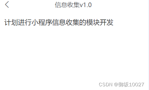
五、详情页面
/pages/article/content.vue 添加详情页面的vue文件
<template>
	<view>
		<u-navbar :is-back="true" :title="title" :border-bottom="false"></u-navbar>
		<view class="u-content">
			<u-parse :html="content"
			:autosetTitle="true"
			:show-with-animation="true"
			:selectable="true"></u-parse>
		</view>
	</view>
</template>

<script>
	export default {
		data() {
			return {
				title:'文章详情',
				content: ``
			}
		},
		onLoad(option) {
			let id = option.id
			let url = "/api/cmsApi/getArticle/"+id;
			this.$u.get(url).then(res => {
				this.title = res.data.smallTitle
				this.content = res.data.articleContent
			});
		},
	}
</script>

<style>
	page{
		background-color: #FFFFFF;
	}
</style>
<style lang="scss" scoped>
	.u-content{
		margin:0 10rpx;
		padding: 24rpx;
		font-size: 34rpx;
		color: $u-main-color;
		line-height: 1.8;
		white-space: pre-wrap !important;
	}
</style>
在pages.json添加文章详情页的的路由
{
	"pages": [// pages 设置页面路径及窗口表现
    //pages数组中第一项表示应用启动页,参考:https://uniapp.dcloud.io/collocation/pages
		{
     // pages节点的第一项为应用入口页(即首页)
			"path": "pages/index/index",
			"style": {
				"navigationStyle": "custom" ,// 导航栏样式:取消原生系统导航栏
				"navigationBarTitleText": "首页", // 导航栏标题文字
				"enablePullDownRefresh": true,  // 下拉刷新
				"app-plus": {
          // 编译到App平台的特定样式
					"pullToRefresh": {
            // 下拉刷新小圈圈样式
						"support": true,
						"color": "#2979ff", //小圈圈的颜色
						"style": "circle" //小圈圈的样式
					}
				}
			}
		},{
        	"path" : "pages/article/article",
        	"style" :
        	{
				"navigationStyle": "custom" ,
        		"navigationBarTitleText" : "文章",
        		"enablePullDownRefresh" : true
        	}
        },
		{
			"path" : "pages/article/content",
			"style" :
			{
				"navigationStyle": "custom" ,
				"navigationBarTitleText" : "文章详情",
				"enablePullDownRefresh" : true
			}
		}]
}
详情页效果如下
参考资料
uni-app官网
在此感谢@Ann_0207的技术支持!