10、CSS 3D 转换
通过 CSS transform 属性,您可以使用以下 3D 转换方法:
rotateX()rotateY()rotateZ()
10.1 rotateX() 方法(使元素绕其 X 轴旋转给定角度)
<!DOCTYPE html>
<html lang="en">

<head>
  <meta charset="UTF-8">
  <meta http-equiv="X-UA-Compatible" content="IE=edge">
  <meta name="viewport" content="width=device-width, initial-scale=1.0">
  <title>Document</title>
  <style>

    /* div{
      position: absolute;
    } */
    div.ex1 {
      width: 200px;
      height: 200px;
      background-color: #F0AAAE;
      border: 1px solid black;
    }

    div.ex2 {
      width: 200px;
      height: 200px;
      background-color: #E45664;
      border: 1px solid black;
      transform: rotateX(50deg);
    }
  </style>
</head>

<body>

   <div>
    <div class="ex1"></div>
    <div class="ex2"></div>
   </div>
</body>

</html>
运行效果:
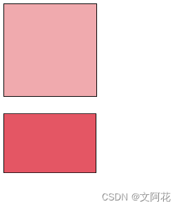
10.2 rotateY() 方法(使元素绕其 Y 轴旋转给定角度)
div.ex2 {
      width: 200px;
      height: 200px;
      background-color: #E45664;
      border: 1px solid black;
      transform: rotateY(50deg);
    }
10.3 rotateZ() 方法(方法使元素绕其 Z 轴旋转给定角度)
div.ex2 {
      width: 200px;
      height: 200px;
      background-color: #E45664;
      border: 1px solid black;
      transform: rotateZ(50deg);
    }
11、CSS 过渡
CSS过渡允许您在给定的时间内平滑地改变属性值。
如需创建过渡效果,必须明确两件事:
- 您要添加效果的
CSS属性 - 效果的持续时间

示例:
transition: width 2s,height 2s;transition: width 2s;
<!DOCTYPE html>
<html lang="en">

<head>
  <meta charset="UTF-8">
  <meta http-equiv="X-UA-Compatible" content="IE=edge">
  <meta name="viewport" content="width=device-width, initial-scale=1.0">
  <title>Document</title>
  <style>

    /* div{
      position: absolute;
    } */
    div.ex1 {
      width: 200px;
      height: 200px;
      background-color: #F0AAAE;
      border: 1px solid black;
      transition: width 2s;
    }

    div.ex1:hover{
      width: 400px;
    }


  </style>
</head>

<body>

   <div>
    <div class="ex1"></div>
   </div>
</body>

</html>
运行效果:
鼠标放置元素上后,元素宽度会从200px 平滑增加到 400px,动画效果持续2秒钟
11.2 transition-timing-function(规定过渡效果的速度曲线)
transition-timing-function 属性可接受以下值:
ease- 规定过渡效果,先缓慢地开始,然后加速,然后缓慢地结束(默认)linear- 规定从开始到结束具有相同速度的过渡效果ease-in-规定缓慢开始的过渡效果ease-out- 规定缓慢结束的过渡效果ease-in-out- 规定开始和结束较慢的过渡效果cubic-bezier(n,n,n,n)- 允许您在三次贝塞尔函数中定义自己的值
11.3 transition-delay (规定过渡效果的延迟(以秒计))。
div {
  transition-delay: 1s;
}
11.4 过渡 + 转换
div {
  transition: width 2s, height 2s, transform 2s;
}
11.5 简写的 transition 属性
div {
  transition-property: width;
  transition-duration: 2s;
  transition-timing-function: linear;
  transition-delay: 1s;
}
可简写为:
div {
  transition: width 2s linear 1s;
}
12、CSS 动画
12.1 @keyframes 规则
如果您在 @keyframes 规则中指定了 CSS 样式,动画将在特定时间逐渐从当前样式更改为新样式。
要使动画生效,必须将动画绑定到某个元素。
animation-duration属性定义需要多长时间才能完成动画。如果未指定animation-duration属性,则动画不会发生,因为默认值是0s(0秒)。
12.2 from、to关键词使用:
下面的例子将 “example” 动画绑定到 <div> 元素。动画将持续 4 秒钟,同时将 <div> 元素的背景颜色从 “red” 逐渐改为 “yellow”:
<!DOCTYPE html>
<html lang="en">

<head>
  <meta charset="UTF-8">
  <meta http-equiv="X-UA-Compatible" content="IE=edge">
  <meta name="viewport" content="width=device-width, initial-scale=1.0">
  <title>Document</title>
  <style>
    div.ex1 {
      width: 200px;
      height: 200px;
      background-color: red;
      animation-name: example;
      animation-duration: 4s;
    }

    @keyframes example {
      from {
        background-color: red;
      }

      to {
        background-color: yellow;
      }
    }
  </style>
</head>

<body>

  <div>
    <div class="ex1"></div>
  </div>
</body>

</html>
12.3 动画完成度(百分制):
<!DOCTYPE html>
<html lang="en">

<head>
  <meta charset="UTF-8">
  <meta http-equiv="X-UA-Compatible" content="IE=edge">
  <meta name="viewport" content="width=device-width, initial-scale=1.0">
  <title>Document</title>
  <style>
    div.ex1 {
      width: 200px;
      height: 200px;
      background-color: red;
      animation-name: example;
      animation-duration: 4s;
    }

    @keyframes example {

      0% {
        background-color: red;
      }

      25% {
        background-color: yellow;
      }

      50% {
        background-color: blue;
      }

      100% {
        background-color: green;
      }
    }
  </style>
</head>

<body>

  <div>
    <div class="ex1"></div>
  </div>
</body>

</html>
12.3 延迟动画:animation-delay
- 负值也是允许的。如果使用负值,则动画将开始播放,如同已播放
N秒。
<!DOCTYPE html>
<html lang="en">

<head>
  <meta charset="UTF-8">
  <meta http-equiv="X-UA-Compatible" content="IE=edge">
  <meta name="viewport" content="width=device-width, initial-scale=1.0">
  <title>Document</title>
  <style>
    div.ex1 {
      width: 200px;
      height: 200px;
      background-color: red;
      animation-name: example;
      animation-duration: 4s;
      animation-delay: 1s;
    }

    @keyframes example {

      0% {
        background-color: red;
      }

      25% {
        background-color: yellow;
      }

      50% {
        background-color: blue;
      }

      100% {
        background-color: green;
      }
    }
  </style>
</head>

<body>

  <div>
    <div class="ex1"></div>
  </div>
</body>

</html>
12.4 设置动画应运行多少次:animation-iteration-count
- 使用值 “
infinite” 使动画永远持续下去
<!DOCTYPE html>
<html lang="en">

<head>
  <meta charset="UTF-8">
  <meta http-equiv="X-UA-Compatible" content="IE=edge">
  <meta name="viewport" content="width=device-width, initial-scale=1.0">
  <title>Document</title>
  <style>
    div.ex1 {
      width: 200px;
      height: 200px;
      background-color: red;
      animation-name: example;
      animation-duration: 4s;
      animation-delay: 1s;
      /* 动画运行次数 */
      animation-iteration-count:3
    }

    @keyframes example {

      0% {
        background-color: red;
      }

      25% {
        background-color: yellow;
      }

      50% {
        background-color: blue;
      }

      100% {
        background-color: green;
      }
    }
  </style>
</head>

<body>

  <div>
    <div class="ex1"></div>
  </div>
</body>

</html>
12.5 反向或交替运行动画:animation-direction
animation-direction 属性可接受以下值:
normal- 动画正常播放(向前)。默认值reverse- 动画以反方向播放(向后)alternate- 动画先向前播放,然后向后alternate-reverse- 动画先向后播放,然后向前
<!DOCTYPE html>
<html lang="en">

<head>
  <meta charset="UTF-8">
  <meta http-equiv="X-UA-Compatible" content="IE=edge">
  <meta name="viewport" content="width=device-width, initial-scale=1.0">
  <title>Document</title>
  <style>
    div.ex1 {
      width: 200px;
      height: 200px;
      background-color: red;
      position: relative;
      animation-name: example;
      animation-duration: 4s;
      animation-timing-function:ease;
      animation-iteration-count: 2;
      /* 动画以反方向播放(向后) */
      animation-duration: reverse;
    }

    @keyframes example {

      0% {
        background-color: red;
        left: 0;
        top: 0;
      }

      25% {
        background-color: yellow;
        left: 200px;
        top: 0;
      }

      50% {
        background-color: blue;
        left: 200px;
        top: 200px;
      }

      100% {
        background-color: green;
        left: 0px;
        top: 200px;
      }
    }
  </style>
</head>

<body>

  <div>
    <div class="ex1"></div>
  </div>
</body>

</html>
12.6 指定动画的速度曲线:animation-timing-function
animation-timing-function 属性可接受以下值:
ease- 指定从慢速开始,然后加快,然后缓慢结束的动画(默认)linear- 规定从开始到结束的速度相同的动画ease-in- 规定慢速开始的动画ease-out- 规定慢速结束的动画ease-in-out- 指定开始和结束较慢的动画cubic-bezier(n,n,n,n)- 运行您在三次贝塞尔函数中定义自己的值
12.7 指定动画的填充模式:animation-fill-mode
- 在不播放动画时(在开始之前,结束之后,或两者都结束时),
animation-fill-mode属性规定目标元素的样式。
animation-fill-mode 属性可接受以下值:
none- 默认值。动画在执行之前或之后不会对元素应用任何样式。forwards- 元素将保留由最后一个关键帧设置的样式值(依赖animation-direction和animation-iteration-count)。backwards- 元素将获取由第一个关键帧设置的样式值(取决于animation-direction),并在动画延迟期间保留该值。both- 动画会同时遵循向前和向后的规则,从而在两个方向上扩展动画属性。
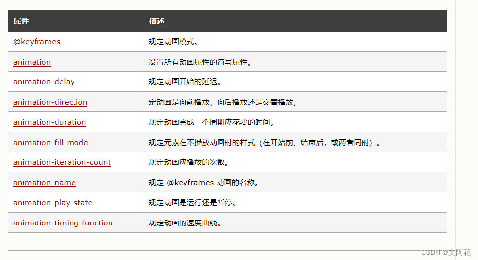
12.8 动画简写属性
  div {
        /* 动画名称 */
        animation-name: example;
        /* 动画执行时间 */
        animation-duration: 5s;
        /* 指定动画的速度曲线-规定从开始到结束的速度相同的动画 */
        animation-timing-function: linear;
        /* 延迟多久后执行动画 */
        animation-delay: 2s;
        /* 执行动画次数:循环 */
        animation-iteration-count: infinite;
        /* 反向或交替运行动画:动画先向前播放,然后向后 */
        animation-direction: alternate;
      }
简写为:
div {
  animation: example 5s linear 2s infinite alternate;
}
13、CSS 工具提示
- 通过
CSS创建工具提示(Tooltip)。
13.1 基础的工具提示
创建一个鼠标移到元素上时显示的工具提示:
<!DOCTYPE html>
<html lang="en">

<head>
  <meta charset="UTF-8">
  <meta http-equiv="X-UA-Compatible" content="IE=edge">
  <meta name="viewport" content="width=device-width, initial-scale=1.0">
  <title>Document</title>
  <style>
    .tooltip {
      position: relative;
      display: inline-block;
      border-bottom: 1px dotted black;
    }

    .tooltiptext {
      position: absolute;
      width: 120px;
      background-color: black;
      opacity: 0.9;
      color: white;
      padding: 10px;
      border-radius: 8px;
      text-align: center;
      visibility: hidden;
    }

    .tooltip:hover .tooltiptext {
      visibility: visible;
    }
  </style>
</head>

<body>

  <div class="tooltip">鼠标移到我上面
    <span class="tooltiptext">提示文字</span>
  </div>

</body>

</html>
13.2 定位工具提示
- 右侧工具提示:
.tooltip .tooltiptext {
  top: -5px;
  left: 105%;
}
- 左侧工具提示:
.tooltip .tooltiptext {
  top: -5px;
  right: 105%;
}
- 顶部工具提示:
.tooltip .tooltiptext {
  width: 120px;
  bottom: 100%;
  left: 50%;
  margin-left: -60px; /* Use half of the width (120/2 = 60), to center the tooltip */
}
- 底部工具提示:
.tooltip .tooltiptext {
  width: 120px;
  top: 100%;
  left: 50%;
  margin-left: -60px; /* Use half of the width (120/2 = 60), to center the tooltip */
}
示例:
<!DOCTYPE html>
<html lang="en">

<head>
  <meta charset="UTF-8">
  <meta http-equiv="X-UA-Compatible" content="IE=edge">
  <meta name="viewport" content="width=device-width, initial-scale=1.0">
  <title>Document</title>
  <style>
    .tooltip {
      position: relative;
      display: inline-block;
      background-color: rgb(107, 119, 189);
      padding: 15px 25px;
      color: white;
      border-radius: 5px;
      margin-left: 200px;
      margin-top: 100px;
    }

    .tooltiptext-top {
      position: absolute;
      width: 120px;
      background-color: black;
      opacity: 0.9;
      color: white;
      padding: 10px;
      border-radius: 8px;
      text-align: center;
      visibility: hidden;
      bottom: 105%;
      left: -30px;
    }

    .tooltip:hover .tooltiptext-top {
      visibility: visible;
    }

    .tooltiptext-left {
      position: absolute;
      width: 120px;
      background-color: black;
      opacity: 0.9;
      color: white;
      padding: 10px;
      border-radius: 8px;
      text-align: center;
      visibility: hidden;
      right: 105%;
      top: 50%;
      transform: translateY(-50%);
    }

    .tooltip:hover .tooltiptext-left {
      visibility: visible;
    }

    .tooltiptext-right {
      position: absolute;
      width: 120px;
      background-color: black;
      opacity: 0.9;
      color: white;
      padding: 10px;
      border-radius: 8px;
      text-align: center;
      visibility: hidden;
      left: 105%;
      top: 50%;
      transform: translateY(-50%);
    }

    .tooltip:hover .tooltiptext-right {
      visibility: visible;
    }

    .tooltiptext-bottom {
      position: absolute;
      width: 120px;
      background-color: black;
      opacity: 0.9;
      color: white;
      padding: 10px;
      border-radius: 8px;
      text-align: center;
      visibility: hidden;
      top: 105%;
      left: 50%;
      transform: translateX(-50%);
    }

    .tooltip:hover .tooltiptext-bottom {
      visibility: visible;
    }
  </style>
</head>

<body>

  <div>
    <div class="tooltip">Top
      <div class="tooltiptext-top">顶部提示</div>

    </div>
    <div class="tooltip">Left
      <div class="tooltiptext-left">左部提示</div>
    </div>
    <div class="tooltip">Right
      <div class="tooltiptext-right">右部提示</div>
    </div>
    <div class="tooltip">Bottom
      <div class="tooltiptext-bottom">底部提示</div>
    </div>
  </div>


</body>

</html>
13.4 工具提示箭头
- 思路:使用伪元素:
::after伪元素(伪元素可用于在元素内容之后插入一些内容) - 顶部提示增加箭头示例( 关键点:
border-color: black transparent transparent transparent;):
<!DOCTYPE html>
<html lang="en">

<head>
  <meta charset="UTF-8">
  <meta http-equiv="X-UA-Compatible" content="IE=edge">
  <meta name="viewport" content="width=device-width, initial-scale=1.0">
  <title>Document</title>
  <style>
    .tooltip {
      position: relative;
      display: inline-block;
      background-color: rgb(107, 119, 189);
      padding: 15px 25px;
      color: white;
      border-radius: 5px;
      margin-left: 200px;
      margin-top: 100px;
    }

    .tooltiptext-top {
      position: absolute;
      width: 120px;
      background-color: black;
      opacity: 0.9;
      color: white;
      padding: 10px;
      border-radius: 8px;
      text-align: center;
      visibility: hidden;
      bottom: 105%;
      left: -30px;
    }

    .tooltip:hover .tooltiptext-top {
      visibility: visible;
    }

    /* 使用伪元素添加箭头内容 */
    .tooltiptext-top::after {
      content: "";
      position: absolute;
      top: 100%;
      left: 50%;
      border-width: 5px;
      border-style: solid;
      border-color: black;
      margin-left: -5px;
      border-color: black transparent transparent transparent;
    }
  </style>
</head>

<body>

  <div>
    <div class="tooltip">Top
      <div class="tooltiptext-top">顶部提示</div>
    </div>
  </div>


</body>

</html>
- 左部提示增加箭头示例( 关键点:
border-color: transparent black transparent transparent;) - 右部提示增加箭头示例( 关键点:
border-color: transparent transparent transparent black;) - 底部提示增加箭头示例( 关键点:
border-color: transparent transparent black transparent ;)
13.5 淡入的工具提示(动画)
.tooltip .tooltiptext {
  opacity: 0;
  transition: opacity 1s;
}

.tooltip:hover .tooltiptext {
  opacity: 1;
}
示例:
<!DOCTYPE html>
<html lang="en">

<head>
  <meta charset="UTF-8">
  <meta http-equiv="X-UA-Compatible" content="IE=edge">
  <meta name="viewport" content="width=device-width, initial-scale=1.0">
  <title>Document</title>
  <style>
    .tooltip {
      position: relative;
      display: inline-block;
      background-color: rgb(107, 119, 189);
      padding: 15px 25px;
      color: white;
      border-radius: 5px;
      margin-left: 200px;
      margin-top: 100px;
    }

    .tooltiptext-top {
      position: absolute;
      width: 120px;
      background-color: black;
      opacity: 0.9;
      color: white;
      padding: 10px;
      border-radius: 8px;
      text-align: center;
      visibility: hidden;
      bottom: 105%;
      left: -30px;
      /* 增加淡入动画 */
      opacity: 0;
      transition: opacity 1s;
    }

    .tooltip:hover .tooltiptext-top {
      visibility: visible;
      opacity: 1;
    }

    /* 使用伪元素添加箭头内容 */
    .tooltiptext-top::after {
      content: "";
      position: absolute;
      top: 100%;
      left: 50%;
      border-width: 5px;
      border-style: solid;
      border-color: black;
      margin-left: -5px;
      border-color: black transparent transparent transparent;
    }
  </style>
</head>

<body>

  <div>
    <div class="tooltip">Top
      <div class="tooltiptext-top">顶部提示</div>
    </div>
  </div>


</body>

</html>


![SpringMVC源码解读[1] -Spring MVC 环境搭建](https://img-blog.csdnimg.cn/direct/41f2bce2f3f64511bc68f17626e573ee.png)
![[图解]产品经理创新模式01物流变成信息流](https://img-blog.csdnimg.cn/direct/f870890de5c34f78b01c9c35a9f70d29.png)