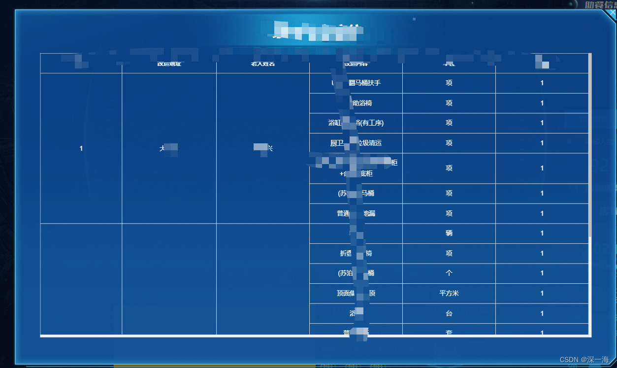
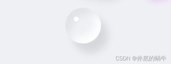
css 如何绘制水滴
- 可以通过box-shadow 来显示阴影
- 可以通过border-radius 改变水滴的形状
- 当然如果像要使其更加灵活,可以使用animation+keyframes关键帧+border-radius,让水滴动起来
是不是很简单
来吧展示效果
html代码,就只有一个div,然后使用一些伪类结合
<div class="water-container">
    <div class="water"></div>
</div>
css代码
.water-container {
    width: 50vw;
    height: 50vh;
    background-color: #eff0f4;
    display: flex;
    justify-content: center;
    align-items: center;
}

.water {
    width: 120px;
    height: 120px;
    border-radius: 50%;
    box-shadow: inset 20px 20px 20px rgba(0, 0, 0, .05),
    25px 35px 20px rgba(0, 0, 0, .05),
    25px 30px 30px rgba(0, 0, 0, .05),
    inset -20px -20px 25px hsla(0, 0%, 100%, .9);
    position: relative;
}

.water::before {
    content: "";
    position: absolute;
    left: 24%;
    top: 25%;
    width: 16px;
    height: 16px;
    background: #fff;
    border-radius: 50%;
}
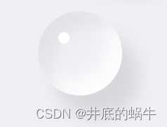
效果:
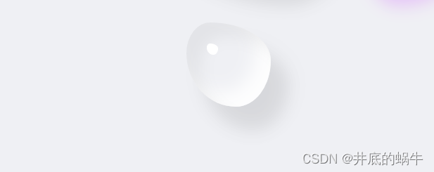
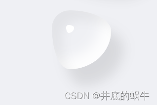
圆形水滴做好了,那我们是不是可以改变其现状呢,只要改变border-radius就可以了
.water {
    width: 120px;
    height: 120px;
    /*改变形状,使其弯曲*/
    border-radius: 30% 70% 70% 30% / 30% 35% 65% 70%;
    box-shadow: inset 20px 20px 20px rgba(0, 0, 0, .05),
    25px 35px 20px rgba(0, 0, 0, .05),
    25px 30px 30px rgba(0, 0, 0, .05),
    inset -20px -20px 25px hsla(0, 0%, 100%, .9);
    position: relative;
}
效果:
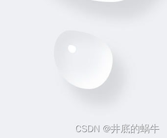
形状改变了,我们就让其动起来,动起来就算加上关键帧改变border-radius
.water {
  width: 120px;
  height: 120px;
  /*改变形状,使其弯曲*/
  border-radius: 30% 70% 70% 30% / 30% 35% 65% 70%;
  box-shadow: inset 20px 20px 20px rgba(0, 0, 0, .05),
  25px 35px 20px rgba(0, 0, 0, .05),
  25px 30px 30px rgba(0, 0, 0, .05),
  inset -20px -20px 25px hsla(0, 0%, 100%, .9);
  position: relative;
  /*添加动画关键帧*/
  animation: waterMove 4s linear infinite;
}

.water::before {
  content: "";
  position: absolute;
  left: 24%;
  top: 25%;
  width: 16px;
  height: 16px;
  background: #fff;
  border-radius: 30% 70% 70% 30% / 30% 35% 65% 70%;
  animation: waterMove 4s linear infinite;
}
/* 关键帧 */
@keyframes waterMove {
    20% {
        border-radius: 30% 70% 53% 47% / 28% 44% 56% 72%;
    }

    40% {
        border-radius: 30% 70% 39% 61% / 34% 39% 61% 66%;
    }

    60% {
        border-radius: 25% 75% 45% 55% / 40% 55% 45% 60%;
    }

    80% {
        border-radius: 28% 72% 31% 69% / 32% 39% 61% 68%;
    }
}
效果:
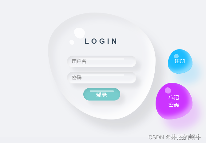
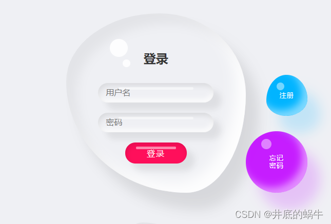
完成后我们就可以在这个水滴里面添加东西了,比如设计登录页面
 <div class="login-container">
    <div class="login-content">
      <div class="login-box">
        <form action="" class="login-form">
          <h2>LOGIN</h2>
          <div class="input-box">
            <input type="text" placeholder="用户名"/>
          </div>
          <div class="input-box">
            <input type="password" placeholder="密码"/>
          </div>
          <div class="input-box">
            <input type="submit" value="登录"/>
          </div>
        </form>
      </div>
      <div class="login-btn forget-pwd">
        <span>忘记</span>
        <span>密码</span>
      </div>
      <div class="login-btn register"><span>注册</span></div>
    </div>
  </div>
.login-container {
    width: 50vw;
    height: 50vh;
    background: #eff0f4;
    display: flex;
    justify-content: center;
    align-items: center;
    opacity: 0.9;
}

.login-content {
    position: relative;
    display: flex;
    justify-content: center;
    align-items: center;
}

.login-box {
    display: flex;
    justify-content: center;
    align-items: center;
    height: 350px;
    position: relative;
    width: 350px;
    border-radius: 52% 48% 33% 67% / 38% 45% 55% 62%;
    box-shadow: inset 20px 20px 20px rgba(0, 0, 0, .05),
    25px 35px 20px rgba(0, 0, 0, .05),
    25px 30px 30px rgba(0, 0, 0, .05),
    inset -20px -20px 25px hsla(0, 0%, 100%, .9);
    /*transition: .5s;*/
    animation: waterMove 9s linear infinite;
}

/* 关键帧 */
@keyframes waterMove {
    20% {
        border-radius: 30% 70% 53% 47% / 28% 44% 56% 72%;
    }

    40% {
        border-radius: 30% 70% 39% 61% / 34% 39% 61% 66%;
    }

    60% {
        border-radius: 25% 75% 45% 55% / 40% 55% 45% 60%;
    }

    80% {
        border-radius: 28% 72% 31% 69% / 32% 39% 61% 68%;
    }
}

.login-box::before {
    content: '';
    position: absolute;
    top: 50px;
    left: 85px;
    width: 35px;
    height: 35px;
    background: #fff;
    border-radius: 52% 48% 33% 67% / 38% 45% 55% 62%;
    opacity: .9;
    animation: waterMove 9s linear infinite;
}

.login-box::after {
    content: '';
    top: 90px;
    position: absolute;
    left: 70px;
    width: 15px;
    height: 15px;
    border-radius: 52% 48% 33% 67% / 38% 45% 55% 62%;
    background: #fff;
    opacity: .9;
    animation: waterMove 9s linear infinite;
}

.login-form {
    display: flex;
    justify-content: center;
    align-items: center;
    flex-direction: column;
    padding: 40px;
    gap: 15px;
}

.login-form h2 {
    gap: 20px;
    letter-spacing: .3em;
}


.input-box {
    width: 225px;
    box-shadow: inset 2px 5px 10px rgba(0, 0, 0, .1),
    inset -2px -5px 10px rgba(255, 255, 255, 1),
    15px 15px 10px rgba(0, 0, 0, .05),
    15px 10px 15px rgba(0, 0, 0, .025);
    position: relative;
    border-radius: 25px;
}

.input-box:last-child {
    width: 120px;
    background: rgb(105, 199, 199);
    transition: .6s;
    box-shadow: inset 2px 5px 10px rgba(0, 0, 0, .1),
    15px 15px 10px rgba(0, 0, 0, .05),
    15px 10px 15px rgba(0, 0, 0, .025);
}

.input-box:last-child:hover {
    width: 150px;
}

.input-box::before {
    content: '';
    position: absolute;
    top: 8px;
    left: 50%;
    transform: translateX(-50%);
    width: 65%;
    height: 5px;
    background: rgba(255, 255, 255, .5);
    border-radius: 5px;
}

.input-box input {
    border: none;
    outline: none;
    background: transparent;
    width: 100%;
    font-size: 1em;
    padding: 10px 15px;
    box-sizing: border-box;
}

.input-box:last-child input {
    color: #fff;
    text-transform: uppercase;
    font-size: 1em;
    cursor: pointer;
    letter-spacing: .1em;
    font-weight: 500;
}

.login-btn {
    position: absolute;
    right: -120px;
    bottom: 0;
    width: 120px;
    height: 120px;
    background: #c61dff;
    color: #fff;
    display: flex;
    flex-direction: column;
    justify-content: center;
    align-items: center;
    flex-wrap: wrap;
    cursor: pointer;
    text-decoration: none;
    letter-spacing: .1em;
    font-size: 1em;
    transition: .25s;
    box-shadow: inset 10px 10px 10px rgba(190, 1, 254, .05),
    25px 35px 20px rgba(190, 1, 254, .1),
    25px 30px 30px rgba(190, 1, 254, .1),
    inset -10px -10px 15px rgba(255, 255, 255, .5);
    border-radius: 44% 56% 65% 35% / 57% 58% 42% 43%;
    user-select: none;
    animation: waterMove2 9s linear infinite;
}

.login-btn::before {
    content: '';
    position: absolute;
    top: 15px;
    left: 30px;
    width: 20px;
    height: 20px;
    border-radius: 44% 56% 35% / 57% 58% 42% 43%;
    background: #fff;
    opacity: .45;
}

.login-btn:hover, .login-btn:hover::before {
    border-radius: 50%;
}

.register {
    bottom: 150px;
    right: -120px;
    width: 80px;
    height: 80px;
    background: #01b4ff;
    border-radius: 49% 51% 52% 48% / 63% 59% 41% 37%;
    box-shadow: inset 10px 10px 10px rgba(1, 180, 255, .005),
    25px 35px 20px rgba(1, 180, 255, .1),
    25px 30px 30px rgba(1, 180, 255, .1),
    inset -10px -10px 15px rgba(255, 255, 255, .5);
}

.register::before {
    left: 20px;
    width: 15px;
    height: 15px;
    border-radius: 49% 51% 52% 48% / 63% 59% 41% 37%;
}


@keyframes waterMove2 {
    20% {
        border-radius: 44% 56% 65% 35% / 57% 58% 42% 43%;
    }

    40% {
        border-radius: 44% 56% 45% 45% / 67% 50% 46% 37%;
    }

    60% {
        border-radius: 39% 61% 70% 30% / 60% 68% 50% 43%;
    }

    80% {
        border-radius: 41% 58% 60% 40% / 52% 48% 70% 52%;
    }
}
效果展示: