Jetpack Compose中没有沿用Android原有的View动画和属性动画,而是新创建了一套全新的动画系统API,这是理所当然的,因为旧的动画系统主要是基于View体系的,而Compose中需要针对的是Composable可组合函数进行处理,那么势必要创造一套新的玩具出来,同时,这也无疑增加了开发者的学习成本。

乍一看Jetpack Compose中的动画Api,尼玛是真的多呀,我C了,简直令人眼花缭乱、云里雾里、天马行空、小兔乱撞、手脚慌乱、头冒虚汗、四肢抓狂、不知所措呀 。。。😭
但是我们可以对其进行分一下类,如果按照使用的方便程度划分,大概可以分为两大类:高级动画API和低级动画API(这里类比高级开发语言的分类,并不是指效果多高级)。
其中高级动画API使用比较简单方便,封装度高,更加适用于日常业务开发,而低级动画API则使用起来较为麻烦,因为其配置项或流程较多,但是却更加灵活,能对动画效果做出更加精细的控制,适合自定义要求度较高的业务场景。
我们还可以按照功能类型进行一个大概的分类,也就是上图中的划分,这里再用表格归类一下:
| 功能需求点 | 可能符合的API类型 |
|---|---|
| 单个组件的显示隐藏转场动画 每个子组件需要不同的入场/出场效果 | AnimatedVisibility |
| 根据组件内容状态变化的动画(数据、尺寸等) 不同组件间的切换动画 | AnimatedContent Modifier.animateContentSize |
| 单纯的淡入淡出动画 | Crossfade |
| 根据数据估值状态自动执行连续动画 基于单个数据值的状态变化执行动画 基于自定义数据类型进行估值动画 指定每一帧/每一时刻的动画状态 替代传统属性动画的方案 | animateXXXAsState |
| 根据不同状态同时管理和运行多个动画 进入界面时自动执行一次动画 监听动画状态 替代传统View动画中的AnimationSet的方案。 | updateTransition MutableTransitionState |
| 永不停止、无限循环的动画 | rememberInfiniteTransition |
| 更加底层的低级动画API 可高度自由定制的估值属性动画 需要在协程中执行的动画 需要控制一些动画并行执行 | Animatable |
| 更加底层的低级动画API 需要手动精确控制动画的时间 手势动画,fling衰减动画 | TargetBasedAnimation DecayAnimation |
高级动画API
AnimatedVisibility
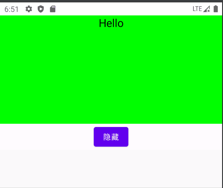
AnimatedVisibility主要用于页面显示状态的动画,即显示/隐藏的过渡动画,或者入场/离场动画。
可以使用 + 运算符组合多个 EnterTransition 或 ExitTransition 对象,并且每个对象都接受可选参数以自定义其行为。
@Composable
fun AnimatedVisibilityExample() {
    var visible by remember { mutableStateOf(true) }
    val density = LocalDensity.current
    Box(Modifier.fillMaxWidth(), contentAlignment = Alignment.TopCenter) {
        AnimatedVisibility(
            visible = visible,
            enter = slideInVertically { with(density) { -40.dp.roundToPx() } } // 从顶部 40dp 的地方开始滑入
                    + expandVertically(expandFrom = Alignment.Top)  // 从顶部开始展开
                    + fadeIn(initialAlpha = 0.3f), // 从初始透明度 0.3f 开始淡入
            exit = slideOutVertically() + shrinkVertically() + fadeOut()
        ) {
            Text("Hello",
                Modifier.background(Color.Green).fillMaxWidth().height(200.dp)
                    .wrapContentWidth(Alignment.CenterHorizontally),
                fontSize = 20.sp
            )
        }
        Button(
            onClick = { visible = !visible },
            modifier = Modifier.padding(top = 200.dp)
        ) {
            Text(text = if(visible) "隐藏" else "显示")
        }
    }
}
运行效果:
默认情况下 EnterTransition 是 fadeIn() + expandIn() 的效果,而 ExitTransition 是 shrinkOut() + fadeOut() 的效果, Compose额外提供了RowScope.AnimatedVisibility和ColumnScope.AnimatedVisibility两个扩展方法, 当我们在Row或Column中调用时,该组件的默认动画效果会根据父容器的布局特征进行调整,比如在Row中EnterTransition默认是fadeIn + expandHorizontally组合,而在Column中EnterTransition默认是fadeIn + expandVertically组合方案。
EnterTransition 和 ExitTransition 动画分类效果示例:
| EnterTransition | ExitTransition |
|---|---|
FadeIn  | FadeOut  |
slideIn  | slideOut  |
slideInHorizontally  | slideOutHorizontally  |
slideInVertically  | slideOutVertically  |
scaleIn  | scaleOut  |
expandIn  | shrinkOut  |
expandHorizontally  | shrinkHorizontally  |
expandVertically  | shrinkVertically  |
为子项添加进入和退出动画效果
AnimatedVisibility 中的内容(直接或间接子项)可以使用 Modifier.animateEnterExit 修饰符为每个子项指定不同的动画行为。
其中每个子项的视觉效果均由 AnimatedVisibility 可组合项中指定的动画与子项自己的进入和退出动画构成。
@OptIn(ExperimentalAnimationApi::class)
@Composable
fun AnimatedVisibilityExample3() {
    var visible by remember { mutableStateOf(true) }
    Box(Modifier.fillMaxWidth(), contentAlignment = Alignment.TopCenter) {
        AnimatedVisibility(visible = visible, enter = fadeIn(), exit = fadeOut()) {
            // 外层Box组件淡入淡出进出屏幕
            Box(Modifier.fillMaxSize().background(Color.DarkGray)) {
                Box(Modifier.align(Alignment.Center)
                    .sizeIn(minWidth = 256.dp, minHeight = 64.dp).background(Color.Green)
                    .animateEnterExit(enter = slideInVertically(), exit = slideOutVertically())
                ) {
                    Text(text = "内层Box组件滑动进出屏幕", Modifier.align(Alignment.Center))
                }
                Box(Modifier.padding(top = 150.dp).align(Alignment.Center)
                    .sizeIn(minWidth = 256.dp, minHeight = 64.dp).background(Color.Cyan)
                    .animateEnterExit(enter = scaleIn(), exit = scaleOut())
                ) {
                    Text(text = "内层层Box组件缩放进出屏幕", Modifier.align(Alignment.Center))
                }
            }
        }
        Button(
            onClick = { visible = !visible },
            modifier = Modifier.padding(top = 50.dp)
        ) {
            Text(text = if(visible) "隐藏" else "显示")
        }
    }
}
运行效果:
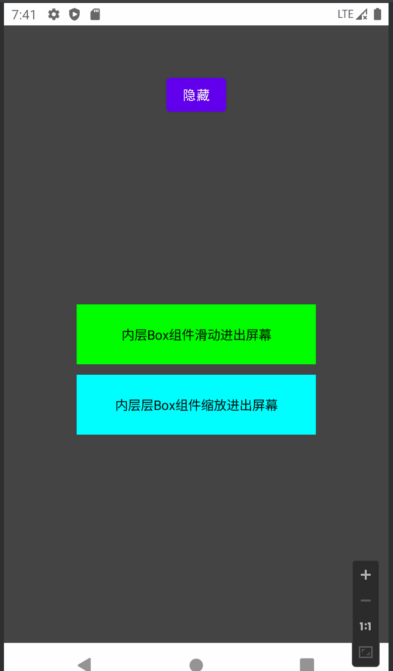
有时我们希望 AnimatedVisibility 内的每个子组件有不同的过渡动画,此时请在 AnimatedVisibility 可组合项中指定 EnterTransition.None 和 ExitTransition.None,即完全不应用任何动画,这样子项就可以通过 Modifier.animateEnterExit 拥有各自的不同动画了。
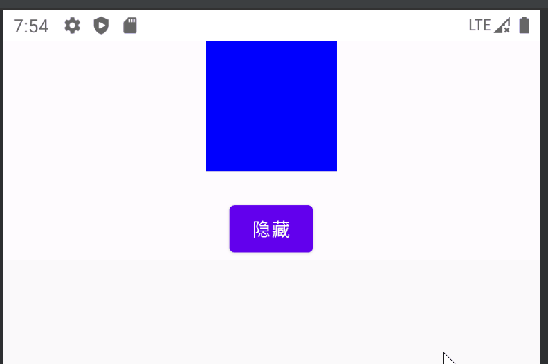
自定义Enter/Exit动画
如果想在内置进入和退出动画之外添加自定义动画效果,请在 AnimatedVisibilityScope 内设置 transition, 添加到 Transition 实例的所有动画状态都将与 AnimatedVisibility 的进入和退出动画同时运行。
AnimatedVisibility 会等到 Transition 中的所有动画都完成后再移除其内容。对于独立于 Transition(例如使用 animate*AsState)创建的退出动画,AnimatedVisibility 将无法解释这些动画,因此可能会在完成之前移除内容可组合项。
@OptIn(ExperimentalAnimationApi::class)
@Composable
fun AnimatedVisibilityExample4() {
    var visible by remember { mutableStateOf(true) }
    Box(Modifier.fillMaxWidth(), contentAlignment = Alignment.TopCenter) {
        AnimatedVisibility(visible = visible, enter = scaleIn(), exit = scaleOut()) {
            // 使用 AnimatedVisibilityScope#transition 添加自定义的动画与AnimatedVisibility同时执行
            val background by transition.animateColor(label = "backgroundTransition") { state ->
                if (state == EnterExitState.Visible) Color.Blue else Color.Green
            }
            Box(modifier = Modifier.size(100.dp).background(background))
        }
        Button(
            onClick = { visible = !visible },
            modifier = Modifier.padding(top = 120.dp)
        ) {
            Text(text = if(visible) "隐藏" else "显示")
        }
    }
}
运行效果:
AnimatedContent
AnimatedContent 可组合项会在内容根据目标状态发生变化时,为内容添加动画效果。
与 AnimatedVisibility 的区别是: AnimatedVisibility用来添加组件自身的入场/离场动画,而AnimatedContent是实现不同组件间的切换动画
AnimatedContent接收一个targetState和一个content,content 是基于 targetState 创建的Composable,当targetState变化时,content的内容也会随之变化。AnimatedContent内部维护着targetState到content的映射表,查找 targetState新旧值对应的content后,在content发生重组时附加动画效果。
@OptIn(ExperimentalAnimationApi::class)
@Composable
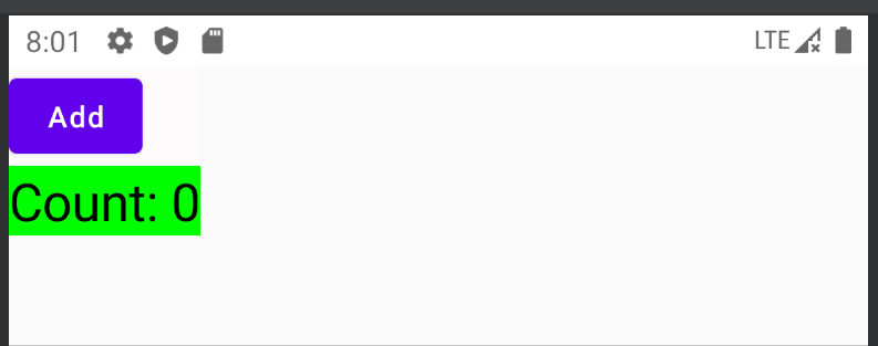
fun AnimatedContentExample() {
Column {
var count by remember { mutableStateOf(0) }
Button(onClick = { count++ }) { Text("Add") }
AnimatedContent(targetState = count) { targetCount ->
// 这里要使用lambda的参数 `targetCount`, 而不是 `count`,否则将没有意义(API 会将此值用作键,以标识当前显示的内容)
Text(text = "Count: $targetCount", Modifier.background(Color.Green), fontSize = 25.sp)
}
}
}
运行效果:
ContentTransform
AnimatedContent默认是淡入淡出效果,可以为 transitionSpec 参数指定 ContentTransform 对象,以自定义此动画行为。
可以使用 with infix 函数来组合 EnterTransition 与 ExitTransition,以创建 ContentTransform
 @ExperimentalAnimationApi
 infix fun EnterTransition.with(exit: ExitTransition) = ContentTransform(this, exit)
ContentTransform本质上就是currentContent(initial) 的 ExitTransition与targetContent的EnterTransition组合, EnterTransition 定义了目标内容应如何显示,ExitTransition 则定义了初始内容应如何消失。
@OptIn(ExperimentalAnimationApi::class)
@Composable
fun AnimatedContentExample2() {
    Column {
        var count by remember { mutableStateOf(0) }
        Button(onClick = { count++ }) { Text("Add") }
        AnimatedContent(
            targetState = count,
            transitionSpec = {
                // 从右往左切换,并伴随淡入淡出效果(initialOffsetX = width, targetOffsetX = -width)
                slideInHorizontally{width -> width} + fadeIn() with
                        slideOutHorizontally{width -> -width} + fadeOut()
            }
        ) { targetCount ->
            Text(text = "Count: $targetCount", Modifier.background(Color.Green), fontSize = 25.sp)
        }
    }
}
运行效果:

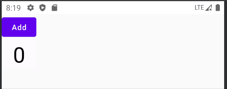
@OptIn(ExperimentalAnimationApi::class)
@Composable
fun AnimatedContentExample3() {
    Column(horizontalAlignment = Alignment.CenterHorizontally) {
        var count by remember { mutableStateOf(0) }
        Button(onClick = { count++ }) { Text("Add") }
        val animationSpec = tween<IntOffset>(200)
        val animationSpec2 = tween<Float>(200)
        AnimatedContent(
            targetState = count,
            transitionSpec = {
                slideInVertically(animationSpec){ height -> height} + fadeIn(animationSpec2) with
                    slideOutVertically(animationSpec) {height -> height} + fadeOut(animationSpec2)
            }
        ) { targetCount ->
            Text(text = "$targetCount", fontSize = 40.sp)
        }
    }
}
运行效果:
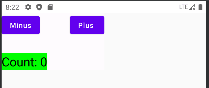
@OptIn(ExperimentalAnimationApi::class)
@Composable
fun AnimatedContentExample4() {
    Column {
        var count by remember { mutableStateOf(0) }
        Row(horizontalArrangement = Arrangement.SpaceAround) {
            Button(onClick = { count-- }) { Text("Minus") }
            Spacer(Modifier.size(60.dp))
            Button(onClick = { count++ }) { Text("Plus ") }
        }
        Spacer(Modifier.size(20.dp))
        AnimatedContent(
            targetState = count,
            transitionSpec = {
                if (targetState > initialState) {
                    // 如果targetState更大,则从下往上切换并伴随淡入淡出效果
                    slideInVertically { height -> height } + fadeIn() with
                            slideOutVertically { height -> -height } + fadeOut()
                } else {
                    // 如果targetState更小,则从上往下切换并伴随淡入淡出效果
                    slideInVertically { height -> -height } + fadeIn() with
                            slideOutVertically { height -> height } + fadeOut()
                }.using(
                    // Disable clipping since the faded slide-in/out should be displayed out of bounds.
                    SizeTransform(clip = false)
                )
            }
        ) { targetCount ->
            Text(text = "Count: $targetCount", Modifier.background(Color.Green), fontSize = 25.sp)
        }
    }
}
运行效果:
slideIntoContainer 和 slideOutOfContainer
除了可用于 AnimatedVisibility 的所有 EnterTransition 和 ExitTransition 函数之外,AnimatedContent 还提供了 slideIntoContainer 和 slideOutOfContainer。这些是 slideInHorizontally/Vertically 和 slideOutHorizontally/Vertically 的便捷替代方案,它们可根据初始内容的大小和 AnimatedContent 内容的目标内容来计算滑动距离。(官方例子可见:slideIntoContainer)
@OptIn(ExperimentalAnimationApi::class)
@Composable
fun SlideIntoContainerSample() {
    val transitionSpec: AnimatedContentScope<Int>.() -> ContentTransform = {
        if (initialState < targetState) {
            slideIntoContainer(towards = AnimatedContentScope.SlideDirection.Up) + fadeIn() with
                    slideOutOfContainer(towards = AnimatedContentScope.SlideDirection.Up) + fadeOut()
        } else {
            slideIntoContainer(towards = AnimatedContentScope.SlideDirection.Down) + fadeIn()  with
                    slideOutOfContainer(towards = AnimatedContentScope.SlideDirection.Down) + fadeOut()
        }.apply {
            // 这里可指定目标内容的 zIndex ,值越大越上层,值越小越下层
//            targetContentZIndex = when (targetState) {
//                NestedMenuState.Level1 -> 1f
//                NestedMenuState.Level2 -> 2f
//                NestedMenuState.Level3 -> 3f
//            }
        }.using(SizeTransform(clip = false))
    }
    Column {
        var count by remember { mutableStateOf(0) }
        Row(horizontalArrangement = Arrangement.SpaceAround) {
            Button(onClick = { count-- }) { Text("Minus") }
            Spacer(Modifier.size(60.dp))
            Button(onClick = { count++ }) { Text("Plus ") }
        }
        Spacer(Modifier.size(20.dp))
        AnimatedContent(
            targetState = count,
            transitionSpec = transitionSpec,
        ) { targetCount ->
            Text(text = "Count: $targetCount", Modifier.background(Color.Green), fontSize = 25.sp)
        }
    }
}
运行效果:同上一个例子一样
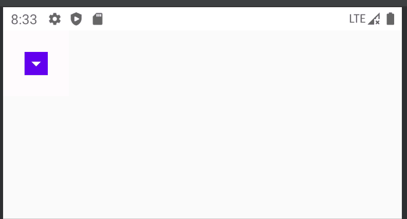
SizeTransform
SizeTransform 定义了大小应如何在初始内容与目标内容之间添加动画效果。在创建动画时,您可以访问初始大小和目标大小。 SizeTransform 还可控制在动画播放期间是否应将内容裁剪为组件大小。
@OptIn(ExperimentalAnimationApi::class, ExperimentalMaterialApi::class)
@Composable
fun SizeTransformAnimatedContentSample() {
    var expanded by remember { mutableStateOf(false) }
    Surface(
        color = MaterialTheme.colors.primary,
        onClick = { expanded = !expanded },
        modifier = Modifier.padding(10.dp).onSizeChanged {  }
    ) {
        AnimatedContent(
            targetState = expanded,
            transitionSpec = {
                fadeIn(animationSpec = tween(150, 150)) with
                    fadeOut(animationSpec = tween(150)) using
                        SizeTransform { initialSize, targetSize ->
                            if (targetState) {
                                keyframes {
                                    // 展开时,先水平方向展开
                                    // 150ms之前:宽度从initialSize.width增大到targetSize.width,高度保持initialSize.height不变
                                    // 150ms之后:宽度保持targetSize.width不变,高度从initialSize.height开始增大到targetSize.height
                                    IntSize(targetSize.width, initialSize.height) at 150
                                    durationMillis = 300
                                }
                            } else {
                                keyframes {
                                    // 收缩时,先垂直方向收起
                                    // 150ms之前:宽度保持initialSize.width不变,高度从initialSize.height减小到targetSize.height
                                    // 150ms之后:宽度从initialSize.width减小到targetSize.width,高度保持targetSize.height不变
                                    IntSize(initialSize.width, targetSize.height) at 150
                                    durationMillis = 300
                                }
                            }
                        }
            }
        ) { targetExpanded ->
            if (targetExpanded) Expanded() else ContentIcon()
        }
    }
}
@Composable
fun ContentIcon() {
    Icon(Icons.Default.ArrowDropDown, "")
}
@Composable
fun Expanded() {
    Text(text = "SizeTransform 定义了大小应如何在初始内容与目标内容之间添加动画效果。在创建动画时,您可以访问初始大小和目标大小。SizeTransform 还可控制在动画播放期间是否应将内容裁剪为组件大小。SizeTransform 定义了大小应如何在初始内容与目标内容之间添加动画效果。在创建动画时,您可以访问初始大小和目标大小。SizeTransform 还可控制在动画播放期间是否应将内容裁剪为组件大小。",
        modifier = Modifier.padding(10.dp))
}
运行效果:
与AnimatedVisibility一样,AnimatedContent 内的子组件也可以通过 Modifier.animateEnterExit() 单独指定动画。
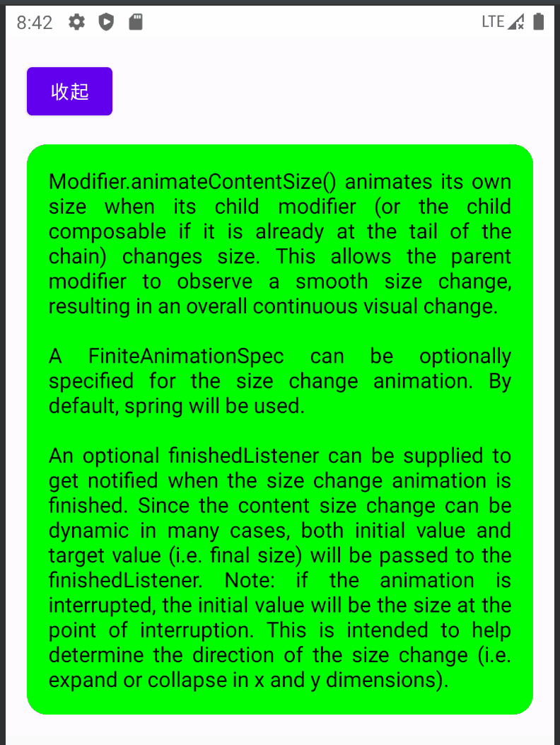
Modifier.animateContentSize
Modifier.animateContentSize: 当容器尺寸大小发生变化时添加动画效果
注意:animateContentSize 在修饰符链中的位置顺序很重要。为了确保流畅的动画,请务必将其放置在任何大小修饰符(如 size 或 defaultMinSize)前面,以确保 animateContentSize 会将带动画效果的值的变化报告给布局。
下面代码使用expand来控制Text的maxLines属性,当最大行数发生变化时,animateContentSize() 会使用过渡动画:
@Composable
fun AnimateContentSizeExample() {
    var expand by remember { mutableStateOf(true) }
    Column(Modifier.padding(16.dp)) {
        Button(onClick = { expand = !expand }) {
            Text(text = if (expand) "收起" else "展开")
        }
        Spacer(Modifier.height(16.dp))
        Box(
            modifier = Modifier.background(Color.Green, RoundedCornerShape(15.dp))
                .padding(16.dp).wrapContentSize()
                .animateContentSize()
        ) {
            Text(
                text = "Modifier.animateContentSize() animates its own size when its child modifier (or the child composable if it is already at the tail of the chain) changes size. This allows the parent modifier to observe a smooth size change, resulting in an overall continuous visual change.\n\n"
                        +"A FiniteAnimationSpec can be optionally specified for the size change animation. By default, spring will be used.\n\n"
                        +"An optional finishedListener can be supplied to get notified when the size change animation is finished. Since the content size change can be dynamic in many cases, both initial value and target value (i.e. final size) will be passed to the finishedListener. Note: if the animation is interrupted, the initial value will be the size at the point of interruption. This is intended to help determine the direction of the size change (i.e. expand or collapse in x and y dimensions).",
                fontSize = 16.sp,
                textAlign = TextAlign.Justify,
                maxLines = if (expand) Int.MAX_VALUE else 2
            )
        }
    }
}
运行效果:
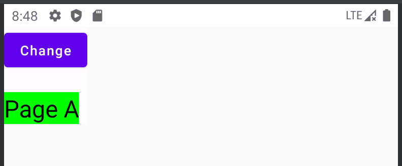
Crossfade
Crossfade 可使用淡入淡出动画在两个布局之间添加动画效果。 通过切换传递给 current 参数的值,可以使用淡入淡出动画来切换内容。如果只是淡入淡出的需求,可以使用Crossfade替代AnimatedContent。
AnimatedContent是Crossfade的一种泛化,AnimatedContent是后来为了增强Crossfade而增加的。
需要注意的是:Crossfade无法实现 SizeTransform 那样尺寸大小变化的动画效果(如果有这种需求,请使用AnimatedContent + SizeTransform 或者使用 Crossfade + Modifier.animateContentSize)
@Composable
fun CrossfadeExample() {
    Column {
        var currentPage by remember { mutableStateOf("A") }
        Button(onClick = { currentPage = if(currentPage == "A") "B" else "A" }) {
            Text("Change")
        }
        Spacer(Modifier.size(20.dp))
        Crossfade(targetState = currentPage) { screen ->
            when (screen) {
                "A" -> Text("Page A", Modifier.background(Color.Green), fontSize = 25.sp)
                "B" -> Text("Page B", Modifier.background(Color.Red), fontSize = 25.sp)
            }
        }
    }
}
运行效果:
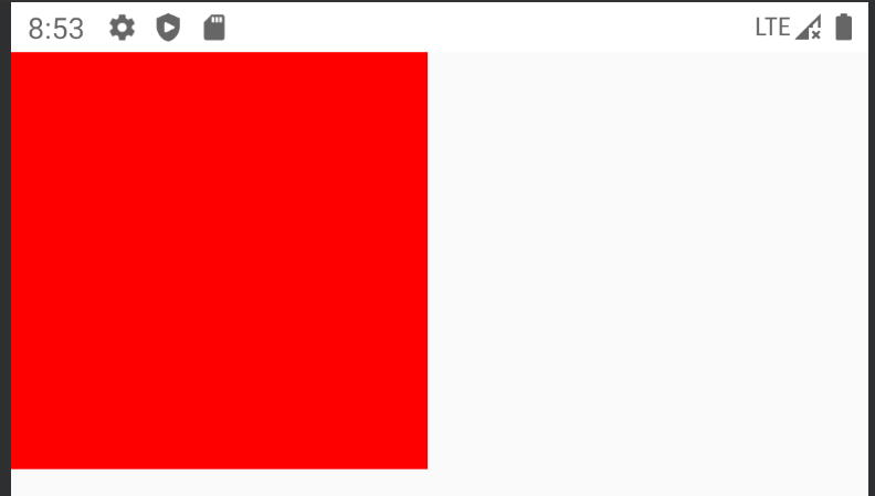
animateXXXAsState
animate*AsState 函数是 Compose 中最简单的动画 API,用于为单个值添加动画效果。类似于传统动画中的属性动画。
您只需提供结束值(或目标值),该 API 就会自动完成从当前值到目标值过渡的估值计算。
例如以下代码:透明度在1和0.2之前切换
@Composable
fun AnimateXXXAsStateExample() {
    var enabled by remember { mutableStateOf(true) }
    val alpha: Float by animateFloatAsState(if (enabled) 1f else 0.2f)
    Box(
        Modifier
            .size(200.dp)
            .graphicsLayer(alpha = alpha)
            .background(Color.Red)
            .clickable { enabled = !enabled }
    )
}
运行效果:
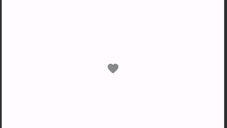
以下代码实现红心按钮动画效果:
- 点击按钮时,buttonSize从24dp开始向32dp过渡,
- 当buttonSize达到32dp时,changeSize被置为false,buttonSize又会从32dp开始向24dp过渡,
- 同时每点击一次按钮,按钮颜色在红色和灰色之间过渡切换
- size: 小 -> 大 -> 小 color: 灰色 -> 红色
@Composable
fun AnimateXXXAsStateExample2() {
    var changeSize by remember { mutableStateOf(false) }
    var changeColor by remember { mutableStateOf(false) }
    val buttonSize by animateDpAsState(if(changeSize) 32.dp else 24.dp)
    val buttonColor by animateColorAsState(
        targetValue = if(changeColor) Color.Red else Color.Gray,
        animationSpec = spring(Spring.DampingRatioNoBouncy)
    )
    if (buttonSize == 32.dp) {
        changeSize = false
    }
    Box(Modifier.fillMaxSize(),contentAlignment = Alignment.Center) {
        IconButton(
            onClick = {
                changeSize = true
                changeColor = !changeColor
            }
        ) {
            Icon(Icons.Rounded.Favorite, null, Modifier.size(buttonSize), tint = buttonColor)
        }
    }
}
运行效果:
请注意,您无需创建任何动画类的实例,也不必处理中断。在后台,系统会在调用点创建并记录一个动画对象(即 Animatable 实例),并将第一个目标值设为初始值。此后,只要您为此可组合项提供不同的目标值,系统就会自动向该值播放动画。
如果已有动画在播放,系统将从其当前值(和速度)开始向目标值播放动画。 在播放动画期间,这个可组合项会重组,并且每帧都会返回一个已更新的动画值。
Compose 为 Float、Color、Dp、Size、Offset、Rect、Int、IntOffset 和 IntSize 提供开箱即用的 animate*AsState 函数。 对于无法直接估值计算的数据类型,可以使用通用类型的 animateValueAsState,并实现 TwoWayConverter 估值计算器。
AnimationVector & TwoWayConverter
Float、Color、Dp等都是通过Animatable转换成可动画类型,而Animatable是借助 TwoWayConverter 实现的:
class Animatable<T, V : AnimationVector>(
    initialValue: T, // T类型的动画初始值
    val typeConverter: TwoWayConverter<T, V>, // 将T类型的数值与V类型的数组进行转换
    private val visibilityThreshold: T? = null, // 动画消失时的阈值,默认为null
    val label: String = "Animatable"
)
interface TwoWayConverter<T, V : AnimationVector> {
    val convertToVector: (T) -> V   // 将T类型的数值转换为V类型
    val convertFromVector: (V) -> T // 将V类型的数值转换为T类型
}
不同类型的数值可以根据需求与不同的AnimationVectorXD进行转换,这里X代表了信息的维度,例如一个Int可以与AnimationVector1D进行转换,AnimationVector1D只包含一个浮点型数值。
 val IntToVector: TwoWayConverter<Int, AnimationVector1D> =
        TwoWayConverter( { AnimationVector1D(it.toFloat()) }, { it.value.toInt() })
同样地,Size包含width和height两个维度,可以与AnimationVector2D进行转换,
Color 包含 red、green、blue 和 alpha 这 4 个维度,可以与 AnimationVector4D 进行转换。
通过这种方式,动画中使用的每种数据类型都可以根据其维度转换为 AnimationVector1D、AnimationVector2D、AnimationVector3D 或 AnimationVector4D。
这样可为对象的不同组件单独添加动画效果,且每个组件都有自己的速度跟踪。对于常见的数据类型,Compose都提供了内置转换器,可以直接使用如Color.VectorConverter、Dp.VectorConverter、Float.VectorConverter、Rect.VectorConverter 等等。可以在对应类型的伴生对象中找到其实现。
自定义TwoWayConverter
首先要明确一点的是,只有没有找到Compose提供的内置转换器的数据类型时才需要进行自定义,通常我们不需要这样做。
例如,您可以结合使用 animateValueAsState 为自定义数据类型添加动画效果,如下所示:
@Composable
fun AnimateValueExample(targetSize: MySize) {
    val animSize: MySize by animateValueAsState(
        targetValue = targetSize,
        typeConverter = TwoWayConverter(
            convertToVector = { size: MySize ->
                // Extract a float value from each of the `Dp` fields.
                AnimationVector2D(size.width.value, size.height.value)
            },
            convertFromVector = { vector: AnimationVector2D ->
                MySize(vector.v1.dp, vector.v2.dp)
            }
        )
    )
}
data class MySize(val width: Dp, val height: Dp)
Transition
Transition 可管理一个或多个动画作为其子项,并在多个状态之间同时运行这些动画。类似传统动画中的AnimationSet。
这里的状态可以是任何数据类型。在很多情况下,您可以使用自定义 enum 类型来确保类型安全,如下例所示:
enum class BoxState {
    Collapsed,
    Expanded
}
updateTransition
updateTransition 可创建并记住 Transition 的实例,当其观察的状态改变时,Transition会自动更新其状态。
var currentState by remember { mutableStateOf(BoxState.Collapsed) }
val transition = updateTransition(currentState, label = "BoxTransition")
然后,您可以使用某一个 transition.animatexxx 扩展函数 来定义此过渡效果中的子动画。为每个状态指定目标值。
这些 transition.animatexxx 扩展函数 会返回一个动画值,在动画播放过程中,当使用 updateTransition 更新过渡状态时,该值将逐帧更新。
您也可以传递 transitionSpec 参数,为过渡状态变化的每个组合指定不同的 AnimationSpec。
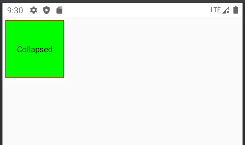
@Composable
fun TransitionAnimationExample() {
    var boxState by remember { mutableStateOf(BoxState.Collapsed) }
    val transition = updateTransition(boxState, label = "BoxTransition")
    val size by transition.animateFloat(
        transitionSpec = { tween(500) }, label = "size"
    ) { state ->
        state.valueOf(collapsed = 100f, expanded = 200f)
    }
    val borderWidth by transition.animateDp(
        transitionSpec = { tween(500) }, label = "borderWidth"
    ) { state ->
        state.valueOf(collapsed = 1.dp, expanded = 2.dp)
    }
    val bgColor by transition.animateColor(
        transitionSpec = {
            when {
                BoxState.Expanded isTransitioningTo BoxState.Collapsed -> spring(stiffness = 50f)
                else -> tween(500)
            }
        }, label = "bgColor"
    ) { state ->
        state.valueOf(collapsed = Color.Green, expanded = Color.Cyan)
    }
    val borderColor by transition.animateColor(label = "borderColor") { state ->
        state.valueOf(collapsed = Color.Red, expanded = Color.Blue)
    }
    Box(
        modifier = Modifier
            .clickable {
                boxState = boxState.swapState()
            }
            .padding(5.dp)
            .size(size.dp)
            .background(bgColor)
            .border(BorderStroke(borderWidth, borderColor)),
        contentAlignment = Alignment.Center
    ) {
        Text(text = boxState.valueOf("Collapsed", "Expanded"))
    }
}

fun <T> BoxState.valueOf(collapsed: T, expanded: T) : T {
    return when (this) {
        BoxState.Collapsed -> collapsed
        BoxState.Expanded -> expanded
    }
}

fun BoxState.swapState() : BoxState = valueOf(BoxState.Expanded, BoxState.Collapsed)
运行效果:
当过渡动画到目标状态后,Transition.currentState 将与 Transition.targetState 相同,这一点可以用作判断是否已完成过渡动画的条件。
MutableTransitionState
MutableTransitionState:为其设置不同的目标值可立即触发动画
有时,我们会希望初始状态与第一个目标状态不同,我们可以通过结合使用 updateTransition 和 MutableTransitionState 来实现这一点。
MutableTransitionState的构造函数接受一个initialState参数,只需要修改它的targetState值与initialState不同的值,就会立即触发动画。
例如,它允许我们在代码进入组合阶段后立即开始播放动画。
@Composable
fun MutableTransitionStateExample() {
    val boxState = remember {
        MutableTransitionState(BoxState.Collapsed).apply {
            targetState = BoxState.Expanded // 修改targetState与initialState不同立即执行动画
        }
    }
    val transition = updateTransition(boxState, label = "BoxTransition")
    val size by transition.animateFloat(
        transitionSpec = { tween(500) }, label = "sizeTransition"
    ) { state ->
        state.valueOf(collapsed = 100f, expanded = 200f)
    }
    val bgColor by transition.animateColor(
        transitionSpec = { tween(500) }, label = "bgColorTransition"
    ) { state ->
        state.valueOf(collapsed = Color.Green, expanded = Color.Cyan)
    }
    Box(
        modifier = Modifier
            .clickable {
                boxState.targetState = boxState.targetState.swapState() // 修改状态时要修改状态的targetState
            }
            .padding(5.dp)
            .size(size.dp)
            .background(bgColor) ,
        contentAlignment = Alignment.Center
    ) {
        Text(text = boxState.valueOf("Collapsed", "Expanded"))
    }
}
fun <T> MutableTransitionState<BoxState>.valueOf(collapsed: T, expanded: T) : T {
    return this.targetState.valueOf(collapsed, expanded)
}
运行效果: 与前面的效果一样,但是进入界面就开始自动执行一次动画。
MutableTransitionState 可以用来监听动画状态
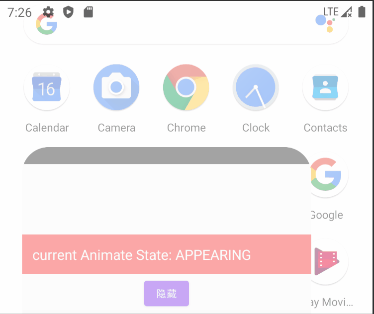
例如,使用 AnimatedVisibility 搭配 MutableTransitionState 可以实现观察动画的可见状态:
@Composable
fun AnimatedVisibilityExample2() {
    // Create a MutableTransitionState<Boolean> for the AnimatedVisibility.
    val state = remember {
        // initialState为false, targetState设置为true,
        // 当AnimatedVisibility上屏时,由于两个状态不同,会立即执行动画
        MutableTransitionState(false).apply {
            targetState = true // Start the animation immediately.
        }
    }
    Box(Modifier.fillMaxWidth(), contentAlignment = Alignment.TopCenter) {
        AnimatedVisibility(visibleState = state) {
            Text(text = "Hello, world!",
                Modifier.background(Color.Green).height(100.dp).fillMaxWidth()
                    .wrapContentWidth(Alignment.CenterHorizontally),
                fontSize = 20.sp)
        }
        // 获取AnimatedVisibility当前所处的动画状态并显示
        Text(text = "current Animate State: ${state.getAnimationState()}",
            Modifier.padding(top = 100.dp).background(Color.Red).fillMaxWidth().padding(15.dp),
            color = Color.White,
            fontSize = 20.sp)
        Button(
            onClick = { state.targetState = !state.targetState },
            Modifier.padding(top = 160.dp)
        ) {
            Text(text = if(state.targetState) "隐藏" else "显示")
        }
    }
}
enum class Animate { VISIBLE, INVISIBLE, APPEARING, DISAPPEARING }
// 为MutableTransitionState定义一个扩展函数来方便的获取动画状态
fun MutableTransitionState<Boolean>.getAnimationState(): Animate {
    return when {
        this.isIdle && this.currentState -> Animate.VISIBLE // 动画已结束,当前处于可见状态
        !this.isIdle && this.currentState -> Animate.DISAPPEARING // 动画执行中,且逐渐不可见
        this.isIdle && !this.currentState -> Animate.INVISIBLE // 动画已结束,当前处于不可见状态
        else -> Animate.APPEARING // 动画执行中,且逐渐可见
    }
}
运行效果:
createChildTransition
对于涉及多个可组合函数的更复杂的过渡,可使用 createChildTransition 来创建子过渡。
此方法对于在复杂的可组合项中分离多个子组件之间的关注点非常有用。父过渡将会知道子过渡中的所有动画值。createChildTransition更像是一种map。
例如:
enum class DialerState { DialerMinimized, NumberPad }
@Composable
fun DialerButton(isVisibleTransition: Transition<Boolean>) {
    // 不需要知道其他状态,只需关注当前isVisibleTransition是 visible 还是 not visible.
    // ...
}
@Composable
fun NumberPad(isVisibleTransition: Transition<Boolean>) {
    // 不需要知道其他状态,只需关注当前isVisibleTransition是 visible 还是 not visible.
    // ...
}
@OptIn(ExperimentalTransitionApi::class)
@Composable
fun Dialer(dialerState: DialerState) {
    val transition = updateTransition(dialerState, label = "")
    Box {
        NumberPad(
            transition.createChildTransition {
                it == DialerState.NumberPad
            }
        )
        DialerButton(
            transition.createChildTransition {
                it == DialerState.DialerMinimized
            }
        )
    }
}
将 Transition 与 AnimatedVisibility 和 AnimatedContent 配合使用
Transition中有分别针对AnimatedVisibility 和 AnimatedContent 的扩展函数。
Transition.AnimatedVisibility 和 Transition.AnimatedContent 的 targetState 源自 Transition, 会在 Transition 的 targetState 发生变化时视需要触发进入/退出过渡。
这些扩展函数允许将原本位于 AnimatedVisibility 或 AnimatedContent 内的所有 enter/exit/sizeTransform 动画提升到 Transition 中。 借助这些扩展函数,可以从外部观察 AnimatedVisibility/AnimatedContent 的状态变化。
@OptIn(ExperimentalAnimationApi::class)
@Composable
fun TransitionWithAnimatedVisibilityAndAnimatedContent() {
    var selected by remember { mutableStateOf(false) }
    // 当 `selected` 变化时触发transition动画
    val transition = updateTransition(selected, label = "")
    val borderColor by transition.animateColor(label = "") { isSelected ->
        if (isSelected) Color.Magenta else Color.White
    }
    val elevation by transition.animateDp(label = "") { isSelected ->
        if (isSelected) 10.dp else 2.dp
    }
    Surface(
        modifier = Modifier.clickable { selected = !selected }
            .padding(10.dp),
        shape = RoundedCornerShape(8.dp),
        border = BorderStroke(2.dp, borderColor),
        elevation = elevation
    ) {
        Column(modifier = Modifier
            .fillMaxWidth()
            .padding(16.dp)) {
            Text(text = "Hello, world!")
            // AnimatedVisibility 作为过渡动画的一部分
            transition.AnimatedVisibility(
                visible = { targetSelected -> targetSelected },
                enter = expandVertically(),
                exit = shrinkVertically()
            ) {
                Text(text = "It is fine today.")
            }
            // AnimatedContent 作为过渡动画的一部分
            transition.AnimatedContent { targetState ->
                if (targetState) {
                    Text(text = "Selected")
                } else {
                    Icon(Icons.Default.Favorite, "")
                }
            }
        }
    }
}
运行效果:
对于transition.AnimatedContent, transition所包含的状态值会被转换成targetState参数传入。
对于transition.AnimatedVisibility,则需要通过一个 lambda转换器 将状态值转换成其所需的 Boolean 类型的 visible 参数。
封装和复用 Transition
在处理具有大量动画值的复杂组件时,可能会希望将动画实现与可组合界面分开。
为此,您可以创建一个类来保存所有动画值,同时创建一个“update”函数来返回该类的实例。过渡实现可提取到新的独立函数中。
当您需要集中处理动画逻辑或使复杂动画可重复使用时,这种模式很有用。
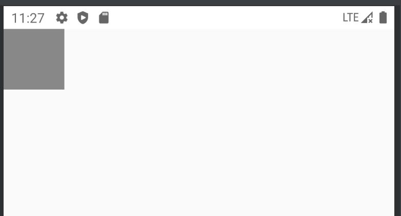
@Composable
fun AnimatingBoxExample() {
    var currentState by remember { mutableStateOf(BoxState.Collapsed) }
    AnimatingBox(
        boxState = currentState,
        Modifier.clickable { currentState = currentState.swapState() }
    )
}
@Composable
fun AnimatingBox(boxState: BoxState, modifier: Modifier = Modifier) {
    val transitionData = updateTransitionData(boxState)
    Box(modifier.background(transitionData.color).size(transitionData.size))
}

// 保存动画值
private class TransitionData(color: State<Color>, size: State<Dp>) {
    val color by color
    val size by size
}

// 创建一个 Transition 并返回其动画值
@Composable
private fun updateTransitionData(boxState: BoxState): TransitionData {
    val transition = updateTransition(boxState, label = "boxState")
    val color = transition.animateColor(label = "color") { state ->
        state.valueOf(collapsed = Color.Gray, expanded =  Color.Red)
    }
    val size = transition.animateDp(label = "size") { state ->
        state.valueOf(collapsed = 64.dp, expanded = 128.dp)
    }
    return remember(transition) { TransitionData(color, size) }
}

fun <T> BoxState.valueOf(collapsed: T, expanded: T) : T {
    return when (this) {
        BoxState.Collapsed -> collapsed
        BoxState.Expanded -> expanded
    }
}

fun BoxState.swapState() : BoxState = valueOf(BoxState.Expanded, BoxState.Collapsed)
运行效果:
rememberInfiniteTransition
InfiniteTransition 可以像 Transition 一样保存一个或多个子动画, 但是,这些动画一进入组合阶段就开始运行,除非被移除,否则不会停止。即一个无限循环的Transition动画。
可以使用 rememberInfiniteTransition 创建 InfiniteTransition 实例。
可以使用 animateColor、animatedFloat 或 animatedValue 添加子动画。
还需要指定 infiniteRepeatable 以指定动画的重复模式。
@Composable
fun RememberInfiniteTransitionExample() {
    val infiniteTransition = rememberInfiniteTransition()
    val color by infiniteTransition.animateColor(
        initialValue = Color.Red,
        targetValue = Color.Blue,
        animationSpec = infiniteRepeatable(
            animation = tween(1000, easing = LinearEasing),
            repeatMode = RepeatMode.Reverse
        )
    )
    val roundPercent by infiniteTransition.animateFloat(
        initialValue = 0f,
        targetValue = 100f,
        animationSpec = infiniteRepeatable(
            animation = tween(1000, easing = FastOutLinearInEasing),
            repeatMode = RepeatMode.Reverse
        )
    )
    val offset by infiniteTransition.animateFloat(
        initialValue = 0f,
        targetValue = 100f,
        animationSpec = infiniteRepeatable(
            animation = tween(1000, easing = FastOutSlowInEasing),
            repeatMode = RepeatMode.Reverse
        )
    )
    Box(modifier = Modifier.size(300.dp)) {
        Box(
            Modifier
                .padding(10.dp)
                .size(100.dp)
                .offset(offset.dp, offset.dp)
                .clip(RoundedCornerShape(roundPercent.toInt()))
                .background(color)
        )
    }
}
运行效果:
在 infiniteRepeatable 中的 repeatMode 有两种动画的重复模式:
- Reverse : 执行到目标状态后再原路返回初始状态,逆向执行动画效果
- Restart: 执行到目标状态后再重新从初始状态开始执行
@Composable
fun InfiniteRepeatableDemo() {
    val infiniteTransition = rememberInfiniteTransition()
    val degrees by infiniteTransition.animateFloat(
        initialValue = 0f,
        targetValue = 360f,
        animationSpec = infiniteRepeatable(
            animation = keyframes {
                durationMillis = 3000
                0F at 0
                360f at 3000
            }
        )
    )

    Box(
        modifier = Modifier.fillMaxSize(),
        contentAlignment = Alignment.Center
    ) {
        Text(
            text = "infiniteRepeatable",
            modifier = Modifier.rotate(degrees = degrees),
            color = Color.Red,
            fontSize = 22.sp
        )
    }
}
运行效果:

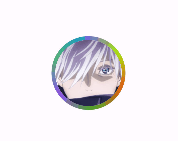
@Composable
fun ImageBorderAnimation() {
    val infiniteTransition = rememberInfiniteTransition()
    val degrees by infiniteTransition.animateFloat(
        initialValue = 0f,
        targetValue = 360f,
        animationSpec = infiniteRepeatable(tween(1000, easing = LinearEasing))
    )
    val strokeWidth = 8.dp
    Box(
        modifier = Modifier.fillMaxSize(),
        contentAlignment = Alignment.Center
    ) {
        Image(
            painter = painterResource(id = R.drawable.ic_head3),
            contentDescription = "head",
            contentScale = ContentScale.Crop,
            modifier = Modifier
                .size(150.dp)
                .drawBehind {
                    rotate(degrees) {
                        drawCircle(
                            brush = Brush.sweepGradient(colors = colors),
                            style = Stroke(strokeWidth.toPx())
                        )
                    }
                }
                .padding(strokeWidth / 2)
                .clip(CircleShape)
        )
    }
}
运行效果:
AnimationSpec
AnimationSpec主要是用来对动画进行配置的,前面许多例子中都使用了,目前Compose中大多数动画Api都支持AnimationSpec参数来定义动画效果
 val alpha: Float by animateFloatAsState(
    targetValue = if (enabled) 1f else 0.5f,
    // Configure the animation duration and easing.
    animationSpec = tween(durationMillis = 300, easing = FastOutSlowInEasing)
 )
Compose提供了多种AnimationSpec的子类
spring弹簧动画
使用spring会创建一个SpringSpec实例,可以用来创建一个基于物理特性的弹跳动画,它的动画估值将在当前值和目标值之间按照弹簧物理运动轨迹进行变化。spring 用作很多动画 API(如 animate*AsState 和 updateTransition)的默认 AnimationSpec。
 val value by animateFloatAsState(
    targetValue = 1f,
    animationSpec = spring(
        dampingRatio = Spring.DampingRatioHighBouncy,
        stiffness = Spring.StiffnessMedium
    )
 )
spring有三个参数dampingRatio、stiffness、visibilityThreshold 其中前两个参数主要用来控制动画跳动效果的:
- dampingRatio 表示弹簧的阻尼比,即弹簧的弹性,dampingRatio值越小弹性越大(震动幅度越大),反之弹性越小(dampingRatio>=0)
dampingRatio默认值是Spring.DampingRatioNoBouncy, 即默认没有弹性,系统预定义的dampingRatio的各个取值及效果如下:
 object Spring {
    const val DampingRatioHighBouncy = 0.2f
    const val DampingRatioMediumBouncy = 0.5f
    const val DampingRatioLowBouncy = 0.75f
    const val DampingRatioNoBouncy = 1f
 }

- stiffness表示弹簧的刚度,值越大表示到静止状态的速度越快,反之越慢。默认值为 Spring.StiffnessMedium。(stiffness>0)
系统预定义的stiffness常量值如下:
 object Spring {
    const val StiffnessHigh = 10_000f
    const val StiffnessMedium = 1500f
    const val StiffnessMediumLow = 400f
    const val StiffnessLow = 200f
    const val StiffnessVeryLow = 50f
 }
- visibilityThreshold是由开发者指定一个阈值,当动画到达这个阈值时,动画立即停止。其类型和targetValue一致。
tween补间动画
使用tween可以创建一个TweenSpec实例,TweenSpec是DurationBasedAnimationSpec的子类。
TweenSpec必须指定时间参数, 它必须在规定时间内完成动画。
 val value by animateFloatAsState(
    targetValue = 1f,
    animationSpec = tween(
        durationMillis = 300,
        delayMillis = 50,
        easing = LinearOutSlowInEasing
    )
 )
tween可以通过easing参数来控制动画变化速率
// 先加速后减速
 val FastOutSlowInEasing: Easing = CubicBezierEasing(0.4f, 0.0f, 0.2f, 1.0f)
 // 先匀速后减速
 val LinearOutSlowInEasing: Easing = CubicBezierEasing(0.0f, 0.0f, 0.2f, 1.0f)
 // 先加速后匀速
 val FastOutLinearInEasing: Easing = CubicBezierEasing(0.4f, 0.0f, 1.0f, 1.0f)
 // 一直匀速
 val LinearEasing: Easing = Easing { fraction -> fraction }
| Easing | 效果 |
|---|---|
| FastOutSlowInEasing |  |
| LinearOutSlowInEasing |  |
| FastOutLinearInEasing |  |
以上预定义的Easing都是通过CubicBezierEasing三阶贝塞尔曲线实现的,也可以自定义CubicBezierEasing。如需自定义CubicBezierEasing可以参考网站 cubic-bezier 来调试自己的参数, 其中,起始点(0,0), 终点(1, 1), 所以只需要提供两个控制点的坐标即可,也就是CubicBezierEasing的四个参数的含义。
keyframes关键帧动画
keyframes 可以更精细的控制动画,它允许在开始和结束之间插入关键帧节点,节点与节点之间的动画过渡可以应用不同效果。
对于其中每个关键帧,您都可以指定 Easing 来确定插值曲线。
 val value by animateFloatAsState(
    targetValue = 1f,
    animationSpec = keyframes {
        durationMillis = 375
        0.0f at 0 with LinearOutSlowInEasing // 0ms初始值为0f, 开始使用LinearOutSlowInEasing
        0.2f at 15 with FastOutLinearInEasing // 15ms达到0.2f, 从15ms开始使用FastOutLinearInEasing
        0.4f at 75 // 75ms达到0.4f
        0.4f at 225 // 225ms达到0.4f
    }
 )
keyframes返回一个KeyFrameSpec实例,它也是DurationBasedAnimationSpec的子类,需要在规定时间内完成动画。
关键帧节点的定义由时间戳、动画数值、动画效果组成。
repeatable循环动画
使用repeatable可以创建一个RepeatableSpec实例。repeatable 反复运行基于时长的动画(例如 tween 或 keyframes),直至达到指定的迭代计数。您可以传递 repeatMode 参数来指定动画是从头开始 (RepeatMode.Restart) 还是从结尾开始 (RepeatMode.Reverse) 重复播放。
 val value by animateFloatAsState(
    targetValue = 1f,
    animationSpec = repeatable(
        iterations = 3, // 重复播放的次数
        animation = tween(durationMillis = 300),
        repeatMode = RepeatMode.Reverse
    )
 )
- RepeatMode.Reverse: 往返执行,达到目标值后再原路返回初始值
- RepeatMode.Restart: 从头执行,达到目标值后,再重新从初始值开始执行
infiniteRepeatable无限循环动画
infiniteRepeatable 与 repeatable 类似,但它会重复无限次的迭代。
 val value by animateFloatAsState(
    targetValue = 1f,
    animationSpec = infiniteRepeatable(
        animation = tween(durationMillis = 300),
        repeatMode = RepeatMode.Reverse
    )
 )
snap快闪动画
snap创建一个SnapSpec实例,snap 是一种特殊的 AnimationSpec,它会立即将值切换到目标值。没有中间过渡,动画瞬间完成。
可以指定 delayMillis 来设置延迟动画的开始时间。
 val value by animateFloatAsState(
    targetValue = 1f,
    animationSpec = snap(delayMillis = 50)
 )
动画形式的矢量资源
如需使用 AnimatedVectorDrawable 资源,请使用 animatedVectorResource 加载可绘制对象文件,并传入 boolean 以在可绘制对象的开始和结束状态之间切换。
@Composable
fun AnimatedVectorDrawable() {
    val image = AnimatedImageVector.animatedVectorResource(R.drawable.ic_hourglass_animated)
    var atEnd by remember { mutableStateOf(false) }
    Image(
        painter = rememberAnimatedVectorPainter(image, atEnd),
        contentDescription = "Timer",
        modifier = Modifier.clickable {
            atEnd = !atEnd
        },
        contentScale = ContentScale.Crop
    )
}
低级动画API
前面提及的所有高级别动画 API 都是在低级别动画 API 的基础上构建而成的。
animate*AsState 函数是最简单的 API,可将即时值变化呈现为动画值。它由 Animatable 提供支持,后者是一种基于协程的 API,用于为单个值添加动画效果。updateTransition 可创建过渡对象,用于管理多个动画值,并且根据状态变化运行这些值。rememberInfiniteTransition 与其类似,不过,它会创建一个无限过渡对象,以管理多个无限期运行的动画。所有这些 API 都是可组合项(Animatable 除外),这意味着这些动画可以在非组合期间创建。
所有这些 API 都基于更基础的 Animation API。虽然大多数应用不会直接与 Animation 互动,但 Animation 的某些自定义功能可以通过更高级别的 API 获得。
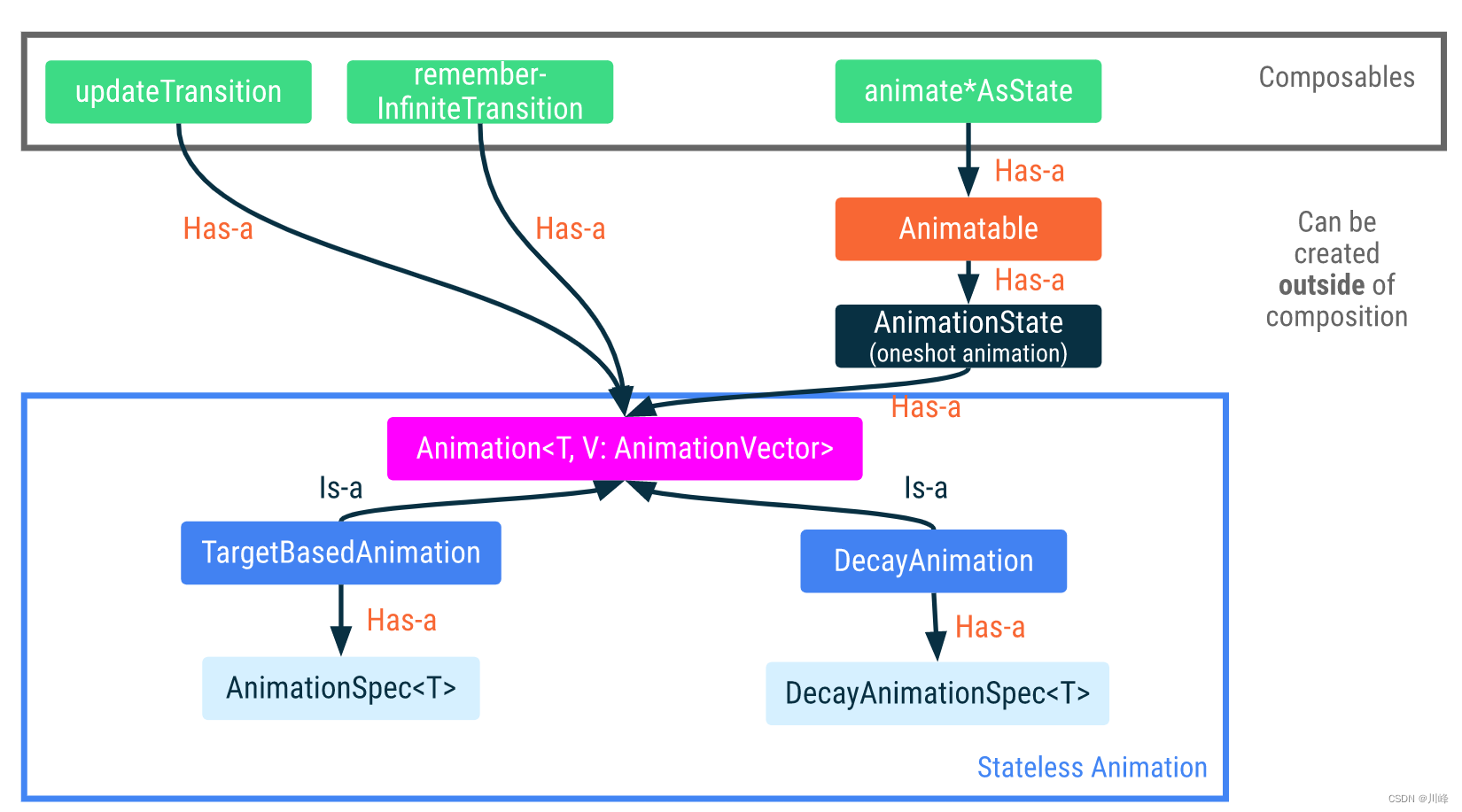
Animatable
Animatable 是一个值容器,它的 animateTo 方法可以根据数值的变化设置动画效果。 animate*AsState 背后就是基于Animatable的实现。它可确保一致的连续性和互斥性,这意味着值变化始终是连续的,并且会取消任何当前正在播放的动画。
Animatable 的许多功能(包括 animateTo)以挂起函数的形式提供。这意味着,它们需要在一个协程作用域内执行。
例如,可以搭配 LaunchedEffect 使用:
// Start out gray and animate to green/red based on `ok`
val color = remember { Animatable(Color.Gray) }
LaunchedEffect(ok) {
    color.animateTo(if (ok) Color.Green else Color.Red)
}
Box(Modifier.fillMaxSize().background(color.value))
这段代码创建了初始值为 Color.Gray 的 Animatable 实例。根据布尔标记 ok 的值,颜色将以动画形式呈现 Color.Green 或 Color.Red。对该布尔值的任何后续更改都会使动画开始使用另一种颜色。
如果正在播放动画的中途修改了ok值,系统会立即中断取消该动画,并且从当前快照值开始新的动画。
与 animate*AsState 相比,使用 Animatable 可以直接对以下几个方面进行更精细的控制:
- 1)Animatable 的初始值可以与第一个目标值不同。例如,上面的代码示例首先显示一个灰色,然后目标值为绿色或红色。
- 2)Animatable 对内容值提供更多操作(即 snapTo 和 animateDecay)。snapTo 可立即将当前值设为目标值,跳过中间过渡值。如果动画本身不是唯一的可信来源,且必须与其他状态(如触摸事件)同步,该函数就非常有用。animateDecay 用于衰减动画(从给定速度变慢),在fling等场景中非常有用。
使用Animatable实现前面通过animatexxxAsState方式实现的红心按钮的例子:
@Composable
fun AnimatableExample() {
    var changeSize by remember { mutableStateOf(false) }
    var changeColor by remember { mutableStateOf(false) }
    val buttonSize = remember { Animatable(24.dp, Dp.VectorConverter) }
    val buttonColor = remember { Animatable(Color.Gray) }
    LaunchedEffect(changeSize, changeColor) {
        // 注意,因为animateTo是挂起函数,会阻塞当前协程,
        // 所以这里必须分别放在launch中启动子协程执行,否则动画效果是顺序执行的
        // 或者,也可以分开放在两个LaunchedEffect里执行
        launch { buttonSize.animateTo(if(changeSize) 32.dp else 24.dp) }
        launch { buttonColor.animateTo(if(changeColor) Color.Red else Color.Gray) }
    }
    if (buttonSize.value == 32.dp) {
        changeSize = false
    }
    Box(
        Modifier.fillMaxSize(),
        contentAlignment = Alignment.Center
    ) {
        IconButton(
            onClick = {
                changeSize = true
                changeColor = !changeColor
            }
        ) {
            Icon(Icons.Rounded.Favorite, null,
                Modifier.size(buttonSize.value), tint = buttonColor.value)
        }
    }
}
运行效果:

这里需要注意的一点是:由于animateTo是挂起函数,会阻塞当前协程作用域范围的执行流程,所以这里必须分别放在launch中启动子协程执行,这样才能使得二者并行同时执行,否则如果直接将两个animateTo先后调用,那么最终动画效果将是顺序执行的,可以将上面代码中的launch都去掉,然后运行效果如下,可以对比一下有什么不同:

上面代码中创建buttonSize时,传入了内置的TwoWayConverter转换器Dp.VectorConverter, Animatable可直接传入Float或Color类型的值,当传入其他类型时需要指定对应的TwoWayConverter转换器。
另外,需要注意的是,LaunchedEffect会在onActive时被执行,最好确保LaunchedEffect中animateTo的默认值与创建Animatable时的默认值相同,不然在首次渲染页面时就会呈现过渡动画(当然如果这就是你预期的需求,那就这样做)
监听动画状态变化值
animateTo可以传一个 lambda回调函数来获得动画状态值的变化:
 buttonColor.animateTo(if(changeColor) Color.Red else Color.Gray) {
    println(value) // 监听动画状态值的变化
 }
停止动画
调用 animation.stop() 可以主动停止动画,但这是一个挂起函数,因此同样需要在一个协程作用域中执行它。
animation.updateBounds()可以指定边界范围上下界(是指动画状态值的区间范围)当达到设置的upperBound或lowerBound时也会会停止动画,但这是属于正常符合预期的停止。
设置updateBounds()之后,还可以根据动画结果返回值执行后续逻辑:
 val result = buttonSize.animateTo(..)
 if (result.endReason == AnimationEndReason.BoundReached) {
     buttonSize.animateTo(...) // 例如可以反向执行动画
 }
还有一种情况是,当使用 Animatable.animateTo() 在执行动画过程中,有人更新了其依赖的状态值,则动画会被立即中断而取消掉。
Animation
Animation 是可用的最低级别的 Animation API。到目前为止,我们看到的许多动画都是基于Animation 构建的。
Animation 子类型有两种:TargetBasedAnimation 和 DecayAnimation。
Animation 只能用于手动控制动画的时间。Animation 是无状态的,它没有任何生命周期概念。它充当更高级别 API 使用的动画计算引擎。
注意:除非需要手动控制时间,否则通常建议使用基于这些类构建的更高级别动画 API。
TargetBasedAnimation
TargetBasedAnimation 可以直接让您自己控制动画的播放时间。
在下面的示例中,TargetAnimation 的播放时间将根据 withFrameNanos 提供的帧时间手动控制。
val anim = remember {
    TargetBasedAnimation(
        animationSpec = tween(200),
        typeConverter = Float.VectorConverter,
        initialValue = 200f,
        targetValue = 1000f
    )
}
var playTime by remember { mutableStateOf(0L) }

LaunchedEffect(anim) {
    val startTime = withFrameNanos { it }

    do {
        playTime = withFrameNanos { it } - startTime
        val animationValue = anim.getValueFromNanos(playTime)
    } while (someCustomCondition())
}
DecayAnimation
与 TargetBasedAnimation 不同,DecayAnimation 不需要提供 targetValue,而是根据起始条件(由 initialVelocity 和 initialValue 设置)以及所提供的 DecayAnimationSpec 计算其 targetValue。
衰减动画通常在快滑手势之后使用,用于使元素减速并停止。动画速度从 initialVelocityVector 设置的值开始,然后逐渐变慢。
手势和动画
与单独处理动画相比,当我们处理触摸事件和动画时,必须考虑几个事项。
首先,当触摸事件开始时,我们可能需要中断正在播放的动画,因为用户互动应当具有最高优先级。
在下面的示例中,我们使用 Animatable 表示圆形组件的偏移位置。触摸事件由 pointerInput 修饰符处理。
当检测到新的点按事件时,我们将调用 animateTo 以将偏移值通过动画过渡到点按位置。在动画播放期间也可能发生点按事件。
在这种情况下,animateTo 会中断正在播放的动画,启动动画以过渡到新的目标位置,同时保持被中断的动画的速度。
@SuppressLint("ReturnFromAwaitPointerEventScope")
@Composable
fun GestureWithAnimation() {
    val offset = remember { Animatable(Offset(0f, 0f), Offset.VectorConverter) }
    Box(Modifier
            .fillMaxSize()
            .pointerInput(Unit) {
                coroutineScope {
                    while (true) {
                        // Detect a tap event and obtain its position.
                        val position = awaitPointerEventScope { awaitFirstDown().position }
                        // Animate to the tap position.
                        launch { offset.animateTo(position) }
                    }
                }
            }
    ) {
        Circle(Modifier.offset { offset.value.toIntOffset() })
    }
}

@Composable
fun Circle(modifier: Modifier = Modifier) {
    Box(modifier.size(100.dp).clip(CircleShape).background(Color.Red))
}

private fun Offset.toIntOffset() = IntOffset(x.roundToInt(), y.roundToInt())
运行效果:
另一种常见模式是需要将动画值与来自触摸事件(例如拖动)的值同步。在下面的示例中,我们会看到以 Modifier 的形式(而不是使用 SwipeToDismiss 可组合项)实现的“滑动关闭”。该元素的水平偏移量表示为 Animatable。此 API 具有可用于手势动画的特征。其值可由触摸事件和动画更改。收到触摸事件时,我们通过 stop 方法停止 Animatable,以便拦截任何正在播放的动画。
在拖动事件期间,我们使用 snapTo 将 Animatable 值更新为从触摸事件计算得出的值。对于快速滑动,Compose 可提供 VelocityTracker 来记录拖动事件并计算速度。速度可直接馈送至投掷动画的 animateDecay。如需将偏移值滑回原始位置,可使用 animateTo 方法指定 0f 的目标偏移值。
@SuppressLint("MultipleAwaitPointerEventScopes", "ReturnFromAwaitPointerEventScope")
fun Modifier.swipeToDismiss(
    onDismissed: () -> Unit
): Modifier = composed {
    val offsetX = remember { Animatable(0f) }
    pointerInput(Unit) {
        // Used to calculate fling decay.
        val decay = splineBasedDecay<Float>(this)
        // Use suspend functions for touch events and the Animatable.
        coroutineScope {
            while (true) {
                // Detect a touch down event.
                val pointerId = awaitPointerEventScope { awaitFirstDown().id }
                val velocityTracker = VelocityTracker()
                // Stop any ongoing animation.
                offsetX.stop()
                awaitPointerEventScope {
                    horizontalDrag(pointerId) { change ->
                        // Update the animation value with touch events.
                        launch { offsetX.snapTo(offsetX.value + change.positionChange().x) }
                        velocityTracker.addPosition(
                            change.uptimeMillis,
                            change.position
                        )
                    }
                }
                // No longer receiving touch events. Prepare the animation.
                val velocity = velocityTracker.calculateVelocity().x
                val targetOffsetX = decay.calculateTargetValue(offsetX.value, velocity)
                // The animation stops when it reaches the bounds.
                offsetX.updateBounds(
                    lowerBound = -size.width.toFloat(),
                    upperBound = size.width.toFloat()
                )
                launch {
                    if (targetOffsetX.absoluteValue <= size.width) {
                        // Not enough velocity; Slide back.
                        offsetX.animateTo(argetValue = 0f,initialVelocity = velocity)
                    } else {
                        // The element was swiped away.
                        offsetX.animateDecay(velocity, decay)
                        onDismissed()
                    }
                }
            }
        }
    }.offset { IntOffset(offsetX.value.roundToInt(), 0) }
}

@Composable
fun SwipeToDismissItem(color: Color = Color.Red) {
    var isDismissed by remember { mutableStateOf(false) }
    if (!isDismissed) {
        Box(
            Modifier
                .swipeToDismiss { isDismissed = true }
                .fillMaxWidth()
                .height(100.dp)
                .background(color)
        )
    }
}
@Composable
fun SwipeToDismissAnimationExample() {
    Column {
        repeat(7) {
            SwipeToDismissItem(color = colors[it % colors.size])
        }
    }
}
运行效果:
列表动画
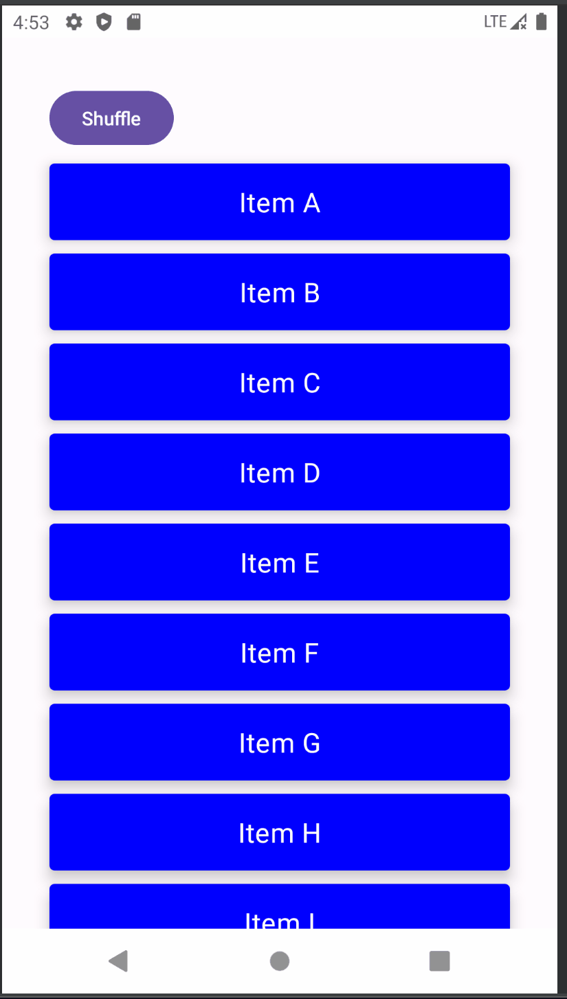
目前官方仅支持对LazyColumn/LazyRow等延时列表重排序的时候做动画效果,可以使用Modifier.animateItemPlacement()来实现:
@OptIn(ExperimentalFoundationApi::class)
@Composable
fun LazyColumnListAnimation() {
    var list by remember { mutableStateOf(('A'..'Z').toList()) }
    LazyColumn(
        Modifier.fillMaxWidth(),
        contentPadding = PaddingValues(35.dp),
        verticalArrangement = Arrangement.spacedBy(10.dp)
    ) {
        item {
            Button(onClick = { list = list.shuffled() }) {
                Text("Shuffle")
            }
        }
        items(list, key = { it }) {
            CardContent(
                "Item $it",
                modifier = Modifier.animateItemPlacement(),
                Color.Blue,
                Color.White
            )
        }
    }
}
运行效果:
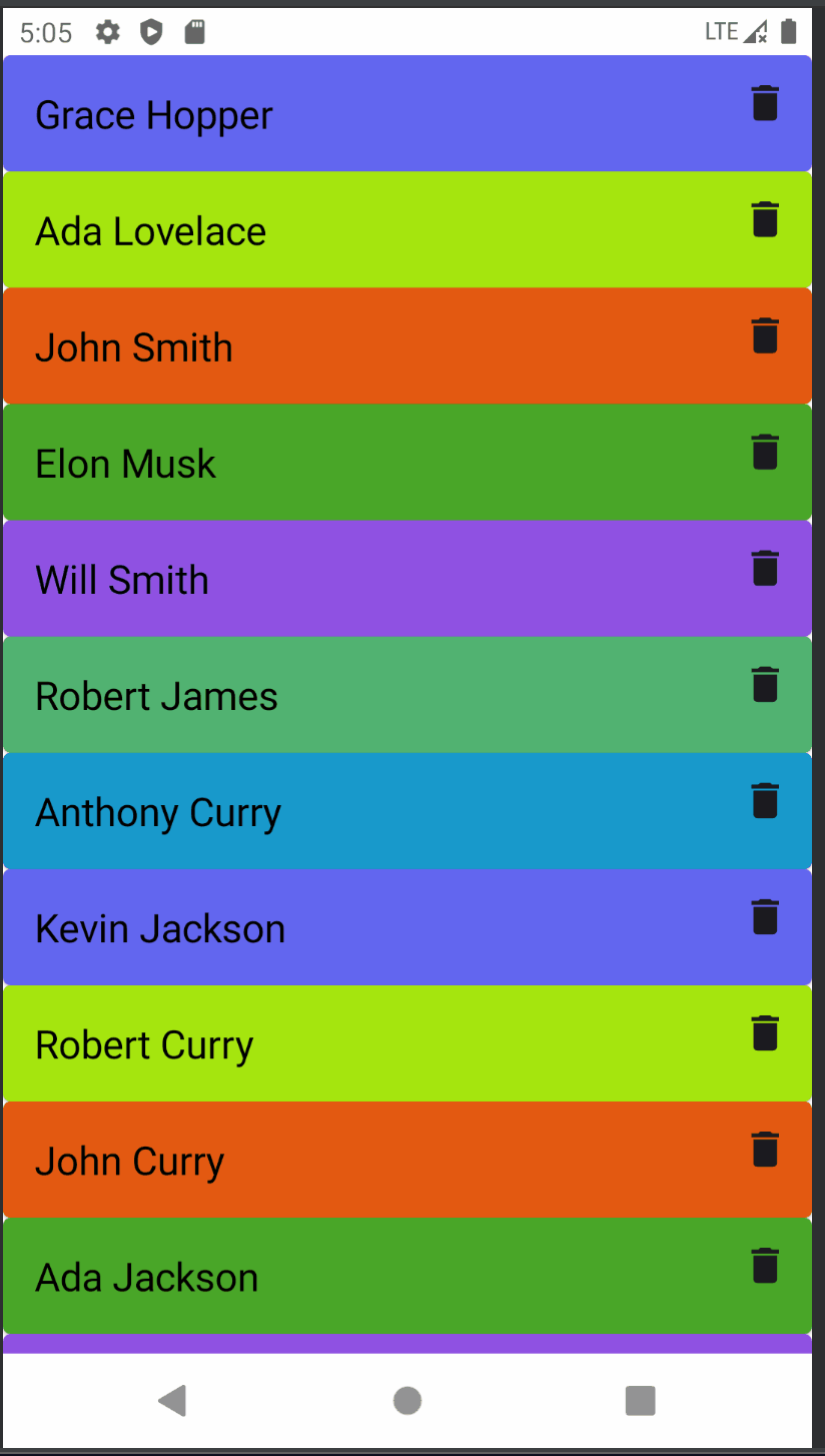
虽然官方目前对LazyList列表添加和删除Item项时,没有可支持的动画Api,但是如果你有需求,也可以使用前面提供的Api来实现,如可以使用AnimatedVisibility:
@Composable
fun ListItemAnimationComponent() {
    val personList = getPersonList()
    val deletedPersonList = remember { mutableStateListOf<Person>() }
    LazyColumn(
        modifier = Modifier.fillMaxWidth()
    ) {
        itemsIndexed(items = personList) { index, person ->
            AnimatedVisibility(
                visible = !deletedPersonList.contains(person),
                enter = expandVertically(),
                exit = shrinkVertically(animationSpec = tween(1000))
            ) {
                Card(
                    shape = RoundedCornerShape(4.dp),
                    backgroundColor = colors[index % colors.size],
                    modifier = Modifier.fillParentMaxWidth()
                ) {
                    Row(
                        modifier = Modifier.fillParentMaxWidth(),
                        horizontalArrangement = Arrangement.SpaceBetween
                    ) {
                        Text(
                            person.name,
                            style = TextStyle(
                                color = Color.Black,
                                fontSize = 20.sp,
                                textAlign = TextAlign.Center
                            ),
                            modifier = Modifier.padding(16.dp)
                        )
                        IconButton(onClick = { deletedPersonList.add(person) }) {
                            Icon(
                                imageVector = Icons.Filled.Delete,
                                contentDescription = "Delete"
                            )
                        }
                    }
                }
            }
        }
    }
}
运行效果:
MotionLayout动画
我们可以通过Compose版本的Constraintlayout依赖库实现一种MotionLayout联动效果的动画,效果如下:
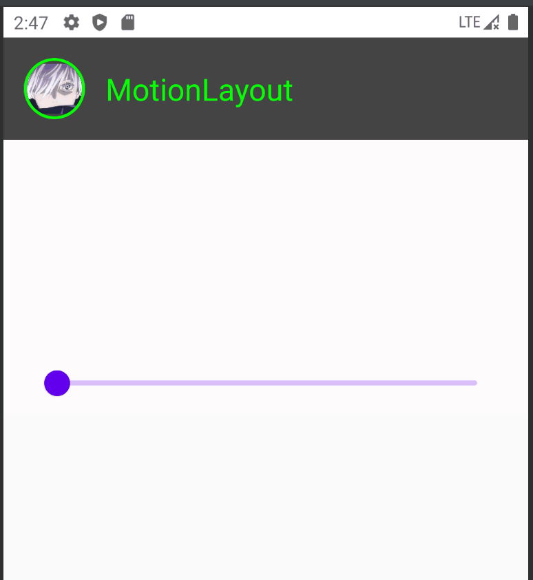
集成步骤:
- 1.确保
app/build.gradle中添加了constraintlayout-compose依赖库 implementation "androidx.constraintlayout:constraintlayout-compose:1.0.1"- 2.在
res/raw/motion_scene.json5中进行配置 - 3.在
MotionLayout Composable函数中解析并使用配置
motion_scene.json5中的内容如下:
{
  ConstraintSets: {
    start: {
      profile_pic: {
        width: 48,
        height: 48,
        start: ['parent', 'start', 16],
        top: ['parent', 'top', 16],
        custom: {
          background: '#08ff04'
        }
      },
      username: {
        top: ['profile_pic', 'top'],
        bottom: ['profile_pic', 'bottom'],
        start: ['profile_pic', 'end', 16]
      },
      box: {
        width: 'spread',
        height: 'spread',
        start: ['parent', 'start'],
        end: ['parent', 'end'],
        top: ['parent', 'top'],
        bottom: ['parent', 'bottom', -16],
      }
    },
    end: {
      profile_pic: {
        width: 150,
        height: 150,
        start: ['parent', 'start'],
        end: ['parent', 'end'],
        top: ['parent', 'top', 16],
        custom: {
          background: '#FFFFFF'
        }
      },
      username: {
        top: ['profile_pic', 'bottom', 16],
        end: ['parent', 'end'],
        start: ['parent', 'start']
      },
      box: {
        width: 'spread',
        height: 'spread',
        start: ['parent', 'start'],
        end: ['parent', 'end'],
        top: ['parent', 'top'],
        bottom: ['parent', 'bottom', -16],
      }
    }
  },
  Transitions: {
    default: {
      from: 'start',
      to: 'end',
      pathMotionArc: 'startHorizontal',
      KeyFrames: {
        KeyAttributes: [
          {
            target: ['profile_pic'],
            frames: [0, 100]
          },
          {
            target: ['username'],
            frames: [0, 50, 100],
            translationX: [0, 90, 0],
          }
        ]
      }
    }
  }
}
这个文件中主要配置了从start到end状态的各种属性值,以及各个组件相对于其他组件的依赖关系,同时可以在Transitions标签中指定KeyFrames的相关属性。
然后可以在Composable中调用设置代码如下:
@Composable
fun MotionLayoutAnimationDemo() {
    Column {
        var progress by remember { mutableStateOf(0f) }
        ProfileHeader(progress = progress)
        Spacer(modifier = Modifier.height(32.dp))
        Slider(
            value = progress,
            onValueChange = { progress = it },
            modifier = Modifier.padding(horizontal = 32.dp)
        )
    }
}

@OptIn(ExperimentalMotionApi::class)
@Composable
fun ProfileHeader(progress: Float) {
    val context = LocalContext.current
    val motionScene = remember {
        context.resources
            .openRawResource(R.raw.motion_scene)
            .readBytes()
            .decodeToString()
    }
    MotionLayout(
        motionScene = MotionScene(content = motionScene),
        progress = progress,
        modifier = Modifier.fillMaxWidth()
    ) {
        val properties = motionProperties(id = "profile_pic")
        Box(
            modifier = Modifier
                .fillMaxWidth()
                .background(Color.DarkGray)
                .layoutId("box")
        )
        Image(
            painter = painterResource(id = R.drawable.ic_head3),
            contentDescription = null,
            modifier = Modifier
                .clip(CircleShape)
                .border(
                    width = 2.dp,
                    color = properties.value.color("background"),
                    shape = CircleShape
                )
                .layoutId("profile_pic")
        )
        Text(
            text = "MotionLayout",
            fontSize = 24.sp,
            modifier = Modifier.layoutId("username"),
            color = properties.value.color("background")
        )
    }
}
虽然看起来有点麻烦,但是却不失为一种可以用来解决复杂动画效果的解决方案。
其他一些动画效果Demo
骨架屏加载动画效果
动画效果如下:
骨架屏加载动画实现要点:
- 整个骨架图有多个具有动画渐变色效果的AnimatedShimmerItem组成,
- ShimmerItem是单个Item布局,由多个闪烁的线条与矩形图形构成。
- 参数brush用作每个组件的背景色,使用linearGradient创建一个具有线性渐变色效果的brush,通过动画控制brush的渐变色的位移属性,放大到整个骨架图,便会呈现微光的渐变色效果了。
源码如下:
import androidx.compose.animation.core.*
import androidx.compose.foundation.background
import androidx.compose.foundation.layout.*
import androidx.compose.foundation.rememberScrollState
import androidx.compose.foundation.shape.RoundedCornerShape
import androidx.compose.foundation.verticalScroll
import androidx.compose.runtime.Composable
import androidx.compose.ui.Alignment
import androidx.compose.ui.Modifier
import androidx.compose.ui.draw.clip
import androidx.compose.ui.geometry.Offset
import androidx.compose.ui.graphics.Brush
import androidx.compose.ui.graphics.Color
import androidx.compose.ui.tooling.preview.Preview
import androidx.compose.ui.unit.dp

val barHeight = 10.dp
val spacerPadding = 3.dp
val roundedCornerShape = RoundedCornerShape(3.dp)
val shimmerColors = listOf(
    Color.LightGray.copy(alpha = 0.6f),
    Color.LightGray.copy(alpha = 0.2f),
    Color.LightGray.copy(alpha = 0.6f),
)

@Preview(showBackground = true)
@Composable
fun AnimatedShimmerItem() {
    val transition = rememberInfiniteTransition()
    val translateAnim = transition.animateFloat(
        initialValue = 0f,
        targetValue = 1000f,
        animationSpec = infiniteRepeatable(
            animation = tween(1500, easing = FastOutSlowInEasing),
            repeatMode = RepeatMode.Restart
        )
    )
    // 微光渐变效果
    val brush = Brush.linearGradient(
        colors = shimmerColors,
        start = Offset.Zero,
        end = Offset(x = translateAnim.value, y = translateAnim.value) // 动画改变end坐标位置产生渐变色位移效果
    )

    ShimmerItem(brush)
}

@Preview(showBackground = true)
@Composable
fun ShimmerItem(brush: Brush = Brush.linearGradient(shimmerColors)) {
    Column(Modifier.fillMaxWidth().padding(10.dp)) {
        Row(verticalAlignment = Alignment.CenterVertically) {
            Spacer(
                modifier = Modifier
                    .size(100.dp)
                    .clip(roundedCornerShape)
                    .background(brush)
            )
            Spacer(modifier = Modifier.width(10.dp))
            Column(verticalArrangement = Arrangement.Center) {
                repeat(5) {
                    Spacer(modifier = Modifier.padding(spacerPadding))
                    Spacer(
                        modifier = Modifier
                            .height(barHeight)
                            .clip(roundedCornerShape)
                            .fillMaxWidth()
                            .background(brush)
                    )
                    Spacer(modifier = Modifier.padding(spacerPadding))
                }
            }
        }

        repeat(3) {
            Spacer(modifier = Modifier.padding(spacerPadding))
            Spacer(
                modifier = Modifier
                    .height(barHeight)
                    .clip(roundedCornerShape)
                    .fillMaxWidth()
                    .background(brush)
            )
            Spacer(modifier = Modifier.padding(spacerPadding))
        }
    }
}

@Preview(showBackground = true)
@Composable
fun ShimmerListPreview() {
    Column(Modifier.padding(5.dp).verticalScroll(rememberScrollState())) {
        repeat(5) {
            AnimatedShimmerItem()
        }
    }
}
收藏按钮动画效果
动画效果如下:
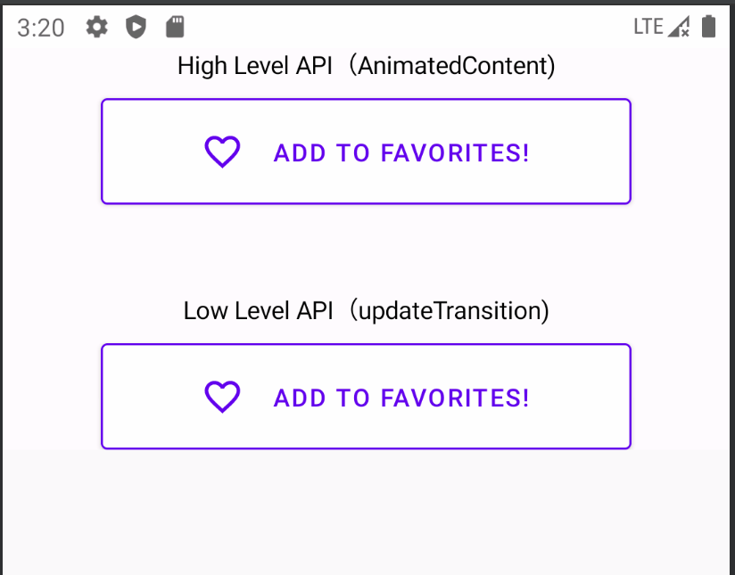
实现要点:
- 使用updateTransition精细控制状态变化时多个维度的属性值同时变化,效果上会比单纯的使用AnimatedContent实现方式更加的细腻丝滑。
源码如下:
import androidx.compose.animation.*
import androidx.compose.animation.core.*
import androidx.compose.foundation.BorderStroke
import androidx.compose.foundation.layout.Box
import androidx.compose.foundation.layout.Column
import androidx.compose.foundation.layout.Row
import androidx.compose.foundation.layout.Spacer
import androidx.compose.foundation.layout.fillMaxWidth
import androidx.compose.foundation.layout.height
import androidx.compose.foundation.layout.size
import androidx.compose.foundation.layout.width
import androidx.compose.foundation.shape.RoundedCornerShape
import androidx.compose.material.Button
import androidx.compose.material.ButtonDefaults
import androidx.compose.material.Icon
import androidx.compose.material.Text
import androidx.compose.material.icons.Icons
import androidx.compose.material.icons.filled.Favorite
import androidx.compose.material.icons.filled.FavoriteBorder
import androidx.compose.runtime.Composable
import androidx.compose.runtime.getValue
import androidx.compose.runtime.mutableStateOf
import androidx.compose.runtime.remember
import androidx.compose.runtime.setValue
import androidx.compose.ui.Alignment
import androidx.compose.ui.Modifier
import androidx.compose.ui.graphics.Color
import androidx.compose.ui.tooling.preview.Preview
import androidx.compose.ui.unit.Dp
import androidx.compose.ui.unit.dp
import com.fly.mycompose.application.ui.theme.MyComposeApplicationTheme
import com.fly.mycompose.application.ui.theme.Purple500

data class UiState(
    val backgroundColor: Color,
    val textColor: Color,
    val roundedCorner: Int,
    val buttonWidth: Dp
)

enum class ButtonState(val ui: UiState) {
    Idle(UiState(Color.White, Purple500, 6, 300.dp)),
    Pressed(UiState(Purple500, Color.White, 50, 60.dp))
}

const val animateDuration = 500

fun changeButtonState(buttonState: ButtonState) : ButtonState {
    return when(buttonState) {
        ButtonState.Idle -> ButtonState.Pressed
        ButtonState.Pressed -> ButtonState.Idle
    }
}

@OptIn(ExperimentalAnimationApi::class)
@Composable
fun AnimatedFavButton(modifier: Modifier = Modifier) {
    var buttonState by remember { mutableStateOf(ButtonState.Idle) }
    Box(modifier) {
        AnimatedContent(
            targetState = buttonState,
            transitionSpec = {
                fadeIn(tween(animateDuration)) with
                   fadeOut(tween(animateDuration))
            }
        ) { state ->
            FavButton(buttonState = state) {
                buttonState = changeButtonState(buttonState)
            }
        }
    }
}

@Composable
fun AnimatedFavButton2(modifier: Modifier = Modifier) {
    var buttonState by remember { mutableStateOf(ButtonState.Idle) }
    val transition = updateTransition(targetState = buttonState, label = "")

    val backgroundColor by transition.animateColor(
        transitionSpec = { spring() }, label = ""
    ) { it.ui.backgroundColor }
    val textColor by transition.animateColor(
        transitionSpec = { spring() }, label = ""
    ) { it.ui.textColor }
    val roundedCorner by transition.animateInt(
        transitionSpec = { spring() }, label = ""
    ) { it.ui.roundedCorner }
    val buttonWidth by transition.animateDp(
        transitionSpec = { spring() }, label = ""
    ) { it.ui.buttonWidth }

    FavButton(
        modifier, buttonState, textColor, backgroundColor, roundedCorner, buttonWidth,
    ) {
        buttonState = changeButtonState(buttonState)
    }
}

@Composable
fun FavButton(
    modifier: Modifier = Modifier,
    buttonState: ButtonState,
    textColor: Color = buttonState.ui.textColor,
    backgroundColor: Color = buttonState.ui.backgroundColor,
    roundedCorner: Int = buttonState.ui.roundedCorner,
    buttonWidth: Dp = buttonState.ui.buttonWidth,
    onClick: () -> Unit
) {
    Button(
        border = BorderStroke(1.dp, Purple500),
        modifier = modifier.size(buttonWidth, height = 60.dp),
        shape = RoundedCornerShape(roundedCorner.coerceIn(0..100)),
        colors = ButtonDefaults.buttonColors(backgroundColor),
        onClick = onClick,
    ) {
        if (buttonState == ButtonState.Idle) {
            Row {
                Icon(
                    tint = textColor,
                    imageVector = Icons.Default.FavoriteBorder,
                    modifier = Modifier.size(24.dp).align(Alignment.CenterVertically),
                    contentDescription = null
                )
                Spacer(Modifier.width(16.dp))
                Text(
                    "ADD TO FAVORITES!",
                    softWrap = false,
                    modifier = Modifier.align(Alignment.CenterVertically),
                    color = textColor
                )
            }
        } else {
            Icon(
                tint = textColor,
                imageVector = Icons.Default.Favorite,
                modifier = Modifier.size(24.dp),
                contentDescription = null
            )
        }
    }
}

@Preview(showBackground = true)
@Composable
fun PreviewFavButton() {
    MyComposeApplicationTheme {
        Box(Modifier.fillMaxWidth(), contentAlignment = Alignment.Center) {
            Column(horizontalAlignment = Alignment.CenterHorizontally) {
                Text("High Level API(AnimatedContent)")
                Spacer(Modifier.height(10.dp))
                AnimatedFavButton()

                Spacer(Modifier.height(50.dp))

                Text("Low Level API(updateTransition)")
                Spacer(Modifier.height(10.dp))
                AnimatedFavButton2()
            }
        }

    }
}
滑动列表时顶部TopBar折叠隐藏动画效果
动画效果如下:
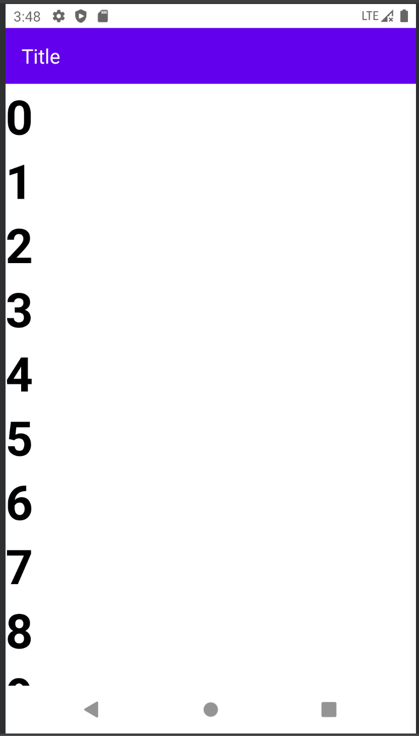
实现要点:
- 使用Box布局组件叠加TopBar组件和LayColumn列表组件,TopBar固定高度,LayColumn顶部预留出对应TopBar高度的padding距离
- 如果LayColumn列表向上滑动时,就修改opBar高度为0,同时修改LayColumn顶部的padding为0,反之则都修改为默认的固定高度值
- TopBar组件上可以应用
Modifier.animateContentSize(), 当高度被修改变化时,会执行动画效果,LayColumn组件可以使用animateDpAsState估值padding自动执行属性动画效果 - 判断LayColumn列表向上滑动的条件:先
rememberLazyListState(),然后判断其firstVisibleItemIndex > 0 || firstVisibleItemScrollOffset > 0就是向上滚动了,TopBar组件和LayColumn组件都要依赖观察该状态值来修改高度和padding
源码如下:
import androidx.compose.ui.Modifier
import androidx.compose.runtime.Composable
import androidx.compose.material.Text
import androidx.compose.foundation.layout.*
import androidx.compose.ui.Alignment
import androidx.compose.animation.animateContentSize
import androidx.compose.animation.core.animateDpAsState
import androidx.compose.animation.core.tween
import androidx.compose.foundation.background
import androidx.compose.foundation.lazy.LazyColumn
import androidx.compose.foundation.lazy.LazyListState
import androidx.compose.foundation.lazy.items
import androidx.compose.foundation.lazy.rememberLazyListState
import androidx.compose.material.MaterialTheme
import androidx.compose.material.Scaffold
import androidx.compose.material.TopAppBar
import androidx.compose.runtime.getValue
import androidx.compose.runtime.remember
import androidx.compose.ui.text.TextStyle
import androidx.compose.ui.text.font.FontWeight
import androidx.compose.ui.unit.dp

val TOP_BAR_HEIGHT = 56.dp
val LazyListState.isScrolled: Boolean
    get() = firstVisibleItemIndex > 0 || firstVisibleItemScrollOffset > 0

@Composable
fun AnimationTopBarDemo() {
    val lazyListState = rememberLazyListState()
    Scaffold(
        content = {
            Box(modifier = Modifier.padding(it).fillMaxSize()) {
                MainContent(lazyListState = lazyListState)
                TopBar(lazyListState = lazyListState)
            }
        }
    )
}

@Composable
fun TopBar(lazyListState: LazyListState) {
    TopAppBar(
        modifier = Modifier
            .fillMaxWidth()
            .background(color = MaterialTheme.colors.primary)
            .animateContentSize(animationSpec = tween(durationMillis = 300))
            .height(height = if (lazyListState.isScrolled) 0.dp else TOP_BAR_HEIGHT),
        contentPadding = PaddingValues(start = 16.dp)
    ) {
        Text(
            text = "Title",
            style = TextStyle(
                fontSize = MaterialTheme.typography.h6.fontSize,
                color = MaterialTheme.colors.surface
            )
        )
    }
}

@Composable
fun MainContent(lazyListState: LazyListState) {
    val numbers = remember { List(size = 25) { it } }
    val padding by animateDpAsState(
        targetValue = if (lazyListState.isScrolled) 0.dp else TOP_BAR_HEIGHT,
        animationSpec = tween(durationMillis = 300)
    )

    LazyColumn(
        modifier = Modifier.padding(top = padding),
        state = lazyListState
    ) {
        items(items = numbers, key = { it }) {
            NumberHolder(number = it)
        }
    }
}

@Composable
fun NumberHolder(number: Int) {
    Row(
        modifier = Modifier.fillMaxWidth(),
        verticalAlignment = Alignment.CenterVertically
    ) {
        Text(
            text = number.toString(),
            style = TextStyle(
                fontSize = MaterialTheme.typography.h3.fontSize,
                fontWeight = FontWeight.Bold
            )
        )
    }
}
参考:
-
Jetpack Compose animation
-
Build Complex Animations With MotionLayout in Jetpack Compose
-
Collapsing Top Bar Animation with Jetpack Compose
-
《Jetpack Compose从入门到实战》- 机械工业出版社 - 2022年9月