目录
前言:
1.前端
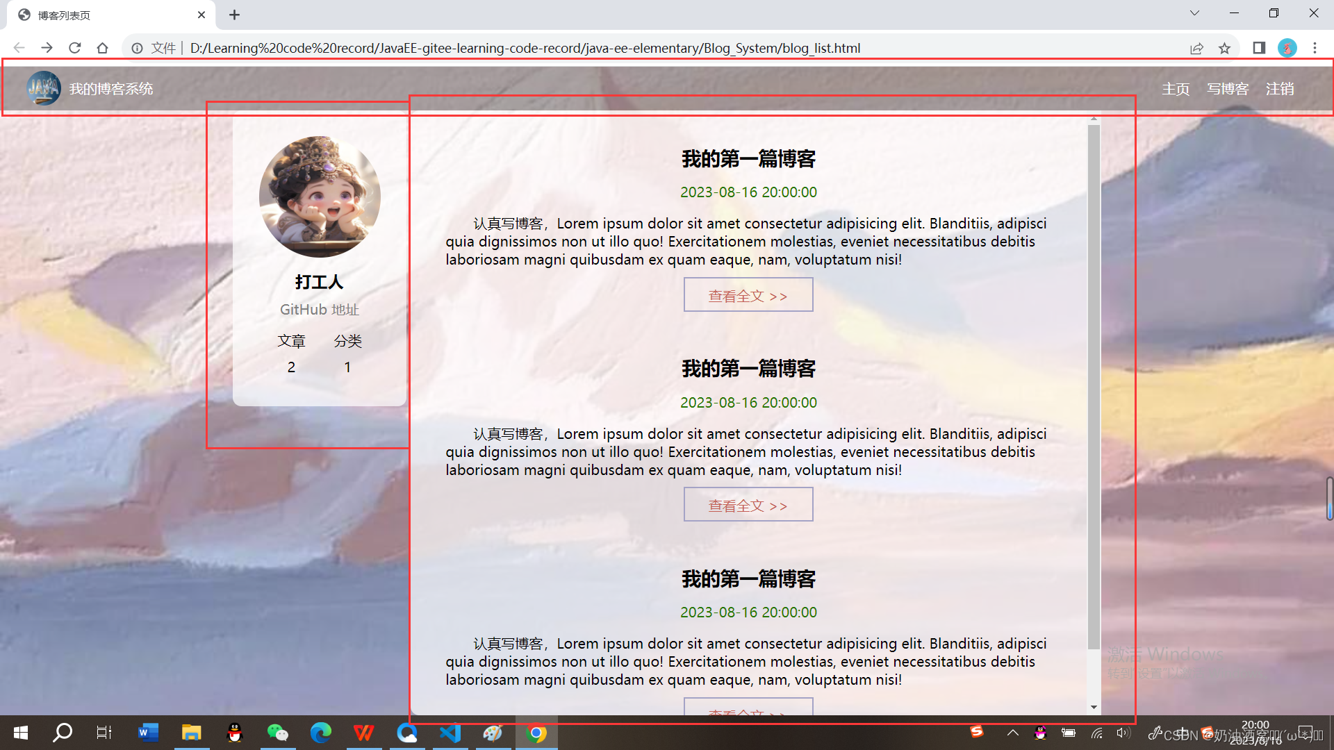
1.1博客列表页
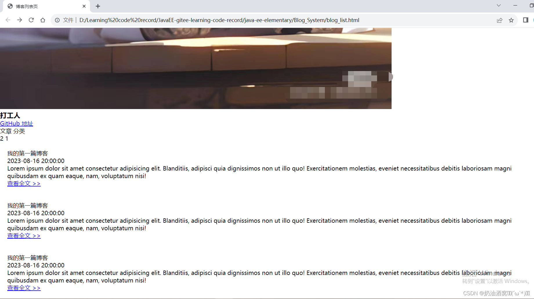
1.1.1博客列表页效果预览图
1.1.2实现导航栏
1.1.3实现版心+个人信息+博客列表
1.2博客详情页
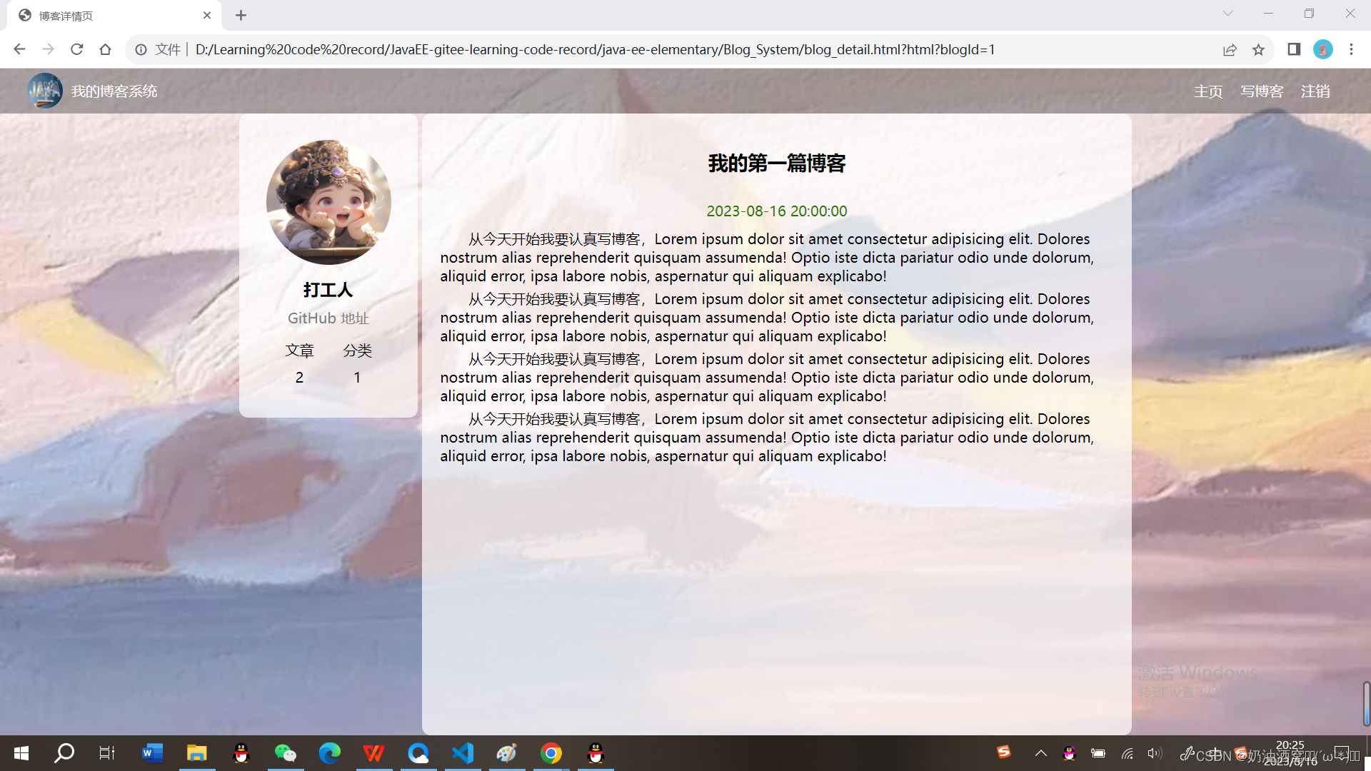
1.2.1博客详情页效果预览图
1.2.2实现导航栏 + 版心+个人信息
1.2.3实现博客正文
1.3登录页
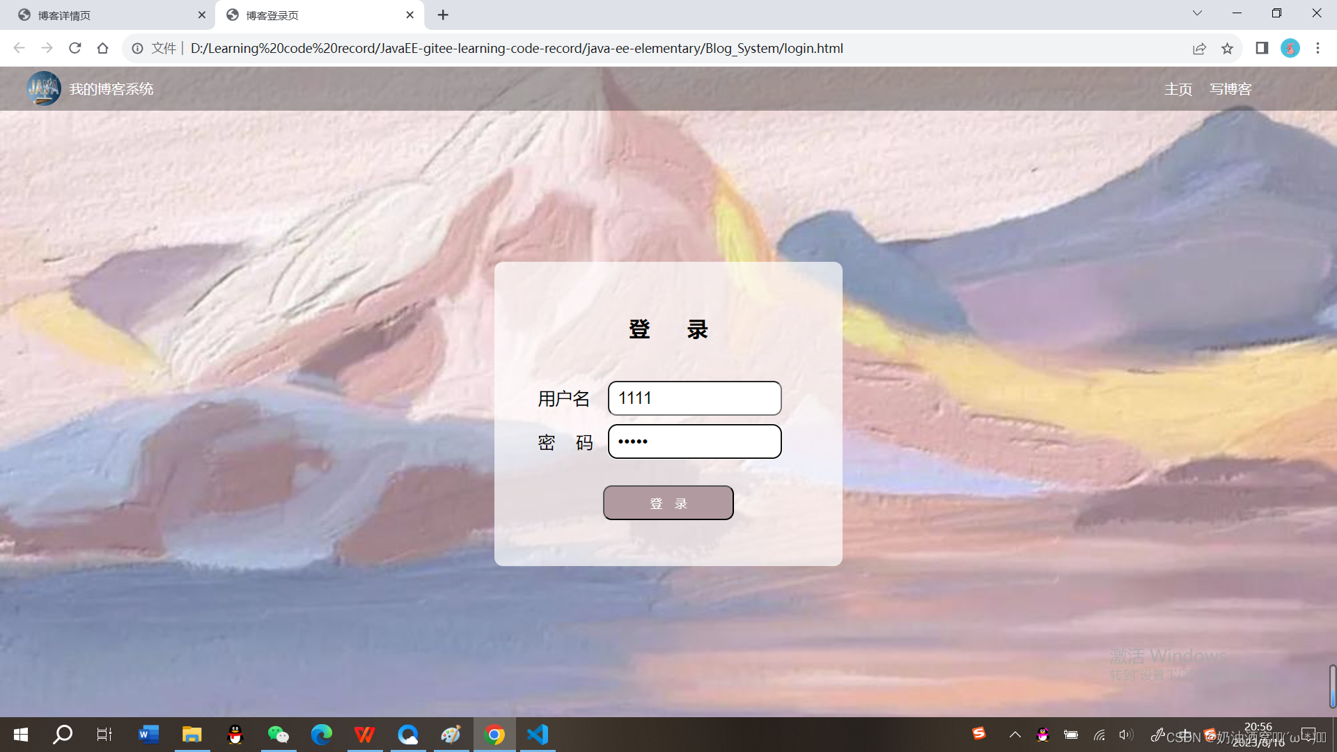
1.3.1登录页效果预览图
1.3.2导航栏和版心的实现
1.3.3实现登录框
1.4博客编辑页
1.4.1博客编辑页效果预览图
1.4.2引入导航栏+版心
1.4.3实现编辑区
结束语:
前言:
这节中小编将会带着大家一起来从前端到后端整体进行一个博客系统的编写。注意这里也只是一个简单的博客系统。大家如果觉得简单的话也可以自己来实现一些其他的功能。话不多说我们开始吧。
1.前端
1.1博客列表页
1.1.1博客列表页效果预览图
公共样式的实现:
由于背景我们这里实现的每一页都是一样的,所以先来实现一下背景图css样式的设置。
css代码展示:
/* 公共的样式 */
* {
    /* 防止撑大盒子 */
    box-sizing: border-box;
    /* 去除浏览器的默认样式 */
    padding: 0;
    margin: 0;
}

html {
    height: 100%;
}

body {
    /* 注意这里图片相对路径的写法 */
    background-image: url(../image/background.jpg);
    background-repeat: no-repeat;
    background-position: center center;
    /* 让图片尽可能的填满整个元素 */
    background-size: cover;
    height: 100%;
}
结果展示:
1.1.2实现导航栏
①我们先来实现html,不加css样式。
代码展示:
<!DOCTYPE html>
<html lang="en">
<head>
    <meta charset="UTF-8">
    <meta name="viewport" content="width=device-width, initial-scale=1.0">
    <title>博客列表页</title>
</head>
<body>
    <!-- 导航栏 -->
    <div class="nav">
        <!-- 图片的引入 -->
        <img src="image/nav.jpg">
        <!-- 标题 -->
        <div class="title">我的博客系统</div>
        <!-- 在这里我们使用一个简单粗暴的办法将后面的链接直接给挤过去 -->
        <a href="blog_list.html">主页</a>
        <a href="blog_edit.html">写博客</a>
        <!-- 这里的地址后期讲解 -->
        <a href="">注销</a>
        <div class="spacer"></div>
    </div>
</body>
</html>
结果展示:
 ②加入css样式。
代码展示:
blog_list.html代码展示:
<!DOCTYPE html>
<html lang="en">
<head>
    <meta charset="UTF-8">
    <meta name="viewport" content="width=device-width, initial-scale=1.0">
    <title>博客列表页</title>
    <link rel="stylesheet" href="css/common.css">
    <link rel="stylesheet" href="css/blog_list.css">
</head>
<body>
    <!-- 导航栏 -->
    <div class="nav">
        <!-- 图片的引入 -->
        <img src="image/nav.jpg">
        <!-- 标题 -->
        <div class="title">我的博客系统</div>
        <!-- 在这里我们使用一个简单粗暴的办法将后面的链接直接给挤过去 -->
        <div class="spacer"></div>

        <a href="blog_list.html">主页</a>
        <a href="blog_edit.html">写博客</a>
        <!-- 这里的地址后期讲解 -->
        <a href="">注销</a>
    </div>
</body>
</html>
common.css代码展示:
/* 公共的样式 */
* {
    /* 防止撑大盒子 */
    box-sizing: border-box;
    /* 去除浏览器的默认样式 */
    padding: 0;
    margin: 0;
}

html {
    height: 100%;
}

body {
    /* 注意这里图片相对路径的写法 */
    background-image: url(../image/background.jpg);
    background-repeat: no-repeat;
    background-position: center center;
    /* 让图片尽可能的填满整个元素 */
    background-size: cover;
    height: 100%;
}

/* 导航栏 */
.nav {
    width: 100%;
    /* 导航栏的高度一般都是50px */
    height: 50px;
    background-color: rgba(50, 50, 50, 0.4);
    color: white;

    /* 使用弹性布局,让里面的元素水平方向排列开*/
    display: flex;
    align-items: center;
}

/* 导航栏中的logo */
.nav img {
    width: 40px;
    height: 40px;
    /* 左右设置外边距,让有一些缝隙 */
    margin-left: 30px;
    margin-right: 10px;
    /* 设置圆角矩形,变成原型 */
    border-radius: 20px;
}

/* a 标签样式的设置 */
.nav a {
    color: white;
    /* 去掉a标签的下划线 */
    text-decoration: none;
    /* 此处使用内边距把多个链接分出距离来 */
    /* 注意此处使用外边距也行,但是内边距更好,能够扩大点击范围 */
    padding: 0 10px;
}

.nav .spacer {
    width:75%;
}
blog_list.css代码展示:
/* 博客列表页的专属样式 */
/* 整个blog的div样式 */
.blog {
    padding: 20px;
}
结果展示:
1.1.3实现版心+个人信息+博客列表
①只有html的实现。
代码展示:
<!DOCTYPE html>
<html lang="en">
<head>
<meta charset="UTF-8">
<meta name="viewport" content="width=device-width, initial-scale=1.0">
<title>博客列表页</title>
<link rel="stylesheet" href="css/common.css">
<link rel="stylesheet" href="css/blog_list.css">
</head>
<body>
<!-- 导航栏 -->
<div class="nav">
<!-- 图片的引入 -->
<img src="image/nav.jpg">
<!-- 标题 -->
<div class="title">我的博客系统</div>
<!-- 在这里我们使用一个简单粗暴的办法将后面的链接直接给挤过去 -->
<div class="spacer"></div>
<a href="blog_list.html">主页</a>
<a href="blog_edit.html">写博客</a>
<!-- 这里的地址后期讲解 -->
<a href="">注销</a>
</div>
<!-- 版心的实现 -->
<div class="container">
<!-- 左侧信息 -->
<div class="container-left">
<!-- 这个div表示整个用户信息的区域 -->
<div class="card">
<!-- 用户的头像 -->
<img src="image/userAvatar.jpg">
<!-- 用户名 -->
<h3>打工人</h3>
<!-- GitHub地址 -->
<a href="https://github.com/yaugaolele/Project.git">GitHub 地址</a>
<!-- 统计信息 -->
<div class="counter">
<span>文章</span>
<span>分类</span>
</div>
<div class="counter">
<span>2</span>
<span>1</span>
</div>
</div>
</div>
<!-- 右侧信息 -->
<div class="container-right">
<!-- 这个div表示一篇博客 -->
<div class="blog">
<!-- 博客标题 -->
<div class="title">我的第一篇博客</div>
<!-- 博客发布的时间 -->
<div class="date">2023-08-16 20:00:00</div>
<!-- 博客的摘要 -->
<div class="desc">
<!-- 使用lorem可以生成一段随机的字符串 -->
Lorem ipsum dolor sit amet consectetur adipisicing elit. Blanditiis, adipisci quia dignissimos non ut illo quo! Exercitationem molestias, eveniet necessitatibus debitis laboriosam magni quibusdam ex quam eaque, nam, voluptatum nisi!
</div>
<!-- html中不能直接写 大于号 ,大于号可能会被当成标签的一部分 -->
<a href="blog_detail.html?html?blogId=1">查看全文 >> </a>
</div>
</div>
</div>
</body>
</html>
结果展示:
②加入css样式之后。
代码展示:
blog_list.html代码展示:
<!DOCTYPE html>
<html lang="en">
<head>
<meta charset="UTF-8">
<meta name="viewport" content="width=device-width, initial-scale=1.0">
<title>博客列表页</title>
<link rel="stylesheet" href="css/common.css">
<link rel="stylesheet" href="css/blog_list.css">
</head>
<body>
<!-- 导航栏 -->
<div class="nav">
<!-- 图片的引入 -->
<img src="image/nav.jpg">
<!-- 标题 -->
<div class="title">我的博客系统</div>
<!-- 在这里我们使用一个简单粗暴的办法将后面的链接直接给挤过去 -->
<div class="spacer"></div>
<a href="blog_list.html">主页</a>
<a href="blog_edit.html">写博客</a>
<!-- 这里的地址后期讲解 -->
<a href="">注销</a>
</div>
<!-- 版心的实现 -->
<div class="container">
<!-- 左侧信息 -->
<div class="container-left">
<!-- 这个div表示整个用户信息的区域 -->
<div class="card">
<!-- 用户的头像 -->
<img src="image/userAvatar.jpg">
<!-- 用户名 -->
<h3>打工人</h3>
<!-- GitHub地址 -->
<a href="https://github.com/yaugaolele/Project.git">GitHub 地址</a>
<!-- 统计信息 -->
<div class="counter">
<span>文章</span>
<span>分类</span>
</div>
<div class="counter">
<span>2</span>
<span>1</span>
</div>
</div>
</div>
<!-- 右侧信息 -->
<div class="container-right">
<!-- 这个div表示一篇博客 -->
<div class="blog">
<!-- 博客标题 -->
<div class="title">我的第一篇博客</div>
<!-- 博客发布的时间 -->
<div class="date">2023-08-16 20:00:00</div>
<!-- 博客的摘要 -->
<div class="desc">
<!-- 使用lorem可以生成一段随机的字符串 -->
认真写博客,Lorem ipsum dolor sit amet consectetur adipisicing elit. Blanditiis, adipisci quia dignissimos non ut illo quo! Exercitationem molestias, eveniet necessitatibus debitis laboriosam magni quibusdam ex quam eaque, nam, voluptatum nisi!
</div>
<!-- html中不能直接写 大于号 ,大于号可能会被当成标签的一部分 -->
<a href="blog_detail.html?html?blogId=1">查看全文 >> </a>
</div>
</div>
</div>
</body>
</html>blog_list.css代码展示:
/* 博客列表页的专属样式 */
/* 整个blog的div样式 */
.blog {
    padding: 20px;
}

/* 设置博客的标题 */
.blog .title {
    font-size: 22px;
    text-align: center;
    font-weight: 900;
}

/* 设置发布时间 */
.blog .date {
    text-align: center;
    color: rgb(0, 120, 0);
    padding: 15px 0;
}

/* 设置摘要部分 */
.blog .desc {
    /* em也是一个单位,和px是并列的,lem == 一个文字的大小 */
    /* 首行缩进两个字节 */
    text-indent: 2em;
}

.blog a {
    /* 改成块级元素 */
    display: block;

    width: 150px;
    height: 40px;
    border: 2px solid rgb(164,163,194);

    /* 修改里面的文字颜色,去掉下划线*/
    color: indianred;
    text-align: center;
    text-decoration: none;

    /* 当文字的行高和元素高度一样的时候,文字恰好是垂直居中 */
    line-height: 40px;

    /* 水平居中 */
    margin: 10px auto;

    /* 加上背景切换的过渡效果,all表示针对所有的变换都进行过渡,2s的意思是过渡的时间是2s。 */
    transition: all 0.8s;
}

/* :hover 是一个伪类选择器,不是选中元素,而是选中元素的某种状态 */
/* 具体来说 :hover 就是选中了元素被鼠标悬停的状态 */
.blog a:hover {
    background-color: rgb(163,134,143);
    color: wheat;
}
common.css代码展示:
/* 公共的样式 */
* {
    /* 防止撑大盒子 */
    box-sizing: border-box;
    /* 去除浏览器的默认样式 */
    padding: 0;
    margin: 0;
}

html {
    height: 100%;
}

body {
    /* 注意这里图片相对路径的写法 */
    background-image: url(../image/background.jpg);
    background-repeat: no-repeat;
    background-position: center center;
    /* 让图片尽可能的填满整个元素 */
    background-size: cover;
    height: 100%;
}

/* 导航栏 */
.nav {
    width: 100%;
    /* 导航栏的高度一般都是50px */
    height: 50px;
    background-color: rgba(50, 50, 50, 0.4);
    color: white;

    /* 使用弹性布局,让里面的元素水平方向排列开*/
    display: flex;
    align-items: center;
}

/* 导航栏中的logo */
.nav img {
    width: 40px;
    height: 40px;
    /* 左右设置外边距,让有一些缝隙 */
    margin-left: 30px;
    margin-right: 10px;
    /* 设置圆角矩形,变成原型 */
    border-radius: 20px;
}

/* a 标签样式的设置 */
.nav a {
    color: white;
    /* 去掉a标签的下划线 */
    text-decoration: none;
    /* 此处使用内边距把多个链接分出距离来 */
    /* 注意此处使用外边距也行,但是内边距更好,能够扩大点击范围 */
    padding: 0 10px;
}

.nav .spacer {
    width:75%;
}

/* 页面的主题部分,也称为版心 */
.container {
    /* 设置成固定宽度,水平居中 */
    width: 1000px;
    margin: auto;
    /* 设置高度,和浏览器窗口一样高 */
    height: calc(100% - 50px);

    display: flex;
    /* 让里面的元素能够等间距铺开 */
    justify-content: space-between;
}

.container-left {
    height: 100px;
    width: 200px;
}

.container-right {
    height: 100%;
    /* 流出来5px的缝隙 */
    width: 795px;

    /* 加上白色半透明背景 */
    background-color: rgba(255, 255, 255, 0.7);
    border-radius: 10px;
    padding: 20px;

    /* 当内容超出范围时,自动添加滚动条 */
    overflow: auto;
}

/* 设置用户信息区 */
.card {
    background-color: rgba(255, 255, 255, 0.7);
    border-radius: 10px;
    padding: 30px;
}

/* 设置用户头像 */
.card img {
    /* 整个.card的宽度是 200px,.card设置了四个方向的内边距,30px */
    /* 剩下的能放图片的空间就是140px */
    width: 140px;
    height: 140px;
    border-radius: 70px;
}

/* 设置用户名 */
.card h3 {
    text-align: center;
    /* 这里使用内边距,把用户名和头像撑开一个距离,使用外边距也是可以的 */
    padding: 10px;
}

/* 设置GitHub地址 */
.card a {
    text-align: center;
    /* 文字设置成灰色 */
    color: gray;
    /* 去掉下划线 */
    text-decoration: none;
    /* 需要把a标签转换成块级元素,上述的文字水平居中才有意义 */
    display: block;
    /* 让a标签和下方有间隔 */
    margin-bottom: 10px;
}

.card .counter {
    display: flex;
    padding: 5px;
    justify-content: space-around;
}
结果展示: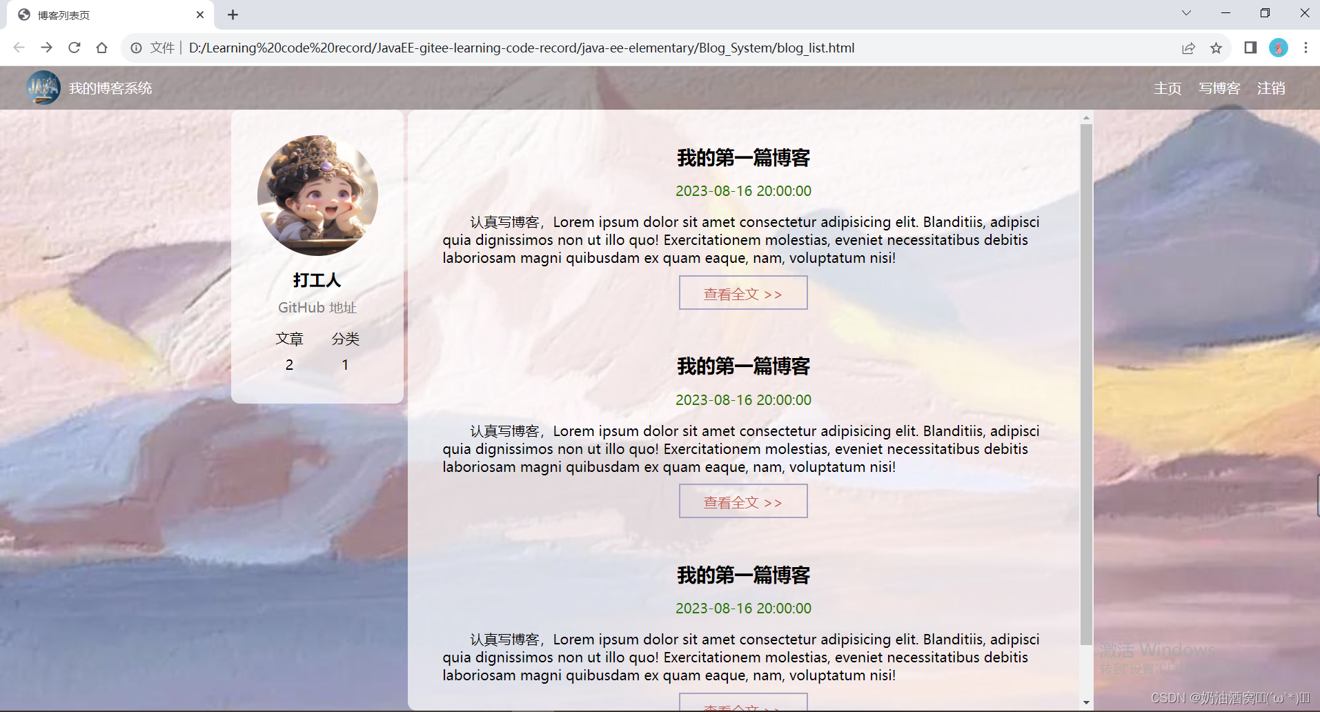
1.2博客详情页
1.2.1博客详情页效果预览图
1.2.2实现导航栏 + 版心+个人信息
这三个和上面的博客列表页的效果都是一样的所以可以直接复制粘贴即可。
代码展示:
<!DOCTYPE html>
<html lang="en">
<head>
    <meta charset="UTF-8">
    <meta name="viewport" content="width=device-width, initial-scale=1.0">
    <title>博客详情页</title>
    <link rel="stylesheet" href="css/common.css">
    <link rel="stylesheet" href="css/blog_detail.css">
</head>
<body>
    <!-- 导航栏 -->
    <div class="nav">
        <!-- 图片的引入 -->
        <img src="image/nav.jpg">
        <!-- 标题 -->
        <div class="title">我的博客系统</div>
        <!-- 在这里我们使用一个简单粗暴的办法将后面的链接直接给挤过去 -->
        <div class="spacer"></div>

        <a href="blog_list.html">主页</a>
        <a href="blog_edit.html">写博客</a>
        <!-- 这里的地址后期讲解 -->
        <a href="">注销</a>
    </div>

    <!-- 版心的实现 -->
    <div class="container">
        <!-- 左侧信息 -->
        <div class="container-left">
            <!-- 这个div表示整个用户信息的区域 -->
            <div class="card">
                <!-- 用户的头像 -->
                <img src="image/userAvatar.jpg">

                <!-- 用户名 -->
                <h3>打工人</h3>

                <!-- GitHub地址 -->
                <a href="https://github.com/yaugaolele/Project.git">GitHub 地址</a>

                <!-- 统计信息 -->
                <div class="counter">
                    <span>文章</span>
                    <span>分类</span>
                </div>
                <div class="counter">
                    <span>2</span>
                    <span>1</span>
                </div>
            </div>
        </div>
        <!-- 右侧信息 -->
        <div class="container-right">
        </div>
</body>
</html>
注意:这里小编直接大家展示了blog_detail.html的代码,common.css我们是直接引入的!!!
结果展示: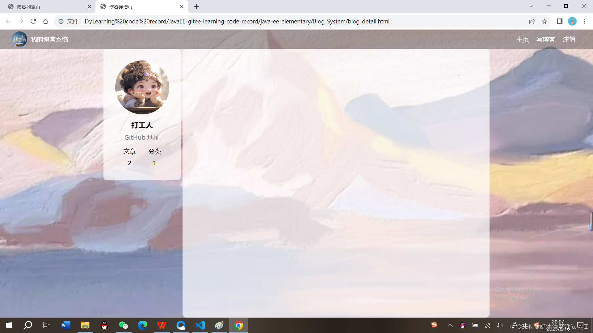
1.2.3实现博客正文
代码展示:
blog_detail.html代码展示:
<!DOCTYPE html>
<html lang="en">
<head>
    <meta charset="UTF-8">
    <meta name="viewport" content="width=device-width, initial-scale=1.0">
    <title>博客详情页</title>
    <link rel="stylesheet" href="css/common.css">
    <link rel="stylesheet" href="css/blog_detail.css">
</head>
<body>
    <!-- 导航栏 -->
    <div class="nav">
        <!-- 图片的引入 -->
        <img src="image/nav.jpg">
        <!-- 标题 -->
        <div class="title">我的博客系统</div>
        <!-- 在这里我们使用一个简单粗暴的办法将后面的链接直接给挤过去 -->
        <div class="spacer"></div>

        <a href="blog_list.html">主页</a>
        <a href="blog_edit.html">写博客</a>
        <!-- 这里的地址后期讲解 -->
        <a href="">注销</a>
    </div>

    <!-- 版心的实现 -->
    <div class="container">
        <!-- 左侧信息 -->
        <div class="container-left">
            <!-- 这个div表示整个用户信息的区域 -->
            <div class="card">
                <!-- 用户的头像 -->
                <img src="image/userAvatar.jpg">

                <!-- 用户名 -->
                <h3>打工人</h3>

                <!-- GitHub地址 -->
                <a href="https://github.com/yaugaolele/Project.git">GitHub 地址</a>

                <!-- 统计信息 -->
                <div class="counter">
                    <span>文章</span>
                    <span>分类</span>
                </div>
                <div class="counter">
                    <span>2</span>
                    <span>1</span>
                </div>
            </div>
        </div>
        <!-- 右侧信息 -->
        <div class="container-right">
            <!-- 博客标题 -->
            <h3>我的第一篇博客</h3>
            <!-- 时间 -->
            <div class="date">2023-08-16 20:00:00</div>
            <div class="content">
                <p>从今天开始我要认真写博客,Lorem ipsum dolor sit amet consectetur adipisicing elit. Dolores nostrum alias reprehenderit quisquam assumenda! Optio iste dicta pariatur odio unde dolorum, aliquid error, ipsa labore nobis, aspernatur qui aliquam explicabo!</p>
                <p>从今天开始我要认真写博客,Lorem ipsum dolor sit amet consectetur adipisicing elit. Dolores nostrum alias reprehenderit quisquam assumenda! Optio iste dicta pariatur odio unde dolorum, aliquid error, ipsa labore nobis, aspernatur qui aliquam explicabo!</p>
                <p>从今天开始我要认真写博客,Lorem ipsum dolor sit amet consectetur adipisicing elit. Dolores nostrum alias reprehenderit quisquam assumenda! Optio iste dicta pariatur odio unde dolorum, aliquid error, ipsa labore nobis, aspernatur qui aliquam explicabo!</p>
                <p>从今天开始我要认真写博客,Lorem ipsum dolor sit amet consectetur adipisicing elit. Dolores nostrum alias reprehenderit quisquam assumenda! Optio iste dicta pariatur odio unde dolorum, aliquid error, ipsa labore nobis, aspernatur qui aliquam explicabo!</p>
            </div>
        </div>
</body>
</html>
blog_detail.css代码展示:
/* 博客详情页的专属样式 */
.container-right h3 {
    font-size: 22px;
    text-align: center;
    font-weight: 900;
    padding: 20px 0;
}

.container-right .date {
    text-align: center;
    color: rgb(0, 120, 0);
    padding: 10px 0;
}

.container-right .content p {
    text-indent: 2em;
    margin-bottom: 5px;
}
结果展示: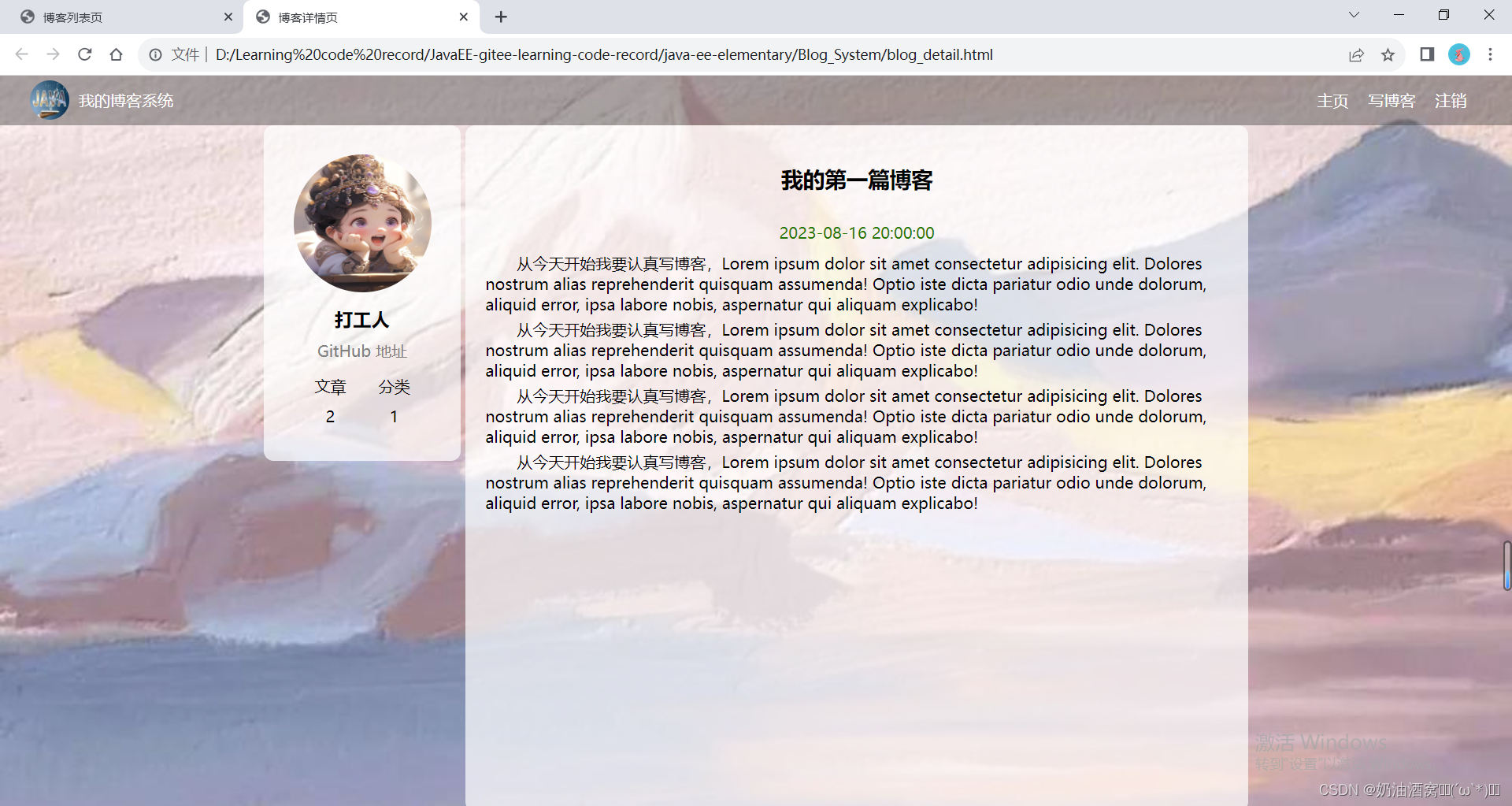
1.3登录页
1.3.1登录页效果预览图
1.3.2导航栏和版心的实现
这里与上述不同的就是直接没有用户的信息的展示了,也没有注销按钮了。
代码展示:
<!DOCTYPE html>
<html lang="en">
<head>
    <meta charset="UTF-8">
    <meta name="viewport" content="width=device-width, initial-scale=1.0">
    <title>博客登录页</title>
    <link rel="stylesheet" href="css/common.css">
    <link rel="stylesheet" href="css/login.css">
</head>
<body>
    <!-- 导航栏 -->
    <div class="nav">
        <!-- 图片的引入 -->
        <img src="image/nav.jpg">
        <!-- 标题 -->
        <div class="title">我的博客系统</div>
        <!-- 在这里我们使用一个简单粗暴的办法将后面的链接直接给挤过去 -->
        <div class="spacer"></div>
        <a href="blog_list.html">主页</a>
        <a href="blog_edit.html">写博客</a>
    </div>

</body>
</html>
结果展示:
1.3.3实现登录框
代码展示:
login.html代码展示:
<!DOCTYPE html>
<html lang="en">
<head>
<meta charset="UTF-8">
<meta name="viewport" content="width=device-width, initial-scale=1.0">
<title>博客登录页</title>
<link rel="stylesheet" href="css/common.css">
<link rel="stylesheet" href="css/login.css">
</head>
<body>
<!-- 导航栏 -->
<div class="nav">
<!-- 图片的引入 -->
<img src="image/nav.jpg">
<!-- 标题 -->
<div class="title">我的博客系统</div>
<!-- 在这里我们使用一个简单粗暴的办法将后面的链接直接给挤过去 -->
<div class="spacer"></div>
<a href="blog_list.html">主页</a>
<a href="blog_edit.html">写博客</a>
</div>
<!-- 登录页面版心 -->
<div class="login-container">
<!-- 登录对话框 -->
<div class="login-dialog">
<h3>登 录</h3>
<!-- 使用form包裹一下下列内容,便于给后续服务器提交数据 -->
<form action="">
<div class="row">
<span>用户名</span>
<input type="text" id="username">
</div>
<div class="row">
<span>密 码</span>
<input type="password" id="password">
</div>
<div class="row">
<input type="submit" value="登 录" id="submit">
</div>
</form>
</div>
</div>
</body>
</html>login.css代码展示:
/* 登录页的样式 */
.login-container {
    width: 100%;
    height: calc(100% - 50px);
    /* 为了让login-dialog垂直水平居中,使用贪心布局 */
    display: flex;
    justify-content: center;
    align-items: center;
}

.login-dialog {
    width: 400px;
    height: 350px;
    background-color: rgba(255,255,255,0.7);
    border-radius: 10px;
}

/* 登录标题 */
.login-dialog h3 {
    font-size: 24px;
    font-weight: 900;
    text-align: center;
    margin-top: 60px;
    margin-bottom: 40px;
}

/* 针对每一行的样式 */
.row {
    height: 50px;
    width: 100%;
    display: flex;
    justify-content: space-around;
    align-items: center;
}

/* 每一行的文字 */
.row span {
    font-size: 20px;
    width: 60px;
    margin-left: 40px;
}

.row #username {
    width: 200px;
    height: 40px;
    font-size: 20px;
    text-indent: 10px;
    border-radius: 10px;
    margin-right: 60px;
}

.row #password {
    width: 200px;
    height: 40px;
    font-size: 20px;
    text-indent: 10px;
    border-radius: 10px;
    margin-right: 60px;
}

.row #submit {
    width: 150px;
    height: 40px;
    color: white;
    background-color: rgb(180,154,161);
    text-align: center;
    /* 设置文字居中 */
    line-height: 40px;
    border-radius: 10px;
    margin-top: 40px;
}

.row #submit:hover {
    background-color: rgb(163,134,143);
    color: wheat;
}
结果展示: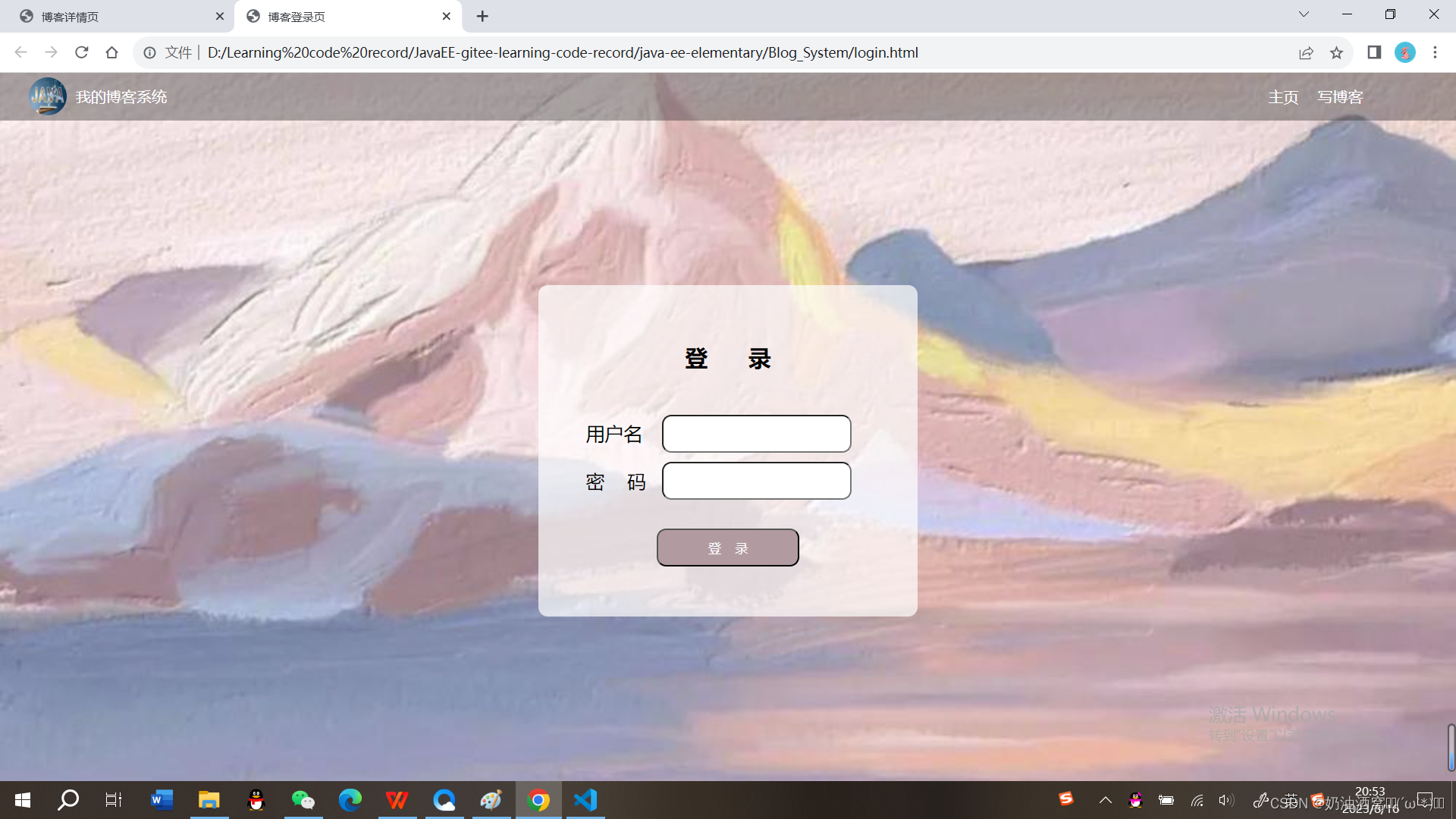
1.4博客编辑页
1.4.1博客编辑页效果预览图
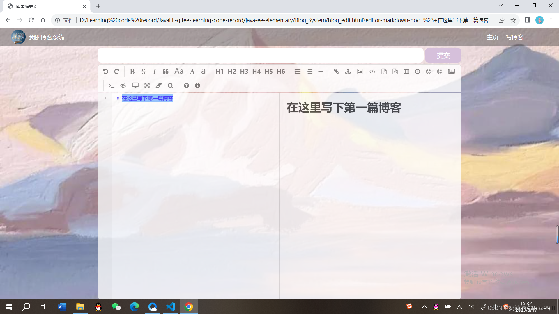
1.4.2引入导航栏+版心
与前面的一致,这里就直接上代码了。
代码展示:
blog_edit.html代码展示:
<!DOCTYPE html>
<html lang="en">
<head>
    <meta charset="UTF-8">
    <meta name="viewport" content="width=device-width, initial-scale=1.0">
    <title>博客编辑页</title>
    <link rel="stylesheet" href="css/common.css">
    <link rel="stylesheet" href="css/blog_edit.css">
</head>
<body>
    <!-- 导航栏 -->
    <div class="nav">
        <!-- 图片的引入 -->
        <img src="image/nav.jpg">
        <!-- 标题 -->
        <div class="title">我的博客系统</div>
        <!-- 在这里我们使用一个简单粗暴的办法将后面的链接直接给挤过去 -->
        <div class="spacer"></div>
        <a href="blog_list.html">主页</a>
        <a href="blog_edit.html">写博客</a>
    </div>

    <!-- 博客编辑页的版心 -->
    <div class="blog-edit-container">
        <form action="">
            <!-- 标题编辑区 -->
            <div class="title">
                <input type="text" id="title-input">
                <input type="submit" id="submit">
            </div>
            <!-- 博客编辑器 -->
            <!-- 把md编辑器放到这个div中 -->
            <div id="editor">

            </div>
        </form>
    </div>
</body>
</html>
blog_edit.css代码展示:
/* 博客编辑页的样式 */
.blog-edit-container {
    width: 1000px;
    height: calc(100% - 50px);
    margin: 0 auto;
}

/* 注意使用后代选择器,防止和导航栏中的title冲突 */
.blog-edit-container .title {
    height: 50px;
    display: flex;
    justify-content: space-between;
    align-items: center;
}
/* 标题的输入框 */
#title-input {
    height: 40px;
    width: 896px;
    border-radius: 10px;
    border: none;
    font-size: 20px;
    text-indent: 10px;
}

/* 提交按钮 */
#submit {
    height: 40px;
    width: 100px;
    border-radius: 10px;
    border: none;
    color: white;
    background-color: thistle;
    font-size: 18px;
}

#submit:hover {
    background-color: rgb(158,130,140);
}

.blog-edit-container form {
    height: 100%;
}

#editor {
    border-radius: 10px;
    /* 设置半透明度,只不够他会让子元素也会跟着一起透明 */
    opacity: 80%;
}
结果展示:
1.4.3实现编辑区
这里我们是直接引入
①直接在网上引入jquer.js内容。☞https://www.bootcdn.cn/jquery/
②下载editor.md的代码到本地目录中。
在官网中下载☞Editor.md - 开源在线 Markdown 编辑器
如下所示: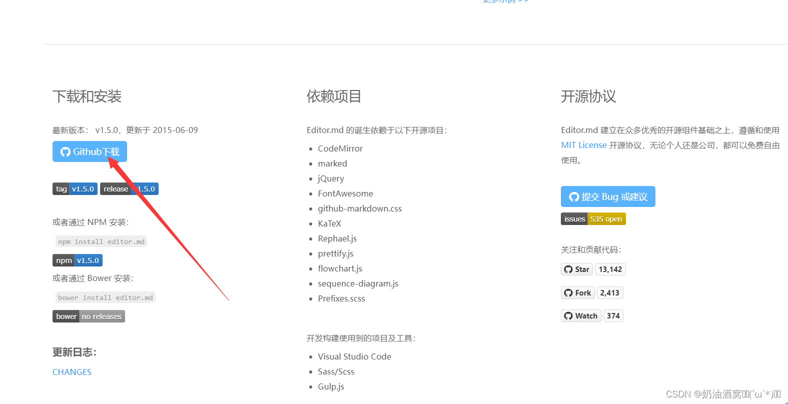
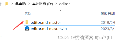
然后将整个目录拷贝到我们的项目中。
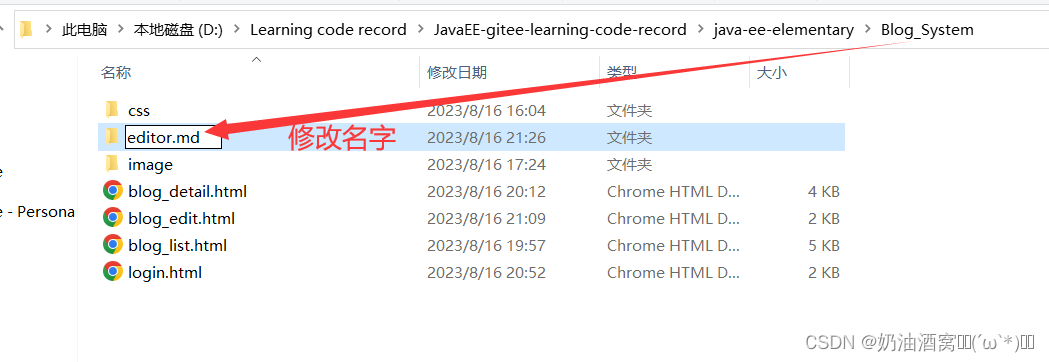
注意:这里的名字和小编的一定要保持一样!!!
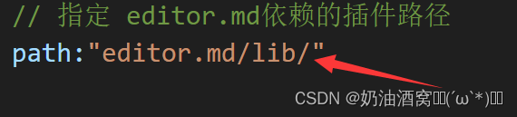
③在html代码中引入editor.md的依赖。
<!-- 引入editor.md的依赖 -->
<link rel="stylesheet" href="editor.md/css/editormd.min.css" />
<script src="editor.md/lib/marked.min.js"></script>
<script src="editor.md/lib/prettify.min.js"></script>
<script src="editor.md/editormd.js"></script>
注意:这里引入了一个css和三个js文件,需要保证你此处的写法在你的本地目录中可以找到对应的文件!!!
④针对editor.md进行初始化。
主要是创建一个编辑器对象,并且关联到页面的某个元素中。首先创建一个id为editor的div(注意属性必须是id不是class,这是editor的要求)。

使用editormd的一个函数来构造编辑器对象。
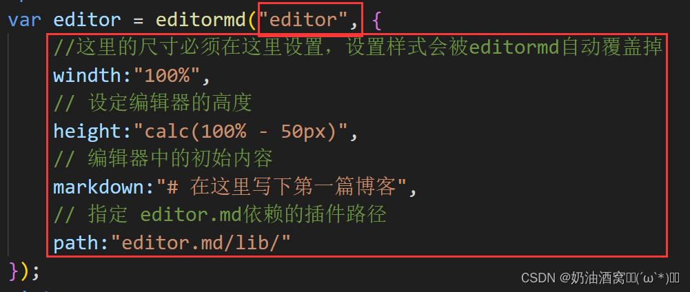
其中第一个参数是指上面的id,第二个参数是一个js对象里面可以写很多属性。
注意:这里一定要保证代码和目录结构要匹配。
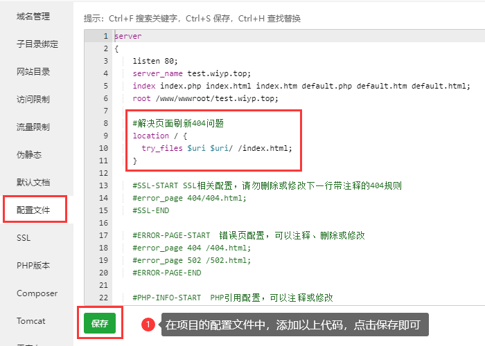
操作完上述一系列动作之后我们就直接可以设置它的样式了。
代码展示:
这里小编值展示有关于html的代码,css的代码和上面没有变动。
<!DOCTYPE html>
<html lang="en">
<head>
    <meta charset="UTF-8">
    <meta name="viewport" content="width=device-width, initial-scale=1.0">
    <title>博客编辑页</title>
    <link rel="stylesheet" href="css/common.css">
    <link rel="stylesheet" href="css/blog_edit.css">
    <script src="https://cdn.bootcdn.net/ajax/libs/jquery/3.6.4/jquery.min.js"></script>
    <!-- 引入editor.md的依赖 -->
    <link rel="stylesheet" href="editor.md/css/editormd.min.css" />
    <script src="editor.md/lib/marked.min.js"></script>
    <script src="editor.md/lib/prettify.min.js"></script>
    <script src="editor.md/editormd.js"></script>
</head>
<body>
    <!-- 导航栏 -->
    <div class="nav">
        <!-- 图片的引入 -->
        <img src="image/nav.jpg">
        <!-- 标题 -->
        <div class="title">我的博客系统</div>
        <!-- 在这里我们使用一个简单粗暴的办法将后面的链接直接给挤过去 -->
        <div class="spacer"></div>
        <a href="blog_list.html">主页</a>
        <a href="blog_edit.html">写博客</a>
    </div>

    <!-- 博客编辑页的版心 -->
    <div class="blog-edit-container">
        <form action="">
            <!-- 标题编辑区 -->
            <div class="title">
                <input type="text" id="title-input">
                <input type="submit" id="submit">
            </div>
            <!-- 博客编辑器 -->
            <!-- 把md编辑器放到这个div中 -->
            <div id="editor">

            </div>
        </form>
    </div>

    <script>
        var editor = editormd("editor", {
            //这里的尺寸必须在这里设置,设置样式会被editormd自动覆盖掉
            windth:"100%",
            // 设定编辑器的高度
            height:"calc(100% - 50px)",
            // 编辑器中的初始内容
            markdown:"# 在这里写下第一篇博客",
            // 指定 editor.md依赖的插件路径
            path:"editor.md/lib/"
        });
    </script>
</body>
</html>
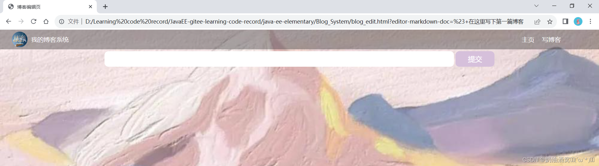
结构展示:
结束语:
这节中小编主要带着大家起来做了博客系统中的前端页面的展示,下一次下节中小编将会带着大家一起来完成后端的设计。希望这节对大家创建项目的前端页面有一定帮助,想要学习的同学记得关注小编和小编一起学习吧!如果文章中有任何错误也欢迎各位大佬及时为小编指点迷津(在此小编先谢过各位大佬啦!)


