目录
- 一、什么是Material Design
- 二、Toolbar
- 三、滑动菜单
- 1、DrawerLayout
- 2、NavigationView
- 四、悬浮按钮和可交互提示
- 1、FloatingActionButton
- 2、Snackbar
- 3、CoordinatorLayout
- 五、卡片式布局
- 1、MaterialCardView
- 2、AppBarLayout
- 六、可折叠式标题栏
- 1、CollapsingToolbarLayout
- 2、充分利用系统状态栏空间
一、什么是Material Design
Material Design是由Google的设计工程师基于传统优秀的设计原则,结合丰富的创意和科学技术所开发的一套全新的界面设计语言,包含了视觉、运行、互动效果等特性。 那么Google凭什么认为Material Design就能解决Android平台界面风格不统一的问题呢?一言以蔽之,好看!
为了做出表率,Google从Android 5.0 系统开始,就将所有内置的应用都应用都使用Material Design风格进行设计。
二、Toolbar
已经将ActionBar隐藏起来了,看下如何使用Toolbar来替代ActionBar,修改activity_main.xml代码:
<?xml version="1.0" encoding="utf-8"?>
<FrameLayout xmlns:android="http://schemas.android.com/apk/res/android"
    xmlns:app="http://schemas.android.com/apk/res-auto"
    android:layout_width="match_parent"
    android:layout_height="match_parent">

    <androidx.appcompat.widget.Toolbar
        android:id="@+id/toolbar"
        android:layout_width="match_parent"
        android:layout_height="?attr/actionBarSize"
        android:background="@color/colorPrimary"
        android:theme="@style/ThemeOverlay.AppCompat.Dark.ActionBar"
        app:popupTheme="@style/ThemeOverlay.AppCompat.Light" />
</FrameLayout>
修改MainActivity.kt代码:
class MainActivity : AppCompatActivity() {
    override fun onCreate(savedInstanceState: Bundle?) {
        super.onCreate(savedInstanceState)
        setContentView(R.layout.activity_main)
        setSupportActionBar(toolbar)
    }
}
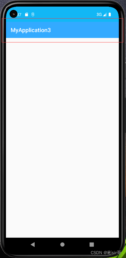
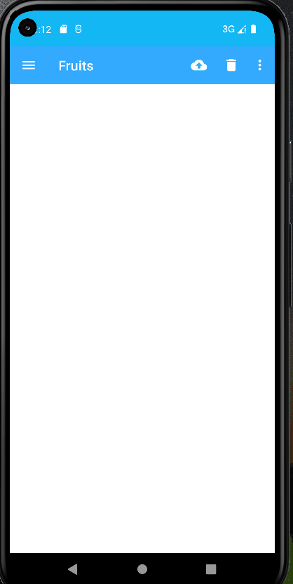
这代码中很关键的代码中一句,调用setSupportActionBar()方法并将Toolbar的实例传入,就是使用了Toolbar,又让它的外观与功能都和ActionBar一致了,运行结果:
怎么修改标题栏上显示的文字,这文字是在AndroidManifest.xml中指定的:
	<application
        android:allowBackup="true"
        android:fullBackupContent="@xml/backup_rules"
        android:icon="@mipmap/ic_launcher"
        ...
        android:theme="@style/AppTheme"
        android:usesCleartextTraffic="true">
        <activity
            android:name=".MainActivity"
            android:exported="true"
            android:label="Fruits">
            ...
        </activity>
    </application>
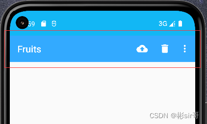
这里给activity增加了一个android:label属性,用于指定在Toolbar中显示的文字,如果没有指定的话,会默认使用application中指定的label文字,也就是应用的名称
Toolbar上可以再添加一些accent按钮,提前准备了几张按钮图标,将它们放在了drawable-xxhdpi目录下,现在右击res目录→New→Android Resource Directory→Resource type下拉菜单选择menu后点击“OK”,可以自动创建一个menu文件夹,右击menu文件夹→New→Menu Resource File,创建一个toolbar.xml→点击“OK”,并编写如下代码:
<?xml version="1.0" encoding="utf-8"?>
<menu xmlns:android="http://schemas.android.com/apk/res/android"
    xmlns:app="http://schemas.android.com/apk/res-auto">
    <item
        android:id="@+id/backup"
        android:icon="@drawable/ic_backup"
        android:title="Backup"
        app:showAsAction="always" />
    <item
        android:id="@+id/delete"
        android:icon="@drawable/ic_delete"
        android:title="Delete"
        app:showAsAction="ifRoom" />
    <item
        android:id="@+id/settings"
        android:icon="@drawable/ic_settings"
        android:title="Settings"
        app:showAsAction="never" />
</menu>
<item>标签来定义accent按钮,android:id用于指定按钮的id,android:icon用于指定按钮的图标,android:title用于指定按钮的文字。
修改MainActivity.kt代码:
class MainActivity : AppCompatActivity() {
	...
    override fun onCreateOptionsMenu(menu: Menu?): Boolean {
        menuInflater.inflate(R.menu.toolbar, menu)
        return true
    }

    override fun onOptionsItemSelected(item: MenuItem): Boolean {
        when (item.itemId) {
            R.id.backup -> Toast.makeText(this, "You clicked Backup", Toast.LENGTH_SHORT).show()
            R.id.delete -> Toast.makeText(this, "You clicked Delete", Toast.LENGTH_SHORT).show()
            R.id.settings -> Toast.makeText(this, "You clicked Settings", Toast.LENGTH_SHORT).show()
        }
        return true
    }
}
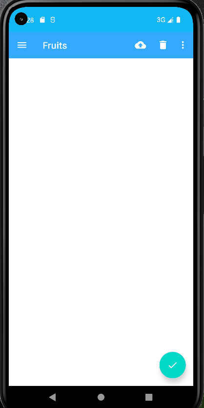
onCreateOptionsMenu()方法中加载了toolbar.xml这个菜单文件,然后在onOptionsItemSelected()方法中处理各个按钮的点击事件,运行结果:
三、滑动菜单
1、DrawerLayout
<?xml version="1.0" encoding="utf-8"?>
<androidx.drawerlayout.widget.DrawerLayout xmlns:android="http://schemas.android.com/apk/res/android"
    xmlns:app="http://schemas.android.com/apk/res-auto"
    android:id="@+id/drawerLayout"
    android:layout_width="match_parent"
    android:layout_height="match_parent">

    <FrameLayout
        android:layout_width="match_parent"
        android:layout_height="match_parent">

        <androidx.appcompat.widget.Toolbar
            android:id="@+id/toolbar"
            android:layout_width="match_parent"
            android:layout_height="?attr/actionBarSize"
            android:background="@color/colorPrimary"
            android:theme="@style/ThemeOverlay.AppCompat.Dark.ActionBar"
            app:popupTheme="@style/ThemeOverlay.AppCompat.Light" />
    </FrameLayout>

    <TextView
        android:layout_width="match_parent"
        android:layout_height="match_parent"
        android:layout_gravity="start"
        android:background="#FFF"
        android:text="This is menu"
        android:textSize="30sp" />
</androidx.drawerlayout.widget.DrawerLayout>
这代码,最外层的控件使用了DrawerLayout。DrawerLayout中放置了两个直接子控件:第一个控件是FrameLayout,用于作为主屏障中显示的内容,当然里面还有刚刚定义的Toolbar,第二个控件是一个TextView,用于作为滑动菜单中显示的内容,其实使用什么都可以,DrawerLayout并没有限制只能使用固定的控件
但是关于第二个子控件有一点需要注意,layout_gravity这个属性是必须指定的,因为我们需要告诉DrawerLayout滑动菜单是在屏障的左边还是右边,指定left表示滑动菜单在左边,指定right表示滑动菜单在右边。这里我指定了start,表示会根据系统语言进行判断
运行结果,然后在屏障的左侧边缘向右拖动,就可以让滑动菜单显示出来了
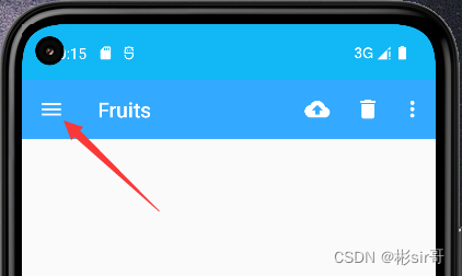
Material Design建议的做法是在Toolbar的最左边加入一个导航按钮,点击按钮也会将滑动菜单的内容展示出来,这样就相当于给用户提供了两种打开滑动菜单的方式,防止一些用户不知道屏障的左侧边缘是可以拖动的。
来实现这个功能,先准备了一张导航按钮的图标ic_menu.png,将它放在了drawable-xxhdpi目录下,修改MainActivity.kt代码
class MainActivity : AppCompatActivity() {
    override fun onCreate(savedInstanceState: Bundle?) {
        super.onCreate(savedInstanceState)
        setContentView(R.layout.activity_main)
        setSupportActionBar(toolbar)
        //***增加代码***
        supportActionBar?.let {
            it.setDisplayHomeAsUpEnabled(true)
            it.setHomeAsUpIndicator(R.drawable.ic_menu)
        }
        //******
    }
    ...
    override fun onOptionsItemSelected(item: MenuItem): Boolean {
        when (item.itemId) {
        	//***增加代码***
            android.R.id.home -> drawerLayout.openDrawer(GravityCompat.START)
            //***
            ...
        }
        return true
    }
}
调用supportActionBar方法得到了ActionBar的,调用了setDisplayHomeAsUpEnabled()方法让导航按钮显示出来,调用setHomeAsUpIndicator()方法来设置一个导航按钮图标。Toolbar最左侧的这个按钮就叫作Home按钮,它默认的图标是一个返回的箭头,含义是返回上一个Activity。
在onOptionsItemSelected()方法中对Home按钮的点击事件进行处理,Home按钮的id永远都是android.R.id.home。调用drawerLayout的openDrawer()方法滑动菜单展示出来,注意openDrawer()方法要求传入一个Gravity参数,为了保证这里的行为和XML中定义的一致,传入了GravityCompat.START
2、NavigationView
菜单页面仅仅使用了一个TextView,非常简单,不过Google给我们提供了一种更好的方法——使用NavigationView。NavigationView是Material库中提供的一个控件,它不仅是严格按钮Material Design的要求来设计的,而且可以将滑动菜单页面的实现变得非常简单
首先,既然这个控件是Material库中提供的,那么就需要将这个库引入项目中才行,打开app/build.gradle文件,在dependencies闭包中添加如下内容:
dependencies {
	...
    implementation 'com.google.android.material:material:1.1.0'
    implementation 'de.hdodenhof:circleimageview:3.0.1'
}
这里添加了两行依赖关系:第二行就是Material库,第二行是一个开源项目CircleImageView,它可以用来轻松实现图片圆形化的功能
需要注意的是,当你引入了Material库之后,还需要将res/values/styles.xml文件中AppTheme的parent的主题改成Theme.MaterialComponents.Light.NoActionBar,否则在使用接下来的一些控件时可能会遇到崩溃问题
在开始使用NavigationView之前,还需要要准备好两个东西:menu和headerLayout。menu是用来在NavigationView中显示具体的菜单项的,headerLayout则是用来在NavigationView中显示头部布局的。
先来准备menu,我事先找了几张图片作为按钮的图标,并将它们放在了drawable-xxhdpi目录下。右击menu文件夹→New→Menu Resource File,创建一个nav_menu.xml文件,并编写如下代码:
<?xml version="1.0" encoding="utf-8"?>
<menu xmlns:android="http://schemas.android.com/apk/res/android">
    <group android:checkableBehavior="single">
        <item
            android:id="@+id/navCall"
            android:icon="@drawable/nav_call"
            android:title="Call" />
        <item
            android:id="@+id/navFriends"
            android:icon="@drawable/nav_friends"
            android:title="Friends" />
        <item
            android:id="@+id/navLocation"
            android:icon="@drawable/nav_location"
            android:title="Location" />
        <item
            android:id="@+id/navMail"
            android:icon="@drawable/nav_mail"
            android:title="Mail" />
        <item
            android:id="@+id/navTask"
            android:icon="@drawable/nav_task"
            android:title="Task" />
    </group>
</menu>
然后右击layout文件夹→New→Layout Resource File,创建一个nav_header.xml文件并在Root element选择RelativeLayout,修改其中的代码:
<?xml version="1.0" encoding="utf-8"?>
<RelativeLayout xmlns:android="http://schemas.android.com/apk/res/android"
    android:layout_width="match_parent"
    android:layout_height="180dp"
    android:padding="10dp"
    android:background="@color/colorPrimary">

    <de.hdodenhof.circleimageview.CircleImageView
        android:id="@+id/iconImage"
        android:layout_width="70dp"
        android:layout_height="70dp"
        android:src="@drawable/ic"
        android:layout_centerInParent="true"/>

    <TextView
        android:id="@+id/mailText"
        android:layout_width="wrap_content"
        android:layout_height="wrap_content"
        android:layout_alignParentBottom="true"
        android:text="156***@xxx.com"
        android:textColor="#FFF"
        android:textSize="14sp"/>

    <TextView
        android:id="@+id/userText"
        android:layout_width="wrap_content"
        android:layout_height="wrap_content"
        android:layout_above="@id/mailText"
        android:text="Tony green"
        android:textColor="#FFF"
        android:textSize="14sp"/>
</RelativeLayout>
activity_main.xml
<?xml version="1.0" encoding="utf-8"?>
<androidx.drawerlayout.widget.DrawerLayout
    xmlns:android="http://schemas.android.com/apk/res/android"
    xmlns:app="http://schemas.android.com/apk/res-auto"
    android:id="@+id/drawerLayout"
    android:layout_width="match_parent"
    android:layout_height="match_parent">

    <FrameLayout
        android:layout_width="match_parent"
        android:layout_height="match_parent">

        <androidx.appcompat.widget.Toolbar
            android:id="@+id/toolbar"
            android:layout_width="match_parent"
            android:layout_height="?attr/actionBarSize"
            android:background="@color/colorPrimary"
            android:theme="@style/ThemeOverlay.AppCompat.Dark.ActionBar"
            app:popupTheme="@style/ThemeOverlay.AppCompat.Light" />
    </FrameLayout>

    <com.google.android.material.navigation.NavigationView
        android:id="@+id/navView"
        android:layout_width="match_parent"
        android:layout_height="match_parent"
        android:layout_gravity="start"
        app:headerLayout="@layout/nav_header"
        app:menu="@menu/nav_menu" />
</androidx.drawerlayout.widget.DrawerLayout>
修改MainActivity.kt
class MainActivity : AppCompatActivity() {
    override fun onCreate(savedInstanceState: Bundle?) {
        super.onCreate(savedInstanceState)
        setContentView(R.layout.activity_main)
        setSupportActionBar(toolbar)
        supportActionBar?.let {
            it.setDisplayHomeAsUpEnabled(true)
            it.setHomeAsUpIndicator(R.drawable.ic_menu)
        }
        //***新增代码***
        navView.setCheckedItem(R.id.navCall)
        navView.setNavigationItemSelectedListener {
            drawerLayout.closeDrawers()
            true
        }
        //******
    }
    ...
}
setCheckedItem()方法将Call菜单项设置为默认选中,setNavigationItemSelectedListener方法来设置一个菜单项选中事件的监听器,DrawerLayout的closeDrawers()方法将滑动菜单关闭,并返回true表示此事件已被处理。运行结果,点击一下Toolbar左侧的导航按钮,如下图:
四、悬浮按钮和可交互提示
1、FloatingActionButton
FloatingActionButton是Material库中提供的一个控件,这个控件可以帮助我们比较轻松地实现悬浮按钮的效果
仍然需要提前准备好一个图标,这里我放在了一张ic_done.png到drawable-xxhdpi目录下,然后修改activity_main.xml中的代码:
<?xml version="1.0" encoding="utf-8"?>
<androidx.drawerlayout.widget.DrawerLayout xmlns:android="http://schemas.android.com/apk/res/android"
    xmlns:app="http://schemas.android.com/apk/res-auto"
    android:id="@+id/drawerLayout"
    android:layout_width="match_parent"
    android:layout_height="match_parent">

    <FrameLayout
        android:layout_width="match_parent"
        android:layout_height="match_parent">

        <androidx.appcompat.widget.Toolbar
            android:id="@+id/toolbar"
            android:layout_width="match_parent"
            android:layout_height="?attr/actionBarSize"
            android:background="@color/colorPrimary"
            android:theme="@style/ThemeOverlay.AppCompat.Dark.ActionBar"
            app:popupTheme="@style/ThemeOverlay.AppCompat.Light" />

        <com.google.android.material.floatingactionbutton.FloatingActionButton
            android:id="@+id/fab"
            android:layout_width="wrap_content"
            android:layout_height="wrap_content"
            android:layout_gravity="bottom|end"
            android:layout_margin="16dp"
            android:src="@drawable/ic_done" />
    </FrameLayout>
    ...
</androidx.drawerlayout.widget.DrawerLayout>
运行结果:
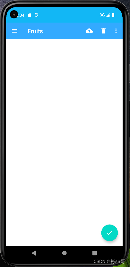
一个漂亮的悬浮按钮就在屏障的右下方出现了
如果你仔细观察的话,会发现这个悬浮按钮的下面还有一个阴影。其实这很好理解,因为FloatingActionButton是悬浮在当前界面上,既然是悬浮,那么理所应当会有投影,Material库中这种细节都帮我们考虑到了
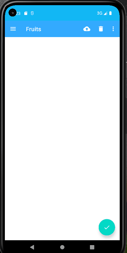
还可以在FloatingActionButton属性中增加悬浮高度:app:elevation="8dp",高度值越大,投影范围也越大。在activity中的悬浮按钮可以点击事件
2、Snackbar
修改MainActivity.kt中的代码:
class MainActivity : AppCompatActivity() {
    override fun onCreate(savedInstanceState: Bundle?) {
        super.onCreate(savedInstanceState)
        setContentView(R.layout.activity_main)
        ...
        fab.setOnClickListener { view ->
            Snackbar.make(view, "Data deleted", Snackbar.LENGTH_SHORT).setAction("Undo") {
                Toast.makeText(this, "Data,restored", Toast.LENGTH_SHORT).show()
            }.show()
        }
    }
    ...
}
Snackbar从屏障底部出现了,上面有我设置的提示文字,还有一个“Undo”按钮,按钮是可以点击的。过一段时间后,Snackbar会自动从屏障底部消失
不管是出现还是消失,Snackbar都是带有动画效果的,因此视觉体验也会比较好
不过,你有没有发现一个bug?这个Snackbar竟然将悬浮按钮给遮挡住了,有没有什么办法能解决一下呢?当然有了,只需要借助CoordinatorLayout就可以轻松解决
3、CoordinatorLayout
CoordinatorLayout可以说是一个加强版的FrameLayout,由AndroidX库提供。它在普通情况下的作用和FrameLayout基本一致,但是它拥有一些额外的Material能力
事实上,CoordinatorLayout可以监听其所有子控件的各种事件,并自动帮助我们做出最为合理的响应。举个简单的例子,刚才弹出的Snackbar提示将悬浮按钮遮挡住了,而如果我们能让CoordinatorLayout监听到Snackbar的弹出事件,那么它会自动将内部的FloatingActionButton向上偏移,从而确保不会被Snackbar遮挡
至于CoordinatorLayout的使用也非常简单,只需要要将原来的FrameLayout替换一下就可以了。修改activity_main.xml中的代码:
<androidx.drawerlayout.widget.DrawerLayout
    xmlns:android="http://schemas.android.com/apk/res/android"
    xmlns:app="http://schemas.android.com/apk/res-auto"
    android:id="@+id/drawerLayout"
    android:layout_width="match_parent"
    android:layout_height="match_parent">

    <androidx.coordinatorlayout.widget.CoordinatorLayout
        android:layout_width="match_parent"
        android:layout_height="match_parent">

        <androidx.appcompat.widget.Toolbar
            android:id="@+id/toolbar"
            android:layout_width="match_parent"
            android:layout_height="?attr/actionBarSize"
            android:background="@color/colorPrimary"
            android:theme="@style/ThemeOverlay.AppCompat.Dark.ActionBar"
            app:popupTheme="@style/ThemeOverlay.AppCompat.Light" />

        <com.google.android.material.floatingactionbutton.FloatingActionButton
            android:id="@+id/fab"
            android:layout_width="wrap_content"
            android:layout_height="wrap_content"
            android:layout_gravity="bottom|end"
            android:layout_margin="16dp"
            android:src="@drawable/ic_done"
            app:elevation="8dp"/>
    </androidx.coordinatorlayout.widget.CoordinatorLayout>
    ...
</androidx.drawerlayout.widget.DrawerLayout>
由于CoordinatorLayout本身就是一个加强版的FrameLayout,因此这种替换不会有任何的副作用。运行结果:
可以看到,悬浮按钮自动向上偏移了Snackbar的同等高度,从而确保不会遮挡。当Snackbar消失的时候,悬浮按钮会自动向下偏移回到原来的位置
不过我们回过头再思考一下,刚才说的是CoordinatorLayout可以监听其所有子控件的各种事件,但是Snackbar好像并不是CoordinatorLayout的子控件吧,为什么它却可以被监听到呢?
其实道理很简单,还记得我们在Snackbar的make()方法中传入的第一参数吗?这个参数就是用来指定Snackbar是基于哪个View触发的,刚才我们传入的是FloatingActionButton本身,而FloatingActionButton是CoordinatorLayout中的子控件,因此这个事件就理所应当能被监听到了。你可以自己再做个实验,如果给Snackbar的make()方法传入一个DrawerLayout,那么Snackbar就会再次遮挡悬浮按钮,因为DrawerLayout不是CoordinatorLayout的子控件,CoordinatorLayout也就无法监听到Snackbar的弹出和隐藏事件了。
五、卡片式布局
1、MaterialCardView
MaterialCardView是用于实现卡片式布局效果的重要控件,由Material库提供。实现上,MaterialCardView也是一个FrameLayout,只是额外提供了圆角和阴影等效果,看上去会有立体的感觉
右击layout文件夹→New→Layout Resource File,创建一个card_item.xml文件并在Root element输入MaterialC时下拉菜单选择com.google.android.material.card.MaterialCardView,修改代码:
<?xml version="1.0" encoding="utf-8"?>
<com.google.android.material.card.MaterialCardView
    xmlns:android="http://schemas.android.com/apk/res/android"
    xmlns:app="http://schemas.android.com/apk/res-auto"
    android:layout_width="match_parent"
    android:layout_height="wrap_content"
    android:layout_margin="10dp"
    app:cardCornerRadius="10dp"
    app:cardElevation="10dp"
    app:contentPadding="10dp">

    <TextView
        android:layout_width="wrap_content"
        android:layout_height="wrap_content"
        android:text="Card"
        android:textSize="20sp" />

    <TextView
        android:layout_width="wrap_content"
        android:layout_height="wrap_content"
        android:layout_marginTop="20dp"
        android:text="世界上根本就不存在完美的事物,我们没必要浪费大量的精力去寻找不存在的东西。与其用一生的时间去执着地追求虚无缥缈的东西,不如珍惜和把握现在美好的生活。
        当我们抛开追求完美的幻想和错觉,收获的可能是埋藏在平凡和朴实生活中的幸福" />
</com.google.android.material.card.MaterialCardView>
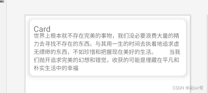
布局预览,如下图:
这个定义了一个MaterialCardView布局,app:cardCornerRadius属性指定卡片圆角的弧度,数值越大,圆角的弧度也越大。app:cardElevation属性指定卡片的高度:高度值越大,投影范围也越大,但是投影效果越淡;高度值越小,投影范围也越小,但是投影效果越浓。这一点和FloatingActionButton是一致的
接下来开始具体的代码实现,修改activity_main.xml中的代码:
<?xml version="1.0" encoding="utf-8"?>
<androidx.drawerlayout.widget.DrawerLayout xmlns:android="http://schemas.android.com/apk/res/android"
    xmlns:app="http://schemas.android.com/apk/res-auto"
    android:id="@+id/drawerLayout"
    android:layout_width="match_parent"
    android:layout_height="match_parent">

    <androidx.coordinatorlayout.widget.CoordinatorLayout
        android:layout_width="match_parent"
        android:layout_height="match_parent">

        <androidx.appcompat.widget.Toolbar
            android:id="@+id/toolbar"
            android:layout_width="match_parent"
            android:layout_height="?attr/actionBarSize"
            android:background="@color/colorPrimary"
            android:theme="@style/ThemeOverlay.AppCompat.Dark.ActionBar"
            app:popupTheme="@style/ThemeOverlay.AppCompat.Light" />

		<!-- ***新增代码*** -->
        <androidx.core.widget.NestedScrollView
            android:id="@+id/nestedScrollView"
            android:layout_width="match_parent"
            android:layout_height="match_parent"
            app:layout_behavior="@string/appbar_scrolling_view_behavior">

            <LinearLayout
                android:layout_width="match_parent"
                android:layout_height="match_parent"
                android:orientation="vertical"
                android:paddingTop="24dp">

                <include layout="@layout/card_item" />

                <include layout="@layout/card_item" />

                <include layout="@layout/card_item" />

                <include layout="@layout/card_item" />

                <include layout="@layout/card_item" />

                <include layout="@layout/card_item" />
            </LinearLayout>
        </androidx.core.widget.NestedScrollView>
        <!-- ****** -->

        ...
    </androidx.coordinatorlayout.widget.CoordinatorLayout>
    ...
</androidx.drawerlayout.widget.DrawerLayout>
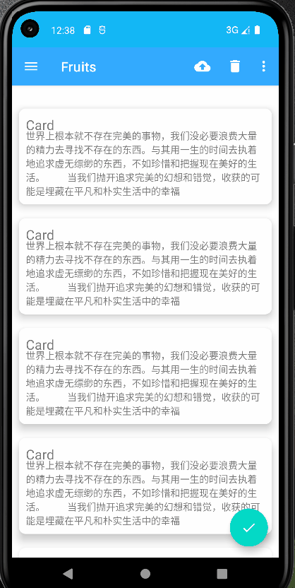
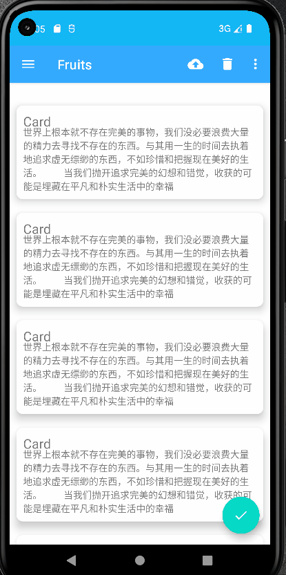
这里我们在CoordinatorLayout中添加了一个NestedScrollView,给它指定一个id,然后将宽度和高度都设置为match_parent,这样NestedScrollView就占满了整个布局的空间,的include就是直接导入小布局,运行结果,如下图:
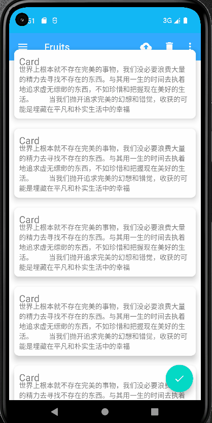
可以看到,这个视图展示出来了。每两行内容都是在一张单独的卡片当中的,并且还拥有圆角和投影,是不是非常美观?
不过,还有一个bug,Toolbar怎么不见了,仔细观察一下原来是被NestedScrollView给挡住了。这个问题又该怎么解决呢?这就需要借助另外一个工具了——AppBarLayout
2、AppBarLayout
修改activity_main.xml中的代码:
<?xml version="1.0" encoding="utf-8"?>
<androidx.drawerlayout.widget.DrawerLayout xmlns:android="http://schemas.android.com/apk/res/android"
    xmlns:app="http://schemas.android.com/apk/res-auto"
    android:id="@+id/drawerLayout"
    android:layout_width="match_parent"
    android:layout_height="match_parent">

    <androidx.coordinatorlayout.widget.CoordinatorLayout
        android:layout_width="match_parent"
        android:layout_height="match_parent">

        <!-- ***新增代码*** -->
        <com.google.android.material.appbar.AppBarLayout
            android:layout_width="match_parent"
            android:layout_height="wrap_content">

            <androidx.appcompat.widget.Toolbar
                android:id="@+id/toolbar"
                android:layout_width="match_parent"
                android:layout_height="?attr/actionBarSize"
                android:background="@color/colorPrimary"
                android:theme="@style/ThemeOverlay.AppCompat.Dark.ActionBar"
                app:popupTheme="@style/ThemeOverlay.AppCompat.Light" />
        </com.google.android.material.appbar.AppBarLayout>
        <!-- ****** -->

        <androidx.core.widget.NestedScrollView
            android:id="@+id/nestedScrollView"
            android:layout_width="match_parent"
            android:layout_height="match_parent"
            app:layout_behavior="@string/appbar_scrolling_view_behavior">

            <LinearLayout
                android:layout_width="match_parent"
                android:layout_height="match_parent"
                android:orientation="vertical"
                android:paddingTop="24dp">

                <include layout="@layout/card_item" />

                <include layout="@layout/card_item" />

                <include layout="@layout/card_item" />

                <include layout="@layout/card_item" />

                <include layout="@layout/card_item" />

                <include layout="@layout/card_item" />
            </LinearLayout>
        </androidx.core.widget.NestedScrollView>
        ...
    </androidx.coordinatorlayout.widget.CoordinatorLayout>
    ...
</androidx.drawerlayout.widget.DrawerLayout>
在NestedScrollView中使用app:layout_behavior属性指定了一个布局行为,appbar_scrolling_view_behavior这个字符串也是由Material库提供的
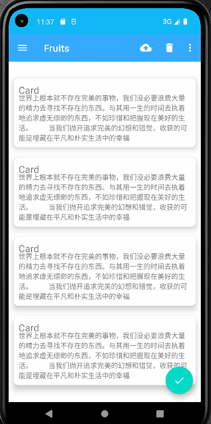
现在重新运行一下程序,你就会发现一切都正常了,如下图:
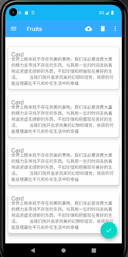
虽说使用AppBarLayout已经成功解决了NestedScrollView遮挡Toolbar的问题,但是刚才提到过,AppBarLayout中应用了一些Material Design的设计理念,好像从上面的例子完全体现不出来呀。事实上,当NestedScrollView滚动的时候就已经将滚动事件通知给AppBarLayout了,只是我们还没进行处理而已。那么下面就让我们来进一步优化,看看AppBarLayout到底能实现什么样的Material Design效果
当AppBarLayout接收滚动事件的时候,它内部的子控件其实是可以指定如何去响应这些事件的,通过app:layout_scrollFlags属性就能实现,修改activity_main.xml中的代码:
这里在Toolbar中添加了一个app:layout_scrollFlags属性,并将这个属性的值指定成了scroll|enterAlways|snap,其中,scroll表示当NestedScrollView向上滚动的时候,Toolbar会跟着一起向上滚动并实现隐藏,enterAlways表示当NestedScrollView向下滚动的时候,Toolbar会跟着一起向下滚动并重新显示,snap表示当Toolbar还没有完全隐藏或显示的时候,会根据当前滚动的距离,自动选择是隐藏还是显示
改了只有这一行代码而已,现在重新运行一下程序,并向上下滚动NestedScrollView,如下图:
可以看到,随着我们向上滚动NestedScrollView,Toolbar竟然消失了!而向下滚动NestedScrollView,Toolbar又会重新出现,这其实也是Material Design中的一项重要设计思想,因为当用户在向上滚动NestedScrollView的时候,其注意力肯定是在NestedScrollView的内容上的,这个时候如果Toolbar还占据着屏障空间,就会在一定程度上影响用户的阅读体验,而将Toolbar隐藏则可以让阅读体验达到最佳状态。当用户需要操作Toolbar上的功能时,只需要要轻微向下滚动,Toolbar就会重新出现。这种设计方式既保证了用户的最佳阅读效果,又不影响任何功能上的操作,Material Design考虑得就是这么细致入微
当然了,像这种功能,如果是使用ActionBar,那就完全不可能实现了,Toolbar的出现为我们提供了更多的功能
六、可折叠式标题栏
虽说我们现在的标题栏是使用Toolbar来编写的,不过它看上去和传统
1、CollapsingToolbarLayout
右击com.example.myapplication3包→New→Kotlin Class/File→输入CollapsingActivity(默认Class)后回车,就创建了一个CollapsingActivity,并将布局名指定成activity_collapsing.xml,然后开始编写可折叠式标题栏详情展示界面的布局
由于整个布局文件比较复杂,这里我准备采用分段编写的方式。activity_collapsing.xml中的内容主要分为两部分,一个是风景标题栏,一个是内容详情,我们来一步步实现
首先实现标题栏部分,这里使用ConstraintLayout作为最外层布局,如下代码:
<androidx.coordinatorlayout.widget.CoordinatorLayout
    xmlns:android="http://schemas.android.com/apk/res/android"
    xmlns:app="http://schemas.android.com/apk/res-auto"
    android:layout_width="match_parent"
    android:layout_height="match_parent">

</androidx.coordinatorlayout.widget.CoordinatorLayout>
一开始的代码还是比较简单的,相信没有什么需要解释的地方。注意的始终记得定义一个xmlns:app的命名空间,在Material Design的开发中会经常用到它
接着在CoordinatorLayout中嵌套一个AppBarLayout,如下代码:
<?xml version="1.0" encoding="utf-8"?>
<androidx.coordinatorlayout.widget.CoordinatorLayout
    xmlns:android="http://schemas.android.com/apk/res/android"
    xmlns:app="http://schemas.android.com/apk/res-auto"
    android:layout_width="match_parent"
    android:layout_height="match_parent">

    <com.google.android.material.appbar.AppBarLayout
        android:id="@+id/appBar"
        android:layout_width="match_parent"
        android:layout_height="250dp">
    </com.google.android.material.appbar.AppBarLayout>

</androidx.coordinatorlayout.widget.CoordinatorLayout>
目前为止也没有什么难理解的地方,我们给AppBarLayout定义了一个id
接下来在AppBarLayout中再嵌套一个CollapsingToolbarLayout,如下代码:
<?xml version="1.0" encoding="utf-8"?>
<androidx.coordinatorlayout.widget.CoordinatorLayout xmlns:android="http://schemas.android.com/apk/res/android"
    xmlns:app="http://schemas.android.com/apk/res-auto"
    android:layout_width="match_parent"
    android:layout_height="match_parent">

    <com.google.android.material.appbar.AppBarLayout
        android:id="@+id/appBar"
        android:layout_width="match_parent"
        android:layout_height="250dp">

        <!-- ***新增代码*** -->
        <com.google.android.material.appbar.CollapsingToolbarLayout
        	android:id="@+id/collapsingToolbar"
            android:layout_width="match_parent"
            android:layout_height="match_parent"
            android:theme="@style/ThemeOverlay.AppCompat.Dark.ActionBar"
            app:contentScrim="@color/colorPrimary"
            app:layout_scrollFlags="scroll|exitUntilCollapsed">

        </com.google.android.material.appbar.CollapsingToolbarLayout>
        <!-- ****** -->

    </com.google.android.material.appbar.AppBarLayout>

</androidx.coordinatorlayout.widget.CoordinatorLayout>
app:contentScrim属性用于指定CollapsingToolbarLayout在趋于折叠状态以及折叠之后的背景色,其实CollapsingToolbarLayout在折叠之后就是一个普通的Toolbar,对么背景色肯定应该是colorPrimary了,具体的效果我们待一会儿就能看到
接下来,在CollapsingToolbarLayout中定义标题栏的具体内容,如下代码:
<?xml version="1.0" encoding="utf-8"?>
<androidx.coordinatorlayout.widget.CoordinatorLayout xmlns:android="http://schemas.android.com/apk/res/android"
    xmlns:app="http://schemas.android.com/apk/res-auto"
    android:layout_width="match_parent"
    android:layout_height="match_parent">

    <com.google.android.material.appbar.AppBarLayout
        android:id="@+id/appBar"
        android:layout_width="match_parent"
        android:layout_height="250dp">

        <com.google.android.material.appbar.CollapsingToolbarLayout
            android:layout_width="match_parent"
            android:layout_height="match_parent"
            android:theme="@style/ThemeOverlay.AppCompat.Dark.ActionBar"
            app:contentScrim="@color/colorPrimary"
            app:layout_scrollFlags="scroll|exitUntilCollapsed">

            <!-- ***新增代码*** -->
            <ImageView
                android:id="@+id/imageView"
                android:layout_width="match_parent"
                android:layout_height="match_parent"
                android:scaleType="centerCrop"
                android:src="@mipmap/image"
                app:layout_collapseMode="parallax"/>

            <androidx.appcompat.widget.Toolbar
                android:id="@+id/toolbar"
                android:layout_width="match_parent"
                android:layout_height="?attr/actionBarSize"
                app:layout_collapseMode="pin"/>
            <!-- ****** -->

        </com.google.android.material.appbar.CollapsingToolbarLayout>

    </com.google.android.material.appbar.AppBarLayout>

</androidx.coordinatorlayout.widget.CoordinatorLayout>
可以看到,在CollapsingToolbarLayout中定义了一个ImageView和一个Toolbar,也就意味着,这个高级版的标题栏将是由普通的标题栏加上图片组合而成的。这里定义的大多数属性我们是已经见过的,就不再解释了,只有一个app:layout_collapseMode比较陌生。它用于指定当前控件在CollapsingToolbarLayout折叠过程中的折叠模式,其中Toolbar指定成pin,表示在折叠的过程中位置始终保持不变,ImageView指定成parallax,表示会在折叠的过程中产生一定的错位偏移,这种模式的视觉效果会非常好
这样就将标题栏的界面编写完成了,下面开始编写内容详情部分,继续修改activity_collapsing.xml中的代码,如下代码:
<?xml version="1.0" encoding="utf-8"?>
<androidx.coordinatorlayout.widget.CoordinatorLayout xmlns:android="http://schemas.android.com/apk/res/android"
    xmlns:app="http://schemas.android.com/apk/res-auto"
    android:layout_width="match_parent"
    android:layout_height="match_parent">

    <com.google.android.material.appbar.AppBarLayout
        android:id="@+id/appBar"
        android:layout_width="match_parent"
        android:layout_height="250dp">
        ...
    </com.google.android.material.appbar.AppBarLayout>

    <androidx.core.widget.NestedScrollView
        android:layout_width="match_parent"
        android:layout_height="match_parent"
        app:layout_behavior="@string/appbar_scrolling_view_behavior">

    </androidx.core.widget.NestedScrollView>

</androidx.coordinatorlayout.widget.CoordinatorLayout>
内容详情的最外层布局使用了一个NestedScrollView,注意它和AppBarLayout是平级的。,因此我们在它的内部就需要使用NestedScrollView或RecyclerView这样的布局。另外,这里通过app:layout_behavior属性指定了一个布局行为,这和之前在RecyclerView中的的用法是一模一样的
不管是ScrollView还是NestedScrollView,它们的内部都只允许存在一个直接子布局。因此,如果我们想要在里面放入很多东西的话,通常会先嵌套一个LinearLayout,然后再在LinearLayout中放入具体的内容就可以了,如下代码:
<?xml version="1.0" encoding="utf-8"?>
<androidx.coordinatorlayout.widget.CoordinatorLayout xmlns:android="http://schemas.android.com/apk/res/android"
    xmlns:app="http://schemas.android.com/apk/res-auto"
    android:layout_width="match_parent"
    android:layout_height="match_parent">
    ...
    <androidx.core.widget.NestedScrollView
        android:layout_width="match_parent"
        android:layout_height="match_parent"
        app:layout_behavior="@string/appbar_scrolling_view_behavior">

        <!-- ***新增代码*** -->
        <LinearLayout
            android:layout_width="match_parent"
            android:layout_height="wrap_content"
            android:orientation="vertical">
        </LinearLayout>
        <!-- ****** -->

    </androidx.core.widget.NestedScrollView>

</androidx.coordinatorlayout.widget.CoordinatorLayout>
android:orientation="vertical"是垂直方向的
接下来在LinearLayout中放入具体的内容,先准备使用一个TextView来显示内容详情,并将TextView放在一个卡片式布局当中,如下代码:
<?xml version="1.0" encoding="utf-8"?>
<androidx.coordinatorlayout.widget.CoordinatorLayout xmlns:android="http://schemas.android.com/apk/res/android"
    xmlns:app="http://schemas.android.com/apk/res-auto"
    android:layout_width="match_parent"
    android:layout_height="match_parent">
    ...
    <androidx.core.widget.NestedScrollView
        android:layout_width="match_parent"
        android:layout_height="match_parent"
        app:layout_behavior="@string/appbar_scrolling_view_behavior">

        <LinearLayout
            android:layout_width="match_parent"
            android:layout_height="wrap_content"
            android:orientation="vertical">

            <com.google.android.material.card.MaterialCardView
                android:layout_width="match_parent"
                android:layout_height="wrap_content"
                android:layout_marginLeft="15dp"
                android:layout_marginTop="35dp"
                android:layout_marginRight="15dp"
                android:layout_marginBottom="15dp"
                app:cardCornerRadius="4dp">

                <TextView
                    android:layout_width="wrap_content"
                    android:layout_height="wrap_content"
                    android:layout_margin="10dp"
                    android:text="世界上根本就不存在完美的事物,我们没必要浪费大量的精力去寻找不存在的东西。与其用一生的时间去执着地追求虚无缥缈的东西,不如珍惜和把握现在美好的生活。
        当我们抛开追求完美的幻想和错觉,收获的可能是埋藏在平凡和朴实生活中的幸福"/>

            </com.google.android.material.card.MaterialCardView>
        </LinearLayout>

    </androidx.core.widget.NestedScrollView>

</androidx.coordinatorlayout.widget.CoordinatorLayout>
编写完了,不过我们还可以在界面上再添加一个悬浮按钮。这个悬浮按钮并不是必需的,根据具体的需求添加就可以了,如果加入的话,我们将获得一些额外的动画效果
为了做出示范,我就准备在activity_collapsing.xml中加入一个悬浮按钮了。这个界面是一个详情展示界面,那么我就加入一个表示评论作用的悬浮按钮吧。首先需要提前准备好一个图标,这里我放置了一张ic_comment.xml到drawable-xxhdpi目录下,然后修改activity_collapsing.xml中的代码:
<?xml version="1.0" encoding="utf-8"?>
<androidx.coordinatorlayout.widget.CoordinatorLayout
    xmlns:android="http://schemas.android.com/apk/res/android"
    xmlns:app="http://schemas.android.com/apk/res-auto"
    android:layout_width="match_parent"
    android:layout_height="match_parent">

    <com.google.android.material.appbar.AppBarLayout
        android:id="@+id/appBar"
        android:layout_width="match_parent"
        android:layout_height="250dp">

        ...

    </com.google.android.material.appbar.AppBarLayout>

    <androidx.core.widget.NestedScrollView
        android:layout_width="match_parent"
        android:layout_height="match_parent"
        app:layout_behavior="@string/appbar_scrolling_view_behavior">

        ...

    </androidx.core.widget.NestedScrollView>

    <com.google.android.material.floatingactionbutton.FloatingActionButton
        android:layout_width="wrap_content"
        android:layout_height="wrap_content"
        android:layout_margin="16dp"
        android:src="@drawable/ic_comment"
        app:layout_anchor="@id/appBar"
        app:layout_anchorGravity="bottom|end"/>

</androidx.coordinatorlayout.widget.CoordinatorLayout>
可以看到,这里加入了一个FloatingActionButton,它和AppBarLayout以及NestedScrollView是平级的。FloatingActionButton中使用app:layout_anchor属性指定了一个锚点,我们就将锚点设置为AppBarLayout,这样悬浮按钮就会出现在标题栏的区域内,接着又使用app:layout_anchorGravity属性将悬浮按钮定位在标题栏区域的右下角。其他一些属性比较简单,就不再进行解释了
好了,现在我们终于将整个activity_collapsing.xml布局都编写完了,内容虽然比较长,但由于是分段编写的,并且每一步我都进行了详细的说明,相信你应该看得很明白吧
界面完成了之后,接下来我们开始编写功能逻辑,修改ImageActivity.kt中的代码:
class ImageActivity : AppCompatActivity() {
    override fun onCreate(savedInstanceState: Bundle?) {
        super.onCreate(savedInstanceState)
        setContentView(R.layout.activity_collapsing)
        setSupportActionBar(toolbar)
        supportActionBar?.setDisplayHomeAsUpEnabled(true)
    }

    override fun onOptionsItemSelected(item: MenuItem): Boolean {
        when (item.itemId) {
            android.R.id.home -> {
                finish()
                return true
            }
        }
        return super.onOptionsItemSelected(item)
    }
}
使用了Toolbar的标准用法,将它作为ActionBar显示,并启用Home按钮。由于Home按钮的默认图标就是一个返回箭头,这正是我们所期望的,因此就不用额外设置的图标了
接下来开始填充界面上的内容,调用CollapsingToolbarLayout的setTitle()方法,将应用名设置当前界面的标题,ImageView的src获取这image设置到标题栏的ImageView上面。
最后,我们在onOptionsItemSelected()方法中处理了Home按钮的点击事件,当点击这个按钮时,就调用finish()方法关闭当前的Activity,从而返回上一个Activity
所有工作都完成了吗?其实还最差最关键的一步,就是处理NestedScrollView的点击事件,不然,我们无法打开ImageActivity,修改activity_main.xml中的代码:
<?xml version="1.0" encoding="utf-8"?>
<androidx.drawerlayout.widget.DrawerLayout xmlns:android="http://schemas.android.com/apk/res/android"
    xmlns:app="http://schemas.android.com/apk/res-auto"
    android:id="@+id/drawerLayout"
    android:layout_width="match_parent"
    android:layout_height="match_parent">

    <androidx.coordinatorlayout.widget.CoordinatorLayout
        android:layout_width="match_parent"
        android:layout_height="match_parent">
        ...
        <androidx.core.widget.NestedScrollView
            android:id="@+id/nestedScrollView"
            android:layout_width="match_parent"
            android:layout_height="match_parent"
            app:layout_behavior="@string/appbar_scrolling_view_behavior">

            <LinearLayout
                android:layout_width="match_parent"
                android:layout_height="match_parent"
                android:orientation="vertical"
                android:paddingTop="24dp">

                <include layout="@layout/card_item"
                    android:id="@+id/card"/><!-- ***新增代码*** -->

                <include layout="@layout/card_item" />

                <include layout="@layout/card_item" />

                <include layout="@layout/card_item" />

                <include layout="@layout/card_item" />

                <include layout="@layout/card_item" />
            </LinearLayout>
        </androidx.core.widget.NestedScrollView>
        <!-- ****** -->
        ...
    </androidx.coordinatorlayout.widget.CoordinatorLayout>
    ...
</androidx.drawerlayout.widget.DrawerLayout>
android:id="@+id/card"点击事件
class MainActivity : AppCompatActivity() {
    override fun onCreate(savedInstanceState: Bundle?) {
        super.onCreate(savedInstanceState)
        setContentView(R.layout.activity_main)
        ...
        //***新增代码***
        card.setOnClickListener {
            val intent = Intent(this@MainActivity,ImageActivity::class.java)
            startActivity(intent)
        }
        //******
    }
    ...
}
调用startActivity()方法启动ImageActivity,如下图:
2、充分利用系统状态栏空间
先看下这gif图,你会发现背景图片和系统的状态栏总有一些不搭的感觉,如果我们能将背景图和状态栏融合到一起,那这个视觉体验绝对能提升好几个档次
不过,在Android 5.0 系统之前,我们是无法对状态栏的背景或颜色进行操作的,那个时候也还没有Material Design的概念,但是Android 5.0 及之后的系统都是支持这个功能。恰好所有代码最低兼容的就是Android 5.0 系统,因此这里完全可以进一步地提升视觉体验
想要让背景图能够和系统状态栏融合,需要借助android:fitsSystemWindows这个属性来实现。在CoordinatorLayout、AppBarLayout、CollapsingToolbarLayout这种嵌套结构的布局中,将控件的android:fitsSystemWindows属性指定成true,就表示该控件会出现在系统状态栏里。对应到我们的程序,那就是标题栏中的ImageView应该设置这个属性了。不过只给ImageView设置这个属性是没有用的,我们必须将ImageView布局结构中的所有父布局都布局上这个属性才可以,修改activity_collapsing.xml中的代码:
<?xml version="1.0" encoding="utf-8"?>
<androidx.coordinatorlayout.widget.CoordinatorLayout xmlns:android="http://schemas.android.com/apk/res/android"
    xmlns:app="http://schemas.android.com/apk/res-auto"
    android:layout_width="match_parent"
    android:layout_height="match_parent"
    android:fitsSystemWindows="true">

    <com.google.android.material.appbar.AppBarLayout
        android:id="@+id/appBar"
        android:layout_width="match_parent"
        android:layout_height="250dp"
        android:fitsSystemWindows="true">

        <com.google.android.material.appbar.CollapsingToolbarLayout
            android:id="@+id/collapsingToolbar"
            android:layout_width="match_parent"
            android:layout_height="match_parent"
            android:theme="@style/ThemeOverlay.AppCompat.Dark.ActionBar"
            app:contentScrim="@color/colorPrimary"
            app:layout_scrollFlags="scroll|exitUntilCollapsed"
            android:fitsSystemWindows="true">

            <ImageView
                android:id="@+id/imageView"
                android:layout_width="match_parent"
                android:layout_height="match_parent"
                android:scaleType="centerCrop"
                android:src="@mipmap/image"
                app:layout_collapseMode="parallax"
                android:fitsSystemWindows="true"/>
            ...
        </com.google.android.material.appbar.CollapsingToolbarLayout>

    </com.google.android.material.appbar.AppBarLayout>
    ...
</androidx.coordinatorlayout.widget.CoordinatorLayout>
但是,即使我们将android:fitsSystemWindows属性都设置好了也没有用,因为还必须在程序的主题中将状态栏颜色指定成透明色才行。指定成透明色的方法很简单,在主题中将android:statusBarColor属性的值指定成@android:color/transparent就可以了
打开res/values/styles.xml文件,对主题的内容进行修改,如下所示:
<resources>

    <style name="AppTheme" parent="Theme.MaterialComponents.Light.NoActionBar">
        <item name="colorPrimary">@color/colorPrimary</item>
        <item name="colorPrimaryDark">@color/colorPrimaryDark</item>
        <item name="colorAccent">@color/colorAccent</item>
        <item name="colorOnSecondary">@color/white</item>
    </style>

    <!-- ***新增代码*** -->
    <style name="ImageActivityTheme" parent="AppTheme">
        <item name="android:statusBarColor">@android:color/transparent</item>
    </style>
    <!-- ****** -->
    ...
</resources>
这里我们定义了一个ImageActivityTheme主题,它是专门给ImageActivity使用的。ImageActivityTheme的父主题是AppTheme,也就是说,它继承了AppTheme中的所有特性。在此基础之上,我们将ImageActivityTheme中的状态栏的颜色指定成透明色
最后,还需要让ImageActivity使用这个主题才可以,修改AndroidManifest.xml中的代码,如下所示:
<?xml version="1.0" encoding="utf-8"?>
<manifest xmlns:android="http://schemas.android.com/apk/res/android"
    package="com.example.myapplication3">

    <application
        android:allowBackup="true"
        android:fullBackupContent="@xml/backup_rules"
        android:icon="@mipmap/ic_launcher"
        android:label="@string/app_name"
        android:networkSecurityConfig="@xml/network_config"
        android:roundIcon="@mipmap/ic_launcher_round"
        android:supportsRtl="true"
        android:theme="@style/AppTheme"
        android:usesCleartextTraffic="true">
        ...
        <activity
            android:name=".ImageActivity"
            android:theme="@style/ImageActivityTheme" /><!-- ***新增代码*** -->
    </application>
</manifest>
这里使用android:theme属性单独给ImageActivity指定了ImageActivityTheme这个主题,这样我们就大功告成了。现在重新运行程序,如下图: