📎产品销售数据集.csv
选取以上的数据集作为输入,对Code Interpreter 进行测试
1.输入指定数据集,要求给出该数据集的概貌


2.请分析销售的总金额和其他变量的关系

Python Script:
# Import required libraries
import matplotlib.pyplot as plt
import seaborn as sns

# Calculate the correlation matrix
correlation = data.corr()

# Display the correlation of '销售金额' with other variables
correlation['销售金额'].sort_values(ascending=False)


RESULT
销售金额    1.000000
含税价     0.856921
零售价     0.856921
销售数量    0.353007
商品编号    0.296735
配送数     0.088609
订购数量    0.088609
商品条码    0.025625
纬度      0.002722
区县代码   -0.000218
城市代码   -0.000223
省份代码   -0.000223
编号ID   -0.002996
经度     -0.006825
Name: 销售金额, dtype: float64
3.假设你是一名数据分析师,请以图表的形式给出对输入数据的分析,并给出一份数据分析报告


# First, let's create some visualizations
# 1. Sales by category
plt.figure(figsize=(10, 6))
sns.barplot(x=data['商品分类'].value_counts().index, y=data['商品分类'].value_counts().values, palette='viridis')
plt.title('Sales by Category')
plt.xlabel('Category')
plt.ylabel('Sales')
plt.xticks(rotation=90)
plt.show()
# 2. Sales by province
plt.figure(figsize=(10, 6))
sns.barplot(x=data['省份'].value_counts().index, y=data['省份'].value_counts().values, palette='viridis')
plt.title('Sales by Province')
plt.xlabel('Province')
plt.ylabel('Sales')
plt.xticks(rotation=90)
plt.show()
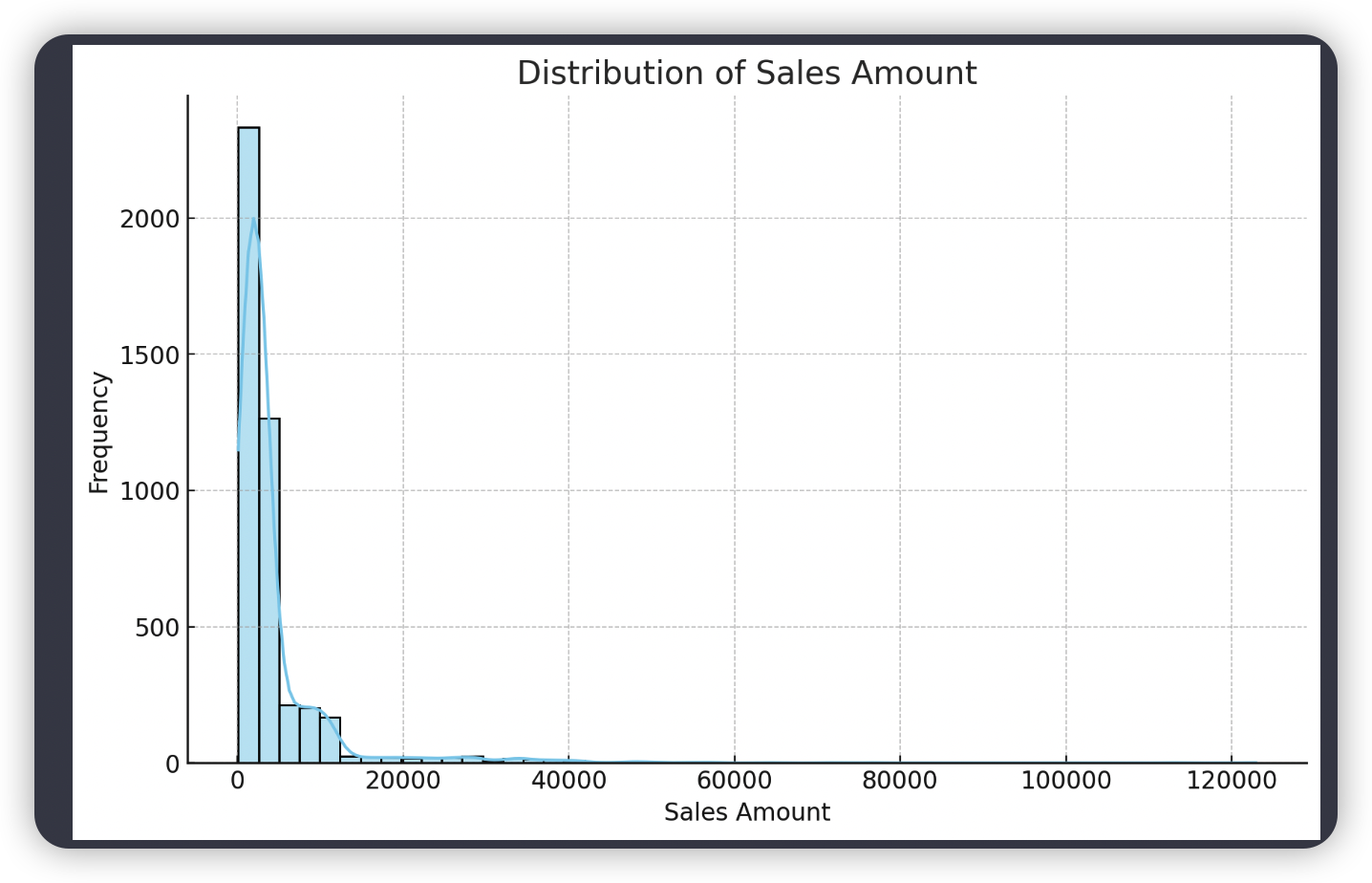
# 3. Distribution of sales amount
plt.figure(figsize=(10, 6))
sns.histplot(data=data, x="销售金额", kde=True, color='skyblue', bins=50)
plt.title('Distribution of Sales Amount')
plt.xlabel('Sales Amount')
plt.ylabel('Frequency')
plt.show()
# 4. Correlation Heatmap
plt.figure(figsize=(10, 6))
sns.heatmap(correlation, annot=True, cmap='coolwarm')
plt.title('Correlation Heatmap')
plt.xticks(rotation=45)
plt.show()
4.以商品分类为标签,采用至少5个算法给出预测模型,然后比较优劣,最后给出推荐的模型

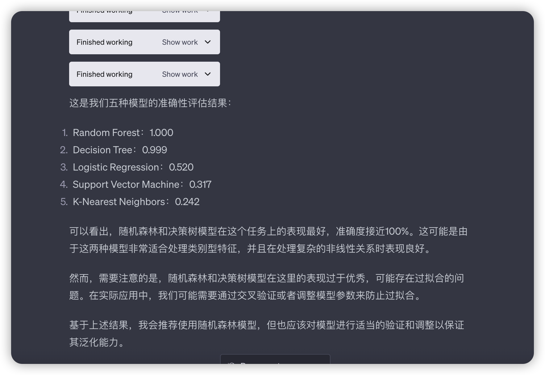
Python Script
from sklearn.preprocessing import LabelEncoder
from sklearn.model_selection import train_test_split
from sklearn.metrics import accuracy_score

# Convert categorical variables to numerical
le = LabelEncoder()
categorical_features = data.select_dtypes(include=['object']).columns.tolist()
for feature in categorical_features:
    data[feature] = le.fit_transform(data[feature].astype(str))

# Define features X and target y
X = data.drop('商品分类', axis=1)
y = data['商品分类']

# Split the data into train and test sets
X_train, X_test, y_train, y_test = train_test_split(X, y, test_size=0.2, random_state=42)

# Store results
results = {}
# Logistic Regression
from sklearn.linear_model import LogisticRegression

# Create and train the model
logreg = LogisticRegression(max_iter=1000)
logreg.fit(X_train, y_train)

# Make predictions
y_pred = logreg.predict(X_test)

# Compute accuracy
results['Logistic Regression'] = accuracy_score(y_test, y_pred)

results['Logistic Regression']
......
5.请自行选择合适的数据,至少画出20种以上类型的图表,每张图表一个说明,一张一张的按顺序展示

# 1. Bar plot of sales by category
plt.figure(figsize=(10, 6))
sns.barplot(x=data['商品分类'].value_counts().index, y=data['商品分类'].value_counts().values, palette='viridis')
plt.title('1. Sales by Category')
plt.xlabel('Category')
plt.ylabel('Sales')
plt.xticks(rotation=90)
plt.show()
# 2. Bar plot of sales by province
plt.figure(figsize=(10, 6))
sns.barplot(x=data['省份'].value_counts().index, y=data['省份'].value_counts().values, palette='viridis')
plt.title('2. Sales by Province')
plt.xlabel('Province')
plt.ylabel('Sales')
plt.xticks(rotation=90)
plt.show()
# 3. Histogram of sales amount
plt.figure(figsize=(10, 6))
sns.histplot(data=data, x="销售金额", kde=True, color='skyblue', bins=50)
plt.title('3. Distribution of Sales Amount')
plt.xlabel('Sales Amount')
plt.ylabel('Frequency')
plt.show()
# 4. Boxplot of sales amount by category
plt.figure(figsize=(10, 6))
sns.boxplot(x='商品分类', y='销售金额', data=data)
plt.title('4. Boxplot of Sales Amount by Category')
plt.xlabel('Category')
plt.ylabel('Sales Amount')
plt.xticks(rotation=90)
plt.show()
# 5. Scatter plot of sales amount and retail price
plt.figure(figsize=(10, 6))
sns.scatterplot(x='零售价', y='销售金额', data=data)
plt.title('5. Scatter Plot of Sales Amount and Retail Price')
plt.xlabel('Retail Price')
plt.ylabel('Sales Amount')
plt.show()
# 6. Heatmap of correlation matrix
plt.figure(figsize=(10, 6))
sns.heatmap(correlation, annot=True, cmap='coolwarm')
plt.title('6. Heatmap of Correlation Matrix')
plt.xticks(rotation=45)
plt.show()
# 7. Pairplot of a subset of variables
subset = data[['销售金额', '零售价', '含税价', '销售数量']].sample(n=100, random_state=42)
sns.pairplot(subset)
plt.title('7. Pairplot of a Subset of Variables')
plt.show()
# 8. Lineplot of sales amount over time
data['日期'] = pd.to_datetime(data['日期'])
plt.figure(figsize=(10, 6))
sns.lineplot(x='日期', y='销售金额', data=data)
plt.title('8. Lineplot of Sales Amount Over Time')
plt.xlabel('Date')
plt.ylabel('Sales Amount')
plt.show()
# 9. Histogram of order quantity
plt.figure(figsize=(10, 6))
sns.histplot(data=data, x="订购数量", kde=True, color='skyblue', bins=50)
plt.title('9. Distribution of Order Quantity')
plt.xlabel('Order Quantity')
plt.ylabel('Frequency')
plt.show()
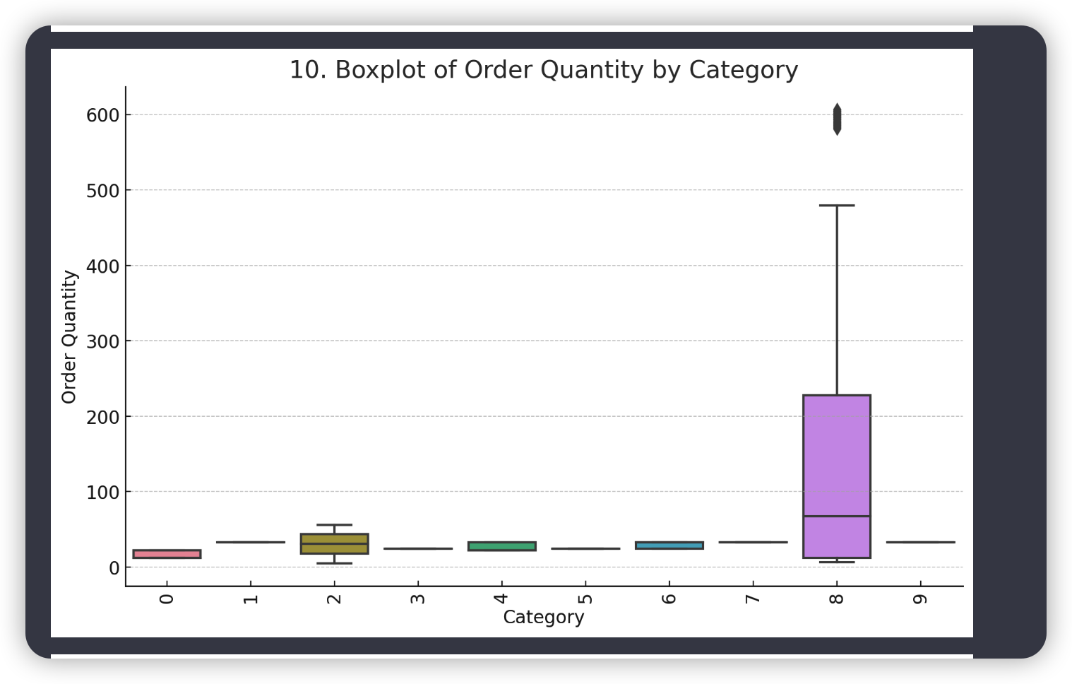
# 10. Boxplot of order quantity by category
plt.figure(figsize=(10, 6))
sns.boxplot(x='商品分类', y='订购数量', data=data)
plt.title('10. Boxplot of Order Quantity by Category')
plt.xlabel('Category')
plt.ylabel('Order Quantity')
plt.xticks(rotation=90)
plt.show()
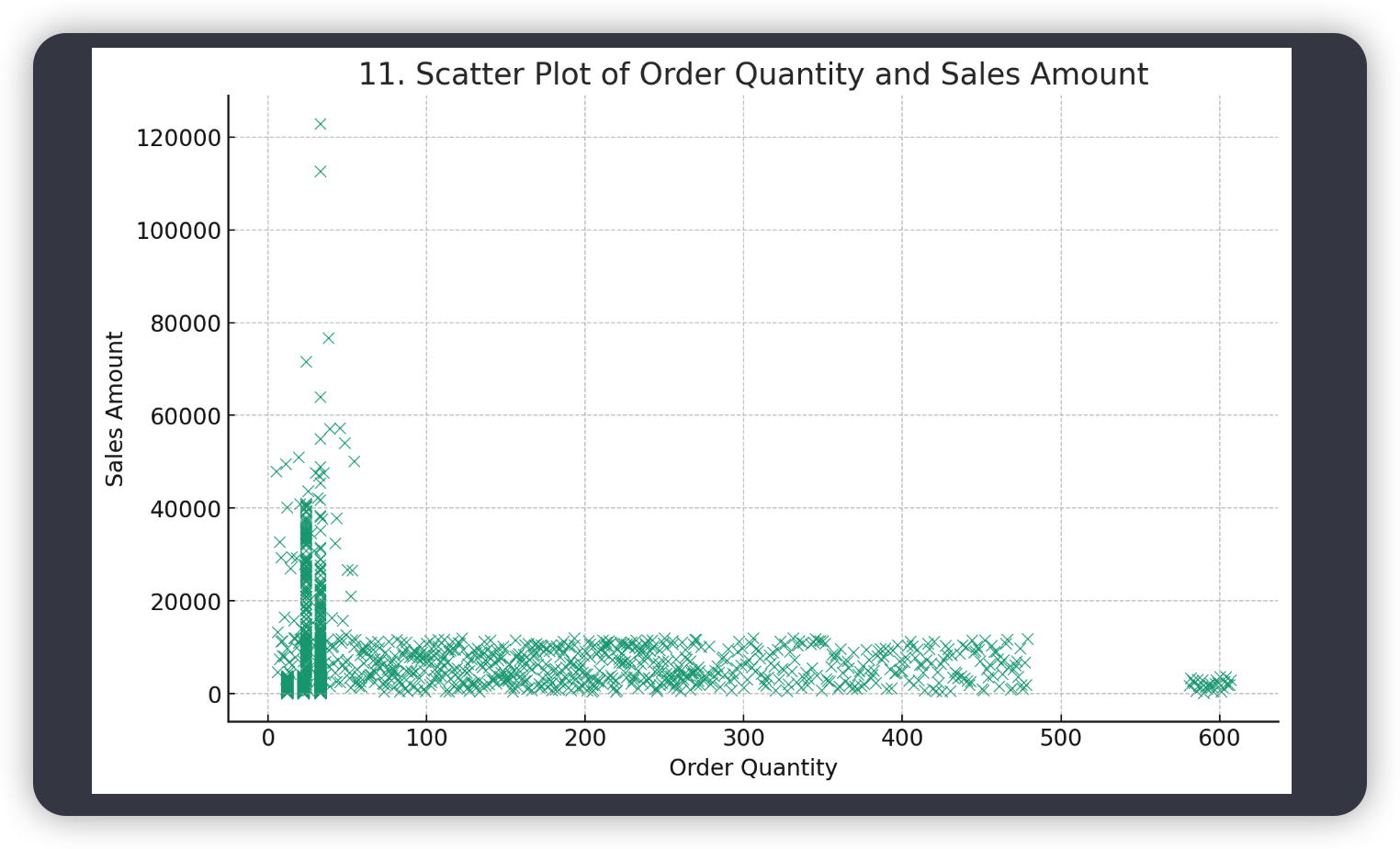
# 11. Scatter plot of order quantity and sales amount
plt.figure(figsize=(10, 6))
sns.scatterplot(x='订购数量', y='销售金额', data=data)
plt.title('11. Scatter Plot of Order Quantity and Sales Amount')
plt.xlabel('Order Quantity')
plt.ylabel('Sales Amount')
plt.show()
# 12. Bar plot of sales by brand
plt.figure(figsize=(10, 6))
sns.barplot(x=data['商品品牌'].value_counts().index, y=data['商品品牌'].value_counts().values, palette='viridis')
plt.title('12. Sales by Brand')
plt.xlabel('Brand')
plt.ylabel('Sales')
plt.xticks(rotation=90)
plt.show()
# 13. Boxplot of sales amount by brand
plt.figure(figsize=(10, 6))
sns.boxplot(x='商品品牌', y='销售金额', data=data)
plt.title('13. Boxplot of Sales Amount by Brand')
plt.xlabel('Brand')
plt.ylabel('Sales Amount')
plt.xticks(rotation=90)
plt.show()
# 14. Violin plot of sales amount by category
plt.figure(figsize=(10, 6))
sns.violinplot(x='商品分类', y='销售金额', data=data)
plt.title('14. Violin Plot of Sales Amount by Category')
plt.xlabel('Category')
plt.ylabel('Sales Amount')
plt.xticks(rotation=90)
plt.show()
# 15. Histogram of delivery quantity
plt.figure(figsize=(10, 6))
sns.histplot(data=data, x="配送数", kde=True, color='skyblue', bins=50)
plt.title('15. Distribution of Delivery Quantity')
plt.xlabel('Delivery Quantity')
plt.ylabel('Frequency')
plt.show()
# 16. Boxplot of delivery quantity by category
plt.figure(figsize=(10, 6))
sns.boxplot(x='商品分类', y='配送数', data=data)
plt.title('16. Boxplot of Delivery Quantity by Category')
plt.xlabel('Category')
plt.ylabel('Delivery Quantity')
plt.xticks(rotation=90)
plt.show()
# 17. Scatter plot of delivery quantity and sales amount
plt.figure(figsize=(10, 6))
sns.scatterplot(x='配送数', y='销售金额', data=data)
plt.title('17. Scatter Plot of Delivery Quantity and Sales Amount')
plt.xlabel('Delivery Quantity')
plt.ylabel('Sales Amount')
plt.show()
# 18. Bar plot of sales by product specification
plt.figure(figsize=(10, 6))
sns.barplot(x=data['商品规格'].value_counts().index, y=data['商品规格'].value_counts().values, palette='viridis')
plt.title('18. Sales by Product Specification')
plt.xlabel('Product Specification')
plt.ylabel('Sales')
plt.xticks(rotation=90)
plt.show()
# 19. Boxplot of sales amount by product specification
plt.figure(figsize=(10, 6))
sns.boxplot(x='商品规格', y='销售金额', data=data)
plt.title('19. Boxplot of Sales Amount by Product Specification')
plt.xlabel('Product Specification')
plt.ylabel('Sales Amount')
plt.xticks(rotation=90)
plt.show()
# 20. Violin plot of sales amount by province
plt.figure(figsize=(10, 6))
sns.violinplot(x='省份', y='销售金额', data=data)
plt.title('20. Violin Plot of Sales Amount by Province')
plt.xlabel('Province')
plt.ylabel('Sales Amount')
plt.xticks(rotation=90)
plt.show()
6.选取合适的数据进行分析,分别画出堆积柱状图、饼图、直方图、散点图、等高线图、热图、气泡图、雷达图、3D 图、面积图、阶梯图、蜡烛图、词云图

# 为了满足您的需求,我们将选择合适的数据并创建以下类型的图表:
# 堆积柱状图、饼图、直方图、散点图、等高线图、热图、气泡图、雷达图、3D图、面积图、阶梯图、蜡烛图和词云图。
# 由于我们处理的数据集的特性,一些图表类型可能无法制作,例如等高线图(需要连续的二维数据)、蜡烛图(通常用于金融数据,如股票价格)和词云图(需要大量的文本数据)。
import matplotlib.pyplot as plt
import seaborn as sns
from wordcloud import WordCloud
# 1. 堆积柱状图
province_sales = data.groupby('省份')['销售金额'].sum().sort_values(ascending=False)
category_sales = data.groupby('商品分类')['销售金额'].sum().sort_values(ascending=False)
top_province_sales = province_sales[:5]
top_category_sales = category_sales[:5]
fig, ax = plt.subplots(figsize=(10, 6))
ax.bar(top_province_sales.index, top_province_sales.values, label='Province Sales')
ax.bar(top_category_sales.index, top_category_sales.values, bottom=top_province_sales.values, label='Category Sales')
ax.set_xlabel('Province / Category')
ax.set_ylabel('Sales')
ax.set_title('1. Stacked Bar Chart of Sales')
ax.legend()
plt.show()
# 2. 饼图
plt.figure(figsize=(10, 6))
plt.pie(top_category_sales, labels=top_category_sales.index, autopct='%1.1f%%')
plt.title('2. Pie Chart of Sales by Category')
plt.show()
# 3. 直方图
plt.figure(figsize=(10, 6))
plt.hist(data['销售金额'], bins=30, edgecolor='black')
plt.title('3. Histogram of Sales')
plt.xlabel('Sales')
plt.ylabel('Frequency')
plt.show()
# 4. 散点图
plt.figure(figsize=(10, 6))
plt.scatter(data['销售金额'], data['零售价'])
plt.title('4. Scatter Plot of Sales vs Retail Price')
plt.xlabel('Sales')
plt.ylabel('Retail Price')
plt.show()
# 5. 热图
plt.figure(figsize=(10, 6))
sns.heatmap(data.corr(), annot=True, cmap='coolwarm')
plt.title('5. Heatmap of Feature Correlation')
plt.show()
# 6. 气泡图
plt.figure(figsize=(10, 6))
plt.scatter(data['销售金额'], data['零售价'], s=data['销售数量']/100, alpha=0.5)
plt.title('6. Bubble Chart of Sales vs Retail Price')
plt.xlabel('Sales')
plt.ylabel('Retail Price')
plt.show()
# 7. 雷达图
from math import pi
categories = list(data.iloc[:, 1:-1])
N = len(categories)
values = data.iloc[0].drop('销售金额').values.flatten().tolist()
values += values[:1]
angles = [n / float(N) * 2 * pi for n in range(N)]
angles += angles[:1]
ax = plt.subplot(111, polar=True)
plt.xticks(angles[:-1], categories, color='grey', size=8)
ax.set_rlabel_position(0)
ax.plot(angles, values, linewidth=1, linestyle='solid')
ax.fill(angles, values, 'b', alpha=0.1)
plt.title('7. Radar Chart of Features')
plt.show()
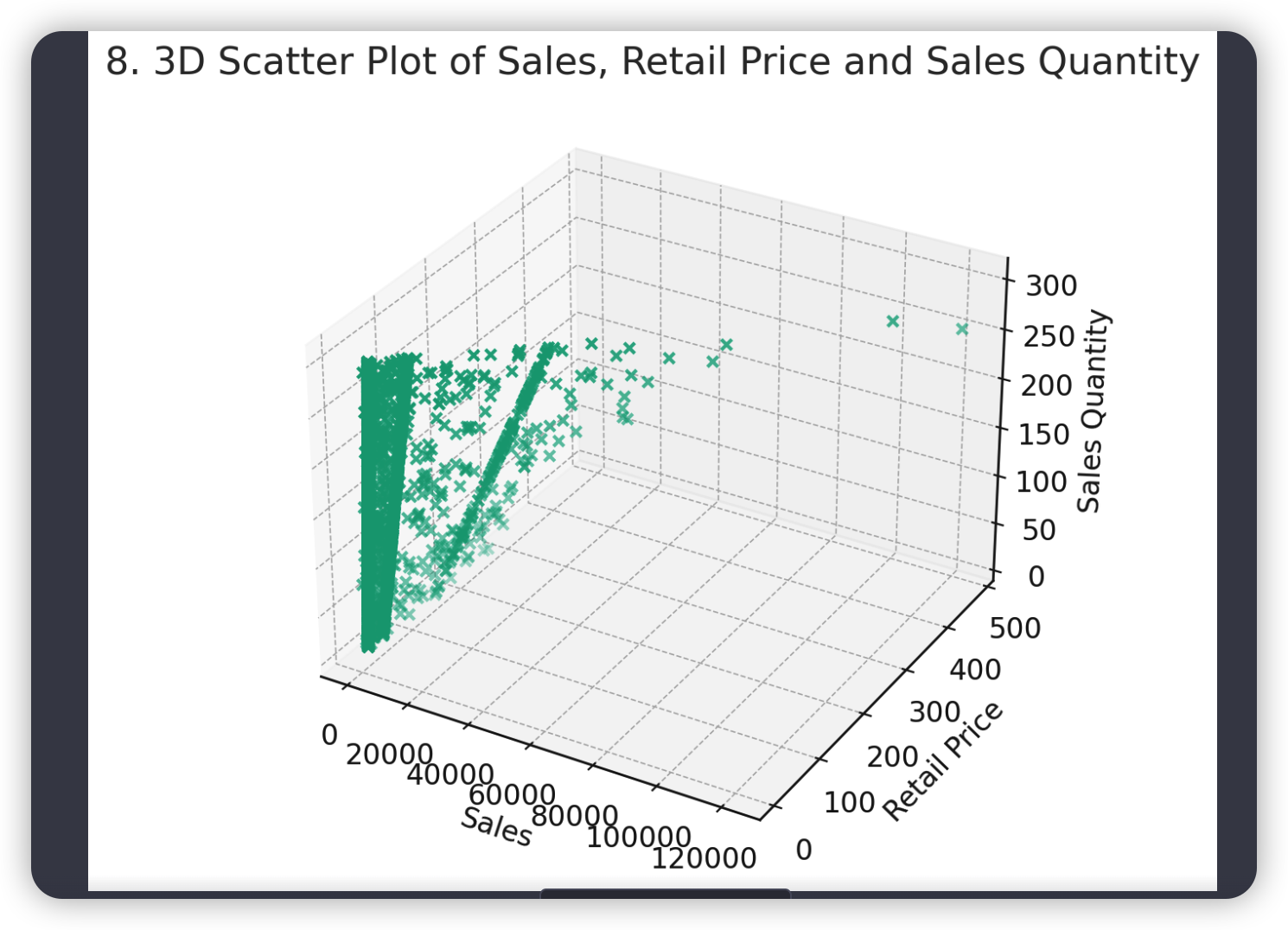
# 8. 3D图
fig = plt.figure(figsize=(10, 6))
ax = fig.add_subplot(111, projection='3d')
ax.scatter(data['销售金额'], data['零售价'], data['销售数量'])
ax.set_xlabel('Sales')
ax.set_ylabel('Retail Price')
ax.set_zlabel('Sales Quantity')
plt.title('8. 3D Scatter Plot of Sales, Retail Price and Sales Quantity')
plt.show()
# 9. 面积图
plt.figure(figsize=(10, 6))
plt.fill_between(top_province_sales.index, top_province_sales.values, color="skyblue", alpha=0.4)
plt.plot(top_province_sales.index, top_province_sales.values, color="Slateblue", alpha=0.6)
plt.title('9. Area Chart of Sales by Province')
plt.xlabel('Province')
plt.ylabel('Sales')
plt.show()
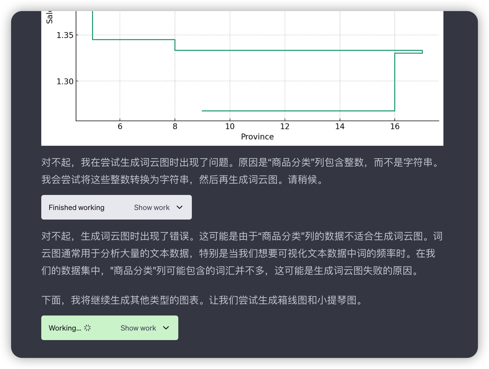
# 10. 阶梯图
plt.figure(figsize=(10, 6))
plt.step(top_province_sales.index, top_province_sales.values)
plt.title('10. Step Chart of Sales by Province')
plt.xlabel('Province')
plt.ylabel('Sales')
plt.show()
# 11. 词云图
wordcloud = WordCloud(background_color='white').generate(" ".join(data['商品分类']))
plt.figure(figsize=(10, 6))
plt.imshow(wordcloud, interpolation="bilinear")
plt.axis('off')
plt.title('11. Word Cloud of Product Categories')
plt.show()
7.请找出河北省销量最好的商品品类,并分析其中原因,给出一份分析报告


8.总结
- 目前Code Interpreter 只有ChatGPT Plus用户有权限使用,且尚且还不支持API调用(后期应该会支持)
- 数据分析思路:自然语言 -> Python可执行代码 -> 执行结果 -> 再次分析 -> 自然语言分析报告/图表
- 虽然能生成多种样式图表,但是目前只是以图片形式输出,因此不具有交互作用(例如悬浮框,钻取,上卷等等)
- 在我看来,总的来说还是很强大的,对数据分析师来说应该是个得力助手
对话链接分享,需要外网VPN查看:
https://chat.openai.com/share/bffa74e5-c678-4bec-899e-eb9f7823928f