移动端布局之流式布局1
- 流式布局(百分比布局)基础
- 案例:京东移动端首页
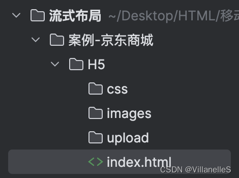
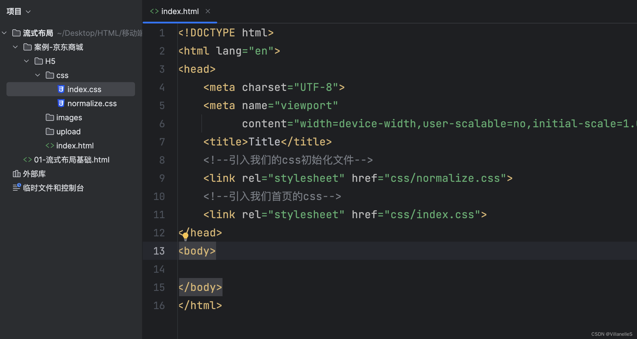
- 搭建相关文件夹结构
- 设置视口标签以及引入初始化样式
- normalize.css
- 引入我们的css初始化文件与首页css
- body设置
- index.css
- app布局和app内容填充
- index.html
- index.css
- 搜索模块布局
- 实现思想
- 具体实现
- index.html
- index.css
- 搜索模块内容制作
- index.html
- index.css
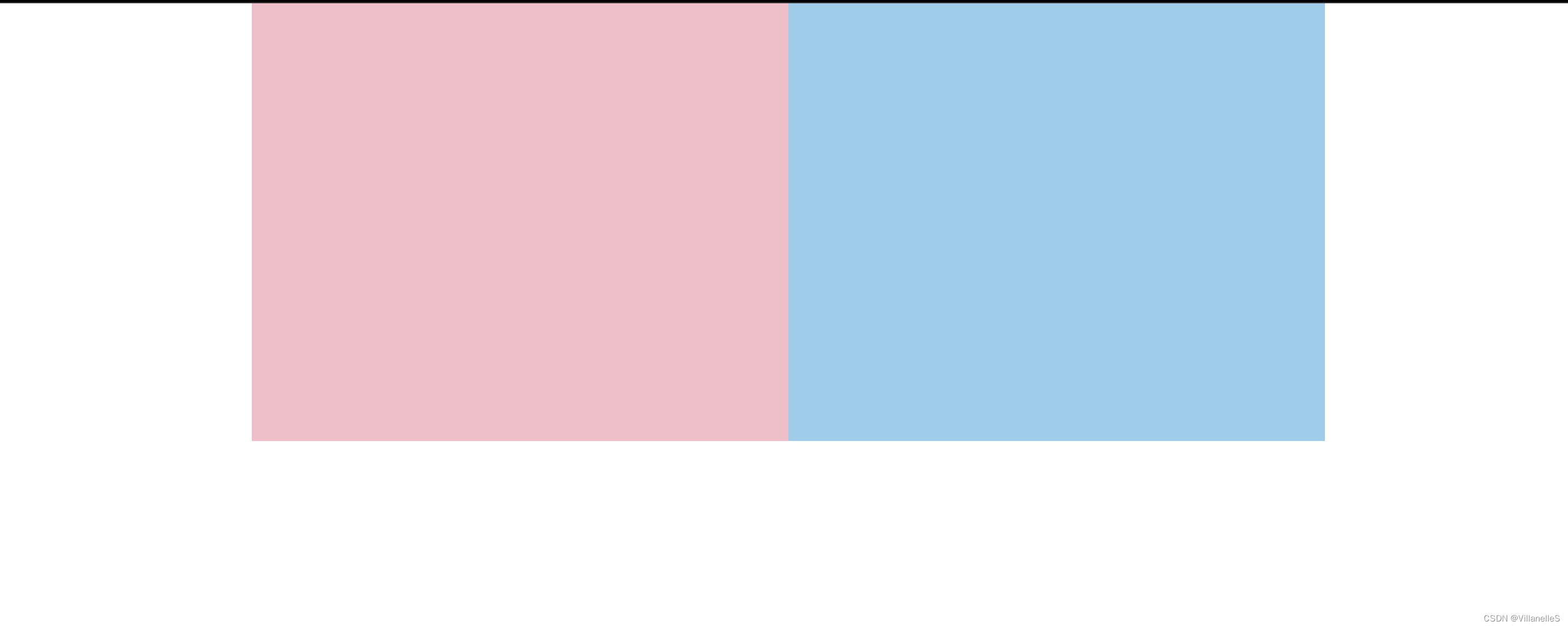
流式布局(百分比布局)基础
- 流式布局,就是百分比布局,也称非固定像素布局
- 通过盒子的宽度设置成百分比来根据屏幕的宽度来进行伸缩,不受固定像素的限制,内容向两侧填充
- 流式布局方式是移动web开发使用的比较常见的布局方式
- max-width 最大宽度(max-height 最大高度)
- min-width 最小宽度(min-height 最小高度)
<!DOCTYPE html>
<html lang="en">
<head>
    <meta charset="UTF-8">
    <title>Title</title>
  <style>
    *{
      padding: 0;
      margin: 0;
    }
    section{
      width: 100%;
      max-width: 980px;
      min-width: 320px;
      margin: 0 auto;
    }
    section div{
      height: 400px;
      float: left;
      width: 50%;
    }
    section div:nth-child(1){
      background-color: pink;
    }
    section div:nth-child(2){
      background-color: skyblue;
    }
  </style>
</head>
<body>
<section>
  <div></div>
  <div></div>
</section>
</body>
</html>
案例:京东移动端首页
- 技术选型
- 方案:我们采取单独制作移动页面方案
- 技术:布局采取流式布局
搭建相关文件夹结构
设置视口标签以及引入初始化样式
<meta name="viewport"
          content="width=device-width,user-scalable=no,initial-scale=1.0,maximum-scale=1.0,minimum-scale=1.0">
normalize.css
/*! normalize.css v8.0.1 | MIT License | github.com/necolas/normalize.css */

/* Document
   ========================================================================== */

/**
 * 1. Correct the line height in all browsers.
 * 2. Prevent adjustments of font size after orientation changes in iOS.
 */

html {
  line-height: 1.15; /* 1 */
  -webkit-text-size-adjust: 100%; /* 2 */
}

/* Sections
   ========================================================================== */

/**
 * Remove the margin in all browsers.
 */

body {
  margin: 0;
}

/**
 * Render the `main` element consistently in IE.
 */

main {
  display: block;
}

/**
 * Correct the font size and margin on `h1` elements within `section` and
 * `article` contexts in Chrome, Firefox, and Safari.
 */

h1 {
  font-size: 2em;
  margin: 0.67em 0;
}

/* Grouping content
   ========================================================================== */

/**
 * 1. Add the correct box sizing in Firefox.
 * 2. Show the overflow in Edge and IE.
 */

hr {
  box-sizing: content-box; /* 1 */
  height: 0; /* 1 */
  overflow: visible; /* 2 */
}

/**
 * 1. Correct the inheritance and scaling of font size in all browsers.
 * 2. Correct the odd `em` font sizing in all browsers.
 */

pre {
  font-family: monospace, monospace; /* 1 */
  font-size: 1em; /* 2 */
}

/* Text-level semantics
   ========================================================================== */

/**
 * Remove the gray background on active links in IE 10.
 */

a {
  background-color: transparent;
}

/**
 * 1. Remove the bottom border in Chrome 57-
 * 2. Add the correct text decoration in Chrome, Edge, IE, Opera, and Safari.
 */

abbr[title] {
  border-bottom: none; /* 1 */
  text-decoration: underline; /* 2 */
  text-decoration: underline dotted; /* 2 */
}

/**
 * Add the correct font weight in Chrome, Edge, and Safari.
 */

b,
strong {
  font-weight: bolder;
}

/**
 * 1. Correct the inheritance and scaling of font size in all browsers.
 * 2. Correct the odd `em` font sizing in all browsers.
 */

code,
kbd,
samp {
  font-family: monospace, monospace; /* 1 */
  font-size: 1em; /* 2 */
}

/**
 * Add the correct font size in all browsers.
 */

small {
  font-size: 80%;
}

/**
 * Prevent `sub` and `sup` elements from affecting the line height in
 * all browsers.
 */

sub,
sup {
  font-size: 75%;
  line-height: 0;
  position: relative;
  vertical-align: baseline;
}

sub {
  bottom: -0.25em;
}

sup {
  top: -0.5em;
}

/* Embedded content
   ========================================================================== */

/**
 * Remove the border on images inside links in IE 10.
 */

img {
  border-style: none;
}

/* Forms
   ========================================================================== */

/**
 * 1. Change the font styles in all browsers.
 * 2. Remove the margin in Firefox and Safari.
 */

button,
input,
optgroup,
select,
textarea {
  font-family: inherit; /* 1 */
  font-size: 100%; /* 1 */
  line-height: 1.15; /* 1 */
  margin: 0; /* 2 */
}

/**
 * Show the overflow in IE.
 * 1. Show the overflow in Edge.
 */

button,
input { /* 1 */
  overflow: visible;
}

/**
 * Remove the inheritance of text transform in Edge, Firefox, and IE.
 * 1. Remove the inheritance of text transform in Firefox.
 */

button,
select { /* 1 */
  text-transform: none;
}

/**
 * Correct the inability to style clickable types in iOS and Safari.
 */

button,
[type="button"],
[type="reset"],
[type="submit"] {
  -webkit-appearance: button;
}

/**
 * Remove the inner border and padding in Firefox.
 */

button::-moz-focus-inner,
[type="button"]::-moz-focus-inner,
[type="reset"]::-moz-focus-inner,
[type="submit"]::-moz-focus-inner {
  border-style: none;
  padding: 0;
}

/**
 * Restore the focus styles unset by the previous rule.
 */

button:-moz-focusring,
[type="button"]:-moz-focusring,
[type="reset"]:-moz-focusring,
[type="submit"]:-moz-focusring {
  outline: 1px dotted ButtonText;
}

/**
 * Correct the padding in Firefox.
 */

fieldset {
  padding: 0.35em 0.75em 0.625em;
}

/**
 * 1. Correct the text wrapping in Edge and IE.
 * 2. Correct the color inheritance from `fieldset` elements in IE.
 * 3. Remove the padding so developers are not caught out when they zero out
 *    `fieldset` elements in all browsers.
 */

legend {
  box-sizing: border-box; /* 1 */
  color: inherit; /* 2 */
  display: table; /* 1 */
  max-width: 100%; /* 1 */
  padding: 0; /* 3 */
  white-space: normal; /* 1 */
}

/**
 * Add the correct vertical alignment in Chrome, Firefox, and Opera.
 */

progress {
  vertical-align: baseline;
}

/**
 * Remove the default vertical scrollbar in IE 10+.
 */

textarea {
  overflow: auto;
}

/**
 * 1. Add the correct box sizing in IE 10.
 * 2. Remove the padding in IE 10.
 */

[type="checkbox"],
[type="radio"] {
  box-sizing: border-box; /* 1 */
  padding: 0; /* 2 */
}

/**
 * Correct the cursor style of increment and decrement buttons in Chrome.
 */

[type="number"]::-webkit-inner-spin-button,
[type="number"]::-webkit-outer-spin-button {
  height: auto;
}

/**
 * 1. Correct the odd appearance in Chrome and Safari.
 * 2. Correct the outline style in Safari.
 */

[type="search"] {
  -webkit-appearance: textfield; /* 1 */
  outline-offset: -2px; /* 2 */
}

/**
 * Remove the inner padding in Chrome and Safari on macOS.
 */

[type="search"]::-webkit-search-decoration {
  -webkit-appearance: none;
}

/**
 * 1. Correct the inability to style clickable types in iOS and Safari.
 * 2. Change font properties to `inherit` in Safari.
 */

::-webkit-file-upload-button {
  -webkit-appearance: button; /* 1 */
  font: inherit; /* 2 */
}

/* Interactive
   ========================================================================== */

/*
 * Add the correct display in Edge, IE 10+, and Firefox.
 */

details {
  display: block;
}

/*
 * Add the correct display in all browsers.
 */

summary {
  display: list-item;
}

/* Misc
   ========================================================================== */

/**
 * Add the correct display in IE 10+.
 */

template {
  display: none;
}

/**
 * Add the correct display in IE 10.
 */

[hidden] {
  display: none;
}
引入我们的css初始化文件与首页css
<meta name="viewport"
          content="width=device-width,user-scalable=no,initial-scale=1.0,maximum-scale=1.0,minimum-scale=1.0">
    <title>Title</title>
    <!--引入我们的css初始化文件-->
    <link rel="stylesheet" href="css/normalize.css">
    <!--引入我们首页的css-->
    <link rel="stylesheet" href="css/index.css">
body设置
index.css
body{
    width: 100%;
    max-width: 1080px;
    min-width: 320px;
    margin: 0 auto;
    font-size: 14px;
    color: #666;
    font-family: -apple-system,Helvetica,sans-serif; /*苹果手机文字,安卓手机默认字体*/
    line-height: 1.5;  /*字体大小的1.5倍*/
}
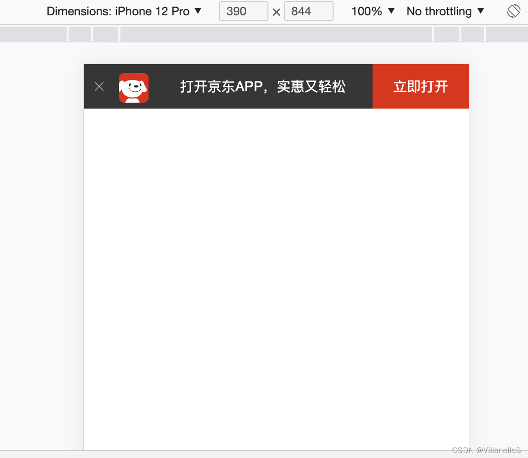
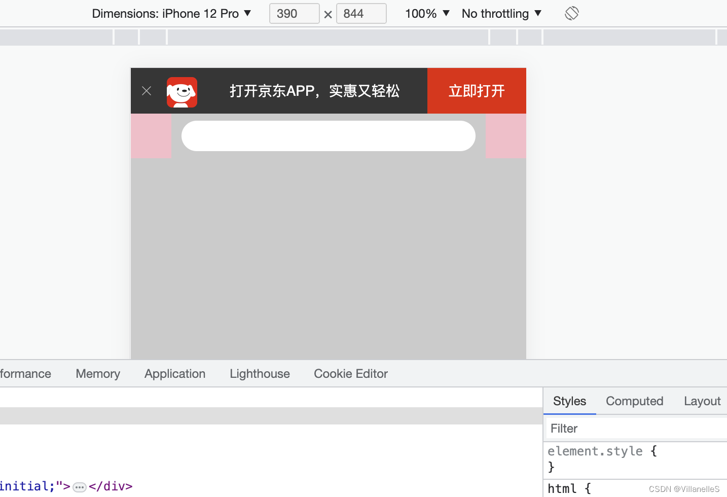
app布局和app内容填充
index.html
<!DOCTYPE html>
<html lang="en">
<head>
    <meta charset="UTF-8">
    <meta name="viewport"
          content="width=device-width,user-scalable=no,initial-scale=1.0,maximum-scale=1.0,minimum-scale=1.0">
    <title>Title</title>
    <!--引入我们的css初始化文件-->
    <link rel="stylesheet" href="css/normalize.css">
    <!--引入我们首页的css-->
    <link rel="stylesheet" href="css/index.css">
</head>
<body>
    <header class="app">
        <ul>
            <li>
                <img src="images/close.png" alt="">
            </li>
            <li>
                <img src="images/logo.png" alt="">
            </li>
            <li>打开京东APP,实惠又轻松</li>
            <li>立即打开</li>
        </ul>
    </header>
</body>
</html>
index.css
body{
    width: 100%;
    max-width: 1080px;
    min-width: 320px;
    margin: 0 auto;
    font-size: 14px;
    color: #666;
    font-family: -apple-system,Helvetica,sans-serif; /*苹果手机文字,安卓手机默认字体*/
    line-height: 1.5;  /*字体大小的1.5倍*/
}
.app{
    height: 45px;
}
ul{
    margin: 0;
    padding: 0;
    list-style: none;
}
.app ul li{
    float: left;
    height: 45px;
    background-color: #333;
    color: #fff;
    text-align: center;  /*图片水平居中*/
    line-height: 45px;  /*图片垂直居中*/
}
.app ul li:nth-child(1){
    width: 8%;
}
.app ul li:nth-child(1) img{
    width: 10px;
}
.app ul li:nth-child(2){
    width: 10%;
}
.app ul li:nth-child(2) img{
    width: 30px;
    /*由于图片默认和文字的基线对齐,因此要将图片和文字居中对齐(适用于行内块元素)*/
    vertical-align: middle;
}
.app ul li:nth-child(3){
    width: 57%;
}
.app ul li:nth-child(4){
    width: 25%;
    background-color: #f53516;
}
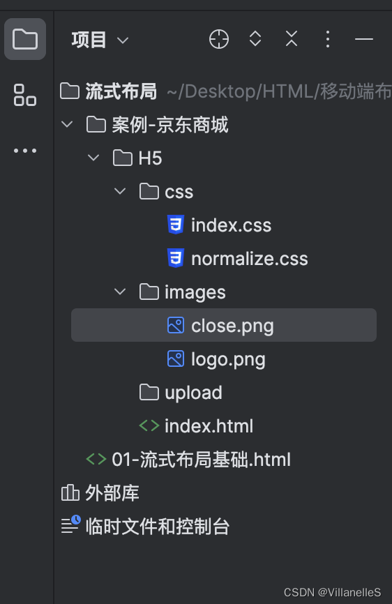
close.png:

logo.png:

搜索模块布局
实现思想
具体实现
index.html
<!DOCTYPE html>
<html lang="en">
<head>
    <meta charset="UTF-8">
    <meta name="viewport"
          content="width=device-width,user-scalable=no,initial-scale=1.0,maximum-scale=1.0,minimum-scale=1.0">
    <title>Title</title>
    <!--引入我们的css初始化文件-->
    <link rel="stylesheet" href="css/normalize.css">
    <!--引入我们首页的css-->
    <link rel="stylesheet" href="css/index.css">
</head>
<body>
    <header class="app">
        <ul>
            <li>
                <img src="images/close.png" alt="">
            </li>
            <li>
                <img src="images/logo.png" alt="">
            </li>
            <li>打开京东APP,实惠又轻松</li>
            <li>立即打开</li>
        </ul>
    </header>
    <!--搜索-->
    <div class="search-wrap">
        <div class="search-btn"></div>
        <div class="search"></div>
        <div class="search-login"></div>
    </div>
</body>
</html>
index.css
body{
width: 100%;
max-width: 1080px;
min-width: 320px;
margin: 0 auto;
font-size: 14px;
color: #666;
font-family: -apple-system,Helvetica,sans-serif; /*苹果手机文字,安卓手机默认字体*/
line-height: 1.5; /*字体大小的1.5倍*/
background-color: #ccc;
}
.app{
height: 45px;
}
ul{
margin: 0;
padding: 0;
list-style: none;
}
.app ul li{
float: left;
height: 45px;
background-color: #333;
color: #fff;
text-align: center; /*图片水平居中*/
line-height: 45px; /*图片垂直居中*/
}
.app ul li:nth-child(1){
width: 8%;
}
.app ul li:nth-child(1) img{
width: 10px;
}
.app ul li:nth-child(2){
width: 10%;
}
.app ul li:nth-child(2) img{
width: 30px;
/*由于图片默认和文字的基线对齐,因此要将图片和文字居中对齐(适用于行内块元素)*/
vertical-align: middle;
}
.app ul li:nth-child(3){
width: 57%;
}
.app ul li:nth-child(4){
width: 25%;
background-color: #f53516;
}
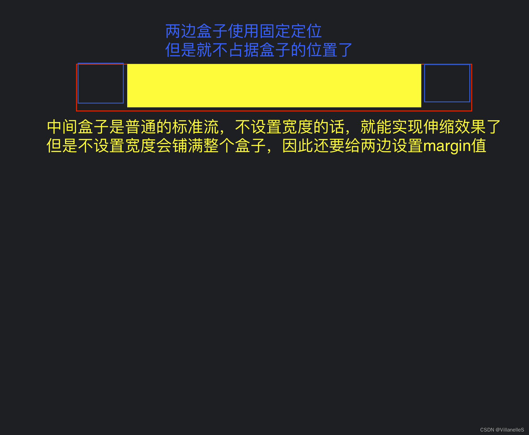
.search-wrap{
height: 44px;
position: relative;
/*外边距合并,解决方法是给父级添加overflow:hidden*/
overflow: hidden;
}
.search-btn{
position: absolute;
width: 40px;
height: 44px;
top: 0;
left: 0;
background-color: pink;
}
.search-login{
position: absolute;
top: 0;
right: 0;
background-color: pink;
width: 40px;
height: 44px;
}
.search{
height: 30px;
margin: 0 50px;
border-radius: 15px;
background-color: #fff;
margin-top: 7px;
/*外边距合并,解决方法是给父级添加overflow:hidden*/
}
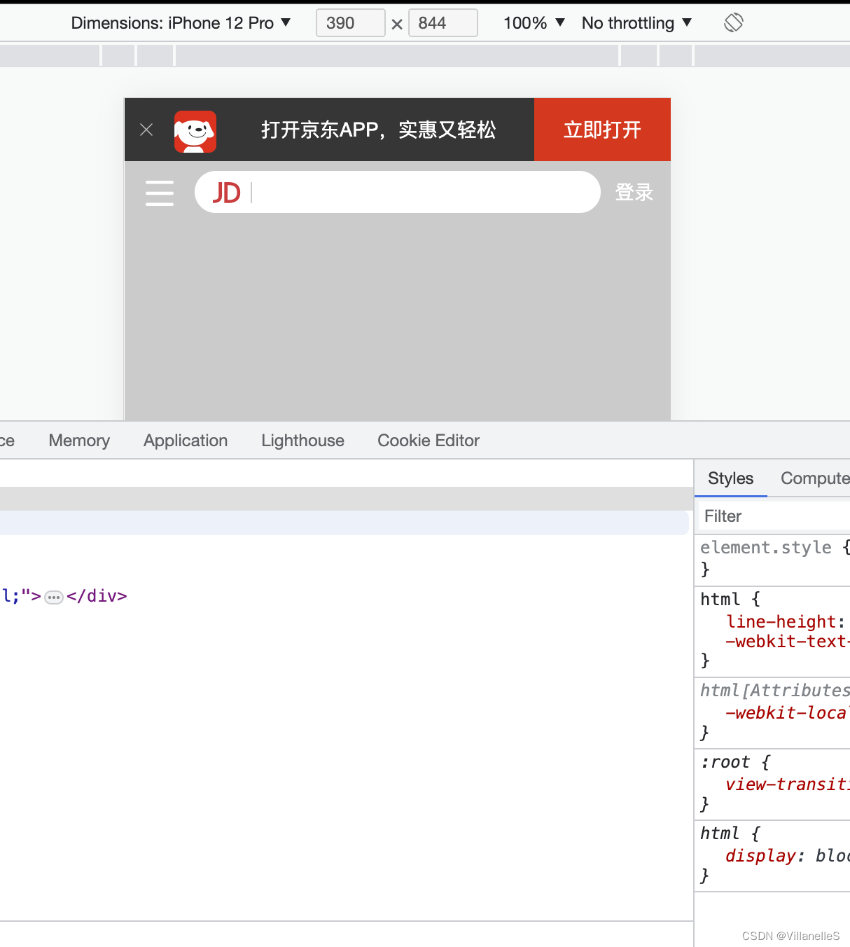
搜索模块内容制作
s-btn:

jd:

index.html
<!DOCTYPE html>
<html lang="en">
<head>
    <meta charset="UTF-8">
    <meta name="viewport"
          content="width=device-width,user-scalable=no,initial-scale=1.0,maximum-scale=1.0,minimum-scale=1.0">
    <title>Title</title>
    <!--引入我们的css初始化文件-->
    <link rel="stylesheet" href="css/normalize.css">
    <!--引入我们首页的css-->
    <link rel="stylesheet" href="css/index.css">
</head>
<body>
    <header class="app">
        <ul>
            <li>
                <img src="images/close.png" alt="">
            </li>
            <li>
                <img src="images/logo.png" alt="">
            </li>
            <li>打开京东APP,实惠又轻松</li>
            <li>立即打开</li>
        </ul>
    </header>
    <!--搜索-->
    <div class="search-wrap">
        <div class="search-btn"></div>
        <div class="search">
            <div class="jd-icon"></div>
        </div>
        <div class="search-login">登录</div>
    </div>
</body>
</html>
index.css
body{
    width: 100%;
    max-width: 1080px;
    min-width: 320px;
    margin: 0 auto;
    font-size: 14px;
    color: #666;
    font-family: -apple-system,Helvetica,sans-serif; /*苹果手机文字,安卓手机默认字体*/
    line-height: 1.5;  /*字体大小的1.5倍*/
    background-color: #ccc;
}
.app{
    height: 45px;
}
ul{
    margin: 0;
    padding: 0;
    list-style: none;
}
.app ul li{
    float: left;
    height: 45px;
    background-color: #333;
    color: #fff;
    text-align: center;  /*图片水平居中*/
    line-height: 45px;  /*图片垂直居中*/
}
.app ul li:nth-child(1){
    width: 8%;
}
.app ul li:nth-child(1) img{
    width: 10px;
}
.app ul li:nth-child(2){
    width: 10%;
}
.app ul li:nth-child(2) img{
    width: 30px;
    /*由于图片默认和文字的基线对齐,因此要将图片和文字居中对齐(适用于行内块元素)*/
    vertical-align: middle;
}
.app ul li:nth-child(3){
    width: 57%;
}
.app ul li:nth-child(4){
    width: 25%;
    background-color: #f53516;
}

.search-wrap{
    height: 44px;
    position: relative;
    /*外边距合并,解决方法是给父级添加overflow:hidden*/
    overflow: hidden;
}
.search-btn{
    position: absolute;
    width: 40px;
    height: 44px;
    top: 0;
    left: 0;
}
.search-btn::before{
    content: "";
    display: block;
    width: 20px;
    height: 18px;
    background: url("../images/s-btn.png") no-repeat;
    background-size: 20px 18px;
    margin: 14px 0 0 15px;
}
.search-login{
    position: absolute;
    top: 0;
    right: 0;
    width: 40px;
    height: 44px;
    line-height: 44px;
    color: #fff;
}
.search{
    height: 30px;
    margin: 0 50px;
    border-radius: 15px;
    background-color: #fff;
    /*外边距合并,解决方法是给父级添加overflow:hidden*/
    margin-top: 7px;
    position: relative;
}
.jd-icon{
    width: 20px;
    height: 15px;
    position: absolute;
    top: 8px;
    left: 13px;
    background: url("../images/jd.png") no-repeat;
    background-size: 20px 15px;
}
/*JD图标后的小竖杠*/
.jd-icon::after{
    content: "";
    position: absolute;
    right: -8px;
    top: 0;
    display: block;
    width: 1px;
    height: 15px;
    background-color: #ccc;
}


![[游戏开发][Unity] Xlua与C#互相调用规则](https://img-blog.csdnimg.cn/5f500d98434942808914b853d9283c1b.png)