💥(1) What' is IA (Information Architecture)?
· Definition of four sentences
I. Information Architecture is "The structure design of shared informaiton environments-共享信息环境的结构设计"
II. Information Architecture is "The synthesis of o/rganization, labeling, search, and navigation systems within digital, physical, and cross-channel ecosystems-数字、物理和跨渠道生态系统中组织、标签、搜索和导航系统的综合"
III. Information Architecture is "The art and science of shaping information products and experiences to support usability and findability, and understanding-"塑造信息产品和体验以支持可用性和可发现性以及理解的艺术和科学"
- Usability: How quickly people can learn to use something, how efficient they are while using, how memorable it is, how error-prone it is, and how much users like using it.
- Findability: The ability of users to identify an appropriate Web site and navigate the pages of the site to discover and retrieve relevant information resources.
IV. Information Architecture is "An emerging discipline and community of practice focused on bringing principles of design and architecture to the digital landscape-一门新兴学科和实践社区,专注于将设计和建筑原则引入数字领域"
· A holistic persperctive
User experience is "The totality of the effect or effects felt by a user as a result of interaction with, and the usage context of, a system, device or product, including the influence of usability, usefulness and the emotional impact during the interaction, and savoring the memory after the interaction-用户在与系统、设备或产品交互时所感受到的整体效果,以及系统、设备或产品的使用环境,包括可用性、实用性和交互过程中的情感影响,以及回味记忆互动之后."
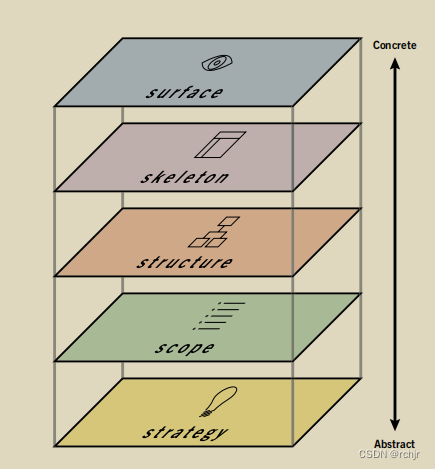
The Elements of User Experience Design (UXD)
Each plane is dependent on the planes below it. So, the surface depends on the skeleton, which depends on the structure, which depends on the scope, which depends on the strategy.When the choices we make don’t align with those above and below, projects derail, deadlines are missed, and costs begin to skyrocket as the development team tries to piece together components that don’t naturally fit it. Even worse, when the product fifinally does launch, users often hate it, because it doesn’t deliver a satisfying experience.This dependence means that decisions on the strategy plane will have a sort of “ripple effect” all the way up the chain. Conversely, the choices available to us on each plane are constrained by the decisions we make about issues on the planes below it.
💥(2) The Topics we are going to talk about
In Information Architecture, we will know some psychologis of design including: vision design, memory design, emotion design, information architecture design, interaction design, and interface design.
Psychology of design: visionPsychology of design: memoryPsychology of design: emotionPrinciples of design: information architecturePrinciples of design: interaction designPrinciples of design: interface design
💥(3) Textbooks for psychology of design
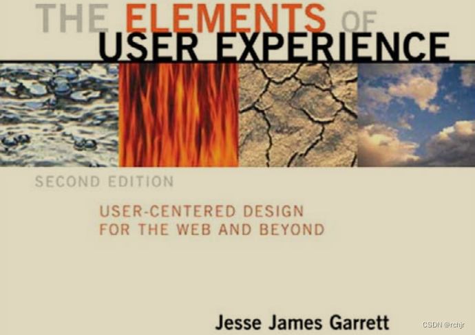
1. The Elements of User Experience
name: The Element of User Experience
author: Garrett
cover: (below)
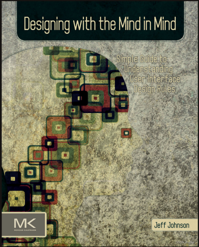
2. Designing with the Mind in Mind
name: Designing with the Mind in Mind
author: Johnson
cover: (below)
3. 100 THINGS EVERY DESIGNER NEEDS TO KNOW ABOUT PEOPLE
name: 100 THINGS EVERY DESIGNER NEEDS TO KNOW ABOUT PEOPLE
author: Susan
cover: (below)
4. COMMUNICATING THE USER EXPERIENCE
name: COMMUNICATING THE USER EXPERIENCE
author: Caddick
cover: (below)
5. Observing the User Experience A Practitioner’s Guide to User Research
name: Observing the User Experience A Practitioner’s Guide to User Research
author: Goodman
cover: (below)
6. Designing Interfaces
name: Designing Interfaces
author: Jenifer Tidwell
cover: (below)
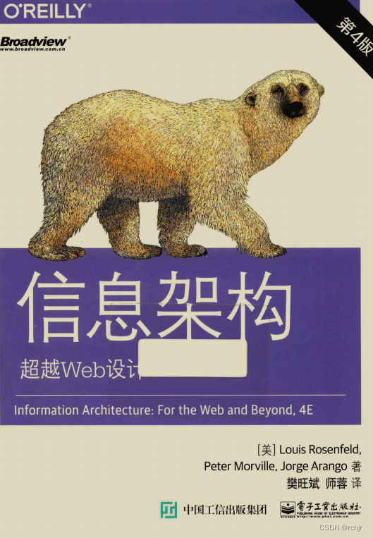
7. 信息架构:超越Web设计(第4版)
name: 信息架构:超越Web设计(第4版)
author: Louis Rosenfeld
cover: (below)
🌟(4) User Experience Design - Chapter 1 Vision
🔥Basics of human vision
About human vision, we need to know that our perception of the world around us is not a true depiction of what is actually there, on the contrast, our perception is biased by past experience, current context, and future goals.
1 Perception biased by the past
Human perception is based on what their past experience leads them to expect than what is actually there - 人类的感知是基于他们过去的经验导致他们期望的,而不是实际存在的.
· primming of mind 头脑的启动
· Once you see something, it's difficult to "unsee" it
2 Perception biased by the present
Visula perception in reading may also be a top-down process, from meaning to sentences, words and characters.
· Polysemy in different languages-不同语言中的多义性
· Perception in one sence may affect simultaneous perception in another sence-一种意义上的感知可能会影响另一种意义上的感知
3 Perception biased by the future
Things unrelated to our goals tend to be filtered out pre-consciously, never registering in our conscious minds.
· Endogenous attention - goal-directed control of attention
· Banner blindness
· Cocktail party effect
🔥Gestalt principles 格式塔原则
Gestalt psychology: A school of psychology based on the "unified whole" - the whole is different than the sum of the parts - 基于“统一整体”的心理学流派——整体不同于部分之和.
Gestalt psychologists: Max Wertheimer, Wolfgang Kohler, Kurt Koffka
Gestalt principles: Human visual system automatically imposes structure on visual inputs so that they can be interpreted in the simplest way, with Law of Pragnanz as the basic principle - 人类视觉系统以 Pragnanz 法则为基本原则,自动将结构强加于视觉输入,以便以最简单的方式对其进行解释.
1 The similarity principle
Objects that share visual characteristics such as shape, size, color, texure, dimension, or orientation appear grouped.
1 Strength of communicating similarity: color > size > shape
2 Anmaly effect - emphasizing with differences
2 The proximity principle
Objects that are near each other(relative to other objects) appear grouped, while those that are father apart do not.
1 White space - power of nothing
3 The continuity principle
Objects that are arranged on a line or curve are perceived to be moer related than those not on the line or curve.
1 Visual cues: more to view
2 Guide user's eyes
4 The symmetry principle
Our vision automatically organize and interprets the ata in our visual field so as to simplify it and give it summetry
1 Balancing visual weight
5 The common region principle
Objects that are located within the same closed region are perceived as being grouped together
1 Design of cards
6 The common fate priciple
Objects that move in the same direction are perceived as more related than those moving in different directions, or not moving at all
7 The closure priciple
Our visual system automatically tries to close open figures so that they are perceived as whole objects rather than separate pieces.
8 The figure/ground principle
Our mind separates the visual field into the figure(the foreground) and ground(the background)
1 Perceptual cues:color, size, motion
2 Application: photograph, movie poster, fullpage background, popup information
🔥Design for reading
Learning to read: reading is an artificial skill that humans learn by systematic instruction and practice; learning to read involves training our brain, including visual system, to recognize patterns.
Process of reading: reading involves both bottom-up, feature-driven processing and top-down, context-driven process.
Feature-driven + context-driven reading特征驱动+上下文驱动阅读
1 Typeface
Serif and sans serif fonts have the same readability; overly decorative fonts can interfere with pattern recognition and slow down reading.
2 Font size
Different fonts have different x-heights, so some fonts look larger than others, even though they are of the same point size.
3 Alignment
Each line of centered or right-aligned text starts in a different horizontal position, so users must consciously adjust their gaze to the actual start of each line
4 Line length
People read faster with a longer line length, but they prefer a short line length(though it creates more interruptions of saccade and fixation eye movement)
Line lenght for body text are usually between 40 to 60 characters. In areas with wider line lengths, sucha as desktop, longer lines can contain up to 100 characters.
5 Background
Visual noise can disrupt automatic reading as users must look very carefully to separate text from background.
1 Visual noise often results from placing text over a patterned background
2 Visual noise also results from displaying text in colors that contrast poorly with the background
6 Vocabulary
Unfamiliar or uncommon vocabulary can disrupt automatic reading as intended users dont't understand it very well or at all.
🌟(5) User Experience Design - Chapter 2 Color
🔥Color models
Color model:an abstract mathematical model that describes the way colors can be defined and represented.
· Munsell color system: hue, value, and chroma
· RGB: additive color used in screen display
·CMYK: subtractive color model used in printing
🔥Color perception
1 Color contrast
Our vision system is much more sensitive to differences in brightness than to absolute brightness levels.
1 Checker shadow illusion - 方格阴影错觉
2 Link/non-link contrat ratio 3:1
3 Foreground/background contrast ratio 4.5:1
2 Color presentation
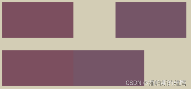
Color patch paleness, size, and separation will affect our ability to distinguish colors from each other.
1 Paleness: the paler or less saturated two colors are, the harder it is to tell them apart
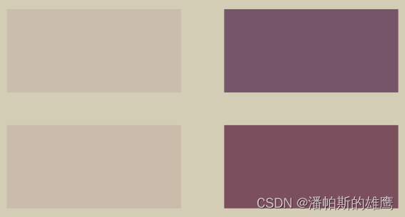
2 Size: the smaller or thinner objects are, the harder it it to distinguish their colors

3 Separation: the more separated objects are, the harder it is to distinguish their colors.
3 Color blindness
Approximately 8% of men and slightly under 0.5% of women have difficult discriminating certain pairs of colors
1 Types of color blindness: prtanopia, deuteranopia, tritanopia, and monochromacy - 红色盲、绿色盲、蓝色盲和单色盲
2 Don't rely solely on colors
3 Keep it minimal
4 Color use guideline
Avoid subtle color differences: make sure the contrast between colors is high; but separate strong opponent colors, like black and white, red and green, yellow and blue - 避免细微的色差:确保颜色之间的对比度高;但要分开强烈的对立颜色,如黑色和白色、红色和绿色、黄色和蓝色
Use color redundantly with other cues:use color as a hint or users, use texture and patterns to emphasize contrast, and clarify color information with text - 与其他提示冗余使用颜色:使用颜色作为提示或用户,使用纹理和图案强调对比,并用文本阐明颜色信息
Create accessible design: Web Content Accessibility Guidelines covers a wide range of recommendations for making web content more accessibel to people with disabilities - 创建可访问的设计:Web 内容可访问性指南涵盖了使 Web 内容更易于残障人士访问的各种建议。
🔥Color theories
1 Warm vs cool colors
Warm colors are associated with things like sun or fire; cool colors are associated with things like water or grass
· Warm colors: yellow, orange, and red
· Cool colors: green, blue, and violet
2 Tints, tones, and shades
Adding white, grey, and black to puer colors produce tints, tones, and shades, respectively
1 Practical Color Coordinate System(PCCS)
3 Color schemes - 配色方案
Logical combinations of colors on the color, wheet, with a purpose to create an aesthetic feeling of style and appeal - 颜色、轮子上的颜色逻辑组合,目的是创造一种风格和吸引力的美感
1 Achromatic, monochromatic, analogous, complementary, triadic, and compound - 消色差、单色、类似、互补、三元和复合
🌟(6) User Experience Design - Chapter 3 Memory
🔥Basics of human memory
Memory is the ability to remember past experices and the ability to recall them to mind in order to influence current behavior.
Sensory memory 感官记忆 is the ability to retain impressions of sensory information after the original stimuli have ended.
Short-term memory 短时记忆 is the ability to hold a small amount of information in mind for a short period of time
Lont-term memory 长时记忆 is the ability to store a seemingly unlimited amount of information almost indefinitely.
Process of memory
· Encoding: transforming information into a form that can be stored in memory
· Storage: creating a permanent record of the encoded informaiton in memory
· Retrival: calling back the stored information in response to some cue of use
Types of memory
· Sensory memory
Iconic memory 图像记忆
Echoic memory 音响记忆
· Short-term memory
working memory 工作记忆
· Long-term memory
procedural memory 陈述记忆(内隐记忆)
declarative memory 程序记忆(外显记忆):semantic memory(语义记忆) + episodic memory(情境记忆)
Memory aids in UX design
Password, Visited links, Breadcrumbs, Search keywords, Multiple modes, Instructions
🔥Short-term memory
Miller's law: human's shor-term memory can hold 7+-2(5+-1) unrelated items simultaneously.
Grouping items into chunks
· Chunking navigation options
· Chunking text
· Chunking mkutimedia content
🔥Long-term memory
1 Memory storage: repetition
Repeating the new information sufficient times moves if from short-term memory to long-term memory
· Design system: consisten color, font, shape, language
· Cross-platform consistency
2 Memory storage: connection
People use schemata to store information in memory; it is easier to remember the new information that can be connected to an existing schema
3 Memory storage: emotion
Emotionally charged events persist in memories more vividly; an emotional reaction creates a memory imprint prompting people to avoid negative experiences and revisit positive ones.
4 Memory retrieval: recognition over recall
Recognition refers to recognizing information as being familiar; recall designates the retrival of realted details from memory
· Selection instead of input
· Iconic enhancement
5 Memory retrival: reconstruction
People reconstruct their memories each time they retrieve them, as affected by various cognitive process and external interventions, resulting in inaccuracies and distortions.
· Eyewitness testimony study
· Implications for self-report user study methods: interview and diaries - 自我报告用户研究方法的启示:访谈和日记
🌟(7) User Experience Design - Chapter 4 Emotion
🔥Basics of human emotions
Emotion: a fast, automatic response to an internal or external stimulus, including body reactions, facial expressions, and subjective apprasial
· Emotion: immediate physiological response to perceived stimulus
· Feeling: physical and mental sensations that arise in the internalization of emotions
· Mood: a semi-persistent mental, physical, and emotional state
Basic emotions: emotions are discrete and universally recognized - anger, disgust, fear, happiness, sadness, and suprise
· Robert Plutchik: wheel of emotions
· James Russell: circumplex model of affect
🔥Emotional design
Emotional design: a design approach that delivers proper emotions with corresponding elements to catch users's attention and make them feel good
· Maslow's pyramid: physiological, safety, love/belonging, esteem, self-actualization
·Goals' of design: functional, reliable, usable, pleasurable(emotional design)
1 Visceral design
The design for people's first impression on the apperance of a productt as triggered by an initial sensory experience, aiming to make it appealing
· I want it. It looks amazing, so will I!
2 Behavioural design
The design for the performance and value felt by people in physical interaction with a product, aming to make it usable and understandable
· I can master it. It makes me feel smart!
3 Reflective design
The design for the meaning and impact felt consciously by people when they reflect on their overall expericence with a product, aming to make it pleasurable
· I can tell a story about it. It completes me!
🔥Affecting users emotions
1 Visual
Visual information can be processed much faster than textual and is more effective in reducing communication gap and in forming initial impressions
2 Music
Listening to music releases dopamine, sometimes aassociated with physical changes in body; different music induces euphoria in different people - 听音乐会释放多巴胺,有时与身体的身体变化有关;不同的音乐会让不同的人产生愉悦感
3 Smell
Olfactory information and emotional information are both processed in the amygdala; people react eotionally to smells(Scent branding / Virtual reality scent generator)
4 Anecdotes
Anecdotes are in story form which is more vivid, interesting, and readable, thus more persuasive than the data-based approach - 轶事是以故事的形式出现的,比基于数据的方法更生动、有趣、可读,因此更有说服力
5 Humor
Humor reminds users that they are real humans behind the design; understand the context and apply humor appropriately by following the same rules as in real life
6 Surprises
Human brain craves the unexpected; providing something unexpected not only gets attention, but also can be pleasurable
7 Difficulty
Higher entry barriers leead to higher evaluation of the value of doing something because people need to reduce cognitive dissonance - 进入门槛越高,对做某事的价值的评价就越高,因为人们需要减少认知失调
8 Occupance
People are happier when they are busy; they will do a task rather than be idle, but the task has to be seen as worthwhile
9 Mircointeractions
Microinteractions are the functional, interactive details of a product, making engaging with the product easier and more pleasurable
😃(8) Information Architecture - Chapter 1 Organization
🔥Challenges of organizing
1 Ambiguity 歧义性
A word has multiple meanings; an object goes to multiple places
2 Heterogeneity 异质性
Multiple types of resources; multiple levels of granularity; resources in multiple formats
3 Disparity 差异性
Differences between designers and users; differences among various users
🔥Organization schemes
Organization scheme: An organization scheme defines the shared characteristics of content items and influences the logical grouping of the items
1 Exact schemes
"Objective" schemes that divide information into well-defined and mutually exclusive categories - 将信息划分为定义明确且相互排斥的类别的“目标”方案
· Alphabetical 字顺型方案
· Chronological 时序型方案
· Geographical 地理型方案
2 Ambiguous schemes
"Subjective" schemes that divide information into categories defying exact definition - 主观的”方案,将信息划分为不同的类别,无视确切的定义
· Topical 主题型方案
· Task-based 任务型方案
· Audience-based 受众型方案
· Hybrid 混合型方案
🔥Organization structure
Organization struction: An organization struction defines the types of relationships between content items and groups
· Hierarchy 层级结构
· Database-model 数据库模型结构
· Hypertext 超文本结构
· Folksonomy 大众分类结构
· Combination 组合结构
😃(9) Information Architecture - Chapter 2 Labeling
🔥Types of labels
1 Textual labels: labels as contextual links - 语境链接标签
Labels that describe the hyperlinks within the body of a chunk of information and occur within the context of the surrounding text
2 Textual labels: labels as headings - 标题标签
Lables that describe the content following them, often used to establish a hierarchy or a process
3 Textual labels: labels as navigation options - 导航选项标签
A small number of labels consistently applied to represent the options within a navigation system
4 Textual labels: labels as index terms - 索引词标签
Keywords, tags, descriptive metadata, and subject headings that represent content for browsing or searching
5 Iconic labels - 图标标签
Icons often used as navigation system labels to add aesthetic appeal to an information environment
🔥Labeling guidelins
1 Consistent labeling system: style
Consistent application of punctuation and case within labeling systems, often by following style guides
2 Consistent labeling system: presentation
Consistent application of fonts, sizes, colors, whitespaces, and grouping to help visuall reinforce the systematic nature of a group of labels.
3 Consistent labeling system: syntax
Consistent application of verb-based, noun-based, or question-based labels in a specific labeling system
4 Consistent labeling system: granularity(粒度)
Making sure that the labels within a labeling system are roughly euqal in their specificity
5 Consistent labeling system: comprehensiveness
Making suer that the labeling system has a comprehensive scope covering all the content in the information environment - 确保标签体系范围全面,涵盖信息环境中的所有内容
6 Consistent labeling system: audience
Developing a separate labeling system for each audience who uses a very different teminology(术语) for the same content
🔥Designing labels
1 Using existing labeling systems
· Your own site
· Comparable and competitive sits
· Controlled vocabularies and thesauri - 受控词汇表和叙词表
2 Creating new labeling systems: content analysis 内容分析
Extracting descriptive keywords or meaningful terms from the content, manually or using software tools
3 Creating new labeling systems: card sorting 卡片分拣
Asking participants to culster labels for existing content into categories, useful for designing both organization and labeling systems
4 Creating new labeling systems: free-listing 自由列举
Selecting an item and asking participants to brainstorm terms to describe it, a lower-cost alternative to card sorting
5 Creating new labeling systems: search log analysis 搜索日志分析
Analyzing the search queries used by real users to describe theri infromation needs in theri own language
6 Creating new labeling systems: tag analysis 标签分析
Analysing the tags added by real users to the content to describe their understandings in their own language
😃(10) Information Architecture - Chapter 3 Navigation
🔥The need for navigation
· Navigation indicates location
· Navigation shows coverage
· Navigation reflects brand
· Navigation affects credibility
🔥Embeded navigation systems
Embeded navigation systems 嵌入式导航系统:navigation systems that are wrapped around and infused within the content of a website, helping users understand where they are and where they can go.
1 Global navigation
Present on every page throughout the site, allowing direct access to key areas and functions no matter where the users travels in the site's hierachy
2 Local navigation
Present on every page within a subsite, enbling users to explore the immediate area; different subsites have different local navigation systems
3 Contextual navigation
Hyperlinks that connect a page with other pages containing similar or related content, supporting associative learning
4 Uility navigation
Feature that lie outside the main content organization but help users use the site, critical to the site's functioning
Embedded navigation design
· Horizontal bars
· Vertical bars
·Inverted L
· Expendables
· Dropdowns
· Giant dropdowns
· Fly-outs
🔥Supplemental navigation systems
Supplemental navigation systems 补充式导航系统:navigation systems that are external to the basic hierachy of a website and provide complementary ways of finding content and completing tasks.
1 Breadcrumbs 面包屑导航条
Lightweight trails that allow users to keep track and maintain awareness of theri location
2 Indexes 索引
Alphabetical lists of keywords or phrases representing the key content, without reflecting the hierarchy
3 Sitemaps 站点地图
Tables of contents that presents the top few levels of the informmation hierarchy, providing an overview of the content
4 Configurations 配置器
A special class of guides that help users configurate products or navigate complex decision tress 5 Filters 过滤器
Control elements that allow users to narrow down the content by choosing certain criteria
