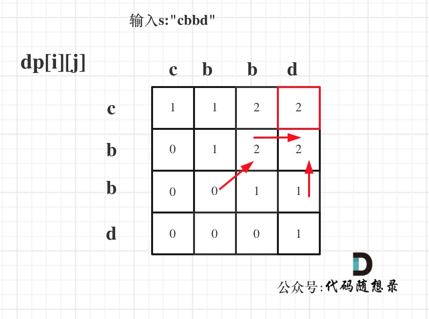
1 GridView网格布局组件
1.1 说明
1.1.1 图例

1.1.2 说明
GridView网格布局在实际项目中用的也是非常多的,当我们想让可以滚动的元素使用矩阵方式排列的时 候。此时我们可以用网格列表组件GridView实现布局
GridView创建网格列表主要有下面三种方式
1、可以通过GridView.count 实现网格布局
2、可以通过GridView.extent 实现网格布局
3、通过GridView.builder实现动态网格布局
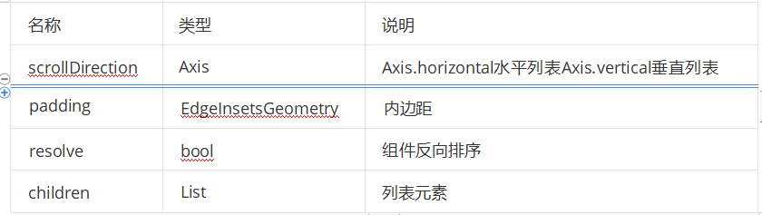
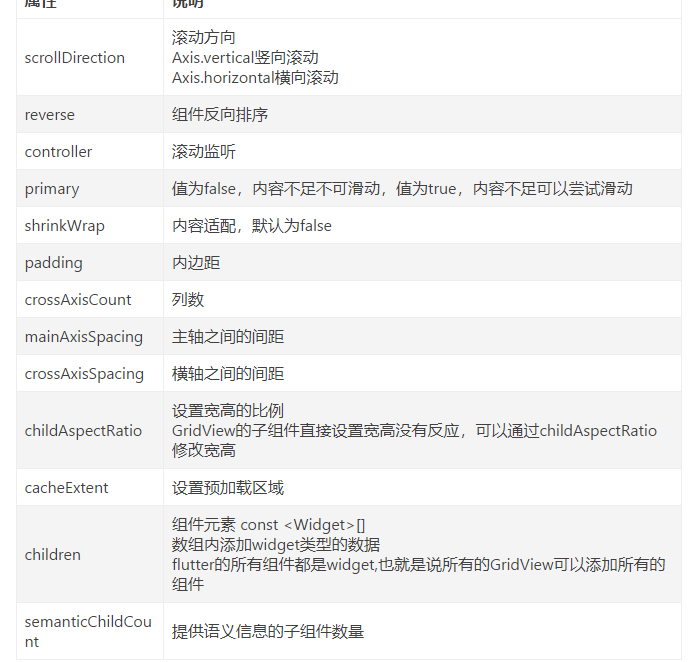
1.2 常用属性
属性
1.3 案例
1.3.1 GridView.count 实现网格布局
GridView.count构造函数内部使用了SliverGridDelegateWithFixedCrossAxisCount,我们通过它可以
快速的创建横轴固定数量子元素的GridView

示例
//GridView.count 实现网格布局
class HomePage extends StatelessWidget {
  const HomePage({Key? key}) : super(key: key);

  @override
  Widget build(BuildContext context) {
    return GridView.count(
      crossAxisCount: 3,
      childAspectRatio: 1.0,
      children: const <Widget>[
        Icon(Icons.home),
        Icon(Icons.ac_unit),
        Icon(Icons.search),
        Icon(Icons.settings),
        Icon(Icons.airport_shuttle),
        Icon(Icons.all_inclusive),
        Icon(Icons.beach_access),
        Icon(Icons.cake),
        Icon(Icons.circle),
      ],
    );
  }
}
1.3.2 GridView.extent实现网格布局
GridView.extent构造函数内部使用了SliverGridDelegateWithMaxCrossAxisExtent,我们通过它可以 快速的创建横轴子元素为固定最大长度的的GridView
//GridView.extent实现网格布局
class HomePage2 extends StatelessWidget {
  const HomePage2({Key? key}) : super(key: key);

  @override
  Widget build(BuildContext context) {
    return GridView.extent(
      maxCrossAxisExtent: 80.0,
      childAspectRatio: 1.0,
      children: const <Widget>[
        Icon(Icons.home),
        Icon(Icons.ac_unit),
        Icon(Icons.search),
        Icon(Icons.settings),
        Icon(Icons.airport_shuttle),
        Icon(Icons.all_inclusive),
        Icon(Icons.beach_access),
        Icon(Icons.cake),
        Icon(Icons.circle),
      ],
    );
  }
}
1.3.3 GridView.count 和 GridView.extent属性详解
//GridView.count 和 GridView.extent属性详解
class HomePage3 extends StatelessWidget {
  const HomePage3({Key? key}) : super(key: key);

  List<Widget> _getListData() {
    List<Widget> list = [];
    for (var i = 0; i < 20; i++) {
      list.add(Container(
        alignment: Alignment.center,
        color: Colors.blue,
        child: Text(
          '这是第$i条数据',
          style: const TextStyle(color: Colors.white, fontSize: 20),
        ),
// height: 400,  //设置高度没有反应
      ));
    }
    return list;
  }

  @override
  Widget build(BuildContext context) {
    return GridView.count(
      crossAxisSpacing: 20.0,
      //水平子 Widget 之间间距
      mainAxisSpacing: 20.0,
      //垂直子 Widget 之间间距
      padding: const EdgeInsets.all(10),
      crossAxisCount: 2,
      //一行的 Widget 数量
      childAspectRatio: 0.8,
      //宽度和高度的比例
      children: _getListData(),
    );
  }
}
1.3.4 GridView实现动态列表
GridView.count实现动态列表
// GridView.count 实现动态列表

class HomePage extends StatelessWidget {
  const HomePage({Key? key}) : super(key: key);

  List<Widget> _getListData() {
    var tempList = listData.map((value) {
      return Container(
        decoration: BoxDecoration(
            border: Border.all(
                color: const Color.fromRGBO(233, 233, 233, 0.9), width: 1)),
        child: Column(
          children: <Widget>[
            Image.asset(value['imageUrl']),
            const SizedBox(height: 12),
            Text(
              value['title'],
              textAlign: TextAlign.center,
              style: const TextStyle(fontSize: 20),
            )
          ],
        ),
      );
    }); // ('xxx','xxx')
    return tempList.toList();
  }

  @override
  Widget build(BuildContext context) {
    return GridView.count(
      crossAxisSpacing: 10.0,
      //水平子 Widget 之间间距
      mainAxisSpacing: 10.0,
      //垂直子 Widget 之间间距
      padding: const EdgeInsets.all(10),
      crossAxisCount: 2,
      //一行的 Widget 数量
      childAspectRatio: 0.7,
      //宽度和高度的比例
      children: _getListData(),
    );
  }
}
GridView.build实现动态列表
// GridView.builder实现动态列表

class HomePage extends StatelessWidget {
  const HomePage({Key? key}) : super(key: key);

  Widget _getListData(context, index) {
    return Container(
      decoration: BoxDecoration(
          border: Border.all(
              color: const Color.fromRGBO(233, 233, 233, 0.9), width: 1)),
      child: Column(
        children: <Widget>[
          Image.asset(listData[index]['imageUrl']),
          const SizedBox(height: 12),
          Text(
            listData[index]['title'],
            textAlign: TextAlign.center,
            style: const TextStyle(fontSize: 20),
          )
        ],
      ),
      height: 400,
      //设置高度没有反应
    );
  }

  @override
  Widget build(BuildContext context) {
    return GridView.builder(
      //注意
      gridDelegate: const SliverGridDelegateWithFixedCrossAxisCount(
        crossAxisSpacing: 10.0, //水平子 Widget 之间间距
        mainAxisSpacing: 10.0, //垂直子 Widget 之间间距
        crossAxisCount: 2, //一行的 Widget 数量
      ),
      itemCount: listData.length,
      itemBuilder: _getListData,
    );
  }
}
2 Flutter Paddiing组件
2.1 说明
在html中常见的布局标签都有padding属性,但是Flutter中很多Widget是没有padding属性。这个时候 我们可以用Padding组件处理容器与子元素之间的间距
2.2 属性
padding:padding值, EdgeInsetss设置填充的值
child:子组件
2.3 示例
import 'package:flutter/material.dart';
import '../../res/listData.dart';

void main() {
  runApp(const MyApp());
}

class MyApp extends StatelessWidget {
  const MyApp({Key? key})
      : super(key: key); // This widget is the root of your application.
  @override
  Widget build(BuildContext context) {
    return MaterialApp(
      title: 'Flutter Demo',
      theme: ThemeData(
        primarySwatch: Colors.blue,
      ),
      home: Scaffold(
        appBar: AppBar(title: const Text("FLutter App")),
        body: const HomePage(),
      ),
    );
  }
}

class HomePage extends StatelessWidget {
  const HomePage({Key? key}) : super(key: key);

  @override
  Widget build(BuildContext context) {
    return GridView.count(
      padding: const EdgeInsets.all(10),
      crossAxisCount: 2,
      childAspectRatio: 1,
      children: [
        Padding(
          padding: const EdgeInsets.all(10),
          child: Image.asset('images/1.png', fit: BoxFit.cover),
        ),
        Padding(
          padding: const EdgeInsets.all(10),
          child: Image.asset('images/2.png', fit: BoxFit.cover),
        ),
        Padding(
          padding: const EdgeInsets.all(10),
          child: Image.asset('images/3.png', fit: BoxFit.cover),
        ),
        Padding(
          padding: const EdgeInsets.all(10),
          child: Image.asset('images/4.png', fit: BoxFit.cover),
        ),
        Padding(
          padding: const EdgeInsets.all(10),
          child: Image.asset('images/5.png', fit: BoxFit.cover),
        ),
        Padding(
          padding: const EdgeInsets.all(10),
          child: Image.asset('images/6.png', fit: BoxFit.cover),
        ),
      ],
    );
  }
}
3 线性布局(Row和Column)
3.1 Row 水平布局组件
3.1.1 Row属性
mainAxisAlignment 主轴的排序方式
crossAxisAlignment 次轴的排序方式
children 组件子元素
3.1.2 示例
import 'package:flutter/material.dart';
import '../../res/listData.dart';

void main() {
  runApp(const MyApp());
}

class MyApp extends StatelessWidget {
  const MyApp({Key? key})
      : super(key: key); // This widget is the root of your application.
  @override
  Widget build(BuildContext context) {
    return MaterialApp(
      title: 'Flutter Demo',
      theme: ThemeData(
        primarySwatch: Colors.blue,
      ),
      home: Scaffold(
        appBar: AppBar(title: const Text("FLutter App")),
        body: const HomePage(),
      ),
    );
  }
}

class HomePage extends StatelessWidget {
  const HomePage({Key? key}) : super(key: key);

  @override
  Widget build(BuildContext context) {
    return Container(
      height: double.infinity,
      width: double.infinity,
      color: Colors.black26,
      child: Row(
        crossAxisAlignment: CrossAxisAlignment.center,
        mainAxisAlignment: MainAxisAlignment.spaceEvenly,
        children: [
          IconContainer(Icons.home, color: Colors.red),
          IconContainer(Icons.search, color: Colors.blue),
          IconContainer(Icons.send, color: Colors.orange),
        ],
      ),
    );
  }
}

class IconContainer extends StatelessWidget {
  Color color;
  double size;
  IconData icon;

  IconContainer(this.icon,
      {Key? key, this.color = Colors.red, this.size = 32.0})
      : super(key: key);

  @override
  Widget build(BuildContext context) {
    return Container(
      height: 100.0,
      width: 100.0,
      color: color,
      child: Center(child: Icon(icon, size: size, color: Colors.white)),
    );
  }
}
3.2 Column垂直布局组件
3.2.1 Column属性
mainAxisAlignment 主轴的排序方式
crossAxisAlignment 次轴的排序方式
children 组件子元素
3.2.2 示例
import 'package:flutter/material.dart';

void main() {
  runApp(const MyApp());
}

class MyApp extends StatelessWidget {
  const MyApp({Key? key})
      : super(key: key); // This widget is the root of your application.
  @override
  Widget build(BuildContext context) {
    return MaterialApp(
      title: 'Flutter Demo',
      theme: ThemeData(
        primarySwatch: Colors.blue,
      ),
      home: Scaffold(
        appBar: AppBar(title: const Text("Flutter App")),
        body: const HomePage(),
      ),
    );
  }
}

class HomePage extends StatelessWidget {
  const HomePage({Key? key}) : super(key: key);

  @override
  Widget build(BuildContext context) {
    return Container(
      height: double.infinity,
      width: double.infinity,
      color: Colors.black26,
      child: Column(
        crossAxisAlignment: CrossAxisAlignment.center,
        mainAxisAlignment: MainAxisAlignment.spaceEvenly,
        children: [
          IconContainer(Icons.home, color: Colors.red),
          IconContainer(Icons.search, color: Colors.blue),
          IconContainer(Icons.send, color: Colors.orange),
        ],
      ),
    );
  }
}

class IconContainer extends StatelessWidget {
  Color color;
  double size;
  IconData icon;

  IconContainer(this.icon,
      {Key? key, this.color = Colors.red, this.size = 32.0})
      : super(key: key);

  @override
  Widget build(BuildContext context) {
    return Container(
      height: 100.0,
      width: 100.0,
      color: color,
      child: Center(child: Icon(icon, size: size, color: Colors.white)),
    );
  }
}
3.3 double.infinity 和double.maxFinite
3.3.1 说明
double.infinity 和double.maxFinite可以让当前元素的width或者height达到父元素的尺寸
3.3.2 底层代码
static const double nan = 0.0 / 0.0; static const double infinity = 1.0 / 0.0; static const double negativeInfinity = -infinity; static const double minPositive = 5e-324; static const double maxFinite = 1.7976931348623157e+308;
3.3.3 如下可以让Container铺满整个屏幕
Widget build(BuildContext context) {
    return Container(
      height: double.infinity,
      width: double.infinity,
      color: Colors.black26,
      child: Column(
        crossAxisAlignment: CrossAxisAlignment.center,
        mainAxisAlignment: MainAxisAlignment.spaceEvenly,
        children: [
          IconContainer(Icons.home, color: Colors.red),
          IconContainer(Icons.search, color: Colors.blue),
          IconContainer(Icons.send, color: Colors.orange),
        ],
      ),
    );
  }
3.3.4 如下可以让Container的宽度和高度等于父元素的宽度高度
@override
Widget build(BuildContext context) {
  return Container(
    height: 400,
    width: 600,
    color: Colors.red,
    child: Container(
      height: double.maxFinite,
      width: double.infinity,
      color: Colors.black26,
      child: Column(
        crossAxisAlignment: CrossAxisAlignment.center,
        mainAxisAlignment: MainAxisAlignment.spaceEvenly,
        children: [
          IconContainer(Icons.home, color: Colors.red),
          IconContainer(Icons.search, color: Colors.blue),
          IconContainer(Icons.send, color: Colors.orange),
        ],
      ),
    ),
  );
}
3.4 弹性布局(Flex Expanded)
3.4.1 说明
Flex组件可以沿着水平或垂直方向排列子组件,如果你知道主轴方向,使用 Row或 Column会方便一 些, 因为 Row和 Column都继承自 Flex ,参数基本相同,所以能使用Flex的地方基本上都可以使用 Row或 Column 。 Flex本身功能是很强大的,它也可以和 Expanded组件配合实现弹性布局 。
3.4.2 水平弹性布局
示例1
import 'package:flutter/material.dart';

void main() {
  runApp(const MyApp());
}

class MyApp extends StatelessWidget {
  const MyApp({Key? key}) : super(key: key);

// This widget is the root of your application.
  @override
  Widget build(BuildContext context) {
    return MaterialApp(
      title: 'Flutter Demo',
      theme: ThemeData(
        primarySwatch: Colors.blue,
      ),
      home: Scaffold(
        appBar: AppBar(title: const Text("Flutter App")),
        body: const HomePage(),
      ),
    );
  }
}

class HomePage extends StatelessWidget {
  const HomePage({Key? key}) : super(key: key);

  @override
  Widget build(BuildContext context) {
    return Flex(
      direction: Axis.horizontal,
      children: [
        Expanded(flex: 2, child: IconContainer(Icons.home, color: Colors.red)),
        Expanded(
          flex: 1,
          child: IconContainer(Icons.search, color: Colors.orange),
        )
      ],
    );
  }
}

class IconContainer extends StatelessWidget {
  Color color;
  double size;
  IconData icon;

  IconContainer(this.icon,
      {Key? key, this.color = Colors.red, this.size = 32.0})
      : super(key: key);

  @override
  Widget build(BuildContext context) {
    return Container(
      height: 100.0,
      width: 100.0,
      color: color,
      child: Center(child: Icon(icon, size: size, color: Colors.white)),
    );
  }
}
示例2
import 'package:flutter/material.dart';

void main() {
  runApp(const MyApp());
}

class MyApp extends StatelessWidget {
  const MyApp({Key? key})
      : super(key: key); // This widget is the root of your application.
  @override
  Widget build(BuildContext context) {
    return MaterialApp(
      title: 'Flutter Demo',
      theme: ThemeData(
        primarySwatch: Colors.blue,
      ),
      home: Scaffold(
        appBar: AppBar(title: const Text("Flutter App")),
        body: const HomePage(),
      ),
    );
  }
}

class HomePage extends StatelessWidget {
  const HomePage({Key? key}) : super(key: key);

  @override
  Widget build(BuildContext context) {
    return Row(
      children: [
        Expanded(flex: 2, child: IconContainer(Icons.home, color: Colors.red)),
        Expanded(
          flex: 1,
          child: IconContainer(Icons.search, color: Colors.orange),
        )
      ],
    );
  }
}

class IconContainer extends StatelessWidget {
  Color color;
  double size;
  IconData icon;

  IconContainer(this.icon,
      {Key? key, this.color = Colors.red, this.size = 32.0})
      : super(key: key);

  @override
  Widget build(BuildContext context) {
    return Container(
      height: 100.0,
      width: 100.0,
      color: color,
      child: Center(child: Icon(icon, size: size, color: Colors.white)),
    );
  }
}
3.4.3 垂直弹性布局
import 'package:flutter/material.dart';
void main() {
runApp(const MyApp());
}
class MyApp extends StatelessWidget {
const MyApp({Key? key}) : super(key: key);
// This widget is the root of your application.
@override
Widget build(BuildContext context) {
return MaterialApp(
title: 'Flutter Demo',
theme: ThemeData(
primarySwatch: Colors.blue,
),
home: Scaffold(
appBar: AppBar(title: const Text("Flutter App")),
body: const HomePage(),
),
);
}
}
class HomePage extends StatelessWidget {
const HomePage({Key? key}) : super(key: key);
@override
Widget build(BuildContext context) {
return Column(
children: [
Expanded(flex: 2, child: IconContainer(Icons.home, color: Colors.red)),
Expanded(
flex: 1,
child: IconContainer(Icons.search, color: Colors.orange),
)
],
);
}
}
class IconContainer extends StatelessWidget {
Color color;
double size;
IconData icon;
IconContainer(this.icon,
{Key? key, this.color = Colors.red, this.size = 32.0})
: super(key: key);
@override
Widget build(BuildContext context) {
return Container(
height: 100.0,
width: 100.0,
color: color,
child: Center(child: Icon(icon, size: size, color: Colors.white)),
);
}
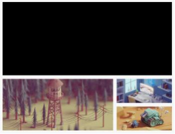
}3.4.4 使用 Row 或 Co1umn 结合Expanded实现下面示例
示例图
代码
import 'package:flutter/material.dart';

void main() {
  runApp(const MyApp());
}

class MyApp extends StatelessWidget {
  const MyApp({Key? key}) : super(key: key);

// This widget is the root of your application.
  @override
  Widget build(BuildContext context) {
    return MaterialApp(
      title: 'Flutter Demo',
      theme: ThemeData(
        primarySwatch: Colors.blue,
      ),
      home: Scaffold(
        appBar: AppBar(title: const Text("Flutter App")),
        body: const HomePage(),
      ),
    );
  }
}

class HomePage extends StatelessWidget {
  const HomePage({Key? key}) : super(key: key);

  @override
  Widget build(BuildContext context) {
    return ListView(
      children: [
        Container(
          width: double.infinity,
          height: 200,
          color: Colors.black,
        ),
        const SizedBox(height: 10),
        Row(
          children: [
            Expanded(
              flex: 2,
              child: SizedBox(
                height: 180,
                child: Image.asset(
                    "images/2.png",
                    fit: BoxFit.cover),
              ),
            ),
            const SizedBox(width: 10),
            Expanded(
                flex: 1,
                child: SizedBox(
                  height: 180,
                  child: Column(
                    children: [
                      Expanded(
                        flex: 1,
                        child: SizedBox(
                          width: double.infinity,
                          child: Image.asset(
                              "images/3.png",
                              fit: BoxFit.cover),
                        ),
                      ),
                      const SizedBox(height: 10),
                      Expanded(
                        flex: 2,
                        child: SizedBox(
                          width: double.infinity,
                          child: Image.asset(
                              "images/4.png",
                              fit: BoxFit.cover),
                        ),
                      )
                    ],
                  ),
                ))
          ],
        )
      ],
    );
  }
}
4 Flutter Wrap组件
4.1 说明
Wrap可以实现流布局,单行的Wrap跟Row表现几乎一致,单列的Wrap则跟Column表现几乎一致。但 Row与Column都是单行单列的, Wrap则突破了这个限制, mainAxis上空间不足时,则向crossAxis上 去扩展显示。
4.2 属性
4.2.1 direction
主轴的方向,默认水平
4.2.2 alignment
主轴的对其方式
4.2.3 spacing
主轴方向上的间距
4.2.4 textDirection
文本方向
4.2.5 verticalDirection
定义了children摆放顺序,默认是down,见Flex相关属性介绍。
4.2.6 runAlignment
run的对齐方式。 run可以理解为新的行或者列,如果是水平方向布局的话, run可以理解为新的一行
4.2.7 runSpacing
run的间距
4.3 示例
import 'package:flutter/material.dart';
import '../../res/listData.dart';
void main() {
runApp(const MyApp());
}
class MyApp extends StatelessWidget {
const MyApp({Key? key})
: super(key: key); // This widget is the root of your application.
@override
Widget build(BuildContext context) {
return MaterialApp(
title: 'Flutter Demo',
theme: ThemeData(
primarySwatch: Colors.blue,
),
home: Scaffold(
appBar: AppBar(title: const Text("FLutter App")),
body: const LayoutDemo(),
),
);
}
}
class LayoutDemo extends StatelessWidget {
const LayoutDemo({Key? key}) : super(key: key);
@override
Widget build(BuildContext context) {
return Padding(
padding: const EdgeInsets.all(3),
child: Wrap(
spacing: 5,
runSpacing: 5,
direction: Axis.vertical,
alignment: WrapAlignment.start,
runAlignment: WrapAlignment.center,
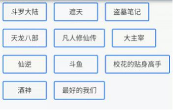
children: <Widget>[
Button("第1集", onPressed: () {}),
Button("第2集", onPressed: () {}),
Button("第3集", onPressed: () {}),
Button("第4集", onPressed: () {}),
Button("第5集", onPressed: () {}),
Button("第6集", onPressed: () {}),
Button("第7集", onPressed: () {}),
Button("第8集", onPressed: () {}),
Button("第9集", onPressed: () {}),
Button("第10集", onPressed: () {}),
Button("第11集", onPressed: () {}),
Button("第12集", onPressed: () {}),
Button("第13集", onPressed: () {}),
Button("第14集", onPressed: () {}),
Button("第15集", onPressed: () {}),
Button("第16集", onPressed: () {}),
Button("第17集", onPressed: () {}),
Button("第18集", onPressed: () {}),
],
),
);
}
}
class Button extends StatelessWidget {
String text;
void Function()? onPressed;
Button(this.text, {Key? key, required this.onPressed}) : super(key: key);
@override
Widget build(BuildContext context) {
return ElevatedButton(
onPressed: onPressed,
style: ButtonStyle(
backgroundColor:
MaterialStateProperty.all(const Color.fromARGB(255, 236, 233, 233)),
foregroundColor: MaterialStateProperty.all(Colors.black45),
),
child: Text(text),
);
}
}
4.4 示例2
import 'package:flutter/material.dart';
void main() {
runApp(const MyApp());
}
class MyApp extends StatelessWidget {
const MyApp({Key? key})
: super(key: key); // This widget is the root of your application.
@override
Widget build(BuildContext context) {
return MaterialApp(
title: 'Flutter Demo',
theme: ThemeData(
primarySwatch: Colors.blue,
),
home: Scaffold(
appBar: AppBar(title: const Text("Flutter App")),
body: const LayoutDemo(),
),
);
}
}
class LayoutDemo extends StatelessWidget {
const LayoutDemo({Key? key}) : super(key: key);
@override
Widget build(BuildContext context) {
return Padding(
padding: const EdgeInsets.all(10),
child: ListView(children: [
Row(
children: [
Text(
"热搜",
style: Theme.of(context).textTheme.headline6,
)
],
),
const Divider(),
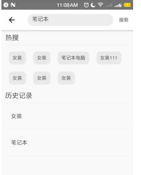
Wrap(
spacing: 10,
runSpacing: 12,
children: [
Button("女装", onPressed: () {}),
Button("笔记本", onPressed: () {}),
Button("玩具", onPressed: () {}),
Button("文学", onPressed: () {}),
Button("女装", onPressed: () {}),
Button("时尚", onPressed: () {}),
Button("女装", onPressed: () {}),
Button("女装", onPressed: () {}),
],
),
const SizedBox(height: 10),
Row(
children: [
Text(
"历史记录",
style: Theme.of(context).textTheme.headline6,
)
],
),
const Divider(),
Column(
children: const [
ListTile(
title: Text("女装"),
),
Divider(),
ListTile(
title: Text("时尚"),
),
Divider(),
],
),
const SizedBox(height: 40),
Padding(
padding: const EdgeInsets.all(20),
child: OutlinedButton.icon(
onPressed: () {},
style: ButtonStyle(
foregroundColor: MaterialStateProperty.all(Colors.black38)),
icon: const Icon(Icons.delete),
label: const Text("清空历史记录")),
)
]),
);
}
}
class Button extends StatelessWidget {
String text;
void Function()? onPressed;
Button(this.text, {Key? key, required this.onPressed}) : super(key: key);
@override
Widget build(BuildContext context) {
return ElevatedButton(
onPressed: onPressed,
style: ButtonStyle(
backgroundColor:
MaterialStateProperty.all(const Color.fromARGB(255, 236, 233, 233)),
foregroundColor: MaterialStateProperty.all(Colors.black45),
),
child: Text(text),
);
}
}
5 层叠布局(Stack、 Align、Positioned)
5.1 Flutter Stack组件
5.1.1 说明
Stack表示堆的意思,我们可以用Stack或者Stack结合Align或者Stack结合 Positiond来实现页面的定位 布局
5.1.2 属性
alignment:配置所有子元素的显示位置
children:子组件
5.1.3 示例
import 'package:flutter/material.dart';

void main() {
  runApp(const MyApp());
}

class MyApp extends StatelessWidget {
  const MyApp({Key? key}) : super(key: key);

// This widget is the root of your application.
  @override
  Widget build(BuildContext context) {
    return MaterialApp(
      title: 'Flutter Demo',
      theme: ThemeData(
        primarySwatch: Colors.blue,
      ),
      home: Scaffold(
        appBar: AppBar(title: const Text("Flutter App")),
        body: const HomePage(),
      ),
    );
  }
}

class HomePage extends StatelessWidget {
  const HomePage({Key? key}) : super(key: key);

  @override
  Widget build(BuildContext context) {
    return Container(
      height: 120.0,
      width: 120.0,
      color: Colors.blue.shade50,
      child: const Align(
        alignment: Alignment.topRight,
        child: FlutterLogo(
          size: 60,
        ),
      ),
    );
  }
}

//Align结合Alignment 参数
class HomePage2 extends StatelessWidget {
  const HomePage2({Key? key}) : super(key: key);

  @override
  Widget build(BuildContext context) {
    return Container(
        height: 120.0,
        width: 120.0,
        color: Colors.blue.shade50,
        child: const Align(
          alignment: Alignment(2, 0.0),
          child: FlutterLogo(
            size: 60,
          ),
        ));
  }
}

//Align结合Stack组件
class HomePage3 extends StatelessWidget {
  const HomePage3({Key? key}) : super(key: key);

  @override
  Widget build(BuildContext context) {
    return Center(
      child: Container(
        height: 400,
        width: 300,
        color: Colors.red,
        child: Stack(
        // alignment: Alignment.center,
          children: const <Widget>[
            Align(
              alignment: Alignment(1, -0.2),
              child: Icon(Icons.home, size: 40, color: Colors.white),
            ),
            Align(
              alignment: Alignment.center,
              child: Icon(Icons.search, size: 30, color: Colors.white),
            ),
            Align(
              alignment: Alignment.bottomRight,
              child: Icon(Icons.settings_applications,
                  size: 30, color: Colors.white),
            )
          ],
        ),
      ),
    );
  }
}
5.2 Flutter Stack Align
5.2.1 说明
Align组件可以调整子组件的位置 , Stack组件中结合Align组件也可以控制每个子元素的显示位置
5.2.2 属性
alignment:配置所有子元素的显示位置
child:子组件
5.2.3 Align结合Container的使用
说明
FlutterLogo 是Flutter SDK 提供的一个组件,内容就是 Flutter 的 log
示例
import 'package:flutter/material.dart';

void main() {
  runApp(const MyApp());
}

class MyApp extends StatelessWidget {
  const MyApp({Key? key})
      : super(key: key); // This widget is the root of your application.
  @override
  Widget build(BuildContext context) {
    return MaterialApp(
      title: 'Flutter Demo',
      theme: ThemeData(
        primarySwatch: Colors.blue,
      ),
      home: Scaffold(
        appBar: AppBar(title: const Text("Flutter App")),
        body: const HomePage(),
      ),
    );
  }
}

class HomePage extends StatelessWidget {
  const HomePage({Key? key}) : super(key: key);

  @override
  Widget build(BuildContext context) {
    return Center(
      child: Stack(
        alignment: Alignment.topLeft,
        children: [
          Container(
            height: 400,
            width: 300,
            color: Colors.red,
          ),
          const Text(
            "这是一个文本",
            style: TextStyle(fontSize: 40, color: Colors.amber),
          )
        ],
      ),
    );
  }
}
5.3 Flutter Stack Positioned
5.3.1 说明
Stack组件中结合Positioned组件也可以控制每个子元素的显示位置
5.3.2 属性
top:子元素距离顶部的距离
bottom:子元素距离底部的距离
left:子元素距离左侧距离
right:子元素距离右侧距离
child:子组件
width:组件的高度 (注意:宽度和高度必须是固定值,没法使用double.infinity)
height:子组件的高度
示例
import 'package:flutter/material.dart';

void main() {
  runApp(const MyApp());
}

class MyApp extends StatelessWidget {
  const MyApp({Key? key})
      : super(key: key); // This widget is the root of your application.
  @override
  Widget build(BuildContext context) {
    return MaterialApp(
      title: 'Flutter Demo',
      theme: ThemeData(
        primarySwatch: Colors.blue,
      ),
      home: Scaffold(
        appBar: AppBar(title: const Text("Flutter App")),
        body: const HomePage(),
      ),
    );
  }
} //Stack组件中结合Positioned组件也可以控制每个子元素的显示位置

class HomePage extends StatelessWidget {
  const HomePage({Key? key}) : super(key: key);

  @override
  Widget build(BuildContext context) {
    // FlutterMediaQuery获取屏幕宽度和高度
    final size = MediaQuery.of(context).size;
    final width = size.width;
    final height = size.height;
    return Center(
      child: Container(
        height: height,
        width: width,
        color: Colors.red,
        child: Stack(
          alignment: Alignment.center,
          children: const <Widget>[
            Positioned(
              left: 10,
              child: Icon(Icons.home, size: 40, color: Colors.white),
            ),
            Positioned(
              bottom: 0,
              left: 100,
              child: Icon(Icons.search, size: 30, color: Colors.white),
            ),
            Positioned(
              right: 0,
              child: Icon(Icons.settings_applications,
                  size: 30, color: Colors.white),
            )
          ],
        ),
      ),
    );
  }
}

// Flutter Stack Positioned固定导航案例
class HomePage2 extends StatelessWidget {
  const HomePage2({Key? key}) : super(key: key);

  @override
  Widget build(BuildContext context) {
    final size = MediaQuery.of(context).size;
    return Stack(
      children: [
        ListView(
          padding: const EdgeInsets.only(top: 45),
          children: const [
            ListTile(
              title: Text("这是一个标题 "),
            ),
            ListTile(
              title: Text("这是一个标题"),
            ),
            ListTile(
              title: Text("这是一个标题"),
            ),
            ListTile(
              title: Text("这是一个标题"),
            ),
            ListTile(
              title: Text("这是一个标题"),
            ),
            ListTile(
              title: Text("这是一个标题"),
            ),
            ListTile(
              title: Text("这是一个标题"),
            ),
            ListTile(
              title: Text("这是一个标题"),
            ),
            ListTile(
              title: Text("这是一个标题"),
            ),
            ListTile(
              title: Text("这是一个标题"),
            ),
            ListTile(
              title: Text("这是一个标题"),
            ),
            ListTile(
              title: Text("这是一个标题"),
            ),
            ListTile(
              title: Text("这是一个标题"),
            ),
            ListTile(
              title: Text("这是一个标题"),
            ),
            ListTile(
              title: Text("这是一个标题"),
            ),
            ListTile(
              title: Text("这是一个标题"),
            ),
            ListTile(
              title: Text("这是一个标题"),
            ),
            ListTile(
              title: Text("这是一个标题"),
            ),
            ListTile(
              title: Text("这是一个标题"),
            ),
            ListTile(
              title: Text("这是一个标题"),
            ),
            ListTile(
              title: Text("这是一个标题"),
            ),
            ListTile(
              title: Text("这是一个标题"),
            ),
            ListTile(
              title: Text("这是一个标题"),
            ),
          ],
        ),
        Positioned(
            top: 0,
            left: 0,
            height: 40,
            width: size.width,
            child: Container(
              alignment: Alignment.center,
              color: Colors.black,
              child: const Text(
                "你好FLutter",
                style: TextStyle(color: Colors.white),
              ),
            ))
      ],
    );
  }
}
6 Flutter AspectRatio
6.1 说明
6.1.1 AspectRatio的作用是根据设置调整子元素child的宽高比。
6.1.2 AspectRatio首先会在布局限制条件允许的范围内尽可能的扩展, widget的高度是由宽度和比率决定 的,类似于BoxFit中的contain,按照固定比率去尽量占满区域。
6.1.3 如果在满足所有限制条件过后无法找到一个可行的尺寸, AspectRatio最终将会去优先适应布局限制条 件,而忽略所设置的比率。
6.2 属性
6.2.1 aspectRatio
宽高比,最终可能不会根据这个值去布局,具体则要看综合因素,外层是否允许 按照这种比率进行布局,这只是一个参考值
6.2.2 child
子组件
6.3 示例
import 'package:flutter/material.dart';

void main() {
  runApp(const MyApp());
} //Flutter AspectRatio

class MyApp extends StatelessWidget {
  const MyApp({Key? key})
      : super(key: key); // This widget is the root of your application.
  @override
  Widget build(BuildContext context) {
    return MaterialApp(
      title: 'Flutter Demo',
      theme: ThemeData(
        primarySwatch: Colors.blue,
      ),
      home: Scaffold(
        appBar: AppBar(title: const Text("Flutter App")),
        body: const HomePage(),
      ),
    );
  }
}

class HomePage extends StatelessWidget {
  const HomePage({Key? key}) : super(key: key);

  @override
  Widget build(BuildContext context) {
    // TODO: implement build
    return Container(
      width: 200,
      color: Colors.yellow,
      child: AspectRatio(
        aspectRatio: 2.0 / 1.0,
        child: Container(
          color: Colors.red,
        ),
        child: LayoutDemo(),
      ),
    );
  }
}

class LayoutDemo extends StatelessWidget {
  @override
  Widget build(BuildContext context) {
    // TODO: implement build
    return AspectRatio(
      aspectRatio: 3.0 / 1.0,
      child: Container(
        color: Colors.blue,
      ),
    );
  }
}