一、前言
手写Table组件这个文章我一直都想写,今天终于得空来写它了。小编认为Table组件是组件库里"较为复杂"的一个组件,因为它的扩展性非常强,并且它的基础样式如何去写都非常考究,那么今天我就带大家来实现一个基础功能的table组件,废话不多bb,进入正题吧。
二、实现哪些功能?
- 最基础的table布局
- 固定头
- 固定列
三、实现的效果
以及组件的使用方式期望是这样:
const column = [{ name: '序号', key: 'order', width: '100px', isFixed: true },{ name: '第二列', key: 'col2', width: '200px' },{ name: '第三列', key: 'col3', width: '300px' },{ name: '第四列', key: 'col4', width: '200px' },{ name: '第五列', key: 'col5', width: '500px' },{ name: '第六列', key: 'col6', width: '200px' },
];
const data = [{ order: 1, col2: '1-2', col3: '1-3', col4: '1-4', col5: '1-5', col6: '1-6' },{ order: 2, col2: '2-2', col3: '2-3', col4: '2-4', col5: '2-5', col6: '2-6' },{ order: 3, col2: '3-2', col3: '3-3', col4: '3-4', col5: '3-5', col6: '3-6' },{ order: 4, col2: '4-2', col3: '4-3', col4: '4-4', col5: '4-5', col6: '4-6' },{ order: 5, col2: '5-2', col3: '5-3', col4: '5-4', col5: '5-5', col6: '5-6' }
];
<CustomTablecolumn = { column } data = { data } rowHeight = { '100px' } />
四、动手实现
4.1、table组件的尺寸
4.1.1、如何定义table组件的宽?
对于table组件来说,定义宽度有2种方式,一种是"固定宽度布局",另一种是"自由宽度布局"。我们可以通过"table-layout"属性在这2种方式中做出选择。
4.1.1.1、“固定宽度布局”
就是显示的定义table标签的宽度(即table-layout: fixed),那么此时
<table>的宽度 与 各列[td | th]的宽度的关系如下:
- table真实的width = Math.max(table.style.width, 各列宽度之和)
- 如果 table.style.width > 各列宽度之和,那么
二者之差再除以列数得到的结果将增加到各列上。
纸上得来终觉浅,我们来跑下代码加深一下上述节论的记忆(以下均是react环境下的代码):
table {table-layout: fixed;border-collapse: collapse;border-spacing: 0px;width: 200px;
}
<div className = 'yon-table-box'><table><colgroup><col style={{ width: '100px' }}><col style={{ width: '100px' }}><col style={{ width: '100px' }}><colgroup><thead><th>列1</th><th>列2</th><th>列3</th></thead></table>
</div>
此时效果如下:
此时我们再稍微改动下样式,css如下:
table {table-layout: fixed;width: 500px;border-collapse: collspse;border-spacing: 0px;
}
效果如下:
此时我们发现,上述结论是对的。
4.1.1.2、“自由宽度布局”
顾名思义,更容易实现这个等式 “table.style.width == 各列宽度之和 + 边框 + 间距”。通过设置 table-layout: auto 来触发。
我们来跑下代码试一下:
table {table-layout: auto;border-collapse: collapse;border-spacing: 0px;width: auto;
}
<div className = 'table-box'><table><colgroup><col style={{ width: '100px' }}><col style={{ width: '100px' }}><col style={{ width: '100px' }}></colgroup><thead><th>列1</th><th>列2</th><th>列3</th></thead></table>
</div>
此时我们来看下效果:
4.1.1.3、table宽度的最终选择
经过上面2种布局的分析,我们决定选用"自由宽度布局"的方式定义table的宽度,此时咱们的CustomTable组件的代码如下:
.yon-table-box {width: 100px;height: 100px;overflow: scroll;}table {table-layout: auto;table-collapse: collapse;table-spacing: 0px;width: auto;}th {background: #f4f4f4;}
 import React from 'react';class CustomTable extends React.Component {constructor(props){super(props)}render (){const { column } = this.props;return <div className = 'yon-table-box'><div className = 'right'>
                    <table>
                        <colgroup>{column.map(colItem => {return <col style={{ colItem.width }}>})}</colgroup><thead><tr>{column.map(colItem => {return <th>{ colItem.name }</th>})}</tr></thead>
                    </table>
                </div></div>}}
Table的使用:
import React from 'react';const column = [{ name: '列1', key: 'col1', width: '100px' },{ name: '列2', key: 'col2', width: '200px' },{ name: '列3', key: 'col3', width: '300px' },];<CustomTable column = { column } />
4.1.2、如何定义table组件的高?
定义table组件的行高度,这个就比较简单了,我们只需要保证 table.style.height = ‘auto’, 即可实现自定义行高,CustomTable组件的代码如下:
.yon-table-box {width: 100px;height: 100px;overflow: scroll;}table {table-layout: auto;table-collapse: collapse;table-spacing: 0px;width: auto;// 新增代码+++++++++++++++++++++height: auto;}th {background: #f4f4f4;}// 新增代码++++++++++++++++++++++++++td {background: #fff;border-bottom: 1px solid rgb(208, 208, 208);}
 import React from 'react';class CustomTable extends React.Component {constructor(props){super(props)}render (){const { column, data, rowHeight } = this.props;return <div className = 'yon-table-box'><div className = 'right'>
                    <table>
                        <colgroup>{column.map(colItem => {return <col style={{ colItem.width }}>})}</colgroup><thead><tr>{column.map(colItem => {return <th>{ colItem.name }</th>})}</tr></thead><tbody>{// 新增代码+++++++++++++++++++++++++data.map(dataItem => {return <tr>{column.map(colItem => {return <td style={{ height: rowHeight }}>{dataItem[colItem.key]}</td>})}</tr>})}</tbody>
                    </table>
                </div></div>}}
好啦,此时咱们的第一个功能到这就算实现啦,如果你是一步一步跟下来的,那么此时的效果应该是这样的:
4.2、固定列
我们先来看一下下面的图:
首先,根据目前实现的效果来看,我们可以得出以下信息:
- 目前dom上就只有一个table,意味着 表头、表体是连着的,符合正常文档流所有的特点。
- 红色框是我们想要固定的列。
好,此时我们来想一下能够做到固定列(无非是2个div互不干扰呗)的方法有哪些?
4.2.1、方式一
把一个table分为左右2个table,并保证只有右侧的table局部滚动,干掉父div的scroll。
4.2.2、方式二
依旧是一个table分为左右2个table,只是在不改变现在滚动的情况下,给左侧的table新增一个"sticky"的粘性定位即可。
4.2.3、方式三
利用js,监听scroll事件,在滚动的时候,利用transform属性,动态的设置translateX,来达到固定列的效果
4.2.3、固定列的最终选择
这里我们选择 方式二。理由非常简单,改动量非常少的情况就可以实现,其他的2种情况的改动都挺大,但是也可以实现,下面我会把其他的2种方式的伪代码写出来供大家参考。
- 方式一。其实这种方式更适合"固定宽度布局"的table,因为这种table的width是非常容易拿到的,你只需要保证列数过多的时候出现滚动条就可以(也仅仅是一行样式的问题),伪代码如下:
import React from 'react';export default class App extends React.Component {constructor(props){super(props)}render (){return <div style={{ display: 'flex' }}><!-- 左侧固定列 --><div className = 'left'><table></table></div><!-- 右侧自由列 --><div className = 'right' style={{ overflow: 'scroll' }}><table></table></div></div>}}
- 方式三。这种利用js的方式是最看重代码结构的,而且还会使你的代码变得非常臃肿(不利于拆分),它比较适用于下面的写法:
import React from 'react';// 大家看到这样的写法其实可能感觉不到什么,但是如果这样写的话,table组件的抽取将会异常困难。class App extends React.Component {constructor(props){super(props)this.leftTableRef = React.createRef();this.scrollTableBox = React.createRef();}scrollTable = () => {// 保持左侧固定不动this.leftTableRef.current.style.transform = `translateX(-${this.scrollTableBox.current.scrollLeft}`;}render (){return <div ref = { this.scrollTableBox } style={{ display: 'flex', overflow: 'scroll' }} onScroll = { () => this.scrollTable() }><!-- 左侧固定列table --><table ref={ this.leftTableRef }></table><!-- 右侧自由列table --><table></table></div>}}
4.2.4、固定列的最终代码
.yon-table-box {width: 100px;height: 100px;overflow: scroll;}table {table-layout: auto;table-collapse: collapse;table-spacing: 0px;width: auto;// 新增代码+++++++++++++++++++++height: auto;} th { background: #f4f4f4;} // 新增代码++++++++++++++++++++++++++td {background: #fff;border-bottom: 1px solid rgb(208, 208, 208);}// 新增代码++++++++++++++++++++++++++.left {position: sticky;left: 0px;}
import React from 'react';class CustomTable extends React.Component {constructor(props){super(props)this.state = {// 固定列集合fixedColumnArr : [];// 自由列集合notFixedColumnArr: [];}}componentDidMount(){const { column } = this.props;this.setState(state => {return {// column配置项中,isFixed用于标识是否是固定列fixedColumnArr : column.filter(item => item.isFixed),notFixedColumnArr: column.filter(item => !item.isFixed)}})}render (){const { data, column, rowHeight } = this.props;const { fixedColumnArr, notFixedColumnArr } = this.state;return <div className = 'yon-table-box'>{ fixedColumnArr.length > 0&& <div className = 'left'> <table> <colgroup> { fixedColumnArr.map(item => { return <col style={{ minWidth: item.width, width: item.width }}> }) } </colgroup> <thead> <tr> { fixedColumnArr.map(item => { return <th>{item.name}</th> }) } </tr> </thead> <tbody> { data.map(dataItem => { return <tr> { fixedColumnArr.map(colItem => { return <td>{dataItem[colItem.key]}</td> }) } </tr> }) } </tbody> </table> </div>}<div className = 'right'><!-- 跟left代码一样,只需要把 fixedColumnArr 换成 notFixedColumnArr 即可 --></div></div>}}
4.3、固定头
固定头的实现思路 其实和 固定列的思路是一样的,这里就不具体分析了,夜也深了,哈哈哈,这里我就偷点懒,给伪代码了:
import React from 'react';class CustomTable extends React.Component {constructor(props){super(props)this.state = {// 固定列集合fixedColumnArr : [];// 自由列集合notFixedColumnArr: [];}}render (){const { data, column, rowHeight } = this.props;return <div className = 'yon-table-box'>// 整张表的头部(整个头部是需要sticky的)<div className = 'top'><div className = 'left'></div><div className = 'right'></div></div>// 整张表的body(左侧需要固定的body是需要sticky的)<div className = 'bottom'><div className = 'left'></div><div className = 'right'></div></div></div>}}
五、最后
好啦,table组件这次就分享到这里了,文章里有讲的不对的地方,欢迎大家指正,如果大家对table组件的实现有什么好的想法,也欢迎评论留言,那么886~~~
最后
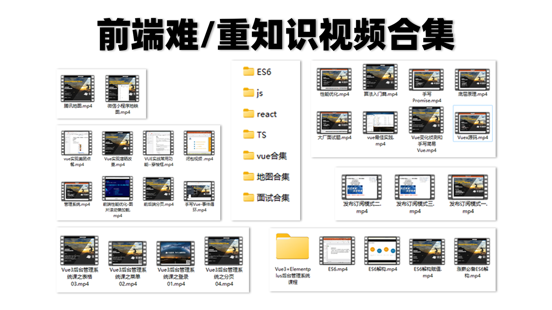
为大家准备了一个前端资料包。包含54本,2.57G的前端相关电子书,《前端面试宝典(附答案和解析)》,难点、重点知识视频教程(全套)。

有需要的小伙伴,可以点击下方卡片领取,无偿分享