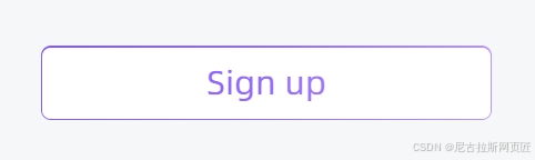
带有hover渐变效果
一、父组件
import LineGradientBox from '../line-gradient-box';
import styles from './index.module.scss';

 <LineGradientBox
  fontSize={20}
  className={styles.btn_height}
  text='Sign up'
  width="100%"
  onClick={() => {
    navigate('/sign-up');
  }}
/>需要传递样式在父组件中先定义好(sitepx函数用法):
.btn_height {
    height: sitepx(50);
}
二、子组件
import clsx from 'clsx';
import styles from './index.module.scss';
const LineGradientBox: React.FC<{
  text: string;
  width: string | number;
  height?: number;
  fontSize?: number;
  className?: string;
  onClick?: () => void;
  beforeTextIcon?: React.ReactNode;
}> = ({ text, width, height, fontSize, className, beforeTextIcon, onClick }) => {
  return (
    <div
      onClick={onClick}
      className={clsx(styles.box, className || '')}
      style={{ minWidth: width, height, lineHeight: height + 'px' }}
    >
      <div className={styles.bgfff} />

      <div
        className={styles.box_content}
        style={{ ...(fontSize ? { fontSize: fontSize + 'px' } : {}) }}
      >
        {beforeTextIcon}
        {text}
      </div>
    </div>
  );
};

export default LineGradientBox;
子组件样式:
.box {
  text-align: center;
  border-radius: 6px;
  overflow: hidden;
  background: $line-gradient-init-color;
  padding: 1px;
  position: relative;
  cursor: pointer;
  padding: 0 10px;

  &_content {
    position: relative;
    z-index: 2;
    width: 100%;
    height: 100%;
    background: $line-gradient-init-color;
    background-clip: text;
    -webkit-background-clip: text;
    -webkit-text-fill-color: transparent;

    display: flex;
    justify-content: center;
    align-items: center;
    & path {
      stroke: linear-gradient(90deg, #8057ff 0%, #936bff 50%, #b892ff 100%) !important;
    }
  }

  &:hover {
    color: var(--color-primary);
    background: $line-gradient-hover-color;

    .box_content {
      background: $line-gradient-hover-color;
      background-clip: text;
      -webkit-background-clip: text;
      -webkit-text-fill-color: transparent;
    }
  }


  .bgfff {
    position: absolute;
    z-index: 1;
    border-radius: 5px;
    top: 1px;
    left: 1px;
    width: calc(100% - 2px);
    height: calc(100% - 2px);
    background-color: #fff;
  }
}


![STM32单片机入门学习——第46节: [14-1] WDG看门狗](https://i-blog.csdnimg.cn/direct/26edd52d9c6d44abbed01355e6a26031.png)