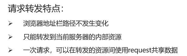
一、样式
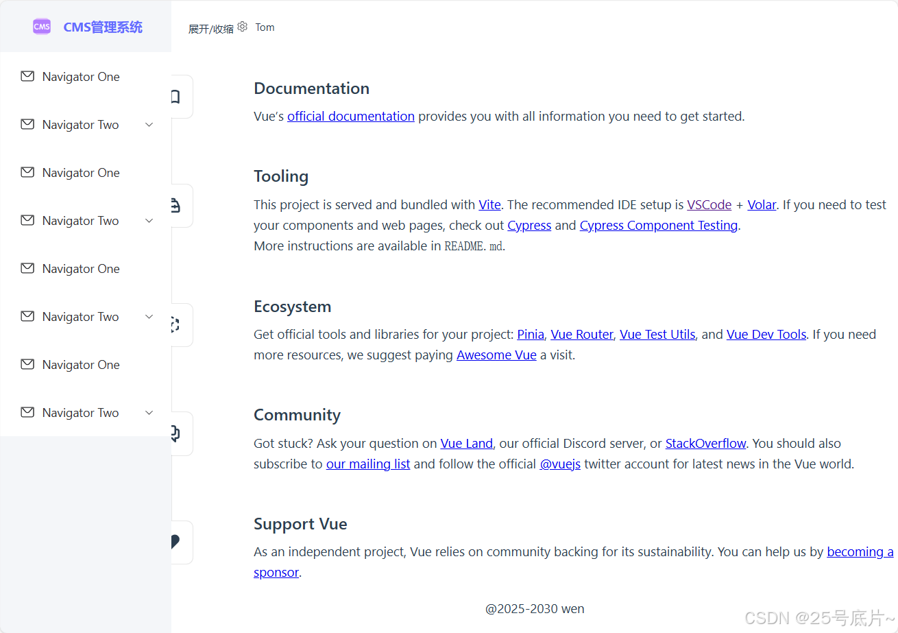
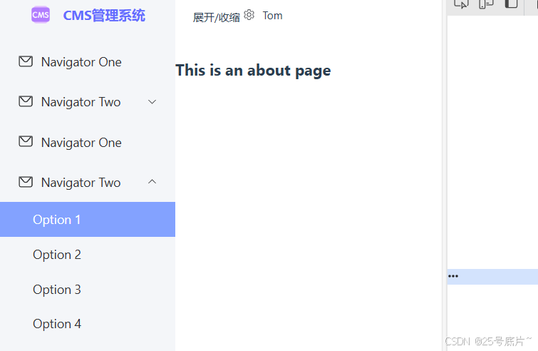
1、初始样式
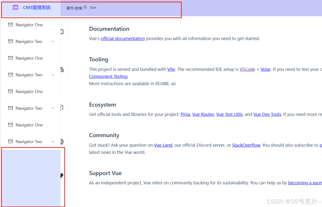
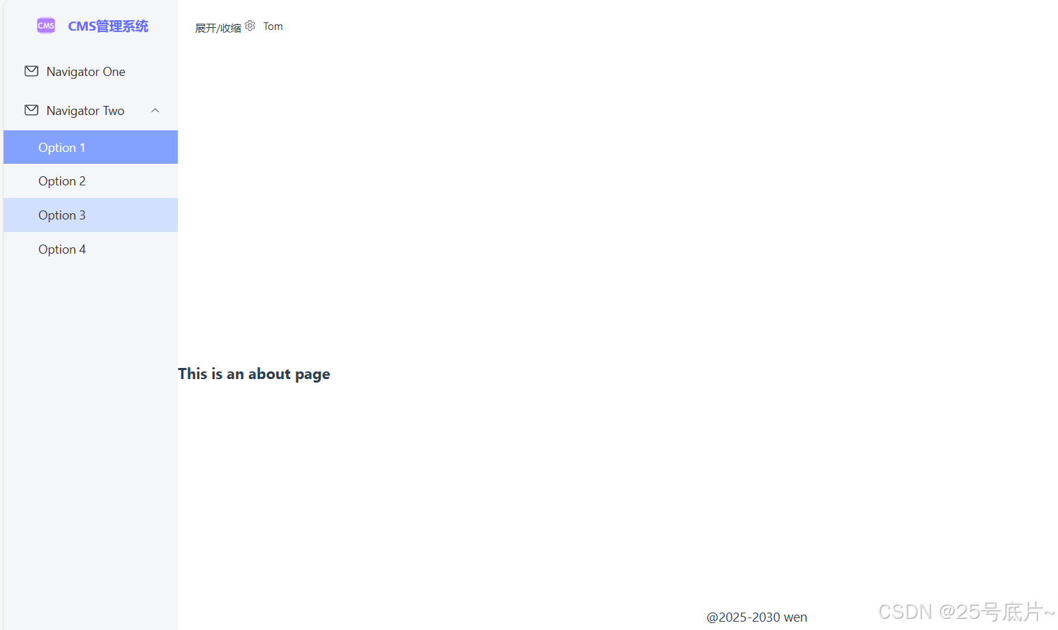
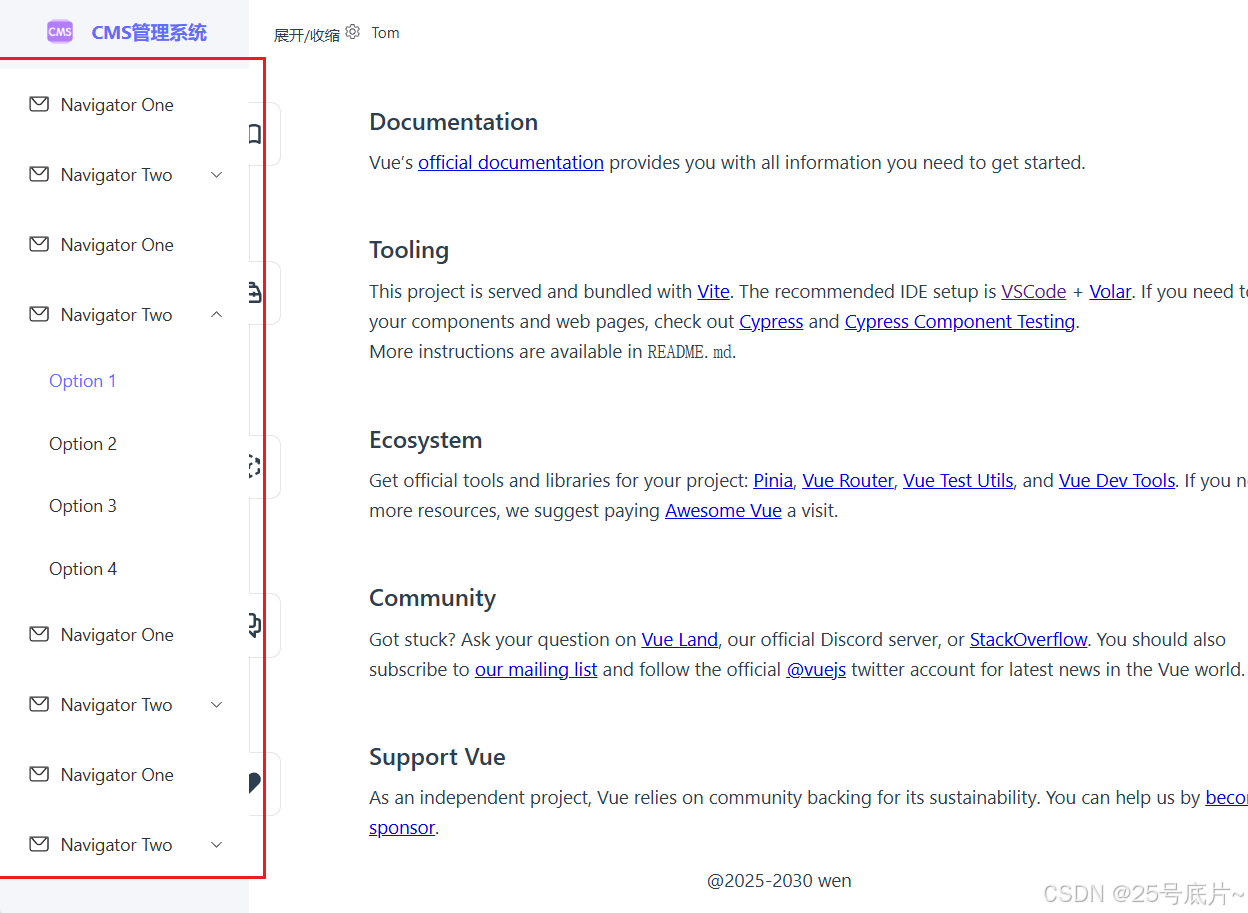
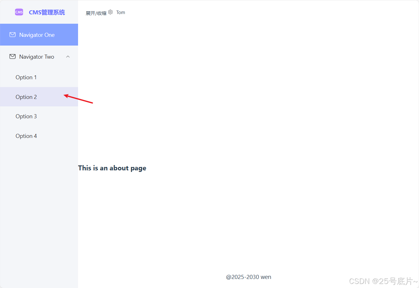
2、 左侧导航栏搭建完成样式
二、实现
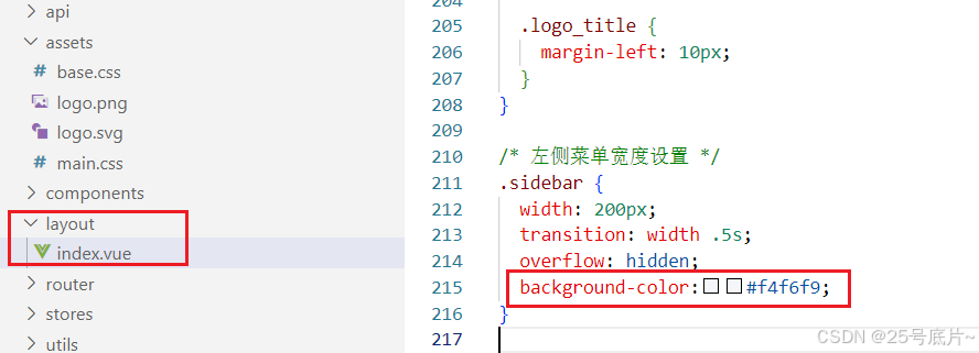
1、设置左侧导航栏底色
(1)去掉顶部和左侧导航栏的底色
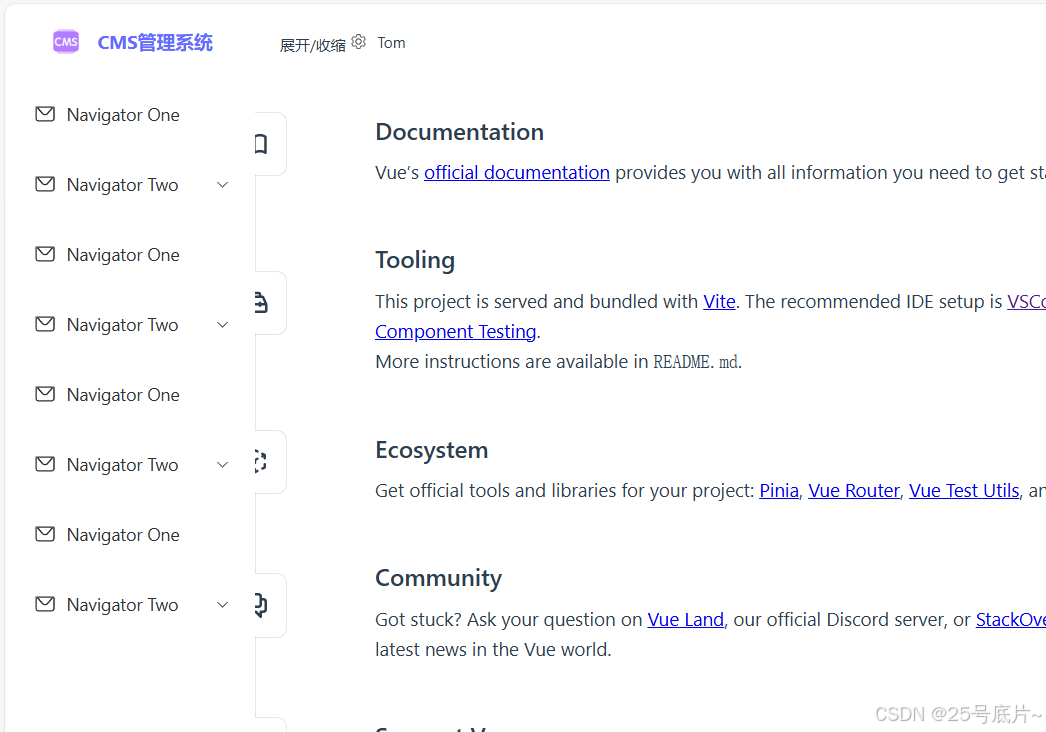
初始页面效果
顶部与左侧底色样式
将代码中与顶部与左侧的样式删掉
移除后页面效果
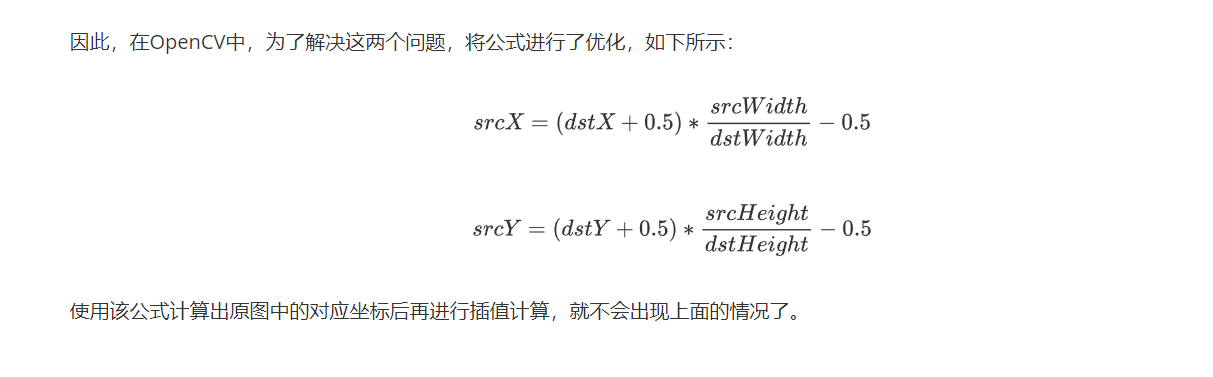
加入设定背景色
#f4f6f9
加入底色后颜色展示
(2)去除菜单项底色
初始页面效果
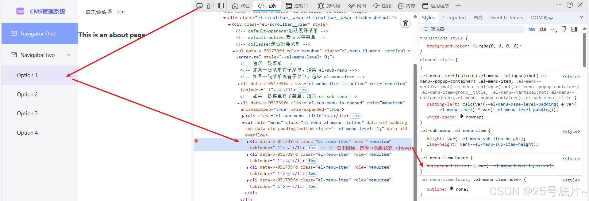
根据开发者工具找到菜单项的底色
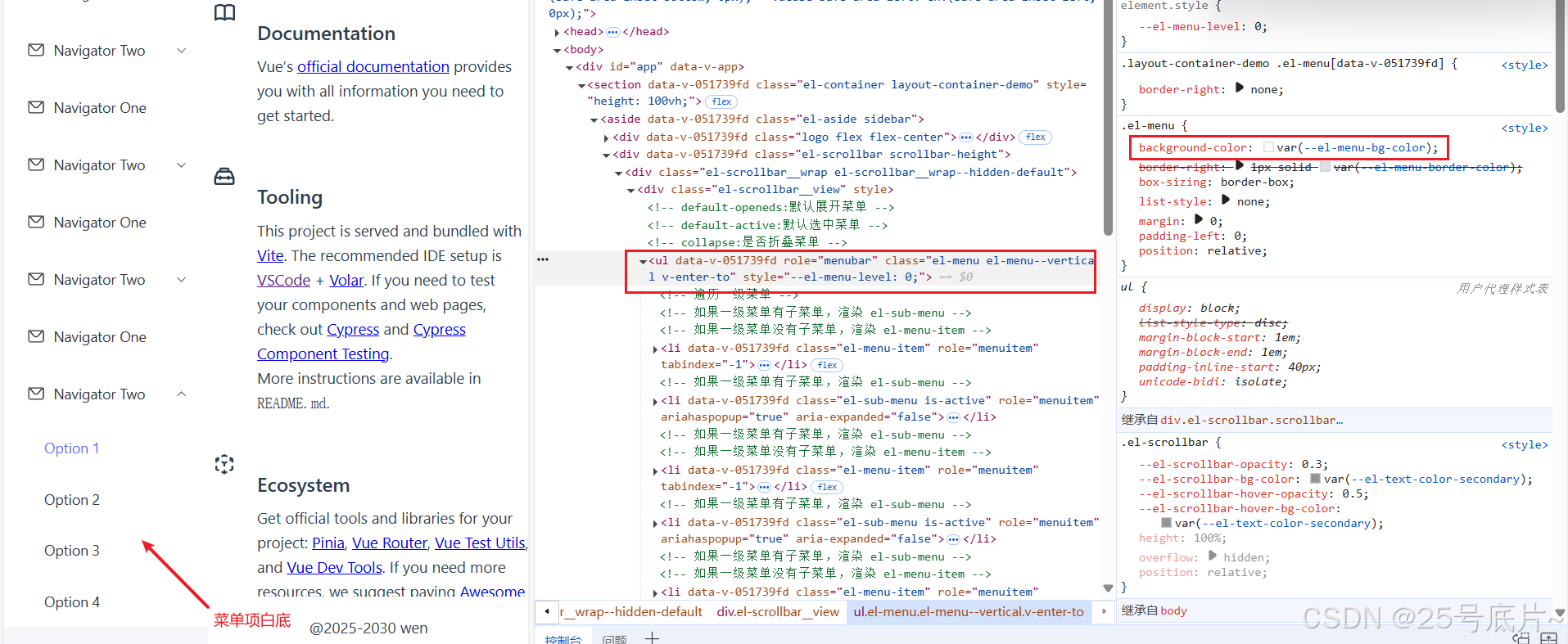
修改底色
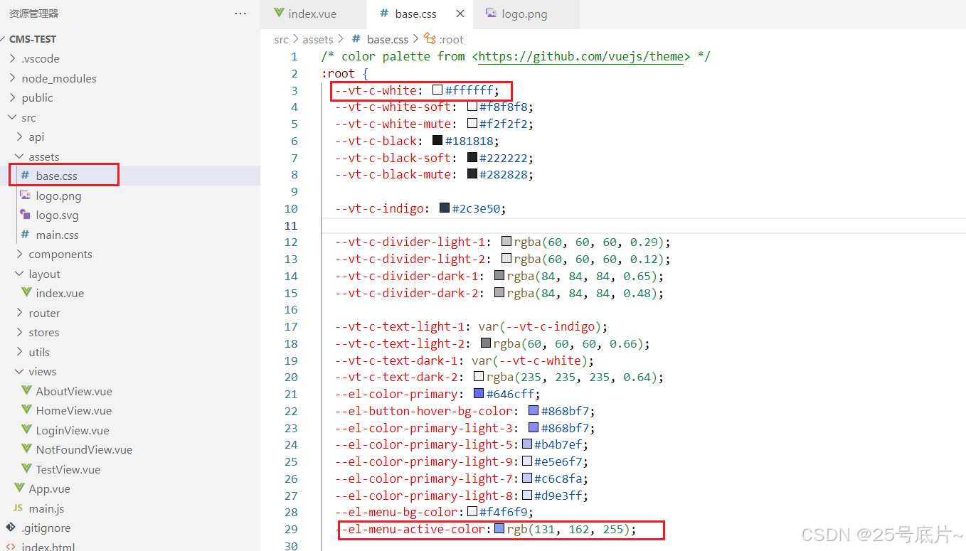
在全局css中将找的.el-menu的背景色的变量var(--el-menu-bg-color); 设置为指定色:#f4f6f9
展示效果
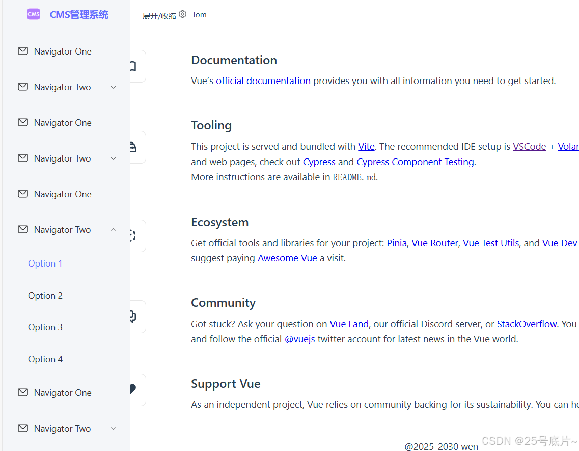
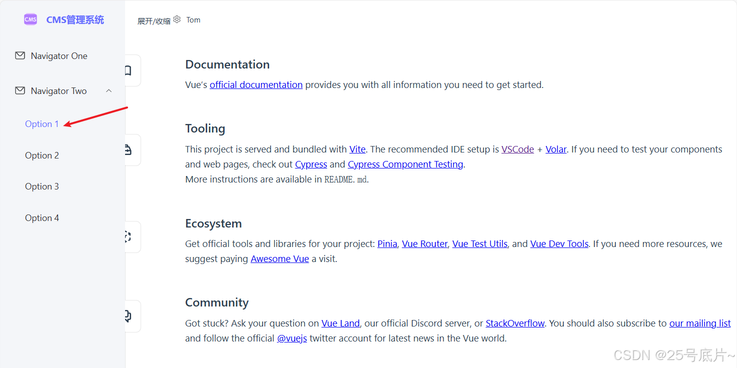
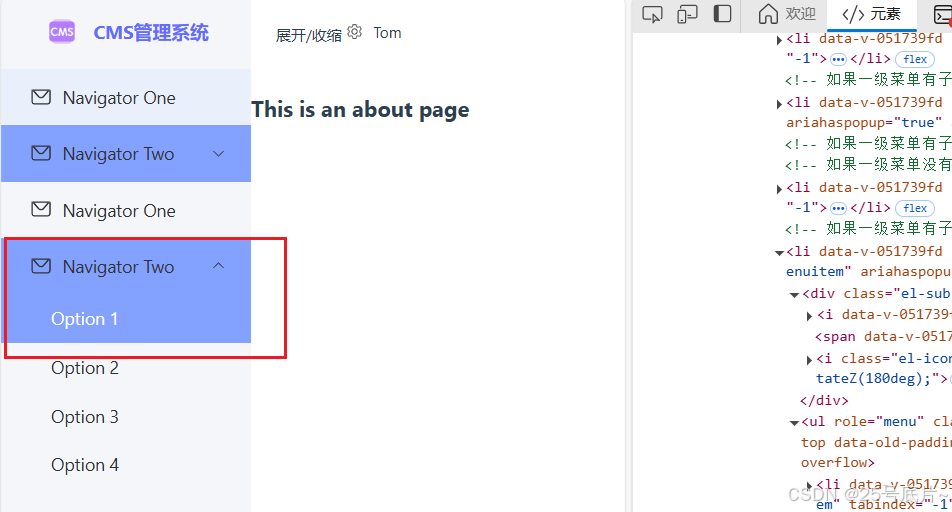
(3)选中菜单项底色
初始页面效果
目前选中项只有一个文字颜色改变,现在需要给一个背景色以及文字色
根据开发者工具找到对应选中效果
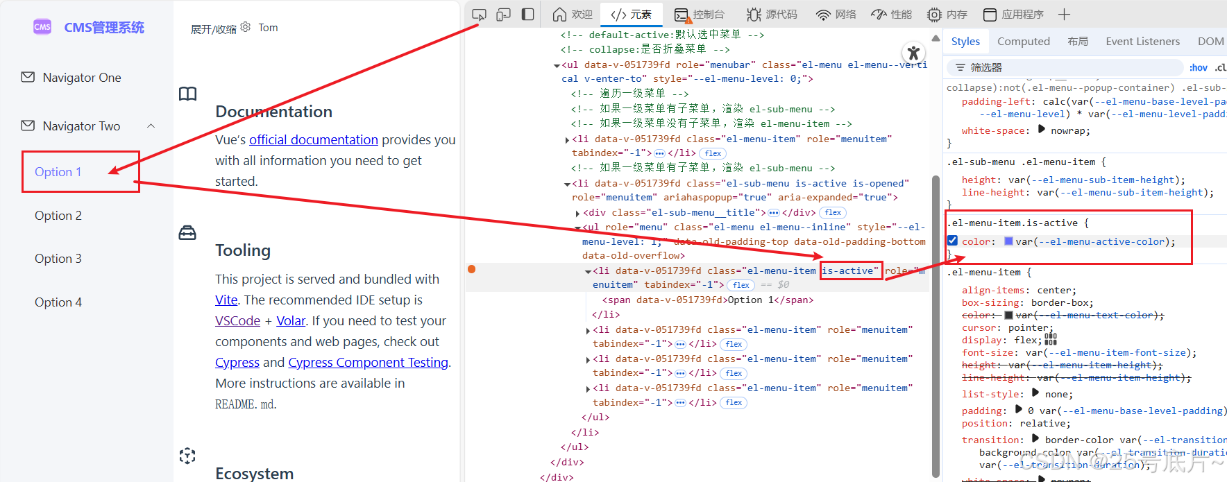
修改选中状态的效果
在页面中增加选中的背景色和文字颜色
使用的变量
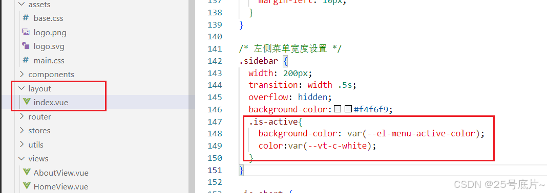
存在问题:选择子项时,该项也会有选中效果
问题解决
选中效果是对于el-menu-item的效果,所以.is-active与其是同级
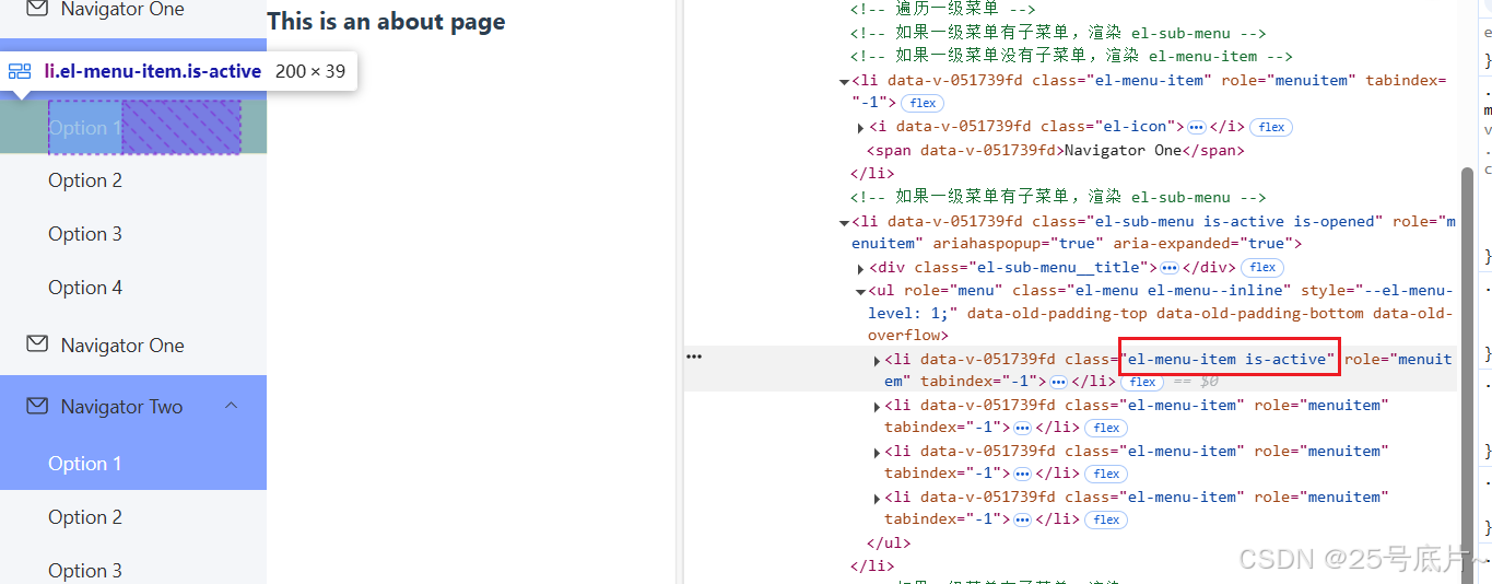
只需将is-active写入el-menu-item中即可(&表示同级)
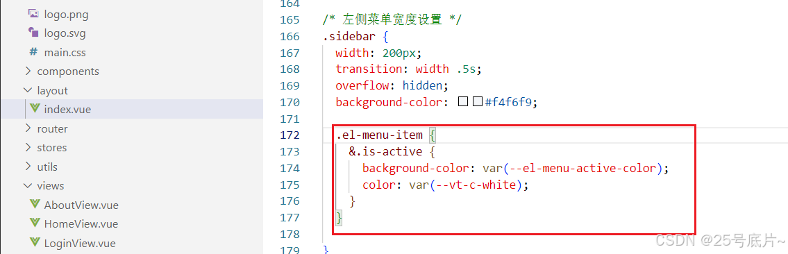
效果
(4)悬停菜单底色
初始页面效果
根据开发者工具找到对应选中项
修改悬停效果
由开发者工具,可以知道设置悬停效果的是个变量,所以直接在全局中修改此变量值即可
(5)调整菜单栏高度
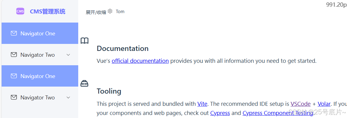
初始页面效果
根据开发者工具找到对应选中效果
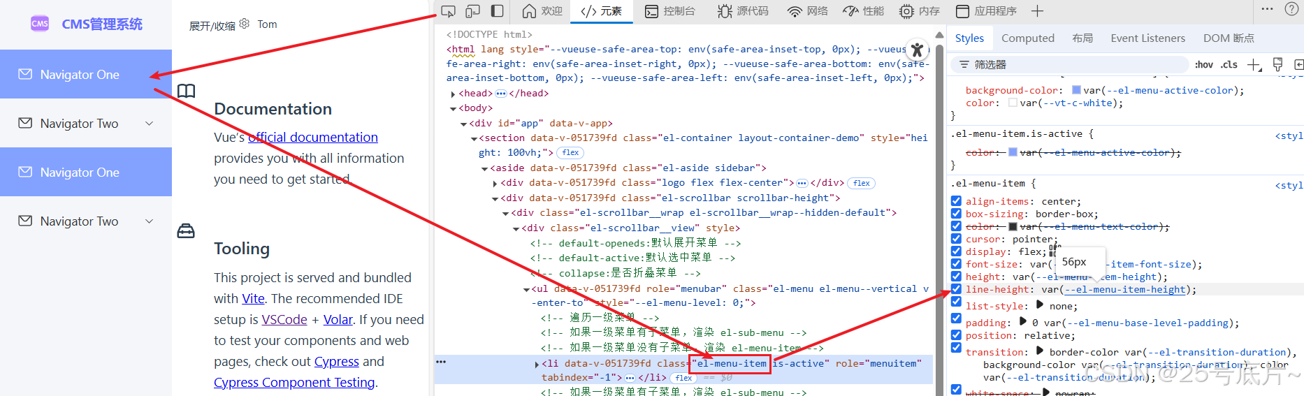
修改菜单块高度
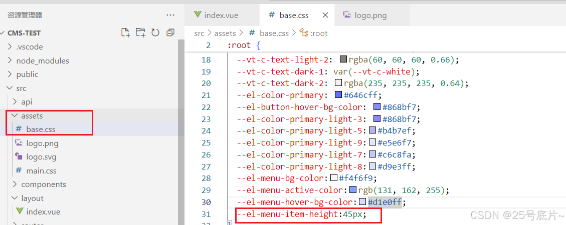
在全局css中修改高度为45px
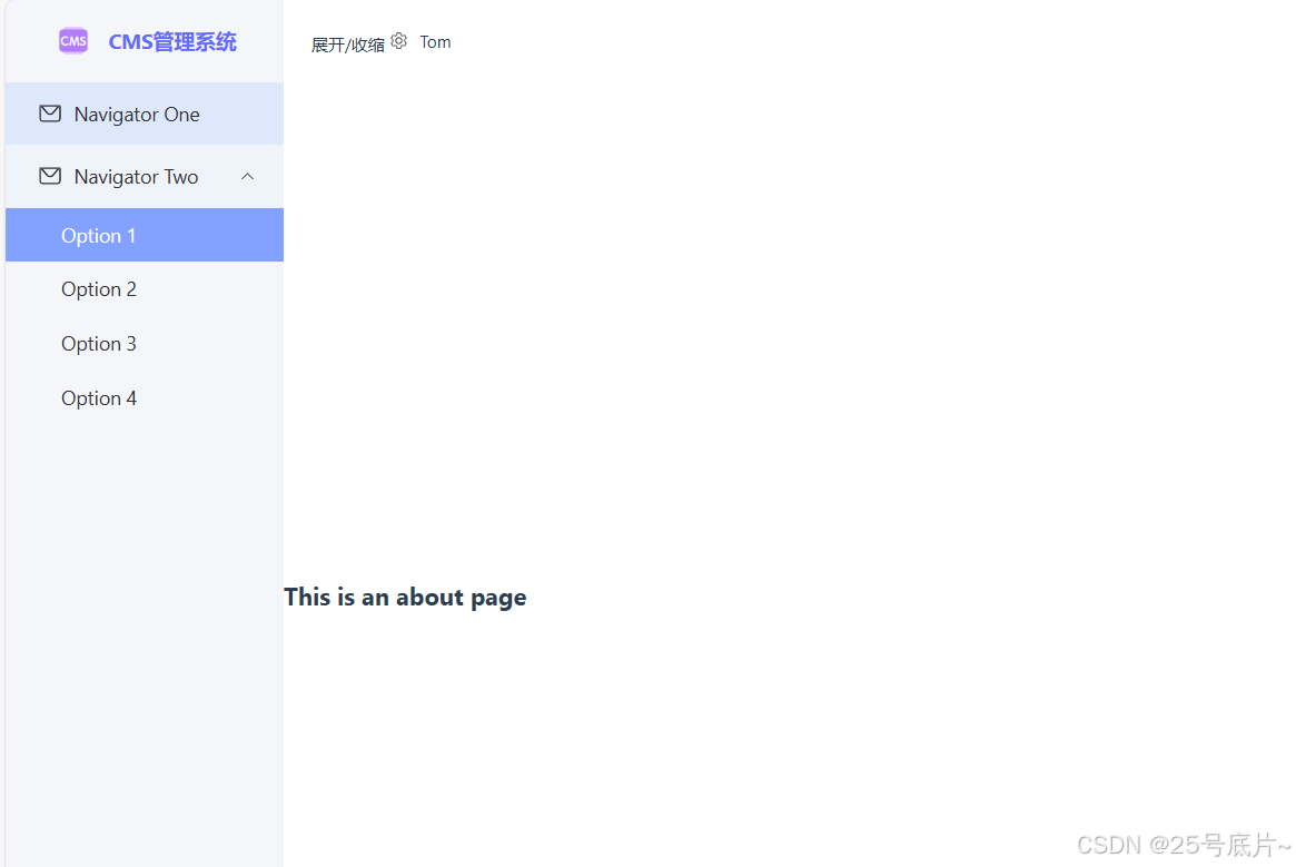
效果
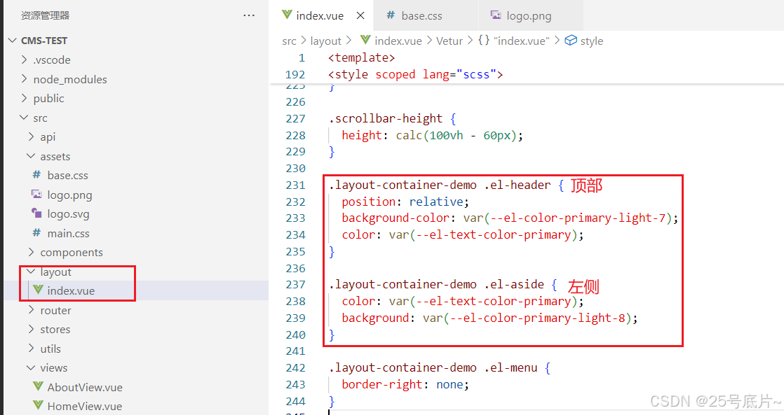
三、完整代码
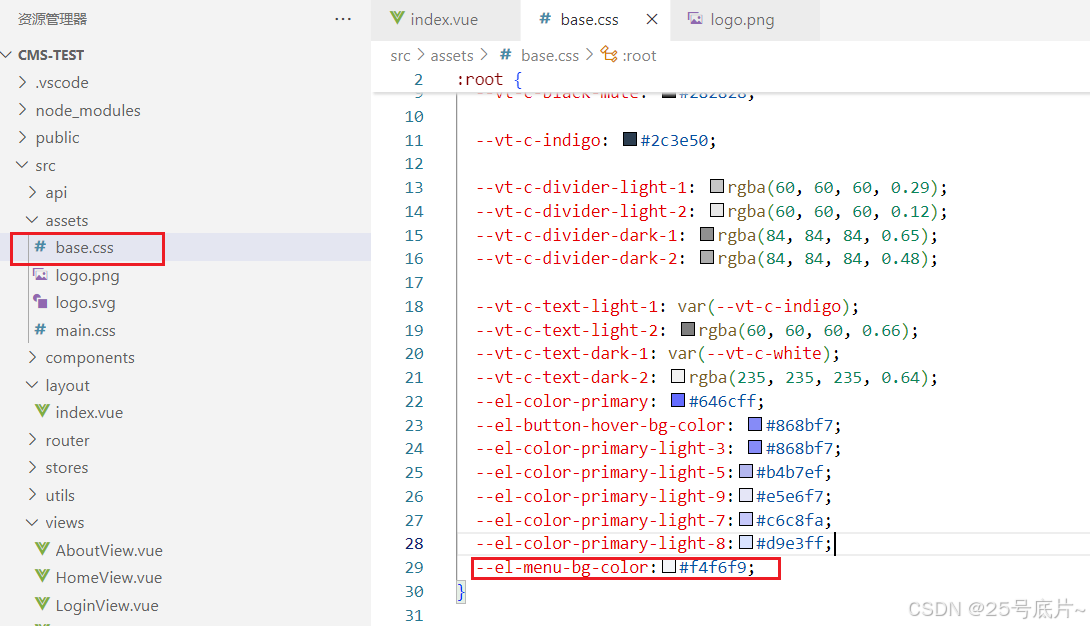
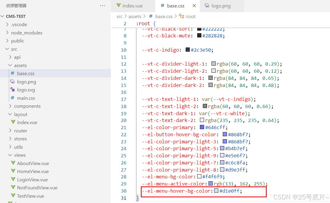
1、base.css
/* color palette from <https://github.com/vuejs/theme> */
:root {
  --vt-c-white: #ffffff;
  --vt-c-white-soft: #f8f8f8;
  --vt-c-white-mute: #f2f2f2;
  --vt-c-black: #181818;
  --vt-c-black-soft: #222222;
  --vt-c-black-mute: #282828;
  --vt-c-indigo: #2c3e50;
  --vt-c-divider-light-1: rgba(60, 60, 60, 0.29);
  --vt-c-divider-light-2: rgba(60, 60, 60, 0.12);
  --vt-c-divider-dark-1: rgba(84, 84, 84, 0.65);
  --vt-c-divider-dark-2: rgba(84, 84, 84, 0.48);
  --vt-c-text-light-1: var(--vt-c-indigo);
  --vt-c-text-light-2: rgba(60, 60, 60, 0.66);
  --vt-c-text-dark-1: var(--vt-c-white);
  --vt-c-text-dark-2: rgba(235, 235, 235, 0.64);
  --el-color-primary: #646cff;
  --el-button-hover-bg-color: #868bf7;
  --el-color-primary-light-3: #868bf7;
  --el-color-primary-light-5:#b4b7ef;
  --el-color-primary-light-9:#e5e6f7;
  --el-color-primary-light-7:#c6c8fa;
  --el-color-primary-light-8:#d9e3ff;
  --el-menu-bg-color:#f4f6f9;
  --el-menu-active-color:rgb(131, 162, 255);
  --el-menu-hover-bg-color:#d1e0ff;
  --el-menu-item-height:45px;
}

/* semantic color variables for this project */
:root {
  --color-background: var(--vt-c-white);
  --color-background-soft: var(--vt-c-white-soft);
  --color-background-mute: var(--vt-c-white-mute);

  --color-border: var(--vt-c-divider-light-2);
  --color-border-hover: var(--vt-c-divider-light-1);

  --color-heading: var(--vt-c-text-light-1);
  --color-text: var(--vt-c-text-light-1);

  --section-gap: 160px;
}

/*
@media (prefers-color-scheme: dark) {
  :root {
    --color-background: var(--vt-c-black);
    --color-background-soft: var(--vt-c-black-soft);
    --color-background-mute: var(--vt-c-black-mute);

    --color-border: var(--vt-c-divider-dark-2);
    --color-border-hover: var(--vt-c-divider-dark-1);

    --color-heading: var(--vt-c-text-dark-1);
    --color-text: var(--vt-c-text-dark-2);
  }
} */

/* *,
*::before,
*::after {
  box-sizing: border-box;
  margin: 0;
  font-weight: normal;
} */

body {
  min-height: 100vh;
  color: var(--color-text);
  background: var(--color-background);
  transition:
    color 0.5s,
    background-color 0.5s;
  line-height: 1.6;
  font-family:
    Inter,
    -apple-system,
    BlinkMacSystemFont,
    'Segoe UI',
    Roboto,
    Oxygen,
    Ubuntu,
    Cantarell,
    'Fira Sans',
    'Droid Sans',
    'Helvetica Neue',
    sans-serif;
  font-size: 15px;
  text-rendering: optimizeLegibility;
  -webkit-font-smoothing: antialiased;
  -moz-osx-font-smoothing: grayscale;
  margin: 0;
}
2、src/layout/index.vue
<template>
  <el-container class="layout-container-demo" style="height: 100vh">
    <el-aside :class="{ 'is-short': iscollapse }" class="sidebar">
      <div class="logo flex flex-center">
        <img src="@/assets/logo.png" alt="">
        <transition name="el-zoom-in-top">
          <span v-if="!iscollapse" class="logo_title">CMS管理系统</span>
        </transition>
      </div>
      <el-scrollbar class="scrollbar-height">
        <!-- default-openeds:默认展开菜单 -->
        <!-- default-active:默认选中菜单 -->
        <!-- collapse:是否折叠菜单 -->
        <el-menu :default-active="activeMenu" :router="true" :collapse='iscollapse'>
          <!-- 遍历一级菜单 -->
          <template v-for="(item, index) in menu" :key="index">
            <!-- 如果一级菜单有子菜单,渲染 el-sub-menu -->
            <el-sub-menu v-if="item.children && item.children.length > 0" :index="`${index + 1}`">
              <template #title>
                <el-icon v-if="item.icon">
                  <component :is="item.icon" />
                </el-icon>
                <span>{{ item.name }}</span>
              </template>
              <!-- 遍历二级菜单 -->
              <el-menu-item v-for="(secondmenu, secondindex) in item.children" :key="secondindex"
                :index="secondmenu.path">
                <span>{{ secondmenu.name }}</span>
              </el-menu-item>
            </el-sub-menu>
            <!-- 如果一级菜单没有子菜单,渲染 el-menu-item -->
            <el-menu-item v-else :index="item.path">
              <el-icon v-if="item.icon">
                <component :is="item.icon" />
              </el-icon>
              <span>{{ item.name }}</span>
            </el-menu-item>
          </template>
        </el-menu>
      </el-scrollbar>
    </el-aside>

    <el-container>
      <el-header style="font-size: 12px">
        <span @click="toggleSideBar">
          展开/收缩
        </span>
        <div class="toolbar">
          <el-dropdown>
            <el-icon style="margin-right: 8px; margin-top: 1px">
              <setting />
            </el-icon>
            <template #dropdown>
              <el-dropdown-menu>
                <el-dropdown-item>View</el-dropdown-item>
                <el-dropdown-item>Add</el-dropdown-item>
                <el-dropdown-item>Delete</el-dropdown-item>
              </el-dropdown-menu>
            </template>
          </el-dropdown>
          <span>Tom</span>
        </div>
      </el-header>
      <!-- 右侧内容 -->
      <el-main>
        <el-scrollbar>
          <RouterView />
        </el-scrollbar>
      </el-main>
      <!-- 底部信息 -->
      <el-footer class="flex flex-center">
        <span>@2025-2030 wen</span>
      </el-footer>
    </el-container>
  </el-container>
</template>

<script setup>
import { ref, reactive } from 'vue'
import { useRoute } from 'vue-router'

//获取当前页面路径
const route = useRoute();
const currentPath = route.path;
const activeMenu = ref(currentPath);

//左侧菜单展开与收缩
const iscollapse = ref(true);//默认不收缩
//点击按钮实现收缩还是展开
const toggleSideBar = () => {
  iscollapse.value = !iscollapse.value;
}
// 菜单
const menu = reactive([
  {
    name: 'Navigator One',
    icon: "message",
    path: '/home',
  },
  {
    name: 'Navigator Two',
    icon: "message",
    children: [
      {
        name: 'Option 1',
        path: '/about',
      },
      {
        name: 'Option 2',
      },
      {
        name: 'Option 3',
      },
      {
        name: 'Option 4',
      },
    ]
  },
]);

</script>

<style scoped lang="scss">
/* logo */
.logo {
  height: 60px;
  font-weight: bold;
  color: var(--el-color-primary);
  white-space: nowrap;

  img {
    width: 30px;
    height: 30px;
  }

  .logo_title {
    margin-left: 10px;
  }
}

/* 左侧菜单宽度设置 */
.sidebar {
  width: 200px;
  transition: width .5s;
  overflow: hidden;
  background-color: #f4f6f9;

  .el-menu-item {
    &.is-active {
      background-color: var(--el-menu-active-color);
      color: var(--vt-c-white);
    }
  }

}

.is-short {
  width: 60px;

  span {
    margin-right: 0px;
    opacity: 0;
    transition: all .5s;
  }
}

.scrollbar-height {
  height: calc(100vh - 60px);
}

.layout-container-demo .el-menu {
  border-right: none;
}

.layout-container-demo .el-main {
  padding: 0;
}

.layout-container-demo .toolbar {
  display: inline-flex;
  align-items: center;
  justify-content: center;
  height: 100%;
  right: 20px;
}
</style>