日常学习开发记录-slider组件
- 从零开始实现一个优雅的Slider滑块组件
- 前言
- 一、基础实现
- 1. 组件结构设计
- 2. 基础样式实现
- 3. 基础交互实现
- 二、功能增强
- 1. 添加拖动功能
- 2. 支持范围选择
- 3. 添加垂直模式
- 三、高级特性
- 1. 键盘操作支持
- 2. 禁用状态
- 五、使用示例
- 六、总结
从零开始实现一个优雅的Slider滑块组件
前言
在Web开发中,滑块组件是一个常见的UI控件,用于数值范围的选择。本文将带领大家从零开始实现一个类似Element UI的Slider组件,我们将采用渐进式开发的方式,从基础功能开始,逐步添加更多特性。
一、基础实现
1. 组件结构设计
首先,我们需要设计一个基础的滑块组件结构:
<template>
  <div class="my-slider">
    <div class="my-slider__runway">
      <div class="my-slider__bar"></div>
      <div class="my-slider__button-wrapper">
        <div class="my-slider__button"></div>
      </div>
    </div>
  </div>
</template>
这个结构包含:
my-slider: 组件容器my-slider__runway: 滑块轨道my-slider__bar: 已选择区域的进度条my-slider__button-wrapper: 滑块按钮容器my-slider__button: 可拖动的滑块按钮
2. 基础样式实现
<style lang="scss" scoped>
  .my-slider {
    width: 100%;
    height: 10px;
    cursor: pointer;
    &__runway {
      width: 100%;
      height: 100%;
      border-radius: 5px;
      background-color: #f0f0f0;
      position: relative;
      .my-slider__bar {
        position: absolute;
        top: 0;
        left: 0;
        height: 100%;
        border-radius: 5px;
      }
      .my-slider__button-wrapper {
        height: 36px;
        width: 36px;
        position: absolute;
        top: -13px;
        transform: translateX(-50%);
        display: flex;
        align-items: center;
        justify-content: center;
        .my-slider__button {
          height: 16px;
          width: 16px;
          border-radius: 50%;
          border: 2px solid #007bff;
          background-color: #fff;
          transition: transform 0.2s;
        }
        &:hover {
          cursor: grab;
          .my-slider__button {
            transform: scale(1.2);
          }
        }
      }
    }
  }
</style>
结果:

3. 基础交互实现
<template>
<div class="my-slider" :class="{ disabled: disabled }">
<div class="my-slider__runway" @click="handleSliderClick" ref="slider">
<div class="my-slider__bar" :style="barStyle"></div>
<div class="my-slider__button-wrapper" :class="{ disabled: disabled }" :style="wrapperStyle">
<div class="my-slider__button"></div>
</div>
</div>
</div>
</template>
<script>
export default {
name: 'MySlider',
props: {
min: {
type: Number,
default: 0,
},
max: {
type: Number,
default: 100,
},
value: {
type: [Array, Number],
default: 0,
},
disabled: {
type: Boolean,
default: false,
},
step: {
type: Number,
default: 1,
},
},
data() {
return {
currentValue: this.value,
sliderSize: 1, // 滑块大小
}
},
computed: {
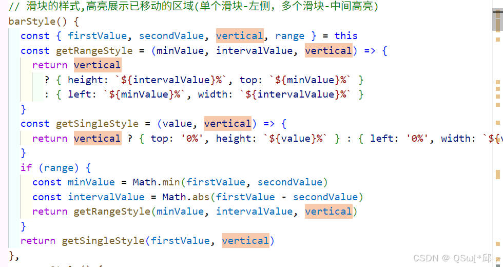
// 滑块的样式,高亮展示已移动的区域(单个滑块-左侧,多个滑块-中间高亮)
barStyle() {
return {
width: `${this.currentValue}%`,
left: `0%`,
}
},
wrapperStyle() {
return {
left: `${this.currentValue}%`,
}
},
precision() {
//确定 min、max 和 step 中最大的小数位数
let precisions = [this.min, this.max, this.step].map(item => {
let decimal = ('' + item).split('.')[1]
return decimal ? decimal.length : 0
})
return Math.max.apply(null, precisions)
},
},
mounted() {
this.resetSliderSize()
},
methods: {
handleSliderClick(event) {
if (this.disabled) return
const sliderOffsetLeft = this.$refs.slider.getBoundingClientRect().left
this.setPosition(((event.clientX - sliderOffsetLeft) / this.sliderSize) * 100)
},
setPosition(percentage) {
//percentage为百分比位置
this.currentValue = this.min + ((this.max - this.min) * percentage) / 100
//每步的步长 max 50 min 0 ,每步步长 100 / 50 = 2
const lengthPerStep = 100 / ((this.max - this.min) / this.step)
//根据当前滑块的百分比位置(percentage)和每一步的长度(lengthPerStep),计算出当前所在的步数(steps) 四舍五入
const steps = Math.round(percentage / lengthPerStep)
//当前显示值 步长 * 步数* 每步的步长+最小值
let value = steps * lengthPerStep * (this.max - this.min) * 0.01 + this.min
value = parseFloat(value.toFixed(this.precision))
this.currentValue = value
//this.$emit('update:value', this.currentValue)
//v-model 默认监听的是 input 事件,而不是 update:value 事件
this.$emit('input', this.currentValue)
},
resetSliderSize() {
this.sliderSize = this.$refs.slider.offsetWidth
},
},
}
</script>
结果:

实现思路:
1. 模板结构
外层容器:<div class="my-slider">,用于包裹整个滑块组件,支持根据 disabled 属性动态添加禁用样式。
滑道:<div class="my-slider__runway">,表示滑块的背景轨道,点击滑道可以快速定位滑块位置。
滑块高亮区域:<div class="my-slider__bar">,表示滑块已移动的区域,宽度根据 currentValue 动态计算。
滑块按钮:<div class="my-slider__button-wrapper">,包含一个圆形按钮,用于拖动滑块,支持禁用状态样式。
2. Props 属性
min:滑块的最小值,默认 0。
max:滑块的最大值,默认 100。
value:滑块的当前值,支持数字或数组类型,默认 0。
disabled:是否禁用滑块,默认 false。
step:滑块的步长,默认 1。
3. 数据与计算属性
currentValue:滑块的当前值,初始值为 props.value。
sliderSize:滑道的宽度,用于计算滑块的百分比位置。
barStyle:计算滑块的样式,动态设置高亮区域的宽度和位置。
wrapperStyle:计算滑块按钮的样式,动态设置按钮的左侧位置。
precision:计算 min、max 和 step 中最大的小数位数,用于确保数值精度。
4. 方法
handleSliderClick(event):处理滑道点击事件,计算点击位置的百分比并设置滑块位置。
setPosition(percentage):根据百分比位置计算滑块的当前值,并触发 input 事件更新父组件的 v-model 绑定值。
resetSliderSize():在组件挂载时重置滑道的宽度。
5. 样式
滑道:灰色背景,圆角矩形。
高亮区域:蓝色背景,表示滑块已移动的区域。
滑块按钮:圆形按钮,支持悬停放大效果,禁用状态下变为灰色。
禁用状态:滑道和高亮区域变为灰色,按钮不可拖动。
6. 交互逻辑
点击滑道:快速定位滑块到点击位置。
拖动滑块:通过 setPosition 方法动态更新滑块位置,并触发 input 事件。
步长控制:根据 step 属性调整滑块的移动步长,确保滑块位置符合步长要求。
禁用状态:当 disabled 为 true 时,禁止所有交互操作。
7. 事件
input 事件:当滑块值发生变化时触发,用于实现 v-model 双向绑定。
主要是在于动态style的计算达到视觉上的效果。
二、功能增强
1. 添加拖动功能
<template>
  <div class="my-slider" :class="{ disabled: disabled }">
    <div class="my-slider__runway" @click="handleSliderClick" ref="slider">
      <div class="my-slider__bar" :style="barStyle"></div>
      <div
        class="my-slider__button-wrapper"
        :class="{ disabled: disabled, dragging: dragging }"
        :style="wrapperStyle"
        @mousedown="onButtonDown"
        @touchstart="onButtonDown"
        ref="button"
      >
        <div class="my-slider__button"></div>
      </div>
    </div>
  </div>
</template>

<script>
  export default {
    name: 'MySlider',
    ///
    data() {
      return {
        currentValue: this.value, // 当前值
        sliderSize: 1, // 滑块大小
        dragging: false, // 是否正在拖拽
        startX: 0, // 开始拖拽时的 x 坐标
        currentX: 0, // 当前拖拽时的 x 坐标
        startPosition: 0, // 开始拖拽时的位置
        newPosition: null, // 新位置
        oldValue: this.value, // 旧值
      }
    },
    computed: {
      // 滑块的样式,高亮展示已移动的区域(单个滑块-左侧,多个滑块-中间高亮)
      barStyle() {
        return {
          width: `${this.currentValue}%`,
          left: `0%`,
        }
      },
      wrapperStyle() {
        return {
          left: `${this.currentValue}%`,
        }
      },
      precision() {
        //确定 min、max 和 step 中最大的小数位数
        let precisions = [this.min, this.max, this.step].map(item => {
          let decimal = ('' + item).split('.')[1]
          return decimal ? decimal.length : 0
        })
        return Math.max.apply(null, precisions)
      },
    },
    watch: {
      value(val) {
        this.currentValue = val
      },
    },
    mounted() {
      this.resetSliderSize()
    },
    methods: {
      /**
       * 点击滑块
       * @param {Event} event - 事件对象
       */
      handleSliderClick(event) {
        if (this.disabled) return
        // 防止点击滑块按钮时触发
        if (this.$refs.button && this.$refs.button.contains(event.target)) {
          return
        }
        const sliderOffsetLeft = this.$refs.slider.getBoundingClientRect().left
        this.setPosition(((event.clientX - sliderOffsetLeft) / this.sliderSize) * 100)
        this.emitChange()
      },
      onButtonDown(event) {
        if (this.disabled) return
        event.preventDefault() // 阻止默认行为
        this.dragging = true // 标记开始拖动

        // 处理触屏事件
        if (event.type === 'touchstart') {
          event.clientX = event.touches[0].clientX
        }

        // 记录初始位置
        this.startX = event.clientX
        this.startPosition = parseFloat(this.currentValue)
        this.newPosition = this.startPosition

        // 添加全局事件监听
        window.addEventListener('mousemove', this.onDragging)
        window.addEventListener('touchmove', this.onDragging)
        window.addEventListener('mouseup', this.onDragEnd)
        window.addEventListener('touchend', this.onDragEnd)
        window.addEventListener('contextmenu', this.onDragEnd)

        this.resetSliderSize() // 重新计算滑块尺寸
      },
      /**
       * 拖拽中
       */
      onDragging(event) {
        if (this.dragging) {
          // 获取当前鼠标位置
          let clientX
          if (event.type === 'touchmove') {
            clientX = event.touches[0].clientX
          } else {
            clientX = event.clientX
          }

          // 计算移动距离并转换为百分比
          const diff = ((clientX - this.startX) / this.sliderSize) * 100
          // 计算新位置
          this.newPosition = this.startPosition + diff
          // 更新滑块位置
          this.setPosition(this.newPosition)
        }
      },
      /**
       * 拖拽结束
       */
      onDragEnd() {
        if (this.dragging) {
          // 使用setTimeout确保在mouseup事件之后执行
          setTimeout(() => {
            this.dragging = false
            this.setPosition(this.newPosition)
            this.emitChange() // 触发change事件
          }, 0)

          // 移除所有事件监听
          window.removeEventListener('mousemove', this.onDragging)
          window.removeEventListener('touchmove', this.onDragging)
          window.removeEventListener('mouseup', this.onDragEnd)
          window.removeEventListener('touchend', this.onDragEnd)
          window.removeEventListener('contextmenu', this.onDragEnd)
        }
      },
      /**
       * 设置滑块位置
       * @param {number} position - 滑块位置 0-100
       */
      setPosition(position) {
        if (position === null || isNaN(position)) return
        if (position < 0) {
          position = 0
        } else if (position > 100) {
          position = 100
        }

        //每步的步长 max 50 min 0 ,每步步长 100 / 50 = 2
        const lengthPerStep = 100 / ((this.max - this.min) / this.step)
        //根据当前滑块的百分比位置(percentage)和每一步的长度(lengthPerStep),计算出当前所在的步数(steps) 四舍五入
        const steps = Math.round(position / lengthPerStep)
        //当前显示值 步长 * 步数* 每步的步长+最小值
        let value = steps * lengthPerStep * (this.max - this.min) * 0.01 + this.min

        value = parseFloat(value.toFixed(this.precision))
        this.currentValue = value

        // 更新 v-model 绑定值,但不触发 change 事件
        this.$emit('input', this.currentValue)
      },
      emitChange() {
        // 拖动结束时触发 change 事件
        this.$emit('change', this.currentValue)
      },
      resetSliderSize() {
        this.sliderSize = this.$refs.slider.offsetWidth
      },
    },
  }
</script>
效果:

实现思路:
使用 mousedown/touchstart 开始拖动
使用 mousemove/touchmove 处理拖动过程
使用 mouseup/touchend 结束拖动
2. 支持范围选择
添加range方法,重点是拖动至重合时候的处理,要记住当前拖动的是哪一个滑块
   // 判断当前点击的是哪个滑块
        const target = event.target.closest('.my-slider__button-wrapper')
        if (target === this.$refs.button) {
          this.startPosition = this.firstValue
          this.currentSlider = 'first'
        } else if (target === this.$refs.button1) {
          this.startPosition = this.secondValue
          this.currentSlider = 'second'
        }
3. 添加垂直模式
通过prop属性vertical来判断是否开启垂直模式
三、高级特性
1. 键盘操作支持
@keydown.left,@keydown.right, @keydown.up,@keydown.down,根据键盘方向事件,更新调用setposition方法直接更新滑块位置
2. 禁用状态
.my-slider {
  &.is-disabled {
    cursor: not-allowed;
    opacity: 0.6;

    .my-slider__button-wrapper {
      cursor: not-allowed;
    }
  }
}
五、使用示例
最后实现的效果:

六、总结
通过这个渐进式的实现过程,我们完成了一个功能完整的Slider组件。主要特点包括:
-
基础功能:
- 单滑块/双滑块支持
- 自定义数值范围
- 平滑的拖动效果
-
增强功能:
- 刻度标记
- 禁用状态
-
高级特性:
- 键盘操作支持
- 垂直模式
- 自定义格式化
-
性能优化:
- 防抖处理
- 计算属性缓存
这个实现不仅满足了基本需求,还考虑到了用户体验、可访问性和性能优化等多个方面。通过这样的渐进式开发,我们可以确保每一步都有坚实的基础,同时逐步增加功能复杂度。