一、鸿蒙开发环境搭建
DevEco Studio安装
- 下载
- 访问官网:https://developer.huawei.com/consumer/cn/deveco-studio/
- 选择操作系统版本后并注册登录华为账号既可下载安装包
- 安装
- 建议:软件和依赖安装目录不要使用中文字符
- 软件安装包下载完成后,解压文件,双击软件安装包可执行程序,选择安装位置,下一步直到安装结束。
- 软件安装完成后,双击软件进入显示页面。
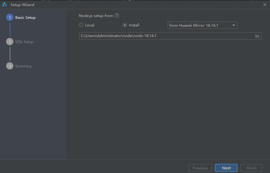
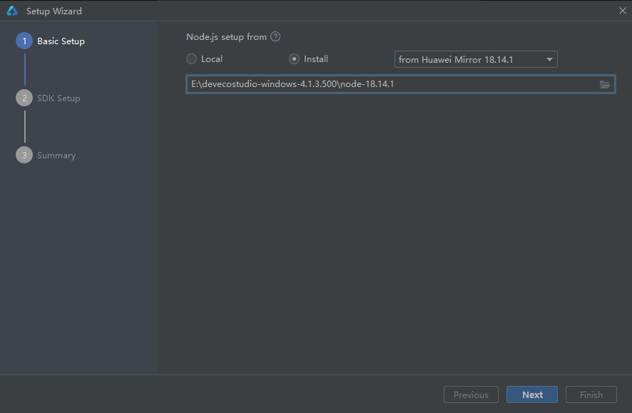
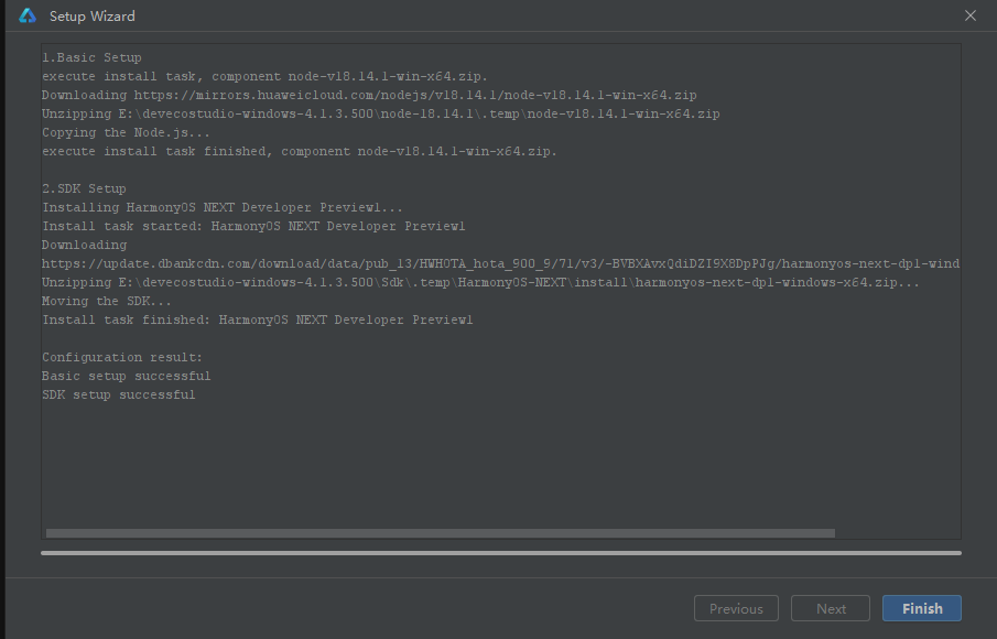
- 依赖安装
- node安装的两种模式:
- 使用本地安装的nod环境的
- 或者通过DevEco Studio进行安装(建议选择)
- 点击Next
- node安装的两种模式:
- SDK安装
- 选择安装位置
- 点击Next
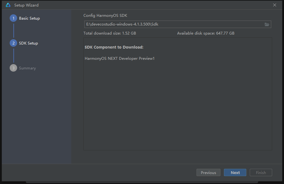
- 点击同意,再点击Next,开始进行依赖下载。
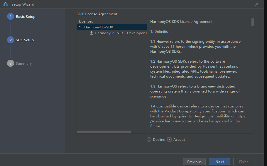
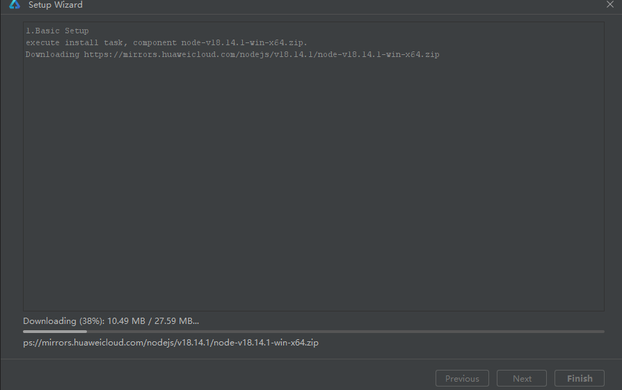
- 点击Finish,依赖下载完成
二、新建项目
- 第一次打开软件页面
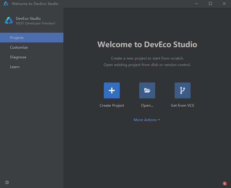
- 点击create Project
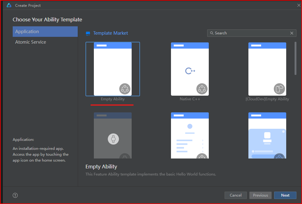
- 选择空模板,点击下一步
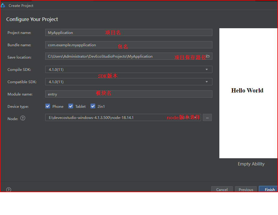
- 填写项目信息并点击完成按钮,项目建立完成
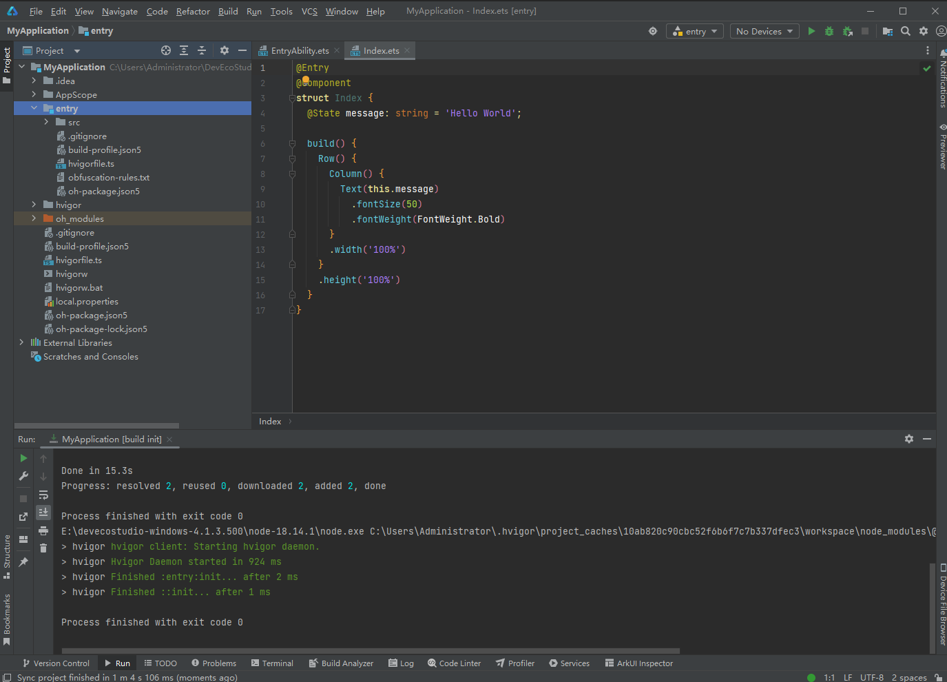
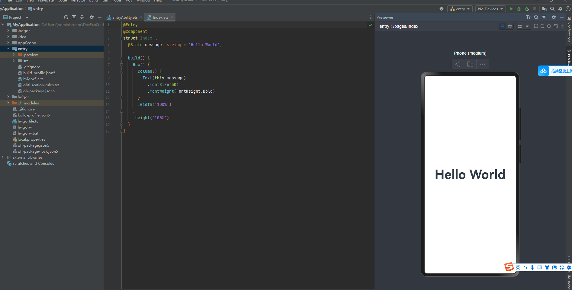
- 点击右侧边栏previewer可以预览代码效果
三、ARkTS语言
简介
ArkTS是HarmonyOS应用开发语言。它在保持TypeScript(简称TS)基本语法风格的基础上,对TS的动态类型特性施加更严格的约束,引入静态类型。同时,提供了声明式UI、状态管理等相应的能力,让开发者可以以更简洁、更自然的方式开发高性能应用
日志打印
console.log("今天也是加油的一天。")

基础数据类型、变量、常量
- 基础数据类型
// 三种常见的基础数据类型
// string 字符串
// number 数字
// boolean 布尔(真、假)

console.log(typeof "varin")
console.log(typeof 1)
console.log(typeof true)
console.log(typeof false)

- 变量
//用来存储数据的容器
// 命名规则:只能包含数字、字符、下划线、$,不能以数字开头;不使用关键字和保留字;区分大小写
// 语法: let 变量名: 类型 = 值

let name : string = "varin"
console.log(name)
// 修改值
name = 'a'
console.log(name)

- 常量
// 存储不可变的数据,强行修改会爆错
// 语法:const 变量名 :数据类型 = 值

const PI :number = 3.14
console.log("π:", PI)

有序数组
// 语法: let 数组名:数据类型[] = [值1,值2]
let names:string[] = ["小明","小红","小美"]
//  打印数据中的所有值
console.log(names.toString())
// 修改names数组中下标为0的值
names[0]="小小明"
// 打印nams数组中下标为0的值
console.log(names[0])

函数
简介:函数是特殊功能的可以重复使用的代码块
/*
定义函数
语法:
function 函数名(形参......){
}
调用函数语法:
函数名(实参)
*/
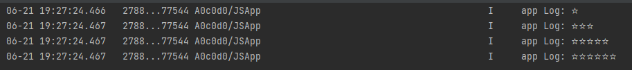
// 场景:传参打印不同数量的☆
function printStars(num:number){
if(num<=0){
return"数量错误"
}
let result:string = ""
for (let i = 0; i < num; i++) {
result+="☆"
}
return result;
}
// 调用函数方式1
console.log(printStars(1))
console.log(printStars(3))
console.log(printStars(5))
// 调用函数方式2
let starss:string = printStars(6)
console.log(starss)
箭头函数
简介:比普通的函数写法更加的简洁
/*
语法1:
()=>{

}
语法2:
#定义
let 函数名=(形参)=>{
 return 结果
}
#调用:函数名(实参)

*/
let printStars = (num:number)=>{
  let result :string = ""
  for (let i = 0; i < num; i++) {
    result+="☆";
  }
  return result;
}
console.log(printStars(1))
console.log(printStars(3))
console.log(printStars(5))
let starss:string = printStars(6)
console.log(starss)

对象
简介:对象是用于描述物体的行为和特征,可以存储多种数据的容器。
/*
定义:
1 通过interface接口约定,对象的结构类型:
语法:
interface 接口名{
  属性1:类型
  属性2:类型
}

2 调用对象语法:
let 对象名:接口名={
  属性1:值
  属性1:值
}
*/
//
interface Person{
  name:string
  age:number
  weight:number
}
let person :Person={
  name:'张三',
  age:11,
  weight:111.1
}
console.log(person.name)
console.log(person.age.toString())
console.log(person.weight.toString())

对象方法
简介:描述对象的行为
/*
1、约定方法类型
语法:
interface 接口名{
  方法名:(形参)=>返回值类型
}
2、添加方法(箭头函数)
语法:
let 对象名:接口名={
  方法名:(形参)={
    方法体
  }
}
*/
interface Person {
  name:string,
  play:(type:string)=>void
}

let person : Person={
  name:'张三',
  play:(type:string)=>{
    console.log(person.name+"喜欢玩"+type+"类型的游戏")
  }
}
console.log(person.name)
person.play("创造")

联合类型
简介:联合类型是一种灵活的数据类型,它修饰的变量可以存储不同类型的数据。
/*
  场景:一个变量既要存字符串也要存数字类型
  语法:let 变量:类型1 | 类型2| 类型3=值
*/
let result : number |string = 100
console.log(typeof result)
result = "A"
console.log(typeof result)

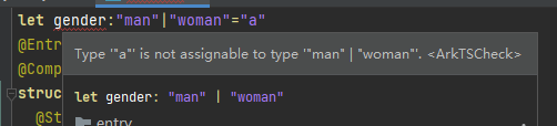
扩展:联合类型也可以限制数据在一个范围内
// 性别限制:值只能是man或woman,填写其他将会报错。
let gender: 'man'| "woman" = "man"
枚举类型
简介:约定变量只能在一组数据范围内选择值
/*
定义语法:
enum 常量名{
常量1=值,
常量2=值,

}
调用语法:
常量名.常量1
*/
enum Colors{
  Red="#f00",
  Green="#0f0",
  Blue="#00f"
}
console.log(Colors.Red)
// 约束类型调用
let green :Colors = Colors.Green
console.log(green)

四、初识鸿蒙应用界面开发
Index.ets文件解读
@Entry
@Component
struct Index {
  @State message: string = 'varin';

  build() { // 构建
    Row() { // 行
      Column() { // 列
        Text(this.message) // 文本
          .fontSize(12) // 字体大小
          .fontWeight(FontWeight.Bold) // 字体粗细
          .fontColor("red") // 字体颜色
      }
      .width('100%') // 列宽
    }
    .height('50px') // 行高
  }
}
界面开发-布局思路
布局思路:先排版,再放内容。
注意点:build只能有一个根元素,并且是容器组件
扩展:
- ArkUI(方舟开发框架)是构建鸿蒙应用的界面框架
- 构建页面的最小单位是:组件
- 组件的分类
- 基础组件:页面呈现的基础元素如:文字、图片、按钮等
- 容器组件:控制布局排布,如:Row行,Column列等。
组件语法:
- 容器组件:Row、Column
  容器组件(){

  }
- 基础组件:文字Text、图片
  基础组件(参数)
  .参数方法(参数)
示例效果实现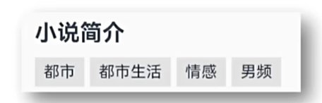
@Entry
@Component
struct Index {
  @State message: string = 'varin';
  build() {
    Column(){
      Text("小说简介")
        .textAlign(TextAlign.Start)
        .width("100%")
        .padding("20")
        .fontWeight(FontWeight.Bold)
      Row(){
        Text("都市")
          .textAlign(TextAlign.Start)
          .width("23%")
          .padding("5")
          .fontWeight(FontWeight.Bold)
          .backgroundColor("#f5f5f5")
          .margin("10px")
        Text("生活")
          .textAlign(TextAlign.Start)
          .width("23%")
          .padding("5")
          .fontWeight(FontWeight.Bold)
          .backgroundColor("#f5f5f5")
          .margin("10px")
        Text("情感")
          .textAlign(TextAlign.Start)
          .width("23%")
          .padding("5")
          .fontWeight(FontWeight.Bold)
          .backgroundColor("#f5f5f5")
          .margin("10px")
        Text("男频")
          .textAlign(TextAlign.Start)
          .width("23%")
          .padding("5")
          .fontWeight(FontWeight.Bold)
          .backgroundColor("#f5f5f5")
          .margin("10px")

      }.width("100%")
      .height("100px")

    }

  }
}
组件的属性方法
- 组件方法使用
/*
组件(){

}
.属性方法(参数)
.属性方法(参数)
*/
 Text("男频")
          .textAlign(TextAlign.Start)
          .width("23%")
          .padding("5")
          .fontWeight(FontWeight.Bold)
          .backgroundColor("#f5f5f5")
          .margin("10px")
- 通用属性
width()
height()
backgroundColor()
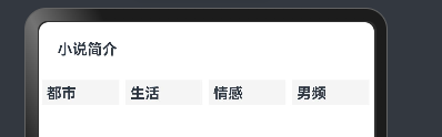
- 实现效果

// 初始结构代码
@Entry
@Component
struct Index {
@State message: string = 'varin';
build() {
Column(){
Text("小说简介")
Row(){
Text("都市")
Text("生活")
Text("情感")
Text("男频")
}
}
}
}
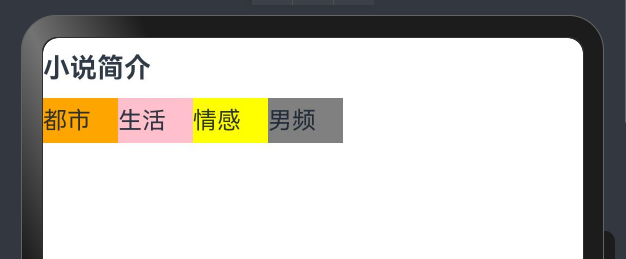
// 实现效果代码
@Entry
@Component
struct Index {
@State message: string = 'varin';
build() {
Column(){
Text("小说简介")
.width("100%")
.fontSize(18)
.height(40)
.fontWeight(FontWeight.Bold) // 100---900
Row(){
Text("都市")
.width(50)
.height(30)
.backgroundColor(Color.Orange)
Text("生活")
.width(50)
.height(30)
.backgroundColor(Color.Pink)
Text("情感")
.width(50)
.height(30)
.backgroundColor(Color.Yellow)
Text("男频")
.width(50)
.height(30)
.backgroundColor(Color.Gray)
}
.width("100%")
}
}
}
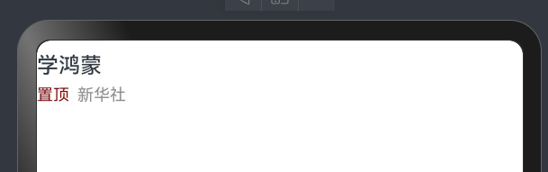
字体颜色
- 简介:给字体设置颜色
- 使用方法
- 使用Color枚举类
- 使用十六进制自己定义颜色
// 使用枚举类
Text("xx").fontColor(Color.Pink)
// 使用十六进制定义
Text("xx").fontColor("#f00")
实现效果
@Entry
@Component
struct Index {
  @State message: string = 'varin';
  build() {
    Column(){
      Text("学鸿蒙")
        .width("100%")
        .height(30)
        .lineHeight(30)
        .fontWeight(500)
      Row()
      {
        Text("置顶")
          .width(30)
          .height(20)
          .fontSize(12)
          .fontColor("#ff910404")
        Text("新华社")
          .width(40)
          .height(20)
          .fontSize(12)
          .fontColor("#ff918f8f")
      }.width("100%")

    }

  }
}
文字溢出省略号、行高
- 语法
/*
  溢出省略号语法,需要配合maxLines(行数)使用
*/
.textOverflow({
  overflow:TextOverflow:xxx
})
// 行高
.lineHeight(高度)
- 实现效果
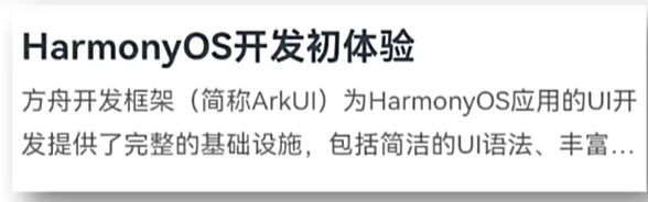
@Entry
@Component
struct Index {
  @State message: string = 'varin';
  build() {
      Column(){
        Text("Harmony OS开发")
          .height(50)
          .lineHeight(50)
          .width("100%")
          .fontSize(34)
          .fontWeight(FontWeight.Bold)
        Row(){
          Text("方舟开发框架(简称ArkUI)为HarmonyOS应用的UI开发提供了完整的基础设施,包括境界的UI语法、丰富的")
            .maxLines(2)
            .textOverflow({
              overflow:TextOverflow.Ellipsis
            })
            .height(60)
            .lineHeight(30)
        }
      }
  }
}
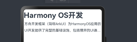
图片组件
- 语法
// 本地图片存放位置:src/main/resources/base/media
// 网络图片:使用url即可
Image(图片数据源)
// 引用图片写法:
Image($r("app.media.文件名"))
- 大致实现效果
@Entry
@Component
struct Index {
@State message: string = 'varin';
build() {
Column(){
Image("https://p4.itc.cn/images01/20231117/8fc1311a803348288b8af7139f47c364.jpeg")
.height(200)
.width("100%")
.borderRadius(10)
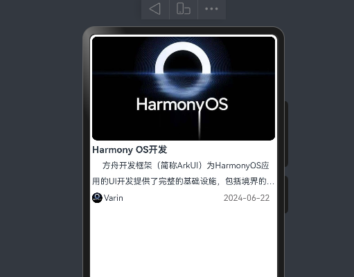
Text("Harmony OS开发")
.width("100%")
.lineHeight(30)
.fontSize(18)
.fontWeight(FontWeight.Bold)
Text("方舟开发框架(简称ArkUI)为HarmonyOS应用的UI开发提供了完整的基础设施,包括境界的UI语法、丰富的")
.maxLines(2)
.textOverflow({
overflow:TextOverflow.Ellipsis
})
.textIndent(20)
.lineHeight(30)
Row(){
Image("https://p4.itc.cn/images01/20231117/8fc1311a803348288b8af7139f47c364.jpeg")
.height(20)
.width(20)
.borderRadius(100)
Text("Varin")
.fontWeight(400)
.width(40)
.textAlign(TextAlign.End)
Text("2024-06-22")
.fontWeight(400)
.width("80%")
.fontColor("#ff797575")
.textAlign(TextAlign.End)
}
.width("100%")
.height(40)
} .margin("1%")
}
}
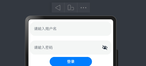
输入框和按钮
- 语法
// 输入框
// 参数对象:placeholder 提示文本
// 属性方法:.type(InputType.xxx) 设置输入框的类型
TextInput(参数对象)
.属性方法()
// 示例:
TextInput({
  placeholder:"占位符"
}).type(InputType.Password)

// 按钮语法
Button("按钮文本")
- 实现效果
@Entry
@Component
struct Index {
  @State message: string = 'varin';
  build() {
    Column() {
      TextInput({
        placeholder:"请输入用户名"
      }).width("96%")
        .height(60)
        .margin(10)
      TextInput({
        placeholder:"请输入密码"
      }).width("96%")
        .height(60)
        .margin(10)
        .type(InputType.Password)
      Button("登录")
        .width("50%")
    }
    .width("100%")
    .height(40)
  }
}
控件之间的间隙
- 语法
// 控制Colunm 和Row内元素的间隙
Column({
  space:10
})
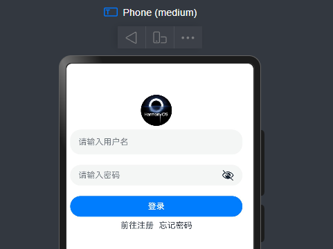
综合-华为登录
实现效果图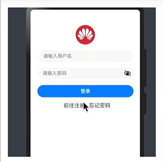
@Entry
@Component
struct Index {
  @State message: string = 'varin';
  build() {
    Column(){
      Row(){}
      .height(60)
        Image($r("app.media.hw"))
          .width(60)
          .height(60)
          .borderRadius(60)
      Column({space:20}){
        TextInput({
          placeholder:"请输入用户名"
        })
          .width("96%")
        TextInput({
          placeholder:"请输入密码"
        }).type(InputType.Password)
          .width("96%")
          Button("登录").width("96%")
      }.margin("2%")
      Row({space:10}){
        Text("前往注册")
        Text("忘记密码")
      }
    }
  }
}
SVG图标
介绍:SVG图标,任意放大缩小不失真,可以改颜色
- 语法
//  语法和Image类似
// .fillColor("#f00") 修改颜色

Image($r("app.media.ic_public_play_next"))
       .fillColor("#f00")
       .width(20)
       .width(20)
布局元素
- 语法
/
*
  内边距:padding()
  外边距:margin()
  边框:border()
  *
/
// 1.padding使用
// 场景一:四边边距都一样
padding(10)
// 场景二:四边边距不一样
padding({
  top:10,
  right:1,
  bottom:11,
  left:23
})

// 2.margin使用
// 场景一:四边边距都一样
margin(10)
// 场景二:四边边距不一样
margin({
  top:10,
  right:1,
  bottom:11,
  left:23
})
// 3.border使用
// 场景一:四边边框都一样
 Text("aaa")
   .border({
     color:"#ff0", // 颜色
     width:1, // 必填
     radius:10, // 圆角
     style:BorderStyle.Solid // 边框类型:Solid(实线)
   })
// 场景二:四边边框不一样(只设置了右边框)
 Text("aaa")
   .border({
     color:"#ff0",
    width:{
      right:1
    },
     radius:10,
     style:BorderStyle.Solid
   })
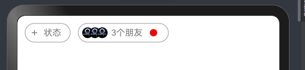
- 实现效果一
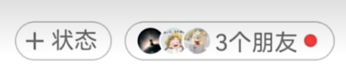
@Entry
@Component
struct Index {
  @State message: string = 'varin';
  build() {
    Row(){
      Row(){
        Image($r("app.media.ic_public_list_add_transparent"))
          .width(15)
          .height(15)
        Text("状态").fontColor("#ff7e7d7d").fontSize(12).margin({
          left:5,
          right:7
        })

      }.border({
        width:1,
        color:"#ffb1aeae",
        style:BorderStyle.Solid,
        radius:30

      }).margin({
        left:10,
        top:10
      }).padding(5)

      Row(){
        Image($r("app.media.hw"))
          .borderRadius(50)
          .width(15)
          .height(15)
        Image($r("app.media.hw"))
          .borderRadius(50)
          .width(15)
          .height(15)
          .margin({
            left:-5
          })

        Image($r("app.media.hw"))
          .borderRadius(50)
          .width(15)
          .height(15)
          .margin({
            left:-5
          })
        Text("3个朋友").fontColor("#ff7e7d7d")
          .fontSize(12)
          .margin({
            left:5
          })
        Row(){

        }.width(10)
        .height(10)
        .borderRadius(50)
        .backgroundColor("red")
        .margin({
          left:10,
          right:10
        })

      }.border({
        width:1,
        color:"#ffb1aeae",
        style:BorderStyle.Solid,
        radius:30

      }).margin({
        left:10,
        top:10
      }).padding(5)
    }
  }
}
- 实现效果二
@Entry
@Component
struct Index {
@State message: string = 'varin';
build() {
Column(){
Image($r("app.media.hw")).borderRadius(50)
.width(100)
.height(100)
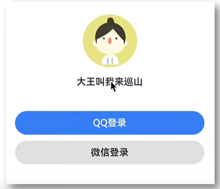
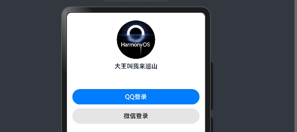
Text("大王叫我来巡山").fontWeight(FontWeight.Bold).margin({
top:10,
bottom:50
})
Button("QQ登录").width("96%").margin({
bottom:10
})
Button("微信登录").width("96%")
.backgroundColor("#ffe5e5e5").fontColor("#000")
}.margin({
top:20,
left:"2%",
right:'2%'
}).width("96%")
组件圆角
- 语法
// borderRadius使用
// 场景一:四边都一样
borderRadius(10)
// 场景二:四边不一样
.borderRadius({
  topLeft:1,
  topRight:2,
  bottomLeft:1,
  bottomRight:2
})
背景属性
- 语法
/*
背景色:backgroundColor
背景图:backgroundImage
背景图位置:backgroundOpsition
背景图尺寸:backgroundSize

*/
- 示例:背景图
/*
ImageRepeat:平铺枚举
*/
@Entry
@Component
struct Index {
@State message: string = 'varin';
build() {
Column(){
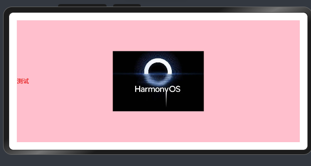
Text("测试").backgroundImage($r("app.media.hw"),ImageRepeat.XY)
.width("100%")
.height("100%")
.fontColor("red")
}.padding(20)
}
}
- 示例:背景图位置
/*
backgroundImagePosition()
两种形式:
一、使用x,y轴
二、使用Alignment枚举类

*/
@Entry
@Component
struct Index {
  @State message: string = 'varin';
  build() {
    Column(){
      Text("测试").backgroundImage($r("app.media.hw"))
        .backgroundColor(Color.Pink)
        .backgroundImagePosition(Alignment.Center)
        .width("100%")
        .height("100%")
        .fontColor("red")
    }.padding(20)
  }
}
- 示例:背景图大小
/*
  两种方式:
  方式一:
  backgroundSize({

  width:10,
  heigth:10

  }}
  方式二:
  使用枚举:ImageSize
*/
背景定位-单位问题
- 扩展:
- 背景使用的单位是px(像素点)
- 宽高默认单位:vp(虚拟像素),可以对不同设备会自动转换,保证不同设备视觉一致。
- vp2px():可将vp进行转换,得到px的数值
线性布局
线性布局(LineLayout)通过线性容器Column和Row创建。
- 语法
// column:垂直
// Row: 水平
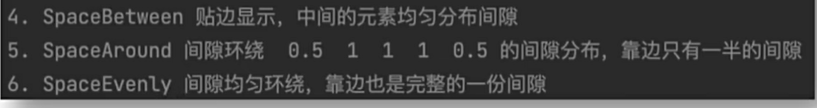
- 排布主方向上的对齐方式
// 属性
.justifyContent(枚举FlexAlign)
// 枚举三个参数:Start(上) Center(中)End(下)
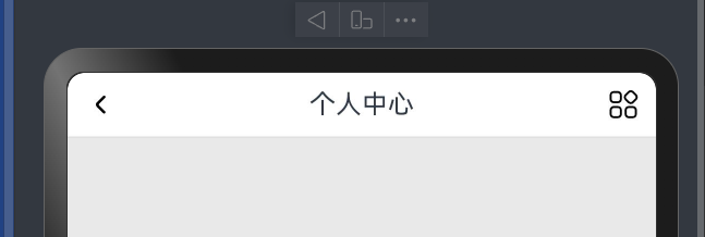
布局案例-个人中心-顶部导航
- 实现效果
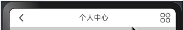
@Entry
@Component
struct Index {
  @State message: string = 'varin';
  build() {
 Column(){
   Row(){
     Image($r("app.media.ic_arrow_left"))
       .width(20)
     Text("个人中心")
     Image($r("app.media.ic_more"))
       .width(20)

   }.height(40)
   .backgroundColor(Color.White)
   .width("100%")
   .padding(10)
   .justifyContent(FlexAlign.SpaceBetween)
   .border({
     width:{
       bottom:1
     },
     style:BorderStyle.Solid,
     color:"#ffe0e0dc"
   })
 }.width("100%")
    .height("100%")
    .backgroundColor("#ffe9e9e9")
  }
}
线性布局-交叉轴对齐方式
// 属性:alignitems()
// 参数:枚举类型
// 交叉轴在水平方向:horizontalalign
// 交叉轴在垂直方向:verticalalign

// Column>>>>h
//Row>>>>V
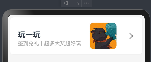
案例-得物列表项展示
实现效果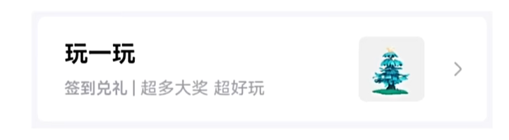
@Entry
@Component
struct Index {
  @State message: string = 'varin';
  build() {
   Column(){
     Row(){
       Column(){
         Text("玩一玩")
           .fontSize(20)
           .lineHeight(40)
           .fontWeight(FontWeight.Bold)
           .textAlign(TextAlign.Start)

         Row(){
           Text("签到兑礼")
             .fontColor("#ffaeacac")
             .fontSize(14)
           Text("|")
             .fontColor("#ffaeacac")
             .fontSize(14)
             .margin({
               left:5,
               right:5
             })
           Text("超多大奖")
             .fontColor("#ffaeacac")
             .fontSize(14)
           Text("超好玩")
             .fontColor("#ffaeacac")
             .fontSize(14)

         }

       }.alignItems(HorizontalAlign.Start)
       .margin({
         left:20
       })
       Image($r("app.media.cat"))
         .width(70)
         .borderRadius(10)
       Image($r("app.media.ic_arrow_right"))
         .fillColor("#ff858383")

         .width(30)
         .margin({
           right:15
         })
     }.justifyContent(FlexAlign.SpaceBetween)
     .width("100%")
     .height(100)
     .backgroundColor(Color.White)
     .border({
       color:"#fff3f2f2",
       width:1,
       radius:10,
       style:BorderStyle.Solid
     })
   }
   .width("100%")
    .height("100%")
    .padding(5)
    .backgroundColor("#f5f5f5")

  }
}
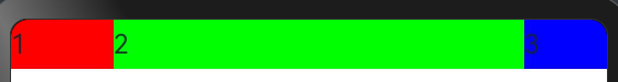
自适应伸缩(权重分配)
- 语法
// 属性
.layoutWeight(权重分配)
- 示例
/*
一行 text3宽为固定值:50,
剩下的宽将分为5分
text1占1份
text2占4份
*/
@Entry
@Component
struct Index {
  @State message: string = 'varin';
  build() {
   Row() {
     Text("1")
       .height(30)
       .layoutWeight(1)
       .backgroundColor("#f00")
     Text("2")
       .height(30)
       .layoutWeight(4)
       .backgroundColor("#0f0")
     Text("3")
       .height(30)
       .width(50)
       .backgroundColor("#00f")
   }.width("100%")
    .height(30)

  }
}
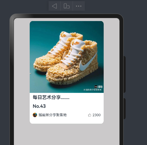
案例-得物卡片
实现效果
import { Filter } from '@ohos.arkui.advanced.Filter';

@Entry
@Component
struct Index {
  @State message: string = 'varin';
  build() {
   Column(){
     Column(){
       Text("每日艺术分享.......")
         .fontWeight(700)
         .height(40)
       Text("No.43")
         .height(20)
         .fontWeight(700)
       Row(){
         Image($r("app.media.cat"))
           .width(15)
           .height(15)
           .borderRadius(15)
         Text("插画师分享聚集地")
           .layoutWeight(1)
           .fontSize(12)
           .padding({
             left:5
           })
         Image($r("app.media.ic_like"))
           .width(10)
           .height(10)
           .fillColor("#ff8f8b8b")
         Text("2300")
           .fontColor("f5f5f5")
           .fontSize(12)
           .padding({
             left:5
           })
       }.height(40)
     }.alignItems(HorizontalAlign.Start)
     .padding(10).justifyContent(FlexAlign.End)
     .borderRadius(10)
     .width("70%")
     .backgroundImage($r("app.media.nick"))
     .backgroundImageSize({
       width:"100%",
       height:'70%'
     })
     .height(350)
     .backgroundColor(Color.White)
     .margin({
       top:10
     })
   }
     .width("100%")
     .height("100%")
    .backgroundColor("#ffcbc9c9")
  }
}
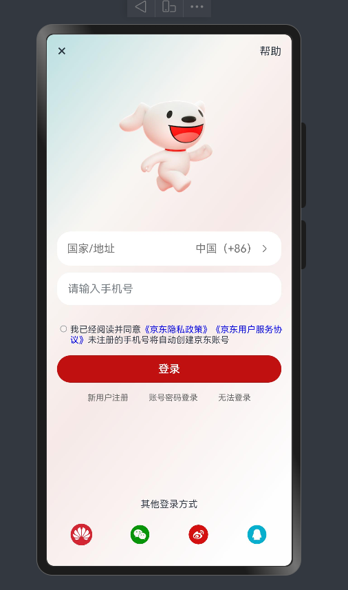
案例-京东登录页
实现效果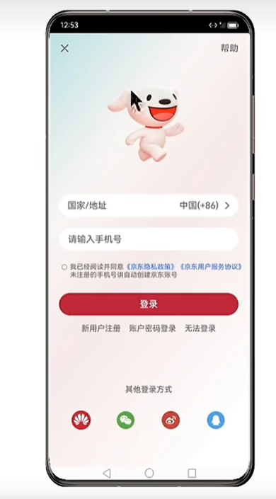
/*
扩展:
checkBox:复选框
span组件,在一段文本中单独修改某些文本,可以使用span包裹
blank组件:弹簧组件,可以自动撑开row或colum的宽或高(填充空白区域)
*/

import { Filter } from '@ohos.arkui.advanced.Filter';
@Entry
@Component
struct Index {
  @State message: string = 'varin';
  build() {
    Column(){
      Row(){
        Text("×")
          .fontSize(25)
        Text("帮助")
      }.width("100%")
      .justifyContent(FlexAlign.SpaceBetween)
      Image($r("app.media.jd_logo"))
        .width(250)
      // TextInput({placeholder:"国家/地址"})
      //   .backgroundColor(Color.White)
      Row(){
        Text("国家/地址").fontColor("#777").layoutWeight(1)
        Text("中国(+86)").fontColor("#777")
        Image($r("app.media.ic_arrow_right")).height(20).fillColor("#777")


      }.width("100%").height(50).borderRadius(20).backgroundColor(Color.White).padding({
        left:15,right:15
      })
      TextInput({placeholder:"请输入手机号"})
        .backgroundColor(Color.White)
        .margin({
          top:10
        })
      Row(){
        // 单选
        // Radio({
        //   value:'1',
        //   group:"1"
        // }).checked(false).backgroundColor(Color.White)
        // 复选
        Checkbox().width(10)
        Text(){
          Span("我已经阅读并同意")
          Span("《京东隐私政策》")
            .fontColor("#00f")
          Span("《京东用户服务协议》")
            .fontColor("#00f")
          Span("未注册的手机号将自动创建京东账号")

        }.fontSize(13).margin({top:3})
        //   Column({space:5}){
        //
        //     Text("我已经阅读并同意《京东隐私政策》 《京东用户服务协议》")
        //       .padding({top:12})
        //       .fontSize(11)
        //
        //
        //     Text("未注册的手机号将自动创建京东账号")
        //       .fontSize(11)
        //
        //   }.layoutWeight(1)
        // .alignItems(HorizontalAlign.Start)

      }.alignItems(VerticalAlign.Top).margin({top:25})
      // .backgroundColor("red")
      Button("登录")
        .width("100%")
        .backgroundColor("#ffc11010")
        .margin({
          top:15
        })
      Row(){
        Text("新用户注册")
          .fontSize(12)
          .fontColor("#666")
        Text("账号密码登录")
          .fontSize(12)
          .fontColor("#666")
        Text("无法登录")
          .fontSize(12)
          .fontColor("#666")
      }.width("100%")
      .padding(15).justifyContent(FlexAlign.SpaceEvenly)
      Blank()
     Column(){

       Text("其他登录方式").fontSize(14).margin({

         bottom:20
       })
       Row(){
         Image($r("app.media.jd_huawei")).width(32).borderRadius(16)
         Image($r("app.media.jd_wechat")).width(32).borderRadius(16).fillColor("#ff089408")
         Image($r("app.media.jd_weibo")).width(32).borderRadius(16).fillColor("#ffd41010")
         Image($r("app.media.jd_QQ")).width(32).borderRadius(16).fillColor("#ff05afcd")

       }.width("100%").justifyContent(FlexAlign.SpaceBetween).padding({
         left:20,right:20
       })
     }.margin({bottom:10})
    }.width("100%").height("100%").backgroundImage($r("app.media.jd_login_bg")).backgroundImageSize(ImageSize.Cover)
    .padding({
      left:15,
      right:15,
      top:10,
      bottom:20
    })

  }
}


![[Centos7] 部署Zabbix5.0](https://img-blog.csdnimg.cn/direct/3f47280a92474c4ba9f2a1bc683d6579.png)