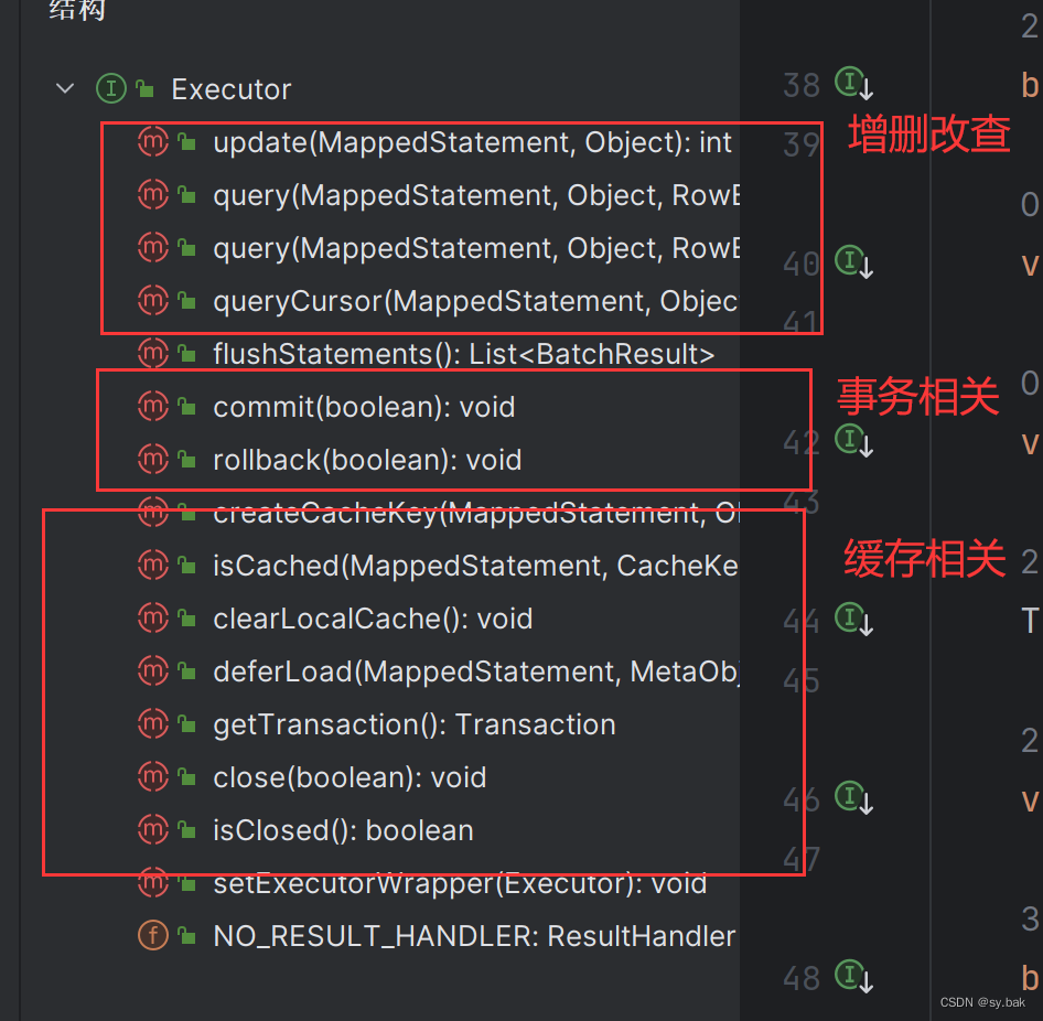
打造你的专属Vue组件:超实用“高级筛选弹窗组件“实战
在现代前端开发中,组件化思想是提高开发效率、维护性和代码复用性的关键。本文将通过一个实例——创建一个自定义的“高级筛选”弹窗组件,来展示如何在Vue框架下利用Composition API和Element Plus构建功能丰富且易于集成的UI组件。下面的代码示例不仅展示了组件的结构、样式定制,还涉及了事件处理和属性传递,是一个全面的组件开发教程。
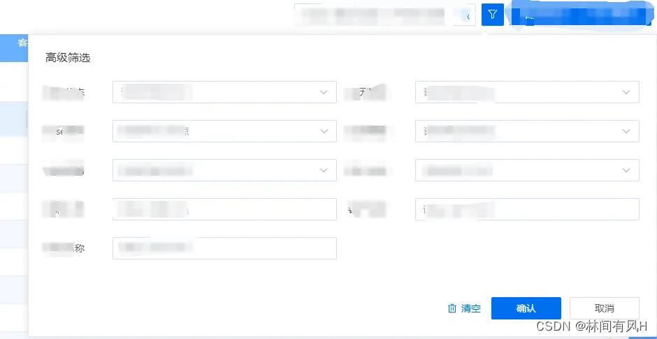
组件效果
组件概览
我们所创建的“高级筛选”组件基于Element Plus的el-popover,旨在为用户提供一个包含筛选条件输入、清除、提交和取消操作的交互界面。组件设计考虑到了外观自定义、事件触发方式的灵活性以及对父组件的通信支持。
组件代码解析
结构与绑定 (<template>)
组件的模板部分定义了弹窗的结构,利用插槽(<slot>)允许外部插入具体的筛选内容。el-popover包裹了整个组件,并通过:title、:trigger、:width等属性接收外部配置,确保组件的灵活性。值得注意的是,通过:teleported="false"保持弹窗在DOM树中的位置不变,这在某些特定布局需求下非常有用。
逻辑处理 (<script setup>)
- 引入依赖: 首先引入了自定义按钮组件
MButton以及图标资源。 - Composition API: 使用
defineOptions定义组件名,ref管理弹窗实例,defineProps和defineEmits分别用来声明组件的属性和事件。 - 事件处理: 定义了
clearClick、submitClick和cancelClick方法,用于响应清除、提交和取消操作,并通过emits触发外部监听的事件。 - 暴露方法: 通过
defineExpose对外暴露close方法,使得外部可以控制弹窗的隐藏。
样式定制 (<style>)
- SCSS: 利用SCSS进行了详细的样式定制,包括按钮的大小调整、图标定位、红色提示点的实现以及弹窗内部元素的布局和间距调整,确保组件的视觉效果与项目整体风格相协调。
实践要点
- 组件通信: 通过props接收外部传入的数据和配置,使用emits触发事件,实现了组件间的解耦与消息传递。
- 样式封装: 利用scoped样式保护组件内部CSS不污染全局,同时通过类名自定义实现了弹窗内容区域的样式扩展。
- 可维护性: 通过Composition API的组合式函数逻辑,使得组件内部状态和行为逻辑清晰,便于维护和测试。
- 灵活性与可扩展性: 通过插槽设计,允许组件在不同场景下承载多样的筛选表单内容,提高了组件的复用性和灵活性。
代码展示
<template>
  <el-popover popper-class="searchadvanced" ref="setRemovePop" :title="title" :trigger="trigger" :teleported="false"
    :width="width" v-bind="$attrs">
    <template #reference>
      <m-button type="primary" class="searchadvanced-icon-btn" :class="{ 'searchadvanced-badge': isDot }"
        :icon="Filter"></m-button>
    </template>
    <slot></slot>
    <div class="searchadvanced-operitoin">
      <m-button class="clearbtn" type="primary" :icon="Delete" link @click="clearClick">清空</m-button>
      <m-button class="opbtn cancelbtn" @click="cancelClick">取消</m-button>
      <m-button class="opbtn submitbtn" type="primary" @click="submitClick">确认</m-button>
    </div>
  </el-popover>
</template>

<script setup lang="ts">
import MButton from '../button'
import { ref } from 'vue'
import { Delete, Filter } from '@element-plus/icons-vue'

defineOptions({
  name: 'MSearchAdvanced'
})

const setRemovePop = ref<any>(null)

const prop = defineProps({
  title: {
    type: String,
    default: '高级筛选',
  },
  trigger: {
    type: String,
    default: 'click',
  },
  width: {
    type: [String, Number],
    default: 900,
  },
  isDot: {
    type: Boolean,
    default: false,
  },
})
const emits = defineEmits(['clear', 'submit', 'cancel'])
const clearClick = () => {
  emits('clear')
}
const submitClick = () => {
  setRemovePop.value.hide()
  emits('submit')
}
const cancelClick = () => {
  setRemovePop.value.hide()
  emits('cancel')
}
const close = () => {
  setRemovePop.value.hide()
}

defineExpose({
  close,
})
</script>

<style lang="scss">
.searchadvanced-icon-btn {
  display: inline-block !important;
  line-height: 32px;
  width: 32px;
  font-size: 16px;
  padding: 0 0 0 6px !important;

  .el-icon {
    font-size: 16px;

  }
}

.searchadvanced-badge {
  position: relative;

  &::after {
    content: '';
    position: absolute;
    width: 10px;
    height: 10px;
    background: red;
    border: 2px solid #fff;
    border-radius: 50%;
    right: -5px;
    top: -5px;
  }
}

.searchadvanced {
  &.el-popper {
    padding: 24px;
    background: #fff;
    border-radius: 2px;
  }

  .el-popover__title {
    margin-bottom: 26px;
  }

  &-operitoin {
    display: flex;
    justify-content: flex-end;
    margin-top: 30px;

    .opbtn {
      width: 100px;
    }
  }
}
</style>