此文章属于前端篇中的第二节CSS样式
继前期HTML标记语言
CSS总结笔记:
3.CSS样式
css,专门用来“美化”标签。
- 基础CSS,写简单页面&看懂&改。
- 模块、调整和修改
3.1CSS应用方法
1.在标签上
- 高度和宽度样式:
<img src="xxx" style="height:100px;" />
- 颜色样式:
<div style="color:red;">中国联通</div>
2.在head标签中写style标签
<!DOCTYPE html>
<html lang="en">
<head>
    <meta charset="UTF-8">
    <title>用户登录</title>
    <style>
        .c1{
            color:red;
        }
    </style>
</head>
<body>
    <h1 class='c1'>用户登录</h1>
    <form method="post" action="/login">
        <div>
            用户名:<input type="text" name="username">
        </div>
        <div>
            密码:<input type="password" name="password">
        </div>
        <input type="submit">
    </form>
</body>
</html>
3.写到文件中
.c1{
    height:100px;
}
.c2{
    color:red;
}
<!DOCTYPE html>
<html lang="en">
<head>
    <meta charset="UTF-8">
    <title>用户登录</title>
    <link rel="stylesheet" href="common.css" />
</head>
<body>

</body>
</html>
案例:Flask中的应用(登录注册)
CSS文件:
.xx{
    color: green;
}
login.html文件(在HTML头内写CSS):
<!DOCTYPE html>
<html lang="en">
<head>
    <meta charset="UTF-8">
    <title>用户登录</title>
    <style>
        .c1{
            color: red;
        }
        .c2{
            height: 50px;
        }
    </style>
</head>
<body>
    <h1 class="c1">用户登录</h1>
    <form method="post" action="/login">
        <div class="c2">
            用户名:<input type="text" name="username">
        </div>
        <div class="c2">
            密码:<input type="password" name="password">
        </div>
        <input type="submit">
    </form>
</body>
</html>
register.html文件(在外部引入CSS文件):
<!DOCTYPE html>
<html lang="en">
<head>
    <meta charset="UTF-8">
    <title>用户注册</title>
    <link rel="stylesheet" href="/static/commons.css">
</head>
<body>
<h1 class="xx">用户注册</h1>
<div>
    用户名:<input type="text">
</div>
<div>
    密码:<input type="password">
</div>

<div>
    性别:<input type="radio">男 <input type="radio">女
</div>

<div>
    爱好:
    <input type="checkbox">篮球
    <input type="checkbox">足球
    <input type="checkbox">乒乓球
</div>

<div>
    擅长的领域:
    <select multiple>
        <option>Python</option>
        <option>C++</option>
        <option>Java</option>
    </select>
</div>

<div>
    备注:<textarea></textarea>
</div>

<div>
    <input type="button" value="button按钮">
    <input type="submit" value="button按钮">
</div>

</body>
</html>
3.2CSS选择器
-
ID选择器(id)
#c2{ color: gold; } <div id="c2">美国</div> -
类选择器(class)
.c1{ color: red; } <div class="c1">中国</div> -
标签选择器
li{ color: pink; } <ul> <li>北京</li> <li>上海</li> <li>深圳</li> </ul> -
属性选择器
input[type='text']{ border: 1px solid red; } .v1[xx="456"]{ color: gold; }<div class="v1" xx="123">a</div> <div class="v1" xx="456">b</div> <div class="v1" xx="999">c</div> -
后代选择器
无穷代:
.yy li{ color: pink; }<div class="yy"> <ul> <li>美国</li> <li>日本</li> <li>韩国</li> </ul> </div>一代:
.yy > a{ color: blue; }<div class="yy"> <a>百度</a> <div> <a>谷歌</a> </div> <ul> <li>美国</li> <li>日本</li> <li>韩国</li> </ul> </div>
关于选择器:
使用频率多:类选择器、标签选择器、后代选择器
使用频率少:属性选择器、ID选择器
关于多个样式覆盖问题:
若样式重复,style最后一个样式为最终样式
<!DOCTYPE html>
<html lang="en">
<head>
    <meta charset="UTF-8">
    <title>Title</title>
    <style>
        .c1{
            color: red;
            border: 1px solid red;
        }
        .c2{
            font-size: 28px;
            color: green;
        }
    </style>
</head>
<body>
    <div class="c1 c2">中国联通</div>
</body>
</html>
若不想覆盖(加入! important):
<!DOCTYPE html>
<html lang="en">
<head>
    <meta charset="UTF-8">
    <title>Title</title>
    <style>
        .c1{
            color: red !important;
            border: 1px solid red;
        }
        .c2{
            font-size: 28px;
            color: green;
        }
    </style>
</head>
<body>
    <div class="c1 c2">中国联通</div>
</body>
</html>
3.4样式
1.高度和宽度
.c1{
    height: 300px;
    width: 500px;
}
注意:宽度,支持百分比。
2.块级和行内标签
- 块级
- 行内
- css样式(既有块级又有行内标签特点):标签 ->
display:inline-block
<!DOCTYPE html>
<html lang="en">
<head>
    <meta charset="UTF-8">
    <title>Title</title>
    <style>
        .c1{
            display: inline-block;
            height: 100px;
            width: 300px;
            border: 1px solid red;
        }
    </style>
</head>
<body>
    <span class="c1">中国移动</span>
    <span class="c1">中国联通</span>
    <span class="c1">中国电信</span>
</body>
</html>
块级和行内标签的转换:
<!DOCTYPE html>
<html lang="en">
<head>
    <meta charset="UTF-8">
    <title>Title</title>
</head>
<body>
    <div style="display: inline-block">中国</div>
    <span style="display:block;">联通</span>
</body>
</html>
高频率:块级+块级&行内。
3.字体和颜色
- color:颜色
- font-size:大小
- font-weight:加粗
- font-family:字体格式
<!DOCTYPE html>
<html lang="en">
<head>
    <meta charset="UTF-8">
    <title>Title</title>
    <style>
        .c1{
            color: red;
            font-size: 18px;
            font-weight: 500;
            font-family: Microsoft YaHei UI;
        }
    </style>
</head>
<body>
    <div class="c1">中国联通</div>
    <div>中国移动</div>
</body>
</html>
4.文字对齐方式
<!DOCTYPE html>
<html lang="en">
<head>
    <meta charset="UTF-8">
    <title>Title</title>
    <style>
        .c1{
            height: 59px;
            width: 300px;
            border: 1px solid red;
            text-align: center; /* 水平方向居中 */
            line-height: 59px; /* 垂直方向居中*/
        }
    </style>
</head>
<body>
    <div class="c1">刘备</div>
</body>
</html>
5.浮动
<!DOCTYPE html>
<html lang="en">
<head>
    <meta charset="UTF-8">
    <title>Title</title>
</head>
<body>
  <div>
    <span>左边</span>
    <span style="float: right">右边</span>
  </div>
</body>
</html>
div默认块级标签,若浮动起来自己有多宽占多宽。
<!DOCTYPE html>
<html lang="en">
<head>
    <meta charset="UTF-8">
    <title>Title</title>
    <style>
        .item{
            float: left;
            width: 200px;
            height: 170px;
            border: 1px solid red;
        }
    </style>
</head>
<body>
  <div>
      <div class="item"></div>
      <div class="item"></div>
      <div class="item"></div>
  </div>
</body>
</html>
如果标签浮动起来,就会脱离文档流。
解决:
<!DOCTYPE html>
<html lang="en">
<head>
    <meta charset="UTF-8">
    <title>Title</title>
    <style>
        .item{
            float: left;
            width: 200px;
            height: 170px;
            border: 1px solid red;
        }
    </style>
</head>
<body>
  <div style="background-color: dodgerblue">
      <div class="item"></div>
      <div class="item"></div>
      <div class="item"></div>
      <div style="clear: both"></div>
  </div>
</body>
</html>
6.内边距
<!DOCTYPE html>
<html lang="en">
<head>
    <meta charset="UTF-8">
    <title>Title</title>
    <style>
        .outer{
            border: 1px solid red;
            height: 200px;
            width: 200px;

            padding-top: 20px;
            padding-left: 20px;
            padding-right: 20px;
        }
    </style>
</head>
<body>
    <div class="outer">
        <div style="background-color: gold">刘备</div>
        <div>
            汉景帝第十九代玄孙
        </div>
    </div>
</body>
</html>
7.外边距
<!DOCTYPE html>
<html lang="en">
<head>
    <meta charset="UTF-8">
    <title>Title</title>
</head>
<body>
    <div style="height: 200px;background-color: dodgerblue"></div>
    <div style="background-color: red;height: 100px;margin-top: 10px;"></div>
</body>
</html>
案例:小米商城(导航条)
<!DOCTYPE html>
<html lang="en">
<head>
    <meta charset="UTF-8">
    <title>Title</title>
    <style>
        body{
            margin: 0;
        }
        .header{
            height: 38px;
            color: #b0b0b0;
            background: #333;
        }
        .container{
            width: 1226px;
            margin: 0 auto;
        }
        .header .menu{
            float: left;
            color: white;
            height: 38px;
        }
        .header .account{
            float: right;
            color: white;
            height: 38px;
            line-height: 38px;
        }
        .header a{
            color: #b0b0b0;
            line-height: 40px;
            display: inline-block;
            font-size: 12px;
            margin-right: 10px;
        }

    </style>
</head>
<body>

<div class="header">
    <div class="container">
        <div class="menu">
            <a>小米商城</a>
            <a>MIUI</a>
            <a>云服务</a>
            <a>有品</a>
            <a>开放平台</a>
        </div>
        <div class="account">
            <a>登录</a>
            <a>注册</a>
            <a>消息通知</a>
        </div>
        <div style="clear: both"></div>
    </div>
</div>

</body>
</html>
总结
-
body标签,默认有一个边距,造成页面四边都有白色间隙,如何去除?
body{ margin: 0; } -
内容居中
-
文本居中,文本会在这个区域中居中。
<div style="width: 200px; text-align: center">刘备</div> -
区域居中,自己要有宽度 +
margin-left:auto;margin-right:auto.container{ width: 980px; margin: 0 auto; } <div class="container">xxx</div>
-
-
父级没有高度或者宽度,被本级支撑起来。
-
若存在浮动,一定记得加入
<div style="clear: both"></div>
案例:小米商城二级菜单
1.骨架部分
<!DOCTYPE html>
<html lang="en">
<head>
    <meta charset="UTF-8">
    <title>Title</title>
    <style>
        body{
            margin: 0;
        }
        .sub-header{
            height: 100px;
            background-color: #b0b0b0;
        }
        .container{
            width: 1226px;
            margin-right: auto;
            margin-left: auto;
        }
        .sub-header .ht{
            height: 88px;
        }
        .sub-header .logo{
            width: 234px;
            float: left;
        }
        .sub-header .menu-list{
            float: left;
        }
        .sub-header .search{
            float: right;
        }
    </style>
</head>
<body>
<div class="sub-header">
    <div class="container">
        <div class="ht logo">abc</div>
        <div class="ht menu-list">abc</div>
        <div class="ht search">asd</div>
        <div style="clear:both"></div>
    </div>
</div>
</body>
</html>
2.logo部分
<!DOCTYPE html>
<html lang="en">
<head>
    <meta charset="UTF-8">
    <title>Title</title>
    <style>
        body{
            margin: 0;
        }
        .sub-header{
            height: 100px;
            background-color: #b0b0b0;
        }
        .container{
            width: 1226px;
            margin-right: auto;
            margin-left: auto;
        }
        .sub-header .ht{
            height: 88px;
        }
        .sub-header .logo{
            width: 234px;
            float: left;
        }
        .sub-header .logo a{
            margin-top: 22px;
            display: inline-block
        }
        .sub-header .logo a img{
            height: 56px;width: 56px;
        }
        .sub-header .menu-list{
            float: left;
        }
        .sub-header .search{
            float: right;
        }
    </style>
</head>
<body>
<div class="sub-header">
    <div class="container">
        <div class="ht logo">
            <!-- a,行内标签;默认设置为高度、边距无效。 -> 块级 -->
            <a href="https://www.mi.com/">
                <img src="/images/logo-mi2.png">
            </a>
        </div>
        <div class="ht menu-list">abc</div>
        <div class="ht search">asd</div>
        <div style="clear:both"></div>
    </div>
</div>
</body>
</html>
3.菜单部分
<!DOCTYPE html>
<html lang="en">
<head>
    <meta charset="UTF-8">
    <title>Title</title>
    <style>
        body{
            margin: 0;
        }

        .sub-header{
            height: 100px;
        }

        .container{
            width: 1226px;
            margin-right: auto;
            margin-left: auto;
        }

        .sub-header .ht{
            height: 100px;
        }

        .sub-header .logo{
            width: 234px;
            float: left;
        }

        .sub-header .logo a{
            margin-top: 22px;
            display: inline-block
        }

        .sub-header .logo a img{
            height: 56px;width: 56px;
        }

        .sub-header .menu-list{
            float: left;
            line-height: 100px;
            border: 1px;
        }

        .sub-header .menu-list a{
            padding: 0 10px;
            display: inline-block;
            color: #333;
            font-size: 16px;
            /*去掉链接下划线*/
            text-decoration: none;
        }

        /*hover当鼠标悬停*/
        .sub-header .menu-list a:hover{
            color: darkorange;
        }

        .sub-header .search{
            float: right;
        }
    </style>
</head>
<body>
<div class="sub-header">
    <div class="container">
        <div class="ht logo">
            <!-- a,行内标签;默认设置为高度、边距无效。 -> 块级 -->
            <a href="https://www.mi.com/">
                <img src="/images/logo-mi2.png">
            </a>
        </div>
        <div class="ht menu-list">
            <a href="https://www.mi.com/">Xiaomi手机</a>
            <a href="https://www.mi.com/">Redmi手机</a>
            <a href="https://www.mi.com/">电视</a>
            <a href="https://www.mi.com/">笔记本</a>
            <a href="https://www.mi.com/">平板</a>
        </div>
        <div class="ht search"></div>
        <div style="clear:both"></div>
    </div>
</div>
</body>
</html>
4.顶部菜单+二级菜单
<!DOCTYPE html>
<html lang="en">
<head>
    <meta charset="UTF-8">
    <title>Title</title>
    <style>
        body{
            margin: 0;
        }
        .header{
            height: 38px;
            color: #b0b0b0;
            background: #333;
        }
        .container{
            width: 1226px;
            margin: 0 auto;
        }
        .header .menu{
            float: left;
            color: white;
            height: 38px;
        }
        .header .account{
            float: right;
            color: white;
            height: 38px;
            line-height: 38px;

            text-decoration: none;
        }
        .header a{
            color: #b0b0b0;
            line-height: 40px;
            display: inline-block;
            font-size: 12px;
            margin-right: 10px;

            text-decoration: none;
        }
        .header .account:hover{
            color: white;
        }
        .header a:hover{
            color: white;
        }


        .sub-header{
            height: 100px;
        }

        .sub-header .ht{
            height: 100px;
        }

        .sub-header .logo{
            width: 234px;
            float: left;
        }

        .sub-header .logo a{
            margin-top: 22px;
            display: inline-block
        }

        .sub-header .logo a img{
            height: 56px;width: 56px;
        }

        .sub-header .menu-list{
            float: left;
            line-height: 100px;
            border: 1px;
        }

        .sub-header .menu-list a{
            padding: 0 10px;
            display: inline-block;
            color: #333;
            font-size: 16px;
            /*去掉链接下划线*/
            text-decoration: none;
        }

        /*hover当鼠标悬停*/
        .sub-header .menu-list a:hover{
            color: darkorange;
        }

        .sub-header .search{
            float: right;
        }

    </style>
</head>
<body>

<div class="header">
    <div class="container">
        <div class="menu">
            <a href="https://www.mi.com/">小米商城</a>
            <a href="https://www.mi.com/">MIUI</a>
            <a href="https://www.mi.com/">云服务</a>
            <a href="https://www.mi.com/">有品</a>
            <a href="https://www.mi.com/">开放平台</a>
        </div>
        <div class="account">
            <a href="https://www.mi.com/">登录</a>
            <a href="https://www.mi.com/">注册</a>
            <a href="https://www.mi.com/">消息通知</a>
        </div>
        <div style="clear: both"></div>
    </div>
</div>

<div class="sub-header">
    <div class="container">
        <div class="ht logo">
            <!-- a,行内标签;默认设置为高度、边距无效。 -> 块级 -->
            <a href="https://www.mi.com/">
                <img src="/images/logo-mi2.png">
            </a>
        </div>
        <div class="ht menu-list">
            <a href="https://www.mi.com/">Xiaomi手机</a>
            <a href="https://www.mi.com/">Redmi手机</a>
            <a href="https://www.mi.com/">电视</a>
            <a href="https://www.mi.com/">笔记本</a>
            <a href="https://www.mi.com/">平板</a>
        </div>
        <div class="ht search"></div>
        <div style="clear:both"></div>
    </div>
</div>

</body>
</html>
小结
-
a标签是行内标签,行内标签的高度、内外边距,默认无效。
-
垂直方向居中
- 文本:line-height
- 图片:边距
-
a标签默认有下划线。(去除:
text-decoration: none;) -
鼠标放上去之后(hover)
a:hover{
	color: white;
}
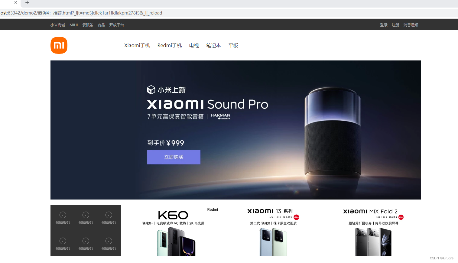
案例:小米商城推荐区域
若想还原,图片部分自行加入
<!DOCTYPE html>
<html lang="en">
<head>
    <meta charset="UTF-8">
    <title>Title</title>
    <style>
        body{
            margin: 0;
        }

        img {
            width: 100%;
            height: 100%;
        }

        .left{
            float: left;
        }

        .header{
            height: 38px;
            color: #b0b0b0;
            background: #333;
        }
        .container{
            width: 1226px;
            margin: 0 auto;
        }
        .header .menu{
            float: left;
            color: white;
            height: 38px;
        }
        .header .account{
            float: right;
            color: white;
            height: 38px;
            line-height: 38px;

            text-decoration: none;
        }
        .header a{
            color: #b0b0b0;
            line-height: 40px;
            display: inline-block;
            font-size: 12px;
            margin-right: 10px;

            text-decoration: none;
        }
        .header .account:hover{
            color: white;
        }
        .header a:hover{
            color: white;
        }


        .sub-header{
            height: 100px;
        }

        .sub-header .ht{
            height: 100px;
        }

        .sub-header .logo{
            width: 234px;
            float: left;
        }

        .sub-header .logo a{
            margin-top: 22px;
            display: inline-block
        }

        .sub-header .logo a img{
            height: 56px;width: 56px;
        }

        .sub-header .menu-list{
            float: left;
            line-height: 100px;
            border: 1px;
        }

        .sub-header .menu-list a{
            padding: 0 10px;
            display: inline-block;
            color: #333;
            font-size: 16px;
            /*去掉链接下划线*/
            text-decoration: none;
        }

        /*hover当鼠标悬停*/
        .sub-header .menu-list a:hover{
            color: darkorange;
        }

        .sub-header .search{
            float: right;
        }

        .slider img{
            width: 1226px;
            height: 460px;
        }

        .news .channel{
            width: 228px;
            height: 164px;
            background-color: #333333;
            padding: 3px;
        }

        .news .list-item{
            width: 316px;
            height: 170px;
        }

        .news .channel .item{
            height: 86px;
            width: 76px;
            float: left;
            text-align: center;
            opacity: 0.5;
        }

        .news .channel .item img{
            height: 24px;
            width: 24px;
            display: block;
            margin: 0 auto 4px;
        }

        .news .channel .item a{
            font-size: 12px;
            display: inline-block;
            padding-top: 18px;
            color: #fff;
            text-decoration: none;
        }

        .news .channel .item a:hover{
            opacity: 1;
        }

        .news{
            margin-top: 14px;
        }


    </style>
</head>
<body>

<div class="header">
    <div class="container">
        <div class="menu">
            <a href="https://www.mi.com/">小米商城</a>
            <a href="https://www.mi.com/">MIUI</a>
            <a href="https://www.mi.com/">云服务</a>
            <a href="https://www.mi.com/">有品</a>
            <a href="https://www.mi.com/">开放平台</a>
        </div>
        <div class="account">
            <a href="https://www.mi.com/">登录</a>
            <a href="https://www.mi.com/">注册</a>
            <a href="https://www.mi.com/">消息通知</a>
        </div>
        <div style="clear: both"></div>
    </div>
</div>

<div class="sub-header">
    <div class="container">
        <div class="ht logo">
            <!-- a,行内标签;默认设置为高度、边距无效。 -> 块级 -->
            <a href="https://www.mi.com/">
                <img src="/images/logo-mi2.png">
            </a>
        </div>
        <div class="ht menu-list">
            <a href="https://www.mi.com/">Xiaomi手机</a>
            <a href="https://www.mi.com/">Redmi手机</a>
            <a href="https://www.mi.com/">电视</a>
            <a href="https://www.mi.com/">笔记本</a>
            <a href="https://www.mi.com/">平板</a>
        </div>
        <div class="ht search"></div>
        <div style="clear:both"></div>
    </div>
</div>

<div class="slider">
    <div class="container">
        <div class="sd-img">
            <img src="/images/b1.png">
        </div>
    </div>
</div>

<div class="news">
    <div class="container">
        <div class="channel left">
            <div class="item">
                <a href="https://www.mi.com/">
                    <img src="/images/c1.png" >
                    <span>保障服务</span>
                </a>
            </div>
            <div class="item">
                <a href="https://www.mi.com/">
                    <img src="/images/c1.png" >
                    <span>保障服务</span>
                </a>
            </div>
            <div class="item">
                <a href="https://www.mi.com/">
                    <img src="/images/c1.png" >
                    <span>保障服务</span>
                </a>
            </div>
            <div class="item">
                <a href="https://www.mi.com/">
                    <img src="/images/c1.png" >
                    <span>保障服务</span>
                </a>
            </div>
            <div class="item">
                <a href="https://www.mi.com/">
                    <img src="/images/c1.png" >
                    <span>保障服务</span>
                </a>
            </div>
            <div class="item">
                <a href="https://www.mi.com/">
                    <img src="/images/c1.png" >
                    <span>保障服务</span>
                </a>
            </div>
            <div class="item">
                <a href="https://www.mi.com/">
                    <img src="/images/c1.png" >
                    <span>保障服务</span>
                </a>
            </div>
            <div style="clear: both"></div>
        </div>
        <div class="list-item left" style="margin-left: 14px">
            <img src="/images/list1.png" />
        </div>
        <div class="list-item left" style="margin-left: 15px">
            <img src="/images/list2.png" />
        </div>
        <div class="list-item left" style="margin-left: 15px">
            <img src="/images/list3.png" />
        </div>
        <div style="clear: both"></div>
    </div>
</div>

</body>
</html>
设置透明度:
.c1{
    opacity: 1;
}
CSS知识点
hover
鼠标悬停显示图片
<!DOCTYPE html>
<html lang="en">
<head>
    <meta charset="UTF-8">
    <title>Title</title>
    <style>
        .c1{
            font-size: 18px;
            color: gold;
        }
        .c1:hover{
            font-size: 50px;
            color: darkorange;
        }
        .c2{
            height: 300px;
            width: 500px;
            border: 1px solid red;
        }
        .c2:hover{
            border: 2px solid green;
        }

        .download{
            display: none;
        }

        .app:hover .download{
            display: block;
        }

    </style>
</head>
<body>
    <div class="c1">移动</div>
    <div class="c2">联通</div>

    <div class="app">
        <div>点击下载</div>
            <div class="download">
                <img src="/images/app.png">
            </div>
    </div>
</body>
</html>
after
c1样式后都加入content内容
<!DOCTYPE html>
<html lang="en">
<head>
    <meta charset="UTF-8">
    <title>Title</title>
    <style>
        .c1:after{
            content: "五虎上将";
        }
    </style>
</head>
<body>
    <div class="c1">关羽</div>
    <div class="c1">张飞</div>
    <div class="c1">赵云</div>
    <div class="c1">黄忠</div>
    <div class="c1">马超</div>
</body>
</html>
<!DOCTYPE html>
<html lang="en">
<head>
    <meta charset="UTF-8">
    <title>Title</title>
    <style>
        .clearfix:after{
            content: "";
            display: block;
            clear: both;
        }
    </style>
</head>
<body>
    <div class="clearfix">
        <div class="item">1</div>
        <div class="item">2</div>
        <div class="item">3</div>
    </div>
</body>
</html>
position
- fixed
- relative
- absolute
1.fiex
固定在窗口的某个位置
案例:固定客服电话位置
<!DOCTYPE html>
<html lang="en">
<head>
    <meta charset="UTF-8">
    <title>Title</title>
    <style>
        .c1{
            background-color: #b0b0b0;
            height: 2000px;
            width: 1226px;
            margin: 0 auto;
        }

        .c2{
            position: fixed;
            border: 2px solid red;
            height: 64px;
            width: 64px;

            right: 10px;
            bottom: 100px;
        }
    </style>
</head>
<body>
    <div class="c1"></div>
    <div class="c2">客服电话</div>
</body>
</html>
![[外链图片转存失败,源站可能有防盗链机制,建议将图片保存下来直接上传(img-eLO61OeU-1674037685954)(C:/Users/lq/AppData/Roaming/Typora/typora-user-images/image-20230118165015951.png)]](https://img-blog.csdnimg.cn/60b46d2db42840c8ae4fdd0c65c45b8e.png)
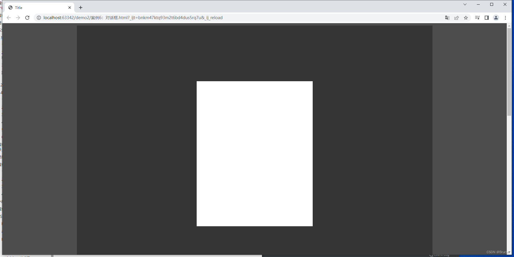
案例:对话框
z-index:定义position在哪一层,数值越大在越上层
<!DOCTYPE html>
<html lang="en">
<head>
    <meta charset="UTF-8">
    <title>Title</title>
    <style>
        .c1{
            background-color: #b0b0b0;
            height: 2000px;
            width: 1226px;
            margin: 0 auto;
        }

        .c2{
            position: fixed;
            left: 0;
            right: 0;
            margin: 0 auto;
            height: 500px;
            width: 400px;
            background-color:  white;
            top: 200px;
            z-index: 10;
        }

        .mask{
            position: fixed;
            left: 0;
            right: 0;
            top: 0;
            bottom: 0;
            background-color: black;
            opacity: 0.7;
            z-index: 9;
        }

    </style>
</head>
<body>
    <!--背景-->
    <div class="c1"></div>
    <!--幕布-->
    <div class="mask"></div>
    <!--对话框-->
    <div class="c2"></div>
</body>
</html>
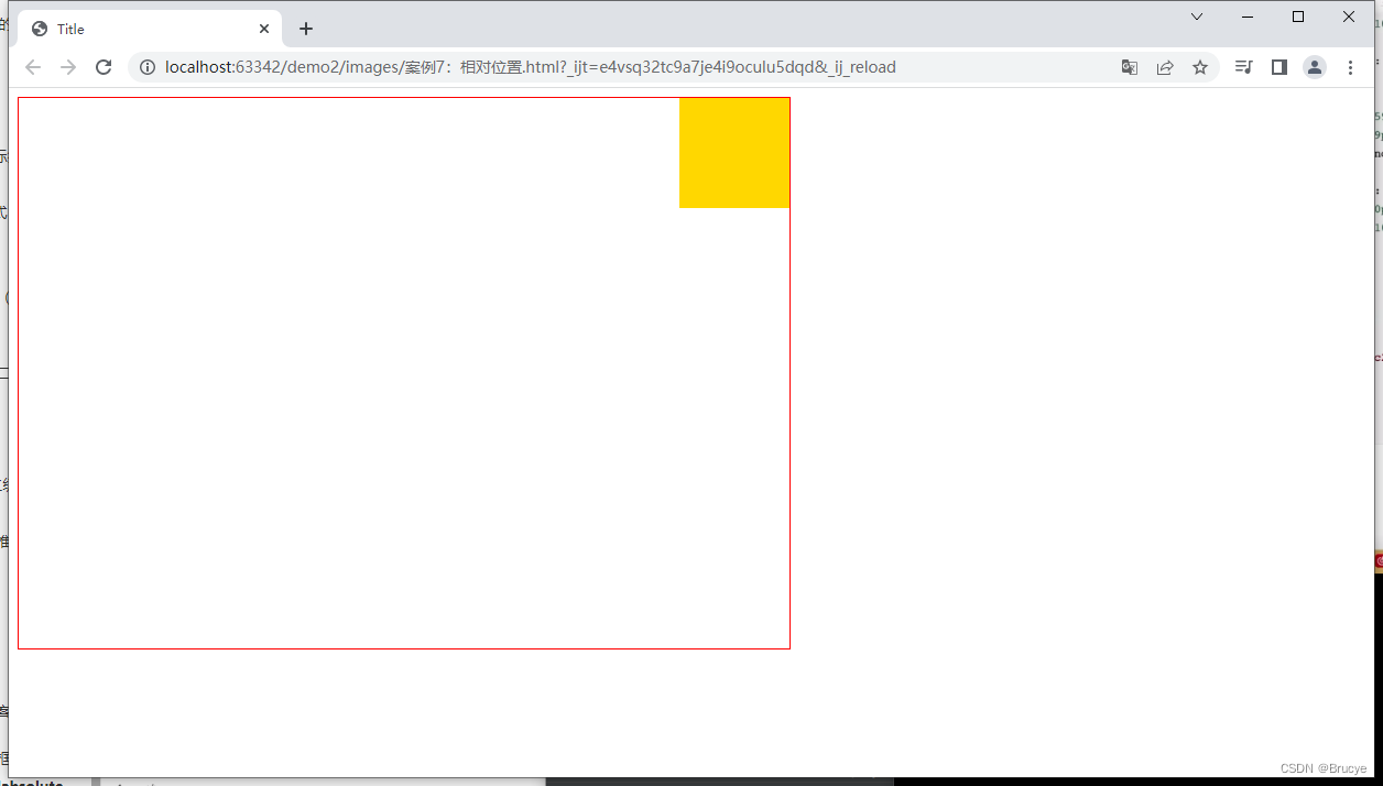
2.relative和absolute
相对进行显示:
父类加上position:relative
子类加上position:absolute
<!DOCTYPE html>
<html lang="en">
<head>
    <meta charset="UTF-8">
    <title>Title</title>
    <style>
        .c1{
            height: 500px;
            width: 700px;
            border: 1px solid red;
            position: relative;
        }

        .c1 .c2{
            background-color: gold;
            position: absolute;
            height: 100px;
            width: 100px;
            right: 0;
        }
    </style>
</head>
<body>
    <div class="c1">
        <div class="c2"></div>
    </div>
</body>
</html>
案例:在相对位置添加二维码
<!DOCTYPE html>
<html lang="en">
<head>
    <meta charset="UTF-8">
    <title>Title</title>
    <style>
        body{
            margin: 0;
        }

        img {
            width: 100%;
            height: 100%;
        }

        .left{
            float: left;
        }

        .header{
            height: 38px;
            color: #b0b0b0;
            background: #333;
        }
        .container{
            width: 1226px;
            margin: 0 auto;
        }
        .header .menu{
            float: left;
            color: white;
            height: 38px;
        }
        .header .account{
            float: right;
            color: white;
            height: 38px;
            line-height: 38px;

            text-decoration: none;
        }
        .header a{
            color: #b0b0b0;
            line-height: 40px;
            display: inline-block;
            font-size: 12px;
            margin-right: 10px;

            text-decoration: none;
        }
        .header .account:hover{
            color: white;
        }
        .header a:hover{
            color: white;
        }


        .sub-header{
            height: 100px;
        }

        .sub-header .ht{
            height: 100px;
        }

        .sub-header .logo{
            width: 234px;
            float: left;
        }

        .sub-header .logo a{
            margin-top: 22px;
            display: inline-block
        }

        .sub-header .logo a img{
            height: 56px;width: 56px;
        }

        .sub-header .menu-list{
            float: left;
            line-height: 100px;
            border: 1px;
        }

        .sub-header .menu-list a{
            padding: 0 10px;
            display: inline-block;
            color: #333;
            font-size: 16px;
            /*去掉链接下划线*/
            text-decoration: none;
        }

        /*hover当鼠标悬停*/
        .sub-header .menu-list a:hover{
            color: darkorange;
        }

        .sub-header .search{
            float: right;
        }

        .slider img{
            width: 1226px;
            height: 460px;
        }

        .news .channel{
            width: 228px;
            height: 164px;
            background-color: #333333;
            padding: 3px;
        }

        .news .list-item{
            width: 316px;
            height: 170px;
        }

        .news .channel .item{
            height: 86px;
            width: 76px;
            float: left;
            text-align: center;
            opacity: 0.5;
        }

        .news .channel .item img{
            height: 24px;
            width: 24px;
            display: block;
            margin: 0 auto 4px;
        }

        .news .channel .item a{
            font-size: 12px;
            display: inline-block;
            padding-top: 18px;
            color: #fff;
            text-decoration: none;
        }

        .news .channel .item a:hover{
            opacity: 1;
        }

        .news{
            margin-top: 14px;
        }

        .app{
            position: relative;
        }

        .app .download{
            position: absolute;
            width: 100px;
            display: none;
        }

        .app:hover .download{
            display: block;
        }

    </style>
</head>
<body>

<div class="header">
    <div class="container">
        <div class="menu">
            <a href="https://www.mi.com/">小米商城</a>
            <a href="https://www.mi.com/">MIUI</a>
            <a href="https://www.mi.com/">云服务</a>
            <a href="https://www.mi.com/">有品</a>
            <a href="https://www.mi.com/">开放平台</a>
            <a href="https://www.mi.com/" class="app">App下载
            <div class="download">
                <img src="images/app.png">
            </div>
            </a>
        </div>
        <div class="account">
            <a href="https://www.mi.com/">登录</a>
            <a href="https://www.mi.com/">注册</a>
            <a href="https://www.mi.com/">消息通知</a>
        </div>
        <div style="clear: both"></div>
    </div>
</div>

<div class="sub-header">
    <div class="container">
        <div class="ht logo">
            <!-- a,行内标签;默认设置为高度、边距无效。 -> 块级 -->
            <a href="https://www.mi.com/">
                <img src="/images/logo-mi2.png">
            </a>
        </div>
        <div class="ht menu-list">
            <a href="https://www.mi.com/">Xiaomi手机</a>
            <a href="https://www.mi.com/">Redmi手机</a>
            <a href="https://www.mi.com/">电视</a>
            <a href="https://www.mi.com/">笔记本</a>
            <a href="https://www.mi.com/">平板</a>
        </div>
        <div class="ht search"></div>
        <div style="clear:both"></div>
    </div>
</div>

<div class="slider">
    <div class="container">
        <div class="sd-img">
            <img src="/images/b1.png">
        </div>
    </div>
</div>

<div class="news">
    <div class="container">
        <div class="channel left">
            <div class="item">
                <a href="https://www.mi.com/">
                    <img src="/images/c1.png" >
                    <span>保障服务</span>
                </a>
            </div>
            <div class="item">
                <a href="https://www.mi.com/">
                    <img src="/images/c1.png" >
                    <span>保障服务</span>
                </a>
            </div>
            <div class="item">
                <a href="https://www.mi.com/">
                    <img src="/images/c1.png" >
                    <span>保障服务</span>
                </a>
            </div>
            <div class="item">
                <a href="https://www.mi.com/">
                    <img src="/images/c1.png" >
                    <span>保障服务</span>
                </a>
            </div>
            <div class="item">
                <a href="https://www.mi.com/">
                    <img src="/images/c1.png" >
                    <span>保障服务</span>
                </a>
            </div>
            <div class="item">
                <a href="https://www.mi.com/">
                    <img src="/images/c1.png" >
                    <span>保障服务</span>
                </a>
            </div>

            <div style="clear: both"></div>
        </div>
        <div class="list-item left" style="margin-left: 14px">
            <img src="/images/list1.png" />
        </div>
        <div class="list-item left" style="margin-left: 15px">
            <img src="/images/list2.png" />
        </div>
        <div class="list-item left" style="margin-left: 15px">
            <img src="/images/list3.png" />
        </div>
        <div style="clear: both"></div>
    </div>
</div>

</body>
</html>
边框
- border:1px 1像素边框
- solid red 实心红色
- dotted red 虚线红色
- border-left 指定边框
背景色
- background-color
总结
以上是CSS常用功能
在开发过程中会用到BootSrap模板
模板:
- 模板基本使用逻辑
- 模板+自己的CSS