六一儿童节快到了,这是一个充满童趣和欢乐的日子。为了给孩子们增添一份节日惊喜,我们决定用HTML5和CSS3制作一个生动有趣的雪糕动画。通过这个项目,不仅能提升你的前端技能,还能带给孩子们一份特别的节日礼物。无论你是前端开发新手还是经验丰富的开发者,这篇教程都会为你揭示如何一步一步实现这个创意十足的动画效果。准备好了吗?让我们一起动手吧!
目录
1 实现思路
2 身体部分的实现
3 雪糕的尖角顶部实现
4 第二区域的实现
5 中间动画区域实现
6 尾部雪糕棍儿的实现
7 完整源代码
1 实现思路
实现过程包含顶部的雪糕尖尖部分、中间区域、雪糕小人儿动画部分、底部部分和雪糕棍儿部分。
在这篇教程中,我们将用CSS3制作一个生动的雪糕动画。
- 首先,使用HTML创建雪糕的基础结构,包括雪糕体和雪糕棒。
- 然后,利用CSS3的渐变和圆角属性为雪糕添加颜色和形状。
- 接着,应用关键帧动画(@keyframes)实现雪糕的上下浮动效果,让雪糕看起来栩栩如生。
- 最后,通过CSS的过渡效果(transition)添加一些交互,例如悬停时雪糕会轻微摇摆。让我们开始这个有趣的项目吧!
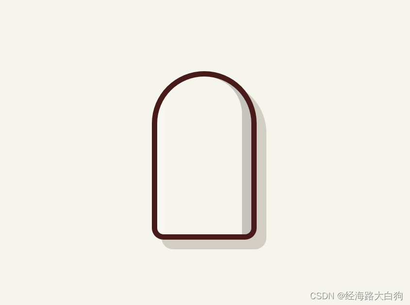
2 身体部分的实现
这里主要是主体身体的区域部分,主要利用了flex布局、border-radius针对四个边角的圆形实现,box-shadow添加阴影部分。
<!-- HTML5部分  -->
<div class="container">
	<div class="icecream">
		<div class="icecream-body">
		</div>
	</div>
</div>

// css3部分
.container {
  width: 100%;
  height: 100%;
  position: relative;
  display: flex;
  align-items: center;
  justify-content: center;
}
.container .icecream {
  width: 27rem;
  height: 58rem;
  display: flex;
  flex-direction: column;
  align-items: center;
  justify-content: center;
}
3 雪糕的尖角顶部实现
这里主要是设定了div元素的高度,设定了色值。重点是父元素的overflow通过hidden的设定,将雪糕顶部不至于超出范围。
<!-- HTML5部分 -->
<div class="icecream-body__slice"></div>

// css3部分
.container .icecream .icecream-body__slice {
  display: flex;
  border-bottom: 1rem solid #461b19;
}
.container .icecream .icecream-body__slice:nth-child(2n-1) {
  height: 30%;
}
4 第二区域的实现
凸显雪糕的不同色值,可以让人更有味觉,仍然通过设定高度,设定border-bottom等边框的值,不超出父元素区域,高度适中,要给下面关键区域流出空白区域。
.container .icecream .icecream-body__slice:nth-child(2n-1) {
  height: 30%;
}
.container .icecream .icecream-body__slice:nth-child(2n) {
  height: 20%;
}
.container .icecream .icecream-body__slice:nth-child(1) {
  background: #a9d8ea;
}
.container .icecream .icecream-body__slice:nth-child(2) {
  background: #ab96db;
}
.container .icecream .icecream-body__slice:nth-child(3) {
  align-items: center;
  justify-content: center;
  background: #fcbad2;
} 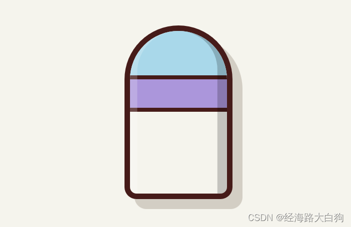
5 中间动画区域实现
中间动画区域,要制作动画,就要有开心的笑脸,笑脸分别由眼睛2个,鼻子一个,眼睛和鼻子分别又有动画展示,还要有鼻涕的流出,体现出六一的儿童氛围。用到的技术点有position定位、transform倾斜、border-radius圆角设定、transform-origin旋转、animation动画等
.container .icecream .icecream-body__slice:nth-child(3) .mouth {
  position: relative;
  width: 3rem;
  height: 2.8rem;
  margin: 0 1rem;
}
.container .icecream .icecream-body__slice:nth-child(3) .mouth__lip {
  width: 100%;
  height: 100%;
  background: #461b19;
  border-radius: 30% 30% 50% 50% / 29% 29% 65% 65%;
  position: absolute;
  z-index: 1;
}
.container .icecream .icecream-body__slice:nth-child(3) .mouth__saliva {
  width: 1.5rem;
  height: 2.5rem;
  background: #ffffff;
  border-radius: 1rem;
  position: absolute;
  transform-origin: 0 0;
  z-index: 0;
  animation: saliva 0.75s cubic-bezier(0.4, 0, 1, 1) infinite alternate;
}

6 尾部雪糕棍儿的实现
尾部雪糕棍儿区域,display: flex;:将雪糕棒子设置为弹性盒模型,以便在需要时可以调整内部元素的布局。border-radius: 0 0 10rem 10rem;:设置雪糕棒子的底部边缘为圆角,使其看起来更加平滑和真实。border: 1.7rem solid #461b19;:设置雪糕棒子的边框,宽度为1.7rem,颜色为深棕色。box-shadow: 2.5rem 2.4rem 0 #d3cec4;:添加阴影效果,使雪糕棒子看起来有深度,颜色为浅灰色,阴影向右和向下偏移。
.container .icecream .icecream-stick {
  display: flex;
  height: 25%;
  width: 10rem;
  border-radius: 0 0 10rem 10rem;
  border: 1.7rem solid #461b19;
  border-top: 0;
  background: #ffd379;
  position: relative;
  box-shadow: 2.5rem 2.4rem 0 #d3cec4;
}
7 完整源代码
小伙伴们可以直接跳过之前的讲解,新建HTML文档,将以下源代码拷贝过去,然后再打开,就可以看到效果啦,源代码如下:
<!DOCTYPE html>
<html lang="en"><head><meta http-equiv="Content-Type" content="text/html; charset=UTF-8">

<title>六一雪糕</title>

<style>
	@keyframes move {
  50% {
    transform: translateX(-0.5rem) rotate(-5deg);
  }
  100% {
    transform: translateX(0.25rem) rotate(1deg);
  }
}
@keyframes eyes {
  0% {
    transform: scaleY(1) translate(0, 0);
  }
  10% {
    transform: scaleY(-1) translate(0, -0.5rem);
  }
  100% {
    transform: scaleY(-1) translate(0, -0.5rem);
  }
}
@keyframes lip {
  to {
    transform: scaleY(0.7);
  }
}
@keyframes saliva {
  0% {
    transform: scaleY(1.5);
  }
  50% {
    transform: scaleY(1.75);
  }
  75% {
    transform: scaleY(1.6);
  }
  100% {
    transform: scaleY(2);
  }
}
*,
*:after,
*:before {
  box-sizing: border-box;
}

html {
  font-size: 50%;
  overflow: hidden;
  height: 100%;
}

body {
  margin: 0;
  padding: 0;
  width: 100%;
  height: 100%;
  background: #f5f4ed;
}

.container {
  width: 100%;
  height: 100%;
  position: relative;
  display: flex;
  align-items: center;
  justify-content: center;
}
.container .icecream {
  width: 27rem;
  height: 58rem;
  display: flex;
  flex-direction: column;
  align-items: center;
  justify-content: center;
}
.container .icecream:hover {
  animation: move 1s ease-in-out infinite alternate;
}
.container .icecream:hover .icecream-body__slice:nth-child(3) .eye {
  animation: eyes 1s ease-in infinite alternate;
}
.container .icecream:hover .icecream-body__slice:nth-child(3) .mouth__lip {
  animation: lip 0.5s ease-in infinite alternate;
}
.container .icecream:hover .icecream-body__slice:nth-child(3) .mouth__saliva {
  opacity: 0;
}
.container .icecream .icecream-body {
  display: flex;
  flex-direction: column;
  height: 75%;
  width: 100%;
  border-radius: 27rem 27rem 6rem 6rem;
  border: 1.4rem solid #461b19;
  position: relative;
  overflow: hidden;
  box-shadow: 2.5rem 2.5rem 0 #d3cec4;
}
.container .icecream .icecream-body:before {
  content: "";
  width: 100%;
  height: 100%;
  border-radius: 20rem 27rem 0 0;
  position: absolute;
  box-shadow: inset 1.8rem 0 0 rgba(255, 255, 255, 0.2);
}
.container .icecream .icecream-body:after {
  content: "";
  width: 100%;
  height: 100%;
  border-radius: 27rem 18rem 0 0;
  position: absolute;
  box-shadow: inset -2.4rem 0 0 rgba(0, 0, 0, 0.2);
}
.container .icecream .icecream-body__slice {
  display: flex;
  border-bottom: 1rem solid #461b19;
}
.container .icecream .icecream-body__slice:nth-child(2n-1) {
  height: 30%;
}
.container .icecream .icecream-body__slice:nth-child(2n) {
  height: 20%;
}
.container .icecream .icecream-body__slice:nth-child(1) {
  background: #a9d8ea;
}
.container .icecream .icecream-body__slice:nth-child(2) {
  background: #ab96db;
}
.container .icecream .icecream-body__slice:nth-child(3) {
  align-items: center;
  justify-content: center;
  background: #fcbad2;
}
.container .icecream .icecream-body__slice:nth-child(3) .eye {
  width: 2.8rem;
  height: 1.5rem;
  background: #461b19;
  border-radius: 2.8rem 2.8rem 0 0;
  position: relative;
  margin-bottom: 3.5rem;
  transform-origin: 0 50%;
}
.container .icecream .icecream-body__slice:nth-child(3) .eye:before {
  content: "";
  width: 0.9rem;
  height: 0.9rem;
  background: #461b19;
  border-radius: 100%;
  position: absolute;
  bottom: 0;
  left: 0;
  transform: translate(0, 0.4rem);
  position: absolute;
  z-index: 1;
}
.container .icecream .icecream-body__slice:nth-child(3) .eye:after {
  content: "";
  width: 0.9rem;
  height: 0.9rem;
  background: #461b19;
  border-radius: 100%;
  position: absolute;
  bottom: 0;
  right: 0;
  transform: translate(0, 0.4rem);
  position: absolute;
  z-index: 1;
}
.container .icecream .icecream-body__slice:nth-child(3) .eye__retina {
  width: 1rem;
  height: 1rem;
  background: #fcbad2;
  border-radius: 100%;
  position: absolute;
  bottom: 0;
  left: 50%;
  transform: translate(-0.5rem, 0.5rem);
  z-index: 1;
}
.container .icecream .icecream-body__slice:nth-child(3) .mouth {
  position: relative;
  width: 3rem;
  height: 2.8rem;
  margin: 0 1rem;
}
.container .icecream .icecream-body__slice:nth-child(3) .mouth__lip {
  width: 100%;
  height: 100%;
  background: #461b19;
  border-radius: 30% 30% 50% 50% / 29% 29% 65% 65%;
  position: absolute;
  z-index: 1;
}
.container .icecream .icecream-body__slice:nth-child(3) .mouth__saliva {
  width: 1.5rem;
  height: 2.5rem;
  background: #ffffff;
  border-radius: 1rem;
  position: absolute;
  transform-origin: 0 0;
  z-index: 0;
  animation: saliva 0.75s cubic-bezier(0.4, 0, 1, 1) infinite alternate;
}
.container .icecream .icecream-body__slice:nth-child(4) {
  background: #ffffd2;
  border-bottom: 0;
}
.container .icecream .icecream-stick {
  display: flex;
  height: 25%;
  width: 10rem;
  border-radius: 0 0 10rem 10rem;
  border: 1.7rem solid #461b19;
  border-top: 0;
  background: #ffd379;
  position: relative;
  box-shadow: 2.5rem 2.4rem 0 #d3cec4;
}
.container .icecream .icecream-stick:before {
  content: "";
  width: 100%;
  height: 3.5rem;
  background: #d9ae58;
  position: absolute;
}
</style>

</head>
<body>

<div class="container">
	<div class="icecream">
		<div class="icecream-body">
			<div class="icecream-body__slice"></div>
			<div class="icecream-body__slice"></div>
			<div class="icecream-body__slice">
				<span class="eye"><span class="eye__retina"></span></span>
				<div class="mouth"><span class="mouth__lip"></span><span class="mouth__saliva"></span></div>
				<span class="eye"><span class="eye__retina"></span></span>
			</div>
			<div class="icecream-body__slice"></div>
		</div>
		<div class="icecream-stick"></div>
	</div>
</div>


</body></html>