文章目录
- Compose 简单组件
- Text
- Text属性
- 使用
- AnnotatedString
- SpanStyle
- ParagraphStyle
- SelectionContainer 和 DisableSelection
- ClickableText
- TextField
- TextField属性
- 使用
- OutlinedTextField
- BasicTextField
- KeyboardOptions 键盘属性
- KeyboardActions IME动作
- Button
- Button属性
- 使用
- Image
- Image属性
- 使用
- ContentScale 缩放比
- alpha 图片透明度
- colorFilter 图片着色
- 加载网络图片
- CircularProgressIndicator & LinearProgressIndicator
- 圆形进度条
- 条形进度条
Compose 简单组件
Text
Compose中的“TextView”。
Text属性
@Composable
fun Text(
    text: String,
    modifier: Modifier = Modifier, // 修饰符
    color: Color = Color.Unspecified, // 文字颜色
    fontSize: TextUnit = TextUnit.Unspecified, // 文字大小
    fontStyle: FontStyle? = null, // 文字样式
    fontWeight: FontWeight? = null, // 文字粗细
    fontFamily: FontFamily? = null, // 字体
    letterSpacing: TextUnit = TextUnit.Unspecified, // 字间距
    textDecoration: TextDecoration? = null, // 文字的装饰,如:下划线
    textAlign: TextAlign? = null, // 文字的对齐方式
    lineHeight: TextUnit = TextUnit.Unspecified, // 行高
    overflow: TextOverflow = TextOverflow.Clip, // 文字溢出处理
    softWrap: Boolean = true, // 是否在换行处中断
    maxLines: Int = Int.MAX_VALUE, // 最大行数
    onTextLayout: (TextLayoutResult) -> Unit = {}, // 文字变化回调
    style: TextStyle = LocalTextStyle.current // 样式配置,包含颜色、字体、行高等
)
使用
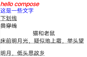
Column(modifier = Modifier.fillMaxSize()) {
    Text(
        "hello compose",
        color = Color.Red,
        fontSize = 16.sp,
        fontStyle = FontStyle.Italic,
        fontWeight = FontWeight.Bold
    )
    Text(
        stringResource(id = R.string.app_text),
        color = Color.Blue,
        fontFamily = FontFamily.Cursive
    )
    Text("下划线", textDecoration = TextDecoration.Underline)
    Text("贯穿线", textDecoration = TextDecoration.LineThrough)
    Text("猫和老鼠", textAlign = TextAlign.Center, modifier = Modifier.width(250.dp))
    Text(
        "床前明月光,疑似地上霜,举头望明月,低头思故乡", lineHeight = 35.sp, modifier = Modifier.width(250.dp)
    )
}
AnnotatedString
AnnotatedString 支持在同一组Text中设置不同的样式。
SpanStyle
SpanStyle 用于字符。
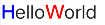
Text(buildAnnotatedString {
    withStyle(style = SpanStyle(color = Color.Blue, fontWeight = FontWeight.Bold)) {
        append("H")
    }
    append("ello")
    withStyle(style = SpanStyle(color = Color.Red, fontWeight = FontWeight.Bold)) {
        append("W")
    }
    append("orld")
})
ParagraphStyle
ParagraphStyle 用于整个段落。

Text(buildAnnotatedString {
    withStyle(style = ParagraphStyle(lineHeight = 30.sp)) {
        withStyle(style = SpanStyle(color = Color.Blue)) {
            append("Hello")
            append("\n")
        }
        withStyle(style = SpanStyle(color = Color.Red)) {
            append("World")
            append("\n")
        }
        append("Text")
    }
})
SelectionContainer 和 DisableSelection
- SelectionContainer 用于文字选择。
- DisableSelection 用于禁止文字选择。
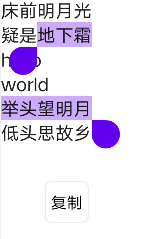
SelectionContainer(modifier = Modifier.fillMaxSize()) {
    Column {
        Text("床前明月光")
        Text("疑是地下霜")
        DisableSelection {
            Text("hello")
            Text("world")
        }
        Text("举头望明月")
        Text("低头思故乡")
    }
}
ClickableText
- ClickableText 用于可点击文本。
ClickableText(text = AnnotatedString("hello world"),
              onClick = { offset ->
                         Log.e("TAG", "offset: ${offset}")
                        }
             )
在Text中添加额外信息:
val annotatedString = buildAnnotatedString {
    append("点击")
    pushStringAnnotation(tag = "URL", annotation = "https://www.baidu.com/")
    withStyle(style = SpanStyle(color = Color.Red, fontWeight = FontWeight.Bold)) {
        append("Url")
    }
    pop()
}
    ClickableText(text = annotatedString, style = TextStyle(fontSize = 30.sp), onClick = { offset ->
        annotatedString.getStringAnnotations(tag = "URL", start = offset, end = offset)
            .firstOrNull()?.let { annotation -> Log.e("TAG", annotation.item) }
    })
TextField
Compose中的"EditText"。
TextField属性
@Composable
fun TextField(
    value: String,
    onValueChange: (String) -> Unit, // 监听输入变化
    modifier: Modifier = Modifier, // 修饰符
    enabled: Boolean = true, // 是否可点击
    readOnly: Boolean = false, // 是否只读
    textStyle: TextStyle = LocalTextStyle.current, // 文字样式
    label: @Composable (() -> Unit)? = null, // 定义label组件
    placeholder: @Composable (() -> Unit)? = null, // 定义placeholder组件
    leadingIcon: @Composable (() -> Unit)? = null, // 定义前置图标
    trailingIcon: @Composable (() -> Unit)? = null, // 定义后置图标
    isError: Boolean = false, // 是否提示错误
    visualTransformation: VisualTransformation = VisualTransformation.None, // 转换输入值
    keyboardOptions: KeyboardOptions = KeyboardOptions.Default, // 软键盘选项,类似于inputType
    keyboardActions: KeyboardActions = KeyboardActions(), // IME动作
    singleLine: Boolean = false, // 是否单行
    maxLines: Int = Int.MAX_VALUE, // 支持最大行数
    interactionSource: MutableInteractionSource = remember { MutableInteractionSource() }, // 交互流
    shape: Shape =
        MaterialTheme.shapes.small.copy(bottomEnd = ZeroCornerSize, bottomStart = ZeroCornerSize), // 输入框形状
    colors: TextFieldColors = TextFieldDefaults.textFieldColors() // 不同状态下颜色
)
使用
简单使用:
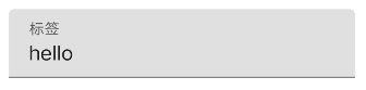
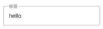
val text = remember { mutableStateOf("hello") }
TextField(value = text.value, onValueChange = { text.value = it }, label = { Text("标签") })
其他属性使用:
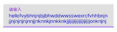
val text = remember { mutableStateOf("hello") }
TextField(
    value = text.value,
    onValueChange = { text.value = it },
    label = { Text("请输入") },
    maxLines = 2,
    textStyle = TextStyle(color = Color.Blue),
    modifier = Modifier.padding(20.dp)
)
OutlinedTextField
val text = remember { mutableStateOf("hello") }
OutlinedTextField(value = text.value, onValueChange = { text.value = it }, label = { Text("标签") })
BasicTextField
val text = remember { mutableStateOf("hello") }
BasicTextField(value = text.value, onValueChange = { text.value = it })
KeyboardOptions 键盘属性
class KeyboardOptions constructor(
    // 大写选项:
    // None 无大写,Characters 全部大写,Words 单词首字母大写,Sentences 句子首字母大写
    val capitalization: KeyboardCapitalization = KeyboardCapitalization.None,
    // 是否开启自动更正
    val autoCorrect: Boolean = true,
    // 键盘类型:
    // Text 普通类型,Ascii ASCII字符类型,Number 数字类型,Phone 电话号码
    // Uri URI类型,Email 邮件地址类型,Password 密码类型,NumberPassword 数字密码类型
    val keyboardType: KeyboardType = KeyboardType.Text,
    // IME动作
    // Default 默认行为,None 不执行任何操作,默认为换行,Go 开始动作,Search 搜索动作
    // Send 发送动作,Previous 上一个,Next 下一步,Done 完成
    val imeAction: ImeAction = ImeAction.Default
)
val text = remember { mutableStateOf("hello") }
TextField(
    value = text.value,
    onValueChange = { text.value = it },
    label = { Text("请输入") },
    maxLines = 2,
    textStyle = TextStyle(color = Color.Blue),
    modifier = Modifier.padding(20.dp),
    keyboardOptions = KeyboardOptions(
        capitalization = KeyboardCapitalization.Characters,
        keyboardType = KeyboardType.Email,
        autoCorrect = true,
        imeAction = ImeAction.Done
    )
)
KeyboardActions IME动作
val context = LocalContext.current
val text = remember { mutableStateOf("hello") }
TextField(
    value = text.value,
    onValueChange = { text.value = it },
    label = { Text("请输入") },
    maxLines = 2,
    textStyle = TextStyle(color = Color.Blue),
    modifier = Modifier.padding(20.dp),
    keyboardOptions = KeyboardOptions(
        capitalization = KeyboardCapitalization.Characters,
        keyboardType = KeyboardType.Email,
        autoCorrect = true,
        imeAction = ImeAction.Search
    ),
    keyboardActions = KeyboardActions(onSearch = {
        Toast.makeText(context, "${text.value} world", Toast.LENGTH_SHORT).show()
    })
)
Button
Compose中的”Button“。
Button属性
@Composable
fun Button(
    onClick: () -> Unit, // 点击事件
    modifier: Modifier = Modifier, // 修饰符
    enabled: Boolean = true, // 是否可点击
    interactionSource: MutableInteractionSource = remember { MutableInteractionSource() }, // 交互流
    elevation: ButtonElevation? = ButtonDefaults.elevation(), // 高度
    shape: Shape = MaterialTheme.shapes.small, // 按钮形状
    border: BorderStroke? = null, // 边框
    colors: ButtonColors = ButtonDefaults.buttonColors(), // 不同状态下颜色
    contentPadding: PaddingValues = ButtonDefaults.ContentPadding, // 内边距
    content: @Composable RowScope.() -> Unit // 内容
)
使用
简单使用:
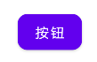
Button(onClick = { }, shape = RoundedCornerShape(10.dp)) {
    Text("按钮")
}
使用colors属性:
colors就是用来设置按钮在不同状态下的颜色的。
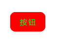
Button(
    onClick = { },
    shape = RoundedCornerShape(10.dp),
    colors = ButtonDefaults.buttonColors(
        backgroundColor = Color.Red, // 背景颜色
        contentColor = Color.Green, // 内容颜色
        disabledBackgroundColor = Color.Blue, // 未启用时的背景颜色
        disabledContentColor = Color.Gray // 未启用时的内容颜色
    )
) {
    Text("按钮")
}
使用contentPadding属性:
contentPadding用于设置内容与容器间的距离。
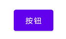
Button(
    onClick = { },
    contentPadding = PaddingValues(20.dp, 10.dp)
) {
    Text("按钮")
}
Image
Compose中的”ImageView“。
Image属性
@Composable
fun Image(
    painter: Painter,
    contentDescription: String?, // 文字描述
    modifier: Modifier = Modifier, // 修饰符
    alignment: Alignment = Alignment.Center, // 对齐方式
    contentScale: ContentScale = ContentScale.Fit, // 图片缩放模式
    alpha: Float = DefaultAlpha, // 透明度
    colorFilter: ColorFilter? = null // 修改图片
)


@Composable
@NonRestartableComposable
fun Image(
    bitmap: ImageBitmap,
    contentDescription: String?,
    modifier: Modifier = Modifier,
    alignment: Alignment = Alignment.Center,
    contentScale: ContentScale = ContentScale.Fit,
    alpha: Float = DefaultAlpha,
    colorFilter: ColorFilter? = null,
    filterQuality: FilterQuality = DefaultFilterQuality
)
使用
简单使用:
Image(
    painter = painterResource(id = R.drawable.ic_launcher_background),
    contentDescription = "图片"
)
使用Bitmap:
val context = LocalContext.current
val path = "${context.cacheDir}${File.separator}a.jpg"
val bitmap = BitmapFactory.decodeFile(path)
Image(
    bitmap = bitmap.asImageBitmap(), contentDescription = null
)
ContentScale 缩放比
@Stable
interface ContentScale {
    // 计算缩放因子
    fun computeScaleFactor(srcSize: Size, dstSize: Size): ScaleFactor

    companion object {
        // 保持图片宽高比,使图片大于或等于目标尺寸
        @Stable
        val Crop

        // 保持图片宽高比,使图片大于或等于目标尺寸
        @Stable
        val Fit

        // 缩放图片并保持宽高比,使图片高度匹配目标尺寸
        @Stable
        val FillHeight

        // 缩放图片并保持宽高比,使图片宽度匹配目标尺寸
        @Stable
        val FillWidth

        // 如果图片大于目标,则缩放
        @Stable
        val Inside

        // 不处理
        @Stable
        val None = FixedScale(1.0f)

        // 横向和纵向缩放填充目标尺寸
        @Stable
        val FillBounds
    }
}
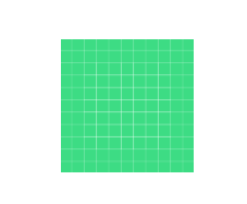
Image(
    painter = painterResource(id = R.drawable.a),
    contentDescription = null,
    contentScale = ContentScale.Crop,
    modifier = Modifier.fillMaxSize(0.5F)
)
alpha 图片透明度
Image(
    painter = painterResource(id = R.drawable.a),
    contentDescription = null,
    alpha = 0.5F
)
colorFilter 图片着色
@Immutable
class ColorFilter internal constructor(internal val nativeColorFilter: NativeColorFilter) {
    companion object {
        // 使用颜色滤镜
        // 参数一:颜色值,参数二:混合模式
        @Stable
        fun tint(color: Color, blendMode: BlendMode = BlendMode.SrcIn): ColorFilter =
            actualTintColorFilter(color, blendMode)

        // 使用颜色矩阵,用于修改饱和度
        @Stable
        fun colorMatrix(colorMatrix: ColorMatrix): ColorFilter =
            actualColorMatrixColorFilter(colorMatrix)

        // 模拟灯光效果
        @Stable
        fun lighting(multiply: Color, add: Color): ColorFilter =
            actualLightingColorFilter(multiply, add)
    }
}
加载网络图片
添加依赖库:
coil是一个图片加载库,完全使用Kotlin编写,使用了Kotlin的协程,图片网络请求方式默认为OkHttp。其特点如下:足够快速,它在内存、图片存储、图片采样、Bitmap重用、暂停/取消下载等细节方面都做了大幅优化。
implementation "com.google.accompanist:accompanist-coil:0.15.0"
使用:

val painter = rememberImagePainter(
    data = "https://www.baidu.com/img/flexible/logo/pc/result@2.png",
    imageLoader = LocalImageLoader.current
)
Image(
    painter = painter,
    contentDescription = null,
    modifier = Modifier.border(
        1.dp,
        Color.Red,
        shape = RectangleShape
    )
)
CircularProgressIndicator & LinearProgressIndicator
Compose中的”ProgressBar“。
圆形进度条
简单使用:

CircularProgressIndicator()
使用属性:
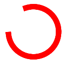
CircularProgressIndicator(
    modifier = Modifier.size(100.dp),
    color = Color.Red,
    strokeWidth = 10.dp
)
设置进度:
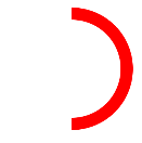
CircularProgressIndicator(
    progress = 0.5F,
    modifier = Modifier.size(100.dp),
    color = Color.Red,
    strokeWidth = 10.dp
)
条形进度条
简单使用:

LinearProgressIndicator()
设置进度:

LinearProgressIndicator(
    progress = 0.5F,
    color = Color.Red,
    backgroundColor = Color.Blue
)