我们经常使用PS或者Flash制作动画,本文则介绍了如何用CSS3画出个叮当猫,实现过程很有趣,感兴趣的朋友可以参考一下
首先,先把HTML结构搭建好:
<div class="wrapper">
 <!--叮当猫整体-->
 <div class="doraemon">
 <!--头部-->
 <div class="head">
 <!--眼睛-->
 <div class="eyes">
 <div class="eye left">
  <!--眼珠-->
  <div class="black bleft"></div>
 </div>
 <div class="eye right">
  <div class="black bright"></div>
 </div>
 </div>
 <!--脸部-->
 <div class="face">
 <!--白色脸底-->
 <div class="white"></div>
 <!--鼻子-->
 <div class="nose">
  <!--鼻子高光部分-->
  <div class="light"></div>
 </div>
 <!--鼻子的竖线-->
 <div class="nose_line"></div>
 <!--嘴巴-->
 <div class="mouth"></div>
 <!--胡须-->
 <div class="whiskers">
  <div class="whisker rTop r160"></div>
  <div class="whisker rMiddle"></div>
  <div class="whisker rBottom r20"></div>
  <div class="whisker lTop r20"></div>
  <div class="whisker lMiddle"></div>
  <div class="whisker lBottom r160"></div>
 </div>
 </div>
 </div>
 <!--脖子和铃铛-->
 <div class="choker">
 <!--铃铛-->
 <div class="bell">
 <div class="bell_line"></div>
 <div class="bell_circle"></div>
 <div class="bell_under"></div>
 <div class="bell_light"></div>
 </div>
 </div>
 <!--身体-->
 <div class="bodys">
 <!--肚子-->
 <div class="body"></div>
 <!--肚兜-->
 <div class="wraps"></div>
 <!--口袋-->
 <div class="pocket"></div>
 <!--遮住一半口袋,使其呈现半圆-->
 <div class="pocket_mask"></div>
 </div>
 <!--右手-->
 <div class="hand_right">
 <!--手臂-->
 <div class="arm"></div>
 <!--手掌-->
 <div class="circle"></div>
 <!--遮住手臂和身子交接处的线-->
 <div class="arm_rewrite"></div>
 </div>
 <!--左手-->
 <div class="hand_left">
 <div class="arm"></div>
 <div class="circle"></div>
 <div class="arm_rewrite"></div>
 </div>
 <!--脚-->
 <div class="foot">
 <div class="left"></div>
 <div class="right"></div>
 <!--双脚之间的缝隙-->
 <div class="foot_rewrite"></div>
 </div>
 </div>
</div>
最好先把叮当猫的整体结构仔细研究一下,这对以后想要自己动手画别的人物形象很有帮助,思路会比较明朗。
接下来,我们按照头部,脖子,身体,脚部分别进行演示。首先将容器wrapper和叮当猫整体做一些基本的样式,叮当猫整体doraemon 设置position为relative,主要是为了便于 子元素/后代元素进行定位。
.wrapper{
 margin: 50px 0 0 500px;
}
.doraemon{
 position: relative;
}
头部head的样式,因为叮当猫的头部不是正圆,所以宽高有一点偏差,然后使用border-radius将头部从矩形变成椭圆形,然后再使用径向渐变从右上角给背景来个放射性渐变,然后在加个阴影,使其更有立体感,background:#07bbee;是为了兼容低版本浏览器:
.doraemon .head {
 position:relative;
 width: 320px;
 height: 300px;
 border-radius: 150px;
 background: #07bbee;
 background: -webkit-radial-gradient(right top,#fff 10%,#07bbee 20%,#10a6ce 75%,#000);
 background: -moz-radial-gradient(right top,#fff 10%,#07bbee 20%,#10a6ce 75%,#000);
 background: -ms-radial-gradient(right top,#fff 10%,#07bbee 20%,#10a6ce 75%,#000);
 border:2px solid #555;
 box-shadow:-5px 10px 15px rgba(0,0,0,0.45);
}
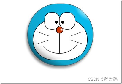
看看效果到底怎么样:
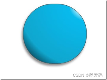
惊讶 shenmgui ,这么丑,别急,慢慢让它活过来:
/*脸部*/
 .doraemon .face {
 position: relative; /*让所有脸部元素可自由定位*/
 z-index: 2; /*脸在头部背景上面*/
 }
 /*白色脸底*/
 .doraemon .face .white {
 width: 265px; /*设置宽高*/
 height: 195px;
 border-radius: 150px;
 position: absolute; /*进行绝对定位*/
 top: 75px;
 left: 25px;
 background: #fff;
 /*此放射渐变也是使脸的左下角暗一些,看上去更真实*/
 background: -webkit-radial-gradient(right top,#fff 75%,#eee 80%,#999 90%,#444);
 background: -moz-radial-gradient(right top,#fff 75%,#eee 80%,#999 90%,#444);
 background: –ms-radial-gradient(right top,#fff 75%,#eee 80%,#999 90%,#444);
 }
 /*鼻子*/
 .doraemon .face .nose{
 width:30px;
 height:30px;
 border-radius:15px;
 background:#c93300;
 border:2px solid #000;
 position:absolute;
 top:110px;
 left:140px;
 z-index:3; /*鼻子在白色脸底下面*/
 }
 /*鼻子上的高光*/
 .doraemon .face .nose .light {
 width:10px;
 height:10px;
 border-radius: 5px;
 box-shadow: 19px 8px 5px #fff; /*通过阴影实现高光*/
 }
 /*鼻子下的线*/
 .doraemon .face .nose_line{
 width:3px;
 height:100px;
 background:#333;
 position:absolute;
 top:143px;
 left:155px;
 z-index:3;
 }
 /*嘴巴*/
 .doraemon .face .mouth{
 width:220px;
 height:400px;
 /*通过底边框加上圆角模拟微笑嘴巴*/
 border-bottom:3px solid #333;
 border-radius:120px;
 position:absolute;
 top:-160px;
 left:45px;
 }
 /*眼睛*/
 .doraemon .eyes {
 position: relative;
 z-index: 3; /*眼睛在白色脸底下面*/
 }
 /*眼睛共同的样式*/
 .doraemon .eyes .eye{
 width:72px;
 height:82px;
 background:#fff;
 border:2px solid #000;
 border-radius:35px 35px;
 position:absolute;
 top:40px;
 }
 /*眼珠*/
 .doraemon .eyes .eye .black{
 width:14px;
 height:14px;
 background:#000;
 border-radius:7px;
 position:absolute;
 top:40px;
 }
 .doraemon .eyes .left{
 left:82px;
 }
 .doraemon .eyes .right {
 left: 156px;
 }
 .doraemon .eyes .eye .bleft {
 left: 50px;
 }

 .doraemon .eyes .eye .bright {
 left: 7px;
 }
写了这么多样式,结果是怎么样的呢:
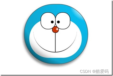
生病 怎么看都觉得别扭,哦!还差胡须须和白色脸底的边框呢,咱给补上:
/*胡须背景,主要用于挡住嘴巴的一部分,不要显得太长*/
 .doraemon .whiskers{
 width:220px;
 height:80px;
 background:#fff;
 border-radius:15px;
 position:absolute;
 top:120px;
 left:45px;
 z-index:2; /*在鼻子和眼睛下面*/
 }
 /*所有胡子的公用样式*/
 .doraemon .whiskers .whisker {
 width: 60px;
 height: 2px;
 background: #333;
 position: absolute;
 z-index: 2;
 }
 /*右上胡子*/
 .doraemon .whiskers .rTop {
 left: 165px;
 top: 25px;
 }
 /*右中胡子*/
 .doraemon .whiskers .rMiddle {
 left: 167px;
 top: 45px;
 }
 /*右下胡子*/
 .doraemon .whiskers .rBottom {
 left: 165px;
 top: 65px;
 }
 /*左上胡子*/
 .doraemon .whiskers .lTop {
 left: 0;
 top: 25px;
 }
 /*左中胡子*/
 .doraemon .whiskers .lMiddle {
 left: -2px;
 top: 45px;
 }
 /*左下胡子*/
 .doraemon .whiskers .lBottom {
 left: 0;
 top: 65px;
 }
 /*胡子旋转角度*/
 .doraemon .whiskers .r160 {
 -webkit-transform: rotate(160deg);
 -moz-transform: rotate(160deg);
 -ms-transform: rotate(160deg);
 -o-transform: rotate(160deg);
 transform: rotate(160deg);
 }
 .doraemon .whiskers .r20 {
 -webkit-transform: rotate(200deg);
 -moz-transform: rotate(200deg);
 -ms-transform: rotate(200deg);
 -o-transform: rotate(200deg);
 transform: rotate(200deg);
 }
微笑 这样就对了,看着多舒服啊!趁热打铁,做脖子和身体:
/*围脖*/
 .doraemon .choker {
 width: 230px;
 height: 20px;
 background: #c40;
 /*线性渐变 让围巾看上去更自然*/
 background: -webkit-gradient(linear,left top,left bottom,from(#c40),to(#800400));
 background: -moz-linear-gradient(center top,#c40,#800400);
 background: -ms-linear-gradient(center top,#c40,#800400);
 border: 2px solid #000;
 border-radius: 10px;
 position: relative;
 top: -40px;
 left: 45px;
 z-index: 4;
 }
 /*铃铛*/
 .doraemon .choker .bell {
 width: 40px;
 height: 40px;
 _overflow: hidden; /*IE6 hack*/
 border: 2px solid #000;
 border-radius: 50px;
 background: #f9f12a;
 background: -webkit-gradient(linear, left top, left bottom, from(#f9f12a),color-stop(0.5, #e9e11a), to(#a9a100));
 background: -moz-linear-gradient(top, #f9f12a, #e9e11a 75%,#a9a100);
 background: -ms-linear-gradient(top, #f9f12a, #e9e11a 75%,#a9a100);
 box-shadow: -5px 5px 10px rgba(0,0,0,0.25);
 position: absolute;
 top: 5px;
 left: 90px;
 }
 /*双横线*/
 .doraemon .choker .bell_line {
 width: 36px;
 height: 2px;
 background: #f9f12a;
 border: 2px solid #333;
 border-radius: 3px 3px 0 0;
 position: absolute;
 top: 10px;
 }
 /*黑点*/
 .doraemon .choker .bell_circle{
 width:12px;
 height:10px;
 background:#000;
 border-radius:5px;
 position:absolute;
 top:20px;
 left:14px;
 }
 /*黑点下的线*/
 .doraemon .choker .bell_under{
 width: 3px;
 height:15px;
 background:#000;
 position:absolute;
 left: 18px;
 top:27px;
 }
 /*铃铛高光*/
 .doraemon .choker .bell_light{
 width:12px;
 height:12px;
 border-radius:10px;
 box-shadow:19px 8px 5px #fff;
 position:absolute;
 top:-5px;
 left:5px;
 opacity:0.7;
 }
 /*身子*/
 .doraemon .bodys {
 position: relative;
 top: -310px;
 }
 /*肚子*/
 .doraemon .bodys .body {
 width: 220px;
 height: 165px;
 background: #07beea;
 background: -webkit-gradient(linear,right top,left top,from(#07beea),color-stop(0.5, #0073b3),color-stop(0.75,#00b0e0), to(#0096be));
 background: -moz-linear-gradient(right center,#07beea,#0073b3 50%,#00b0e0 75%,#0096be 100%);
 background: -ms-linear-gradient(right center,#07beea,#0073b3 50%,#00b0e0 75%,#0096be 100%);
 border:2px solid #333;
 position:absolute;
 top:265px;
 left:50px;
 }
 /*白色肚兜*/
 .doraemon .bodys .wraps {
 width: 170px;
 height: 170px;
 background: #fff;
 background: -webkit-gradient(linear, right top, left bottom, from(#fff),color-stop(0.75,#fff),color-stop(0.83,#eee),color-stop(0.90,#999),color-stop(0.95,#444), to(#000));
 background: -moz-linear-gradient(right top,#fff,#fff 75%,#eee 83%,#999 90%,#444 95%,#000);
 background: -ms-linear-gradient(right top,#fff,#fff 75%,#eee 83%,#999 90%,#444 95%,#000);
 border: 2px solid #000;
 border-radius: 85px;
 position: absolute;
 left: 72px;
 top: 230px;
 }
 /*口袋*/
 .doraemon .bodys .pocket {
 width: 130px;
 height: 130px;
 border-radius: 65px;
 background: #fff;
 background: -webkit-gradient(linear, right top, left bottom, from(#fff),color-stop(0.70,#fff),color-stop(0.75,#f8f8f8),color-stop(0.80,#eee),color-stop(0.88,#ddd), to(#fff));
 background: -moz-linear-gradient(right top, #fff, #fff 70%,#f8f8f8 75%,#eee 80%,#ddd 88%, #fff);
 background: -ms-linear-gradient(right top, #fff, #fff 70%,#f8f8f8 75%,#eee 80%,#ddd 88%, #fff);
 border: 2px solid #000;
 position:absolute;
 top: 250px;
 left: 92px;
 }
 /*挡住口袋一半*/
 .doraemon .bodys .pocket_mask {
 width: 134px;
 height: 60px;
 background:#fff;
 border-bottom: 2px solid #000;
 position:absolute;
 top: 259px;
 left: 92px;
 }
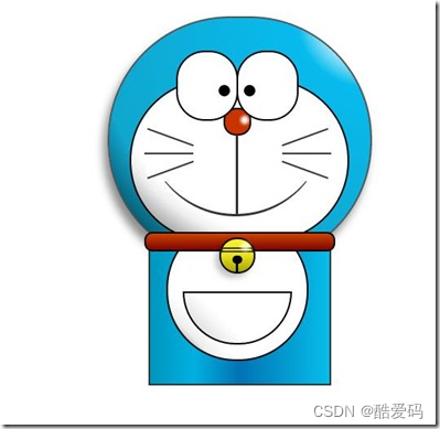
好吧,脖子和身子都有啦!上图:
现在看起来有点像摆设品,不过笑容还是那么单纯,好了,赶紧把手脚做出来:
*左右手*/
 .doraemon .hand_right, .doraemon .hand_left {
 height: 100px;
 width: 100px;
 position: absolute;
 top: 272px;
 left: 248px;
 }
 /*左手*/
 .doraemon .hand_left {
 left: -10px;
 }
 /*手臂公共部分*/
 .doraemon .arm {
 width:80px;
 height:50px;
 background: #07beea;
 background: -webkit-gradient(linear, left top, left bottom, from(#07beea),color-stop(0.85,#07beea), to(#555));
 background: -moz-linear-gradient(center top, #07BEEA, #07BEEA 85%, #555);
 background: -ms-linear-gradient(center top, #07BEEA, #07BEEA 85%, #555);
 border: 1px solid #000000;
 box-shadow: -10px 7px 10px rgba(0, 0, 0, 0.35);
 z-index: -1;
 position: relative;
 }
 /*右手手臂*/
 .doraemon .hand_right .arm {
 top: 17px;
 -webkit-transform: rotate(35deg);
 -moz-transform: rotate(35deg);
 -ms-transform: rotate(35deg);
 -o-transform: rotate(35deg);
 transform: rotate(35deg);
 }
 /*左手手臂*/
 .doraemon .hand_left .arm {
 top: 17px;
 background: #0096be; /*背光一面使用纯色,使其有立体感*/
 box-shadow: 5px -7px 10px rgba(0, 0, 0, 0.25);
 -webkit-transform: rotate(145deg);
 -moz-transform: rotate(145deg);
 -ms-transform: rotate(145deg);
 -o-transform: rotate(145deg);
 transform: rotate(145deg);
 }
 /*圆形手掌公共部分*/
 .doraemon .circle {
 width: 60px;
 height: 60px;
 border-radius: 30px;
 border: 2px solid #000;
 background: #fff;
 background: -webkit-gradient(linear, right top, left bottom, from(#fff),color-stop(0.5,#fff),color-stop(0.70,#eee),color-stop(0.8,#ddd), to(#999));
 background: -moz-linear-gradient(right top, #fff, #fff 50%, #eee 70%, #ddd 80%,#999);
 background: -ms-linear-gradient(right top, #fff, #fff 50%, #eee 70%, #ddd 80%,#999);
 position: absolute;
 }
 /*右手手掌*/
 .doraemon .hand_right .circle {
 left: 40px;
 top: 32px;
 }
 /*左手手掌*/
 .doraemon .hand_left .circle {
 left: -20px;
 top: 32px;
 }
 /*手臂和身体结合处,使用背景遮住边框*/
 .doraemon .arm_rewrite {
 height: 45px;
 width: 5px;
 background: #07beea;
 position: relative;
 }
 /*右手结合处*/
 .doraemon .hand_right .arm_rewrite {
 top: -45px;
 left: 22px;
 }
 /*左手结合处*/
 .doraemon .hand_left .arm_rewrite {
 top: -45px;
 left: 60px;
 background: #0096be; /*同理,背光一面使用纯色,使其有立体感*/
 }
 /*脚部*/
 .doraemon .foot {
 width: 280px;
 height: 40px;
 position: relative;
 top: 55px;
 left: 20px;
 }
 /*左右脚共同样式*/
 .doraemon .foot .left, .doraemon .foot .right {
 width: 125px;
 height: 30px;
 background: #fff;
 background: -webkit-gradient(linear, right top, left bottom, from(#fff),color-stop(0.75,#fff),color-stop(0.85,#eee), to(#999));
 background: -moz-linear-gradient(right top, #fff, #fff 75%, #eee 85%, #999);
 background: -ms-linear-gradient(right top, #fff, #fff 75%, #eee 85%, #999);
 border: 2px solid #333;
 border-radius: 80px 60px 60px 40px;
 box-shadow: -6px 0 10px rgba(0, 0, 0, 0.35);
 position: relative;
 }
 .doraemon .foot .left {
 left: 8px;
 top: 65px;
 }

 .doraemon .foot .right {
 top: 31px;
 left: 141px;
 }
 /*双脚之间的缝隙,加阴影使用立体感*/
 .doraemon .foot .foot_rewrite {
 width: 20px;
 height: 10px;
 background: #fff;
 background: -webkit-gradient(linear, right top, left bottom, from(#666),color-stop(0.83,#fff), to(#fff));
 background: -moz-linear-gradient(right top, #666, #fff 83%, #fff);
 background: -ms-linear-gradient(right top, #666, #fff 83%, #fff);
 /*制作半圆效果*/
 border: 2px solid #000;
 border-bottom: none;
 border-radius: 40px 40px 0 0;
 position: relative;
 top: -11px;
 left: 130px;
 _left: 127px;
 }
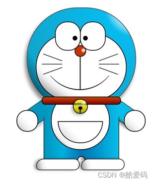
好了,最后完整结果:
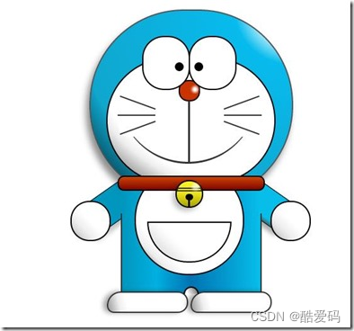
看一下,效果是不是和一开始的一样呢 大笑 ,虽然做好了,但是还是可以让它动起来的,比如眼睛,我们可以给它加个动画效果,让眼睛转动起来:
/*眼珠*/
 .doraemon .eyes .eye .black {
 width: 14px;
 height: 14px;
 background: #000;
 border-radius: 7px;
 position: absolute;
 top: 40px;
 -webkit-animation: eyemove 3s linear infinite;
 -moz-animation: eyemove 3s linear infinite;
 -ms-animation: eyemove 3s linear infinite;
 -o-animation: eyemove 3s linear infinite;
 animation: eyemove 3s linear infinite;
 }

 /*让眼睛动起来*/
 @-webkit-keyframes eyemove {
 70%{
 margin:0 0 0 0;
 }
 80% {
 margin: -22px 0 0 0;
 }

 85% {
 margin: -22px 0 0 5px;
 }

 90% {
 margin: -22px 10px 0 0;
 }

 93% {
 margin: -22px 0 0 0;
 }

 96% {
 margin: 0 0 0 0;
 }
 }

 @-moz-keyframes eyemove {
 70% {
 margin: 0 0 0 0;
 }

 80% {
 margin: -22px 0 0 0;
 }

 85% {
 margin: -22px 0 0 5px;
 }

 90% {
 margin: -22px 10px 0 0;
 }

 93% {
 margin: -22px 0 0 0;
 }

 96% {
 margin: 0 0 0 0;
 }
 }

 @-o-keyframes eyemove {
 70% {
 margin: 0 0 0 0;
 }

 80% {
 margin: -22px 0 0 0;
 }

 85% {
 margin: -22px 0 0 5px;
 }

 90% {
 margin: -22px 10px 0 0;
 }

 93% {
 margin: -22px 0 0 0;
 }

 96% {
 margin: 0 0 0 0;
 }
 }
 @keyframes eyemove {
 70% {
 margin: 0 0 0 0;
 }

 80% {
 margin: -22px 0 0 0;
 }

 85% {
 margin: -22px 0 0 5px;
 }

 90% {
 margin: -22px 10px 0 0;
 }

 93% {
 margin: -22px 0 0 0;
 }

 96% {
 margin: 0 0 0 0;
 }
 }
OK,这样,眼睛就会动了,有兴趣的可以试一下,这里就无法展示了。但是如果你有什么更好的动画效果也可以尝试,那么这个案例就结束了。