📋文章目录
- 复现图片
- 设置工作路径和加载相关R包
- 读取数据集
- 数据可视化
- 计算均值和标准差
- 可视化过程
跟着「Nature」正刊学作图,今天复现Nature文章中的一张双轴图–左边为分组柱状图、右边为折线散点图。
复现图片

图中的a是我们今天准备复刻的,该图由柱状图和散点图组合的双轴图。
设置工作路径和加载相关R包
rm(list = ls()) # 清空当前环境变量
setwd("C:/Users/Zz/Desktop/公众号 SES") # 设置工作路径
# 加载R包
library(ggplot2)
library(tidyverse)
读取数据集
cData <- read_csv("cData.csv")
head(cData)
# Weeks Type               lfValue rgValue
# <dbl> <chr>                <dbl>   <dbl>
# 1    20 By week of testing    2500    1.3
# 2    20 By week of testing    2550    1.5
# 3    20 By week of testing    2450    1.45
# 4    21 By week of testing    2750    1.2
# 5    21 By week of testing    2780    1.25
# 6    21 By week of testing    2680    1.18
数据可视化
# 物种组成堆叠面积图
library(ggplot2)
library(ggalluvial)
ggplot(data = top10,
       aes(x = Depth, y = Abundance, fill = reorder(Phylum, -Abundance),
           colour = reorder(Phylum, -Abundance),
           stratum = reorder(Phylum, -Abundance) ,
           alluvium = reorder(Phylum, -Abundance))) +
  geom_alluvium(aes(fill = reorder(Phylum, -Abundance)),
                alpha = 0.7, decreasing = FALSE) +
  geom_stratum(aes(fill = reorder(Phylum, Abundance)),
                   width = 0.3, size = 0.1, color = "black") +
  scale_y_continuous(expand = c(0, 0)) +
  theme_bw() +
  facet_grid(. ~ Treat, scales = "fixed") +
  scale_fill_manual(values = c("#EB7369", "#CF8B0B", "#9D9F20", "#2BB077", "#2BB077",
                                "#1BB3B7", "#29A4DE", "#8989C1", "#B174AD",
                                "#DE66A1"), name =  "Phylum") +
  scale_color_manual(values = c("#EB7369", "#CF8B0B", "#9D9F20", "#2BB077", "#2BB077",
                                "#1BB3B7", "#29A4DE", "#8989C1", "#B174AD",
                                "#DE66A1")) +
  guides(color = "none")+
  theme(
    panel.grid=element_blank(),
    panel.spacing.x = unit(0, units = "cm"),
    strip.background = element_rect(
      color = "white", fill = "white",
      linetype = "solid", size = 1),
    strip.placement = "outside",
    axis.line.y.left = element_line(color = "black", size = 0.7),
    axis.line.x.bottom = element_line(color = "black", size = 0.7),
    strip.text.x = element_text(size = 14, face = "bold"),
    axis.text = element_text(face = "bold",
                             size = 12, color = "black"),
    axis.title = element_text(face = "bold",
                              size = 14, colour = "black"),
    legend.title = element_text(face = "bold",
                                size = 12, color = "black"),
    legend.text = element_text(face = "bold", size = 12, color = "black"),
    axis.ticks.x = element_line(size = 1),
    axis.ticks.y = element_line(size = 1),
  )+
  labs(x = "Depth",y= "Relative Abundance of Phylum (%)")
数据包括以下指标:2个(左边和右边)数值变量、2个分类变量。
在可视化前,我们需要先思考图中构成的元素,由哪些组成。
- 计算每个分组或处理下的均值和标准差;
计算均值和标准差
cData_summary <- cData %>%
  group_by(Weeks, Type) %>%
  summarise(
    avg_lfValue = mean(lfValue),
    sd_lfValue = sd(lfValue),
    avg_rgValue = mean(rgValue),
    sd_rgValue = sd(rgValue),
  )
cData_summary
# Weeks Type               avg_lfValue sd_lfValue avg_rgValue sd_rgValue
# <dbl> <chr>                    <dbl>      <dbl>       <dbl>      <dbl>
# 1    20 By week of onset         2623.       25.2        1.98     0.0764
# 2    20 By week of testing       2500        50          1.42     0.104
# 3    21 By week of onset         3543.       40.4        1.74     0.0361
# 4    21 By week of testing       2737.       51.3        1.21     0.0361
# 5    22 By week of onset         2770        26.5        1.28     0.0300
# 6    22 By week of testing       2160        60          1.10     0.0839
# 7    23 By week of onset         2143.       40.4        1.31     0.0208
# 8    23 By week of testing       1777.       75.1        1.02     0.0153
# 9    24 By week of onset         1823.       25.2        1.15     0.0300
# 10    24 By week of testing       1667.       61.1        1.07     0.0265
# 11    25 By week of onset         1690        36.1        1.23     0.0208
# 12    25 By week of testing       1610        36.1        1.2      0.0300
# 13    26 By week of onset         1607.       30.6        1.18     0.0252
# 14    26 By week of testing       1673.       30.6        1.16     0.0361
可视化过程
ggplot()+
  geom_bar(
    data = cData_summary %>%
             mutate(Type = factor(Type, levels = c("By week of testing","By week of onset"))),
           aes(x = Weeks, y = avg_lfValue, fill = Type),
           alpha = 0.5, stat = "identity", position = position_dodge(0.75), width = 0.75
    ) +
  geom_errorbar(
    data = cData_summary %>%
      mutate(Type = factor(Type, levels = c("By week of testing","By week of onset"))),
    aes(x = Weeks, y = avg_lfValue,
        ymin = avg_lfValue - sd_lfValue, ymax = avg_lfValue + sd_lfValue,
        group = Type), color = "black",
    position = position_dodge(0.75), width = 0.2
  ) +
  geom_line(
    data = cData_summary %>%
      mutate(Type = factor(Type, levels = c("By week of testing","By week of onset"))),
    aes(x = Weeks, avg_rgValue*1950, group = Type, color = Type),
    position = position_dodge(0.75), linewidth = 0.8
    ) +
  geom_point(
    data = cData_summary %>%
      mutate(Type = factor(Type, levels = c("By week of testing","By week of onset"))),
    aes(x = Weeks, y = avg_rgValue*1950, color = Type),
    position = position_dodge(0.75), size = 2.5
  ) +
  scale_x_continuous(
    breaks = seq(20, 26, 1)
    ) +
  scale_y_continuous(name = c("Number of laboratory-confirmed\n sympotomatic cases"),
                     sec.axis = sec_axis(~ ./1950,
                                         name = c("Test positivity rate (%)"),
                                         breaks = seq(0, 2, 1)),
                     limits = c(0, 4000),
                     breaks = seq(0, 4000, 500),
                     expand = c(0, 0)) +
  scale_color_manual(
    values = c("#FE8F3C", "#1E899A")
                     ) +
  scale_fill_manual(
    values = c("#FE8F3C", "#1E899A")
  ) +
  theme_bw() +
  theme(
    legend.position = c(0.9, 0.9),
    legend.background = element_blank(),
    panel.grid.major = element_blank(),
    panel.grid.minor = element_blank(),
    axis.text.x.bottom = element_text(color = "black", size = 12),
    axis.text.y.left = element_text(color = "black", size = 12),
    axis.text.y.right = element_text(color = "#44909A", size = 12),
    axis.title.y.right = element_text(color = "#44909A", size = 12, angle = 90),
    axis.line.y.right = element_line(color = "#44909A"),
    axis.ticks.y.right = element_line(color = "#44909A"),
    axis.title = element_text(color = "black", size = 12)
    ) +
  labs(
    x = "Week",
    color = "",
    fill = ""
    )
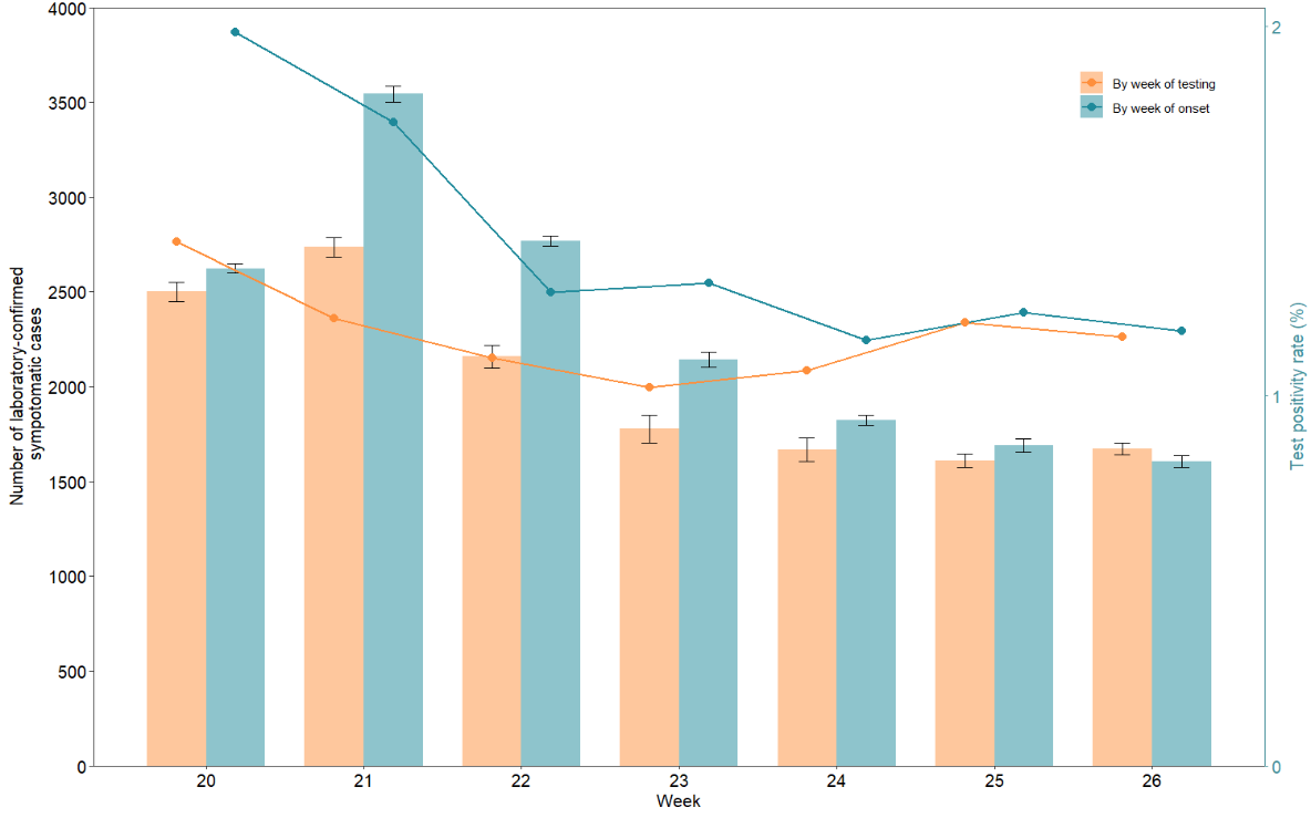
复现效果比较完美,细节可以参考文中代码,有疑惑可以留言讨论~
