数据可视化
技术栈

canvas
<canvas width="300" height="300"></canvas>
- 当没有设置宽度和高度的时候,canvas 会初始化宽度为 300 像素和高度为 150 像素。切记不能通过样式去设置画布的宽度与高度
- 宽高必须通过属性设置,如果使用样式设置,会导致画布内的坐标出现问题
- 给canvas画布添加文本内容、子节点没有任何意义
- 浏览器认为canvas标签是一张图片,右键可保存图片
- 你想操作canvas画布:画布当中绘制图形、显示一个文字,都必须通过JS完成
获取上下文
const canvas = document.querySelector('canvas');
// 获取canvas的上下文 相当于笔
const ctx = canvas.getContext('2d');
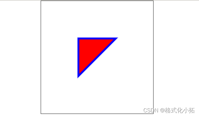
绘制线段
1.线段的起点 x,y
ctx.moveTo(100,100);
2.其他点
ctx.lineTo(100,200);
ctx.lineTo(200,100);
3.绘制线段
ctx.stroke();
4.图形的填充颜色
ctx.fillStyle = 'red';
5.填充
ctx.fill();
6.线段的颜色,宽度
ctx.strokeStyle = 'blue';
ctx.lineWidth = '5';
7.将起点和终点连接
ctx.closePath();
<style>
    *{
        margin: 0;
        padding: 0;
        box-sizing: border-box;
    }
    body{
        display: flex;
        align-items: center;
        justify-content: center;
    }
    canvas{
        border: 1px solid black;
    }
</style>
<body>
    <canvas width="300" height="300"></canvas>
    <script>
        const canvas = document.querySelector('canvas');
        // 获取canvas的上下文 相当于笔
        const ctx = canvas.getContext('2d');
        // 线段的起点 x,y
        ctx.moveTo(100,100);
        // 其他点
        ctx.lineTo(100,200);
        ctx.lineTo(200,100);
        // 图形的填充颜色
        ctx.fillStyle = 'red';
        // 填充
        ctx.fill();
        // 线段的颜色,宽度
        ctx.strokeStyle = 'blue';
        ctx.lineWidth = '5';
        // 将起点和终点连接
        ctx.closePath();
        // stroke方法绘制线段
        ctx.stroke();
    </script>
</body>
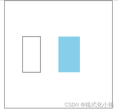
绘制矩形
第一种方式:strokeRect(),参数为x、y、w、h 缺点:没有办法设置填充颜色
ctx.strokeRect(50, 100, 50, 100)
第二种方式:fillRect() ,填充颜色可以替换 绘制图形之前设置填充颜色
ctx.fillStyle = "skyblue"; ctx.fill(); ctx.fillRect(150, 100, 60, 100);
<body>
    <canvas width="300" height="300"></canvas>
    <script>
        const canvas = document.querySelector('canvas');
        // 获取canvas的上下文 相当于笔
        const ctx = canvas.getContext('2d');
        //绘制矩形
        // 第一种方式:strokeRect()参数为x、y、w、h 缺点:没有办法设置填充颜色
        ctx.strokeRect(50, 100, 50, 100)
        // 第二种方式:fillRect() 填充颜色可以替换 绘制图形之前设置填充颜色
        ctx.fillStyle = "skyblue";
        ctx.fill();
        ctx.fillRect(150, 100, 60, 100);
    </script>
</body>
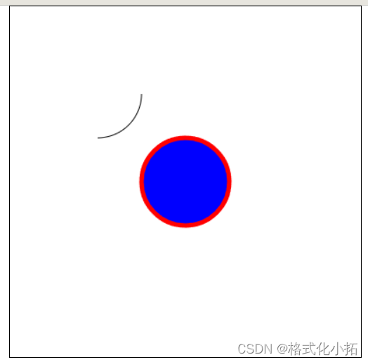
绘制圆形
arc(x, y, radius, starAngle, endAngle, anticlockwise)
- x : 圆心的 x 坐标
- y:圆心的 y 坐标
- radius : 半径
- starAngle :开始角度
- endAngle:结束角度
- anticlockwise :是否逆时针(true)为逆时针,(false)为顺时针
<body>
    <canvas width="400" height="400"></canvas>
    <script>
        const canvas = document.querySelector('canvas');
        const ctx = canvas.getContext('2d');
        // 开始
        ctx.beginPath();
        // x,y,r,起始弧度 ,结束弧度,是否逆时针绘制
        // 2 * PI * 弧度 = 360
        // 弧
        ctx.arc(100, 100, 50, 0.5 * Math.PI, 2 * Math.PI, true);
        // 结束
        ctx.stroke();

        // 圆
        ctx.beginPath();
        ctx.strokeStyle = 'red';
        ctx.lineWidth = '5';
        ctx.arc(200, 200, 50, 0, 2 * Math.PI, true);
        // 必须放置arc后面
        ctx.fillStyle = "blue";
        ctx.fill();
        ctx.stroke();
    </script>
</body>
清除路径
清除绘画的路径,多个图形就不会连接在一起
context.beginPath()
context.closePath()
清除矩形区域
当在一个画布反复绘制图形,需要将上一次的图形清空
clearRect(x, y, width, height)
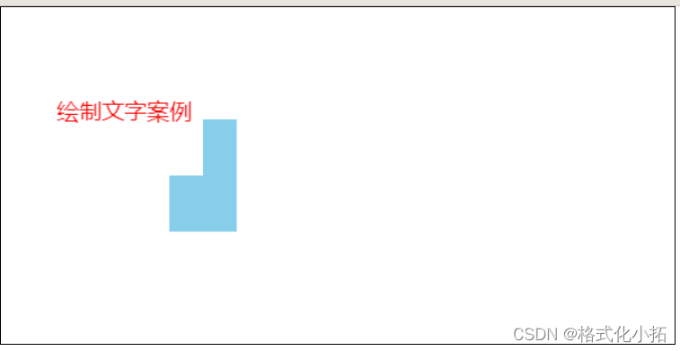
绘制文字
fillText(text, x, y, maxWidth)
<body>
    <!-- 宽高必须通过属性设置,如果使用样式设置,会导致画布内的坐标出现问题 -->
    <canvas width="600" height="300"></canvas>
    <script>
        const canvas = document.querySelector('canvas');
        const ctx = canvas.getContext('2d');
        ctx.fillStyle = "skyblue";
        ctx.fill();
        ctx.fillRect(150, 100, 60, 100);
        // 清除画布-整个画布 起点x,y,width,height
        // ctx.clearRect(0,0,600,300);
        // 清除部分画布
        ctx.clearRect(150, 100, 30, 50);
        // 文字样式
        ctx.fillStyle = "red";
        ctx.font = '20px 微软雅黑';
        // 绘制文字 tex,x,y
        ctx.fillText('绘制文字案例', 50, 100)
    </script>
</body>
案例:绘制一个柱状图

<!DOCTYPE html>
<html lang="en">

<head>
    <meta charset="UTF-8">
    <meta name="viewport" content="width=device-width, initial-scale=1.0">
    <title>案例绘制柱状图</title>
    <style>
        * {
            margin: 0;
            padding: 0;
        }

        body {
            display: flex;
            justify-content: center;
        }

        canvas {
            border: 1px solid black;
        }
    </style>
</head>

<body>
    <canvas width="800" height="520"></canvas>
    <script>
        const canvas = document.querySelector('canvas');
        const ctx = canvas.getContext('2d');
        // 绘制标题文字
        ctx.font = '20px 微软雅黑';
        ctx.fillStyle = '#c23531';
        ctx.fillText('数据可视化-柱状图', 60, 20);
        // 绘制坐标轴
        ctx.moveTo(100, 100);
        ctx.lineTo(100, 400);
        ctx.lineTo(700, 400);
        // y轴
        ctx.moveTo(100, 100);
        ctx.lineTo(90, 100);
        ctx.moveTo(100, 160);
        ctx.lineTo(90, 160);
        ctx.moveTo(100, 220);
        ctx.lineTo(90, 220);
        ctx.moveTo(100, 280);
        ctx.lineTo(90, 280);
        ctx.moveTo(100, 340);
        ctx.lineTo(90, 340);
        ctx.moveTo(100, 400);
        ctx.lineTo(90, 400);
        // x轴
        ctx.moveTo(100, 400);
        ctx.lineTo(100, 410);
        ctx.moveTo(250, 400);
        ctx.lineTo(250, 410);
        ctx.moveTo(400, 400);
        ctx.lineTo(400, 410);
        ctx.moveTo(550, 400);
        ctx.lineTo(550, 410);
        ctx.moveTo(700, 400);
        ctx.lineTo(700, 410);
        ctx.stroke()
        // 横线
        ctx.strokeStyle = 'rgb(204, 204, 204)';
        ctx.moveTo(100, 100);
        ctx.lineTo(700, 100);
        ctx.moveTo(100, 160);
        ctx.lineTo(700, 160);
        ctx.moveTo(100, 220);
        ctx.lineTo(700, 220);
        ctx.moveTo(100, 280);
        ctx.lineTo(700, 280);
        ctx.moveTo(100, 340);
        ctx.lineTo(700, 340);
        ctx.stroke()
        // y轴文本
        ctx.font = '16px 微软雅黑';
        ctx.fillStyle = 'black';
        ctx.fillText('150', 60, 108);
        ctx.fillText('120', 60, 168);
        ctx.fillText('90', 70, 228);
        ctx.fillText('60', 70, 288);
        ctx.fillText('30', 70, 348);
        ctx.fillText('0', 80, 408);
        // x轴文本
        ctx.fillText('食品', 160, 420);
        ctx.fillText('数码', 310, 420);
        ctx.fillText('服饰', 460, 420);
        ctx.fillText('箱包', 610, 420);
        // 绘制矩形 x,y,width,height 注意高度是向下计算,左上角为起点
        ctx.fillStyle = '#c23531';
        ctx.fillRect(120, 340, 110, 60);
        ctx.fillRect(270, 180, 110, 220);
        ctx.fillRect(420, 220, 110, 180);
        ctx.fillRect(570, 100, 110, 300);
    </script>
</body>

</html>
![[外链图片转存失败,源站可能有防盗链机制,建议将图片保存下来直接上传(img-3lW85DCu-1692416369798)(../3.js笔记复习/JavaScript.assets/下载.png)]](https://img-blog.csdnimg.cn/ab3fc07cc7ec4c7b9b7f7dc4fee165bf.png)
svg
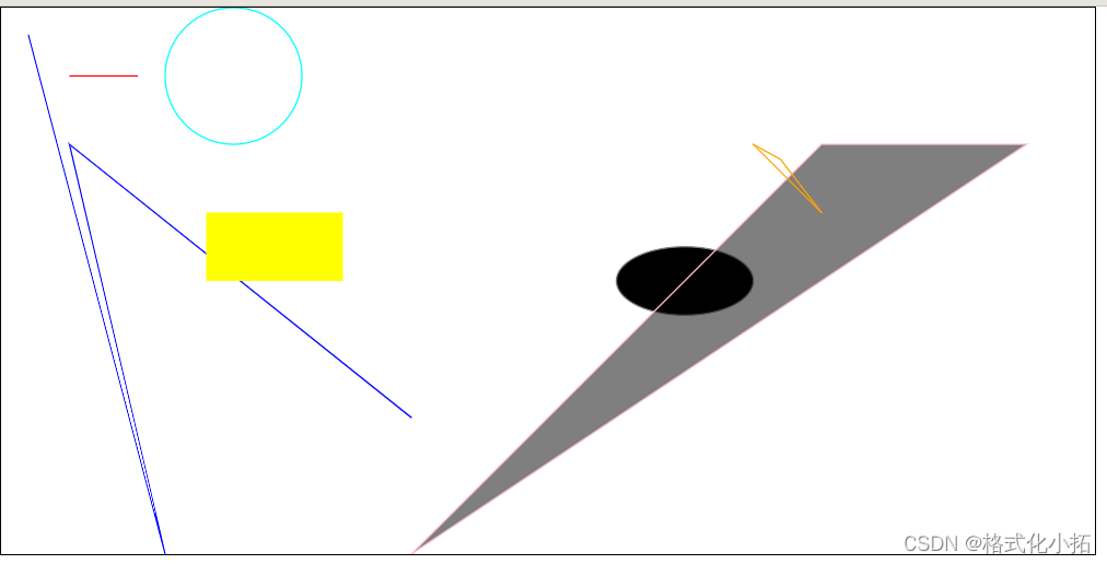
SVG是一种基于 XML 的图像文件格式,全称为Scalable Vector Graphics,可缩放的矢量图形。
<svg> 包裹并定义整个矢量图。<svg>
案例
<!DOCTYPE html>
<html lang="en">

<head>
    <meta charset="UTF-8">
    <meta name="viewport" content="width=device-width, initial-scale=1.0">
    <title>Document</title>
    <style>
        * {
            margin: 0;
            padding: 0;
        }

        svg {
            width: 800px;
            height: 400px;
            border: 1px solid black;
        }
    </style>
</head>

<body>
    <!-- 默认300 * 150,绘图必须在svg内部绘制 -->
    <svg>
        <!-- 绘制线段 -->
        <line x1="50" y1="50" x2="100" y2="50" stroke="red"></line>
        <!-- 绘制折线 -->
        <polyline points="300 300,50,100,120 400,20 20" stroke="blue" fill-opacity="0"></polyline>
        <!-- 绘制矩形 -->
        <rect x="150" y="150" width="100" height="50" fill="yellow"></rect>
        <!-- 绘制圆形 -->
        <circle cx="170" cy="50" r="50" style="stroke: cyan;fill:none"></circle>
        <!-- 绘制圆形和椭圆 -->
        <ellipse cx="500" cy="200" rx="50" ry="25" style="stroke: gray;fill: black;"></ellipse>
        <!-- 绘制多边形 -->
        <polygon points="600 100,300,400,750 100" stroke="pink" fill-opacity="0.5"></polygon>
        <!-- 绘制任意形状或路径 -->
        <path stroke="orange" fill-opacity="0" d="
        M 550 100 ,
        L 570 111,
        L 600 150,
        Z"></path>
    </svg>
</body>

</html>
使用方法
以下标签都要包裹在 <svg> 中使用
<line>
创建一条直线。
<!--
  x1 y1 是第一个点坐标
  x2 y2 是第二个点坐标
 -->
<line x1="" y1="" x2="" y2=""></line>
<polyline>
创建折线。
<!--
  依次传入点坐标,即可绘制
 -->
<polyline points="
  x1 y1
  x2 y2
  x3 y3
  ...
"></polyline>
<!-- 你也可以把上面的代码写成: -->
<polyline points="x1 y1, x2 y2, x3 y3"></polyline>
<!-- 或 -->
<polyline points="x1 y1 x2 y2 x3 y3"></polyline>
<rect>
创建矩形。
<!--
  x y 左上角点坐标
  width 宽度
  height 高度
 -->
<rect x="" y="" width="" height=""></rect>
<circle>
创建圆。
<!--
  cx cy 圆心点坐标
  r 半径
  style 样式
-->
<circle cx='70' cy='95' r='50' style='stroke:black; fill:none'></circle>
<ellipse>
创建圆和椭圆。
<!--
  cx cy 圆心点坐标
  rx x轴半径
  ry y轴半径
 -->
<ellipse cx="" cy="" rx="" ry="" style="fill:black;"></ellipse>
<polygon>
创建多边形。
<polygon points="x1 y1, x2 y2, x3 y3" />
<path>
通过指定点以及点和点之间的线来创建任意形状。
<!--
  M 移动到初始位置
  L 画线
  Z 将结束和开始点闭合
-->
<path d="
  M x1 y1
  L x2 y2
  L x3 y3
  L x4 y4
  L x5 y5
  L x6 y6
  L x7 y7
  Z
"></path>
起始文件
<!DOCTYPE html>
<html lang="en">

<head>
  <meta charset="UTF-8">
  <meta name="viewport" content="width=device-width, initial-scale=1.0">
  <meta http-equiv="X-UA-Compatible" content="ie=edge">
  <title>Hand Coded SVG</title>
  <style>
    html,
    body {
      height: 100%;
      width: 100%;
      background: #e9e9e9;
    }

    body {
      margin: 0;
      text-align: center;
    }

    .grid {
      width: 750px;
      height: 500px;
      margin: 0 auto;
      padding-top: 100px;
      padding-left: 100px;
      background-image: url('grid.png');
      position: relative;
    }

    .grid::before {
      content: "";
      border-left: 1px solid #7c7cea;
      position: absolute;
      top: 0;
      left: 100px;
      width: 750px;
      height: 600px;
    }

    .grid::after {
      content: "";
      border-top: 1px solid #7c7cea;
      position: absolute;
      top: 100px;
      left: 0;
      width: 850px;
      height: 500px;
    }

    svg {
      stroke: #000;
      stroke-width: 5;
      stroke-linecap: round;
      stroke-linejoin: round;
      fill: none;
    }
  </style>
</head>

<body>

  <div class="grid">

  </div>

</body>

</html>
- SVG入门—如何手写SVG(opens new window)
- SVG 入门指南
Echarts
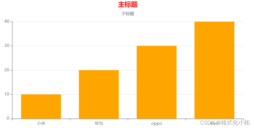
01-基本使用
<!DOCTYPE html>
<html lang="en">

<head>
    <meta charset="UTF-8">
    <meta name="viewport" content="width=device-width, initial-scale=1.0">
    <title>Document</title>
    <!-- 从bootcdn获取echarts的在线链接 -->
    <script src="https://cdn.bootcdn.net/ajax/libs/echarts/5.4.2/echarts.js"></script>
    <style>
        * {
            margin: 0;
            padding: 0;
        }

        .ec {
            margin: 0 auto;
            width: 800px;
            height: 400px;
        }
    </style>
</head>

<body>
    <!-- 图表容器 -->
    <div class="ec"></div>
    <script>
        // 初始化echarts容器
        const myEcharts = echarts.init(document.querySelector('.ec'));
        // 设定配置项、数据
        const option = {
            // 图表标题
            title: {
                // 主标题
                text: '主标题',
                // 主标题颜色
                textStyle: {
                    color: 'red',
                },
                // 主标题位置
                left: 'center',
                // 子标题
                subtext: '子标题',
            },
            // x轴配置项
            xAxis: {
                // x轴数据
                data: ['小米', '华为', 'oppo', 'vivo'],
            },
            // y轴配置项
            yAxis: {
                // 显示y轴的线
                axisLine: {
                    show: true,
                },
                // 显示y轴刻度
                axisTick: {
                    show: true,
                }
            },
            // 系列设置:图标类型 数据展示
            series: [
                {
                    // 图标类型 bar line pie
                    type: 'bar',
                    // 数据
                    data: [10, 20, 30, 40],
                    // 颜色
                    color: 'orange',
                }
            ]
        }
        // 设定配置项
        myEcharts.setOption(option);
    </script>
</body>

</html>
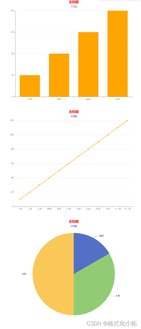
02-多个图表展示
<!DOCTYPE html>
<html lang="en">

<head>
    <meta charset="UTF-8">
    <meta name="viewport" content="width=device-width, initial-scale=1.0">
    <title>Document</title>
    <!-- 从bootcdn获取echarts的在线链接 -->
    <script src="https://cdn.bootcdn.net/ajax/libs/echarts/5.4.2/echarts.js"></script>
    <style>
        * {
            margin: 0;
            padding: 0;
        }

        .ec,
        .ec2,
        .ec3 {
            margin: 0 auto;
            width: 800px;
            height: 600px;
        }
    </style>
</head>

<body>
    <!-- 图表容器 -->
    <div class="ec"></div>
    <div class="ec2"></div>
    <div class="ec3"></div>
    <script>
        // 图表一
        // 初始化echarts容器
        const myEcharts = echarts.init(document.querySelector('.ec'));
        // 设定配置项、数据
        const option = {
            // 图表标题
            title: {
                // 主标题
                text: '主标题',
                // 主标题颜色
                textStyle: {
                    color: 'red',
                },
                // 主标题位置
                left: 'center',
                // 子标题
                subtext: '子标题',
            },
            // x轴配置项
            xAxis: {
                // x轴数据
                data: ['小米', '华为', 'oppo', 'vivo'],
            },
            // y轴配置项
            yAxis: {
                // 显示y轴的线
                axisLine: {
                    show: true,
                },
                // 显示y轴刻度
                axisTick: {
                    show: true,
                }
            },
            // 系列设置:图标类型 数据展示
            series: [
                {
                    // 图标类型 bar line pie
                    type: 'bar',
                    // 数据
                    data: [10, 20, 30, 40],
                    // 颜色
                    color: 'orange',
                }
            ]
        }
        // 设定配置项
        myEcharts.setOption(option);

        // 图表二
        // 初始化echarts容器
        const myEcharts2 = echarts.init(document.querySelector('.ec2'));
        // 设定配置项、数据
        const option2 = {
            // 图表标题
            title: {
                // 主标题
                text: '主标题',
                // 主标题颜色
                textStyle: {
                    color: 'red',
                },
                // 主标题位置
                left: 'center',
                // 子标题
                subtext: '子标题',
                // 子标题颜色
                subtextStyle: {
                    color: 'blue'
                }
            },
            // x轴配置项
            xAxis: {
                // x轴数据
                data: ['一月', '二月', '三月', '四月', '五月', '六月', '七月', '八月', '九月', '十月', '十一月', '十二月'],
            },
            // y轴配置项
            yAxis: {
                // // 显示y轴的线
                // axisLine: {
                //     show: true,
                // },
                // // 显示y轴刻度
                // axisTick: {
                //     show: true,
                // }
            },
            // 系列设置:图标类型 数据展示
            series: [
                {
                    // 图标类型 bar line pie
                    type: 'line',
                    // 数据
                    data: [10, 20, 30, 40, 50, 60, 70, 80, 90, 100, 110, 120],
                    // 颜色
                    color: 'orange',
                }
            ]
        }
        // 设定配置项
        myEcharts2.setOption(option2);

        // 图表三
        // 初始化echarts容器
        const myEcharts3 = echarts.init(document.querySelector('.ec3'));
        // 设定配置项、数据
        const option3 = {
            // 图表标题
            title: {
                // 主标题
                text: '主标题',
                // 主标题颜色
                textStyle: {
                    color: 'red',
                },
                // 主标题位置
                left: 'center',
                // 子标题
                subtext: '子标题',
                // 子标题颜色
                subtextStyle: {
                    color: 'blue'
                }
            },
            // // x轴配置项
            // xAxis: {},
            // // y轴配置项
            // yAxis: {},
            // 系列设置:图标类型 数据展示
            series: [
                {
                    // 图标类型 bar line pie
                    type: 'pie',
                    // 数据
                    data: [
                        {
                            name: '蔬菜',
                            value: 10
                        },
                        {
                            name: '水果',
                            value: 20
                        },
                        {
                            name: '肉类',
                            value: 30
                        },
                    ],
                    // 饼图 宽高
                    width: 600,
                    height: 600,
                    // 饼图 位置
                    left: 100,
                    // top: 5,
                    // 饼图 半径
                    // radius: 400,
                }
            ]
        }
        // 设定配置项
        myEcharts3.setOption(option3);
    </script>
</body>

</html>
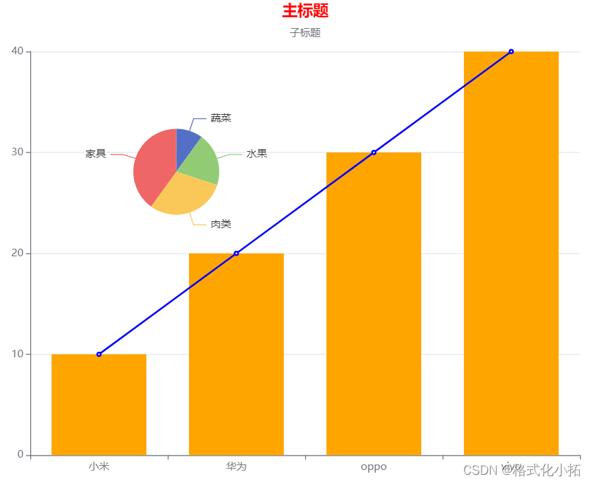
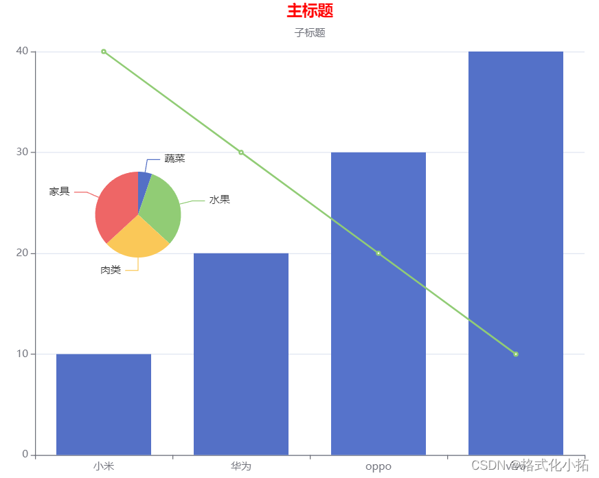
03-一个图标展示多个图标类型
<!DOCTYPE html>
<html lang="en">

<head>
    <meta charset="UTF-8">
    <meta name="viewport" content="width=device-width, initial-scale=1.0">
    <title>Document</title>
    <!-- 从bootcdn获取echarts的在线链接 -->
    <script src="https://cdn.bootcdn.net/ajax/libs/echarts/5.4.2/echarts.js"></script>
    <style>
        * {
            margin: 0;
            padding: 0;
        }

        .ec{
            margin: 0 auto;
            width: 800px;
            height: 600px;
        }
    </style>
</head>

<body>
    <!-- 图表容器 -->
    <div class="ec"></div>
    <script>
        // 图表一
        // 初始化echarts容器
        const myEcharts = echarts.init(document.querySelector('.ec'));
        // 设定配置项、数据
        const option = {
            // 图表标题
            title: {
                // 主标题
                text: '主标题',
                // 主标题颜色
                textStyle: {
                    color: 'red',
                },
                // 主标题位置
                left: 'center',
                // 子标题
                subtext: '子标题',
            },
            // x轴配置项
            xAxis: {
                // x轴数据
                data: ['小米', '华为', 'oppo', 'vivo'],
            },
            // y轴配置项
            yAxis: {
                // 显示y轴的线
                axisLine: {
                    show: true,
                },
                // 显示y轴刻度
                axisTick: {
                    show: true,
                }
            },
            // 系列设置:图标类型 数据展示
            series: [
                {
                    // 图标类型 bar line pie
                    type: 'bar',
                    // 数据
                    data: [10, 20, 30, 40],
                    // 颜色
                    color: 'orange',
                },
                {
                    // 图标类型 bar line pie
                    type: 'line',
                    // 数据
                    data: [10, 20, 30, 40],
                    // 颜色
                    color: 'blue',
                },
                {
                    // 图标类型 bar line pie
                    type: 'pie',
                    // 数据
                    data: [
                        {
                            name: '蔬菜',
                            value: 10
                        },
                        {
                            name: '水果',
                            value: 20
                        },
                        {
                            name: '肉类',
                            value: 30
                        },
                        {
                            name: '家具',
                            value: 40
                        },
                    ],
                    // 饼图 宽高
                    width: 300,
                    height: 300,
                    // 饼图 位置
                    left: 100,
                    top: 50,
                    // 饼图 半径
                    radius: 50,
                }
            ]
        }
        // 设定配置项
        myEcharts.setOption(option);
    </script>
</body>

</html>
04-dataset数据集使用
<!DOCTYPE html>
<html lang="en">

<head>
    <meta charset="UTF-8">
    <meta name="viewport" content="width=device-width, initial-scale=1.0">
    <title>Document</title>
    <!-- 从bootcdn获取echarts的在线链接 -->
    <script src="https://cdn.bootcdn.net/ajax/libs/echarts/5.4.2/echarts.js"></script>
    <style>
        * {
            margin: 0;
            padding: 0;
        }

        .ec {
            margin: 0 auto;
            width: 800px;
            height: 600px;
        }
    </style>
</head>

<body>
    <!-- 图表容器 -->
    <div class="ec"></div>
    <script>
        // 图表一
        // 初始化echarts容器
        const myEcharts = echarts.init(document.querySelector('.ec'));
        // 设定配置项、数据
        const option = {
            // 设置数据集
            dataset: {
                // 数据源
                source: [
                    ["小米", 10, 40, '蔬菜', 10],
                    ["华为", 20, 30, '水果', 60],
                    ["oppo", 30, 20, '肉类', 50],
                    ["vivo", 40, 10, '家具', 70],
                ]
            },
            // 图表标题
            title: {
                // 主标题
                text: '主标题',
                // 主标题颜色
                textStyle: {
                    color: 'red',
                },
                // 主标题位置
                left: 'center',
                // 子标题
                subtext: '子标题',
            },
            // x轴配置项
            // 声明一个 X 轴,类目轴(category)。默认情况下,类目轴对应到 dataset 第一列。
            xAxis: { type: 'category' },
            // y轴配置项
            yAxis: {
                // 显示y轴的线
                axisLine: {
                    show: true,
                },
                // 显示y轴刻度
                axisTick: {
                    show: true,
                }
            },
            // 系列设置:图标类型 数据展示
            series: [
                {
                    // 图标类型 bar line pie
                    type: 'bar',
                    encode: {
                        y: 1
                    }
                },
                {
                    // 图标类型 bar line pie
                    type: 'line',
                    encode: {
                        y: 2
                    }
                },
                {
                    // 图标类型 bar line pie
                    type: 'pie',
                    // 数据
                    encode: {
                        //饼图旁边的文字
                        itemName: 3,
                        value: 4
                    },
                    // 饼图 宽高
                    width: 300,
                    height: 300,
                    // 饼图 位置
                    left: 50,
                    top: 100,
                    // 饼图 半径
                    radius: 50,
                }
            ]
        }
        // 设定配置项
        myEcharts.setOption(option);
    </script>
</body>

</html>
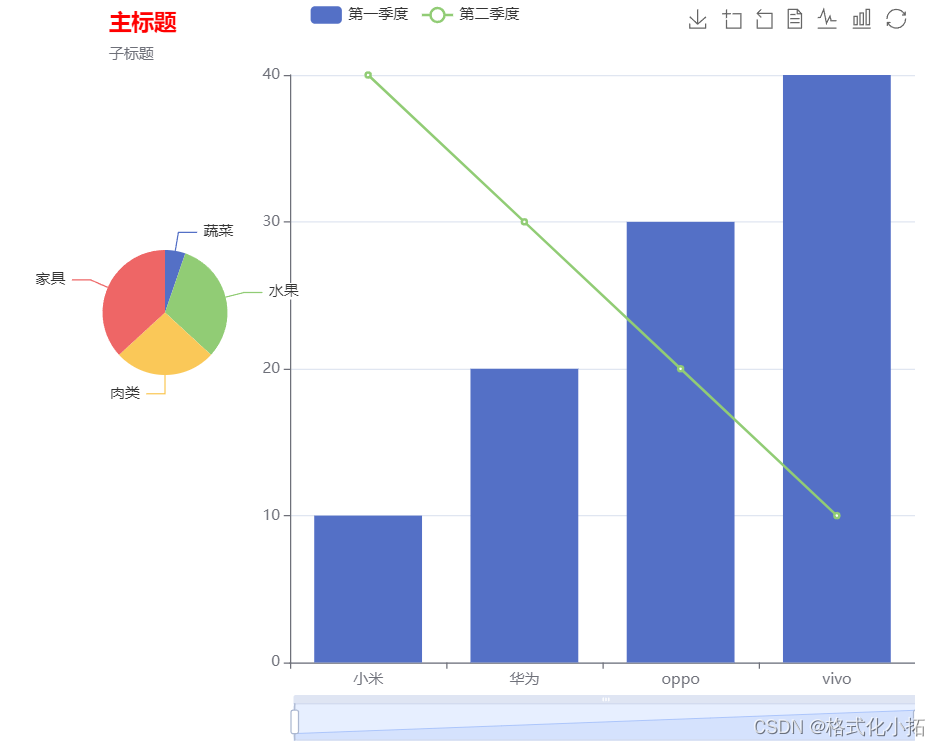
05-echarts组件
<!DOCTYPE html>
<html lang="en">

<head>
    <meta charset="UTF-8">
    <meta name="viewport" content="width=device-width, initial-scale=1.0">
    <title>Document</title>
    <!-- 从bootcdn获取echarts的在线链接 -->
    <script src="https://cdn.bootcdn.net/ajax/libs/echarts/5.4.2/echarts.js"></script>
    <style>
        * {
            margin: 0;
            padding: 0;
        }

        .ec {
            margin: 0 auto;
            width: 800px;
            height: 600px;
        }
    </style>
</head>

<body>
    <!-- 图表容器 -->
    <div class="ec"></div>
    <script>
        // 图表一
        // 初始化echarts容器
        const myEcharts = echarts.init(document.querySelector('.ec'));
        // 设定配置项、数据
        const option = {
            // 设置数据集
            dataset: {
                // 数据源
                source: [
                    ["小米", 10, 40, '蔬菜', 10],
                    ["华为", 20, 30, '水果', 60],
                    ["oppo", 30, 20, '肉类', 50],
                    ["vivo", 40, 10, '家具', 70],
                ]
            },
            // 图表标题
            title: {
                // 主标题
                text: '主标题',
                // 主标题颜色
                textStyle: {
                    color: 'red',
                },
                // 主标题位置
                left: 150,
                top: 5,
                // 子标题
                subtext: '子标题',
            },
            // x轴配置项
            // 声明一个 X 轴,类目轴(category)。默认情况下,类目轴对应到 dataset 第一列。
            xAxis: { type: 'category' },
            // y轴配置项
            yAxis: {
                // 显示y轴的线
                axisLine: {
                    show: true,
                },
                // 显示y轴刻度
                axisTick: {
                    show: true,
                }
            },
            // 系列设置:图标类型 数据展示
            series: [
                {
                    // 图标类型 bar line pie
                    type: 'bar',
                    encode: {
                        y: 1
                    },
                    name: '第一季度'
                },
                {
                    // 图标类型 bar line pie
                    type: 'line',
                    encode: {
                        y: 2
                    },
                    name: '第二季度'
                },
                {
                    // 图标类型 bar line pie
                    type: 'pie',
                    // 数据
                    encode: {
                        //饼图旁边的文字
                        itemName: 3,
                        value: 4
                    },
                    // 饼图 宽高
                    width: 300,
                    height: 300,
                    // 饼图 位置
                    left: 50,
                    top: 100,
                    // 饼图 半径
                    radius: 50,
                }
            ],
            //提示组件
            tooltip: {
                //提示框文字的颜色
                textStyle: {
                    color: 'orange'
                }
            },
            // x轴下的范围选择拖动框
            dataZoom: {},
            //系列切换组件
            legend: {
                data: ['第一季度', '第二季度']
            },
            //工具栏组件
            toolbox: {
                show: true,
                feature: {
                    saveAsImage: {},
                    dataZoom: {
                        yAxisIndex: "none"
                    },
                    dataView: {
                        readOnly: false
                    },
                    magicType: {
                        type: ["line", "bar"]
                    },
                    restore: {},
                }
            },
            //调整图表布局
            grid: {
                left: 300,
                right: 0,
            }
        }
        // 设定配置项
        myEcharts.setOption(option);
    </script>
</body>

</html>
06-一个坐标系
<!DOCTYPE html>
<html lang="en">

<head>
    <meta charset="UTF-8">
    <meta http-equiv="X-UA-Compatible" content="IE=edge">
    <meta name="viewport" content="width=device-width, initial-scale=1.0">
    <title>Document</title>
    <!-- 从bootcdn获取echarts的在线链接 -->
    <script src="https://cdn.bootcdn.net/ajax/libs/echarts/5.4.2/echarts.js"></script>
    <style>
        * {
            margin: 0;
            padding: 0;
        }

        div {
            width: 100%;
            height: 400px;
        }
    </style>
</head>

<body>
    <div></div>
</body>

</html>
<script>
    let dom = document.querySelector('div');
    let mycharts = echarts.init(dom);
    //一个坐标系:散点图
    mycharts.setOption({
        //标题
        title: {
            text: "一个坐标系-散点图",
            left: 'center'
        },
        //x轴
        xAxis: {
            // type: 'category'
        },
        yAxis: {},
        //散点图
        series: [
            {
                type: "scatter",
                //散点图的数据
                data: [
                    [10, 20],
                    [10, 22],
                    [10, 21],
                    [13, 66],
                    [50, 9],
                    [44, 22],
                    [15, 10]
                ]
            }
        ],
    });
</script>
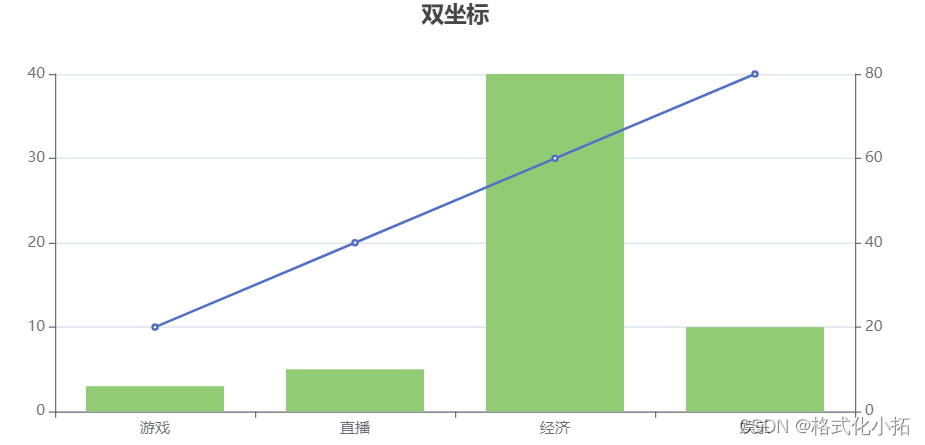
07-多个坐标轴
<!DOCTYPE html>
<html lang="en">

<head>
    <meta charset="UTF-8">
    <meta http-equiv="X-UA-Compatible" content="IE=edge">
    <meta name="viewport" content="width=device-width, initial-scale=1.0">
    <title>Document</title>
    <!-- 引入echarts依赖包 -->
    <script src="https://cdn.bootcdn.net/ajax/libs/echarts/5.1.2/echarts.js"></script>
    <style>
        * {
            margin: 0;
            padding: 0;
        }

        div {
            width: 800px;
            height: 400px;
        }
    </style>
</head>

<body>
    <!-- 准备一个容器:容器就是显示图标区域 -->
    <div></div>
</body>

</html>
<script>
    //基于准备好的DOM初始化echarts实例
    let dom = document.querySelector('div');
    //创建echarts实例
    let mycharts = echarts.init(dom);
    //双做标题
    mycharts.setOption({
        title: {
            text: "双坐标",
            left: 'center',
        },
        xAxis: {
            data: ['游戏', '直播', '经济', '娱乐']
        },
        yAxis: [
            {  //显示Y轴的线
                axisLine: {
                    show: true
                },
                //显示Y轴刻度
                axisTick: {
                    show: true
                }
            },
            {
                //显示Y轴的线
                axisLine: {
                    show: true
                },
                //显示Y轴刻度
                axisTick: {
                    show: true
                }
            }
        ],
        series: [
            {
                type: 'line',
                data: [10, 20, 30, 40],
                //用的是索引值为0的y轴
                yAxisIndex: 0
            }
            ,
            {
                type: 'bar',
                data: [6, 10, 80, 20],
                //用的是索引值为1的y轴
                yAxisIndex: 1
            }
        ]
    })
</script>
08-柱状图标签
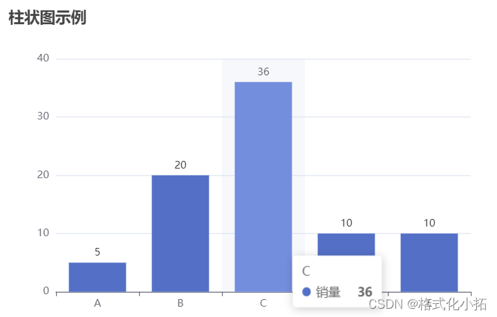
<!DOCTYPE html>
<html>

<head>
    <meta charset="utf-8">
    <title>ECharts Example</title>
    <!-- 引入 ECharts 库 -->
    <script src="https://cdn.jsdelivr.net/npm/echarts@5.1.2/dist/echarts.min.js"></script>
</head>

<body>
    <!-- 创建一个用于放置图表的容器 -->
    <div id="myChart" style="width: 600px; height: 400px;"></div>

    <script>
        // 在 JavaScript 中配置和绘制图表
        // 创建 ECharts 实例,并将图表容器传递给它
        var myChart = echarts.init(document.getElementById('myChart'));

        // 定义图表的配置项和数据
        var option = {
            title: {
                text: '柱状图示例'
            },
            xAxis: {
                data: ['A', 'B', 'C', 'D', 'E']
            },
            yAxis: {},
            series: [{
                name: '销量',
                type: 'bar',
                data: [5, 20, 36, 10, 10],
                label: {  // 添加 label 配置
                    show: true,  // 显示标签
                    position: 'top'  // 标签位置
                }
            }],
            tooltip: {  // 配置悬浮提示框
                trigger: 'axis',  // 触发方式为坐标轴
                axisPointer: {  // 坐标轴指示器配置
                    type: 'shadow'  // 显示阴影
                }
            }
        };

        // 使用配置项绘制图表
        myChart.setOption(option);
    </script>
</body>

</html>
关于更多,请去官网查看链接: echarts官网