目录
1、Matplotlib简介
2、Matplotlib安装
3、Matplotlib导入
4、Matplotlib基本应用
5、画图种类
5.1、Scatter散点图
5.2、条形图
5.3、等高线图
5.4、Image图片
5.5、3D图像
6、多图合并显示
6.1、Subplot多合一显示
6.2、SubPlot分格显示
6.3、图中图
6.4、次坐标轴
7、动画
8、绘制图形
9、面向对象编程
10、理解对象
11、坐标
12、深入基础
13、画散点图
13.1、初认识
13.2、图例无法显示中文
1、Matplotlib简介
matplotlib是基于python语言的开源项目,旨在为python提供一个数据绘图包。我将在这篇文章中介绍matplotlib API的核心对象,并介绍如何使用这些对象来实现绘图。实际上,matplotlib的对象体系严谨而有趣,为使用者提供了巨大的发挥空间。用户在熟悉了核心对象之后,可以轻易的定制图像。matplotlib的对象体系也是计算机图形学的一个优秀范例。即使你不是python程序员,你也可以从文中了解一些通用的图形绘制原则。matplotlib使用numpy进行数组运算,并调用一系列其他的python库来实现硬件交互。matplotlib的核心是一套由对象构成的绘图API。
matplotlib项目是由John D. Hunter发起的。John D. Hunter由于癌症于去年过世,但他发为社区作出的无比贡献将永远留存。
John D. Hunter
你需要安装python, numpy和matplotlib。(可以到python.org下载python编译器。相关python包的安装,请参看我的Python小技巧)
matplotlib的官网: Matplotlib — Visualization with Python 官网有丰富的图例和文档说明。
github地址为:Matplotlib Developers · GitHub
2、Matplotlib安装
有时候利用python需要安装matplotlib进行绘图,可以输入如下命令:
pip install matplotlib3、Matplotlib导入
import matplotlib.pyplot as plt#为方便简介为plt
import numpy as np#画图过程中会使用numpy
import pandas as pd#画图过程中会使用pandas
4、Matplotlib基本应用
x=np.linspace(-1,1,50)#定义x数据范围
y1=2*x+1#定义y数据范围
y2=x**2
plt.figure()#定义一个图像窗口
plt.plot(x,y1)#plot()画出曲线
plt.show()#显示图像
matplotlib的figure为单独图像窗口,小窗口内还可以有更多的小图片。
x=np.linspace(-3,3,50)#50为生成的样本数
y1=2*x+1
y2=x**2
plt.figure(num=1,figsize=(8,5))#定义编号为1 大小为(8,5)
plt.plot(x,y1,color='red',linewidth=2,linestyle='--')#颜色为红色,线宽度为2,线风格为--
plt.plot(x,y2)#进行画图
plt.show()#显示图
设置坐标轴
x=np.linspace(-3,3,50)
y1=2*x+1
y2=x**2
plt.figure(num=2,figsize=(8,5))
plt.plot(x,y1,color='red',linewidth=2,linestyle='-')
plt.plot(x,y2)#进行画图
plt.xlim(-1,2)
plt.ylim(-2,3)
plt.xlabel("I'm x")
plt.ylabel("I'm y")
plt.show()
自定义坐标轴
x=np.linspace(-3,3,50)
y1=2*x+1
y2=x**2
plt.figure(num=2,figsize=(8,5))
plt.plot(x,y1,color='red',linewidth=2,linestyle='-')
plt.plot(x,y2)#进行画图
plt.xlim(-1,2)
plt.ylim(-2,3)
plt.xlabel("I'm x")
plt.ylabel("I'm y")
new_ticks=np.linspace(-1,2,5)#小标从-1到2分为5个单位
print(new_ticks)
#[-1.   -0.25  0.5   1.25  2.  ]
plt.xticks(new_ticks)#进行替换新下标
plt.yticks([-2,-1,1,2,],
           [r'$really\ bad$','$bad$','$well$','$really\ well$'])
plt.show()
设置边框属性
x=np.linspace(-3,3,50)
y1=2*x+1
y2=x**2
plt.figure(num=2,figsize=(8,5))
plt.plot(x,y1,color='red',linewidth=2,linestyle='--')
plt.plot(x,y2)#进行画图
plt.xlim(-1,2)
plt.ylim(-2,3)
new_ticks=np.linspace(-1,2,5)#小标从-1到2分为5个单位
plt.xticks(new_ticks)#进行替换新下标
plt.yticks([-2,-1,1,2,],
           [r'$really\ bad$','$bad$','$well$','$really\ well$'])
ax=plt.gca()#gca=get current axis
ax.spines['right'].set_color('none')#边框属性设置为none 不显示
ax.spines['top'].set_color('none')
plt.show()
调整移动坐标轴
x=np.linspace(-3,3,50)
y1=2*x+1
y2=x**2
plt.figure(num=2,figsize=(8,5))
plt.plot(x,y1,color='red',linewidth=2,linestyle='--')
plt.plot(x,y2)#进行画图
plt.xlim(-1,2)
plt.ylim(-2,3)
new_ticks=np.linspace(-1,2,5)#小标从-1到2分为5个单位
plt.xticks(new_ticks)#进行替换新下标
plt.yticks([-2,-1,1,2,],
           [r'$really\ bad$','$bad$','$well$','$really\ well$'])
ax=plt.gca()#gca=get current axis
ax.spines['right'].set_color('none')#边框属性设置为none 不显示
ax.spines['top'].set_color('none')
ax.xaxis.set_ticks_position('bottom')#使用xaxis.set_ticks_position设置x坐标刻度数字或名称的位置 所有属性为top、bottom、both、default、none
ax.spines['bottom'].set_position(('data', 0))#使用.spines设置边框x轴;使用.set_position设置边框位置,y=0位置 位置所有属性有outward、axes、data
ax.yaxis.set_ticks_position('left')
ax.spines['left'].set_position(('data',0))#坐标中心点在(0,0)位置
plt.show()
matplotlib中legend图例帮助我们展示数据对应的图像名称。
x=np.linspace(-3,3,50)
y1=2*x+1
y2=x**2
plt.figure(num=2,figsize=(8,5))
plt.xlim(-1,2)
plt.ylim(-2,3)
new_ticks=np.linspace(-1,2,5)#小标从-1到2分为5个单位
plt.xticks(new_ticks)#进行替换新下标
plt.yticks([-2,-1,1,2,],
           [r'$really\ bad$','$bad$','$well$','$really\ well$'])

l1,=plt.plot(x,y1,color='red',linewidth=2,linestyle='--',label='linear line')
l2,=plt.plot(x,y2,label='square line')#进行画图
plt.legend(loc='best')#显示在最好的位置
plt.show()#显示图
调整位置和名称,单独修改label信息,我们可以在plt.legend输入更多参数
plt.legend(handles=[l1, l2], labels=['up', 'down'],  loc='best')
#loc有很多参数 其中best自分配最佳位置
'''
 'best' : 0,
 'upper right'  : 1,
 'upper left'   : 2,
 'lower left'   : 3,
 'lower right'  : 4,
 'right'        : 5,
 'center left'  : 6,
 'center right' : 7,
 'lower center' : 8,
 'upper center' : 9,
 'center'       : 10,
 '''
x=np.linspace(-3,3,50)
y = 2*x + 1
plt.figure(num=1, figsize=(8, 5))
plt.plot(x, y,)

#移动坐标轴
ax = plt.gca()
ax.spines['right'].set_color('none')
ax.spines['top'].set_color('none')
ax.xaxis.set_ticks_position('bottom')
ax.spines['bottom'].set_position(('data', 0))
ax.yaxis.set_ticks_position('left')
ax.spines['left'].set_position(('data', 0))

#标注信息
x0=1
y0=2*x0+1
plt.scatter(x0,y0,s=50,color='b')
plt.plot([x0,x0],[y0,0],'k--',lw=2.5)#连接(x0,y0)(x0,0) k表示黑色 lw=2.5表示线粗细
#xycoords='data'是基于数据的值来选位置,xytext=(+30,-30)和textcoords='offset points'对于标注位置描述和xy偏差值,arrowprops对图中箭头类型设置
plt.annotate(r'$2x0+1=%s$' % y0, xy=(x0, y0), xycoords='data', xytext=(+30, -30),
             textcoords='offset points', fontsize=16,
             arrowprops=dict(arrowstyle='->', connectionstyle="arc3,rad=.2"))
#添加注视text(-3.7,3)表示选取text位置 空格需要用\进行转译 fontdict设置文本字体
plt.text(-3.7, 3, r'$This\ is\ the\ some\ text. \mu\ \sigma_i\ \alpha_t$',
         fontdict={'size': 16, 'color': 'r'})
plt.show()
x=np.linspace(-3, 3, 50)
y=0.1*x
plt.figure()
plt.plot(x, y, linewidth=10, zorder=1)
plt.ylim(-2, 2)

#移动坐标轴
ax = plt.gca()
ax.spines['right'].set_color('none')
ax.spines['top'].set_color('none')
ax.spines['top'].set_color('none')
ax.xaxis.set_ticks_position('bottom')
ax.spines['bottom'].set_position(('data', 0))
ax.yaxis.set_ticks_position('left')
ax.spines['left'].set_position(('data', 0))

#label.set_fontsize(12)重新调整字体大小 bbox设置目的内容的透明度相关参数 facecolor调节box前景色 edgecolor设置边框 alpha设置透明度 zorder设置图层顺序
for label in ax.get_xticklabels() + ax.get_yticklabels():
    label.set_fontsize(12)
    label.set_bbox(dict(facecolor='red', edgecolor='None', alpha=0.7, zorder=2))
plt.show()
5、画图种类
5.1、Scatter散点图
n=1024
X=np.random.normal(0,1,n)#每一个点的X值
Y=np.random.normal(0,1,n)#每一个点的Y值
T=np.arctan2(Y,X)#arctan2返回给定的X和Y值的反正切值
#scatter画散点图 size=75 颜色为T 透明度为50% 利用xticks函数来隐藏x坐标轴
plt.scatter(X,Y,s=75,c=T,alpha=0.5)
plt.xlim(-1.5,1.5)
plt.xticks(())#忽略xticks
plt.ylim(-1.5,1.5)
plt.yticks(())#忽略yticks
plt.show()
5.2、条形图
#基本图形
n=12
X=np.arange(n)
Y1=(1-X/float(n))*np.random.uniform(0.5,1,n)
Y2=(1-X/float(n))*np.random.uniform(0.5,1,n)
plt.bar(X,+Y1,facecolor='#9999ff',edgecolor='white')
plt.bar(X,-Y2,facecolor='#ff9999',edgecolor='white')

#标记值
for x,y in zip(X,Y1):#zip表示可以传递两个值
    plt.text(x+0.4,y+0.05,'%.2f'%y,ha='center',va='bottom')#ha表示横向对齐 bottom表示向下对齐
for x,y in zip(X,Y2):
    plt.text(x+0.4,-y-0.05,'%.2f'%y,ha='center',va='top')
plt.xlim(-0.5,n)
plt.xticks(())#忽略xticks
plt.ylim(-1.25,1.25)
plt.yticks(())#忽略yticks
plt.show()
5.3、等高线图
n=256
x=np.linspace(-3,3,n)
y=np.linspace(-3,3,n)
X,Y=np.meshgrid(x,y)#meshgrid从坐标向量返回坐标矩阵
#f函数用来计算高度值 利用contour函数把颜色加进去 位置参数依次为x,y,f(x,y),透明度为0.75,并将f(x,y)的值对应到camp之中
def f(x,y):
    return (1 - x / 2 + x ** 5 + y ** 3) * np.exp(-x ** 2 - y ** 2)
plt.contourf(X,Y,f(X,Y),8,alpha=0.75,cmap=plt.cm.hot)#8表示等高线分成多少份 alpha表示透明度 cmap表示color map
#使用plt.contour函数进行等高线绘制 参数依次为x,y,f(x,y),颜色选择黑色,线条宽度为0.5
C=plt.contour(X,Y,f(X,Y),8,colors='black',linewidth=0.5)
#使用plt.clabel添加高度数值 inline控制是否将label画在线里面,字体大小为10
plt.clabel(C,inline=True,fontsize=10)
plt.xticks(())#隐藏坐标轴
plt.yticks(())
plt.show()
5.4、Image图片
利用matplotlib打印出图像
a = np.array([0.313660827978, 0.365348418405, 0.423733120134,
              0.365348418405, 0.439599930621, 0.525083754405,
              0.423733120134, 0.525083754405, 0.651536351379]).reshape(3,3)
#origin='lower'代表的就是选择的原点位置
plt.imshow(a,interpolation='nearest',cmap='bone',origin='lower')#cmap为color map
plt.colorbar(shrink=.92)#右边颜色说明 shrink参数是将图片长度变为原来的92%
plt.xticks(())
plt.yticks(())
plt.show()
出图方式 此处采用内插法中的nearest-neighbor
5.5、3D图像
import numpy as np
import matplotlib.pyplot as plt
from mpl_toolkits.mplot3d import Axes3D#需另外导入模块Axes 3D
fig=plt.figure()#定义图像窗口
ax=Axes3D(fig)#在窗口上添加3D坐标轴
#将X和Y值编织成栅格
X=np.arange(-4,4,0.25)
Y=np.arange(-4,4,0.25)
X,Y=np.meshgrid(X,Y)
R=np.sqrt(X**2+Y**2)
Z=np.sin(R)#高度值
#将colormap rainbow填充颜色,之后将三维图像投影到XY平面做等高线图,其中ratride和cstride表示row和column的宽度
ax.plot_surface(X,Y,Z,rstride=1,cstride=1,cmap=plt.get_cmap('rainbow'))#rstride表示图像中分割线的跨图
#添加XY平面等高线 投影到z平面
ax.contourf(X,Y,Z,zdir='z',offset=-2,cmap=plt.get_cmap('rainbow'))#把图像进行投影的图形 offset表示比0坐标轴低两个位置
ax.set_zlim(-2,2)
plt.show()
6、多图合并显示
6.1、Subplot多合一显示
均匀图中图:MatPlotLib可以组合许多的小图在大图中显示,使用的方法叫做subplot。
plt.figure()
plt.subplot(2,1,1)#表示整个图像分割成2行2列,当前位置为1
plt.plot([0,1],[0,1])#横坐标变化为[0,1] 竖坐标变化为[0,2]

plt.subplot(2,3,4)
plt.plot([0,1],[0,2])

plt.subplot(2,3,5)
plt.plot([0,1],[0,3])

plt.subplot(2,3,6)
plt.plot([0,1],[0,4])
plt.show()
不均匀图中图
plt.figure()
plt.subplot(2,1,1)#将整个窗口分割成2行1列,当前位置表示第一个图
plt.plot([0,1],[0,1])#横坐标变化为[0,1],竖坐标变化为[0,1]

plt.subplot(2,3,4)#将整个窗口分割成2行3列,当前位置为4
plt.plot([0,1],[0,2])

plt.subplot(2,3,5)
plt.plot([0,1],[0,3])

plt.subplot(2,3,6)
plt.plot([0,1],[0,4])
plt.show()
6.2、SubPlot分格显示
方法一
import matplotlib.gridspec as gridspec#引入新模块
plt.figure()
'''
使用plt.subplot2grid创建第一个小图,(3,3)表示将整个图像分割成3行3列,(0,0)表示从第0行0列开始作图,colspan=3表示列的跨度为3。colspan和rowspan缺省时默认跨度为1
'''
ax1 = plt.subplot2grid((3, 3), (0, 0), colspan=3)  # stands for axes
ax1.plot([1, 2], [1, 2])
ax1.set_title('ax1_title')#设置图的标题

#将图像分割成3行3列,从第1行0列开始做图,列的跨度为2
ax2 = plt.subplot2grid((3, 3), (1, 0), colspan=2)

#将图像分割成3行3列,从第1行2列开始做图,行的跨度为2
ax3 = plt.subplot2grid((3, 3), (1, 2), rowspan=2)

#将图像分割成3行3列,从第2行0列开始做图,行与列的跨度默认为1
ax4 = plt.subplot2grid((3, 3), (2, 0))
ax4.scatter([1, 2], [2, 2])
ax4.set_xlabel('ax4_x')
ax4.set_ylabel('ax4_y')
ax5 = plt.subplot2grid((3, 3), (2, 1))
方法二
plt.figure()
gs = gridspec.GridSpec(3, 3)#将图像分割成3行3列
ax6 = plt.subplot(gs[0, :])#gs[0:1]表示图占第0行和所有列
ax7 = plt.subplot(gs[1, :2])#gs[1,:2]表示图占第1行和第二列前的所有列
ax8 = plt.subplot(gs[1:, 2])
ax9 = plt.subplot(gs[-1, 0])
ax10 = plt.subplot(gs[-1, -2])#gs[-1.-2]表示这个图占倒数第1行和倒数第2行
plt.show()
方法三
'''
建立一个2行2列的图像窗口,sharex=True表示共享x轴坐标,sharey=True表示共享y轴坐标,((ax11,ax12),(ax13,1x14))表示从到至右一次存放ax11,ax12,ax13,ax114
'''
f, ((ax11, ax12), (ax13, ax14)) = plt.subplots(2, 2, sharex=True, sharey=True)
ax11.scatter([1,2], [1,2])ax11.scatter 坐标范围x为[1,2],y为[1,2]
plt.tight_layout()#表示紧凑显示图像
plt.show()
6.3、图中图
fig=plt.figure()
#创建数据
x=[1,2,3,4,5,6,7]
y=[1,3,4,2,5,8,6]

#绘制大图:假设大图的大小为10,那么大图被包含在由(1,1)开始,宽8高8的坐标系之中。
left, bottom, width, height = 0.1, 0.1, 0.8, 0.8
ax1 = fig.add_axes([left, bottom, width, height])  # main axes
ax1.plot(x, y, 'r')#绘制大图,颜色为red
ax1.set_xlabel('x')#横坐标名称为x
ax1.set_ylabel('y')
ax1.set_title('title')#图名称为title

#绘制小图,注意坐标系位置和大小的改变
ax2 = fig.add_axes([0.2, 0.6, 0.25, 0.25])
ax2.plot(y, x, 'b')#颜色为buue
ax2.set_xlabel('x')
ax2.set_ylabel('y')
ax2.set_title('title inside 1')

#绘制第二个小兔
plt.axes([0.6, 0.2, 0.25, 0.25])
plt.plot(y[::-1], x, 'g')#将y进行逆序
plt.xlabel('x')
plt.ylabel('y')
plt.title('title inside 2')
plt.show()
6.4、次坐标轴
x=np.arange(0,10,0.1)
y1=0.5*x**2
y2=-1*y1
fig, ax1 = plt.subplots()

ax2 = ax1.twinx()#镜像显示
ax1.plot(x, y1, 'g-')
ax2.plot(x, y2, 'b-')

ax1.set_xlabel('X data')
ax1.set_ylabel('Y1 data', color='g')#第一个y坐标轴
ax2.set_ylabel('Y2 data', color='b')#第二个y坐标轴
plt.show()
7、动画
from matplotlib import animation#引入新模块
fig,ax=plt.subplots()
x=np.arange(0,2*np.pi,0.01)#数据为0~2PI范围内的正弦曲线
line,=ax.plot(x,np.sin(x))# line表示列表

#构造自定义动画函数animate,用来更新每一帧上x和y坐标值,参数表示第i帧
def animate(i):
    line.set_ydata(np.sin(x+i/100))
    return line,

#构造开始帧函数init
def init():
    line.set_ydata(np.sin(x))
    return line,

# frame表示动画长度,一次循环所包含的帧数;interval表示更新频率
# blit选择更新所有点,还是仅更新新变化产生的点。应该选True,但mac用户选择False。
ani=animation.FuncAnimation(fig=fig,func=animate,frames=200,init_func=init,interval=20,blit=False)
plt.show()
8、绘制图形
在matplotlib.pyplot中,你还可以找到下面的绘图函数。如果你经常使用数据绘图程序,应该会很熟悉这些图形:
绘图程序如下:
import matplotlib.pyplot as plt

# 1D data
x = [1,2,3,4,5]
y = [2.3,3.4,1.2,6.6,7.0]

plt.figure(figsize=(12,6))

plt.subplot(231)
plt.plot(x,y)
plt.title("plot")

plt.subplot(232)
plt.scatter(x, y)
plt.title("scatter")

plt.subplot(233)
plt.pie(y)
plt.title("pie")

plt.subplot(234)
plt.bar(x, y)
plt.title("bar")

# 2D data
import numpy as np
delta = 0.025
x = y = np.arange(-3.0, 3.0, delta)
X, Y = np.meshgrid(x, y)
Z    = Y**2 + X**2

plt.subplot(235)
plt.contour(X,Y,Z)
plt.colorbar()
plt.title("contour")

# read image
import matplotlib.image as mpimg
img=mpimg.imread('marvin.jpg')

plt.subplot(236)
plt.imshow(img)
plt.title("imshow")

plt.savefig("matplot_sample.jpg")
面用到的marvin.jpg是下图,请保存到当地电脑:
函数式编程创造了一个仿真MATLAB的工作环境,并有许多成形的绘图函数。如果只是作为Matplotlib的一般用户(非开发者),pyplot可以满足大部分的需求。
(当然,matplotlib是免费而开源的,MATLAB昂贵而封闭。这是不“仿真”的地方)
9、面向对象编程
尽管函数式绘图很便利,但利用函数式编程会有以下缺点:
1) 增加了一层“函数”调用,降低了效率。
2) 隶属关系被函数掩盖。整个matplotlib包是由一系列有组织有隶属关系的对象构成的。函数掩盖了原有的隶属关系,将事情变得复杂。
3) 细节被函数掩盖。pyplot并不能完全复制对象体系的所有功能,图像的许多细节调中最终还要回到对象。
4) 每件事情都可以有至少两种方式完成,用户很容易混淆。
而对于开发者来说,了解对象是参与到Matplotlib项目的第一步。
我们将上面的直线绘图更改为面向对象式(OO, object-oriented)的,为此,我们引入两个类: Figure和FigureCanvas。(函数式编程也调用了这些类,只是调用的过程被函数调用所遮掩。)
# object-oriented plot

from matplotlib.figure import Figure
from matplotlib.backends.backend_agg import FigureCanvasAgg as FigureCanvas

fig    = Figure()
canvas = FigureCanvas(fig)
ax     = fig.add_axes([0.1, 0.1, 0.8, 0.8])

line,  = ax.plot([0,1], [0,1])
ax.set_title("a straight line (OO)")
ax.set_xlabel("x value")
ax.set_ylabel("y value")

canvas.print_figure('demo.jpg')
新的demo.jpg如下:
10、理解对象
上面的例子中,我们至少构建了四个对象: fig, canvas, ax, line。它们分别属于Figure类,FigureCanvas类,Axes类和Line2D类。(使用obj.__class__.__name__来查询对象所属的类)
在深入各个对象之前,我们先来做一个比喻。看下面一个图片:
这个图片是用KTurtle绘制。参看把你的孩子打造成为码农
可以看到,图中有一个房子,房子上有窗户和门,窗户上有条纹,门上有把手,此外图像外还有一只小乌龟。我们所提到的房子,窗户,门,条纹,把手,都可以称其为对象。不同的对象之间有依附关系,比如窗户和门属于房子,而把手属于门。乌龟和房子则是并行的两个对象。此外,整个图像外有一个方框,用来表明可绘图的范围,所有上面提到的元素都依附于该方框。
这就是用面向对象的方式来理解一个图像。事实上,对象是描述图像的最自然的方式,面向对象编程最成功的领域就是在计算机图形方面。我们先来看什么是Figure和Axes对象。在matplotlib中,整个图像为一个Figure对象。在Figure对象中可以包含一个,或者多个Axes对象。每个Axes对象都是一个拥有自己坐标系统的绘图区域。其逻辑关系如下:
转过头来看直线图。整个图像是fig对象。我们的绘图中只有一个坐标系区域,也就是ax。此外还有以下对象。(括号中表示对象的基本类型)
Title为标题。Axis为坐标轴,Label为坐标轴标注。Tick为刻度线,Tick Label为刻度注释。各个对象之间有下面的对象隶属关系:
(yaxis同样有tick, label和tick label,没有画出)
尽管data是数据绘图的关键部分,也就是数据本身的图形化显示,但是必须和xaxis, yaxis, title一起,才能真正构成一个绘图区域axes。一个单纯的,无法读出刻度的线是没有意义的。xaxis, yaxis, title合起来构成了数据的辅助部分(data guide)。
上面元素又包含有多种图形元素。比如说,我们的data对象是一条线(Line2D)。title, tick label和label都是文本(Text),而tick是由短线(Line 2D)和tick label构成,xaxis由坐标轴的线和tick以及label构成,ax由xaxis, yaxis, title, data构成,ax自身又构成了fig的一部分。上面的每个对象,无论是Line2D, Text还是fig,它们都来自于一个叫做Artist的基类。
OO绘图的原程序还有一个canvas对象。它代表了真正进行绘图的后端(backend)。Artist只是在程序逻辑上的绘图,它必须连接后端绘图程序才能真正在屏幕上绘制出来(或者保存为文件)。我们可以将canvas理解为绘图的物理(或者说硬件)实现。
在OO绘图程序中,我们并没有真正看到title, tick, tick label, xaxis, yaxis对象,而是使用ax.set_*的方法间接设置了这些对象。但这些对象是真实存在的,你可以从上层对象中找到其“真身”。比如,fig.axes[0].xaxis就是我们上面途中的xaxis对象。我们可以通过fig -> axes[0] (也就是ax) -> xaxis的顺序找到它。因此,重复我们刚才已经说过的,一个fig就构成了一个完整的图像。对于每个Artist类的对象,都有findobj()方法,来显示该对象所包含的所有下层对象。
11、坐标
坐标是计算机绘图的基础。计算机屏幕是由一个个像素点构成的。想要在屏幕上显示图像,计算机必须告诉屏幕每个像素点上显示什么。所以,最贴近硬件的坐标体系是以像素为单位的坐标体系。我们可以通过具体说明像素位置来标明显示器上的某一点。这叫做显示坐标(display coordinate),以像素为单位。
然而,像素坐标不容易被纳入绘图逻辑。相同的程序,在不同的显示器上就要调整像素值,以保证图像不变形。所以一般情况下,还会有图像坐标和数据坐标。
图像坐标将一张图的左下角视为原点,将图像的x方向和y方向总长度都看做1。x方向的0.2就是指20%的图像在x方向的总长,y方向0.8的长度指80%的y方向总长。(0.5, 0.5)是图像的中点,(1, 1)指图像的右上角。比如下面的程序,我们在使用add_axes时,传递的参数中,前两个元素为axes的左下角在fig的图像坐标上的位置,后两个元素指axes在fig的图像坐标上x方向和y方向的长度。fig的图像坐标称为Figure坐标,储存在为fig.transFigure
(类似的,每个axes,比如ax1,有属于自己的图像坐标。它以ax1绘图区域总长作为1,称为Axes坐标。也就是ax1.transAxes。(0.5, 0.5)就表示在Axes的中心。Axes坐标和Figure坐标原理相似,只是所用的基准区域不同。)
# object-oriented plot
from matplotlib.figure import Figure
from matplotlib.backends.backend_agg import FigureCanvasAgg as FigureCanvas

fig    = Figure()
canvas = FigureCanvas(fig)

# first axes
ax1    = fig.add_axes([0.1, 0.1, 0.2, 0.2])
line,  = ax1.plot([0,1], [0,1])
ax1.set_title("ax1")

# second axes
ax2    = fig.add_axes([0.4, 0.3, 0.4, 0.5])
sca    = ax2.scatter([1,3,5],[2,1,2])
ax2.set_title("ax2")

canvas.print_figure('demo.jpg')
我们在绘图,比如使用plot的时候,绘制了两点间的连线。这两点分别为(0, 0)和(1, 1)。(plot中的第一个表为两个x坐标,第二个表为两个y坐标)。这时使用的坐标系为数据坐标系(ax1.transData)。我们可以通过绘出的坐标轴读出数据坐标的位置。
如果绘制的是具体数据,那么数据坐标符合我们的需求。如果绘制的是标题这样的附加信息,那么Axes坐标符合符合我们的需求。如果是整个图像的注解,那么Figure坐标更符合需求。每一个Artist对象都有一个transform属性,用于查询和改变所使用的坐标系统。如果为显示坐标,transform属性为None。
12、深入基础
在上面的例子中,无论是使用plot绘制线,还是scatter绘制散点,它们依然是比较成熟的函数。matplotlib实际上提供了更大的自由度,允许用户以更基础的方式来绘制图形,比如下面,我们绘制一个五边形。
# object-oriented plot

from matplotlib.figure import Figure
from matplotlib.backends.backend_agg import FigureCanvasAgg as FigureCanvas

fig    = Figure()
canvas = FigureCanvas(fig)
ax     = fig.add_axes([0.1, 0.1, 0.8, 0.8])

from matplotlib.path import Path
import matplotlib.patches as patches

verts = [
    (0., 0.),
    (0., 1.),
    (0.5, 1.5),
    (1., 1.),
    (1., 0.),
    (0., 0.),
    ]

codes = [Path.MOVETO,
         Path.LINETO,
         Path.LINETO,
         Path.LINETO,
         Path.LINETO,
         Path.CLOSEPOLY,
         ]

path = Path(verts, codes)

patch = patches.PathPatch(path, facecolor='coral')
ax.add_patch(patch)
ax.set_xlim(-0.5,2)
ax.set_ylim(-0.5,2)

canvas.print_figure('demo.jpg')
在上面的程序中。我们首先确定顶点,然后构建了一个path对象,这个对象实际上就是5个顶点的连线。在codes中,我们先使用MOVETO将画笔移动到起点,然后依次用直线连接(LINETO)(我们也可以用曲线来连线,比如CURVE4,但这里没有用到)。 在path建立了封闭的5边形后,我们在path的基础上构建了patch对象,是一个图形块。patch的背景颜色选为coral。最后,我们将这个patch对象添加到预先准备好的ax上,就完成了整个绘图。
上面的过程中,我们就好像拿着一个画笔的小孩,一步步画出心目中的图画。这就是深入理解matplotlib的魅力所在——创造你自己的数据绘图函数!
(将上面的程序封装到函数中,保留顶点以及其它参数接口,就构成了一个五边形绘图函数。O(∩_∩)O~ 我们也创造了新的“一键绘图”)
可以相像,一个plot函数如何用path对象实现。
13、画散点图
13.1、初认识
基本代码如下:
import numpy as np
import matplotlib.pyplot as plt
N = 1000
x = np.random.randn(N)
y = np.random.randn(N)
plt.scatter(x, y)
plt.show()这里使用numpy包的random函数随机生成1000组数据,然后通过scatter函数绘制了散点图。
这篇文章的重点其实在于scatter函数。
- x,y 形如shape(n,)的数组,可选值,
- s 点的大小(也就是面积)默认20
- c 点的颜色或颜色序列,默认蓝色。其它如
c = 'r' (red); c = 'g' (green); c = 'k' (black) ; c = 'y'(yellow) - marker 形状,可选值,默认是圆
如果需要其他的,可搜索matplotlib的官网,在官网中搜索markers,选择第一个结果。
import numpy as np
import matplotlib.pyplot as plt
N = 1000
x = np.random.randn(N)
y = np.random.randn(N)
color = ['r','y','k','g','m']
plt.scatter(x, y,c=color,marker='>')
plt.show()- alpha:标量,可选,默认值:无, 0(透明)和1(不透明)之间的alpha混合值
import numpy as np
import matplotlib.pyplot as plt
N = 1000
x = np.random.randn(N)
y = np.random.randn(N)
plt.scatter(x, y,alpha=0.5)
plt.show() 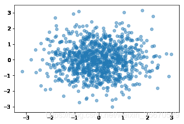
- edgecolors,顾名思义,边缘颜色或颜色序列,可选值,默认值:None
import numpy as np
import matplotlib.pyplot as plt
N = 1000
x = np.random.randn(N)
y = np.random.randn(N)
plt.scatter(x, y,alpha=0.5,edgecolors= 'white') #edgecolors = 'w',亦可
plt.show()
13.2、图例无法显示中文
import numpy as np
import matplotlib.pyplot as plt
N = 1000
x = np.random.randn(N)
y = np.random.randn(N)
plt.scatter(x, y,alpha=0.5,edgecolors= 'white')
plt.title('示例')#显示图表标题
plt.xlabel('x轴')#x轴名称
plt.ylabel('y轴')#y轴名称
plt.grid(True)#显示网格线
plt.show()
查找原因,发现时因为matplotlib库没有中文字体。
解决方案
每次编代码时都进行参数设置如下:
#coding:utf-8
import matplotlib.pyplot as plt
plt.rcParams['font.sans-serif']=['SimHei'] #用来正常显示中文标签
plt.rcParams['axes.unicode_minus']=False #用来正常显示负号
#有中文出现的情况,需要u'内容'14、matplotlib.cm
Builtin colormaps, colormap handling utilities, and the ScalarMappable mixin.
class matplotlib.cm.ScalarMappable(norm=None, cmap=None)[source]
Bases: object
This is a mixin class to support scalar data to RGBA mapping. The ScalarMappable makes use of data normalization before returning RGBA colors from the given colormap.
| Parameters: | norm : matplotlib.colors.Normalize instance The normalizing object which scales data, typically into the interval cmap : str or Colormap instance The colormap used to map normalized data values to RGBA colors. |
|---|
add_checker(self, checker)[source]
Add an entry to a dictionary of boolean flags that are set to True when the mappable is changed.
autoscale(self)[source]
Autoscale the scalar limits on the norm instance using the current array
autoscale_None(self)[source]
Autoscale the scalar limits on the norm instance using the current array, changing only limits that are None
changed(self)[source]
Call this whenever the mappable is changed to notify all the callbackSM listeners to the 'changed' signal
check_update(self, checker)[source]
If mappable has changed since the last check, return True; else return False
cmap = None
The Colormap instance of this ScalarMappable.
colorbar = None
The last colorbar associated with this ScalarMappable. May be None.
get_alpha(self)[source]
| Returns: | alpha : float Always returns 1. |
|---|
get_array(self)[source]
Return the array
get_clim(self)[source]
return the min, max of the color limits for image scaling
get_cmap(self)[source]
return the colormap
norm = None
The Normalization instance of this ScalarMappable.
set_array(self, A)[source]
Set the image array from numpy array A.
| Parameters: | A : ndarray |
|---|
set_clim(self, vmin=None, vmax=None)[source]
set the norm limits for image scaling; if vmin is a length2 sequence, interpret it as (vmin, vmax) which is used to support setp
ACCEPTS: a length 2 sequence of floats; may be overridden in methods that have vmin and vmax kwargs.
set_cmap(self, cmap)[source]
set the colormap for luminance data
| Parameters: | cmap : colormap or registered colormap name |
|---|
set_norm(self, norm)[source]
Set the normalization instance.
| Parameters: | norm : Normalize |
|---|
Notes
If there are any colorbars using the mappable for this norm, setting the norm of the mappable will reset the norm, locator, and formatters on the colorbar to default.
to_rgba(self, x, alpha=None, bytes=False, norm=True)[source]
Return a normalized rgba array corresponding to x.
In the normal case, x is a 1-D or 2-D sequence of scalars, and the corresponding ndarray of rgba values will be returned, based on the norm and colormap set for this ScalarMappable.
There is one special case, for handling images that are already rgb or rgba, such as might have been read from an image file. If x is an ndarray with 3 dimensions, and the last dimension is either 3 or 4, then it will be treated as an rgb or rgba array, and no mapping will be done. The array can be uint8, or it can be floating point with values in the 0-1 range; otherwise a ValueError will be raised. If it is a masked array, the mask will be ignored. If the last dimension is 3, the alpha kwarg (defaulting to 1) will be used to fill in the transparency. If the last dimension is 4, the alpha kwarg is ignored; it does not replace the pre-existing alpha. A ValueError will be raised if the third dimension is other than 3 or 4.
In either case, if bytes is False (default), the rgba array will be floats in the 0-1 range; if it is True, the returned rgba array will be uint8 in the 0 to 255 range.
If norm is False, no normalization of the input data is performed, and it is assumed to be in the range (0-1).
matplotlib.cm.get_cmap(name=None, lut=None)[source]
Get a colormap instance, defaulting to rc values if name is None.
Colormaps added with register_cmap() take precedence over built-in colormaps.
If name is a matplotlib.colors.Colormap instance, it will be returned.
If lut is not None it must be an integer giving the number of entries desired in the lookup table, and name must be a standard mpl colormap name.
matplotlib.cm.register_cmap(name=None, cmap=None, data=None, lut=None)[source]
Add a colormap to the set recognized by get_cmap().
It can be used in two ways:
register_cmap(name='swirly', cmap=swirly_cmap)

register_cmap(name='choppy', data=choppydata, lut=128)
In the first case, cmap must be a matplotlib.colors.Colormap instance. The name is optional; if absent, the name will be the name attribute of the cmap.
In the second case, the three arguments are passed to the LinearSegmentedColormap initializer, and the resulting colormap is registered.
matplotlib.cm.revcmap(data)[source]
Can only handle specification data in dictionary format.