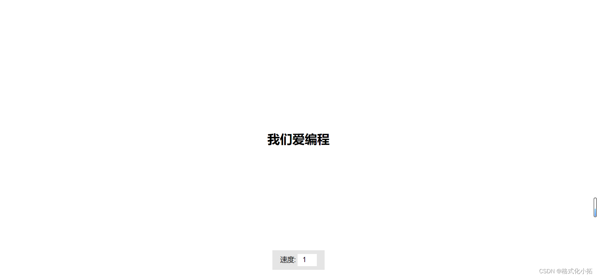
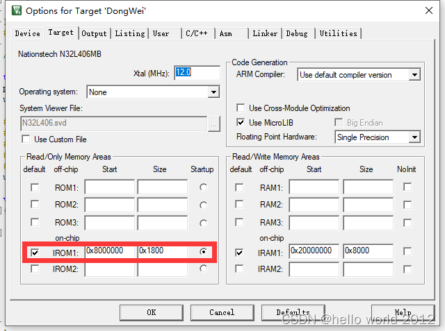
扫描出现动画
参考了网友写的二维码扫描

<template>
  <div>


    <div class="scan-content">
      <img  style="width: 2rem;height: 2rem;" src="../../assets/images/eye.png" alt="" />
      <div class="line"></div>
    </div>


  </div>
</template>

<script>
  export default {

    data() {
      return {
      }
    },

    methods: {
    }
  }
</script>

<style scoped>


  .line {
    height: 2rem;
    width: 2rem;
    position: absolute;
    left: 0;
    top: 0;
    background: linear-gradient(90deg, rgba(0, 255, 51, 0) 43%, #00ff33 211%);
    border-right: 3px solid #00ff33;
    animation: radar-beam 2s 1 alternate;
    animation-timing-function: cubic-bezier(0.53, 0, 0.43, 0.99);
    animation-delay: 1.4s;
  }


   .scan-content {
     position: relative;
    animation: scan-content1 2s 1 alternate;
    animation-timing-function: cubic-bezier(0.53, 0, 0.43, 0.99);
    animation-delay: 1.4s;
     overflow: hidden;
     height: 2rem;
  }

  @keyframes radar-beam {
    0% {
      transform: translateX(-100%);
    }

    100% {
      transform: translateX(0);
    }
  }
  @keyframes scan-content1 {
    0% {
      width: 0;
    }

    100% {
      width: 2rem;

    }
  }
</style>