1写在前面
前面写了superheat的教程,今天写一下第二波,如何进行聚类以及添加注释图吧。🤩
分分钟提升你的heatmap的颜值哦!~🥰
2用到的包
# devtools::install_github("rlbarter/superheat")
library(superheat)
library(tidyverse)
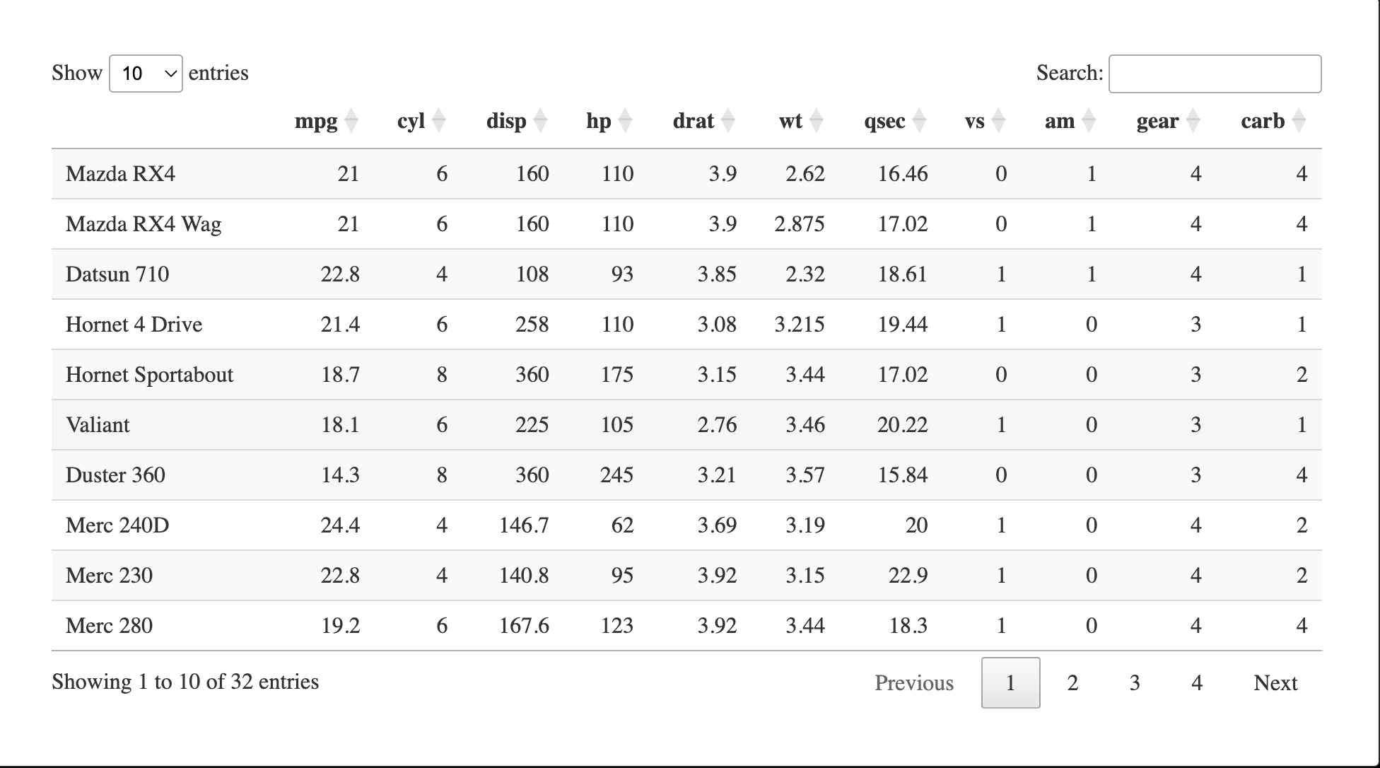
3示例数据
data("mtcars")

DT::datatable(mtcars)
4行聚类
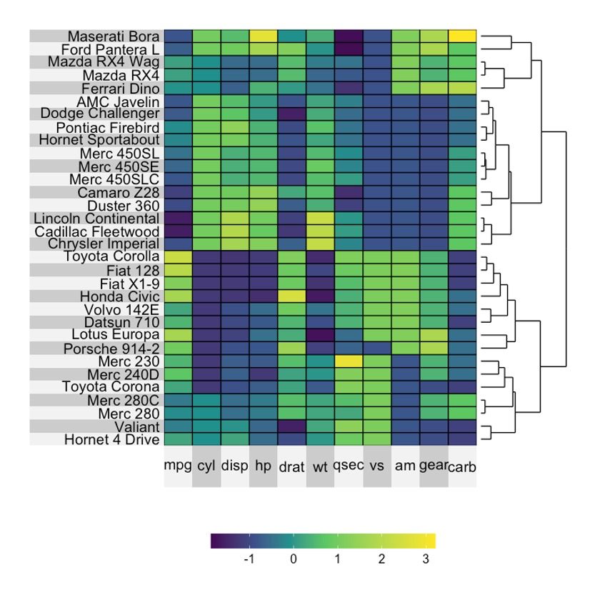
4.1 生成聚类树
superheat(mtcars,
          scale = T,
          row.dendrogram = T)
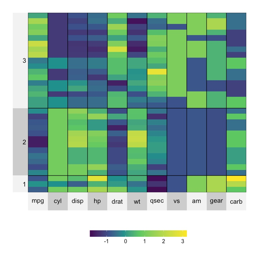
4.2 聚类结果可视化
set.seed(123)
superheat(mtcars,
          scale = T,
          n.clusters.rows = 3)
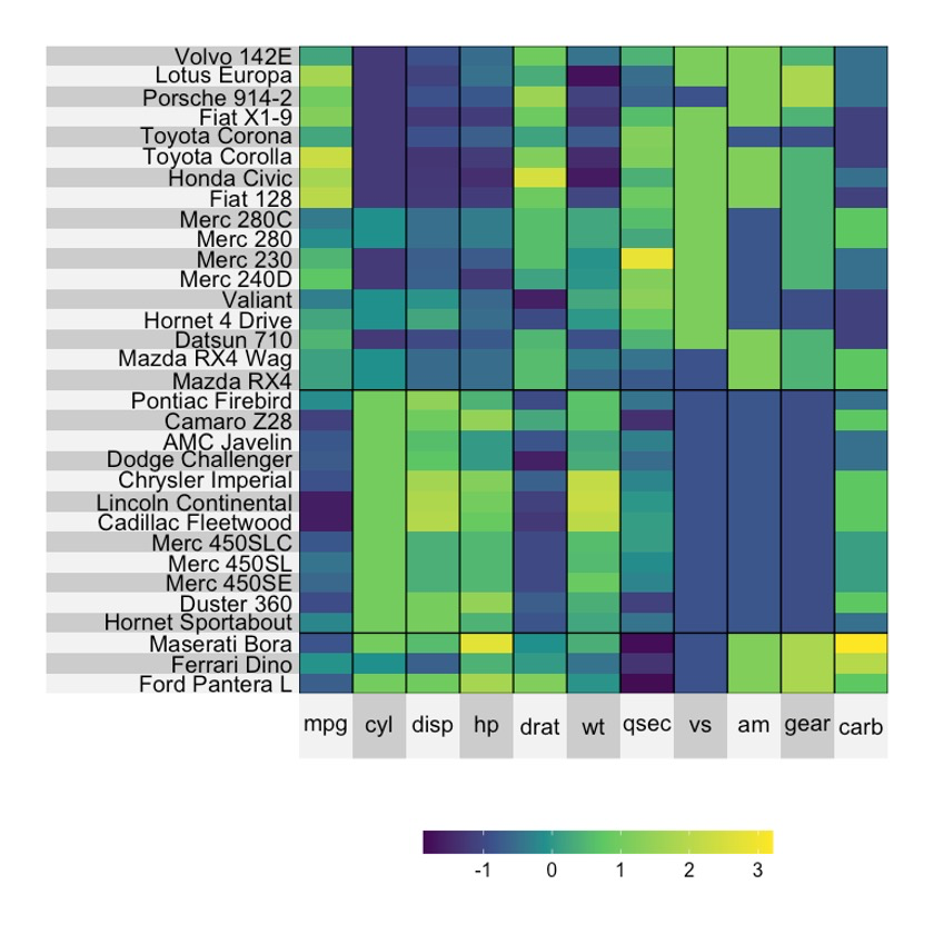
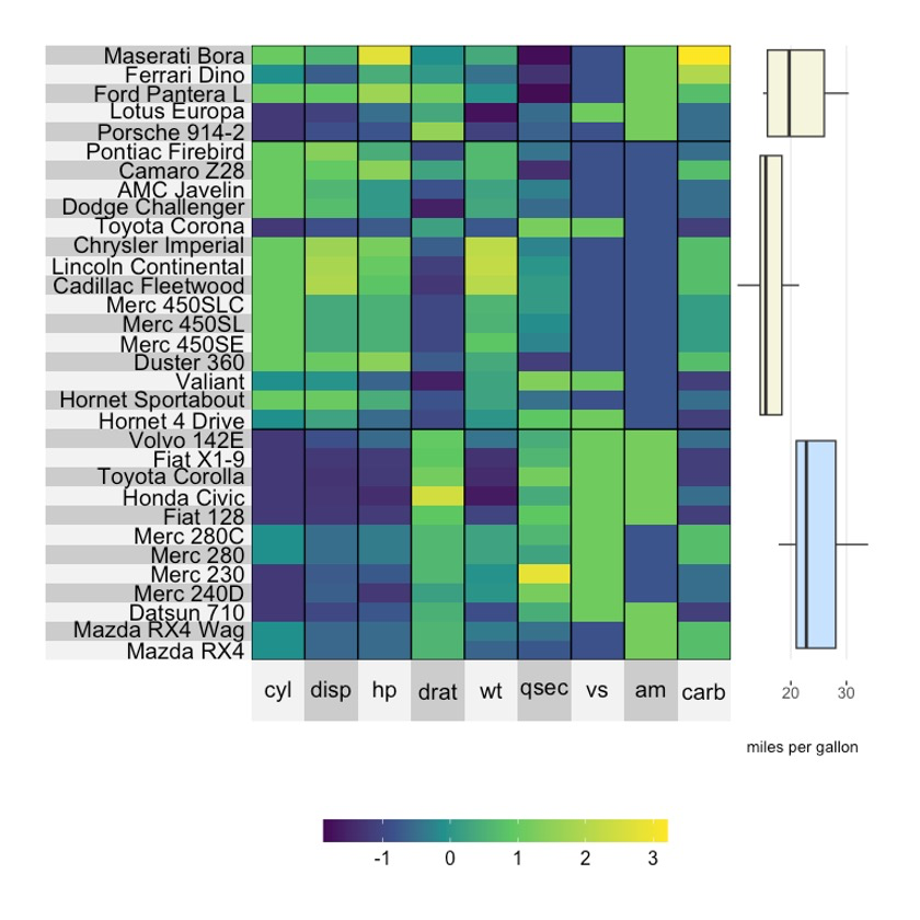
4.3 强制显示行名
默认情况下,在聚类时,相应的标签会分组到聚类名称中(通常为 1、2、3……等)。😘
如果想强制标签为原始变量名称,可以分别指定left.label = 'variable'或Bottom.label = 'variable'。🥳
set.seed(123)
superheat(mtcars,
          scale = T,
          n.clusters.rows = 3,
          left.label = 'variable')
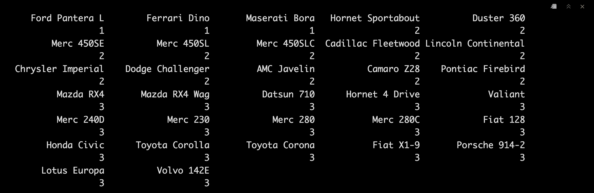
4.4 提取聚类结果
我们来试试提取一下聚类的结果吧。🤩
set.seed(123)
superheatmap <- superheat(mtcars,
                          scale = T,
                          n.clusters.rows = 3,
                          left.label = 'variable',
                          print.plot = F)

superheatmap$membership.rows
4.5 自定义聚类结果
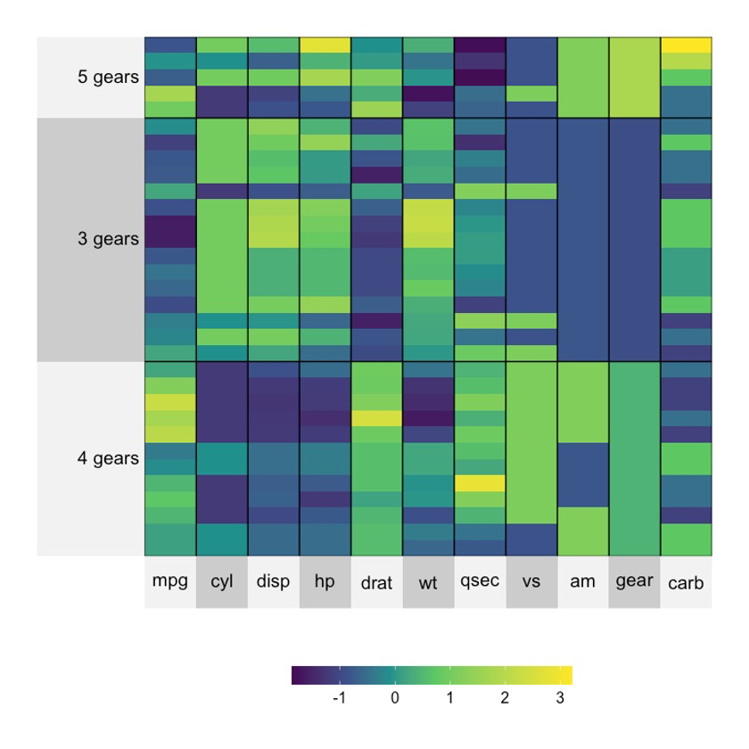
有时候你可能会有自己想要的聚类结果,手动定义一下吧。😘
gears <- paste(mtcars$gear, "gears")

set.seed(123)
superheat(mtcars,
          scale = T,
          membership.rows = gears)
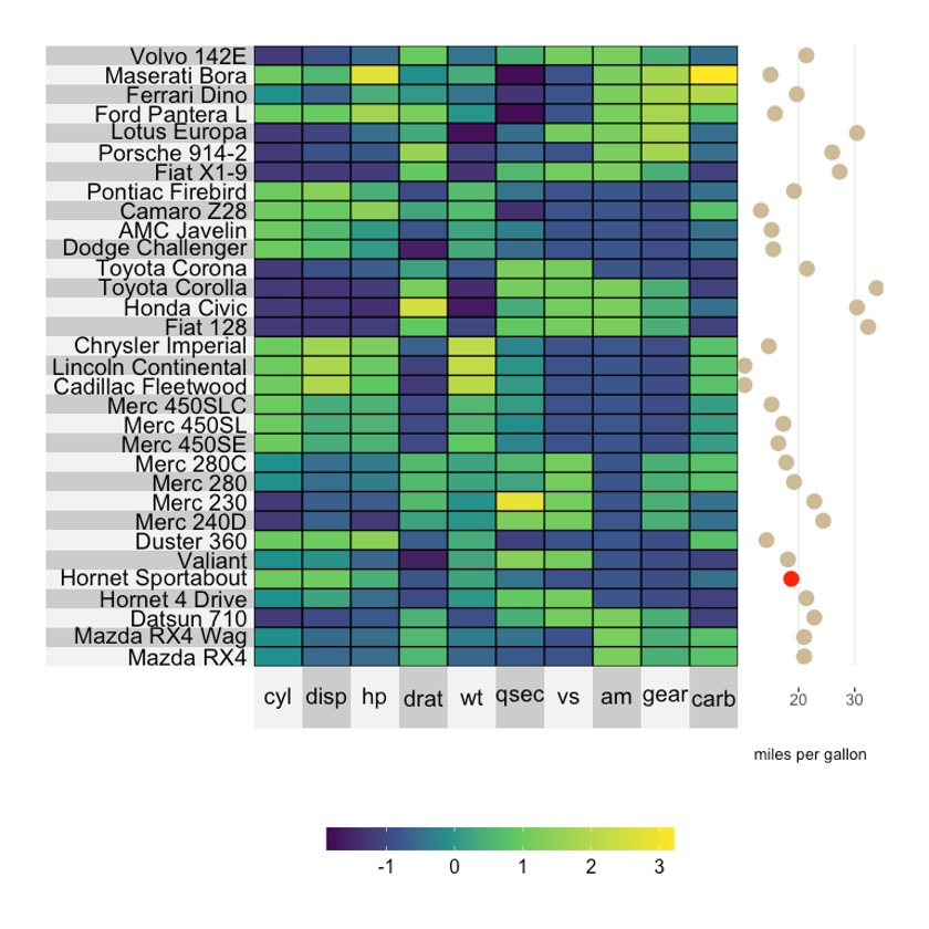
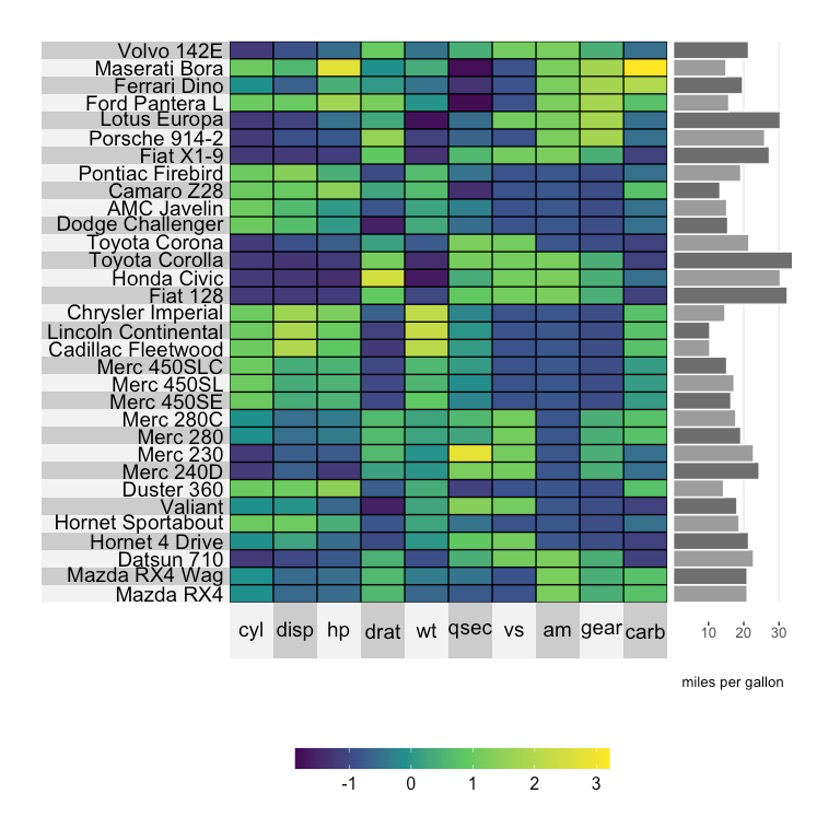
5注释图-Scatterplots
我们可以在热图的旁边添加一些注释图,非常简单,比如yt (‘y top’)或者yr(‘y right’)。🤒
常用的类型有以下几种,我们一起看看吧。😂
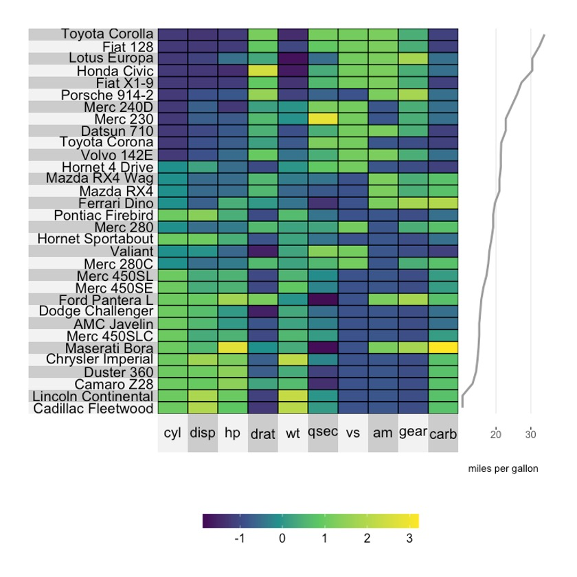
5.1 基础绘图
superheat(dplyr::select(mtcars, -mpg),
          scale = T,
          yr = mtcars$mpg,
          yr.axis.name = "miles per gallon")

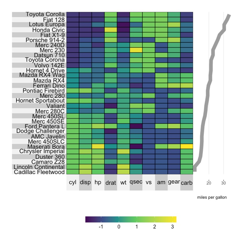
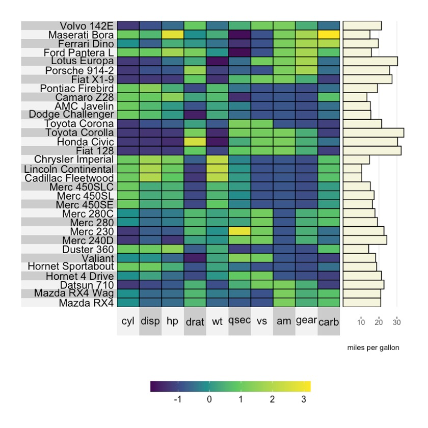
5.2 调整大小
superheat(dplyr::select(mtcars, -mpg),
          scale = T,
          yr = mtcars$mpg,
          yr.axis.name = "miles per gallon",
          yr.point.size = 4)

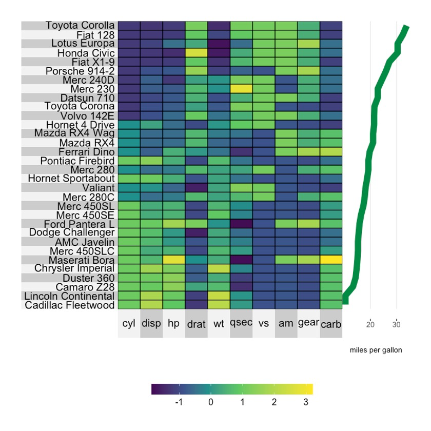
5.3 调整颜色
point.col <- rep("wheat3", nrow(mtcars))
point.col[5] <- "red"

superheat(dplyr::select(mtcars, -mpg),
          scale = T,
          yr = mtcars$mpg,
          yr.axis.name = "miles per gallon",
          yr.obs.col = point.col,
          yr.point.size = 4)
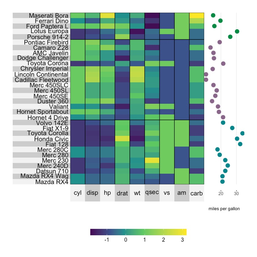
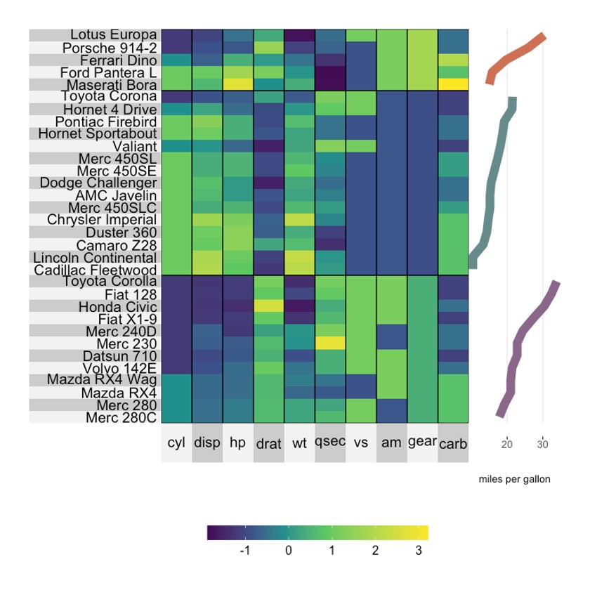
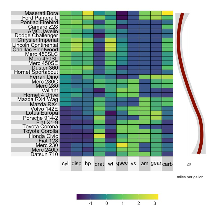
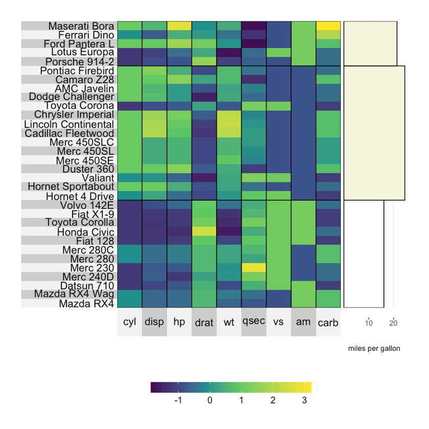
5.4 聚类颜色
我们甚至可以直接设置聚类的颜色,参数为yr.cluster.col。🧐
superheat(dplyr::select(mtcars, -mpg, -gear),
          # scale
          scale = T,
          # 行聚类
          membership.rows = paste(mtcars$gear, "gears"),
          left.label = "variable",
          # mpg scatterplot
          yr = mtcars$mpg,
          yr.axis.name = "miles per gallon",
          yr.cluster.col = c("turquoise4", "plum4", "springgreen4"),
          yr.point.size = 4)
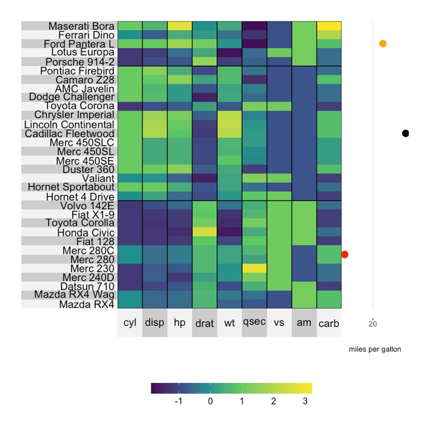
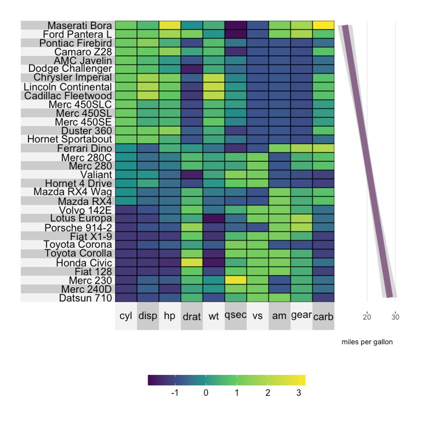
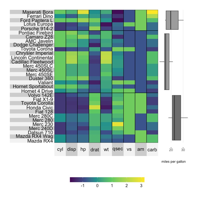
5.5 只显示一个聚类点
mpg.per.cluster <- mtcars %>%
  group_by(gear) %>%
  summarize(mpg.avg = mean(mpg)) %>%
  select(mpg.avg) %>%
  unlist

superheat(dplyr::select(mtcars, -mpg, -gear),
          scale = T,
          membership.rows = paste(mtcars$gear, "gears"),
          left.label = "variable",
          yr = mpg.per.cluster,
          yr.axis.name = "miles per gallon",
          yr.cluster.col = c("black", "red", "orange"),
          yr.point.size = 4)
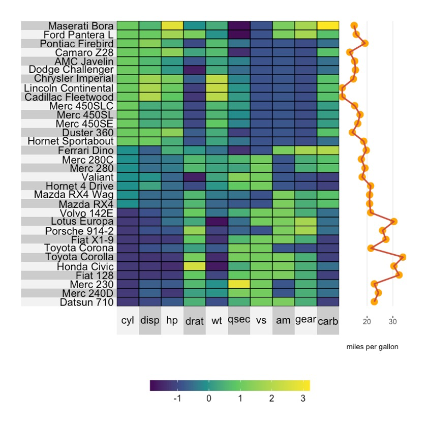
6注释图-Scatterplots
6.1 基础绘图
换个Line plot试试。🤪
superheat(dplyr::select(mtcars, -mpg),
          scale = T,
          yr = mtcars$mpg,
          yr.axis.name = "miles per gallon",
          yr.plot.type = "line",
          order.rows = order(mtcars$mpg))
6.2 调整大小
superheat(dplyr::select(mtcars, -mpg),
          scale = T,
          yr = mtcars$mpg,
          yr.axis.name = "miles per gallon",
          yr.plot.type = "line",
          yr.line.size = 4,
          order.rows = order(mtcars$mpg))
6.3 调整颜色
superheat(dplyr::select(mtcars, -mpg),
          scale = T,
          yr = mtcars$mpg,
          yr.axis.name = "miles per gallon",
          yr.plot.type = "line",
          yr.line.size = 4,
          yr.line.col = "springgreen4",
          order.rows = order(mtcars$mpg))
6.4 聚类
superheat(dplyr::select(mtcars, -mpg),
          scale = T,
          membership.rows = paste(mtcars$gear, "gears"),
          left.label = "variable",
          yr = mtcars$mpg,
          yr.axis.name = "miles per gallon",
          yr.plot.type = "line",
          yr.line.size = 4,
          yr.cluster.col = c("plum4", "paleturquoise4", "salmon3"),
          order.rows = order(mtcars$mpg))
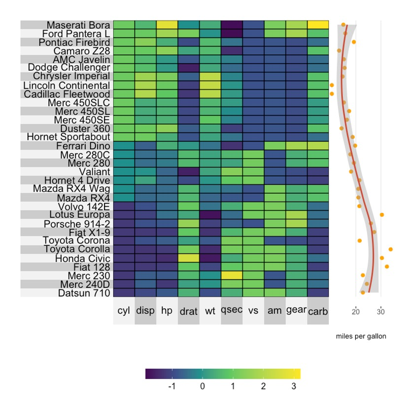
7注释图-Smoothed line
7.1 Loess curve
superheat(dplyr::select(mtcars, -mpg),
          scale = T,
          yr = mtcars$mpg,
          yr.axis.name = "miles per gallon",
          yr.plot.type = "smooth",
          yr.line.size = 4,
          yr.line.col = "red4",
          order.rows = order(mtcars$cyl))
7.2 Linear regression line
superheat(dplyr::select(mtcars, -mpg),
          scale = T,
          yr = mtcars$mpg,
          yr.axis.name = "miles per gallon",
          yr.plot.type = "smooth",
          smoothing.method = "lm",
          yr.line.size = 4,
          yr.line.col = "plum4",
          order.rows = order(mtcars$cyl))
7.3 Scatterplot with connecting line plot
superheat(dplyr::select(mtcars, -mpg),
          scale = T,
          yr = mtcars$mpg,
          yr.axis.name = "miles per gallon",
          yr.plot.type = "scatterline",
          yr.line.col = "tomato3",
          yr.obs.col = rep("orange", nrow(mtcars)),
          yr.point.size = 4,
          order.rows = order(mtcars$cyl))
7.4 Scatterplot with smoothed line
superheat(dplyr::select(mtcars, -mpg),
          scale = T,
          yr = mtcars$mpg,
          yr.axis.name = "miles per gallon",
          yr.plot.type = "scattersmooth",
          yr.line.col = "tomato3",
          yr.obs.col = rep("orange", nrow(mtcars)),
          order.rows = order(mtcars$cyl))
8注释图-Barplot
8.1 基础绘图
superheat(dplyr::select(mtcars, -mpg),
          scale = T,
          yr = mtcars$mpg,
          yr.axis.name = "miles per gallon",
          yr.plot.type = "bar")
8.2 调整颜色
superheat(dplyr::select(mtcars, -mpg),
          scale = T,
          yr = mtcars$mpg,
          yr.axis.name = "miles per gallon",
          yr.plot.type = "bar",
          yr.bar.col = "black",
          yr.obs.col = rep("beige", nrow(mtcars)))
8.3 聚类
mpg.per.cluster <- mtcars %>%
  group_by(gear) %>%
  summarize(mpg.avg = mean(mpg)) %>%
  select(mpg.avg) %>%
  unlist

superheat(dplyr::select(mtcars, -mpg, -gear),
          scale = T,
          membership.rows = paste(mtcars$gear, "gears"),
          left.label = "variable",
          yr = mpg.per.cluster,
          yr.axis.name = "miles per gallon",
          yr.plot.type = "bar",
          yr.bar.col = "black",
          yr.cluster.col = c("beige", "white", "beige"))
9注释图-Boxplot
9.1 基础绘图
mpg.per.cluster <- mtcars %>%
  group_by(gear) %>%
  summarize(mpg.avg = mean(mpg)) %>%
  select(mpg.avg) %>%
  unlist

superheat(dplyr::select(mtcars, -mpg, -gear),
          scale = T,
          membership.rows = paste(mtcars$gear, "gears"),
          left.label = "variable",
          yr = mtcars$mpg,
          yr.axis.name = "miles per gallon",
          yr.plot.type = "boxplot")
9.2 调整颜色
mpg.per.cluster <- mtcars %>%
  group_by(gear) %>%
  summarize(mpg.avg = mean(mpg)) %>%
  select(mpg.avg) %>%
  unlist

superheat(dplyr::select(mtcars, -mpg, -gear),
          scale = T,
          membership.rows = paste(mtcars$gear, "gears"),
          left.label = "variable",
          yr = mtcars$mpg,
          yr.axis.name = "miles per gallon",
          yr.plot.type = "boxplot",
          yr.cluster.col = c("beige", "slategray1", "beige"))
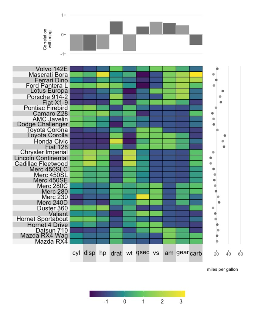
10注释图坐标轴的调整
10.1 调整轴名称
用到yr.axis.name或者yt.axis.name就行啦。🤒
superheat(dplyr::select(mtcars, -mpg),
          scale = T,
          yr = mtcars$mpg,
          yr.axis.name = "miles per gallon",
          yt = cor(mtcars)[-1,"mpg"],
          yt.plot.type = "bar",
          yt.axis.name = "Correlation\nwith mpg")

10.2 调整坐标轴名称及数字大小
可以分别使用yr.axis.name.size/yt.axis.name.size或yr.axis.size/yt.axis.size来调整。😘
superheat(dplyr::select(mtcars, -mpg),
          scale = T,
          yr = mtcars$mpg,
          yr.axis.name = "miles per gallon",
          yt = cor(mtcars)[-1,"mpg"],
          yt.plot.type = "bar",
          yt.axis.name = "Correlation\nwith mpg",
          yt.axis.size = 14,
          yt.axis.name.size = 14)

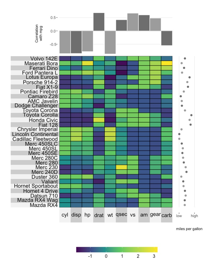
10.3 调整坐标轴Limits
superheat(dplyr::select(mtcars, -mpg),
          scale = T,
          yr = mtcars$mpg,
          yr.axis.name = "miles per gallon",
          yr.lim = c(0, 60),
          yt = cor(mtcars)[-1,"mpg"],
          yt.plot.type = "bar",
          yt.axis.name = "Correlation\nwith mpg",
          yt.lim = c(-1.5, 1))
10.4 调整坐标轴ticks
superheat(dplyr::select(mtcars, -mpg),
          scale = T,
          yr = mtcars$mpg,
          yr.axis.name = "miles per gallon",
          yr.lim = c(0, 60),
          yr.breaks = c(10, 40),
          yt = cor(mtcars)[-1,"mpg"],
          yt.plot.type = "bar",
          yt.axis.name = "Correlation\nwith mpg")

10.5 调整坐标轴ticks的labels
superheat(dplyr::select(mtcars, -mpg),
          scale = T,
          yr = mtcars$mpg,
          yr.axis.name = "miles per gallon",
          yr.lim = c(0, 60),
          yr.breaks = c(10, 40),
          yr.break.labels = c("low", "high"),
          yt = cor(mtcars)[-1,"mpg"],
          yt.plot.type = "bar",
          yt.axis.name = "Correlation\nwith mpg")
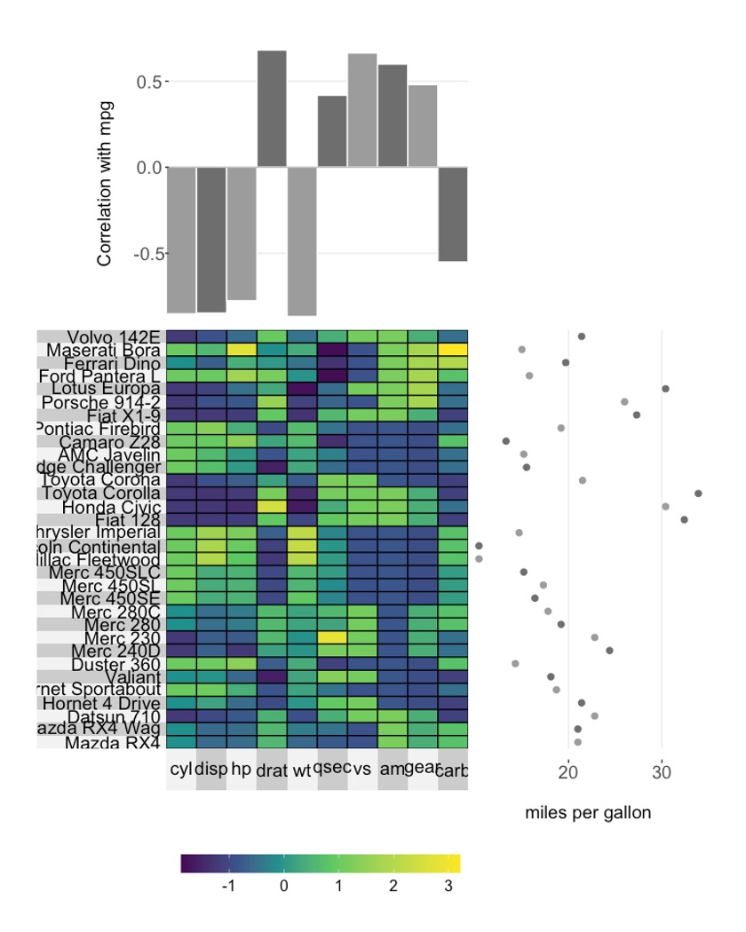
10.6 调整注释图大小
superheat(dplyr::select(mtcars, -mpg),
          scale = T,
          yr = mtcars$mpg,
          yr.axis.name = "miles per gallon",
          yr.axis.size = 14,
          yr.axis.name.size = 14,
          yr.plot.size = 0.8,
          yt = cor(mtcars)[-1,"mpg"],
          yt.plot.type = "bar",
          yt.axis.name = "Correlation with mpg",
          yt.axis.size = 14,
          yt.axis.name.size = 14,
          yt.plot.size = 0.7)

点个在看吧各位~ ✐.ɴɪᴄᴇ ᴅᴀʏ 〰
📍 🤩 LASSO | 不来看看怎么美化你的LASSO结果吗!?
📍 🤣 chatPDF | 别再自己读文献了!让chatGPT来帮你读吧!~
📍 🤩 WGCNA | 值得你深入学习的生信分析方法!~
📍 🤩 ComplexHeatmap | 颜狗写的高颜值热图代码!
📍 🤥 ComplexHeatmap | 你的热图注释还挤在一起看不清吗!?
📍 🤨 Google | 谷歌翻译崩了我们怎么办!?(附完美解决方案)
📍 🤩 scRNA-seq | 吐血整理的单细胞入门教程
📍 🤣 NetworkD3 | 让我们一起画个动态的桑基图吧~
📍 🤩 RColorBrewer | 再多的配色也能轻松搞定!~
📍 🧐 rms | 批量完成你的线性回归
📍 🤩 CMplot | 完美复刻Nature上的曼哈顿图
📍 🤠 Network | 高颜值动态网络可视化工具
📍 🤗 boxjitter | 完美复刻Nature上的高颜值统计图
📍 🤫 linkET | 完美解决ggcor安装失败方案(附教程)
📍 ......
本文由 mdnice 多平台发布