Text:文字
Text("Flutter")Text是最常用也是最基础的,目前学习阶段只用来加载文字数据,更多属性和样式设置请查看源码自己探索。

Button:按钮
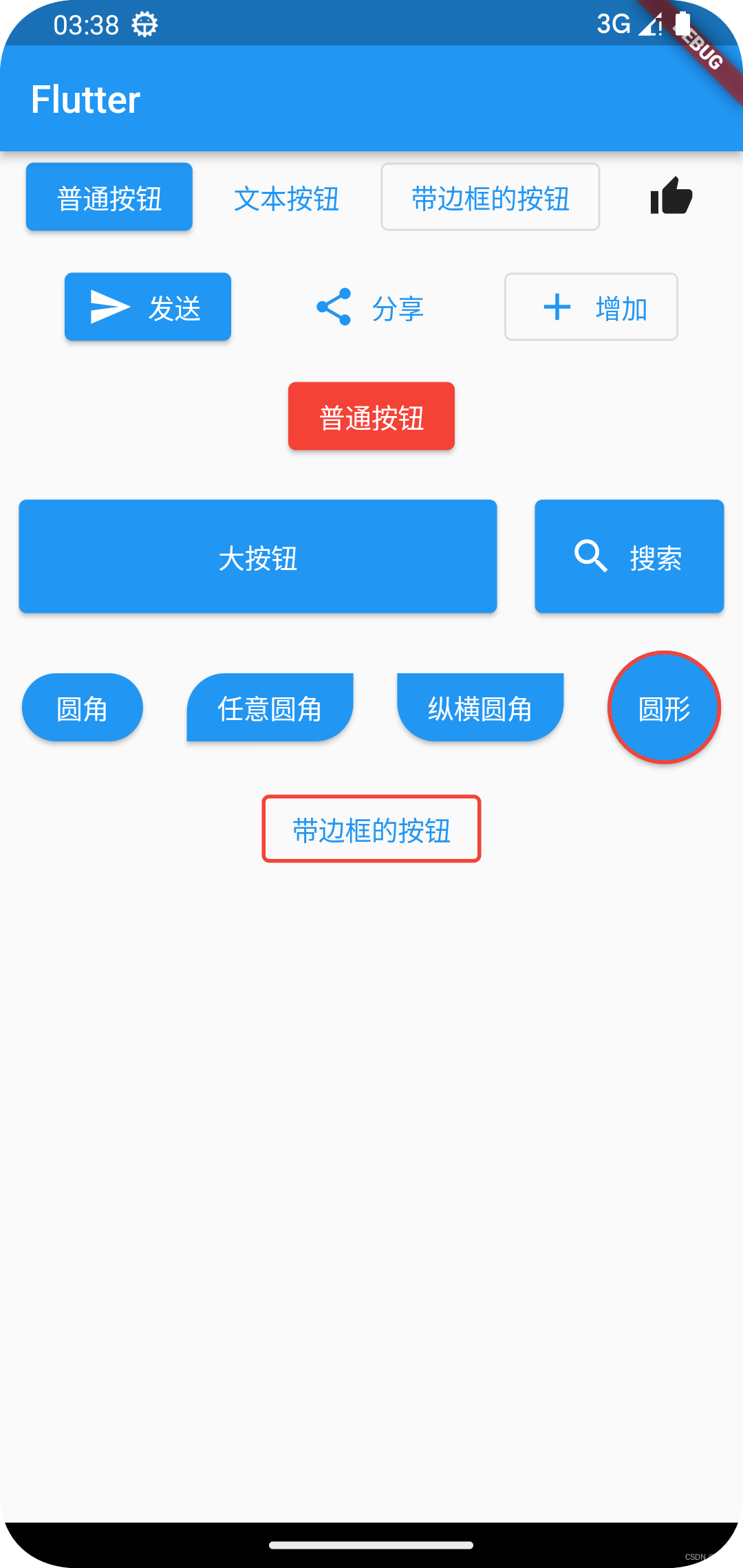
ElevatedButton:普通按钮
ElevatedButton(
  onPressed: () {
    if (kDebugMode) {
      print("ElevatedButton");
    }
  },
  child: const Text("普通按钮"),
),
TextButton:文本按钮
TextButton(
  onPressed: () {
    if (kDebugMode) {
      print("TextButton");
    }
  },
  child: const Text("文本按钮"),
),
OutlinedButton:带边框按钮
OutlinedButton(
  onPressed: () {
    if (kDebugMode) {
      print("OutlinedButton");
    }
  },
  child: const Text("带边框的按钮"),
),
IconButton:图片按钮
IconButton(
  onPressed: () {
    if (kDebugMode) {
      print("IconButton");
    }
  },
  icon: const Icon(Icons.thumb_up),
)带图片的文本按钮,只需要在各控件后加.icon就可以了
ElevatedButton.icon(
  onPressed: () {
    if (kDebugMode) {
      print('点击了发送按钮');
    }
  },
  icon: const Icon(Icons.send),
  label: const Text("发送"),
),
自定义样式按钮
 ElevatedButton(
   style: ButtonStyle(
     backgroundColor: MaterialStateProperty.all(Colors.red), //背景颜色
     foregroundColor:
         MaterialStateProperty.all(Colors.white), //文字图标颜色
   ),
   onPressed: () {
     if (kDebugMode) {
       print("ElevatedButton");
     }
   },
   child: const Text("普通按钮"),
)大按钮和设置按钮大小可以在容器里面设置按钮
Container(
  width: 100,
  height: 60,
  margin: const EdgeInsets.all(10),
  child: ElevatedButton.icon(
    onPressed: () {},
    icon: const Icon(Icons.search),
    label: const Text("搜索"),
),加样式的各种圆角和边框按钮
Row(
  mainAxisAlignment: MainAxisAlignment.spaceAround,
  children: [
    ElevatedButton(
      style: ButtonStyle(
        shape: MaterialStateProperty.all(
          RoundedRectangleBorder(
            borderRadius: BorderRadius.circular(20),
          ),
        ),
      ),
      onPressed: () {},
      child: const Text("圆角"),
    ),
    ElevatedButton(
      style: ButtonStyle(
        shape: MaterialStateProperty.all(
          const RoundedRectangleBorder(
            borderRadius: BorderRadius.only(
              topLeft: Radius.circular(20),
              bottomRight: Radius.circular(20),
            ),
          ),
        ),
      ),
      onPressed: () {},
      child: const Text("任意圆角"),
    ),
    ElevatedButton(
      style: ButtonStyle(
        shape: MaterialStateProperty.all(
          const RoundedRectangleBorder(
            borderRadius: BorderRadius.vertical(
              top: Radius.circular(0),
              bottom: Radius.circular(20),
            ),
          ),
        ),
      ),
      onPressed: () {},
      child: const Text("纵横圆角"),
    ),
    SizedBox(
      width: 60,
      height: 60,
      child: ElevatedButton(
        style: ButtonStyle(
          //按钮样式设置
          shape: MaterialStateProperty.all(
            const CircleBorder(
              side: BorderSide(
                width: 2, //边框宽度
                color: Colors.red, //边框颜色
              ),
            ),
          ),
        ),
        onPressed: () {},
        child: const Text("圆形"),
      ),
    ),
  ],
),
const SizedBox(height: 10),
Row(
  mainAxisAlignment: MainAxisAlignment.spaceAround,
  children: [
    OutlinedButton(
      style: ButtonStyle(
        side: MaterialStateProperty.all(
          //修改边框颜色和宽度
          const BorderSide(
            width: 2,
            color: Colors.red,
          ),
        ),
      ),
      onPressed: () {},
      child: const Text("带边框的按钮"),
    )
  ],
),
完整代码:
import 'package:flutter/foundation.dart';
import 'package:flutter/material.dart';

void main() {
  runApp(const MyApp());
}

class MyApp extends StatelessWidget {
  const MyApp({super.key});

  @override
  Widget build(BuildContext context) {
    return MaterialApp(
      theme: ThemeData(primarySwatch: Colors.blue),
      home: Scaffold(
        appBar: AppBar(
          title: const Text("Flutter"),
        ),
        body: const MyHomePage(),
      ),
    );
  }
}

class MyHomePage extends StatelessWidget {
  const MyHomePage({Key? key}) : super(key: key);

  @override
  Widget build(BuildContext context) {
    return const LayoutDemo();
  }
}

class LayoutDemo extends StatelessWidget {
  const LayoutDemo({super.key});

  @override
  Widget build(BuildContext context) {
    return ListView(
      children: [
        Row(
          mainAxisAlignment: MainAxisAlignment.spaceEvenly,
          children: [
            ElevatedButton(
              onPressed: () {
                if (kDebugMode) {
                  print("ElevatedButton");
                }
              },
              child: const Text("普通按钮"),
            ),
            TextButton(
              onPressed: () {
                if (kDebugMode) {
                  print("TextButton");
                }
              },
              child: const Text("文本按钮"),
            ),
            OutlinedButton(
              onPressed: () {
                if (kDebugMode) {
                  print("OutlinedButton");
                }
              },
              child: const Text("带边框的按钮"),
            ),
            IconButton(
              onPressed: () {
                if (kDebugMode) {
                  print("IconButton");
                }
              },
              icon: const Icon(Icons.thumb_up),
            )
          ],
        ),
        const SizedBox(height: 10),
        Row(
          mainAxisAlignment: MainAxisAlignment.spaceEvenly,
          children: [
            ElevatedButton.icon(
              onPressed: () {
                if (kDebugMode) {
                  print('点击了发送按钮');
                }
              },
              icon: const Icon(Icons.send),
              label: const Text("发送"),
            ),
            TextButton.icon(
              onPressed: () {
                if (kDebugMode) {
                  print('分享');
                }
              },
              icon: const Icon(Icons.share),
              label: const Text("分享"),
            ),
            OutlinedButton.icon(
              onPressed: () {},
              icon: const Icon(Icons.add),
              label: const Text("增加"),
            )
          ],
        ),
        const SizedBox(height: 10),
        Row(
          mainAxisAlignment: MainAxisAlignment.spaceEvenly,
          children: [
            ElevatedButton(
              style: ButtonStyle(
                backgroundColor: MaterialStateProperty.all(Colors.red), //背景颜色
                foregroundColor:
                    MaterialStateProperty.all(Colors.white), //文字图标颜色
              ),
              onPressed: () {
                if (kDebugMode) {
                  print("ElevatedButton");
                }
              },
              child: const Text("普通按钮"),
            )
          ],
        ),
        const SizedBox(height: 10),
        Row(
          mainAxisAlignment: MainAxisAlignment.center,
          children: [
            Expanded(
              flex: 1,
              child: Container(
                height: 60,
                margin: const EdgeInsets.all(10),
                child: ElevatedButton(
                  onPressed: () {},
                  child: const Text("大按钮"),
                ),
              ),
            ),
            Container(
              width: 100,
              height: 60,
              margin: const EdgeInsets.all(10),
              child: ElevatedButton.icon(
                onPressed: () {},
                icon: const Icon(Icons.search),
                label: const Text("搜索"),
              ),
            )
          ],
        ),
        const SizedBox(height: 10),
        Row(
          mainAxisAlignment: MainAxisAlignment.spaceAround,
          children: [
            ElevatedButton(
              style: ButtonStyle(
                shape: MaterialStateProperty.all(
                  RoundedRectangleBorder(
                    borderRadius: BorderRadius.circular(20),
                  ),
                ),
              ),
              onPressed: () {},
              child: const Text("圆角"),
            ),
            ElevatedButton(
              style: ButtonStyle(
                shape: MaterialStateProperty.all(
                  const RoundedRectangleBorder(
                    borderRadius: BorderRadius.only(
                      topLeft: Radius.circular(20),
                      bottomRight: Radius.circular(20),
                    ),
                  ),
                ),
              ),
              onPressed: () {},
              child: const Text("任意圆角"),
            ),
            ElevatedButton(
              style: ButtonStyle(
                shape: MaterialStateProperty.all(
                  const RoundedRectangleBorder(
                    borderRadius: BorderRadius.vertical(
                      top: Radius.circular(0),
                      bottom: Radius.circular(20),
                    ),
                  ),
                ),
              ),
              onPressed: () {},
              child: const Text("纵横圆角"),
            ),
            SizedBox(
              width: 60,
              height: 60,
              child: ElevatedButton(
                style: ButtonStyle(
                  //按钮样式设置
                  shape: MaterialStateProperty.all(
                    const CircleBorder(
                      side: BorderSide(
                        width: 2, //边框宽度
                        color: Colors.red, //边框颜色
                      ),
                    ),
                  ),
                ),
                onPressed: () {},
                child: const Text("圆形"),
              ),
            ),
          ],
        ),
        const SizedBox(height: 10),
        Row(
          mainAxisAlignment: MainAxisAlignment.spaceAround,
          children: [
            OutlinedButton(
              style: ButtonStyle(
                side: MaterialStateProperty.all(
                  //修改边框颜色和宽度
                  const BorderSide(
                    width: 2,
                    color: Colors.red,
                  ),
                ),
              ),
              onPressed: () {},
              child: const Text("带边框的按钮"),
            )
          ],
        ),
      ],
    );
  }
}
Card:卡片
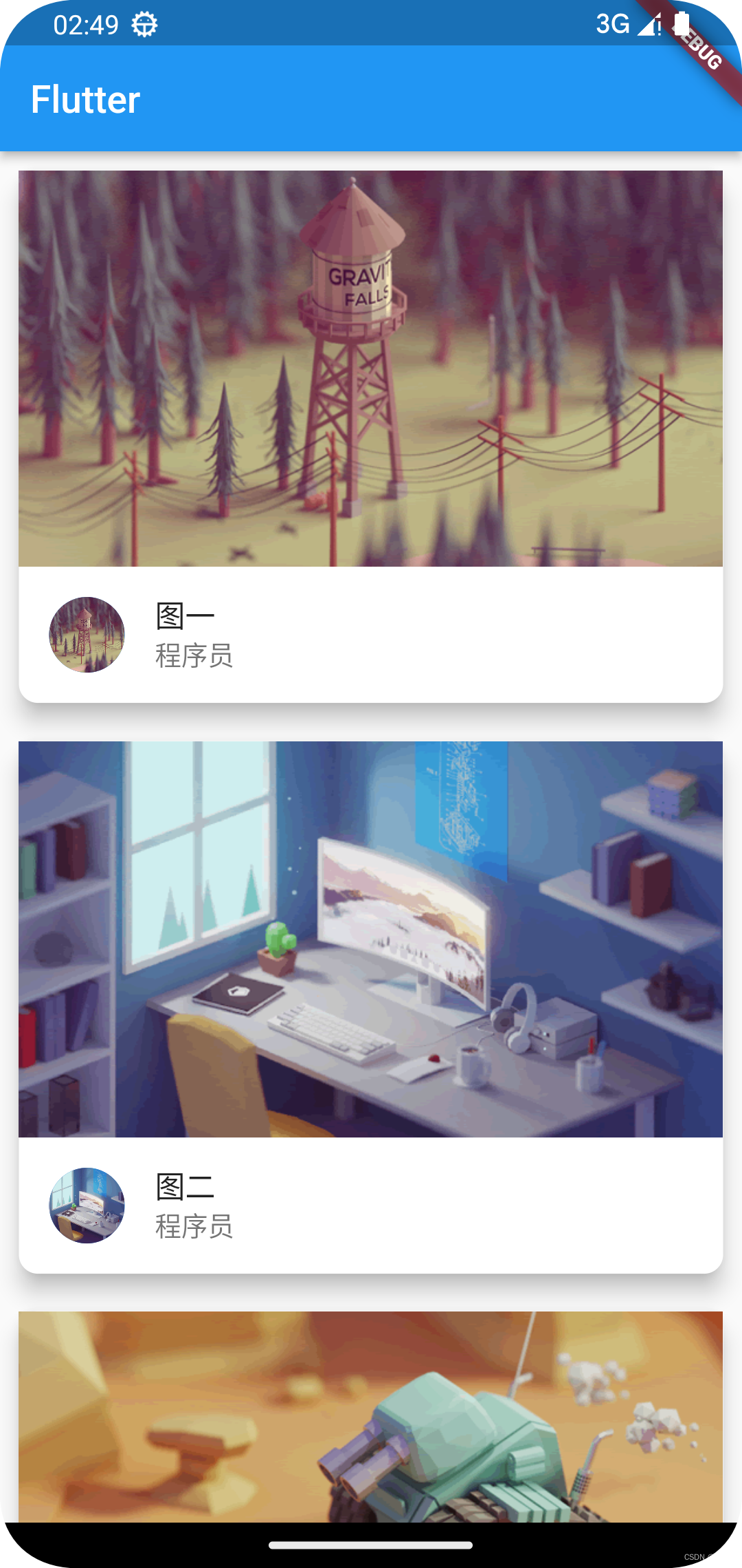
Card相当于原生中的CardView控件,用于卡片样式布局。
完整代码:
import 'package:flutter/material.dart';
import 'package:flutter_demo/res/listData.dart';

void main() {
  runApp(const MyApp());
}

class MyApp extends StatelessWidget {
  const MyApp({super.key});

  @override
  Widget build(BuildContext context) {
    return MaterialApp(
      theme: ThemeData(primarySwatch: Colors.blue),
      home: Scaffold(
        appBar: AppBar(
          title: const Text("Flutter"),
        ),
        body: const MyHomePage(),
      ),
    );
  }
}

class MyHomePage extends StatelessWidget {
  const MyHomePage({Key? key}) : super(key: key);

  @override
  Widget build(BuildContext context) {
    return const LayoutDemo();
  }
}

class LayoutDemo extends StatelessWidget {
  const LayoutDemo({super.key});

  List<Widget> _initCardData() {
    var tempList = listData.map((value) {
      //卡片控件
      return Card(
        shape: RoundedRectangleBorder(borderRadius: BorderRadius.circular(10)), //圆角大小
        elevation: 10, //阴影深度
        margin: const EdgeInsets.all(10),//四周间距
        child: Column(
          children: [
            AspectRatio(
              aspectRatio: 16 / 9,//屏幕比例
              child: Image.network(value["imageUrl"], fit: BoxFit.cover),
            ),
            ListTile(
              //ClipOval实现圆角图片设置
              /*leading: ClipOval(
                child: Image.network(
                  value["imageUrl"],
                  fit: BoxFit.cover,
                  width: 40,
                  height: 40,
                ),
              ),*/
              //CircleAvatar实现圆角图片设置
              leading: CircleAvatar(
                backgroundImage: NetworkImage(value["imageUrl"]),
              ),
              title: Text(value["title"]),
              subtitle: Text(value["author"]),
            ),
          ],
        ),
      );
    });
    return tempList.toList();
  }

  @override
  Widget build(BuildContext context) {
    return ListView(
      children: _initCardData(),
    );
  }
}
Card控件下的shape属性用于设置卡片样式,elevation属性用于设置卡片阴影深度。
AspectRatio控件设置图片比例。
ListView实现数据列表,相当于原生ScrollView、NestedScrollView、ListView、RecyclerView。
ListTile填充列表数据,title属性添加列表标题,subtitle为副标题,还有更多属性请查看ListTile源码。
CircleAvatar或者ClipOval控件实现圆形图片显示。
数据文件listData.dart
List listData = [
  {
    "title": "图一",
    "author": "程序员",
    "imageUrl": "https://www.itying.com/images/flutter/1.png",
  },
  {
    "title": "图二",
    "author": "程序员",
    "imageUrl": "https://www.itying.com/images/flutter/2.png",
  },
  {
    "title": "图三",
    "author": "程序员",
    "imageUrl": "https://www.itying.com/images/flutter/3.png",
  },
  {
    "title": "图四",
    "author": "程序员",
    "imageUrl": "https://www.itying.com/images/flutter/4.png",
  },
  {
    "title": "图五",
    "author": "程序员",
    "imageUrl": "https://www.itying.com/images/flutter/5.png",
  },
  {
    "title": "图六",
    "author": "程序员",
    "imageUrl": "https://www.itying.com/images/flutter/6.png",
  },
];