💡 作者:韩信子@ShowMeAI
📘 数据分析实战系列:https://www.showmeai.tech/tutorials/40
📘 AI 岗位&攻略系列:https://www.showmeai.tech/tutorials/47
📘 本文地址:https://www.showmeai.tech/article-detail/402
📢 声明:版权所有,转载请联系平台与作者并注明出处
📢 收藏ShowMeAI查看更多精彩内容
💡 引言

数据科学在互联网、医疗、电信、零售、体育、航空、艺术等各个领域仍然越来越受欢迎。在 📘Glassdoor的美国最佳职位列表中,数据科学职位排名第三,2022 年有近 10,071 个职位空缺。
除了数据独特的魅力,数据科学相关岗位的薪资也备受关注,在本篇内容中,ShowMeAI会基于数据对下述问题进行分析:
- 数据科学中薪水最高的工作是什么?
- 哪个国家的薪水最高,机会最多?
- 典型的薪资范围是多少?
- 工作水平对数据科学家有多重要?
- 数据科学,全职vs自由职业者
- 数据科学领域薪水最高的工作是什么?
- 数据科学领域平均薪水最高的工作是什么?
- 数据科学专业的最低和最高工资
- 招聘数据科学专业人员的公司规模如何?
- 工资是不是跟公司规模有关?
- WFH(远程办公)和 WFO 的比例是多少?
- 数据科学工作的薪水每年如何增长?
- 如果有人正在寻找与数据科学相关的工作,你会建议他在网上搜索什么?
- 如果你有几年初级员工的经验,你应该考虑跳槽到什么规模的公司?
💡 数据说明
我们本次用到的数据集是 🏆数据科学工作薪水数据集,大家可以通过 ShowMeAI 的百度网盘地址下载。
🏆 实战数据集下载(百度网盘):公众号『ShowMeAI研究中心』回复『实战』,或者点击 这里 获取本文 [37]基于pandasql和plotly的数据科学家薪资分析与可视化 『ds_salaries数据集』
⭐ ShowMeAI官方GitHub:https://github.com/ShowMeAI-Hub
数据集包含 11 列,对应的名称和含义如下:
| 参数 | 含义 |
|---|---|
| work_year | 支付工资的年份 |
| experience_level : 发薪时的经验等级 | |
| employment_type | 就业类型 |
| job_title | 岗位名称 |
| salary | 支付的总工资总额 |
| salary_currency | 支付的薪水的货币 |
| salary_in_usd | 支付的标准化工资(美元) |
| employee_residence | 员工的主要居住国家 |
| remote_ratio | 远程完成的工作总量 |
| company_location | 雇主主要办公室所在的国家/地区 |
| company_size | 根据员工人数计算的公司规模 |

本篇分析使用到Pandas和SQL,欢迎大家阅读ShowMeAI的数据分析教程和对应的工具速查表文章,系统学习和动手实践:
📘图解数据分析:从入门到精通系列教程
📘编程语言速查表 | SQL 速查表
📘数据科学工具库速查表 | Pandas 速查表
📘数据科学工具库速查表 | Matplotlib 速查表
💡 导入工具库
我们先导入需要使用的工具库,我们使用pandas读取数据,使用 Plotly 和 matplotlib 进行可视化。并且我们在本篇中会使用 SQL 进行数据分析,我们这里使用到了 📘pandasql 工具库。
# For loading data
import pandas as pd
import numpy as np

# For SQL queries
import pandasql as ps

# For ploting graph / Visualization
import plotly.graph_objects as go
import plotly.express as px
from plotly.offline import iplot
import plotly.figure_factory as ff

import plotly.io as pio
import seaborn as sns
import matplotlib.pyplot as plt

# To show graph below the code or on same notebook
from plotly.offline import init_notebook_mode
init_notebook_mode(connected=True)

# To convert country code to country name
import country_converter as coco

import warnings
warnings.filterwarnings('ignore')
💡 加载数据集
我们下载的数据集是 CSV 格式的,所以我们可以使用 read_csv 方法来读取我们的数据集。
# Loading data
salaries = pd.read_csv('ds_salaries.csv')
要查看前五个记录,我们可以使用 salaries.head() 方法。
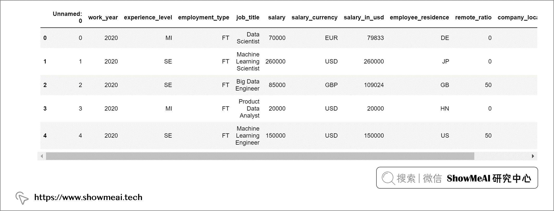
借助 pandasql完成同样的任务是这样的:
# Function query to execute SQL queries
def query(query):
 return ps.sqldf(query)

# Showing Top 5 rows of data
query("""
        SELECT *
        FROM salaries
        LIMIT 5
""")
输出:
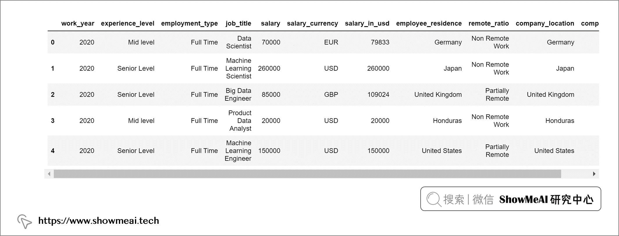
💡 数据预处理
我们数据集中的第1列“Unnamed: 0”是没有用的,在分析之前我们把它剔除:
salaries = salaries.drop('Unnamed: 0', axis = 1)
我们查看一下数据集中缺失值情况:
salaries.isna().sum()
输出:
work_year             0
experience_level      0
employment_type       0
job_title             0
salary                0
salary_currency       0
salary_in_usd         0
employee_residence    0
remote_ratio          0
company_location      0
company_size          0
dtype: int64
我们的数据集中没有任何缺失值,因此不用做缺失值处理,employee_residence 和 company_location 使用的是短国家代码。我们映射替换为国家的全名以便于理解:
# Converting countries code to country names
salaries["employee_residence"] = coco.convert(names=salaries["employee_residence"], to="name")
salaries["company_location"] = coco.convert(names=salaries["company_location"], to="name")
这个数据集中的experience_level代表不同的经验水平,使用的是如下缩写:
- CN: Entry Level (入门级)
- ML:Mid level (中级)
- SE:Senior Level (高级)
- EX:Expert Level (资深专家级)
为了更容易理解,我们也把这些缩写替换为全称。
# Replacing values in column - experience_level :
salaries['experience_level'] = query("""SELECT
                                          REPLACE(
                                            REPLACE(
                                              REPLACE(
                                                REPLACE(
                                                  experience_level, 'MI', 'Mid level'),
                                                                    'SE', 'Senior Level'),
                                                                    'EN', 'Entry Level'),
                                                                    'EX', 'Expert Level')
                                        FROM
                                          salaries""")
同样的方法,我们对工作形式也做全称替换
- FT: Full Time (全职)
- PT: Part Time (兼职)
- CT:Contract (合同制)
- FL:Freelance (自由职业)
# Replacing values in column - experience_level :
salaries['employment_type'] = query("""SELECT
                                          REPLACE(
                                            REPLACE(
                                              REPLACE(
                                                REPLACE(
                                                  employment_type, 'PT', 'Part Time'),
                                                                    'FT', 'Full Time'),
                                                                    'FL', 'Freelance'),
                                                                    'CT', 'Contract')
                                        FROM
                                          salaries""")
数据集中公司规模字段处理如下:
- S:Small (小型)
- M:Medium (中型)
- L:Large (大型)
# Replacing values in column - company_size :
salaries['company_size'] = query("""SELECT
                                       REPLACE(
                                         REPLACE(
                                           REPLACE(
                                             company_size, 'M', 'Medium'),
                                                           'L', 'Large'),
                                                           'S', 'Small')
                                    FROM
                                       salaries""")
我们对远程比率字段也做一些处理,以便更好理解
# Replacing values in column - remote_ratio :
salaries['remote_ratio'] = query("""SELECT
                                        REPLACE(
                                          REPLACE(
                                            REPLACE(
                                              remote_ratio, '100', 'Fully Remote'),
                                                            '50', 'Partially Remote'),
                                                            '0', 'Non Remote Work')
                                    FROM
                                      salaries""")
这是预处理后的最终输出。
💡 数据分析&可视化
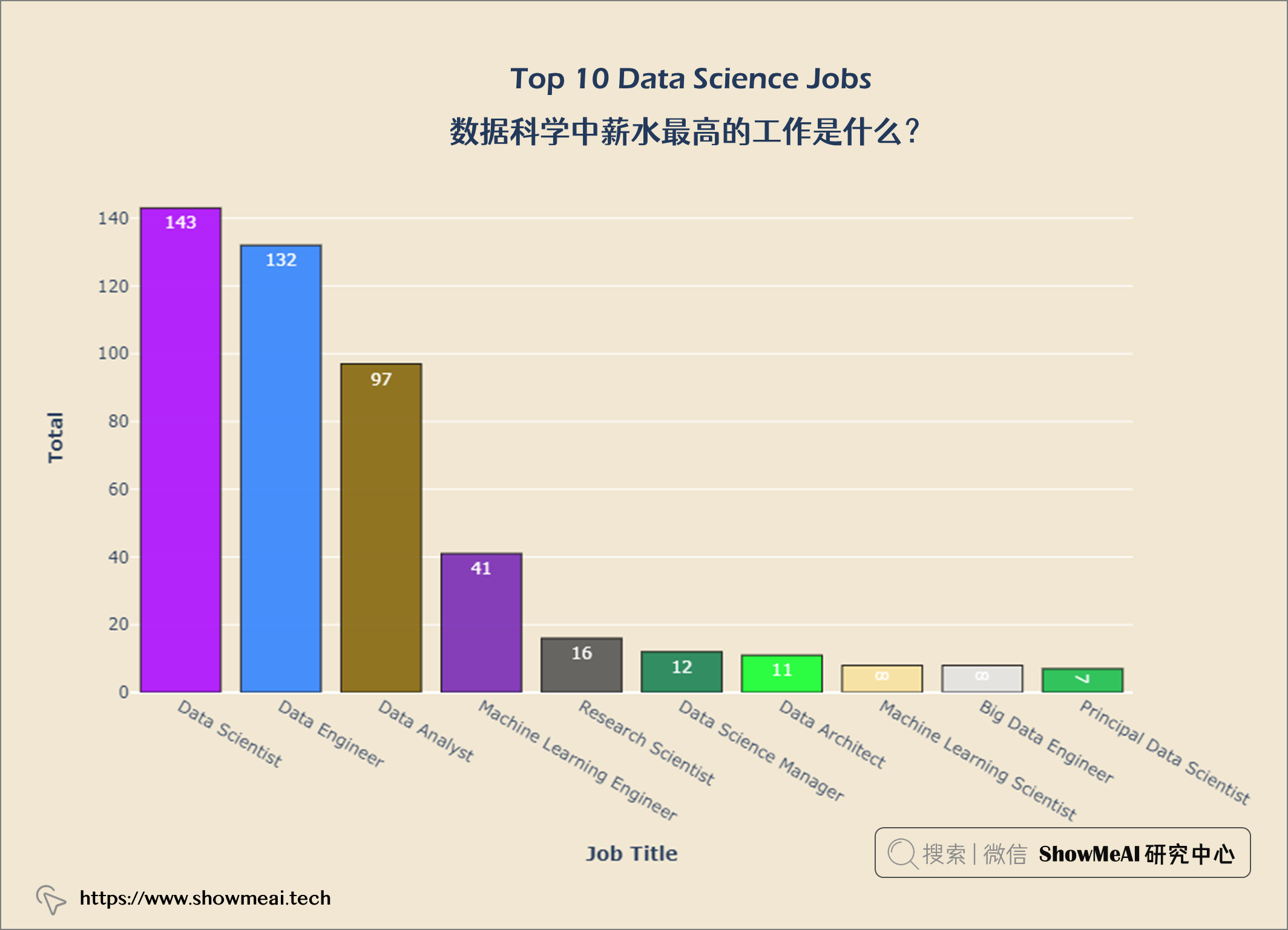
💦 数据科学中薪水最高的工作是什么?
top10_jobs = query("""
                    SELECT job_title,
                    Count(*) AS job_count
                    FROM salaries
                    GROUP BY job_title
                    ORDER BY job_count DESC
                    LIMIT 10
""")
我们绘制条形图以便更直观理解:
data = go.Bar(x = top10_jobs['job_title'], y = top10_jobs['job_count'],
             text = top10_jobs['job_count'], textposition = 'inside',
             textfont = dict(size = 12,
                            color = 'white'),
             marker = dict(color = px.colors.qualitative.Alphabet,
                          opacity = 0.9,
                          line_color = 'black',
                          line_width = 1))


layout = go.Layout(title = {'text': "<b>Top 10 Data Science Jobs</b>",
                            'x':0.5, 'xanchor': 'center'},
                   xaxis = dict(title = '<b>Job Title</b>', tickmode = 'array'),
                   yaxis = dict(title = '<b>Total</b>'),
                   width = 900,
                   height = 600)


fig = go.Figure(data = data, layout = layout)
fig.update_layout(plot_bgcolor = '#f1e7d2',
                 paper_bgcolor = '#f1e7d2')
fig.show()
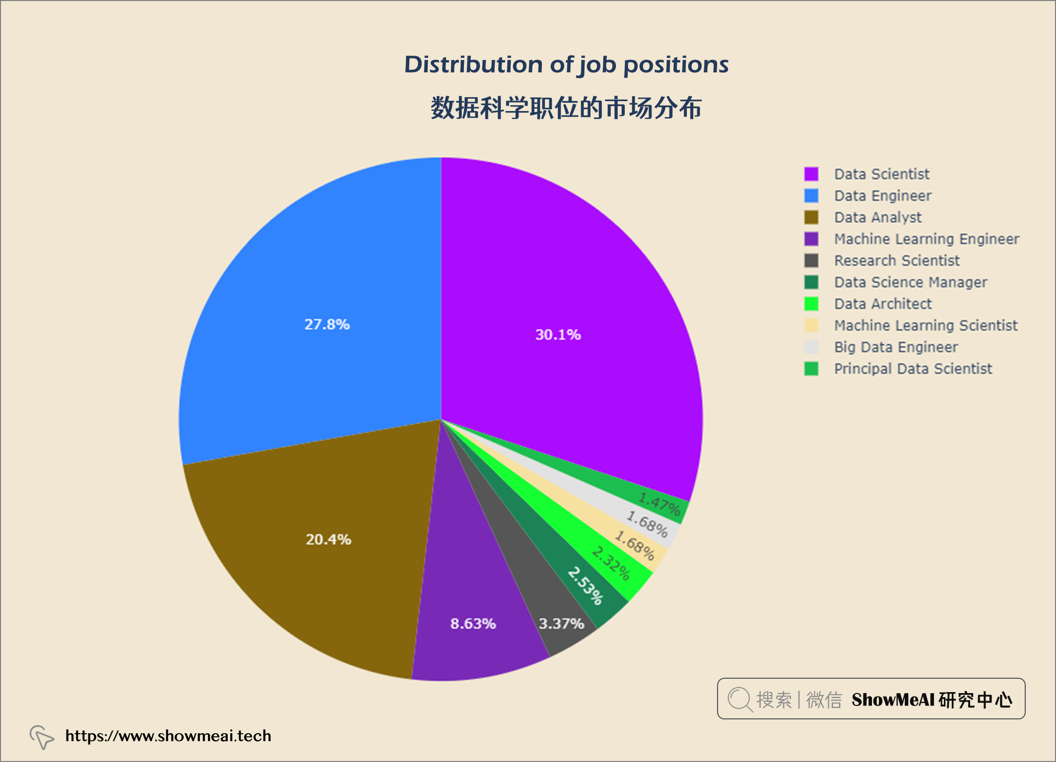
💦 数据科学职位的市场分布
fig = px.pie(top10_jobs, values='job_count',
              names='job_title',
              color_discrete_sequence = px.colors.qualitative.Alphabet)


fig.update_layout(title = {'text': "<b>Distribution of job positions</b>",
                            'x':0.5, 'xanchor': 'center'},
                   width = 900,
                   height = 600)

fig.update_layout(plot_bgcolor = '#f1e7d2',
                 paper_bgcolor = '#f1e7d2')
fig.show()
💦 拥有最多数据科学工作的国家
top10_com_loc = query("""
                    SELECT company_location AS company,
                    Count(*) AS job_count
                    FROM salaries
                    GROUP BY company
                    ORDER BY job_count DESC
                    LIMIT 10
""")


data = go.Bar(x = top10_com_loc['company'], y = top10_com_loc['job_count'],
             textfont = dict(size = 12,
                            color = 'white'),
             marker = dict(color = px.colors.qualitative.Alphabet,
                          opacity = 0.9,
                          line_color = 'black',
                          line_width = 1))


layout = go.Layout(title = {'text': "<b>Top 10 Data Science Countries</b>",
                            'x':0.5, 'xanchor': 'center'},
                   xaxis = dict(title = '<b>Countries</b>', tickmode = 'array'),
                   yaxis = dict(title = '<b>Total</b>'),
                   width = 900,
                   height = 600)


fig = go.Figure(data = data, layout = layout)
fig.update_layout(plot_bgcolor = '#f1e7d2',
                 paper_bgcolor = '#f1e7d2')
fig.show()
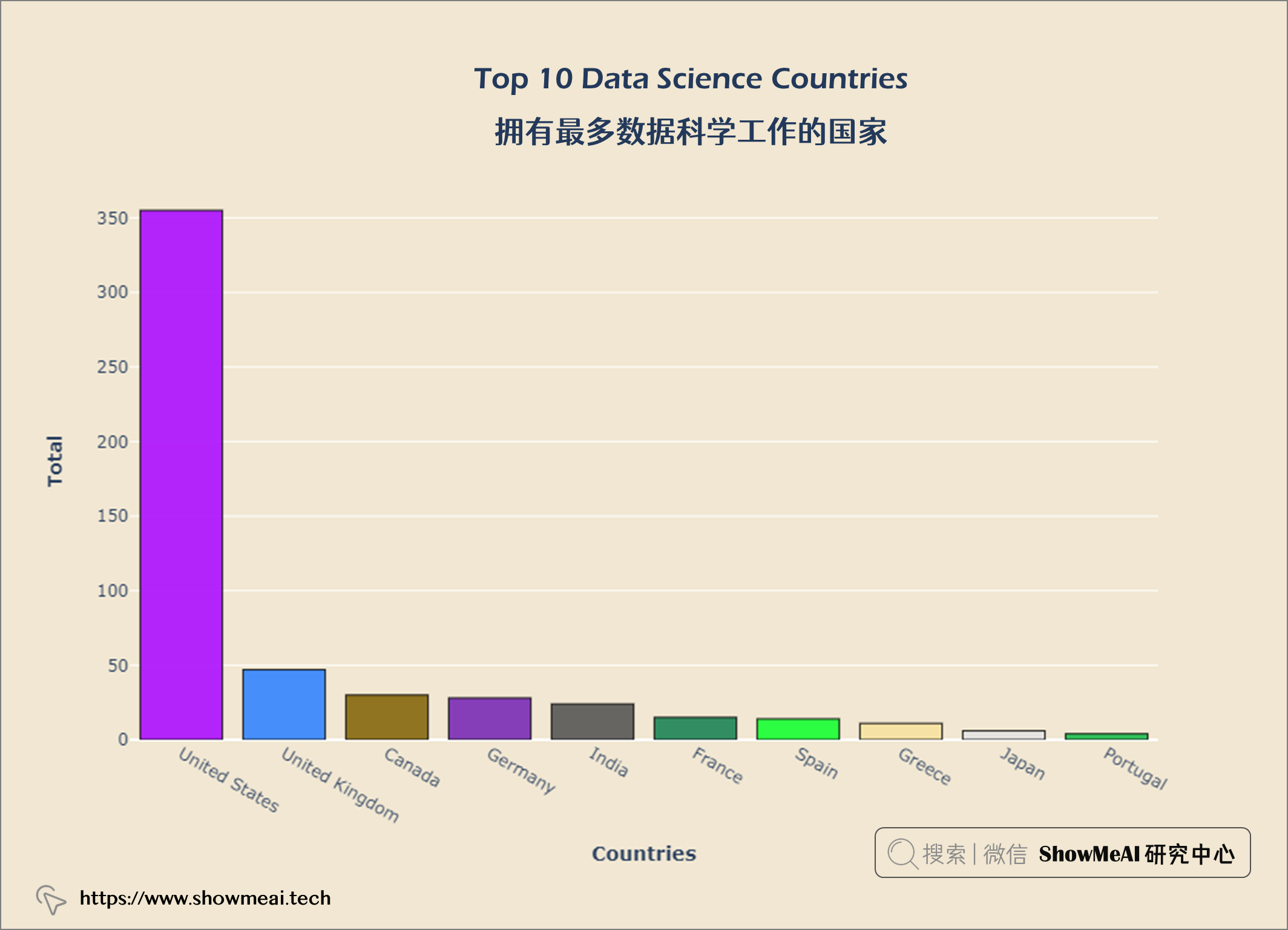
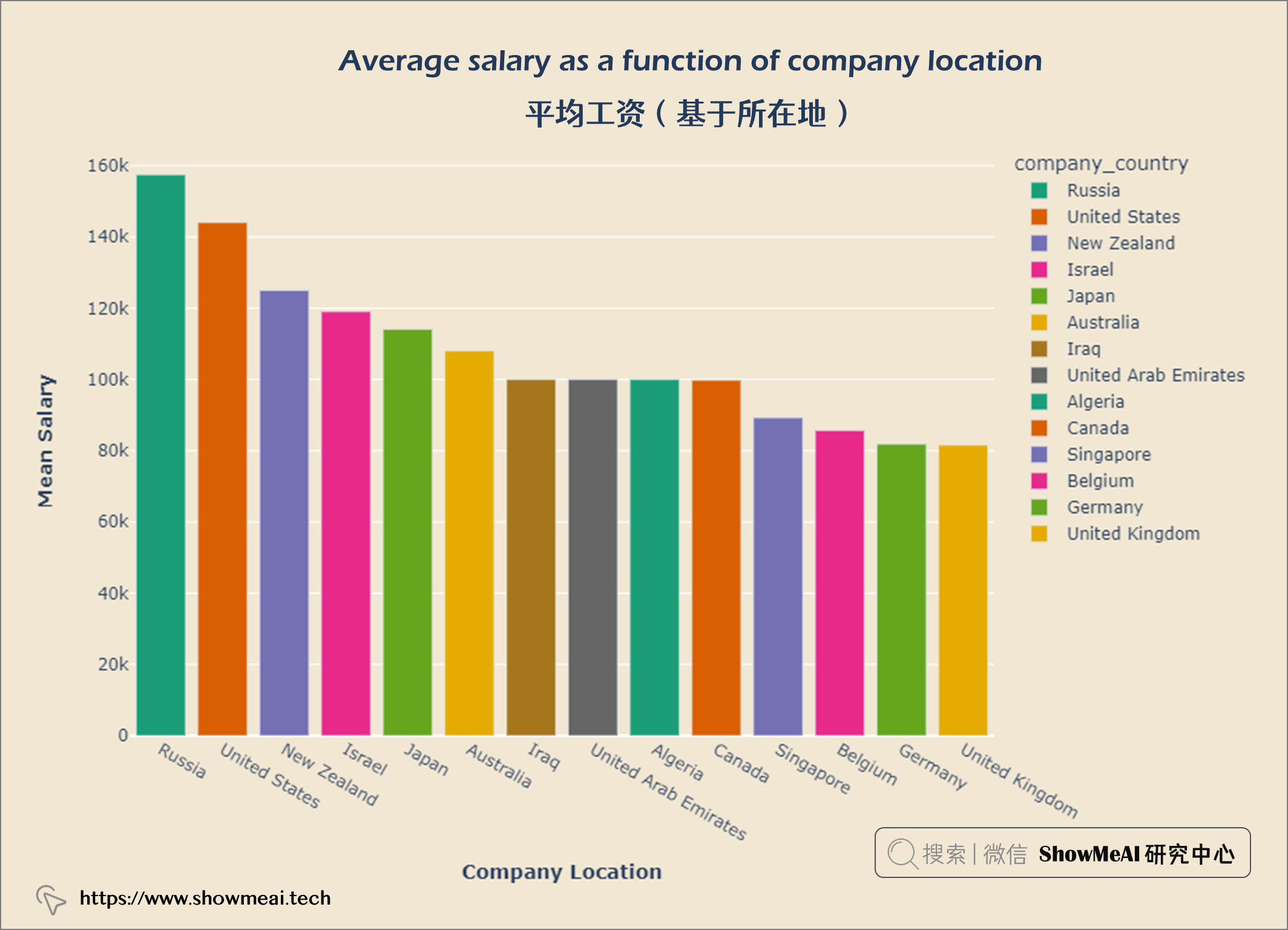
从上图中,我们可以看出美国在数据科学方面的工作机会最多。现在我们来看看世界各地的薪水。大家可以继续运行代码,查看可视化结果。
df = salaries
df["company_country"] = coco.convert(names = salaries["company_location"], to = 'name_short')

temp_df = df.groupby('company_country')['salary_in_usd'].sum().reset_index()
temp_df['salary_scale'] = np.log10(df['salary_in_usd'])


fig = px.choropleth(temp_df, locationmode = 'country names', locations = "company_country",
                   color = "salary_scale", hover_name = "company_country",
                   hover_data = temp_df[['salary_in_usd']],
                    color_continuous_scale = 'Jet',
                   )


fig.update_layout(title={'text':'<b>Salaries across the World</b>',
                         'xanchor': 'center','x':0.5})
fig.update_layout(plot_bgcolor = '#f1e7d2',
                 paper_bgcolor = '#f1e7d2')
fig.show()
💦 平均工资(基于货币计算)
df = salaries[['salary_currency','salary_in_usd']].groupby(['salary_currency'], as_index = False).mean().set_index('salary_currency').reset_index().sort_values('salary_in_usd', ascending = False)

#Selecting top 14
df = df.iloc[:14]
fig = px.bar(df, x = 'salary_currency',
            y = 'salary_in_usd',
            color = 'salary_currency',
            color_discrete_sequence = px.colors.qualitative.Safe,
            )

fig.update_layout(title={'text':'<b>Average salary as a function of currency</b>',
                         'xanchor': 'center','x':0.5},
                 xaxis_title = '<b>Currency</b>',
                 yaxis_title = '<b>Mean Salary</b>')
fig.update_layout(plot_bgcolor = '#f1e7d2',
                 paper_bgcolor = '#f1e7d2')
fig.show()
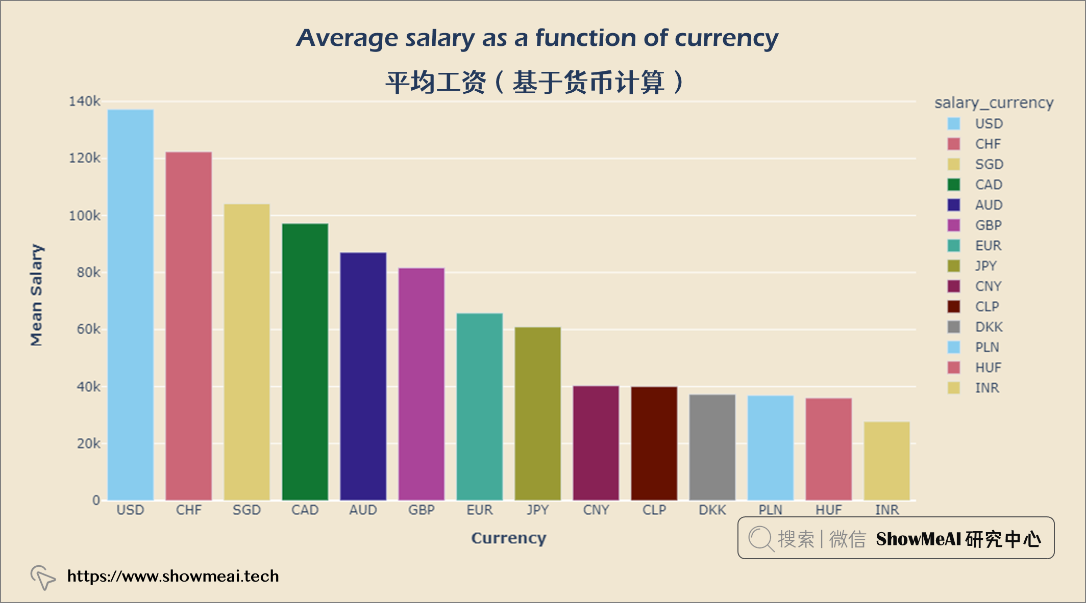
人们以美元赚取的收入最多,其次是瑞士法郎和新加坡元。
df = salaries[['company_country','salary_in_usd']].groupby(['company_country'], as_index = False).mean().set_index('company_country').reset_index().sort_values('salary_in_usd', ascending = False)


#Selecting top 14
df = df.iloc[:14]
fig = px.bar(df, x = 'company_country',
            y = 'salary_in_usd',
            color = 'company_country',
            color_discrete_sequence = px.colors.qualitative.Dark2,
            )


fig.update_layout(title = {'text': "<b>Average salary as a function of company location</b>",
                            'x':0.5, 'xanchor': 'center'},
                   xaxis = dict(title = '<b>Company Location</b>', tickmode = 'array'),
                   yaxis = dict(title = '<b>Mean Salary</b>'),
                   width = 900,
                   height = 600)


fig.update_layout(plot_bgcolor = '#f1e7d2',
                 paper_bgcolor = '#f1e7d2')
fig.show()
💦 数据科学工作经验水平分布
job_exp = query("""
            SELECT experience_level, Count(*) AS job_count
            FROM salaries
            GROUP BY experience_level
            ORDER BY job_count ASC
""")


data = go.Bar(x = job_exp['job_count'], y = job_exp['experience_level'],
              orientation = 'h', text = job_exp['job_count'],
             marker = dict(color = px.colors.qualitative.Alphabet,
                          opacity = 0.9,
                          line_color = 'white',
                          line_width = 2))


layout = go.Layout(title = {'text': "<b>Jobs on Experience Levels</b>",
                           'x':0.5, 'xanchor':'center'},
                  xaxis = dict(title='<b>Total</b>', tickmode = 'array'),
                  yaxis = dict(title='<b>Experience lvl</b>'),
                  width = 900,
                  height = 600)

fig = go.Figure(data = data, layout = layout)
fig.update_layout(plot_bgcolor = '#f1e7d2',
                  paper_bgcolor = '#f1e7d2')
fig.show()
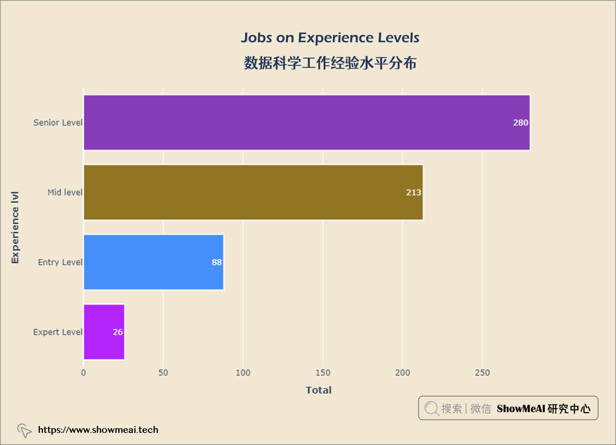
从上图可以看出,大多数数据科学都是 高级水平 ,专家级很少。
💦 数据科学工作就业类型分布
job_emp = query("""
SELECT employment_type,
COUNT(*) AS job_count
FROM salaries
GROUP BY employment_type
ORDER BY job_count ASC
""")


data =  go.Bar(x = job_emp['job_count'], y = job_emp['employment_type'],
               orientation ='h',text = job_emp['job_count'],
               textposition ='outside',
               marker = dict(color = px.colors.qualitative.Alphabet,
                             opacity = 0.9,
                             line_color = 'white',
                             line_width = 2))


layout = go.Layout(title = {'text': "<b>Jobs on Employment Type</b>",
                           'x':0.5, 'xanchor': 'center'},
                   xaxis = dict(title='<b>Total</b>', tickmode = 'array'),
                   yaxis =dict(title='<b>Emp Type lvl</b>'),
                   width = 900,
                   height = 600)


fig = go.Figure(data = data, layout = layout)
fig.update_layout(plot_bgcolor = '#f1e7d2',
                  paper_bgcolor = '#f1e7d2')
fig.show()
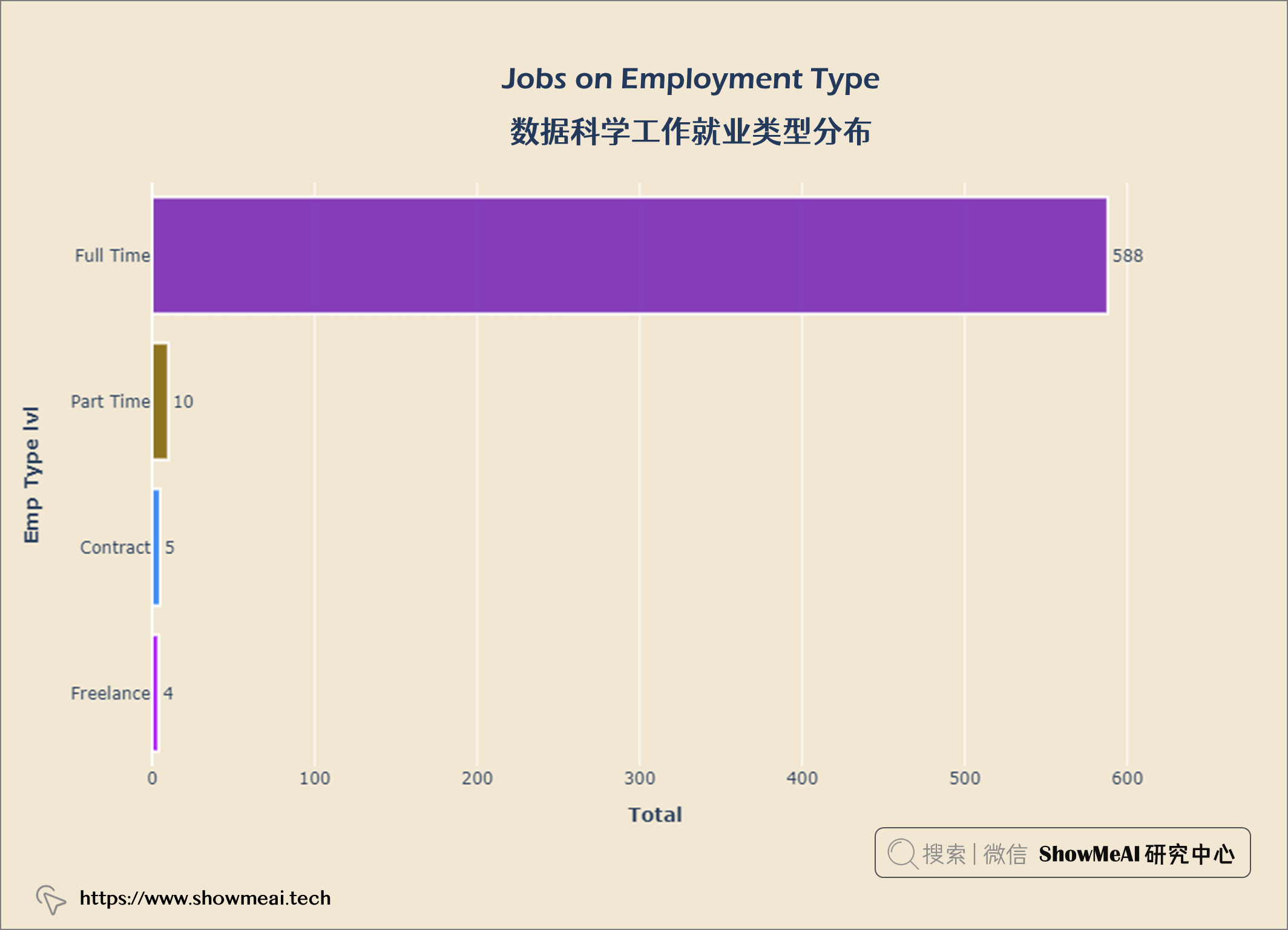
从上图中,我们可以看到大多数数据科学家从事 全职工作 ,而合同工和自由职业者 则较少
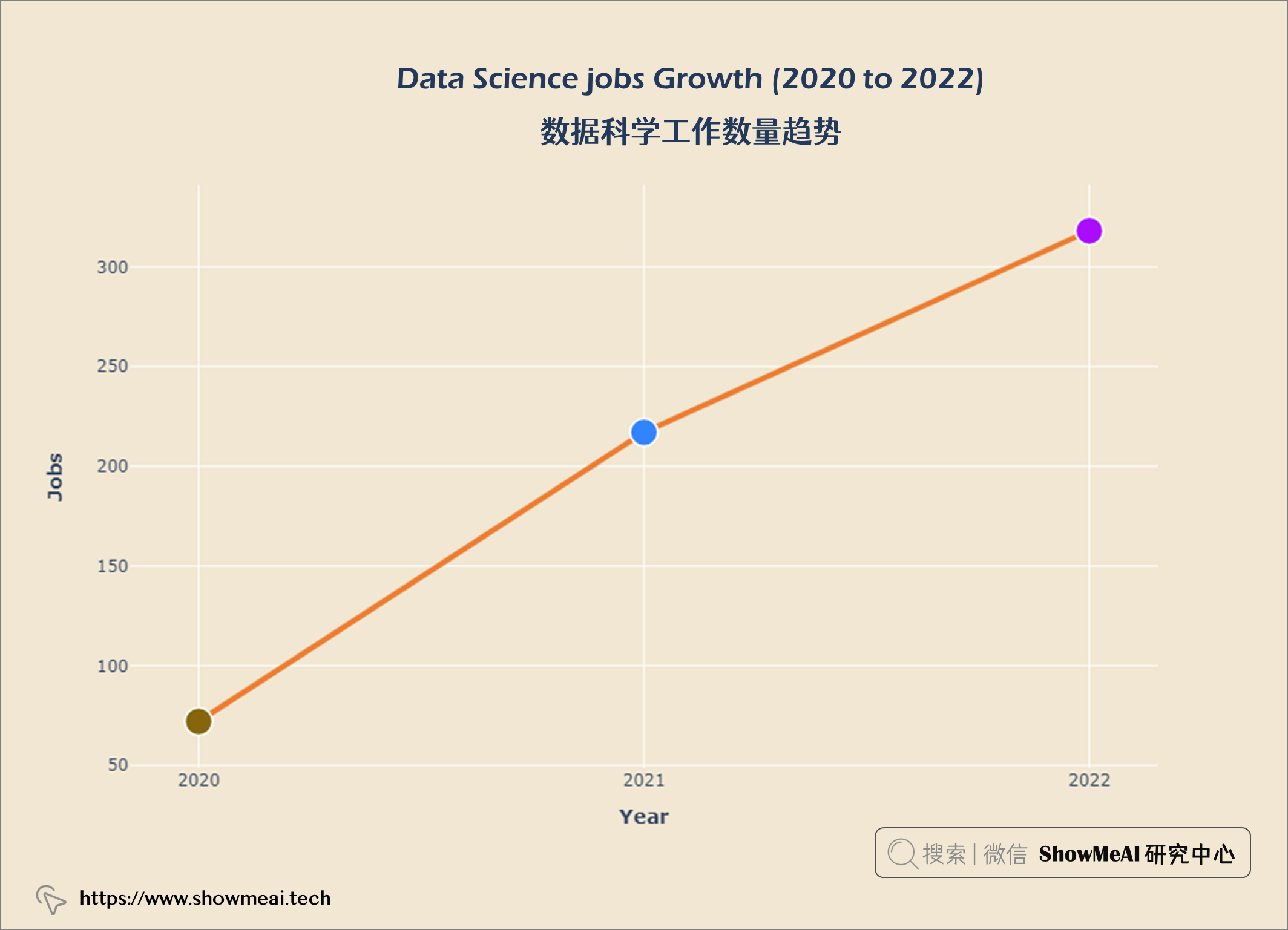
💦 数据科学工作数量趋势
job_year = query("""
    SELECT work_year, COUNT(*) AS 'job count'
    FROM salaries
    GROUP BY work_year
    ORDER BY 'job count' DESC
""")


data = go.Scatter(x = job_year['work_year'], y = job_year['job count'],
                  marker = dict(size = 20,
                                line_width = 1.5,
                                line_color = 'white',
                                color = px.colors.qualitative.Alphabet),
                  line = dict(color = '#ED7D31', width = 4), mode = 'lines+markers')


layout  = go.Layout(title = {'text' : "<b><i>Data Science jobs Growth (2020 to 2022)</i></b>",
                             'x' : 0.5, 'xanchor' : 'center'},
                    xaxis = dict(title = '<b>Year</b>'),
                    yaxis = dict(title = '<b>Jobs</b>'),
                    width = 900,
                    height = 600)


fig = go.Figure(data = data, layout = layout)
fig.update_xaxes(tickvals = ['2020','2021','2022'])
fig.update_layout(plot_bgcolor = '#f1e7d2',
                 paper_bgcolor = '#f1e7d2')
fig.show()
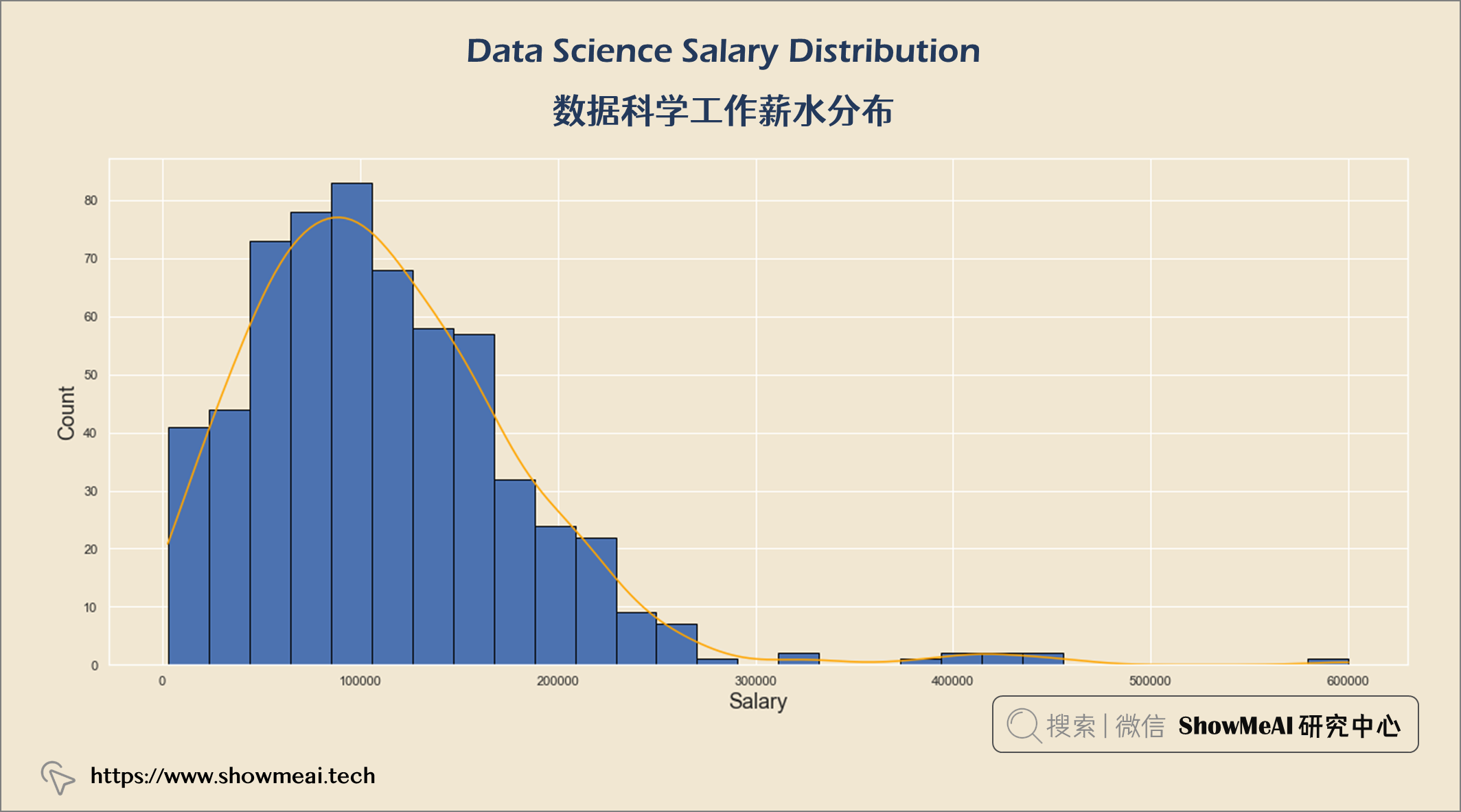
💦 数据科学工作薪水分布
salary_usd = query("""
                    SELECT salary_in_usd
                    FROM salaries
""")


import matplotlib.pyplot as plt

plt.figure(figsize = (20, 8))
sns.set(rc = {'axes.facecolor' : '#f1e7d2',
             'figure.facecolor' : '#f1e7d2'})

p = sns.histplot(salary_usd["salary_in_usd"],
                kde = True, alpha = 1, fill = True,
                edgecolor = 'black', linewidth = 1)
p.axes.lines[0].set_color("orange")
plt.title("Data Science Salary Distribution \n", fontsize = 25)
plt.xlabel("Salary", fontsize = 18)
plt.ylabel("Count", fontsize = 18)
plt.show()
💦 薪酬最高的 10 大数据科学工作
salary_hi10 = query("""
    SELECT job_title,
    MAX(salary_in_usd) AS salary
    FROM salaries
    GROUP BY salary
    ORDER BY salary DESC
    LIMIT 10
""")

data = go.Bar(x = salary_hi10['salary'],
             y = salary_hi10['job_title'],
             orientation = 'h',
             text = salary_hi10['salary'],
             textposition = 'inside',
             insidetextanchor = 'middle',
              textfont = dict(size = 13,
                             color = 'black'),
              marker = dict(color = px.colors.qualitative.Alphabet,
                           opacity = 0.9,
                           line_color = 'black',
                           line_width = 1))

layout = go.Layout(title = {'text': "<b>Top 10 Highest paid Data Science Jobs</b>",
                           'x':0.5,
                           'xanchor': 'center'},
                   xaxis = dict(title = '<b>salary</b>', tickmode = 'array'),
                   yaxis = dict(title = '<b>Job Title</b>'),
                   width = 900,
                   height = 600)
fig = go.Figure(data = data, layout
                = layout)
fig.update_layout(plot_bgcolor = '#f1e7d2',
                 paper_bgcolor = '#f1e7d2')
fig.show()
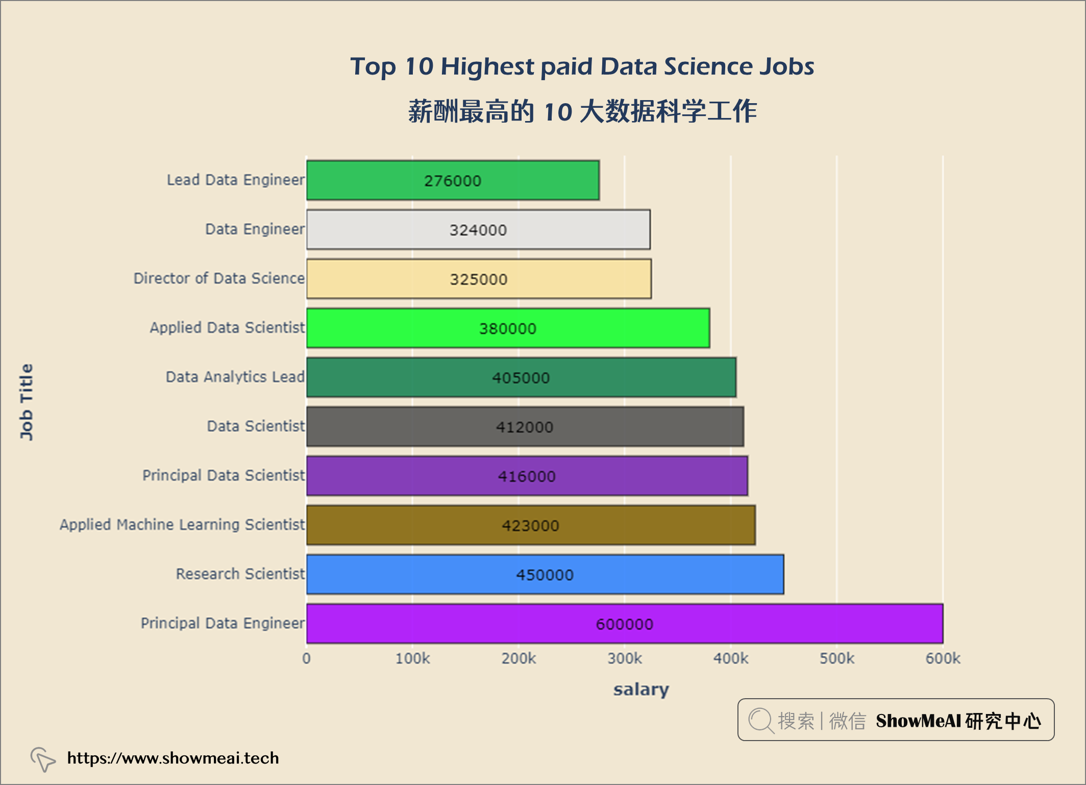
首席数据工程师 是数据科学领域的高薪工作。
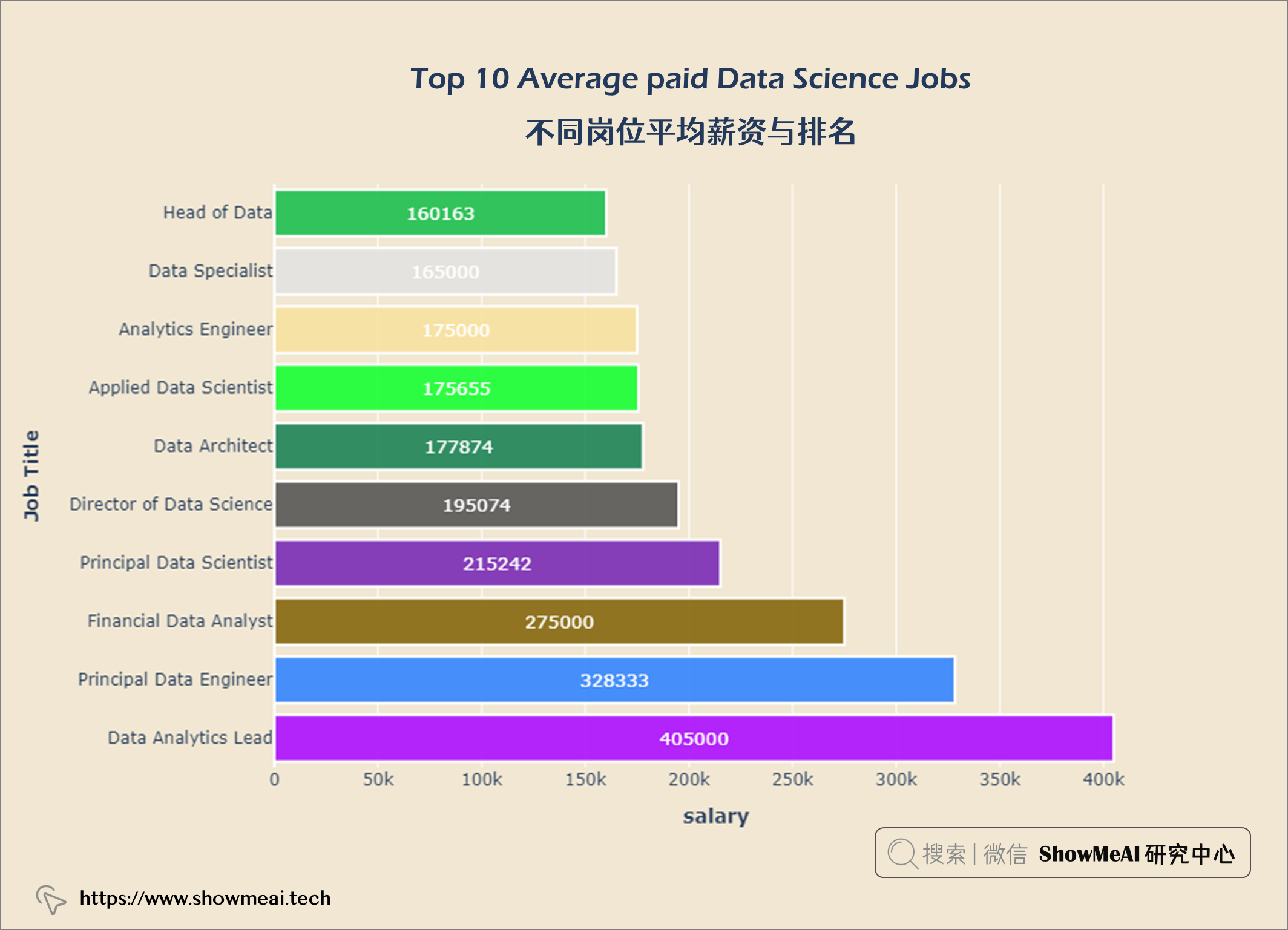
💦 不同岗位平均薪资与排名
salary_av10 = query("""
    SELECT job_title,
    ROUND(AVG(salary_in_usd)) AS salary
    FROM salaries
    GROUP BY job_title
    ORDER BY salary DESC
    LIMIT 10
""")

data = go.Bar(x = salary_av10['salary'],
             y = salary_av10['job_title'],
             orientation = 'h',
             text = salary_av10['salary'],
             textposition = 'inside',
             insidetextanchor = 'middle',
              textfont = dict(size = 13,
                             color = 'white'),
              marker = dict(color = px.colors.qualitative.Alphabet,
                           opacity = 0.9,
                           line_color = 'white',
                           line_width = 2))

layout = go.Layout(title = {'text': "<b>Top 10 Average paid Data Science Jobs</b>",
                           'x':0.5,
                           'xanchor': 'center'},
                   xaxis = dict(title = '<b>salary</b>', tickmode = 'array'),
                   yaxis = dict(title = '<b>Job Title</b>'),
                   width = 900,
                   height = 600)
fig = go.Figure(data = data, layout = layout)
fig.update_layout(plot_bgcolor = '#f1e7d2',
                 paper_bgcolor = '#f1e7d2')
fig.show()
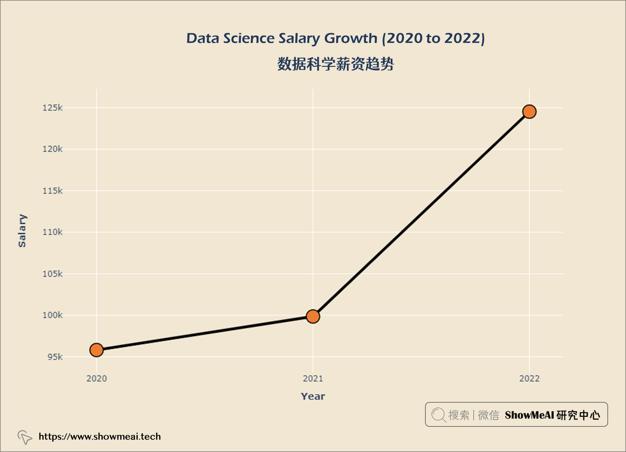
💦 数据科学薪资趋势
salary_year = query("""
    SELECT ROUND(AVG(salary_in_usd)) AS salary,
    work_year AS year
    FROM salaries
    GROUP BY year
    ORDER BY salary DESC
""")

data = go.Scatter(x = salary_year['year'],
                 y = salary_year['salary'],
                 marker = dict(size = 20,
                 line_width = 1.5,
                 line_color = 'black',
                 color = '#ED7D31'),
                 line = dict(color = 'black', width = 4), mode = 'lines+markers')

layout = go.Layout(title = {'text' : "<b>Data Science Salary Growth (2020 to 2022) </b>",
                            'x' : 0.5,
                            'xanchor' : 'center'},
                   xaxis = dict(title = '<b>Year</b>'),
                   yaxis = dict(title = '<b>Salary</b>'),
                   width = 900,
                   height = 600)


fig = go.Figure(data = data, layout = layout)
fig.update_xaxes(tickvals = ['2020','2021','2022'])
fig.update_layout(plot_bgcolor = '#f1e7d2',
                 paper_bgcolor = '#f1e7d2')
fig.show()
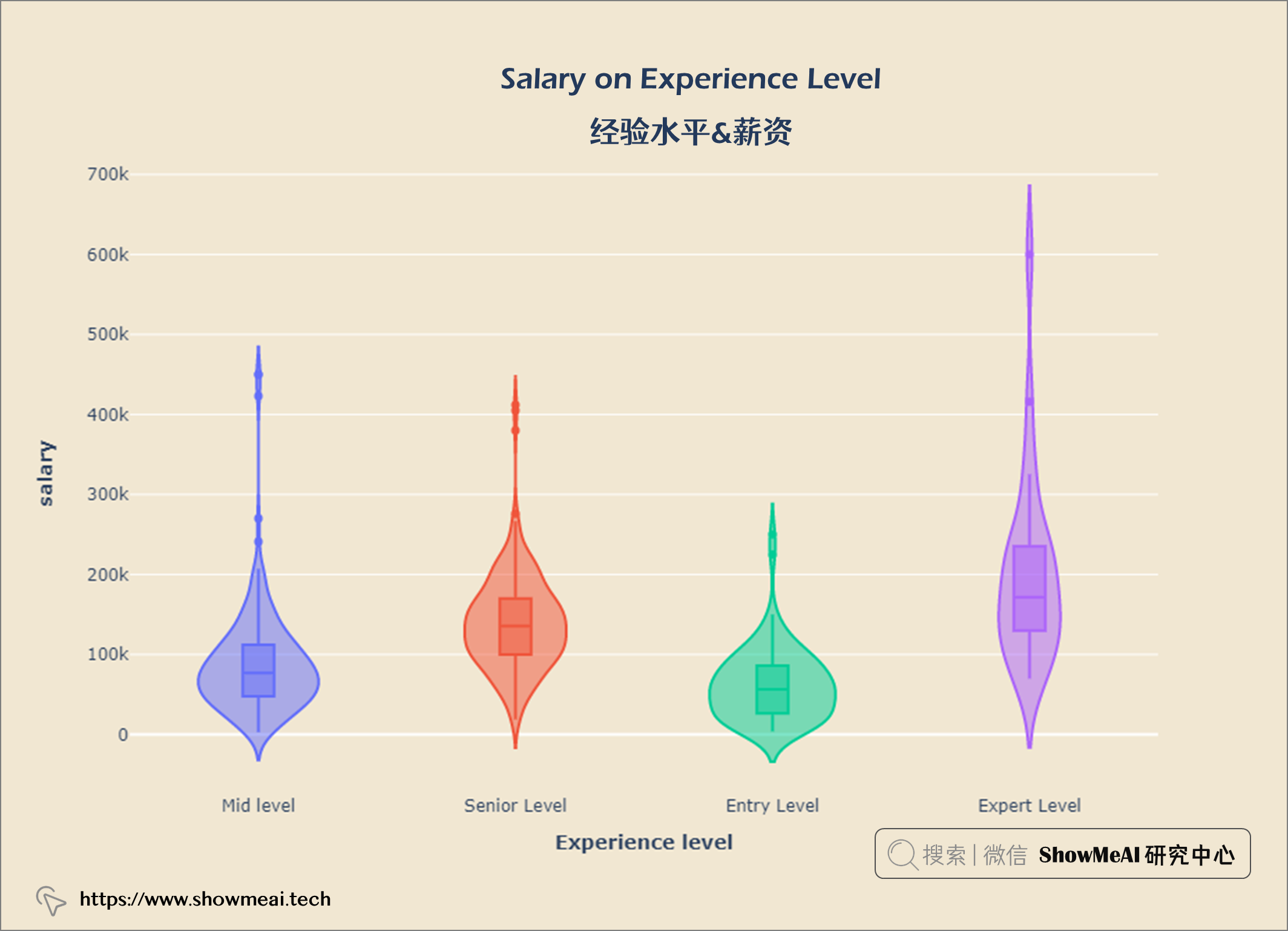
💦 经验水平&薪资
salary_exp = query("""
    SELECT experience_level AS 'Experience Level',
    salary_in_usd AS Salary
    FROM salaries
""")

fig = px.violin(salary_exp, x = 'Experience Level', y = 'Salary', color = 'Experience Level', box = True)

fig.update_layout(title = {'text': "<b>Salary on Experience Level</b>",
                            'xanchor': 'center','x':0.5},
                   xaxis = dict(title = '<b>Experience level</b>'),
                   yaxis = dict(title = '<b>salary</b>',
                                ticktext = [-300000, 0, 100000, 200000, 300000, 400000, 500000, 600000, 700000]),
                   width = 900,
                   height = 600)

fig.update_layout(paper_bgcolor= '#f1e7d2',
                  plot_bgcolor = '#f1e7d2',
                  showlegend = False)
fig.show()
💦 不同经验水平的薪资趋势
tmp_df = salaries.groupby(['work_year', 'experience_level']).median()
tmp_df.reset_index(inplace = True)

fig = px.line(tmp_df, x='work_year', y='salary_in_usd', color='experience_level', symbol="experience_level")

fig.update_layout(title = {'text': "<b>Median Salary Trend By Experience Level</b>",
                            'x':0.5, 'xanchor': 'center'},
                  xaxis = dict(title = '<b>Working Year</b>', tickvals = [2020, 2021, 2022], tickmode = 'array'),
                  yaxis = dict(title = '<b>Salary</b>'),
                  width = 900,
                  height = 600)

fig.update_layout(plot_bgcolor = '#f1e7d2',
                 paper_bgcolor = '#f1e7d2')
fig.show()
观察 1. 在COVID-19大流行期间(2020 年至 2021 年),专家级员工薪资非常高,但是呈现部分下降趋势。 2. 2021年以后专家级和高级职称人员工资有所上涨。
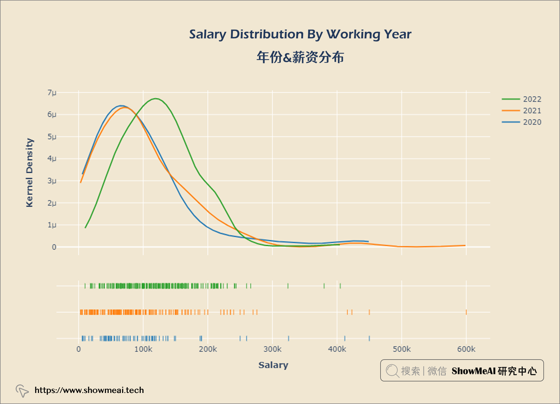
💦 年份&薪资分布
year_gp = salaries.groupby('work_year')
hist_data = [year_gp.get_group(2020)['salary_in_usd'],
             year_gp.get_group(2021)['salary_in_usd'],
            year_gp.get_group(2022)['salary_in_usd']]
group_labels = ['2020', '2021', '2022']

fig = ff.create_distplot(hist_data, group_labels, show_hist = False)


fig.update_layout(title = {'text': "<b>Salary Distribution By Working Year</b>",
                            'x':0.5, 'xanchor': 'center'},
                  xaxis = dict(title = '<b>Salary</b>'),
                  yaxis = dict(title = '<b>Kernel Density</b>'),
                  width = 900,
                  height = 600)

fig.update_layout(plot_bgcolor = '#f1e7d2',
                 paper_bgcolor = '#f1e7d2')
fig.show()
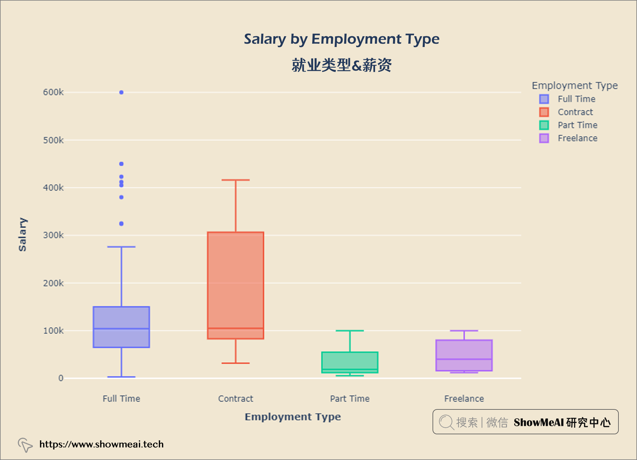
💦 就业类型&薪资
salary_emp = query("""
    SELECT employment_type AS 'Employment Type',
    salary_in_usd AS Salary
    FROM salaries
""")

fig = px.box(salary_emp,x='Employment Type',y='Salary',
       color = 'Employment Type')


fig.update_layout(title = {'text': "<b>Salary by Employment Type</b>",
                            'x':0.5, 'xanchor': 'center'},
                  xaxis = dict(title = '<b>Employment Type</b>'),
                  yaxis = dict(title = '<b>Salary</b>'),
                  width = 900,
                  height = 600)

fig.update_layout(plot_bgcolor = '#f1e7d2',
                 paper_bgcolor = '#f1e7d2')
fig.show()
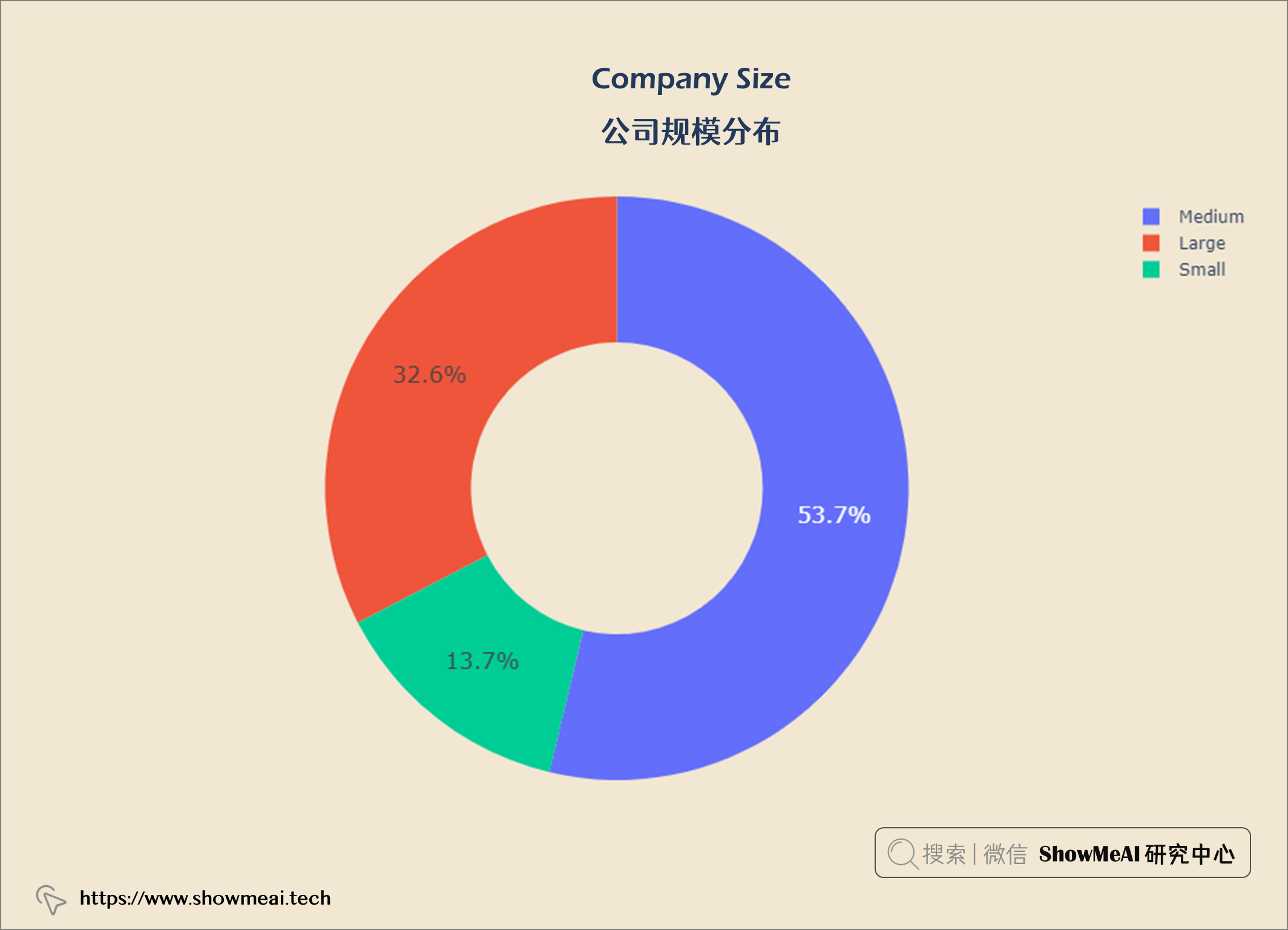
💦 公司规模分布
comp_size = query("""
                SELECT company_size,
                COUNT(*) AS count
                FROM salaries
                GROUP BY company_size
""")


import plotly.graph_objects as go
data = go.Pie(labels = comp_size['company_size'],
              values = comp_size['count'].values,
              hoverinfo = 'label',
              hole = 0.5,
              textfont_size = 16,
              textposition = 'auto')
fig = go.Figure(data = data)


fig.update_layout(title = {'text': "<b>Company Size</b>",
                            'x':0.5, 'xanchor': 'center'},
                  xaxis = dict(title = '<b></b>'),
                  yaxis = dict(title = '<b></b>'),
                  width = 900,
                  height = 600)

fig.update_layout(plot_bgcolor = '#f1e7d2',
                 paper_bgcolor = '#f1e7d2')
fig.show()
💦 不同公司规模的经验水平比例
df = salaries.groupby(['company_size', 'experience_level']).size()
comp_s = np.round(df['Small'].values / df['Small'].values.sum(),2)
comp_m = np.round(df['Medium'].values / df['Medium'].values.sum(),2)
comp_l = np.round(df['Large'].values / df['Large'].values.sum(),2)

fig = go.Figure()
categories = ['Entry Level', 'Expert Level','Mid level','Senior Level']

fig.add_trace(go.Scatterpolar(
    r = comp_s,
    theta = categories,
    fill = 'toself',
    name = 'Company Size S'))

fig.add_trace(go.Scatterpolar(
    r = comp_m,
    theta = categories,
    fill = 'toself',
    name = 'Company Size M'))

fig.add_trace(go.Scatterpolar(
    r = comp_l,
    theta = categories,
    fill = 'toself',
    name = 'Company Size L'))

fig.update_layout(
    polar = dict(
    radialaxis = dict(range = [0, 0.6])),
    showlegend = True,
)


fig.update_layout(title = {'text': "<b>Proportion of Experience Level In Different Company Sizes</b>",
                            'x':0.5, 'xanchor': 'center'},
                  xaxis = dict(title = '<b></b>'),
                  yaxis = dict(title = '<b></b>'),
                  width = 900,
                  height = 600)

fig.update_layout(plot_bgcolor = '#f1e7d2',
                 paper_bgcolor = '#f1e7d2')
fig.show()

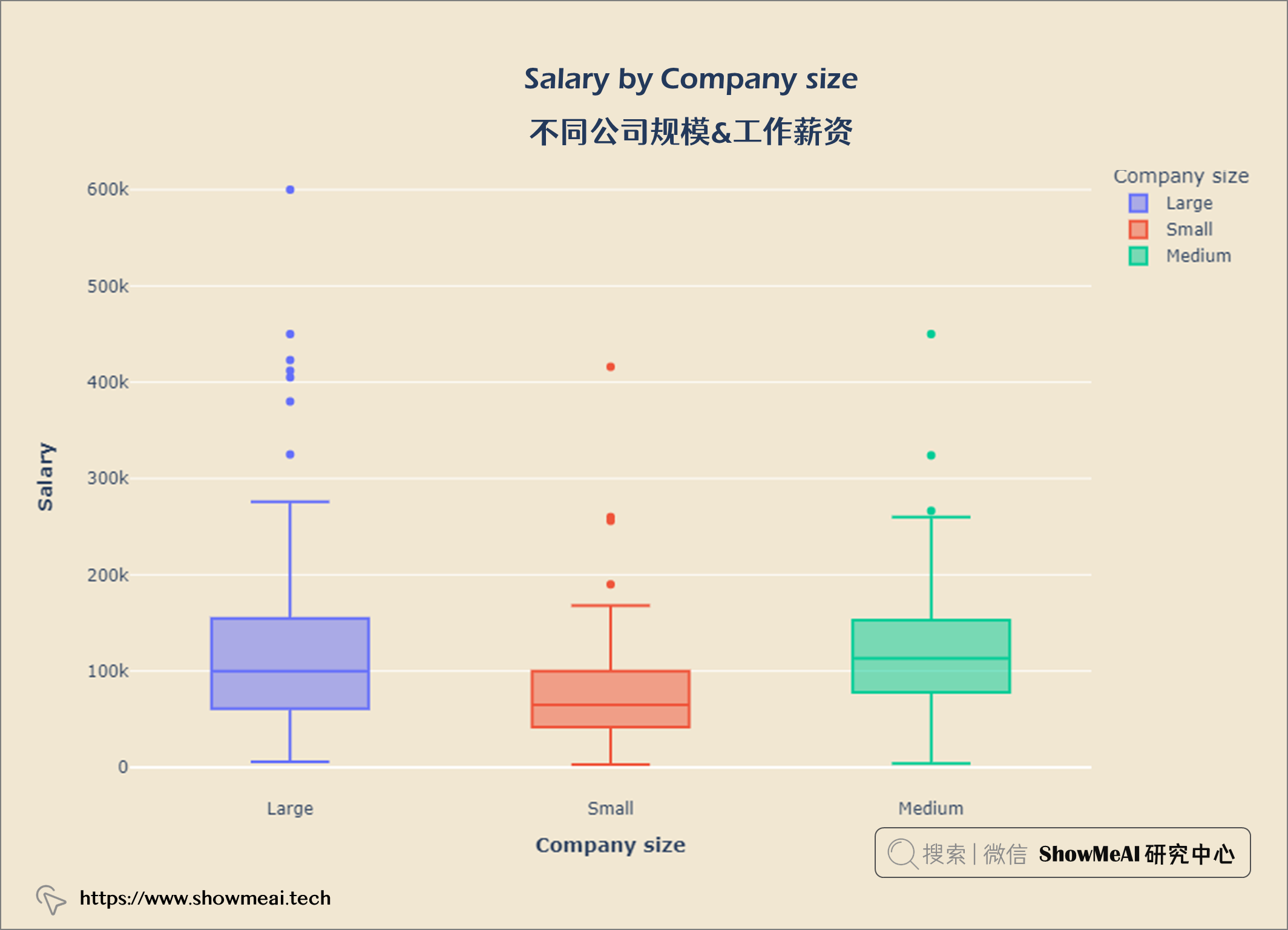
💦 不同公司规模&工作薪资
salary_size = query("""
    SELECT company_size AS 'Company size',
    salary_in_usd AS Salary
    FROM salaries
""")

fig = px.box(salary_size, x='Company size', y = 'Salary',
             color = 'Company size')


fig.update_layout(title = {'text': "<b>Salary by Company size</b>",
                            'x':0.5, 'xanchor': 'center'},
                  xaxis = dict(title = '<b>Company size</b>'),
                  yaxis = dict(title = '<b>Salary</b>'),
                  width = 900,
                  height = 600)

fig.update_layout(plot_bgcolor = '#f1e7d2',
                 paper_bgcolor = '#f1e7d2')
fig.show()
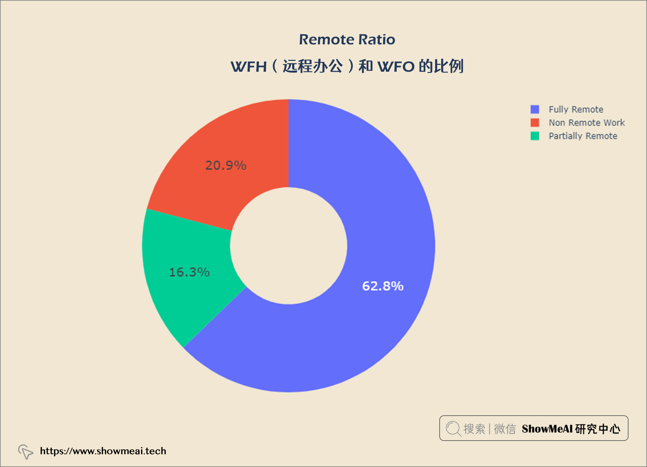
💦 WFH(远程办公)和 WFO 的比例
rem_type = query("""
    SELECT remote_ratio,
    COUNT(*) AS total
    FROM salaries
    GROUP BY remote_ratio
""")


data = go.Pie(labels = rem_type['remote_ratio'], values = rem_type['total'].values,
             hoverinfo = 'label',
             hole = 0.4,
             textfont_size = 18,
             textposition = 'auto')

fig = go.Figure(data = data)

fig.update_layout(title = {'text': "<b>Remote Ratio</b>",
                            'x':0.5, 'xanchor': 'center'},
                  width = 900,
                  height = 600)

fig.update_layout(plot_bgcolor = '#f1e7d2',
                 paper_bgcolor = '#f1e7d2')
fig.show()
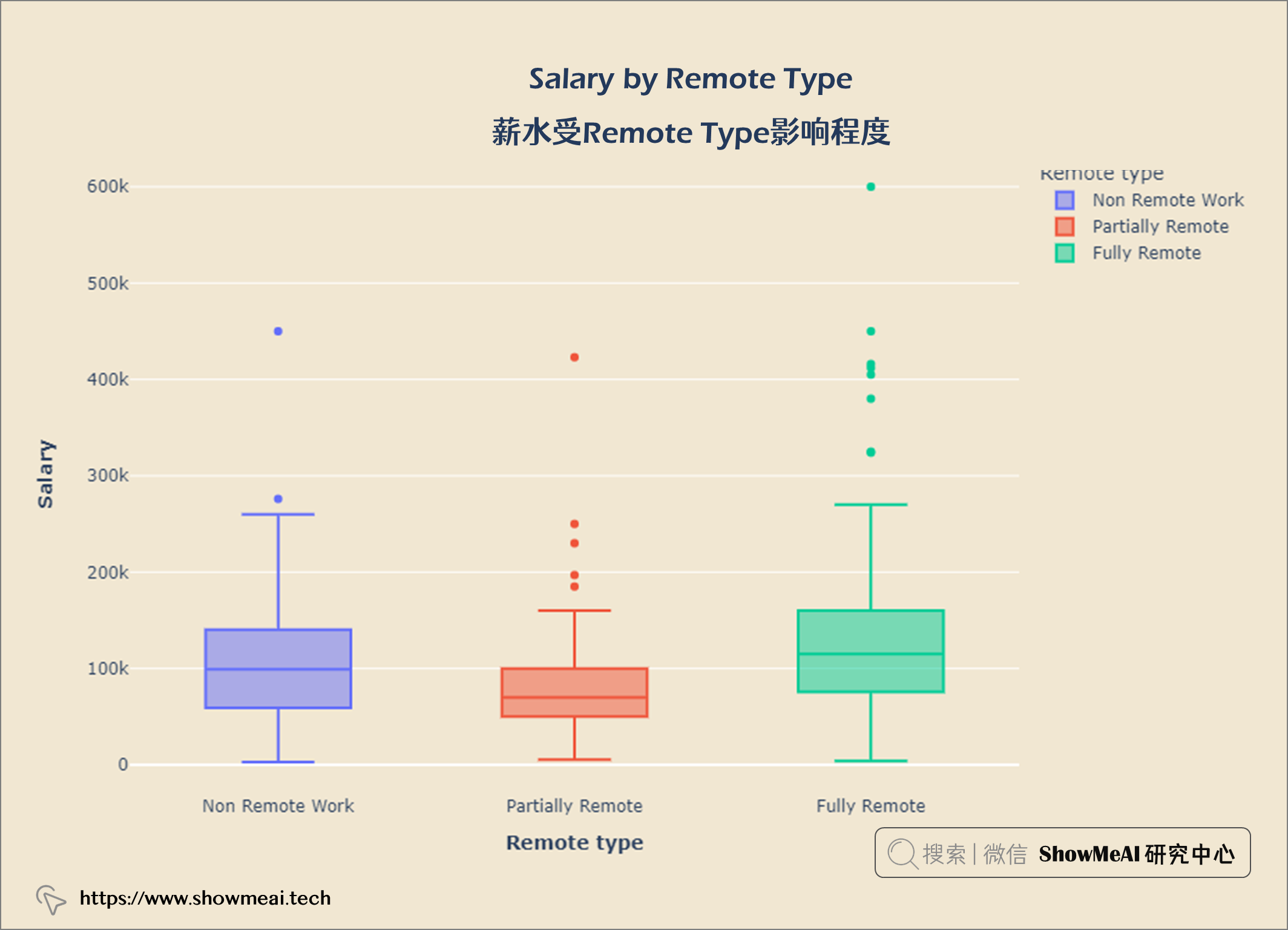
💦 薪水受Remote Type影响程度
salary_remote = query("""
    SELECT remote_ratio AS 'Remote type',
    salary_in_usd AS Salary
    From salaries
""")

fig = px.box(salary_remote, x = 'Remote type', y = 'Salary', color = 'Remote type')


fig.update_layout(title = {'text': "<b>Salary by Remote Type</b>",
                            'x':0.5, 'xanchor': 'center'},
                  xaxis = dict(title = '<b>Remote type</b>'),
                  yaxis = dict(title = '<b>Salary</b>'),
                  width = 900,
                  height = 600)

fig.update_layout(plot_bgcolor = '#f1e7d2',
                 paper_bgcolor = '#f1e7d2')
fig.show()
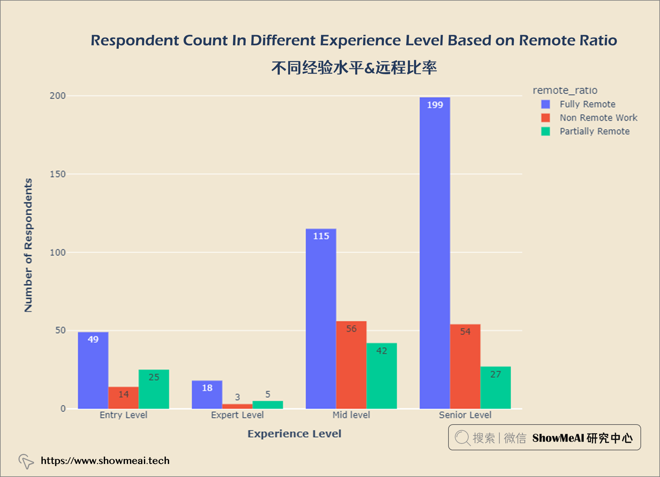
💦 不同经验水平&远程比率
exp_remote = salaries.groupby(['experience_level', 'remote_ratio']).count()
exp_remote.reset_index(inplace = True)

fig = px.histogram(exp_remote, x = 'experience_level',
                  y = 'work_year', color = 'remote_ratio',
                  barmode = 'group',
                  text_auto = True)


fig.update_layout(title = {'text': "<b>Respondent Count In Different Experience Level Based on Remote Ratio</b>",
                            'x':0.5, 'xanchor': 'center'},
                  xaxis = dict(title = '<b>Experience Level</b>'),
                  yaxis = dict(title = '<b>Number of Respondents</b>'),
                  width = 900,
                  height = 600)

fig.update_layout(plot_bgcolor = '#f1e7d2',
                 paper_bgcolor = '#f1e7d2')
fig.show()
💡 分析结论
-
数据科学领域Top3多的职位是数据科学家、数据工程师和数据分析师。
-
数据科学工作越来越受欢迎。员工比例从2020年的11.9%增加到2022年的52.4%。
-
美国是数据科学公司最多的国家。
-
工资分布的IQR在62.7k和150k之间。
-
在数据科学员工中,大多数是高级水平,而专家级则更少。
-
大多数数据科学员工都是全职工作,很少有合同工和自由职业者。
-
首席数据工程师是薪酬最高的数据科学工作。
-
数据科学的最低工资(入门级经验)为4000美元,具有专家级经验的数据科学的最高工资为60万美元。
-
公司构成:53.7%中型公司,32.6%大型公司,13.7%小型数据科学公司。
-
工资也受公司规模影响,规模大的公司支付更高的薪水。
-
62.8%的数据科学是完全远程工作,20.9%是非远程工作,16.3%是部分远程工作。
-
数据科学薪水随时间和经验积累而增长。
参考资料
- 📘 Glassdoor
- 📘 pandasql
- 📘 数据科学工作薪水数据集(Kaggle)
- 📘 图解数据分析:从入门到精通系列教程:https://www.showmeai.tech/tutorials/33
- 📘 编程语言速查表 | SQL 速查表:https://www.showmeai.tech/article-detail/99
- 📘 数据科学工具库速查表 | Pandas 速查表:https://www.showmeai.tech/article-detail/101
- 📘 数据科学工具库速查表 | Matplotlib 速查表:https://www.showmeai.tech/article-detail/103
推荐阅读
- 🌍 数据分析实战系列 :https://www.showmeai.tech/tutorials/40
- 🌍 机器学习数据分析实战系列:https://www.showmeai.tech/tutorials/41
- 🌍 深度学习数据分析实战系列:https://www.showmeai.tech/tutorials/42
- 🌍 TensorFlow数据分析实战系列:https://www.showmeai.tech/tutorials/43
- 🌍 PyTorch数据分析实战系列:https://www.showmeai.tech/tutorials/44
- 🌍 NLP实战数据分析实战系列:https://www.showmeai.tech/tutorials/45
- 🌍 CV实战数据分析实战系列:https://www.showmeai.tech/tutorials/46
- 🌍 AI 面试题库系列:https://www.showmeai.tech/tutorials/48
![[附源码]计算机毕业设计JAVA一点到家小区微帮服务系统](https://img-blog.csdnimg.cn/8aae1fd461984b0481f3b8b3fca37654.png)


![[附源码]计算机毕业设计JAVA医疗预约系统](https://img-blog.csdnimg.cn/19dfad6a9869467d88027787d6645862.png)