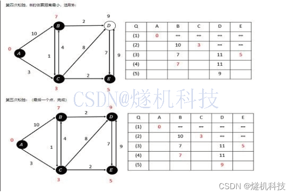
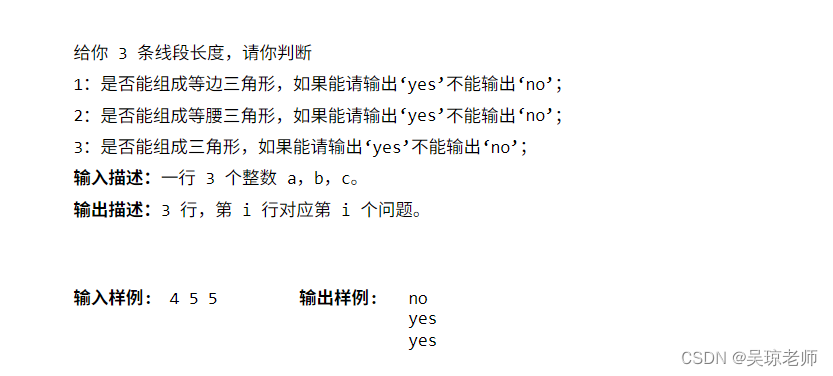
快六一啦,小时候顶多吃个小冰棍,或者是那种小冰袋,现在的小朋友真是好,动不动就能吃到冰淇淋,今天用CSS3实现一个冰淇淋的动画特效吧
目录
实现思路
桶身的实现
冰淇淋身体的实现
五彩颗粒的实现
HTML源码
CSS3源码
最后

实现思路
- 本文采用多DOM的方式进行布局,冰淇淋桶身通过border-radius进行特殊区域进行圆润处理;
- 眼部比较容易理解,先做大的border-radius圆角形状,然后内部做小的白色圆角处理,并且进行定位;通过animation动画,使眼睛可以左右移动;
- 嘴角做半圆处理,然后再通过rotateZ角度旋转,变为卡通可爱形;
- 然后是顶部分三部分处理,包括右上角的樱桃部分;
- 最后是五彩颗粒,采用定位的方式,因为原本我们采用的是DIV元素,所以需要使用一定的圆角处理;
桶身的实现
桶身使用.base类,对width和height做固定,使用position做定位,所以需要z-index的属性加入,需要一定的圆角,又要使用border-radius做处理;
底部为了模拟放在桌子表面上,需要有一个放置的阴影效果,这里使用filter的属性,并控制其blur属性值,
眼睛就是大的DIV套小的DIV,然后采用position进行定位,分别以border-radius做圆角处理,这里需要一个animation动画,使其左右转动,注意,分为左右两只可爱小眼睛;
嘴角因为是DIV元素,而且首先做了上半圆的处理,然后再使用rotateZ(180deg)将其旋转即可;
部分CSS3代码如下:
.eye{
    width: 4vmax;
    height: 4vmax;
    border-radius: 50%;
    position: absolute;
    background: #472a1c;
    top: 19vmax;
    z-index: 110;
}

.eye::before{
    content: '';
    position: absolute;
    top: .75vmax;
    left: .75vmax;
    width: 1.15vmax;
    height: 1.15vmax;
    border-radius: 50%;
    background: white;
    animation: 4s eye infinite ;

}
.eye::after{
    content: '';
    position: absolute;
    top: 2.5vmax;
    left: 1vmax;
    width: .5vmax;
    height: .5vmax;
    border-radius: 50%;
    background: white;
    animation: 4s eye infinite ;

}
.eye-l{ left: 8.8vmax; }
.eye-r{ left: 17.5vmax; }
冰淇淋身体的实现
身体部分采用上中下3个DOM元素做分层处理,分别添加.top__item类,因为冰淇淋被挤压到桶身后呈圆形,所以border-radius真是一个神奇的属性;
然后再通过::before和::after伪类进行阴影部分的元素定位与布局,再配合linear-gradient使特殊部位进行阴影效果,使效果更逼真;
顶部樱桃部分位于最顶部的.top_item类中,但樱桃并非border-radius:50%那样的圆角,而是稍微有一点非圆角,部分CSS3代码如下
.top__item:nth-of-type(3)::before{
    content: '';
    position: absolute;
    width: 4vmax;
    height: 4vmax;
    right: 0;
    top: 0vmax;
    border-radius: 50% / 60%;
    background: #e30b5d;
    transform: rotateZ(-10deg);
}
五彩颗粒的实现
五彩颗粒重点在于定位和方位的旋转效果,这里使用了absolute定位,并且需要z-index的层级比其他元素要高,然后再分别进行top值和left值的定位,并采用rotateZ的旋转属性,使每个五彩颗粒角度方位不同,但其实看这个冰淇淋也就是两种角度,而且为了更吸引小朋友,需要做成不同颜色的,这就需要不同的background属性值,这个比较简单,部分CSS3代码如下
.chips{
    width: 2vmax;
    height: .5vmax;
    position: absolute;
    top: 10vmax;
    left: 8vmax;

    border-radius: 50%;
    transform: rotateZ(35deg);
    z-index: 200;
}
.chips:nth-of-type(2){
    top: 8vmax;
    left: 12vmax;
}
到这里就算讲解完成了,但讲N遍也不如拿到代码自己看一看,改一改源码玩一玩,下面给出源码
HTML源码
<body>
<div class="main">
	<div class="base"></div>
	<div class="sdw"></div>

	<div class="eye eye-l"></div>
	<div class="eye eye-r"></div>
	<div class="shadow shadow-l"></div>
	<div class="shadow shadow-r"></div>
	<div class="mouth"></div>

	<div class="top">
		<div class="top__item"></div>
		<div class="top__item"></div>
		<div class="top__item"></div>
	</div>

	<div class="colors">
		<div class="chips chips--blue"></div>
		<div class="chips chips--pink chips--rotate"></div>
		<div class="chips chips--green"></div>
		<div class="chips chips--blue chips--rotate"></div>
		<div class="chips chips--pink"></div>
		<div class="chips chips--green chips--rotate"></div>
		<div class="chips chips--blue"></div>
	</div>
</div>
CSS3源码
<style>
	*,
*::before,
*::after{
    margin: 0;
    padding: 0;
    box-sizing: border-box;
}
body{
    display: flex;
    justify-content: center;
    align-items: center;
    width: 100%;
    height: 100vh;
    background: #FFD275;
    color: white;
    overflow: hidden;
    font-family: 'Montserrat', sans-serif;
    position: relative;

}
a{
    font-family: sans-serif;
    font-size: 12px;
    font-weight: normal;
    text-decoration: none;
    letter-spacing: 0;
    cursor: pointer;
    color: #00b1b7;
}
.particles{
    width: 100%;
    height: 100vh;
    position: absolute;
    z-index: 1;
}

.main{
    height: 30vmax;
    width: 30vmax;
    position: relative;
    animation: 2s jump ease-out infinite alternate;
    z-index: 10;
}
.base{
    position: absolute;
    width: 18vmax;
    bottom: 4vmax;
    left: 6vmax;

    border-top: 10vmax solid #ff87a4;
    border-top-left-radius: 10px;
    border-top-right-radius: 10px;
    border-left: 3vmax solid transparent;
    border-right: 3vmax solid transparent;
    border-bottom: none;
    z-index: 90;

}
.base::after{
    content: '';
    position: absolute;
    width: 12vmax;
    height: 4vmax;
    background: linear-gradient(to bottom, #ff87a4 60%, #e3748f);
    bottom: -1.65vmax;
    border-radius: 50%;
}

.eye{
    width: 4vmax;
    height: 4vmax;
    border-radius: 50%;
    position: absolute;
    background: #472a1c;
    top: 19vmax;
    z-index: 110;
}

.eye::before{
    content: '';
    position: absolute;
    top: .75vmax;
    left: .75vmax;
    width: 1.15vmax;
    height: 1.15vmax;
    border-radius: 50%;
    background: white;
    animation: 4s eye infinite ;

}
.eye::after{
    content: '';
    position: absolute;
    top: 2.5vmax;
    left: 1vmax;
    width: .5vmax;
    height: .5vmax;
    border-radius: 50%;
    background: white;
    animation: 4s eye infinite ;

}
.eye-l{ left: 8.8vmax; }
.eye-r{ left: 17.5vmax; }

.shadow{
    position: absolute;
    width: 2vmax;
    height: 1vmax;
    bottom: 6.5vmax;
    z-index: 109;
    border-radius: 50%;
    background: #ff2a7b;
    animation: .1s shake infinite;

}
.shadow-l{ left: 8.4vmax; }
.shadow-r{ left: 19.5vmax; }

.mouth{
    position: absolute;
    top: 23vmax;
    left: calc(15vmax - 1.5vmax);

    border-top-left-radius: 1.5vmax;
    border-top-right-radius: 1.5vmax;
    border: 1.5vmax solid #ff2a7b;
    transform: rotateZ(180deg);

    z-index: 110;
    animation: 2s mouth infinite alternate;

}


.top{
    position: absolute;
    width: 22vmax;
    height: 15vmax;
    bottom: 12vmax;
    left: 4vmax;
}
.top__item:nth-of-type(1){
    position: absolute;
    width: 100%;
    height: 8vmax;
    border-radius: 5vmax;
    bottom: 0;
    z-index: 100;
    background: #f2e7e8;

}
.top__item:nth-of-type(1)::after{
    content: '';
    position: absolute;
    width: 10vmax;
    height: 10vmax;
    right: -.5vmax;
    top: -2vmax;
    border-radius: 50%;
    background: #f2e7e8;
    background: linear-gradient(120deg, rgba(242, 231, 232, 1) 40%, #d6c6c8);

}
.top__item:nth-of-type(1)::before{
    content: '';
    position: absolute;
    width: 18vmax;
    height: 3vmax;
    left: 2vmax;
    bottom: -.8vmax;
    border-radius: 50%;
    background: linear-gradient(to bottom, #f2e7e8 30%, #d6c6c8);

}
.top__item:nth-of-type(2){
    position: absolute;
    width: 16vmax;
    height:5vmax;
    bottom: 6vmax;
    left: 3vmax;
    border-radius: 5vmax;
    z-index: 80;
    background: #f2e7e8;
}
.top__item:nth-of-type(2)::after{
    content: '';
    position: absolute;
    width: 4vmax;
    height: 4vmax;
    right: 0;
    top: -1vmax;
    border-radius: 50%;
    background: #f2e7e8;
}
.top__item:nth-of-type(3){
    position: absolute;
    width: 12vmax;
    height: 10vmax;
    left: 5vmax;
    border-radius: 50%;
    top: 0;
    z-index: 70;
    background: #f2e7e8;
}
.top__item:nth-of-type(3)::before{
    content: '';
    position: absolute;
    width: 4vmax;
    height: 4vmax;
    right: 0;
    top: 0vmax;
    border-radius: 50% / 60%;
    background: #e30b5d;
    transform: rotateZ(-10deg);
}
.top__item:nth-of-type(3)::after{
    content: '';
    position: absolute;
    width: 1vmax;
    height: 1vmax;
    right: 1vmax;
    top: .75vmax;
    border-radius: 50%;
    background: white;
    opacity: .4;
}


.chips{
    width: 2vmax;
    height: .5vmax;
    position: absolute;
    top: 10vmax;
    left: 8vmax;

    border-radius: 50%;
    transform: rotateZ(35deg);
    z-index: 200;
}
.chips:nth-of-type(2){
    top: 8vmax;
    left: 12vmax;
}
.chips:nth-of-type(3){
    top: 4vmax;
    left: 14vmax;
}
.chips:nth-of-type(4){
    top: 14vmax;
    left: 14vmax;
}
.chips:nth-of-type(5){
    top: 15vmax;
    left: 18vmax;
}
.chips:nth-of-type(6){
    top: 9vmax;
    left: 20vmax;
}
.chips:nth-of-type(7){
    top: 15vmax;
    left: 6vmax;
}

.chips--rotate{ transform: rotateZ(-35deg); }
.chips--blue{ background: #00b1b7; }
.chips--pink{ background: #ff2c7c; }
.chips--green{ background: #00df4a; }


.sdw{
    width: 12vmax;
    height: 4vmax;
    position: absolute;
    bottom: 1.5vmax;
    left: calc(50% - 6vmax);

    background: black;
    border-radius: 50%;
    filter: blur(3px);
    animation: 2s sdw ease-out infinite alternate;

}
@keyframes sdw {
    0%, 90%{
        opacity: .3;
        transform: translateY(0vmax) scale(.98);
    }
    100%{
        transform: translateY(5vmax) scale(.95);
        opacity: .1;
    }
}

@keyframes eye {
    0%, 45%{ transform: translateX(0vmax);}
    50%, 95%{ transform: translateX(1.25vmax);}
}
@keyframes mouth {
    0%, 80%{
        border: 1.5vmax solid #ff2a7b;
        border-bottom: 0;
    }
    100%{
        border: 1.5vmax solid #ff2a7b;
    }
}

@keyframes shake {
    0%{ transform: translateY(-1px); }
    100%{ transform: translateY(1px);}
}
@keyframes jump {
    0%, 90%{
        transform: translateY(2vmax) scale(1);
    }
    100%{
        transform: translateY(-3vmax) scale(.95);
    }
}
@keyframes move {
    0%{
        transform: translateY(0) rotateZ(35deg);
        opacity: 0;
    }
    10% ,90%{
        opacity: .35;
    }
    100%{
        transform: translateY(35vmax) rotateZ(-35deg);
        opacity: 0;
    }
}

</style>
最后
最后,希望不管是大人还是小朋友们,都可以渡过一个快乐的六一儿童节,即便自己不是小孩子了,也奖励自己一个六一小礼物吧