1、圆角边框
border-radius属性,用于设置元素的外边框圆角
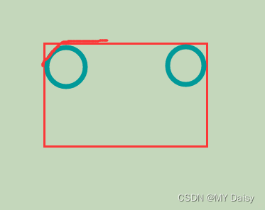
原理:(椭)圆和矩形的两条边相切(圆的半径就是length),形成圆角效果
属性:
border-top-left-radius;左上
border-top-right-radius:右上
border-bottom-right-radius;右下
border-bottom-left-radius:左下
简写形式:border-radius
length1-4代表左上、右上、右下、左下角
只写一个数值就代表,四个角一样
border-radius:length1,length2,length3,length4;
border-radius:length;
border-radius:length1,length2;
参数值:可以是百分比或数值形式
1.2圆角边框的应用
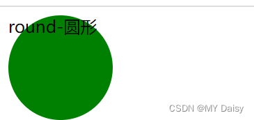
1、画圆
设置length为矩形长(宽)的一半,矩形长=宽(正方形 ),也可以直接写50%
div{
	width:100px;
	height:100px;
	border-radius:50px;//或者写50%
}
<!DOCTYPE html>
<html lang="en">
<head>
    <meta charset="UTF-8">
    <meta http-equiv="X-UA-Compatible" content="IE=edge">
    <meta name="viewport" content="width=device-width, initial-scale=1.0">
    <title>Document</title>
    <style>
        .round{
            width: 100px;
            height: 100px;
            border-radius:50%;
            background-color: green;
        }
    </style>
</head>
<body>
    <div class="round">round-圆形 </div>
</body>
</html>
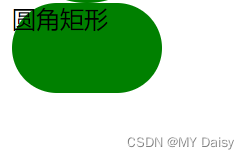
2、圆角矩形
设置length为矩形高度的一半
<!DOCTYPE html>
<html lang="en">
<head>
    <meta charset="UTF-8">
    <meta http-equiv="X-UA-Compatible" content="IE=edge">
    <meta name="viewport" content="width=device-width, initial-scale=1.0">
    <title>Document</title>
    <style>
        .round_rectangle{
            width: 100px;
            height: 60px;
            border-radius: 30px;
            background-color: green;
        }
    </style>
</head>
<body>
    <div class="round_rectangle">圆角矩形</div>
</body>
</html>
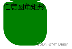
3 不同的圆角矩形
<!DOCTYPE html>
<html lang="en">
<head>
    <meta charset="UTF-8">
    <meta http-equiv="X-UA-Compatible" content="IE=edge">
    <meta name="viewport" content="width=device-width, initial-scale=1.0">
    <title>Document</title>
    <style>
        .arbitrary{
            width: 100px;
            height: 100px;
            border-radius:10px 20px 30px 40px;
            background-color:green;
        }
    </style>
</head>
<body>
    <div class="arbitrary">任意圆角矩形</div>
</body>
</html>
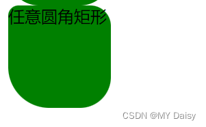 或者这样写:
<!DOCTYPE html>
<html lang="en">
<head>
    <meta charset="UTF-8">
    <meta http-equiv="X-UA-Compatible" content="IE=edge">
    <meta name="viewport" content="width=device-width, initial-scale=1.0">
    <title>Document</title>
    <style>
        .arbitrary{
            width: 100px;
            height: 100px;
            /* border-radius:10px 20px 30px 40px; */
            border-top-left-radius:10px;
            border-top-right-radius: 20px;
            border-bottom-right-radius: 30px;
            border-bottom-left-radius: 40px;
            background-color:green;
        }
    </style>
</head>
<body>
    <div class="arbitrary">任意圆角矩形</div>
</body>
</html>
2.盒子阴影(**)
2.1 阴影介绍
css3新增样式属性,使用box-shadow属性为盒子添加阴影效果
box-shadow:h-shadow v-shadow blur spread color inset
| 值 | 描述 |
|---|---|
| h-shadow | 必须,水平(horizontal)阴影的位置,可以是负值,px |
| v-shadow | 必须,垂直(vertical)阴影的位置,可以是负值,px |
| blur | 可选,模糊距离,影子的虚实,px,如果为负值,就看不到了 |
| spread | 可选,阴影的尺寸,影子的大小,px |
| color | 可选,阴影的颜色 |
| inset | 可选,将外部阴影改为内部阴影,默认不写就是外阴影 |
2.2 阴影实际应用
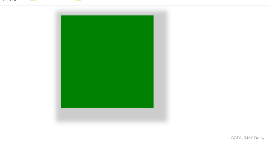
(1)静态影子
<!DOCTYPE html>
<html lang="en">
<head>
    <meta charset="UTF-8">
    <meta http-equiv="X-UA-Compatible" content="IE=edge">
    <meta name="viewport" content="width=device-width, initial-scale=1.0">
    <title>Document</title>
    <style>
        div{
            width: 200px;
            height: 200px;
            background-color: green;
            box-shadow: 10px 10px 10px 20px rgba(0,0,0,0.2);
            margin: 20px auto;
        }
    </style>
</head>
<body>
    <div></div>
</body>
</html>
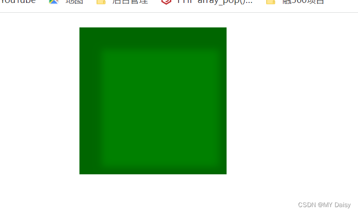
(2)动态影子
鼠标悬浮到盒子,展示阴影的效果
<!DOCTYPE html>
<html lang="en">

<head>
    <meta charset="UTF-8">
    <meta http-equiv="X-UA-Compatible" content="IE=edge">
    <meta name="viewport" content="width=device-width, initial-scale=1.0">
    <title>Document</title>
    <style>
        div {
            width: 200px;
            height: 200px;
            background-color: green;
            margin: 20px auto;
        }

        div:hover {
            box-shadow: 10px 10px 10px 20px rgba(0, 0, 0, 0.2) inset;
        }
    </style>
</head>

<body>
    <div></div>
</body>

</html>
QQ录屏20221130231318
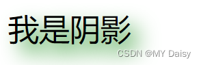
3、文字阴影
css3中使用text-shadow属性
text-shadow:h-shadow v-shadow blur color;
| 值 | 描述 |
|---|---|
| h-shadow | 必须,水平阴影的位置,允许负值,px |
| v-shadow | 必须,垂直阴影位置,允许负值,px |
| blur | 可选,模糊程度,虚实,px |
| color | 可选,阴影颜色 |
<!DOCTYPE html>
<html lang="en">
<head>
    <meta charset="UTF-8">
    <meta http-equiv="X-UA-Compatible" content="IE=edge">
    <meta name="viewport" content="width=device-width, initial-scale=1.0">
    <title>Document</title>
    <style>
        div{
            font-size: 30px;
            text-shadow: 10px 10px 20px green;
        }
    </style>
</head>
<body>
    <div>我是阴影</div>
</body>
</html>